
Blog

  • To Ignite a Personalization Practice, Run this Prepersonalization Workshop

    To Ignite a Personalization Practice, Run this Prepersonalization Workshop

    Picture this. You’ve joined a squad at your company that’s designing new product features with an emphasis on automation or AI. Or your company has just implemented a personalization engine. Either way, you’re designing with data. Now what? When it comes to designing for personalization, there are many cautionary tales, no overnight successes, and few guides for the perplexed. 

    Between the fantasy of getting it right and the fear of it going wrong—like when we encounter “persofails” in the vein of a company repeatedly imploring everyday consumers to buy additional toilet seats—the personalization gap is real. It’s an especially confounding place to be a digital professional without a map, a compass, or a plan.

    For those of you venturing into personalization, there’s no Lonely Planet and few tour guides because effective personalization is so specific to each organization’s talent, technology, and market position. 

    But you can ensure that your team has packed its bags sensibly.

    There’s a DIY formula to increase your chances for success. At minimum, you’ll defuse your boss’s irrational exuberance. Before the party you’ll need to effectively prepare.

    We call it prepersonalization.

    Behind the music

    Consider Spotify’s DJ feature, which debuted this past year.

    We’re used to seeing the polished final result of a personalization feature. Before the year-end award, the making-of backstory, or the behind-the-scenes victory lap, a personalized feature had to be conceived, budgeted, and prioritized. Before any personalization feature goes live in your product or service, it lives amid a backlog of worthy ideas for expressing customer experiences more dynamically.

    So how do you know where to place your personalization bets? How do you design consistent interactions that won’t trip up users or—worse—breed mistrust? We’ve found that for many budgeted programs to justify their ongoing investments, they first needed one or more workshops to convene key stakeholders and internal customers of the technology. Make yours count.

    ​From Big Tech to fledgling startups, we’ve seen the same evolution up close with our clients. In our experiences with working on small and large personalization efforts, a program’s ultimate track record—and its ability to weather tough questions, work steadily toward shared answers, and organize its design and technology efforts—turns on how effectively these prepersonalization activities play out.

    Time and again, we’ve seen effective workshops separate future success stories from unsuccessful efforts, saving countless time, resources, and collective well-being in the process.

    A personalization practice involves a multiyear effort of testing and feature development. It’s not a switch-flip moment in your tech stack. It’s best managed as a backlog that often evolves through three steps: 

    1. customer experience optimization (CXO, also known as A/B testing or experimentation)
    2. always-on automations (whether rules-based or machine-generated)
    3. mature features or standalone product development (such as Spotify’s DJ experience)

    This is why we created our progressive personalization framework and why we’re field-testing an accompanying deck of cards: we believe that there’s a base grammar, a set of “nouns and verbs” that your organization can use to design experiences that are customized, personalized, or automated. You won’t need these cards. But we strongly recommend that you create something similar, whether that might be digital or physical.

    Set your kitchen timer

    How long does it take to cook up a prepersonalization workshop? The surrounding assessment activities that we recommend including can (and often do) span weeks. For the core workshop, we recommend aiming for two to three days. Here’s a summary of our broader approach along with details on the essential first-day activities.

    The full arc of the wider workshop is threefold:

    1. Kickstart: This sets the terms of engagement as you focus on the opportunity as well as the readiness and drive of your team and your leadership. .
    2. Plan your work: This is the heart of the card-based workshop activities where you specify a plan of attack and the scope of work.
    3. Work your plan: This phase is all about creating a competitive environment for team participants to individually pitch their own pilots that each contain a proof-of-concept project, its business case, and its operating model.

    Give yourself at least a day, split into two large time blocks, to power through a concentrated version of those first two phases.

    Kickstart: Whet your appetite

    We call the first lesson the “landscape of connected experience.” It explores the personalization possibilities in your organization. A connected experience, in our parlance, is any UX requiring the orchestration of multiple systems of record on the backend. This could be a content-management system combined with a marketing-automation platform. It could be a digital-asset manager combined with a customer-data platform.

    Spark conversation by naming consumer examples and business-to-business examples of connected experience interactions that you admire, find familiar, or even dislike. This should cover a representative range of personalization patterns, including automated app-based interactions (such as onboarding sequences or wizards), notifications, and recommenders. We have a catalog of these in the cards. Here’s a list of 142 different interactions to jog your thinking.

    This is all about setting the table. What are the possible paths for the practice in your organization? If you want a broader view, here’s a long-form primer and a strategic framework.

    Assess each example that you discuss for its complexity and the level of effort that you estimate that it would take for your team to deliver that feature (or something similar). In our cards, we divide connected experiences into five levels: functions, features, experiences, complete products, and portfolios. Size your own build here. This will help to focus the conversation on the merits of ongoing investment as well as the gap between what you deliver today and what you want to deliver in the future.

    Next, have your team plot each idea on the following 2×2 grid, which lays out the four enduring arguments for a personalized experience. This is critical because it emphasizes how personalization can not only help your external customers but also affect your own ways of working. It’s also a reminder (which is why we used the word argument earlier) of the broader effort beyond these tactical interventions.

    Each team member should vote on where they see your product or service putting its emphasis. Naturally, you can’t prioritize all of them. The intention here is to flesh out how different departments may view their own upsides to the effort, which can vary from one to the next. Documenting your desired outcomes lets you know how the team internally aligns across representatives from different departments or functional areas.

    The third and final kickstart activity is about naming your personalization gap. Is your customer journey well documented? Will data and privacy compliance be too big of a challenge? Do you have content metadata needs that you have to address? (We’re pretty sure that you do: it’s just a matter of recognizing the relative size of that need and its remedy.) In our cards, we’ve noted a number of program risks, including common team dispositions. Our Detractor card, for example, lists six stakeholder behaviors that hinder progress.

    Effectively collaborating and managing expectations is critical to your success. Consider the potential barriers to your future progress. Press the participants to name specific steps to overcome or mitigate those barriers in your organization. As studies have shown, personalization efforts face many common barriers.

    At this point, you’ve hopefully discussed sample interactions, emphasized a key area of benefit, and flagged key gaps? Good—you’re ready to continue.

    Hit that test kitchen

    Next, let’s look at what you’ll need to bring your personalization recipes to life. Personalization engines, which are robust software suites for automating and expressing dynamic content, can intimidate new customers. Their capabilities are sweeping and powerful, and they present broad options for how your organization can conduct its activities. This presents the question: Where do you begin when you’re configuring a connected experience?

    What’s important here is to avoid treating the installed software like it were a dream kitchen from some fantasy remodeling project (as one of our client executives memorably put it). These software engines are more like test kitchens where your team can begin devising, tasting, and refining the snacks and meals that will become a part of your personalization program’s regularly evolving menu.

    The ultimate menu of the prioritized backlog will come together over the course of the workshop. And creating “dishes” is the way that you’ll have individual team stakeholders construct personalized interactions that serve their needs or the needs of others.

    The dishes will come from recipes, and those recipes have set ingredients.

    Verify your ingredients

    Like a good product manager, you’ll make sure—andyou’ll validate with the right stakeholders present—that you have all the ingredients on hand to cook up your desired interaction (or that you can work out what needs to be added to your pantry). These ingredients include the audience that you’re targeting, content and design elements, the context for the interaction, and your measure for how it’ll come together. 

    This isn’t just about discovering requirements. Documenting your personalizations as a series of if-then statements lets the team: 

    1. compare findings toward a unified approach for developing features, not unlike when artists paint with the same palette; 
    2. specify a consistent set of interactions that users find uniform or familiar; 
    3. and develop parity across performance measurements and key performance indicators too. 

    This helps you streamline your designs and your technical efforts while you deliver a shared palette of core motifs of your personalized or automated experience.

    Compose your recipe

    What ingredients are important to you? Think of a who-what-when-why construct

    • Who are your key audience segments or groups?
    • What kind of content will you give them, in what design elements, and under what circumstances?
    • And for which business and user benefits?

    We first developed these cards and card categories five years ago. We regularly play-test their fit with conference audiences and clients. And we still encounter new possibilities. But they all follow an underlying who-what-when-why logic.

    Here are three examples for a subscription-based reading app, which you can generally follow along with right to left in the cards in the accompanying photo below. 

    1. Nurture personalization: When a guest or an unknown visitor interacts with  a product title, a banner or alert bar appears that makes it easier for them to encounter a related title they may want to read, saving them time.
    2. Welcome automation: When there’s a newly registered user, an email is generated to call out the breadth of the content catalog and to make them a happier subscriber.
    3. Winback automation: Before their subscription lapses or after a recent failed renewal, a user is sent an email that gives them a promotional offer to suggest that they reconsider renewing or to remind them to renew.

    A useful preworkshop activity may be to think through a first draft of what these cards might be for your organization, although we’ve also found that this process sometimes flows best through cocreating the recipes themselves. Start with a set of blank cards, and begin labeling and grouping them through the design process, eventually distilling them to a refined subset of highly useful candidate cards.

    You can think of the later stages of the workshop as moving from recipes toward a cookbook in focus—like a more nuanced customer-journey mapping. Individual “cooks” will pitch their recipes to the team, using a common jobs-to-be-done format so that measurability and results are baked in, and from there, the resulting collection will be prioritized for finished design and delivery to production.

    Better kitchens require better architecture

    Simplifying a customer experience is a complicated effort for those who are inside delivering it. Beware anyone who says otherwise. With that being said,  “Complicated problems can be hard to solve, but they are addressable with rules and recipes.”

    When personalization becomes a laugh line, it’s because a team is overfitting: they aren’t designing with their best data. Like a sparse pantry, every organization has metadata debt to go along with its technical debt, and this creates a drag on personalization effectiveness. Your AI’s output quality, for example, is indeed limited by your IA. Spotify’s poster-child prowess today was unfathomable before they acquired a seemingly modest metadata startup that now powers its underlying information architecture.

    You can definitely stand the heat…

    Personalization technology opens a doorway into a confounding ocean of possible designs. Only a disciplined and highly collaborative approach will bring about the necessary focus and intention to succeed. So banish the dream kitchen. Instead, hit the test kitchen to save time, preserve job satisfaction and security, and safely dispense with the fanciful ideas that originate upstairs of the doers in your organization. There are meals to serve and mouths to feed.

    This workshop framework gives you a fighting shot at lasting success as well as sound beginnings. Wiring up your information layer isn’t an overnight affair. But if you use the same cookbook and shared recipes, you’ll have solid footing for success. We designed these activities to make your organization’s needs concrete and clear, long before the hazards pile up.

    While there are associated costs toward investing in this kind of technology and product design, your ability to size up and confront your unique situation and your digital capabilities is time well spent. Don’t squander it. The proof, as they say, is in the pudding.

  • User Research Is Storytelling

    User Research Is Storytelling

    Ever since I was a boy, I’ve been fascinated with movies. I loved the characters and the excitement—but most of all the stories. I wanted to be an actor. And I believed that I’d get to do the things that Indiana Jones did and go on exciting adventures. I even dreamed up ideas for movies that my friends and I could make and star in. But they never went any further. I did, however, end up working in user experience (UX). Now, I realize that there’s an element of theater to UX—I hadn’t really considered it before, but user research is storytelling. And to get the most out of user research, you need to tell a good story where you bring stakeholders—the product team and decision makers—along and get them interested in learning more.

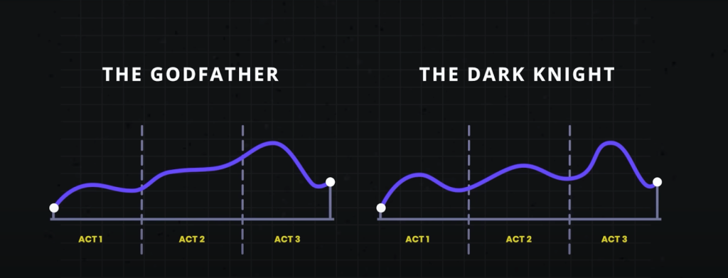
    Think of your favorite movie. More than likely it follows a three-act structure that’s commonly seen in storytelling: the setup, the conflict, and the resolution. The first act shows what exists today, and it helps you get to know the characters and the challenges and problems that they face. Act two introduces the conflict, where the action is. Here, problems grow or get worse. And the third and final act is the resolution. This is where the issues are resolved and the characters learn and change. I believe that this structure is also a great way to think about user research, and I think that it can be especially helpful in explaining user research to others.

    Use storytelling as a structure to do research

    It’s sad to say, but many have come to see research as being expendable. If budgets or timelines are tight, research tends to be one of the first things to go. Instead of investing in research, some product managers rely on designers or—worse—their own opinion to make the “right” choices for users based on their experience or accepted best practices. That may get teams some of the way, but that approach can so easily miss out on solving users’ real problems. To remain user-centered, this is something we should avoid. User research elevates design. It keeps it on track, pointing to problems and opportunities. Being aware of the issues with your product and reacting to them can help you stay ahead of your competitors.

    In the three-act structure, each act corresponds to a part of the process, and each part is critical to telling the whole story. Let’s look at the different acts and how they align with user research.

    Act one: setup

    The setup is all about understanding the background, and that’s where foundational research comes in. Foundational research (also called generative, discovery, or initial research) helps you understand users and identify their problems. You’re learning about what exists today, the challenges users have, and how the challenges affect them—just like in the movies. To do foundational research, you can conduct contextual inquiries or diary studies (or both!), which can help you start to identify problems as well as opportunities. It doesn’t need to be a huge investment in time or money.

    Erika Hall writes about minimum viable ethnography, which can be as simple as spending 15 minutes with a user and asking them one thing: “‘Walk me through your day yesterday.’ That’s it. Present that one request. Shut up and listen to them for 15 minutes. Do your damndest to keep yourself and your interests out of it. Bam, you’re doing ethnography.” According to Hall, [This] will probably prove quite illuminating. In the highly unlikely case that you didn’t learn anything new or useful, carry on with enhanced confidence in your direction.”  

    This makes total sense to me. And I love that this makes user research so accessible. You don’t need to prepare a lot of documentation; you can just recruit participants and do it! This can yield a wealth of information about your users, and it’ll help you better understand them and what’s going on in their lives. That’s really what act one is all about: understanding where users are coming from. 

    Jared Spool talks about the importance of foundational research and how it should form the bulk of your research. If you can draw from any additional user data that you can get your hands on, such as surveys or analytics, that can supplement what you’ve heard in the foundational studies or even point to areas that need further investigation. Together, all this data paints a clearer picture of the state of things and all its shortcomings. And that’s the beginning of a compelling story. It’s the point in the plot where you realize that the main characters—or the users in this case—are facing challenges that they need to overcome. Like in the movies, this is where you start to build empathy for the characters and root for them to succeed. And hopefully stakeholders are now doing the same. Their sympathy may be with their business, which could be losing money because users can’t complete certain tasks. Or maybe they do empathize with users’ struggles. Either way, act one is your initial hook to get the stakeholders interested and invested.

    Once stakeholders begin to understand the value of foundational research, that can open doors to more opportunities that involve users in the decision-making process. And that can guide product teams toward being more user-centered. This benefits everyone—users, the product, and stakeholders. It’s like winning an Oscar in movie terms—it often leads to your product being well received and successful. And this can be an incentive for stakeholders to repeat this process with other products. Storytelling is the key to this process, and knowing how to tell a good story is the only way to get stakeholders to really care about doing more research. 

    This brings us to act two, where you iteratively evaluate a design or concept to see whether it addresses the issues.

    Act two: conflict

    Act two is all about digging deeper into the problems that you identified in act one. This usually involves directional research, such as usability tests, where you assess a potential solution (such as a design) to see whether it addresses the issues that you found. The issues could include unmet needs or problems with a flow or process that’s tripping users up. Like act two in a movie, more issues will crop up along the way. It’s here that you learn more about the characters as they grow and develop through this act. 

    Usability tests should typically include around five participants according to Jakob Nielsen, who found that that number of users can usually identify most of the problems: “As you add more and more users, you learn less and less because you will keep seeing the same things again and again… After the fifth user, you are wasting your time by observing the same findings repeatedly but not learning much new.” 

    There are parallels with storytelling here too; if you try to tell a story with too many characters, the plot may get lost. Having fewer participants means that each user’s struggles will be more memorable and easier to relay to other stakeholders when talking about the research. This can help convey the issues that need to be addressed while also highlighting the value of doing the research in the first place.

    Researchers have run usability tests in person for decades, but you can also conduct usability tests remotely using tools like Microsoft Teams, Zoom, or other teleconferencing software. This approach has become increasingly popular since the beginning of the pandemic, and it works well. You can think of in-person usability tests like going to a play and remote sessions as more like watching a movie. There are advantages and disadvantages to each. In-person usability research is a much richer experience. Stakeholders can experience the sessions with other stakeholders. You also get real-time reactions—including surprise, agreement, disagreement, and discussions about what they’re seeing. Much like going to a play, where audiences get to take in the stage, the costumes, the lighting, and the actors’ interactions, in-person research lets you see users up close, including their body language, how they interact with the moderator, and how the scene is set up.

    If in-person usability testing is like watching a play—staged and controlled—then conducting usability testing in the field is like immersive theater where any two sessions might be very different from one another. You can take usability testing into the field by creating a replica of the space where users interact with the product and then conduct your research there. Or you can go out to meet users at their location to do your research. With either option, you get to see how things work in context, things come up that wouldn’t have in a lab environment—and conversion can shift in entirely different directions. As researchers, you have less control over how these sessions go, but this can sometimes help you understand users even better. Meeting users where they are can provide clues to the external forces that could be affecting how they use your product. In-person usability tests provide another level of detail that’s often missing from remote usability tests. 

    That’s not to say that the “movies”—remote sessions—aren’t a good option. Remote sessions can reach a wider audience. They allow a lot more stakeholders to be involved in the research and to see what’s going on. And they open the doors to a much wider geographical pool of users. But with any remote session there is the potential of time wasted if participants can’t log in or get their microphone working. 

    The benefit of usability testing, whether remote or in person, is that you get to see real users interact with the designs in real time, and you can ask them questions to understand their thought processes and grasp of the solution. This can help you not only identify problems but also glean why they’re problems in the first place. Furthermore, you can test hypotheses and gauge whether your thinking is correct. By the end of the sessions, you’ll have a much clearer picture of how usable the designs are and whether they work for their intended purposes. Act two is the heart of the story—where the excitement is—but there can be surprises too. This is equally true of usability tests. Often, participants will say unexpected things, which change the way that you look at things—and these twists in the story can move things in new directions. 

    Unfortunately, user research is sometimes seen as expendable. And too often usability testing is the only research process that some stakeholders think that they ever need. In fact, if the designs that you’re evaluating in the usability test aren’t grounded in a solid understanding of your users (foundational research), there’s not much to be gained by doing usability testing in the first place. That’s because you’re narrowing the focus of what you’re getting feedback on, without understanding the users’ needs. As a result, there’s no way of knowing whether the designs might solve a problem that users have. It’s only feedback on a particular design in the context of a usability test.  

    On the other hand, if you only do foundational research, while you might have set out to solve the right problem, you won’t know whether the thing that you’re building will actually solve that. This illustrates the importance of doing both foundational and directional research. 

    In act two, stakeholders will—hopefully—get to watch the story unfold in the user sessions, which creates the conflict and tension in the current design by surfacing their highs and lows. And in turn, this can help motivate stakeholders to address the issues that come up.

    Act three: resolution

    While the first two acts are about understanding the background and the tensions that can propel stakeholders into action, the third part is about resolving the problems from the first two acts. While it’s important to have an audience for the first two acts, it’s crucial that they stick around for the final act. That means the whole product team, including developers, UX practitioners, business analysts, delivery managers, product managers, and any other stakeholders that have a say in the next steps. It allows the whole team to hear users’ feedback together, ask questions, and discuss what’s possible within the project’s constraints. And it lets the UX research and design teams clarify, suggest alternatives, or give more context behind their decisions. So you can get everyone on the same page and get agreement on the way forward.

    This act is mostly told in voiceover with some audience participation. The researcher is the narrator, who paints a picture of the issues and what the future of the product could look like given the things that the team has learned. They give the stakeholders their recommendations and their guidance on creating this vision.

    Nancy Duarte in the Harvard Business Review offers an approach to structuring presentations that follow a persuasive story. “The most effective presenters use the same techniques as great storytellers: By reminding people of the status quo and then revealing the path to a better way, they set up a conflict that needs to be resolved,” writes Duarte. “That tension helps them persuade the audience to adopt a new mindset or behave differently.”

    This type of structure aligns well with research results, and particularly results from usability tests. It provides evidence for “what is”—the problems that you’ve identified. And “what could be”—your recommendations on how to address them. And so on and so forth.

    You can reinforce your recommendations with examples of things that competitors are doing that could address these issues or with examples where competitors are gaining an edge. Or they can be visual, like quick mockups of how a new design could look that solves a problem. These can help generate conversation and momentum. And this continues until the end of the session when you’ve wrapped everything up in the conclusion by summarizing the main issues and suggesting a way forward. This is the part where you reiterate the main themes or problems and what they mean for the product—the denouement of the story. This stage gives stakeholders the next steps and hopefully the momentum to take those steps!

    While we are nearly at the end of this story, let’s reflect on the idea that user research is storytelling. All the elements of a good story are there in the three-act structure of user research: 

    • Act one: You meet the protagonists (the users) and the antagonists (the problems affecting users). This is the beginning of the plot. In act one, researchers might use methods including contextual inquiry, ethnography, diary studies, surveys, and analytics. The output of these methods can include personas, empathy maps, user journeys, and analytics dashboards.
    • Act two: Next, there’s character development. There’s conflict and tension as the protagonists encounter problems and challenges, which they must overcome. In act two, researchers might use methods including usability testing, competitive benchmarking, and heuristics evaluation. The output of these can include usability findings reports, UX strategy documents, usability guidelines, and best practices.
    • Act three: The protagonists triumph and you see what a better future looks like. In act three, researchers may use methods including presentation decks, storytelling, and digital media. The output of these can be: presentation decks, video clips, audio clips, and pictures. 

    The researcher has multiple roles: they’re the storyteller, the director, and the producer. The participants have a small role, but they are significant characters (in the research). And the stakeholders are the audience. But the most important thing is to get the story right and to use storytelling to tell users’ stories through research. By the end, the stakeholders should walk away with a purpose and an eagerness to resolve the product’s ills. 

    So the next time that you’re planning research with clients or you’re speaking to stakeholders about research that you’ve done, think about how you can weave in some storytelling. Ultimately, user research is a win-win for everyone, and you just need to get stakeholders interested in how the story ends.

  • From Beta to Bedrock: Build Products that Stick.

    From Beta to Bedrock: Build Products that Stick.

    As a product builder over too many years to mention, I’ve lost count of the number of times I’ve seen promising ideas go from zero to hero in a few weeks, only to fizzle out within months.

    Financial products, which is the field I work in, are no exception. With people’s real hard-earned money on the line, user expectations running high, and a crowded market, it’s tempting to throw as many features at the wall as possible and hope something sticks. But this approach is a recipe for disaster. Here’s why:

    The pitfalls of feature-first development

    When you start building a financial product from the ground up, or are migrating existing customer journeys from paper or telephony channels onto online banking or mobile apps, it’s easy to get caught up in the excitement of creating new features. You might think, “If I can just add one more thing that solves this particular user problem, they’ll love me!” But what happens when you inevitably hit a roadblock because the narcs (your security team!) don’t like it? When a hard-fought feature isn’t as popular as you thought, or it breaks due to unforeseen complexity?

    This is where the concept of Minimum Viable Product (MVP) comes in. Jason Fried’s book Getting Real and his podcast Rework often touch on this idea, even if he doesn’t always call it that. An MVP is a product that provides just enough value to your users to keep them engaged, but not so much that it becomes overwhelming or difficult to maintain. It sounds like an easy concept but it requires a razor sharp eye, a ruthless edge and having the courage to stick by your opinion because it is easy to be seduced by “the Columbo Effect”… when there’s always “just one more thing…” that someone wants to add.

    The problem with most finance apps, however, is that they often become a reflection of the internal politics of the business rather than an experience solely designed around the customer. This means that the focus is on delivering as many features and functionalities as possible to satisfy the needs and desires of competing internal departments, rather than providing a clear value proposition that is focused on what the people out there in the real world want. As a result, these products can very easily bloat to become a mixed bag of confusing, unrelated and ultimately unlovable customer experiences—a feature salad, you might say.

    The importance of bedrock

    So what’s a better approach? How can we build products that are stable, user-friendly, and—most importantly—stick?

    That’s where the concept of “bedrock” comes in. Bedrock is the core element of your product that truly matters to users. It’s the fundamental building block that provides value and stays relevant over time.

    In the world of retail banking, which is where I work, the bedrock has got to be in and around the regular servicing journeys. People open their current account once in a blue moon but they look at it every day. They sign up for a credit card every year or two, but they check their balance and pay their bill at least once a month.

    Identifying the core tasks that people want to do and then relentlessly striving to make them easy to do, dependable, and trustworthy is where the gravy’s at.

    But how do you get to bedrock? By focusing on the “MVP” approach, prioritizing simplicity, and iterating towards a clear value proposition. This means cutting out unnecessary features and focusing on delivering real value to your users.

    It also means having some guts, because your colleagues might not always instantly share your vision to start with. And controversially, sometimes it can even mean making it clear to customers that you’re not going to come to their house and make their dinner. The occasional “opinionated user interface design” (i.e. clunky workaround for edge cases) might sometimes be what you need to use to test a concept or buy you space to work on something more important.

    Practical strategies for building financial products that stick

    So what are the key strategies I’ve learned from my own experience and research?

    1. Start with a clear “why”: What problem are you trying to solve? For whom? Make sure your mission is crystal clear before building anything. Make sure it aligns with your company’s objectives, too.
    2. Focus on a single, core feature and obsess on getting that right before moving on to something else: Resist the temptation to add too many features at once. Instead, choose one that delivers real value and iterate from there.
    3. Prioritize simplicity over complexity: Less is often more when it comes to financial products. Cut out unnecessary bells and whistles and keep the focus on what matters most.
    4. Embrace continuous iteration: Bedrock isn’t a fixed destination—it’s a dynamic process. Continuously gather user feedback, refine your product, and iterate towards that bedrock state.
    5. Stop, look and listen: Don’t just test your product as part of your delivery process—test it repeatedly in the field. Use it yourself. Run A/B tests. Gather user feedback. Talk to people who use it, and refine accordingly.

    The bedrock paradox

    There’s an interesting paradox at play here: building towards bedrock means sacrificing some short-term growth potential in favour of long-term stability. But the payoff is worth it—products built with a focus on bedrock will outlast and outperform their competitors, and deliver sustained value to users over time.

    So, how do you start your journey towards bedrock? Take it one step at a time. Start by identifying those core elements that truly matter to your users. Focus on building and refining a single, powerful feature that delivers real value. And above all, test obsessively—for, in the words of Abraham Lincoln, Alan Kay, or Peter Drucker (whomever you believe!!), “The best way to predict the future is to create it.”

  • An Holistic Framework for Shared Design Leadership

    An Holistic Framework for Shared Design Leadership

    Picture this: You’re in a meeting room at your tech company, and two people are having what looks like the same conversation about the same design problem. One is talking about whether the team has the right skills to tackle it. The other is diving deep into whether the solution actually solves the user’s problem. Same room, same problem, completely different lenses.

    This is the beautiful, sometimes messy reality of having both a Design Manager and a Lead Designer on the same team. And if you’re wondering how to make this work without creating confusion, overlap, or the dreaded “too many cooks” scenario, you’re asking the right question.

    The traditional answer has been to draw clean lines on an org chart. The Design Manager handles people, the Lead Designer handles craft. Problem solved, right? Except clean org charts are fantasy. In reality, both roles care deeply about team health, design quality, and shipping great work. 

    The magic happens when you embrace the overlap instead of fighting it—when you start thinking of your design org as a design organism.

    The Anatomy of a Healthy Design Team

    Here’s what I’ve learned from years of being on both sides of this equation: think of your design team as a living organism. The Design Manager tends to the mind (the psychological safety, the career growth, the team dynamics). The Lead Designer tends to the body (the craft skills, the design standards, the hands-on work that ships to users).

    But just like mind and body aren’t completely separate systems, so, too, do these roles overlap in important ways. You can’t have a healthy person without both working in harmony. The trick is knowing where those overlaps are and how to navigate them gracefully.

    When we look at how healthy teams actually function, three critical systems emerge. Each requires both roles to work together, but with one taking primary responsibility for keeping that system strong.

    The Nervous System: People & Psychology

    Primary caretaker: Design Manager
    Supporting role: Lead Designer

    The nervous system is all about signals, feedback, and psychological safety. When this system is healthy, information flows freely, people feel safe to take risks, and the team can adapt quickly to new challenges.

    The Design Manager is the primary caretaker here. They’re monitoring the team’s psychological pulse, ensuring feedback loops are healthy, and creating the conditions for people to grow. They’re hosting career conversations, managing workload, and making sure no one burns out.

    But the Lead Designer plays a crucial supporting role. They’re providing sensory input about craft development needs, spotting when someone’s design skills are stagnating, and helping identify growth opportunities that the Design Manager might miss.

    Design Manager tends to:

    • Career conversations and growth planning
    • Team psychological safety and dynamics
    • Workload management and resource allocation
    • Performance reviews and feedback systems
    • Creating learning opportunities

    Lead Designer supports by:

    • Providing craft-specific feedback on team member development
    • Identifying design skill gaps and growth opportunities
    • Offering design mentorship and guidance
    • Signaling when team members are ready for more complex challenges

    The Muscular System: Craft & Execution

    Primary caretaker: Lead Designer
    Supporting role: Design Manager

    The muscular system is about strength, coordination, and skill development. When this system is healthy, the team can execute complex design work with precision, maintain consistent quality, and adapt their craft to new challenges.

    The Lead Designer is the primary caretaker here. They’re setting design standards, providing craft coaching, and ensuring that shipping work meets the quality bar. They’re the ones who can tell you if a design decision is sound or if we’re solving the right problem.

    But the Design Manager plays a crucial supporting role. They’re ensuring the team has the resources and support to do their best craft work, like proper nutrition and recovery time for an athlete.

    Lead Designer tends to:

    • Definition of design standards and system usage
    • Feedback on what design work meets the standard
    • Experience direction for the product
    • Design decisions and product-wide alignment
    • Innovation and craft advancement

    Design Manager supports by:

    • Ensuring design standards are understood and adopted across the team
    • Confirming experience direction is being followed
    • Supporting practices and systems that scale without bottlenecking
    • Facilitating design alignment across teams
    • Providing resources and removing obstacles to great craft work

    The Circulatory System: Strategy & Flow

    Shared caretakers: Both Design Manager and Lead Designer

    The circulatory system is about how information, decisions, and energy flow through the team. When this system is healthy, strategic direction is clear, priorities are aligned, and the team can respond quickly to new opportunities or challenges.

    This is where true partnership happens. Both roles are responsible for keeping the circulation strong, but they’re bringing different perspectives to the table.

    Lead Designer contributes:

    • User needs are met by the product
    • Overall product quality and experience
    • Strategic design initiatives
    • Research-based user needs for each initiative

    Design Manager contributes:

    • Communication to team and stakeholders
    • Stakeholder management and alignment
    • Cross-functional team accountability
    • Strategic business initiatives

    Both collaborate on:

    • Co-creation of strategy with leadership
    • Team goals and prioritization approach
    • Organizational structure decisions
    • Success measures and frameworks

    Keeping the Organism Healthy

    The key to making this partnership sing is understanding that all three systems need to work together. A team with great craft skills but poor psychological safety will burn out. A team with great culture but weak craft execution will ship mediocre work. A team with both but poor strategic circulation will work hard on the wrong things.

    Be Explicit About Which System You’re Tending

    When you’re in a meeting about a design problem, it helps to acknowledge which system you’re primarily focused on. “I’m thinking about this from a team capacity perspective” (nervous system) or “I’m looking at this through the lens of user needs” (muscular system) gives everyone context for your input.

    This isn’t about staying in your lane. It’s about being transparent as to which lens you’re using, so the other person knows how to best add their perspective.

    Create Healthy Feedback Loops

    The most successful partnerships I’ve seen establish clear feedback loops between the systems:

    Nervous system signals to muscular system: “The team is struggling with confidence in their design skills” → Lead Designer provides more craft coaching and clearer standards.

    Muscular system signals to nervous system: “The team’s craft skills are advancing faster than their project complexity” → Design Manager finds more challenging growth opportunities.

    Both systems signal to circulatory system: “We’re seeing patterns in team health and craft development that suggest we need to adjust our strategic priorities.”

    Handle Handoffs Gracefully

    The most critical moments in this partnership are when something moves from one system to another. This might be when a design standard (muscular system) needs to be rolled out across the team (nervous system), or when a strategic initiative (circulatory system) needs specific craft execution (muscular system).

    Make these transitions explicit. “I’ve defined the new component standards. Can you help me think through how to get the team up to speed?” or “We’ve agreed on this strategic direction. I’m going to focus on the specific user experience approach from here.”

    Stay Curious, Not Territorial

    The Design Manager who never thinks about craft, or the Lead Designer who never considers team dynamics, is like a doctor who only looks at one body system. Great design leadership requires both people to care about the whole organism, even when they’re not the primary caretaker.

    This means asking questions rather than making assumptions. “What do you think about the team’s craft development in this area?” or “How do you see this impacting team morale and workload?” keeps both perspectives active in every decision.

    When the Organism Gets Sick

    Even with clear roles, this partnership can go sideways. Here are the most common failure modes I’ve seen:

    System Isolation

    The Design Manager focuses only on the nervous system and ignores craft development. The Lead Designer focuses only on the muscular system and ignores team dynamics. Both people retreat to their comfort zones and stop collaborating.

    The symptoms: Team members get mixed messages, work quality suffers, morale drops.

    The treatment: Reconnect around shared outcomes. What are you both trying to achieve? Usually it’s great design work that ships on time from a healthy team. Figure out how both systems serve that goal.

    Poor Circulation

    Strategic direction is unclear, priorities keep shifting, and neither role is taking responsibility for keeping information flowing.

    The symptoms: Team members are confused about priorities, work gets duplicated or dropped, deadlines are missed.

    The treatment: Explicitly assign responsibility for circulation. Who’s communicating what to whom? How often? What’s the feedback loop?

    Autoimmune Response

    One person feels threatened by the other’s expertise. The Design Manager thinks the Lead Designer is undermining their authority. The Lead Designer thinks the Design Manager doesn’t understand craft.

    The symptoms: Defensive behavior, territorial disputes, team members caught in the middle.

    The treatment: Remember that you’re both caretakers of the same organism. When one system fails, the whole team suffers. When both systems are healthy, the team thrives.

    The Payoff

    Yes, this model requires more communication. Yes, it requires both people to be secure enough to share responsibility for team health. But the payoff is worth it: better decisions, stronger teams, and design work that’s both excellent and sustainable.

    When both roles are healthy and working well together, you get the best of both worlds: deep craft expertise and strong people leadership. When one person is out sick, on vacation, or overwhelmed, the other can help maintain the team’s health. When a decision requires both the people perspective and the craft perspective, you’ve got both right there in the room.

    Most importantly, the framework scales. As your team grows, you can apply the same system thinking to new challenges. Need to launch a design system? Lead Designer tends to the muscular system (standards and implementation), Design Manager tends to the nervous system (team adoption and change management), and both tend to circulation (communication and stakeholder alignment).

    The Bottom Line

    The relationship between a Design Manager and Lead Designer isn’t about dividing territories. It’s about multiplying impact. When both roles understand they’re tending to different aspects of the same healthy organism, magic happens.

    The mind and body work together. The team gets both the strategic thinking and the craft excellence they need. And most importantly, the work that ships to users benefits from both perspectives.

    So the next time you’re in that meeting room, wondering why two people are talking about the same problem from different angles, remember: you’re watching shared leadership in action. And if it’s working well, both the mind and body of your design team are getting stronger.

  • Why Inner Excellence Creates Outer Success

    Why Inner Excellence Creates Outer Success

    Why Inner Excellence Creates Outer Success written by John Jantsch read more at Duct Tape Marketing

    Listen to the full episode: Overview In this episode of the Duct Tape Marketing Podcast, John Jantsch interviews Jim Murphy, high-performance coach, speaker, and creator of the Inner Excellence Methodology. Jim has coached world-class athletes, Olympians, and business leaders, helping them master the inner game that leads to breakthrough results. He shares the story behind […]

    Why Inner Excellence Creates Outer Success written by John Jantsch read more at Duct Tape Marketing

    Listen to the full episode:

    Overview

    In this episode of the Duct Tape Marketing Podcast, John Jantsch interviews Jim Murphy, high-performance coach, speaker, and creator of the Inner Excellence Methodology. Jim has coached world-class athletes, Olympians, and business leaders, helping them master the inner game that leads to breakthrough results. He shares the story behind his book’s viral moment with NFL star AJ Brown, the practical spiritual approach to peak performance, and why detaching from outcomes is the secret to true excellence—on the field, in business, and in life.

    About the Guest

    Jim Murphy is a high-performance coach, author, and creator of the Inner Excellence Methodology. With a background as a professional athlete and decades of experience coaching Olympians, pro athletes, and top business leaders, Jim’s work blends science, spirituality, and practical tools for living—and performing—at your best. His book, “Inner Excellence: Train Your Mind for Extraordinary Performance and the Best Possible Life,” has sold over half a million copies and is available in more than 25 languages.

    Actionable Insights

    • Viral validation: Wide receiver AJ Brown’s sideline reading of “Inner Excellence” sparked global interest, taking the book from niche to worldwide bestseller.
    • Lasting results come from mastering your inner game—moving beyond tactics to focus on mindset, heart, and presence.
    • Detach from outcomes: The best performers focus on the process and personal growth, not just external results or wins.
    • Redefine success: Go beyond achievements and ask, “Who do I want to become? What do I truly value? How do I want to live?”
    • Freedom to fail is essential for high performance—joy, excitement, and learning are key to resilience and breakthrough.
    • Inner Excellence applies equally to athletes, business leaders, and entrepreneurs: the inner game is universal.
    • Daily practices for entrepreneurs and marketers: Learn and grow every day, give the best you have, be present and grateful, focus only on what you can control.
    • Embracing vulnerability and humility (accurate self-view, not over or under-inflated ego) leads to greater confidence, peace, and fearlessness.
    • Lasting change happens when you strip away “doing” and shift toward “being”—starting with speaking the truth and expanding beliefs about what’s possible.

    Great Moments (with Timestamps)

    • 01:30 – AJ Brown’s Sideline Reading Goes Viral
      How an NFL star’s ritual turned “Inner Excellence” into a bestseller overnight.
    • 04:37 – From Minor League Struggles to Mindset Breakthrough
      Jim’s journey from pro baseball disappointment to coaching and creating his method.
    • 06:41 – Letting Go of Outcome Control
      A Ryder Cup client story and the power of trading “small lollipops” for a bigger vision of success.
    • 09:11 – Fear of Failure and Redefining Success
      Why baseball teaches resilience and how to focus on what truly matters.
    • 10:49 – The Inner Game for Athletes and Executives
      How mindset mastery is the same for business leaders as for pro athletes.
    • 12:08 – Daily Practices for Entrepreneurs and Marketers
      The four goals: Learn and grow, give your best, be present and grateful, focus on what you control.
    • 14:21 – Vulnerability, Humility, and Embracing Failure
      How accurate self-view and “letting go” drive real breakthroughs.
    • 17:25 – Shifting from Doing to Being
      Why speaking the truth and expanding your beliefs unlocks new levels of possibility.
    • 18:46 – How Viral Success Changed (and Validated) the Work
      Jim reflects on confidence, humility, and seeing himself as a messenger, not the “originator.”

    Insights

    “Detach from outcomes. Go for the whole candy store: fullness of life, not just small tangible wins.”

    “Redefine success. Ask who you want to become, what you value, and how you want to live—not just what you want to achieve.”

    “Freedom to fail and the joy of learning are essential for high performance—whether on the field or in business.”

    “Humility is an accurate view of self—neither overinflated nor underinflated. Let go of ego, and you can be fearless.”

    “The most important change is shifting from doing to being—stripping away what isn’t true and expanding what you believe is possible.”

    John Jantsch (00:00.773)

    Hello and welcome to another episode of the Duct Tape Marketing Podcast. This is John Jantsch and my guest today is Jim Murphy. He’s a high performance coach, author, speaker, and the creator of the Inner Excellence Methodology. He’s coached world-class athletes, Olympians, and business leaders, helping them achieve breakthrough results by mastering their inner game. His own journey from minor league baseball player to elite coach led him to develop a practical spiritual approach to peak performance.

    that goes beyond tactics and into mindset, heart, and presence. We’re going to talk about his book, Interpresence, or I’m sorry, Interexcellence, Train Your Mind for Extraordinary Performance and the Best Possible Life. So Jim, welcome to the show.

    Jim (00:44.194)

    Thanks, John.

    John Jantsch (00:45.851)

    Few years ago, I had Captain Sullivan on the show. You may recall he is the airline pilot that landed his airplane after taking off in New York City in the Hudson River. Do you remember that a few? Sully, right. And then I turned it into a movie. Of course he had a book. So I had to start that show, you know, as he said, well, I have, you know, I have to tell that story, you know, every time I now am asked to talk about, you know, how that went. So he certainly had the story down. Not nearly as dramatic, but.

    Jim (00:57.336)

    So weak.

    John Jantsch (01:15.451)

    You have a bit of an AJ Brown story. want to, I’m sure people are asking you and I’m sure you love telling it. You’re probably getting tired of telling it, but you want to tell us kind of your kind of moment happened. Gosh, what was that now? Eight, nine months ago.

    Jim (01:30.254)

    Yeah, John, I’m very grateful to tell it. So on January 12th, uh, AJ Brown was a, he’s a wide receiver for the Philadelphia Eagles. It’s a wild card game Packers versus the Eagles. Um, Sunday night football, the only NFL game on and, um, in middle of the game, he’s reading the football reading, reading inter excellence on the sidelines during the football game. And so the TV station zooms in on it’s like, what is AJ Brown doing? And then, oh my gosh, he was reading a book and Kevin Brown and

    John Jantsch (01:37.051)

    me.

    John Jantsch (01:57.435)

    you

    Jim (01:59.81)

    Tom Burkhart made a big deal about it afterwards. They asked him, what were you doing? Were you bored? Were you? He said, no, it’s a book that I read before I bring to every game. Read it before the game to get centered and read it after every drive to get re centered. My teammates call it the recipe. And so that was the first time I actually heard about him doing this. I saw a picture of him on social media of like a month earlier, but I had no context. didn’t know anything about it. And so I found out what the rest of the world.

    that he was doing this at that time. And just an amazing thing for him to do to be true to himself, that find something that helps him be better at what he does and to be more fearless and show all of us that we all have time to read.

    John Jantsch (02:40.687)

    Well, and then of course the punchline, I suppose, what happened to you next?

    Jim (02:48.424)

    a few things, john, a few things. Yeah, my world changed a lot. The you know, the message that selfless is fearless, as you know, spread around the world now, love, wisdom and courage. And so the book had sold maybe seven or eight or 9000 copies in nine years. mean, sorry, 16 years, initially was was published in 2009 by McGraw Hill. And then I

    John Jantsch (02:49.563)

    Hehehehehe

    Jim (03:18.329)

    put out a revised edition self-published in 2018 or 2020. And then so that’s the book AJ Brown has been reading. And since then, it’s sold, I don’t know, close to half a million copies, I would say.

    John Jantsch (03:32.123)

    So, I’m curious, how did you print the books without that sort of immediate demand?

    Jim (03:42.21)

    Yeah, so it’s amazing how the world is now with Amazon and they print on demand. so if

    John Jantsch (03:44.645)

    Yeah, yeah.

    John Jantsch (03:48.527)

    Yeah, but they were able to print on that kind of demand. Yeah, yeah.

    Jim (03:52.27)

    Well, apparently they did run out at some point. So they’ve got print centers all over the world. And so there was a time when the demand was so high, it’s sold tens of thousands of copies every day for the first few weeks that they did run out at one point.

    John Jantsch (04:09.435)

    Yeah, that’s a crazy story. Well, good for you. know, frankly, I love to hear stories like that. Persons out there doing their work and you know, as a magical moment happened, I think we all deserve it. You start the book talking about your own struggles as a minor league player, the mindset, you know, performance anxiety, self doubt. Would you say that that was instrumental to you developing kind of your own framework?

    Jim (04:37.78)

    yeah, yeah, absolutely. My whole life since I was a little kid, I obsessed about being a superstar. I was going to play in the NFL like A.J. Brown or I was going to be in the NBA or Major League Baseball. And so when I got drafted by the Cubs, it was a dream come true. But I had a vision problem that was with me for my entire professional career. I played five years in the minors and then eventually had to retire because of it. And my identity was completely wrapped up in my role as a pro athlete. And when I lost it, I felt like I lost everything. And so

    I got a job with him. asked got out asked to coach a high school baseball team in inner city Seattle and I had no interest in coaching but I took the job was driving a truck for FedEx and we went undefeated and I realized wow I love coaching. Who knew? And then so I went on this journey to become a pro baseball coach. I got went to grad school got a job with the Texas Rangers two weeks after graduation. So now I felt like I was somebody again and then I quit six months into the first season and so.

    devastated again my identity, you know, I was somebody and I lost it and then somebody again I lost it and so I kind of got tired of this merry-go-round of feeling like I was someone and no one and end up leaving for the desert to go live a life of solitude to figure out what to do with my life and that’s where Interactionless was born. I spent five years full-time writing and researching how to have peace and confidence under the most pressure and what I found John was that that The path to having the most peace and confidence under the most pressure is the same path of building an extraordinary life

    when filled with deep contentment, joy and confidence, independent of circumstance. It’s a wholehearted path where you understand what the human heart deeply needs and wants and how to get it.

    John Jantsch (06:15.611)

    So you started touching on this idea of your identity and you spend a lot of time or one of the core principles really is kind of this idea of letting go of the need to control the outcome, which is, you know, being very attached to the outcome. Can you, do you have a client story, executive athlete, I suppose you don’t want to name names, but where, you you help somebody kind of overcome that control of the outcome.

    Jim (06:41.582)

    Yeah, I’ll tell you. When I was at the Ryder Cup years ago, it’s one of the biggest events in golf pro golf. You have the team USA versus Team Europe. And one of the players top 10 in the world said Jim, I’m too attached to the results of my my performance. You know, I get too tense. What can I do? And I said, Well, imagine there’s a little kid who loves lollipops, and he’s got a lollipop and you want to take it from him, but you don’t want to struggle. Is there any way you could get him to give you the lollipop?

    by volunteering it to give it to you. And he said, you know, I don’t know. And I said, well, what if you had a bigger lollipop and asked him to trade? And he said, he’d probably trade. What kid wouldn’t trade a small lollipop for a bigger one? I said, that’s what you need. Your lollipop is too small. Your lollipop is, I just want to get birdies and I want to win the tournament. And I, you know, I want to be successful. I want to get some tangible results. That’s way too small. First of all, you don’t even know if that’s good for you to get birdies and

    Good results and have more success. Is that going to be good for you in the long run and your family? You don’t know what you need is to pursue fullness of life and develop yourself in that way, which we know is good for you where you feel fully alive and make that your your Pursuit go for the whole candy store. Don’t settle for these little these 10 these tangible things that you don’t even know if will make you happy let alone fulfilled

    John Jantsch (08:06.651)

    You talk a lot about fear. You identify a number of them. Um, one of them of which is true. don’t care what you’re doing. Fear of failure shows up in a lot of people’s lives when they pursue anything. Um, I’m curious. I’m a huge baseball fan. That’s, that’s my sport. Um, and you know, it’s very cliche to say, but I’ll say it anyway. You know, the best baseball players fail 70 % of the time, right? In the, in the, uh, hitting world. Um,

    So, so how does, I mean, how do they get through that and you know, that, that idea of I’m, afraid to fail, but you know, and, what’s weird about it is 20 hits in a season might make the difference between being seen as a failure or being seen as, as a superstar. So, you know, how do you, how do you, how do, how did you, or how do you see baseball players in particular? This would apply to all athletes, I suppose, but I just.

    I feel like baseball has more failure in it than any other sport. So, you know, how do, how do you, they deal with that?

    Jim (09:11.534)

    You got to redefine success to something that’s meaningful to you and then break it down into smaller components Specifically, how do I want to feel in my life? How do I want to live? Who do I want to become? Who am I meant to become? And What is my purpose? What do I value most if you’re not clear on those things then the default is I just need more success I need more base hits and But that’s too far out of your control. It’s just you

    John Jantsch (09:37.115)

    Mm-hmm.

    Jim (09:40.844)

    Now you’re just happy if you get hit, sad if you don’t, and stressed when you need it, and you’re never gonna be your best when you’re stressed. We need to have freedom to fail to be your best. There needs to be an element of joy and excitement to be your best. In order to have that joy and excitement, we need to focus on the reason why you want the base hit. Why do you want the base hit? Well, so I can have a good batting average. Why do I want that? So I can become an all-star. Why do you want that?

    So I can make more money. What do you want that? Well, I want a great life. Really. I want a more comfortable life. Well, what is it that you really want? Is it just a $10 million house on the water? Is that what you want? Or is it what you think that will give you, which is great experiences and deep enriching relationships where you’re learning and growing and making a difference, where you feel fully alive? Is that what you okay? That’s what you want? Well, I’m going show you how to go for that directly and let everything else be added to you.

    John Jantsch (10:33.932)

    So we have been talking mostly about athletes, but you coach a lot of business leaders who are certainly not performing in the same way. Is it any different or is it really basically get down to the same bottom line?

    Jim (10:49.582)

    Exact same thing. I don’t teach people what to do, how to do their job. Unless it’s pro baseball, I might have had a few couple things there, but it doesn’t matter if you’re a CEO of Google or you’re a pro athlete or Olympic swimmer or anybody. It’s really how do you be fully engaged in the moment when you’re performing unattached to what you’re trying to do? How can you expand what you believe is possible? How can you perform with freedom and passion?

    John Jantsch (10:58.361)

    Yeah.

    Jim (11:18.848)

    unattached to what you’re trying to do. And that’s, that’s everything I’m telling you about is really clarifying these things that are most meaningful to you and, pursuing them.

    John Jantsch (11:28.123)

    So athletes today, I mean, obviously they’ve trained their body. mean, that’s kind of a lot. That’s, that’s what comes with the deal. Increasingly, you’re seeing sports psychologists. You know, you’re actually seeing people in the dugout, uh, that are, you know, mindset related. Business owners don’t necessarily, well, a lot of them don’t train their body like an athlete, even though they need to perform, but they certainly don’t have the same idea of training their mind. Are there exercise? I know there are exercises in your system. Uh, you want to talk a little bit about.

    ones that are really geared towards entrepreneurs or even have a lot of marketers on this show that would help them train their mind.

    Jim (12:08.684)

    Yeah, well, with the InterEx Lancers, the number one goal every day is to learn and grow. If you want to be great at business, we need to be creative. We can’t be attached to the results and circumstances. We need to think clearly. We have to have a clear mind and unburdened heart. If you want to be great at anything, business included, we can’t be caught up in the past and future. so learn and grow every day is the number one goal. And then within that, we have four daily goals.

    Give the best of what you have some days it’s not going to be good. Be present, be grateful, focus on your routines and only what you can control.

    John Jantsch (12:46.575)

    There certainly is, you talk openly about the spiritual elements of what you teach, presence, gratitude, acceptance, in addition to like performance metrics. Do you ever, especially with business leaders, do you ever get any skepticism, pushback that, just like give me the tools, give me the, you I don’t need that woo-woo stuff.

    Jim (13:09.68)

    yeah, yeah. Pro athletes, business leaders. Yeah, definitely. If you’re a high achiever, then you don’t want the woo woo. You want tangible results. You don’t want to mess around. You don’t want to waste your time. And I get it. The question is if something is really important to you, if this is the biggest year of your career, maybe your free agent or maybe you have a massive deal you’re working on or just trying to get a job and you need the money.

    The more important it is to you, then the more important the process of how you live and what you do every day is, you know, then it’s more important. So the question is, what’s the best process for you to be your best every day? And that’s what InterEx is, is I present to you what I think, what I’ve learned is the best process for the majority of people to be fully engaged in the moment, heart, mind and body on a test and what they’re trying to do.

    John Jantsch (14:02.297)

    You talk about in the book embracing, excuse me, vulnerability and even failure in some cases. You want to talk a little bit about whether it’s on your own personal life or with the client where you’ve helped, we’re embracing that imperfection has kind of led to a breakthrough.

    Jim (14:21.922)

    Yeah, I define humility as an accurate view of self, not overinflated and not under inflated. And so

    John Jantsch (14:25.563)

    Right.

    Jim (14:34.382)

    pro athletes and most people they come to me because they’re underperforming and essentially they come to me wanting they’re obsessing about things that they want can’t control and then they just try harder and then the trying harder causes them to be more tense more anxious and worse performance and so then they just that causes more stress and then they feel like they need to become more needy and so it’s just this endless loop and so essentially

    They’re coming to me for low level needs and desires. Become world number one. Be the best in the industry. That’s a low level need is, well, one, I call it low level because you don’t even know if it’s good for you, let alone gonna make you happy. Say you got a million followers or $10 million or $10 million house on the water. Is that gonna make you happy? You might think so and hopefully, but it may not. And so, but that’s people come to me because I’ve helped people achieve extraordinary success.

    John Jantsch (15:09.275)

    Mm-hmm.

    Jim (15:32.438)

    generally most people their first year together, they have the best year of their careers. It’s because we focus on developing themselves as people giving inner strength and inner peace, let everything else be added to them. So, this is the crucial thing.

    John Jantsch (15:48.773)

    So how do you balance the fact that, especially in the field that you’re working with, mean, that people are taught their entire lives to strive for excellence, to hustle, to work harder, to outwork everybody else. I how do you balance that? Because you’re not, I mean, they obviously have to have the skills they have to put into work, but you’re telling them something completely different than what society is probably pumping in.

    Jim (16:14.998)

    Yeah. Society says the only thing that matters is the results, bottom line, black and white, zero sum score. Like it’s either win or lose. There’s only only so many pieces to the pie. And I’m saying, we live in an unstable, unfair world that has a lot of, horrible things in it. And, if you don’t have a clear system, you’re going to get sucked into negativity and because of all the instability and even evil and violence.

    So we need to have a clear system to make sure we’re focusing on who you can become and what’s possible in your life. And so, Inter Excellence is about developing the habits of thought and action every day where you can be fully engaged in the moment more often, unattached to the results of what you’re trying to do. And we do that by training your heart to love most what’s most empowering.

    John Jantsch (17:03.493)

    So I’m guessing a fair amount of people you work with need like you need to strip some stuff away, you know, because they come to you with being full on being doing. What’s kind of the first step to get somebody to shift their mindset from that, you know, away from doing and more towards, I guess you would call it being.

    Jim (17:25.762)

    how they speak. The first thing we do is we make sure that we’re speaking the truth. That’s Inter Excellence has nine disciplines and one of the disciplines is to speak the truth about the past to create possibilities in the future. So people come to me and they want to perform better. they’re, they often will talk to me about how they’re struggling with something. And, but the thing is your subconscious is what’s running your life and creating these beliefs that are limitations on what’s possible.

    It’s really, really hard to outperform your beliefs, the subconscious comfort level with what you feel is possible in your life. And so, Inter-Excellence is largely about expanding what you believe is possible by getting yourself to see possibilities and feel it as if it’s real. And so we need to be able to come to edge of our feelings and beliefs and not resist those moments where we’re super uncomfortable.

    John Jantsch (18:18.393)

    Because your work went from being exposed to X amount of people to a much larger X, has that changed just because I’m guessing you’re getting a lot more feedback, you have more people reaching out to you saying, hey, I want a piece of you. Has that changed not you, but has that changed anything, how you think about your system, how you think about the work, or is it only validated?

    Jim (18:46.894)

    Oh yeah, it’s changed a lot. My life has changed a lot. Um, I think of what if I would have died January 11th or before, you know, I, the majority of the things in the book that I wrote 16 years ago are the same. And it was selling one to two copies a day before January 12th. And then, um, you know, now it’s like I said, it’s going to be in 26 or 27 languages and it’s sold half a million copies or whatever. And so, um,

    John Jantsch (18:58.255)

    Right.

    Jim (19:14.646)

    what’s changed is is well, I want to more definitely more confidence in the message. Like in the past, I you know, I believed in the message for sure. But there’s always a wonder like, why don’t more people? Why isn’t the book more popular? didn’t understand it. And so now it’s just kind of that’s really cool. But I don’t think of myself as as the originator of this.

    John Jantsch (19:32.304)

    Yeah.

    Jim (19:41.876)

    or even author. I’m just a lowly messenger. And so because it’s so extraordinary, everything that’s happened, it’s, I mean, it’s, there’s no way that I could say, I did this. And so the moment we start to think that I’m doing it and that I’m somebody because I’m doing these great things, then we start to get afraid of, what if I make mistakes? But when you can take yourself completely out of the picture,

    John Jantsch (19:52.123)

    Thanks

    John Jantsch (20:06.521)

    Yeah.

    Jim (20:10.904)

    there’s no concern for self, then you can be fearless. God’s given me this gift that I realized, you know, at the very most I’ve added maybe one or 2 % to anything good that’s happened in the last six months. And since I know that there’s no like, I’m somebody now. I know I’m nobody.

    John Jantsch (20:30.873)

    Yeah. Well, Jim, I appreciate you taking a moment to share with our listeners. Is there some place you would invite people to connect with you? Obviously the book’s available everywhere, but if people want to learn more about your coaching or just really, you know, anything, explore anything deeper from the book.

    Jim (20:53.09)

    Yeah, I would go to interexcellence.com and sign up for the newsletter. We have a VIP newsletter that talks about our retreats and workshops. We’ve got a retreat coming up in Mexico here very soon. and then social media, Instagram, InterExcellence, InterExcellence, Jim Murphy, and other social media outlets. You’ll find me.

    Jim (21:16.28)

    Thanks so much, John.

    powered by

  • Fright Night Predicted the Two Sides of Nerd Culture 40 Years Ago

    Fright Night Predicted the Two Sides of Nerd Culture 40 Years Ago

    The 1980s seemed to be the era of geeks. Not only did geeks get their own company with Revenge of the Geeks, but they also were mainstays in shows such as The Breakfast Club, Sixteen Candles, and even pictures no starring Anthony Michael Hall. So it should come as no surprise that the 1985 monster video Fright Night had […]…

    The article Fright Night Predicted the Two Sides of Nerd Culture 40 Years Before appeared primary on Den of Geek.

    Episode 6 of Star Trek: Strange New World year 3 is spoiler-free in this article.

    Star Trek: Strange New Worlds year 3 show 6″ The Sehlat Who Ate Its Tail” concluded with one the excellent traditional science fiction curls. The feared and almost mythical hunter send the Organization encounters, the one that had been destroying planets and spacecraft with impunity, was in fact a long-lost place objective that was initially launched from Earth.

    It&#8217, s not exactly a new twist ( even before Planet of the Apes did a variant on it, numerous versions of it had appeared in The Twilight Zone and beyond ), and in this installment it even bordered on being a little problematic. You might have been wondering if Kirk would have been so unhappy about those 7, 000 deaths if the room hat had opened to reveal a brand-new bumpy forehead.

    cnx. command. push ( function ( ) {cnx ( {playerId:” 106e33c0-3911-473c-b599-b1426db57530″, }). render ( “0270c398a82f44f49c23c16122516796” ),

    But it also gave us a picture into a exciting time in Star Trek‘s potential story. Lost and destined place operations are a constant in the Star Trek universe in the twenty-first era. In Kirk’s very first trip on display,” Where No Man Has Gone Before”, he encountered the journey record of the SS Valiant, and later the area sensor Wanderer. The staff of Next Generation discovered the bodies of the stricken NASA spacecraft Charybdis and the only survivors left inside a fiber novel reconstruction. Even Voyager ran into the long-lost Mars mission Ares IV ( presumably making The Martian movie’s Ares III mission Trek canon ), and the experiment warp probe Friendship One.

    Yet among these galaxy-spanning journeys, this hunter ship stands out thanks to what we can see when the viewscreen zooms in on the remaining Earth-originating functions.

    We see a familiar emblem now known as the” Starfleet Delta” ( there’s a whole other article to be written about the history of that ) and the letters and numbers “XCV-100”. That ship receives a heritage that is unique to the USS Enterprise NCC-1701 herself thanks to those numbers.

    ” All these ships were called Business”

    In Star Trek: The Motion Image, those numbers initially appear together on camera ( though they are too small for you to really examine ). An alien entity has possessed a member of the ship’s crew ( later it would turn out this entity was yet another Earth probe that had gone astray, this time the Voyager VI probe ). The Enterprise is given a tour of the Enterprise in search of peace and understanding, including the ship’s recreation room ( not to be confused with the holodeck, which was also known as the recreation room in Star Trek: The Animated Series and the most recent” A Space Adventure Hour” ). Here the entity is shown a wall of pictures, including a sailing ship, the real-world aircraft carrier the crew would eventually break into in Star Trek IV, the prototype NASA space shuttle ( which in real life was named after the fictional starship ), and the Enterprise we know and love. One more, never-seen-before starship, some of which had never been seen before, was located in the ships that were in between those spaceships.

    A tiny, circular spacecraft on the end of a long pole, surrounded by a pair of large circle shapes. The brand Enterprise XCV 330 would have appeared if viewers had been able to look carefully enough. It was a small, blink-and-you’ll-miss-it aspect, but obviously Trekkies have been obsessing over it for years.

    Put a Ring on the Ring

    That picture has its origins right at the very beginning of Star Trek‘s story, when Matt Jefferies ( the man who the famous” Jefferies Tubes” are named after ) was sketching out potential outlines for what would eventually become the Enterprise. A ship with a large set of rings at the back, sometimes with a saucer at the front, and occasionally with other shapes, would be one of those sketches and yield some interesting outlines for a dozen new sci-fi shows. But one of those discarded sketches, sketch” 22L” would go on to have a far longer continuing mission.

    Mark Rademaker, a digital artist, has contributed to a wide range of Star Trek projects, including some that were entirely based on that sketch.

    ” About 10 years later sketch 22L got picked up again when Gene was developing a new series called’ Starship’”, Rademaker tells us. That series was never realized. But for that series Matt Jefferies did make some more detailed interior and exterior blueprints and artwork of the’ 22L ‘ version”.

    Because this new series wasn’t going to be Star Trek, its interior would have some significant differences, even if those differences might end up being more cosmetic.

    Instead of a bridge based around one man in a chair, it was based around people sitting in a circle around a computer console – a design with ideas that would still find their way into Star Trek: The Next Generation‘s early set designs.

    People “would not travel to a planet, but rather” step into” the “metafier” ( the dome on the right side of the command module ) and “project” themselves onto a planet,” Rademaker says. ” I assume this was another cost saving mechanic, just like a transporter”.

    Another attempt to relaunch Star Trek with the spinoff Phase II was unsuccessful, and the resultant movie production was the Star Trek canon.

    ” When they were building the ship wall in the rec room, Gene]Roddenberry ] asked Rick Sternbach to do a high contrast ink version of a Matt Jefferies ‘ painting, to add onto this wall”, says Rademaker.

    The Space Cruise Liner

    For a long time that detail would remain a tantalizing tidbit of canon. The Star Trek Spaceflight Chronology served as the only additional information fans could have for decades. Published in 1980, written and edited by Stan Goldstein and Fred Goldstein, and illustrated by Rick Sternbach, this book was for years the “official” history of the Star Trek universe.

    The ring-ship Enterprise was referred to as” Declaration Class,” operating from 2123 to 2165 as an interstellar cruise liner with three theaters, three nightclubs, and a zero-gravity gymnasium, among other things, according to this chronology, which ran from the earliest days of spaceflight to the Enterprise as depicted in the Star Trek movies. The book also claimed it was the first kind of ship to be equipped with a subspace radio.

    Up until 2001, when a new show showcasing the adventures of the Enterprise that were previously untold in the Original Series, the ship remained in canon there for decades.

    Probably correctly deciding that the show’s hero ship would need to be more recognizably” Star Trek” than the historic ring ship, the show opted for a different design, one that for some reason never made it to the rec room wall of the 1701.

    Return to the Canon

    But while the Enterprise that would appear in Star Trek: Enterprise was reassuringly saucer-and-warp-nacelle based, the show would also need other ship designs. Vulcan starships would play a significant role in the show for the first time, and such iconic aliens needed an iconic starship design.

    Like many designers before and since, their first idea was to dive into Matt Jefferies ‘ wastepaper basket.

    As designer Doug Drexler later stated,” My main goal was to create a new classic Matthew Jeffries concept for Star Trek as a signature ship.” So the Enterprise Vulcan spaceship design ethic came from Matt Jeffries ring ship for Gene Roddenberry’s Starship“!

    With the episode” First Flight,” Enterprise would go a step further in establishing the ring ship’s place in the canon. This episode provided a flashback to the early days of the warp program, where 80 years after Zefram Cochrane achieved Warp 1, Earth was still trying to get to Warp 2. We were introduced to Club 602, the San Francisco bar where all the Starfleet flyboys hang out, and we saw young Jonathan Archer competing to be the first person to command an actual starship. The bar is decorated with various photos and insignias celebrating the history of flight and spaceflight, and in another blink-and-you’ll-miss-it appearance, the Enterprise XCV-330 mission patch, with a picture of the enigmatic ring ship, is right up there on the board.

    This again raises the question of how the XCV-330 fits into Star Trek‘s chronology.

    ” My personal theory: Somewhere between 2055 and 2110, XCV ships were developed”, suggests Rademaker. I’m assuming the XCV-330 was a human design that was based on some sub-light XCV platform but that was engineered to work with a Vulcan low warp ring template. It might be a later and perhaps even the final version of this line of ships. This would explain the rings, a somewhat dated cylindrical body with a thin interior, and a long neck, keeping the crew far from the danger areas.

    Relaunching the XCV-330

    Rademaker has had ample time to consider this. He first came into contact with the ship in a professional capacity when he met Andrew Probert, who among other things designed the Enterprise for The Motion Picture and The Next Generation, as well as the XCV-330 for Star Trek’s” Ships of the Line” calendar.

    Rademaker recalls that Andrew and I mailed back and forth about the general shapes and a lot about the details, with Andrew sketching over my renders to help us decide which direction to take. ” This collab with Andrew really opened my eyes, I improved a lot because of it”.

    The work received a lot of attention, including that from the modeling firm QMx. They asked Rademaker for a file of the 3D model so that they could use it to create an” Artisan model”.

    ” Later, when I sat in the theater, I discovered that QMx used the model to make a prop for Into Darkness“! Rademaker says.

    Between Zefram Cochrane’s experimental warp ship” The Phoenix” and the real-life Ares V rocket, the miniature appears on Admiral Marcus ‘ desk. This places it before humans achieve lightspeed. This Enterprise was” Earth&#8217, s first sublight, interplanetary, and interstellar space vehicle,” according to the QMx website ( which is unfortunately no longer online ).

    Rakemaker’s model would continue its voyages, with Eaglemoss using it as the basis for their own Enterprise XCV-330 miniature. According to the Spaceflight Chronology, Rademaker was hired to work on the ring ship once more until 2023, 100 years prior to the launch of this Enterprise.

    ” I was just about to do a refit on this ship to make it compatible with my current render software when Mike Okuda reached out and asked me if I could model the bridge for the Roddenberry Archive. Great performance”! Rademaker says.

    At the Rodenberry Archive, you can visit Rademaker’s reconstruction of this Enterprise, both inside and out, including an explorable 3D reconstruction of its bridge and “metafier” room, based on Jefferies ‘ blueprints from the defunct Starship show.

    The model even gave the ship its first actual appearance, depicting its eventual demise in the short film” Memory Wall”. For NASA, Reedmaker has also continued to work on the shape of the ring ship. You see, the workings of Star Trek‘s warp drive are very close to the ideas of physicist Miguel Alcubierre. His” Alcubierre drive” is thought to be driven by an engine that is most likely, you might say, ring-shaped.

    ” In 2011 Dr. Harold ‘ Sonny’ White ( Then working at NASA ) asked me to modify the XCV-330 to create a ship for STEM outreach”, Rademaker shares. We ultimately made the decision to create a completely new ringship that would be more in line with his theory. ( The IXS-110 aka IXS Enterprise. ) The media decided against the idea of presenting that ship as an actual new NASA Starship, instead acting as a useful motivator for students to enter STEM/STEAM. It was good fun”.

    The Continuing Voyages

    The ring ship design is finding its way into Star Trek shows for the first time as well. With what is now a Hugo award-winning finale, Star Trek: Lower Decks came to a close last year. The story featured an alternate 21st century, parallel universe traversing ship called the USS Beagle. Its design, which included some extra solar panels, added details, and a clever new landing mechanism, was undoubtedly an evolution of the Enterprise XCV-330.

    And finally, we come to the XCV-100 in last week’s episode of Strange New Worlds. It provides a lot of insight into how the Enterprise ringed up in Star Trek history. If this ship has a ring like the Enterprise, that is obscured, and the ship appears much bigger than the ship in Rademaker’s models.

    The XCV-100’s size was a requirement for their mission, and it was not a ship with a warp capability. The XCV-330 compared to the 100 seems to be a scaled down version but with very similar parameters of the nose/front end, like that was an optimized shape for some reason”, Rademaker hypothesizes. Or perhaps they simply altered the shape to fit your needs. Not unheard of in shipbuilding, some hulls in terms of hydrodynamics can be scaled up from for example 60 to 120 meters, without significant changes in characteristics”.

    We can see the ID number, the American flag, and the iconic Starfleet delta in the brief glimpse we have of the ship ( many decades before Starfleet could have been created ).

    ” The 100 probably was constructed somewhere between 2055 and 2063. Therefore, it still appears a US-like flag next to the UESPA logo, which is also visible on the Friendship One probe launched in 2067,” Rademaker suggests. ” However, that probe does not carry any nation flags on the outside. That makes me think that 2067 will mark the beginning of UESPA’s long-term unification and the formalization of Earth’s unification in terms of space-related issues.

    We even see the crew’s spacesuits, which are clearly based on the prototype of NASA’s” Z2″ spacesuit being developed for a potential Mars mission. In that way, the XCV-100 serves as a missing link, a direct link between Pike’s spacecraft Enterprise and NASA’s ( however long that may go ) future.

    Look closer though, and there’s a bit more to it than that. We are informed of the legends and rumors about this scavenger ship through” The Sehlat Who Ate Its Tail.” Even the Gorn call it a monster.

    Its needs are bottomless, according to Scott. All it does is consume and make itself bigger. The more it demands, the bigger it becomes. Then it moves on to devour the next resource, like it will never stop. &#8221,

    When he says it, we think he’s describing an alien monster. Like the Doomsday Machine from TOS or the Borg, something consumes, destroys, and assimilates everything it encounters.

    But of course, it turns out he’s describing us – humans as they exist in the 21st century, viewed by the inhabitants of Star Trek‘s perfect future.

    It’s a long journey to get from here to there, in the words of another old Enterprise…

    New episodes of Star Trek: Strange New Worlds premiere Thursdays on Paramount+, culminating with a finale on Sept. 11.

    The first post on Den of Geek was titled Strange New Worlds &#8217, XCV-100 Is a Missing Link in Star Trek History.

  • McKenna Grace and Jojo Regina Open Up About Sisterhood, Survival, and What We Hide

    McKenna Grace and Jojo Regina Open Up About Sisterhood, Survival, and What We Hide

    The most interesting tales are often told from viewpoints that we unconsciously ignore. That’s precisely what writer and producer Dan Kay set out to do with What We Hide, an emotionally driven picture that examines the current effects of dependency through the eyes of its youngest testimony and those left to pick up the items ]… ]

    The second post McKenna Grace and Jojo Regina Open Up About Sisters, Survival, and What We Hide appeared initially on Den of Geek.

    This article contains trailers for Star Trek: Strange New World year 3 season 6.

    One of the greatest traditional science fiction curls came to an end in Star Trek: Odd New Worlds year 3 episode 6 of” The Sehlat Who Ate Its Tail.” The feared and near-mythical hunter send the Organization encounters, the one that had been flying through the cosmos wiping out planets and spaceships with leave, was not a strange new mysterious threat, but in fact a long-lost space mission previously launched from Earth.

    It’s not exactly a new twist ( there were numerous variations of it in The Twilight Zone and beyond before Planet of the Apes made one ), and in this installment it even crossed the line of being a little problematic. The episode did leave you wondering if Kirk would have been quite so upset about those 7, 000 deaths if the space helmet had opened to reveal a new kind of bumpy forehead.

    cnx. cmd. cnx ( playerId:” 106e33c0-3911-473c-b599-b1426db57530 ), ): function ( ). render ( “0270c398a82f44f49c23c16122516796” ), }),

    It also provided a window into a fascinating time in the future of Star Trek. The 21st century of the Star Trek universe is littered with lost and doomed space missions. In” Where No Man Has Gone Before,” Kirk’s first screen encounter, he encountered the space probe Nomad and the flight recorder from the SS Valiant. The Next Generation’s crew came across the wreckage of the doomed NASA spacecraft Charybdis ( as well as the corpse of its sole surviving crewmember trapped in a reconstruction of an old pulp novel ). The Mars mission Ares IV, which is thought to be the base for the Ares III mission Trek canon, and the experiment warp probe Friendship One, are both on board Voyager.

    But even among these jaunts into the galaxy, this scavenger ship stands out thanks to what we see when the viewscreen zooms in on the remaining Earth-originating features of the ship.

    We can now see the letters and numbers “XCV-100” and the well-known emblem that is now known as the” Starfleet Delta” ( there is a whole other article to be written about that ). Those numbers give that ship a lineage that leads to none other than the USS Enterprise NCC-1701 herself.

    ” Energy was the name of all of these ships.”

    The first time those numbers appear together on screen ( although too small for you to actually read ) are in Star Trek: The Motion Picture. A member of the ship’s crew has been taken by an alien entity, which it turns out to be yet another Earth probe that has gone wrong, this time the Voyager VI probe. In search of peace and understanding, the entity is given a tour of the Enterprise, including the ship’s recreation room ( not to be confused with the holodeck, which was also called the recreation room in Star Trek: The Animated Series and the recent” A Space Adventure Hour“. A sailing ship, the real-world aircraft carrier the crew would eventually use in Star Trek IV, the prototype NASA space shuttle ( which in real life was named after the fictional starship ), and the Enterprise we know and love are all depicted in a wall of pictures. Between those spaceships was another, never-seen-before spaceship, some previously unseen part of the Enterprise lineage.

    A pair of large ring shapes surround a small, cylindrical capsule on the end of a long rod. If viewers had been able to look closely enough, they would have seen the name Enterprise XCV 330. Since it was a tiny, blink-and-you’ll-miss-it detail, Trekkies have undoubtedly been obsessing over it for decades.

    Put a Ring on It

    That image was created when Matt Jefferies ( the man whose famous” Jefferies Tubes” are named after ) was sketching out potential outlines for what would eventually become the Enterprise. It has its origins right at the very beginning of Star Trek‘s story. You could go through those sketches and find cool outlines for a dozen new sci-fi shows, but one shape that kept recurring was the idea of a ship with a large set of rings at the back – sometimes with a saucer at the front, sometimes with other shapes. However, the sketch” 22L,” one of those discarded sketches, would continue to serve a much longer, ongoing purpose.

    Mark Rademaker is a digital artist who has worked on a wide range of Star Trek projects, including several based around that very sketch.

    According to Rademaker, “Sketch 22L was picked up again about ten years later when Gene was creating a new series called” Starship.” ” That series never came to fruition. However, Matt Jefferies did produce some more detailed interior and exterior blueprints and artwork for the” 22L” version for that series.

    This new show was not going to be Star Trek, which meant its interior would have some extensive differences, even if ultimately those differences might turn out to be more cosmetic.

    Instead of being based on a single man in a chair, the bridge was designed with concepts that would still appear on Star Trek: The Next Generation‘s early set designs.

    ” People would not transport to a planet, but step into the’ metafier’ ( The dome on the right side of the command module ) and ‘ project’ themselves onto a planet”, Rademaker says. I’m assuming that this was another low-cost mechanic, similar to a transporter.

    When Starship failed to materialize, another attempt to relaunch Star Trek with the spinoff Phase II turned into a movie production and that design finally found its way into Star Trek canon.

    Gene Roddenberry requested Rick Sternbach to create a high contrast ink version of a Matt Jefferies painting for the rec room wall when they were building the ship wall, according to Rademaker.

    The Space Cruise Liner

    That particular detail would continue to be a tantalizing piece of canon for a long time. For decades the only further information fans would have on the ship was the Star Trek Spaceflight Chronology. This book, written and edited by Stan Goldstein and Fred Goldstein and illustrated by Rick Sternbach, was for many years the “official” history of the Star Trek universe. It was published in 1980.

    This chronology, which ran from the earliest days of spaceflight to the Enterprise as depicted in the Star Trek movies, described the ring-ship Enterprise as” Declaration Class”, operating from 2123 to 2165 as an interstellar cruise liner, with three theaters, three nightclubs, and a zero-gravity gymnasium, among other things. Additionally, the book claimed that it was the first ship to have a subspace radio.

    That was where the ship remained in canon for decades, until 2001, with the launch of a new show chronicling the adventures of the Enterprise that came before the one in the Original Series.

    The show chose a different design, one that for some reason never made it to the 1701 rec room wall, because it was probably correctly determined that the show’s hero ship would need to be more recognizably” Star Trek” than the historic ring ship.

    Back into the Canon

    However, the Star Trek: Enterprise based Enterprise was reassuringly saucer-and-warp-nacelle based, and the show would also require other ship designs. For the first time, Vulcan starships would play a major role in the show, and such iconic aliens needed an iconic starship design.

    Like many designers before and since, their first thought was to dive into Matt Jefferies ‘ “wastepaper basket.”

    As designer Doug Drexler said later,” My main impetus was to get another classic]Matt ] Jeffries concept on Star Trek as a signature ship. So Matt Jeffries ‘ ring ship for Gene Roddenberry’s” Starship” is where the Enterprise Vulcan spaceship design ethic originated.

    Enterprise would go a step further in cementing the ring ship’s place in the canon with the episode” First Flight”. In this episode, a flashback to the early days of the warp program was provided. 80 years after Zefram Cochrane won Warp 1, Earth was still attempting to reach Warp 2. We saw young Jonathan Archer competing to be the first person to command an actual starship, and are introduced to Club 602, the San Francisco bar where all the Starfleet flyboys hang out. The Enterprise XCV-330 mission patch, which features a picture of the mysterious ring ship, is right up there on the board, and the bar is decorated with various photos and insignias celebrating the history of flight and spaceflight.

    Which raises the question, once again, of how the XCV-330 fits into Star Trek‘s chronology.

    XCV ships were developed somewhere between 2055 and 2110, according to Rademaker. ” I assume the XCV-330 was a human design based on some sub-light XCV platform but engineered to combine it with a Vulcan low warp ring template. It might be the final and perhaps even the most complete version of this line of ships. This would explain the rings, a rather dated cylindrical and thin internal layout, and a long neck so the crew is far away from the danger bits”.

    Releasing the XCV-330

    Rademaker has had plenty of time to think about this. When he met Andrew Probert, who designed the Enterprise for The Motion Picture and The Next Generation, as well as the XCV-330 for Star Trek’s” Ships of the Line,” he first came into contact with the ship in a professional capacity.

    ” Andrew and I mailed back and forth about the general shapes and a lot about the details, with Andrew sketching over my renders to illustrate what direction to take”, Rademaker remembers. ” This collab with Andrew really opened my eyes, and I improved a lot as a result.”

    The work caught a few eyes, including that of modeling company QMx. In order to create an” Artisan model,” they requested a file of the 3D model from Rademaker.

    ” Later, when I sat in the cinema, I found out that QMx used the model to do a prop for Into Darkness“! Raemaker asserts.

    The miniature appears on Admiral Marcus’s desk, between the real-life Ares V rocket and Zefram Cochrane’s experimental warp ship” The Phoenix”. This places it before people can travel at lightspeed. According to the QMx website ( which is sadly no longer online ), this Enterprise was” Earth&#8217, s first sublight, interplanetary, and interstellar space vehicle”.

    Eaglemoss would use Rakemaker’s model as the foundation for their own Enterprise XCV-330 miniature, which would continue its journeys. Most recently, in 2023, 100 years before the launch of this Enterprise according to the Spaceflight Chronology, Rademaker was recruited to work on the ring ship once again.

    When Mike Okuda reached out to ask if I could model the bridge for the Roddenberry Archive, I was just about to do a refit on this ship. Great gig”! Raemaker asserts.

    You can visit Rademaker’s reconstruction of this Enterprise, inside and out, at the Rodenberry Archive, including an explorable 3D reconstruction of its bridge and “metafier” room, based on Jefferies ‘ blueprints from the defunct Starship show.

    The model even made its first real appearance on the ship, which was ultimately depicted in the short film” Memory Wall.” Rademaker has also continued working with the ring ship shape for NASA. You see, the theories of physicist Miguel Alcubierre are very similar to those of Star Trek‘s warp drive. His theoretical” Alcubierre drive” would be driven by an engine that is most likely, you guessed it, ring shaped.

    ” Dr. Harold” Sonny” White ( who was then employed by NASA ) requested that I modify the XCV-330 to make a ship for STEM outreach,” Rademaker says. ” We eventually decided to do a whole new ringship that would conform better to his theory. ( The IXS-110, also known as the IXS Enterprise. ) The idea was never to present that ship as an actual new NASA Starship, more like a good motivator for students to get into STEM/STEAM, but the media decided otherwise. It was enjoyable.

    The Continuing Voyages

    For the first time, Star Trek‘s ring ship design is being featured. As Star Trek: Lower Decks drew to a close last year, with what is now a Hugo award-winning finale. The USS Beagle, a ship that travels through an alternate 21st century, parallel universe, and was the subject of the story. Its design was clearly a variation of the Enterprise XCV-330, with some extra solar panels and added details, and a nifty new landing mechanism.

    Finally, we come to the XCV-100 in the episode from last week’s Strange New Worlds. It gives us a lot of clues about how the ring ship Enterprise fits into Star Trek history. The ship appears much larger than the ship in Rademaker’s models if it has a ring similar to the Enterprise, which is obscured.

    ” The XCV-100 was not a warp capable ship, and the larger size was a requirement for their mission. In contrast to the 100, the XCV-330 appears to be a scaled down version with very similar nose/front end parameters, as if that was an optimal shape for some reason,” Rademaker suggests. ” Or maybe they just made this shape in a couple of sizes. Some hulls can be increased from, say, 60 to 120 meters without making significant structural changes. This is not uncommon in shipbuilding.

    In the brief glimpse we get of the ship, we notice the ID number, the American flag, and the iconic Starfleet delta ( many decades before Starfleet could have actually been established ).

    ” The 100 probably was constructed sometime between 2055 and 2063.” Hence it still shows a US like flag alongside an UESPA logo that we also see on the Friendship One probe that was launched in 2067″, Rademaker suggests. That probe does not, however, have any nation flags on the outside. That makes me assume that 2067 is when UESPA is well established and Earth &#8217, s unification in terms of space related things has been formalized”.

    Even the crew’s spacesuits are visible, which are clearly based on the prototype of NASA’s” Z2″ spacesuit being created for a potential Mars mission. In that way, the XCV-100 is a missing link, a very concrete connection between Pike’s starship Enterprise, and our own time’s NASA space program ( however much longer that might last ).

    However, look closer, and there’s a little bit more to it than that. Through” The Sehlat Who Ate Its Tail” we are told the legends and rumors about this scavenger ship. Even the Gorn refer to it as a monster.

    As Scott describes it,” Its needs are bottomless. It only consumes and grows bigger. The bigger it gets, the more it requires. Then it moves on to eat the next resource, as if it never stops. &#8221,

    When he says it, we believe we are describing an alien monster. Something consumes, destroys and assimilates everything it encounters, like the Doomsday Machine from TOS, or the Borg.

    But it turns out he’s talking about people as they are in the 21st century, as the Star Trek fans can see it.

    To a paraphrase another old Enterprise, it’s a long road getting from here to there…

    On Paramount+, new Star Trek: Strange New Worlds episodes will air on Thursdays before the season’s finale on September 11.

    The post Strange New Worlds &#8217, XCV-100 Is a Missing Link in Star Trek History appeared first on Den of Geek.

  • Star Trek: Strange New Worlds Season 3 Episode 7 Review — What Is Starfleet?

    Star Trek: Strange New Worlds Season 3 Episode 7 Review — What Is Starfleet?

    This Star Trek: Strange New Worlds review contains spoilers for season 3 episode 7. Part of the joy of Star Trek: Strange New Worlds is that it takes risks, both in terms of the stories it tells and the formats it chooses to tell them in. Most of the time, those risks pay off. After all, […]

    The post Star Trek: Strange New Worlds Season 3 Episode 7 Review — What Is Starfleet? appeared first on Den of Geek.

    This article contains spoilers for Star Trek: Strange New World season 3 episode 6.

    Star Trek: Strange New Worlds season 3 episode 6 “The Sehlat Who Ate Its Tail” concluded with one the great classic science fiction twists. The feared and near-mythical scavenger ship the Enterprise encounters, the one that had been flying through the galaxy wiping out planets and spaceships with abandon, was not a mysterious new alien threat, but in fact a long-lost space mission originally launched from Earth.

    It’s not exactly a new twist (even before Planet of the Apes did a variant on it, numerous versions of it had appeared in The Twilight Zone and beyond), and in this installment it even bordered on being a little problematic. The episode did leave you wondering if Kirk would have been quite so upset about those 7,000 deaths if the space helmet had opened to reveal a new kind of bumpy forehead.

    cnx.cmd.push(function() {
    cnx({
    playerId: “106e33c0-3911-473c-b599-b1426db57530”,

    }).render(“0270c398a82f44f49c23c16122516796”);
    });

    But it also gave us a glimpse into a fascinating period in Star Trek’s future history. The 21st century of the Star Trek universe is littered with lost and doomed space missions. In Kirk’s very first adventure on screen, “Where No Man Has Gone Before,” he encountered the flight recorder of the SS Valiant, and later the space probe Nomad. The Next Generation’s crew came across the wreckage of the doomed NASA spacecraft Charybdis (as well as the corpse of its sole surviving crewmember trapped in a reconstruction of an old pulp novel). Even Voyager ran into the long-lost Mars mission Ares IV (presumably making The Martian movie’s Ares III mission Trek canon), and the experiment warp probe Friendship One.

    But even among these jaunts into the galaxy, this scavenger ship stands out thanks to what we see when the viewscreen zooms in on the remaining Earth-originating features of the ship.

    We see a familiar emblem now known as the “Starfleet Delta” (there’s a whole other article to be written about the history of that) and the letters and numbers “XCV-100.” Those numbers give that ship a lineage that leads to none other than the USS Enterprise NCC-1701 herself.

    “All these ships were called Enterprise”

    The first time those numbers appear together on screen (although too small for you to actually read) are in Star Trek: The Motion Picture. An alien entity has possessed a member of the ship’s crew (later it would turn out this entity was yet another Earth probe that had gone astray, this time the Voyager VI probe). In search of peace and understanding, the entity is given a tour of the Enterprise, including the ship’s recreation room (not to be confused with the holodeck, which was also called the recreation room in Star Trek: The Animated Series and the recent “A Space Adventure Hour.” Here the entity is shown a wall of pictures, including a sailing ship, the real-world aircraft carrier the crew would eventually break into in Star Trek IV, the prototype NASA space shuttle (which in real life was named after the fictional starship), and the Enterprise we know and love. Between those spaceships was another, never-seen-before spaceship, some previously unseen part of the Enterprise lineage.

    A small, cylindrical capsule on the end of a long rod, surrounded by a pair of large ring shapes. If viewers had been able to look closely enough, they would have seen the name Enterprise XCV 330. It was a tiny, blink-and-you’ll-miss-it detail, so naturally Trekkies have been obsessing over it for decades.

    Put a Ring on It

    That picture has its origins right at the very beginning of Star Trek’s story, when Matt Jefferies (the man who the famous “Jefferies Tubes” are named after) was sketching out potential outlines for what would eventually become the Enterprise. You could go through those sketches and find cool outlines for a dozen new sci-fi shows, but one shape that kept recurring was the idea of a ship with a large set of rings at the back – sometimes with a saucer at the front, sometimes with other shapes. But one of those discarded sketches, sketch “22L” would go on to have a far longer continuing mission.

    Mark Rademaker is a digital artist who has worked on a wide range of Star Trek projects, including several based around that very sketch.

    “About 10 years later sketch 22L got picked up again when Gene was developing a new series called ‘Starship’,” Rademaker tells us. “That series never came to fruition. But for that series Matt Jefferies did make some more detailed interior and exterior blueprints and artwork of the ‘22L’ version.”

    This new show was not going to be Star Trek, which meant its interior would have some extensive differences, even if ultimately those differences might turn out to be more cosmetic.

    Instead of a bridge based around one man in a chair, it was based around people sitting in a circle around a computer console – a design with ideas that would still find their way into Star Trek: The Next Generation’s early set designs.

    “People would not transport to a planet, but step into the ‘metafier’ (The dome on the right side of the command module) and ‘project’ themselves onto a planet,” Rademaker says. “I assume this was another cost saving mechanic, just like a transporter.”

    When Starship failed to materialize, another attempt to relaunch Star Trek with the spinoff Phase II turned into a movie production and that design finally found its way into Star Trek canon.

    “When they were building the ship wall in the rec room, Gene [Roddenberry] asked Rick Sternbach to do a high contrast ink version of a Matt Jefferies’ painting, to add onto this wall,” says Rademaker.

    The Space Cruise Liner

    For a long time that detail would remain a tantalizing tidbit of canon. For decades the only further information fans would have on the ship was the Star Trek Spaceflight Chronology. Published in 1980, written and edited by Stan Goldstein and Fred Goldstein, and illustrated by Rick Sternbach, this book was for years the “official” history of the Star Trek universe.

    This chronology, which ran from the earliest days of spaceflight to the Enterprise as depicted in the Star Trek movies, described the ring-ship Enterprise as “Declaration Class,” operating from 2123 to 2165 as an interstellar cruise liner, with three theaters, three nightclubs, and a zero-gravity gymnasium, among other things. The book also claimed it was the first kind of ship to be equipped with a subspace radio.

    That was where the ship remained in canon for decades, until 2001, with the launch of a new show chronicling the adventures of the Enterprise that came before the one in the Original Series.

    Probably correctly deciding that the show’s hero ship would need to be more recognizably “Star Trek” than the historic ring ship, the show opted for a different design, one that for some reason never made it to the rec room wall of the 1701.

    Back into the Canon

    But while the Enterprise that would appear in Star Trek: Enterprise was reassuringly saucer-and-warp-nacelle based, the show would also need other ship designs. For the first time, Vulcan starships would play a major role in the show, and such iconic aliens needed an iconic starship design.

    Like many designers before and since, their first idea was to dive into Matt Jefferies’ wastepaper basket.

    As designer Doug Drexler said later, “My main impetus was to get another classic [Matt] Jeffries concept on Star Trek as a signature ship. So the Enterprise Vulcan spaceship design ethic came from Matt Jeffries ring ship for Gene Roddenberry’s Starship!”

    Enterprise would go a step further in cementing the ring ship’s place in the canon with the episode “First Flight.” This episode provided a flashback to the early days of the warp program, where 80 years after Zefram Cochrane achieved Warp 1, Earth was still trying to get to Warp 2. We saw young Jonathan Archer competing to be the first person to command an actual starship, and are introduced to Club 602, the San Francisco bar where all the Starfleet flyboys hang out. The bar is decorated with various photos and insignias celebrating the history of flight and spaceflight, and in another blink-and-you’ll-miss-it appearance, the Enterprise XCV-330 mission patch, with a picture of the enigmatic ring ship, is right up there on the board.

    Which raises the question, once again, of how the XCV-330 fits into Star Trek’s chronology.

    “My personal theory: Somewhere between 2055 and 2110, XCV ships were developed,” suggests Rademaker. “I assume the XCV-330 was a human design based on some sub-light XCV platform but engineered to combine it with a Vulcan low warp ring template. It might be a later and perhaps even the final version of this line of ships. This would explain the rings, a rather dated cylindrical and thin internal layout, and a long neck so the crew is far away from the danger bits.”

    Relaunching the XCV-330

    Rademaker has had plenty of time to think about this. He first came into contact with the ship in a professional capacity when he met Andrew Probert, who among other things designed the Enterprise for The Motion Picture and The Next Generation, as well as the XCV-330 for Star Trek’s “Ships of the Line” calendar.

    “Andrew and I mailed back and forth about the general shapes and a lot about the details, with Andrew sketching over my renders to illustrate what direction to take,” Rademaker remembers. “This collab with Andrew really opened my eyes, I improved a lot because of it.”

    The work caught a few eyes, including that of modeling company QMx. They asked Rademaker for a file of the 3D model so that they could use it to create an “Artisan model”.

    “Later, when I sat in the cinema, I found out that QMx used the model to do a prop for Into Darkness!” Rademaker says.

    The miniature appears on Admiral Marcus’s desk, between the real-life Ares V rocket and Zefram Cochrane’s experimental warp ship “The Phoenix.” This places it before humans achieve lightspeed. According to the QMx website (which is sadly no longer online), this Enterprise was “Earth’s first sublight, interplanetary, and interstellar space vehicle.”

    Rakemaker’s model would continue its voyages, with Eaglemoss using it as the basis for their own Enterprise XCV-330 miniature. Most recently, in 2023, 100 years before the launch of this Enterprise according to the Spaceflight Chronology, Rademaker was recruited to work on the ring ship once again.

    “I was just about to do a refit on this ship to make it compatible with my current render software when Mike Okuda reached out and asked me if I could model the bridge for the Roddenberry Archive. Great gig!” Rademaker says.

    You can visit Rademaker’s reconstruction of this Enterprise, inside and out, at the Rodenberry Archive, including an explorable 3D reconstruction of its bridge and “metafier” room, based on Jefferies’ blueprints from the defunct Starship show.

    The model even gave the ship its first actual appearance, depicting its eventual demise in the short film “Memory Wall.” Rademaker has also continued working with the ring ship shape for NASA. You see, the workings of Star Trek’s warp drive are very close to the ideas of physicist Miguel Alcubierre. His theoretical “Alcubierre drive” would be driven by an engine that is most likely, you guessed it, ring shaped.

    “In 2011 Dr. Harold ‘Sonny’ White (Then working at NASA) asked me to modify the XCV-330 to create a ship for STEM outreach,” Rademaker shares. “We eventually decided to do a whole new ringship that would conform better to his theory. (The IXS-110 aka IXS Enterprise.)  The idea was never to present that ship as an actual new NASA Starship, more like a good motivator for students to get into STEM/STEAM, but the media decided otherwise. It was good fun.”

    The Continuing Voyages

    The ring ship design is finding its way into Star Trek shows for the first time as well. As Star Trek: Lower Decks drew to a close last year, with what is now a Hugo award-winning finale. The story featured an alternate 21st century, parallel universe traversing ship called the USS Beagle. Its design was clearly a variation of the Enterprise XCV-330, with some extra solar panels and added details, and a nifty new landing mechanism.

    And finally, we come to the XCV-100 in last week’s episode of Strange New Worlds. It gives us a lot of clues about how the ring ship Enterprise fits into Star Trek history. If this ship has a ring like the Enterprise, that is obscured, and the ship appears much bigger than the ship in Rademaker’s models.

    “The XCV-100 was not a warp capable ship, and the larger size was a requirement for their mission. The XCV-330 compared to the 100 seems to be a scaled down version but with very similar parameters of the nose/front end, like that was an optimized shape for some reason,” Rademaker hypothesizes. “Or maybe they just made this shape in a couple of sizes. Not unheard of in shipbuilding, some hulls in terms of hydrodynamics can be scaled up from for example 60 to 120 meters, without significant changes in characteristics.”

    In the brief glimpse we get of the ship, we notice the ID number, the American flag, and the iconic Starfleet delta (many decades before Starfleet could have actually been established).

    “The 100 probably was constructed somewhere between 2055 and 2063. Hence it still shows a US like flag alongside an UESPA logo that we also see on the Friendship One probe that was launched in 2067,” Rademaker suggests. “However, that probe does not carry any nation flags on the outside. That makes me assume that 2067 is when UESPA is well established and Earth’s unification in terms of space related things has been formalized.”

    We even see the crew’s spacesuits, which are clearly based on the prototype of NASA’s “Z2” spacesuit being developed for a potential Mars mission. In that way, the XCV-100 is a missing link, a very concrete connection between Pike’s starship Enterprise, and our own time’s NASA space program (however much longer that might last).

    Look closer though, and there’s a bit more to it than that. Through “The Sehlat Who Ate Its Tail” we are told the legends and rumors about this scavenger ship. Even the Gorn call it a monster.

    As Scott describes it, “Its needs are bottomless. All it does is consume and make itself bigger. The bigger it gets, the more it requires. Then it moves on to devour the next resource, like it will never stop.”

    When he says it, we think he’s describing an alien monster. Something consumes, destroys and assimilates everything it encounters, like the Doomsday Machine from TOS, or the Borg.

    But of course, it turns out he’s describing us – humans as they exist in the 21st century, viewed by the inhabitants of Star Trek’s perfect future.

    To a paraphrase another old Enterprise, it’s a long road getting from here to there…

    New episodes of Star Trek: Strange New Worlds premiere Thursdays on Paramount+, culminating with a finale on Sept. 11.

    The post Strange New Worlds’ XCV-100 Is a Missing Link in Star Trek History appeared first on Den of Geek.

  • A Ron Howard Family Vacation Led to His Darkest Movie

    A Ron Howard Family Vacation Led to His Darkest Movie

    Ron Howard always wanted to visit the Galápagos. In the director’s mind, it was a “bucket list” destination before there was a movie called The Bucket List. When we catch up with the Oscar-winning filmmaker, he even points out that he dreamed about this well ahead of his frequent collaborator and friend Paul Bettany filming […]

    The post A Ron Howard Family Vacation Led to His Darkest Movie appeared first on Den of Geek.

    This article contains spoilers for Star Trek: Strange New World season 3 episode 6.

    Star Trek: Strange New Worlds season 3 episode 6 “The Sehlat Who Ate Its Tail” concluded with one the great classic science fiction twists. The feared and near-mythical scavenger ship the Enterprise encounters, the one that had been flying through the galaxy wiping out planets and spaceships with abandon, was not a mysterious new alien threat, but in fact a long-lost space mission originally launched from Earth.

    It’s not exactly a new twist (even before Planet of the Apes did a variant on it, numerous versions of it had appeared in The Twilight Zone and beyond), and in this installment it even bordered on being a little problematic. The episode did leave you wondering if Kirk would have been quite so upset about those 7,000 deaths if the space helmet had opened to reveal a new kind of bumpy forehead.

    cnx.cmd.push(function() {
    cnx({
    playerId: “106e33c0-3911-473c-b599-b1426db57530”,

    }).render(“0270c398a82f44f49c23c16122516796”);
    });

    But it also gave us a glimpse into a fascinating period in Star Trek’s future history. The 21st century of the Star Trek universe is littered with lost and doomed space missions. In Kirk’s very first adventure on screen, “Where No Man Has Gone Before,” he encountered the flight recorder of the SS Valiant, and later the space probe Nomad. The Next Generation’s crew came across the wreckage of the doomed NASA spacecraft Charybdis (as well as the corpse of its sole surviving crewmember trapped in a reconstruction of an old pulp novel). Even Voyager ran into the long-lost Mars mission Ares IV (presumably making The Martian movie’s Ares III mission Trek canon), and the experiment warp probe Friendship One.

    But even among these jaunts into the galaxy, this scavenger ship stands out thanks to what we see when the viewscreen zooms in on the remaining Earth-originating features of the ship.

    We see a familiar emblem now known as the “Starfleet Delta” (there’s a whole other article to be written about the history of that) and the letters and numbers “XCV-100.” Those numbers give that ship a lineage that leads to none other than the USS Enterprise NCC-1701 herself.

    “All these ships were called Enterprise”

    The first time those numbers appear together on screen (although too small for you to actually read) are in Star Trek: The Motion Picture. An alien entity has possessed a member of the ship’s crew (later it would turn out this entity was yet another Earth probe that had gone astray, this time the Voyager VI probe). In search of peace and understanding, the entity is given a tour of the Enterprise, including the ship’s recreation room (not to be confused with the holodeck, which was also called the recreation room in Star Trek: The Animated Series and the recent “A Space Adventure Hour.” Here the entity is shown a wall of pictures, including a sailing ship, the real-world aircraft carrier the crew would eventually break into in Star Trek IV, the prototype NASA space shuttle (which in real life was named after the fictional starship), and the Enterprise we know and love. Between those spaceships was another, never-seen-before spaceship, some previously unseen part of the Enterprise lineage.

    A small, cylindrical capsule on the end of a long rod, surrounded by a pair of large ring shapes. If viewers had been able to look closely enough, they would have seen the name Enterprise XCV 330. It was a tiny, blink-and-you’ll-miss-it detail, so naturally Trekkies have been obsessing over it for decades.

    Put a Ring on It

    That picture has its origins right at the very beginning of Star Trek’s story, when Matt Jefferies (the man who the famous “Jefferies Tubes” are named after) was sketching out potential outlines for what would eventually become the Enterprise. You could go through those sketches and find cool outlines for a dozen new sci-fi shows, but one shape that kept recurring was the idea of a ship with a large set of rings at the back – sometimes with a saucer at the front, sometimes with other shapes. But one of those discarded sketches, sketch “22L” would go on to have a far longer continuing mission.

    Mark Rademaker is a digital artist who has worked on a wide range of Star Trek projects, including several based around that very sketch.

    “About 10 years later sketch 22L got picked up again when Gene was developing a new series called ‘Starship’,” Rademaker tells us. “That series never came to fruition. But for that series Matt Jefferies did make some more detailed interior and exterior blueprints and artwork of the ‘22L’ version.”

    This new show was not going to be Star Trek, which meant its interior would have some extensive differences, even if ultimately those differences might turn out to be more cosmetic.

    Instead of a bridge based around one man in a chair, it was based around people sitting in a circle around a computer console – a design with ideas that would still find their way into Star Trek: The Next Generation’s early set designs.

    “People would not transport to a planet, but step into the ‘metafier’ (The dome on the right side of the command module) and ‘project’ themselves onto a planet,” Rademaker says. “I assume this was another cost saving mechanic, just like a transporter.”

    When Starship failed to materialize, another attempt to relaunch Star Trek with the spinoff Phase II turned into a movie production and that design finally found its way into Star Trek canon.

    “When they were building the ship wall in the rec room, Gene [Roddenberry] asked Rick Sternbach to do a high contrast ink version of a Matt Jefferies’ painting, to add onto this wall,” says Rademaker.

    The Space Cruise Liner

    For a long time that detail would remain a tantalizing tidbit of canon. For decades the only further information fans would have on the ship was the Star Trek Spaceflight Chronology. Published in 1980, written and edited by Stan Goldstein and Fred Goldstein, and illustrated by Rick Sternbach, this book was for years the “official” history of the Star Trek universe.

    This chronology, which ran from the earliest days of spaceflight to the Enterprise as depicted in the Star Trek movies, described the ring-ship Enterprise as “Declaration Class,” operating from 2123 to 2165 as an interstellar cruise liner, with three theaters, three nightclubs, and a zero-gravity gymnasium, among other things. The book also claimed it was the first kind of ship to be equipped with a subspace radio.

    That was where the ship remained in canon for decades, until 2001, with the launch of a new show chronicling the adventures of the Enterprise that came before the one in the Original Series.

    Probably correctly deciding that the show’s hero ship would need to be more recognizably “Star Trek” than the historic ring ship, the show opted for a different design, one that for some reason never made it to the rec room wall of the 1701.

    Back into the Canon

    But while the Enterprise that would appear in Star Trek: Enterprise was reassuringly saucer-and-warp-nacelle based, the show would also need other ship designs. For the first time, Vulcan starships would play a major role in the show, and such iconic aliens needed an iconic starship design.

    Like many designers before and since, their first idea was to dive into Matt Jefferies’ wastepaper basket.

    As designer Doug Drexler said later, “My main impetus was to get another classic [Matt] Jeffries concept on Star Trek as a signature ship. So the Enterprise Vulcan spaceship design ethic came from Matt Jeffries ring ship for Gene Roddenberry’s Starship!”

    Enterprise would go a step further in cementing the ring ship’s place in the canon with the episode “First Flight.” This episode provided a flashback to the early days of the warp program, where 80 years after Zefram Cochrane achieved Warp 1, Earth was still trying to get to Warp 2. We saw young Jonathan Archer competing to be the first person to command an actual starship, and are introduced to Club 602, the San Francisco bar where all the Starfleet flyboys hang out. The bar is decorated with various photos and insignias celebrating the history of flight and spaceflight, and in another blink-and-you’ll-miss-it appearance, the Enterprise XCV-330 mission patch, with a picture of the enigmatic ring ship, is right up there on the board.

    Which raises the question, once again, of how the XCV-330 fits into Star Trek’s chronology.

    “My personal theory: Somewhere between 2055 and 2110, XCV ships were developed,” suggests Rademaker. “I assume the XCV-330 was a human design based on some sub-light XCV platform but engineered to combine it with a Vulcan low warp ring template. It might be a later and perhaps even the final version of this line of ships. This would explain the rings, a rather dated cylindrical and thin internal layout, and a long neck so the crew is far away from the danger bits.”

    Relaunching the XCV-330

    Rademaker has had plenty of time to think about this. He first came into contact with the ship in a professional capacity when he met Andrew Probert, who among other things designed the Enterprise for The Motion Picture and The Next Generation, as well as the XCV-330 for Star Trek’s “Ships of the Line” calendar.

    “Andrew and I mailed back and forth about the general shapes and a lot about the details, with Andrew sketching over my renders to illustrate what direction to take,” Rademaker remembers. “This collab with Andrew really opened my eyes, I improved a lot because of it.”

    The work caught a few eyes, including that of modeling company QMx. They asked Rademaker for a file of the 3D model so that they could use it to create an “Artisan model”.

    “Later, when I sat in the cinema, I found out that QMx used the model to do a prop for Into Darkness!” Rademaker says.

    The miniature appears on Admiral Marcus’s desk, between the real-life Ares V rocket and Zefram Cochrane’s experimental warp ship “The Phoenix.” This places it before humans achieve lightspeed. According to the QMx website (which is sadly no longer online), this Enterprise was “Earth’s first sublight, interplanetary, and interstellar space vehicle.”

    Rakemaker’s model would continue its voyages, with Eaglemoss using it as the basis for their own Enterprise XCV-330 miniature. Most recently, in 2023, 100 years before the launch of this Enterprise according to the Spaceflight Chronology, Rademaker was recruited to work on the ring ship once again.

    “I was just about to do a refit on this ship to make it compatible with my current render software when Mike Okuda reached out and asked me if I could model the bridge for the Roddenberry Archive. Great gig!” Rademaker says.

    You can visit Rademaker’s reconstruction of this Enterprise, inside and out, at the Rodenberry Archive, including an explorable 3D reconstruction of its bridge and “metafier” room, based on Jefferies’ blueprints from the defunct Starship show.

    The model even gave the ship its first actual appearance, depicting its eventual demise in the short film “Memory Wall.” Rademaker has also continued working with the ring ship shape for NASA. You see, the workings of Star Trek’s warp drive are very close to the ideas of physicist Miguel Alcubierre. His theoretical “Alcubierre drive” would be driven by an engine that is most likely, you guessed it, ring shaped.

    “In 2011 Dr. Harold ‘Sonny’ White (Then working at NASA) asked me to modify the XCV-330 to create a ship for STEM outreach,” Rademaker shares. “We eventually decided to do a whole new ringship that would conform better to his theory. (The IXS-110 aka IXS Enterprise.)  The idea was never to present that ship as an actual new NASA Starship, more like a good motivator for students to get into STEM/STEAM, but the media decided otherwise. It was good fun.”

    The Continuing Voyages

    The ring ship design is finding its way into Star Trek shows for the first time as well. As Star Trek: Lower Decks drew to a close last year, with what is now a Hugo award-winning finale. The story featured an alternate 21st century, parallel universe traversing ship called the USS Beagle. Its design was clearly a variation of the Enterprise XCV-330, with some extra solar panels and added details, and a nifty new landing mechanism.

    And finally, we come to the XCV-100 in last week’s episode of Strange New Worlds. It gives us a lot of clues about how the ring ship Enterprise fits into Star Trek history. If this ship has a ring like the Enterprise, that is obscured, and the ship appears much bigger than the ship in Rademaker’s models.

    “The XCV-100 was not a warp capable ship, and the larger size was a requirement for their mission. The XCV-330 compared to the 100 seems to be a scaled down version but with very similar parameters of the nose/front end, like that was an optimized shape for some reason,” Rademaker hypothesizes. “Or maybe they just made this shape in a couple of sizes. Not unheard of in shipbuilding, some hulls in terms of hydrodynamics can be scaled up from for example 60 to 120 meters, without significant changes in characteristics.”

    In the brief glimpse we get of the ship, we notice the ID number, the American flag, and the iconic Starfleet delta (many decades before Starfleet could have actually been established).

    “The 100 probably was constructed somewhere between 2055 and 2063. Hence it still shows a US like flag alongside an UESPA logo that we also see on the Friendship One probe that was launched in 2067,” Rademaker suggests. “However, that probe does not carry any nation flags on the outside. That makes me assume that 2067 is when UESPA is well established and Earth’s unification in terms of space related things has been formalized.”

    We even see the crew’s spacesuits, which are clearly based on the prototype of NASA’s “Z2” spacesuit being developed for a potential Mars mission. In that way, the XCV-100 is a missing link, a very concrete connection between Pike’s starship Enterprise, and our own time’s NASA space program (however much longer that might last).

    Look closer though, and there’s a bit more to it than that. Through “The Sehlat Who Ate Its Tail” we are told the legends and rumors about this scavenger ship. Even the Gorn call it a monster.

    As Scott describes it, “Its needs are bottomless. All it does is consume and make itself bigger. The bigger it gets, the more it requires. Then it moves on to devour the next resource, like it will never stop.”

    When he says it, we think he’s describing an alien monster. Something consumes, destroys and assimilates everything it encounters, like the Doomsday Machine from TOS, or the Borg.

    But of course, it turns out he’s describing us – humans as they exist in the 21st century, viewed by the inhabitants of Star Trek’s perfect future.

    To a paraphrase another old Enterprise, it’s a long road getting from here to there…

    New episodes of Star Trek: Strange New Worlds premiere Thursdays on Paramount+, culminating with a finale on Sept. 11.

    The post Strange New Worlds’ XCV-100 Is a Missing Link in Star Trek History appeared first on Den of Geek.

  • Asynchronous Design Critique: Giving Feedback

    Asynchronous Design Critique: Giving Feedback

    One of the most powerful sweet skills we have at our disposal is the ability to work together to improve our designs while developing our own abilities and perspectives, regardless of how it is used or what it might be called.

    Feedback is also one of the most underestimated equipment, and generally by assuming that we’re now great at it, we settle, forgetting that it’s a skill that can be trained, grown, and improved. Bad feedback can lead to conflict in projects, lower confidence, and long-term, undermine trust and teamwork. Quality opinions can be a revolutionary force.

    Practicing our knowledge is absolutely a good way to enhance, but the learning gets yet faster when it’s paired with a good base that programs and focuses the exercise. What are some fundamental components of providing effective opinions? And how can comments be adjusted for isolated and distributed job settings?

    We can find a long history of sequential opinions on the web: code was written and discussed on mailing lists since the beginning of open source. Currently, engineers engage on pull calls, developers post in their favourite design tools, project managers and sprint masters exchange ideas on tickets, and so on.

    Design analysis is often the label used for a type of input that’s provided to make our job better, jointly. It generally shares many of the principles with comments, but it also has some differences.

    The material

    The content of the feedback is the basis of every effective criticism, so where do we need to begin? There are many versions that you can use to design your content. The one that I personally like best—because it’s obvious and actionable—is this one from Lara Hogan.

    This formula is typically used to provide feedback to people, but it also fits really well in a pattern criticism because it finally addresses one of the main inquiries that we work on: What? Where? Why? How? Imagine that you’re giving some comments about some pattern function that spans several screens, like an onboard movement: there are some pages shown, a stream blueprint, and an outline of the decisions made. You notice things that needs to be improved. If you keep the three components of the equation in mind, you’ll have a mental unit that can help you become more precise and effective.

    Here is a post that could be included in some feedback, and it might appear fair at first glance because it appears to merely fit the equation. But does it?

    Not confident about the keys ‘ patterns and hierarchy—it feels off. May you alter them?

    Observation for style feedback doesn’t really mean pointing out which part of the software your input refers to, but it also refers to offering a viewpoint that’s as specific as possible. Do you offer the user’s viewpoint? Your expert perspective? A business perspective? From the perspective of the project manager? A first-time user’s perspective?

    I anticipate that one of these two buttons will go forward and the other will go back when I see them.

    Impact is about the why. Just pointing out a UI element might sometimes be enough if the issue may be obvious, but more often than not, you should add an explanation of what you’re pointing out.

    I anticipate that one of these two buttons will go forward and the other will go back when I see them. But this is the only screen where this happens, as before we just used a single button and an “×” to close. This seems to be breaking the consistency in the flow.

    The question approach is meant to provide open guidance by eliciting the critical thinking in the designer receiving the feedback. Notably, in Lara’s equation she provides a second approach: request, which instead provides guidance toward a specific solution. While that’s a viable option for feedback in general, in my experience, going back to the question approach typically leads to the best solutions because designers are generally more at ease in being given an open space to explore.

    The difference between the two can be exemplified with, for the question approach:

    I anticipate that one of these two buttons will go forward and the other will go back when I see them. But this is the only screen where this happens, as before we just used a single button and an “×” to close. This seems to be breaking the consistency in the flow. Would it make sense to unify them?

    Or, for the request approach:

    I anticipate that one of these two buttons will go forward and the other will go back when I see them. But this is the only screen where this happens, as before we just used a single button and an “×” to close. This seems to be breaking the consistency in the flow. Let’s make sure that all screens have the same pair of forward and back buttons.

    At this point in some situations, it might be useful to integrate with an extra why: why you consider the given suggestion to be better.

    I anticipate that one of these two buttons will go forward and the other will go back when I see them. But this is the only screen where this happens, as before we just used a single button and an “×” to close. This seems to be breaking the consistency in the flow. Let’s make sure that all screens have the same two forward and back buttons so that users don’t get confused.

    Choosing the question approach or the request approach can also at times be a matter of personal preference. I spent a while working on improving my feedback, conducting anonymous feedback reviews and sharing feedback with others. After a few rounds of this work and a year later, I got a positive response: my feedback came across as effective and grounded. Until I changed teams. Quite unexpected, my next round of criticism from one particular person wasn’t very positive. The reason is that I had previously tried not to be prescriptive in my advice—because the people who I was previously working with preferred the open-ended question format over the request style of suggestions. However, there was one person in this other team who now preferred specific guidance. So I adapted my feedback for them to include requests.

    One comment that I heard come up a few times is that this kind of feedback is quite long, and it doesn’t seem very efficient. No, but also yes. Let’s explore both sides.

    No, this kind of feedback is effective because the length is a byproduct of clarity, and giving this kind of feedback can provide precisely enough information for a sound fix. Also if we zoom out, it can reduce future back-and-forth conversations and misunderstandings, improving the overall efficiency and effectiveness of collaboration beyond the single comment. Imagine that in the example above the feedback were instead just,” Let’s make sure that all screens have the same two forward and back buttons”. Since the designer receiving this feedback wouldn’t have much to go by, they might just make the change. In later iterations, the interface might change or they might introduce new features—and maybe that change might not make sense anymore. Without explaining the why, the designer might assume that the change is one of consistency, but what if it wasn’t? So there could now be an underlying concern that changing the buttons would be perceived as a regression.

    Yes, this style of feedback is not always efficient because the points in some comments don’t always need to be exhaustive, sometimes because certain changes may be obvious (” The font used doesn’t follow our guidelines” ) and sometimes because the team may have a lot of internal knowledge such that some of the whys may be implied.

    Therefore, the equation above is intended to serve as a mnemonic to reflect and enhance the practice rather than a strict template for feedback. Even after years of active work on my critiques, I still from time to time go back to this formula and reflect on whether what I just wrote is effective.

    The atmosphere

    Well-grounded content is the foundation of feedback, but that’s not really enough. The soft skills of the person who’s providing the critique can multiply the likelihood that the feedback will be well received and understood. It has been demonstrated that only positive feedback can lead to sustained change in people, and tone alone can determine whether content is rejected or welcomed.

    Since our goal is to be understood and to have a positive working environment, tone is essential to work on. Over the years, I’ve tried to summarize the necessary soft skills in a formula that resembles the one for content: the receptivity equation.

    Respectful feedback comes across as grounded, solid, and constructive. It’s the kind of feedback that, whether it’s positive or negative, is perceived as useful and fair.

    The time when feedback occurs is known as timing. To-the-point feedback doesn’t have much hope of being well received if it’s given at the wrong time. When a new feature’s entire high-level information architecture is about to go live, it might still be relevant if the questioning raises a significant blocker that no one saw, but those concerns are much more likely to have to wait for a later revision. So in general, attune your feedback to the stage of the project. Early iteration? Iteration later? Polishing work in progress? Each of these needs a different one. The right timing will make it more likely that your feedback will be well received.

    Attitude is the equivalent of intent, and in the context of person-to-person feedback, it can be referred to as radical candor. That entails checking whether what we have in mind will actually help the person and improve the overall project before writing. This might be a hard reflection at times because maybe we don’t want to admit that we don’t really appreciate that person. Although it’s possible, and that’s okay, it’s hoped not to be the case. Acknowledging and owning that can help you make up for that: how would I write if I really cared about them? How can I avoid being passive aggressive? How can I be more helpful?

    Form is relevant especially in a diverse and cross-cultural work environments because having great content, perfect timing, and the right attitude might not come across if the way that we write creates misunderstandings. There could be many reasons for this, including the fact that occasionally certain words may cause specific reactions, that non-native speakers may not be able to comprehend all thenuances of some sentences, that our brains may be different, and that we may perceive the world differently. Neurodiversity is a requirement. Whatever the reason, it’s important to review not just what we write but how.

    A few years back, I was asking for some feedback on how I give feedback. I was given some helpful advice, but I also found a surprise in my comment. They pointed out that when I wrote” Oh, ]… ]”, I made them feel stupid. That wasn’t my intention at all! I felt really bad, and I just realized that I provided feedback to them for months, and every time I might have made them feel stupid. I was horrified … but also thankful. I quickly changed the way I typed “oh” into my list of replaced words (your choice between aText, TextExpander, or others ), so that it was instantly deleted when I typed “oh.”

    Something to highlight because it’s quite frequent—especially in teams that have a strong group spirit—is that people tend to beat around the bush. A positive attitude doesn’t necessarily mean giving in to criticism; it just means that you give it in a respectful and constructive manner, whether it be in the form of criticism or criticism. The nicest thing that you can do for someone is to help them grow.

    We have a great advantage in giving feedback in written form: it can be reviewed by another person who isn’t directly involved, which can help to reduce or remove any bias that might be there. The best, most insightful moments for me came when I shared a comment and asked a trusted person how it sounds, how can I do it better, or even” How would you have written it”? I discovered that by seeing the two versions side by side, I’ve learned a lot.

    The format

    Asynchronous feedback also has a significant inherent benefit: we can devote more time to making sure that the suggestions ‘ clarity of communication and actionability fulfill two main objectives.

    Let’s imagine that someone shared a design iteration for a project. You are reviewing it and leaving a comment. There are many ways to accomplish this, and context is of course important, but let’s try to think about some things that might be worthwhile to take into account.

    In terms of clarity, start by grounding the critique that you’re about to give by providing context. This includes specifically describing where you’re coming from: do you have a thorough understanding of the project, or is this your first time seeing it? Are you coming from a high-level perspective, or are you figuring out the details? Are there regressions? Which user’s point of view do you consider when providing feedback? Is the design iteration at a point where it would be okay to ship this, or are there major things that need to be addressed first?

    Even if you’re giving feedback to a team that already has some background information on the project, providing context is helpful. And context is absolutely essential when giving cross-team feedback. If I were to review a design that might be indirectly related to my work, and if I had no knowledge about how the project arrived at that point, I would say so, highlighting my take as external.

    We frequently concentrate on the negatives and attempt to list every improvement that could be made. That’s of course important, but it’s just as important—if not more—to focus on the positives, especially if you saw progress from the previous iteration. Although this may seem superfluous, it’s important to keep in mind that design is a field with hundreds of possible solutions to each problem. So pointing out that the design solution that was chosen is good and explaining why it’s good has two major benefits: it confirms that the approach taken was solid, and it helps to ground your negative feedback. In the longer term, sharing positive feedback can help prevent regressions on things that are going well because those things will have been highlighted as important. Positive feedback can also help to lessen impostor syndrome as an added bonus.

    There’s one powerful approach that combines both context and a focus on the positives: frame how the design is better than the status quo ( compared to a previous iteration, competitors, or benchmarks ) and why, and then on that foundation, you can add what could be improved. There is a significant difference between a critique of a design that is already in good shape and one that isn’t quite there yet.

    Another way that you can improve your feedback is to depersonalize the feedback: the comments should always be about the work, never about the person who made it. It’s” This button isn’t well aligned” versus” You haven’t aligned this button well”. Just before sending, review your writing to make changes to this.

    In terms of actionability, one of the best approaches to help the designer who’s reading through your feedback is to split it into bullet points or paragraphs, which are easier to review and analyze one by one. You might want to break up the feedback into sections or even between several comments for longer pieces. Of course, adding screenshots or signifying markers of the specific part of the interface you’re referring to can also be especially useful.

    One approach that I’ve personally used effectively in some contexts is to enhance the bullet points with four markers using emojis. A red square indicates that it is something I consider blocking, a yellow diamond indicates that it needs to be changed, and a green circle provides a thorough, positive confirmation. I also use a blue spiral � � for either something that I’m not sure about, an exploration, an open alternative, or just a note. However, I’d only use this strategy on teams where I’ve already established a high level of trust because it might turn out to be quite demoralizing if I deliver a lot of red squares and change how I communicate that.

    Let’s see how this would work by reusing the example that we used earlier as the first bullet point in this list:

    • 🔶 Navigation—I anticipate that one of these two buttons will go forward and the other will go back when I see them. But this is the only screen where this happens, as before we just used a single button and an “×” to close. This seems to be breaking the consistency in the flow. Let’s make sure that all screens have the same two forward and back buttons so that users don’t get confused.
    • � � Overall— I think the page is solid, and this is good enough to be our release candidate for a version 1.0.
    • � � Metrics—Good improvement in the buttons on the metrics area, the improved contrast and new focus style make them more accessible.
    • Button Style: Using the green accent in this context gives the impression that it’s a positive action because green is typically seen as a confirmation color. Do we need to explore a different color?
    • Tiles—It seems to me that the tiles should use the Subtitle 2 style rather than the Subtitle 1 style given the number of items on the page and the overall page hierarchy. This will keep the visual hierarchy more consistent.
    • � � Background—Using a light texture works well, but I wonder whether it adds too much noise in this kind of page. What is the purpose of using that?

    What about giving feedback directly in Figma or another design tool that allows in-place feedback? These are generally difficult to use because they conceal discussions and are harder to follow, but in the right setting, they can be very effective. Just make sure that each of the comments is separate so that it’s easier to match each discussion to a single task, similar to the idea of splitting mentioned above.

    One final note: say the obvious. We don’t say something because we sometimes think it’s obvious that something is either good or wrong. Or sometimes we might have a doubt that we don’t express because the question might sound stupid. Say it, that’s fine. You might have to reword it a little bit to make the reader feel more comfortable, but don’t hold it back. Good feedback is transparent, even when it may be obvious.

    Another benefit of asynchronous feedback is that written feedback automatically monitors decisions. Especially in large projects,” Why did we do this”? there’s nothing better than open, transparent discussions that can be reviewed at any time, and this could be a question that arises from time to time. For this reason, I recommend using software that saves these discussions, without hiding them once they are resolved.

    Content, tone, and format. Although each of these subjects offers a useful model, focusing on eight areas, including observation, impact, question, timing, attitude, form, clarity, and actionability, is a lot of work at once. One effective approach is to take them one by one: first identify the area that you lack the most (either from your perspective or from feedback from others ) and start there. Then the third, the third, and so on. At first you’ll have to put in extra time for every piece of feedback that you give, but after a while, it’ll become second nature, and your impact on the work will multiply.

    Thanks to Brie Anne Demkiw and Mike Shelton for reviewing the first draft of this article.