Category: Blog

Your blog category

  • Mobile-First CSS: Is It Time for a Rethink?

    Mobile-First CSS: Is It Time for a Rethink?

    The mobile-first design methodology is great—it focuses on what really matters to the user, it’s well-practiced, and it’s been a common design pattern for years. So developing your CSS mobile-first should also be great, too…right? 

    Well, not necessarily. Classic mobile-first CSS development is based on the principle of overwriting style declarations: you begin your CSS with default style declarations, and overwrite and/or add new styles as you add breakpoints with min-width media queries for larger viewports (for a good overview see “What is Mobile First CSS and Why Does It Rock?”). But all those exceptions create complexity and inefficiency, which in turn can lead to an increased testing effort and a code base that’s harder to maintain. Admit it—how many of us willingly want that?

    On your own projects, mobile-first CSS may yet be the best tool for the job, but first you need to evaluate just how appropriate it is in light of the visual design and user interactions you’re working on. To help you get started, here’s how I go about tackling the factors you need to watch for, and I’ll discuss some alternate solutions if mobile-first doesn’t seem to suit your project.

    Advantages of mobile-first

    Some of the things to like with mobile-first CSS development—and why it’s been the de facto development methodology for so long—make a lot of sense:

    Development hierarchy. One thing you undoubtedly get from mobile-first is a nice development hierarchy—you just focus on the mobile view and get developing. 

    Tried and tested. It’s a tried and tested methodology that’s worked for years for a reason: it solves a problem really well.

    Prioritizes the mobile view. The mobile view is the simplest and arguably the most important, as it encompasses all the key user journeys, and often accounts for a higher proportion of user visits (depending on the project). 

    Prevents desktop-centric development. As development is done using desktop computers, it can be tempting to initially focus on the desktop view. But thinking about mobile from the start prevents us from getting stuck later on; no one wants to spend their time retrofitting a desktop-centric site to work on mobile devices!

    Disadvantages of mobile-first

    Setting style declarations and then overwriting them at higher breakpoints can lead to undesirable ramifications:

    More complexity. The farther up the breakpoint hierarchy you go, the more unnecessary code you inherit from lower breakpoints. 

    Higher CSS specificity. Styles that have been reverted to their browser default value in a class name declaration now have a higher specificity. This can be a headache on large projects when you want to keep the CSS selectors as simple as possible.

    Requires more regression testing. Changes to the CSS at a lower view (like adding a new style) requires all higher breakpoints to be regression tested.

    The browser can’t prioritize CSS downloads. At wider breakpoints, classic mobile-first min-width media queries don’t leverage the browser’s capability to download CSS files in priority order.

    The problem of property value overrides

    There is nothing inherently wrong with overwriting values; CSS was designed to do just that. Still, inheriting incorrect values is unhelpful and can be burdensome and inefficient. It can also lead to increased style specificity when you have to overwrite styles to reset them back to their defaults, something that may cause issues later on, especially if you are using a combination of bespoke CSS and utility classes. We won’t be able to use a utility class for a style that has been reset with a higher specificity.

    With this in mind, I’m developing CSS with a focus on the default values much more these days. Since there’s no specific order, and no chains of specific values to keep track of, this frees me to develop breakpoints simultaneously. I concentrate on finding common styles and isolating the specific exceptions in closed media query ranges (that is, any range with a max-width set). 

    This approach opens up some opportunities, as you can look at each breakpoint as a clean slate. If a component’s layout looks like it should be based on Flexbox at all breakpoints, it’s fine and can be coded in the default style sheet. But if it looks like Grid would be much better for large screens and Flexbox for mobile, these can both be done entirely independently when the CSS is put into closed media query ranges. Also, developing simultaneously requires you to have a good understanding of any given component in all breakpoints up front. This can help surface issues in the design earlier in the development process. We don’t want to get stuck down a rabbit hole building a complex component for mobile, and then get the designs for desktop and find they are equally complex and incompatible with the HTML we created for the mobile view! 

    Though this approach isn’t going to suit everyone, I encourage you to give it a try. There are plenty of tools out there to help with concurrent development, such as Responsively App, Blisk, and many others. 

    Having said that, I don’t feel the order itself is particularly relevant. If you are comfortable with focusing on the mobile view, have a good understanding of the requirements for other breakpoints, and prefer to work on one device at a time, then by all means stick with the classic development order. The important thing is to identify common styles and exceptions so you can put them in the relevant stylesheet—a sort of manual tree-shaking process! Personally, I find this a little easier when working on a component across breakpoints, but that’s by no means a requirement.

    Closed media query ranges in practice 

    In classic mobile-first CSS we overwrite the styles, but we can avoid this by using media query ranges. To illustrate the difference (I’m using SCSS for brevity), let’s assume there are three visual designs: 

    • smaller than 768
    • from 768 to below 1024
    • 1024 and anything larger 

    Take a simple example where a block-level element has a default padding of “20px,” which is overwritten at tablet to be “40px” and set back to “20px” on desktop.

    Classic min-width mobile-first

    .my-block {
      padding: 20px;
      @media (min-width: 768px) {
        padding: 40px;
      }
      @media (min-width: 1024px) {
        padding: 20px;
      }
    }

    Closed media query range

    .my-block {
      padding: 20px;
      @media (min-width: 768px) and (max-width: 1023.98px) {
        padding: 40px;
      }
    }

    The subtle difference is that the mobile-first example sets the default padding to “20px” and then overwrites it at each breakpoint, setting it three times in total. In contrast, the second example sets the default padding to “20px” and only overrides it at the relevant breakpoint where it isn’t the default value (in this instance, tablet is the exception).

    The goal is to: 

    • Only set styles when needed. 
    • Not set them with the expectation of overwriting them later on, again and again. 

    To this end, closed media query ranges are our best friend. If we need to make a change to any given view, we make it in the CSS media query range that applies to the specific breakpoint. We’ll be much less likely to introduce unwanted alterations, and our regression testing only needs to focus on the breakpoint we have actually edited. 

    Taking the above example, if we find that .my-block spacing on desktop is already accounted for by the margin at that breakpoint, and since we want to remove the padding altogether, we could do this by setting the mobile padding in a closed media query range.

    .my-block {
      @media (max-width: 767.98px) {
        padding: 20px;
      }
      @media (min-width: 768px) and (max-width: 1023.98px) {
        padding: 40px;
      }
    }

    The browser default padding for our block is “0,” so instead of adding a desktop media query and using unset or “0” for the padding value (which we would need with mobile-first), we can wrap the mobile padding in a closed media query (since it is now also an exception) so it won’t get picked up at wider breakpoints. At the desktop breakpoint, we won’t need to set any padding style, as we want the browser default value.

    Bundling versus separating the CSS

    Back in the day, keeping the number of requests to a minimum was very important due to the browser’s limit of concurrent requests (typically around six). As a consequence, the use of image sprites and CSS bundling was the norm, with all the CSS being downloaded in one go, as one stylesheet with highest priority. 

    With HTTP/2 and HTTP/3 now on the scene, the number of requests is no longer the big deal it used to be. This allows us to separate the CSS into multiple files by media query. The clear benefit of this is the browser can now request the CSS it currently needs with a higher priority than the CSS it doesn’t. This is more performant and can reduce the overall time page rendering is blocked.

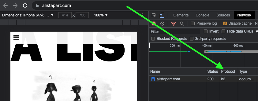
    Which HTTP version are you using?

    To determine which version of HTTP you’re using, go to your website and open your browser’s dev tools. Next, select the Network tab and make sure the Protocol column is visible. If “h2” is listed under Protocol, it means HTTP/2 is being used. 

    Note: to view the Protocol in your browser’s dev tools, go to the Network tab, reload your page, right-click any column header (e.g., Name), and check the Protocol column.

    Also, if your site is still using HTTP/1...WHY?!! What are you waiting for? There is excellent user support for HTTP/2.

    Splitting the CSS

    Separating the CSS into individual files is a worthwhile task. Linking the separate CSS files using the relevant media attribute allows the browser to identify which files are needed immediately (because they’re render-blocking) and which can be deferred. Based on this, it allocates each file an appropriate priority.

    In the following example of a website visited on a mobile breakpoint, we can see the mobile and default CSS are loaded with “Highest” priority, as they are currently needed to render the page. The remaining CSS files (print, tablet, and desktop) are still downloaded in case they’ll be needed later, but with “Lowest” priority. 

    With bundled CSS, the browser will have to download the CSS file and parse it before rendering can start.

    While, as noted, with the CSS separated into different files linked and marked up with the relevant media attribute, the browser can prioritize the files it currently needs. Using closed media query ranges allows the browser to do this at all widths, as opposed to classic mobile-first min-width queries, where the desktop browser would have to download all the CSS with Highest priority. We can’t assume that desktop users always have a fast connection. For instance, in many rural areas, internet connection speeds are still slow. 

    The media queries and number of separate CSS files will vary from project to project based on project requirements, but might look similar to the example below.

    Bundled CSS


    This single file contains all the CSS, including all media queries, and it will be downloaded with Highest priority.

    Separated CSS


    Separating the CSS and specifying a media attribute value on each link tag allows the browser to prioritize what it currently needs. Out of the five files listed above, two will be downloaded with Highest priority: the default file, and the file that matches the current media query. The others will be downloaded with Lowest priority.

    Depending on the project’s deployment strategy, a change to one file (mobile.css, for example) would only require the QA team to regression test on devices in that specific media query range. Compare that to the prospect of deploying the single bundled site.css file, an approach that would normally trigger a full regression test.

    Moving on

    The uptake of mobile-first CSS was a really important milestone in web development; it has helped front-end developers focus on mobile web applications, rather than developing sites on desktop and then attempting to retrofit them to work on other devices.

    I don’t think anyone wants to return to that development model again, but it’s important we don’t lose sight of the issue it highlighted: that things can easily get convoluted and less efficient if we prioritize one particular device—any device—over others. For this reason, focusing on the CSS in its own right, always mindful of what is the default setting and what’s an exception, seems like the natural next step. I’ve started noticing small simplifications in my own CSS, as well as other developers’, and that testing and maintenance work is also a bit more simplified and productive. 

    In general, simplifying CSS rule creation whenever we can is ultimately a cleaner approach than going around in circles of overrides. But whichever methodology you choose, it needs to suit the project. Mobile-first may—or may not—turn out to be the best choice for what’s involved, but first you need to solidly understand the trade-offs you’re stepping into.

  • Opportunities for AI in Accessibility

    Opportunities for AI in Accessibility

    I was completely moved by Joe Dolson’s current article on the crossroads of AI and availability because I found it to be both skeptical about how widespread use of AI is. In fact, I’m very skeptical of AI myself, despite my role at Microsoft as an accessibility technology strategist who helps manage the AI for Accessibility award program. AI can be used in quite productive, inclusive, and accessible ways, as well as in harmful, exclusive, and harmful ways, like with any tool. Additionally, there are a bit of uses in the subpar center as well.

    I’d like you to consider this a “yes … and” piece to complement Joe’s post. I’m just trying to contradict what he’s saying, but I’m just trying to give some context to initiatives and opportunities where AI can make a difference for people with disability. I want to take some time to talk about what’s possible in hope that we’ll get there one day. I’m no saying that there aren’t real challenges or pressing problems with AI that need to be addressed; there are.

    Other text

    Joe’s article spends a lot of time examining how computer vision versions can create other words. He raises a lot of appropriate points regarding the state of the world right now. And while computer-vision concepts continue to improve in the quality and complexity of information in their information, their benefits aren’t wonderful. He argues to be accurate that the state of image research is currently very poor, especially for some graphic types, in large part due to the absence of contextual contexts in which to look at images ( as a result of having separate “foundation” models for words analysis and image analysis ). Today’s models aren’t trained to distinguish between images that are contextually relevant ( should probably have descriptions ) and those that are purely decorative ( couldn’t possibly need a description ) either. However, I still think there’s possible in this area.

    As Joe points out, alt text authoring by human-in-the-loop should definitely be a thing. And if AI can intervene and provide a starting point for alt text, even if the quick reads,” What is this BS?” That’s not correct at all … Let me try to offer a starting point— I think that’s a gain.

    If we can specifically station a design to examine image usage in context, this may help us more quickly determine which images are likely to be elegant and which ones are likely to be descriptive. That will help clarify which situations require image descriptions, and it will increase authors ‘ effectiveness in making their sites more visible.

    While complex images—like graphs and charts—are challenging to describe in any sort of succinct way ( even for humans ), the image example shared in the GPT4 announcement points to an interesting opportunity as well. Let’s say you came across a map that was simply the name of the table and the type of visualization it was: Pie table comparing smartphone use to have mobile usage among US households making under$ 30, 000 annually. ( That would be a pretty bad alt text for a chart because it frequently leaves many unanswered questions about the data, but let’s just assume that was the description in place. ) If your browser knew that that image was a pie chart ( because an onboard model concluded this ), imagine a world where users could ask questions like these about the graphic:

    • Do more people use smartphones or other types of smartphones?
    • How many more?
    • Is there a group of people that don’t fall into either of these buckets?
    • How many people are that?

    For a moment, the chance to learn more about images and data in this way could be revolutionary for people with low vision and blindness as well as for those with various forms of color blindness, cognitive disabilities, and other issues. It could also be useful in educational contexts to help people who can see these charts, as is, to understand the data in the charts.

    What if you could ask your browser to make a complicated chart simpler? What if you demanded that the line graph be isolated into just one line? What if you could ask your browser to transpose the colors of the different lines to work better for form of color blindness you have? What if you could ask it to switch colors for patterns? That seems like a possibility given the chat-based interfaces and our current ability to manipulate images in modern AI tools.

    Now imagine a purpose-built model that could extract the information from that chart and convert it to another format. Perhaps it could convert that pie chart (or, better yet, a series of pie charts ) into more usable ( and useful ) formats, like spreadsheets, for instance. That would be incredible!

    Matching algorithms

    When Safiya Umoja Noble chose to write her book Algorithms of Oppression, she hit the nail on the head. Although her book focused on the ways that search engines can foster racism, I believe it’s equally true that all computer models have the potential to foster conflict, prejudice, and intolerance. Whether it’s Twitter always showing you the latest tweet from a bored billionaire, YouTube sending us into a Q-hole, or Instagram warping our ideas of what natural bodies look like, we know that poorly authored and maintained algorithms are incredibly harmful. Many of these are the result of a lack of diversity in the people who create and build them. There is real potential for algorithm development when these platforms are built with inclusive features in, though.

    Take Mentra, for example. They serve as a network of employment for people who are neurodivers. Based on more than 75 data points, they match job seekers with potential employers using an algorithm. On the job-seeker side of things, it considers each candidate’s strengths, their necessary and preferred workplace accommodations, environmental sensitivities, and so on. On the employer side, it takes into account each work environment, communication strategies for each job, and other factors. Mentra made the decision to change the script when it came to the typical employment websites because it was run by neurodivergent people. They use their algorithm to propose available candidates to companies, who can then connect with job seekers that they are interested in, reducing the emotional and physical labor on the job-seeker side of things.

    More people with disabilities can be used to create algorithms, which can lessen the likelihood that they will harm their communities. Diverse teams are crucial because of this.

    Imagine that a social media company’s recommendation engine was tuned to analyze who you’re following and if it was tuned to prioritize follow recommendations for people who talked about similar things but who were different in some key ways from your existing sphere of influence. For instance, if you were to follow a group of non-disabled white male academics who talk about AI, it might be advisable to follow those who are disabled, aren’t white, or aren’t men who also talk about AI. If you followed its recommendations, you might learn more about what’s happening in the AI field. These same systems should also use their understanding of biases about particular communities—including, for instance, the disability community—to make sure that they aren’t recommending any of their users follow accounts that perpetuate biases against (or, worse, spewing hate toward ) those groups.

    Other ways that AI can assist people with disabilities

    If I weren’t attempting to combine this with other tasks, I’m sure I could go on and on, giving various examples of how AI could be used to assist people with disabilities, but I’m going to make this last section into a bit of a lightning round. In no particular order:

      Voice preservation You may have been aware of the voice-prescribing options from Microsoft, Acapela, or others, or you may have seen the VALL-E paper or Apple’s announcement for Global Accessibility Awareness Day. It’s possible to train an AI model to replicate your voice, which can be a tremendous boon for people who have ALS ( Lou Gehrig’s disease ) or motor-neuron disease or other medical conditions that can lead to an inability to talk. This technology can also be used to create audio deepfakes, so it’s something we need to approach responsibly, but the technology has truly transformative potential.
    • voice recognition Researchers like those in the Speech Accessibility Project are paying people with disabilities for their help in collecting recordings of people with atypical speech. As I type, they are actively recruiting people with Parkinson’s and related conditions, and they intend to expand this to other conditions as the project develops. More people with disabilities will be able to use voice assistants, dictation software, and voice-response services, as well as to use only their voices to control computers and other devices, according to this research.
    • Text transformation. The most recent generation of LLMs is quite capable of changing existing text without giving off hallucinations. This is incredibly empowering for those who have cognitive disabilities and who may benefit from text summaries, simplified versions, or even text that has been prepared for Bionic Reading.

    The importance of diverse teams and data

    We must acknowledge the importance of our differences. The intersections of the identities that we exist in have an impact on our lived experiences. These lived experiences—with all their complexities ( and joys and pain ) —are valuable inputs to the software, services, and societies that we shape. The data we use to train new models must be based on our differences, and those who provide it to us need to be compensated for doing so. Inclusive data sets produce stronger models that promote more justifiable outcomes.

    Want a model that doesn’t demean or patronize or objectify people with disabilities? Make sure that you include information about disabilities that is written by people who have a range of disabilities and that is well represented in the training data.

    Want a non-binary language model? You may be able to use existing data sets to build a filter that can intercept and remediate ableist language before it reaches readers. Despite this, AI models won’t be replacing human copy editors anytime soon when it comes to sensitivity reading.

    Want a copilot for coding that provides recomprehensible recommendations after the jump? Train it on code that you know to be accessible.


    I have no doubt that AI has the potential to harm people today, tomorrow, and long into the future. However, I think we should also acknowledge this and make thoughtful, thoughtful, and intentional changes to our approaches to AI that will also reduce harm over time with an emphasis on accessibility ( and, in general, inclusion ). Today, tomorrow, and well into the future.


    Thanks to Kartik Sawhney for assisting me with writing this article, Ashley Bischoff for her invaluable editorial assistance, and of course Joe Dolson for the prompt.

  • I am a creative.

    I am a creative.

    I am imaginative. What I do involves chemistry. It is a puzzle. I don’t perform it as much as I let it be done by me.

    I have a creative side. This tag is not appropriate for all creatives. Not all people see themselves in this manner. Some innovative persons incorporate technology into their work. That is the way they are, and I take that into account. Perhaps I also have a little bit of fear for them. However, my method is different; my becoming is unique.

    Apologizing and qualifying in progress is a diversion. My brain uses that to destroy me. I’ll leave it alone for today. I may come back later to make amends and define. After I’ve said what I should have. which is sufficient.

    Except when it is simple and flows like a beverage valley.

    Sometimes it does go that method. Maybe I have to make something right away. I’ve learned to avoid saying it right away because people think you don’t work hard enough when you know it’s the best idea when you’re on the go and you know it’s the best idea.

    Maybe I just work until the thought strikes me. Maybe it arrives right away and I don’t remind people for three weeks. Sometimes I get so excited about something that just happened that I blurt it out and didn’t stop myself. like a child who discovered a medal in one of his Cracker Jacks. I occasionally manage to get away with this. Yes, that is the best plan, but sometimes another people disagree. The majority of the time, they don’t, and I regret that joy has faded.

    Joy should only be saved for the meet, when it will matter. not the informal gathering that two different gatherings precede that meeting. Nothing understands why we hold these gatherings. We keep saying we’re getting rid of them, but we keep discovering new ways to get them. They occasionally yet excel. But occasionally they are a hindrance to the real job. Depending on what you do and where you do it, the ratio between when conferences are valuable and when they are a sad distraction vary. And who you are and how you go about doing it. I’ll go back and forth once more. I am imaginative. That is the design.

    Often, a lot of diligent and individual work ends up with something that is barely useful. Maybe I have to accept that and move on to the next task.

    Don’t inquire about the procedure. I am imaginative.

    I have a creative side. I have no power over my goals. And I have no power over my best tips.

    I may hammer apart and often find it useful to surround myself with images or information. I can go for a move, which occasionally works. There is a Eureka that has nothing to do with sizzling fuel and flowing pots. I may be making dinner. I frequently have a sense of direction when I awaken. The idea that may have saved me disappears almost as frequently as I become aware and a part of the world once more as a senseless wind of oblivion. For inventiveness, in my opinion, originates in that other world. the one that we enter in ambitions and, possibly, before and after suicide. But authors should be asking this, and I am not one of them. I am imaginative. And it’s for philosophers to build massive soldiers in their imaginative world that they claim to be true. But that is yet another diversion. And one that is miserable. Possibly on a much bigger issue than whether or not I am creative. But that’s not how I came around, though.

    Often the outcome is mitigation. also suffering. Do you know the actor who is tortured by the cliché? Even when the artist attempts to create a soft drink song, a callback in a worn-out sitcom, or a budget request, that noun is real.

    Some individuals who detest the idea of being called artistic perhaps been closeted artists, but that’s between them and their gods. No offence here, that’s meant. Your facts is also true. But I should take care of me.

    Designers are recognized as artists.

    Disadvantages are aware of cons, just like queers are aware of queers, just like real rappers are aware of actual rappers. Artists are highly revered by people in the world. We respect, follow, and nearly deify the excellent ones. Of program, deifying any person is a dreadful error. We’ve been given a warning. We are more knowledgeable. We are aware that people are simply people. They argue, they are depressed, they regret their most important choices, they are weak and hungry, they can be violent, and they can be as terrible as we can because they are clay, just like us. But. But. However, they produce something incredible. They give birth to something that was unable to occur before them or otherwise. They are thought’s founders. And I suppose I should add that they are the mother of technology because it’s just lying it. Ba ho bum! Okay, that’s all said and done. Continue.

    Creatives denigrate our personal small accomplishments because they are compared to those of the wonderful people. Wonderful video! I‘m not Miyazaki, though. That is glory right then. That is brilliance straight out of the Bible. This meagre much creation that I made? It essentially fell off the pumpkin vehicle. And the carrots weren’t actually new.

    Artists is aware that they are at best Salieri. Also Mozart’s original artists believe that.

    I have a creative side. I haven’t worked in advertising in 30 times, but my previous artistic managers are the ones who make my hallucinations. They are correct to do that. When it really counts, my brain goes flat because I am too lazy and simplistic. There is no treatment for innovative mania.

    I have a creative side. Every project I create has a goal that makes Indiana Jones appear older and snoring in a balcony head. The more I pursue my creative endeavors, the faster I progress in my work, and the more I slog through lines and gaze blankly before beginning that task.

    I can move ten times more quickly than those who aren’t creative, those who have only had a short-cut of creativity, and those who have just had a short-cut of creativity for work. Only that I spend twice as long putting the work off as they do before I work ten times as quickly as they do. When I put my mind to it, I am so confident in my ability to do a wonderful career. I am completely dependent on the excitement scramble of delay. The leap also terrifies me.

    I am hardly a painter.

    I have a creative side. hardly a musician. Though as a child, I had a dream that I would one day become that. Some of us criticize our abilities and fear our own accomplishments because we are not Michelangelos and Warhols. That is narcissism, but at least we don’t practice elections.

    I have a creative side. Despite my belief in reason and science, my decisions are based on my own senses. And bear witness to what comes next, both the successes and the catastrophes.

    I have a creative side. Another artists, who see things differently, will find every word I’ve said irritate me. Ask a question to two designers, and you’ll find three responses. No matter how we perhaps think about it, our debate, our passion for it, and our responsibility to our own truth, at least in my opinion, are the best indications that we are artists.

    I have a creative side. I lament my lack of taste in almost all of the areas of human understanding, which I know very little about. And I put my ego before everything else in the places that are most important to me, or perhaps more precisely, to my passions. Without my passions, I had probably have to spend time staring living in the eye, which almost none of us can do for very long. No seriously. Actually, no. Because so much in existence is intolerable if you really look at it.

    I have a creative side. I think that when I’m gone, some of the good parts of me will stay in the head of at least one additional person, just like a family does.

    Working frees me from worrying about my job.

    I have a creative side. I fear that my little product will disappear.

    I have a creative side. I’m too busy making the next thing to devote too much time to it, especially since practically everything I create did achieve the level of success I conceive of.

    I have a creative side. I think that method is the greatest secret. I think it is so important that I’m actually foolish enough to publish an essay I wrote into a little machine without having to go through or edit it. I swear I didn’t do this frequently. But I did it right away because I was even more frightened of forgetting what I was saying because I was afraid of you seeing through my sad movements toward the beautiful.

    There. I believe I’ve said it.

  • Humility: An Essential Value

    Humility: An Essential Value

    Humility, a designer’s essential value—that has a nice ring to it. What about humility, an office manager’s essential value? Or a dentist’s? Or a librarian’s? They all sound great. When humility is our guiding light, the path is always open for fulfillment, evolution, connection, and engagement. In this chapter, we’re going to talk about why.

    That said, this is a book for designers, and to that end, I’d like to start with a story—well, a journey, really. It’s a personal one, and I’m going to make myself a bit vulnerable along the way. I call it:

    The Tale of Justin’s Preposterous Pate

    When I was coming out of art school, a long-haired, goateed neophyte, print was a known quantity to me; design on the web, however, was rife with complexities to navigate and discover, a problem to be solved. Though I had been formally trained in graphic design, typography, and layout, what fascinated me was how these traditional skills might be applied to a fledgling digital landscape. This theme would ultimately shape the rest of my career.

    So rather than graduate and go into print like many of my friends, I devoured HTML and JavaScript books into the wee hours of the morning and taught myself how to code during my senior year. I wanted—nay, needed—to better understand the underlying implications of what my design decisions would mean once rendered in a browser.

    The late ’90s and early 2000s were the so-called “Wild West” of web design. Designers at the time were all figuring out how to apply design and visual communication to the digital landscape. What were the rules? How could we break them and still engage, entertain, and convey information? At a more macro level, how could my values, inclusive of humility, respect, and connection, align in tandem with that? I was hungry to find out.

    Though I’m talking about a different era, those are timeless considerations between non-career interactions and the world of design. What are your core passions, or values, that transcend medium? It’s essentially the same concept we discussed earlier on the direct parallels between what fulfills you, agnostic of the tangible or digital realms; the core themes are all the same.

    First within tables, animated GIFs, Flash, then with Web Standards, divs, and CSS, there was personality, raw unbridled creativity, and unique means of presentment that often defied any semblance of a visible grid. Splash screens and “browser requirement” pages aplenty. Usability and accessibility were typically victims of such a creation, but such paramount facets of any digital design were largely (and, in hindsight, unfairly) disregarded at the expense of experimentation.

    For example, this iteration of my personal portfolio site (“the pseudoroom”) from that era was experimental, if not a bit heavy- handed, in the visual communication of the concept of a living sketchbook. Very skeuomorphic. I collaborated with fellow designer and dear friend Marc Clancy (now a co-founder of the creative project organizing app Milanote) on this one, where we’d first sketch and then pass a Photoshop file back and forth to trick things out and play with varied user interactions. Then, I’d break it down and code it into a digital layout.

    Along with design folio pieces, the site also offered free downloads for Mac OS customizations: desktop wallpapers that were effectively design experimentation, custom-designed typefaces, and desktop icons.

    From around the same time, GUI Galaxy was a design, pixel art, and Mac-centric news portal some graphic designer friends and I conceived, designed, developed, and deployed.

    Design news portals were incredibly popular during this period, featuring (what would now be considered) Tweet-size, small-format snippets of pertinent news from the categories I previously mentioned. If you took Twitter, curated it to a few categories, and wrapped it in a custom-branded experience, you’d have a design news portal from the late 90s / early 2000s.

    We as designers had evolved and created a bandwidth-sensitive, web standards award-winning, much more accessibility-conscious website. Still ripe with experimentation, yet more mindful of equitable engagement. You can see a couple of content panes here, noting general news (tech, design) and Mac-centric news below. We also offered many of the custom downloads I cited before as present on my folio site but branded and themed to GUI Galaxy.

    The site’s backbone was a homegrown CMS, with the presentation layer consisting of global design + illustration + news author collaboration. And the collaboration effort here, in addition to experimentation on a ‘brand’ and content delivery, was hitting my core. We were designing something bigger than any single one of us and connecting with a global audience.

    Collaboration and connection transcend medium in their impact, immensely fulfilling me as a designer.

    Now, why am I taking you down this trip of design memory lane? Two reasons.

    First, there’s a reason for the nostalgia for that design era (the “Wild West” era, as I called it earlier): the inherent exploration, personality, and creativity that saturated many design portals and personal portfolio sites. Ultra-finely detailed pixel art UI, custom illustration, bespoke vector graphics, all underpinned by a strong design community.

    Today’s web design has been in a period of stagnation. I suspect there’s a strong chance you’ve seen a site whose structure looks something like this: a hero image / banner with text overlaid, perhaps with a lovely rotating carousel of images (laying the snark on heavy there), a call to action, and three columns of sub-content directly beneath. Maybe an icon library is employed with selections that vaguely relate to their respective content.

    Design, as it’s applied to the digital landscape, is in dire need of thoughtful layout, typography, and visual engagement that goes hand-in-hand with all the modern considerations we now know are paramount: usability. Accessibility. Load times and bandwidth- sensitive content delivery. A responsive presentation that meets human beings wherever they’re engaging from. We must be mindful of, and respectful toward, those concerns—but not at the expense of creativity of visual communication or via replicating cookie-cutter layouts.

    Pixel Problems

    Websites during this period were often designed and built on Macs whose OS and desktops looked something like this. This is Mac OS 7.5, but 8 and 9 weren’t that different.

    Desktop icons fascinated me: how could any single one, at any given point, stand out to get my attention? In this example, the user’s desktop is tidy, but think of a more realistic example with icon pandemonium. Or, say an icon was part of a larger system grouping (fonts, extensions, control panels)—how did it also maintain cohesion amongst a group?

    These were 32 x 32 pixel creations, utilizing a 256-color palette, designed pixel-by-pixel as mini mosaics. To me, this was the embodiment of digital visual communication under such ridiculous constraints. And often, ridiculous restrictions can yield the purification of concept and theme.

    So I began to research and do my homework. I was a student of this new medium, hungry to dissect, process, discover, and make it my own.

    Expanding upon the notion of exploration, I wanted to see how I could push the limits of a 32×32 pixel grid with that 256-color palette. Those ridiculous constraints forced a clarity of concept and presentation that I found incredibly appealing. The digital gauntlet had been tossed, and that challenge fueled me. And so, in my dorm room into the wee hours of the morning, I toiled away, bringing conceptual sketches into mini mosaic fruition.

    These are some of my creations, utilizing the only tool available at the time to create icons called ResEdit. ResEdit was a clunky, built-in Mac OS utility not really made for exactly what we were using it for. At the core of all of this work: Research. Challenge. Problem- solving. Again, these core connection-based values are agnostic of medium.

    There’s one more design portal I want to talk about, which also serves as the second reason for my story to bring this all together.

    This is K10k, short for Kaliber 1000. K10k was founded in 1998 by Michael Schmidt and Toke Nygaard, and was the design news portal on the web during this period. With its pixel art-fueled presentation, ultra-focused care given to every facet and detail, and with many of the more influential designers of the time who were invited to be news authors on the site, well… it was the place to be, my friend. With respect where respect is due, GUI Galaxy’s concept was inspired by what these folks were doing.

    For my part, the combination of my web design work and pixel art exploration began to get me some notoriety in the design scene. Eventually, K10k noticed and added me as one of their very select group of news authors to contribute content to the site.

    Amongst my personal work and side projects—and now with this inclusion—in the design community, this put me on the map. My design work also began to be published in various printed collections, in magazines domestically and overseas, and featured on other design news portals. With that degree of success while in my early twenties, something else happened:

    I evolved—devolved, really—into a colossal asshole (and in just about a year out of art school, no less). The press and the praise became what fulfilled me, and they went straight to my head. They inflated my ego. I actually felt somewhat superior to my fellow designers.

    The casualties? My design stagnated. Its evolution—my evolution— stagnated.

    I felt so supremely confident in my abilities that I effectively stopped researching and discovering. When previously sketching concepts or iterating ideas in lead was my automatic step one, I instead leaped right into Photoshop. I drew my inspiration from the smallest of sources (and with blinders on). Any critique of my work from my peers was often vehemently dismissed. The most tragic loss: I had lost touch with my values.

    My ego almost cost me some of my friendships and burgeoning professional relationships. I was toxic in talking about design and in collaboration. But thankfully, those same friends gave me a priceless gift: candor. They called me out on my unhealthy behavior.

    Admittedly, it was a gift I initially did not accept but ultimately was able to deeply reflect upon. I was soon able to accept, and process, and course correct. The realization laid me low, but the re-awakening was essential. I let go of the “reward” of adulation and re-centered upon what stoked the fire for me in art school. Most importantly: I got back to my core values.

    Always Students

    Following that short-term regression, I was able to push forward in my personal design and career. And I could self-reflect as I got older to facilitate further growth and course correction as needed.

    As an example, let’s talk about the Large Hadron Collider. The LHC was designed “to help answer some of the fundamental open questions in physics, which concern the basic laws governing the interactions and forces among the elementary objects, the deep structure of space and time, and in particular the interrelation between quantum mechanics and general relativity.” Thanks, Wikipedia.

    Around fifteen years ago, in one of my earlier professional roles, I designed the interface for the application that generated the LHC’s particle collision diagrams. These diagrams are the rendering of what’s actually happening inside the Collider during any given particle collision event and are often considered works of art unto themselves.

    Designing the interface for this application was a fascinating process for me, in that I worked with Fermilab physicists to understand what the application was trying to achieve, but also how the physicists themselves would be using it. To that end, in this role,

    I cut my teeth on usability testing, working with the Fermilab team to iterate and improve the interface. How they spoke and what they spoke about was like an alien language to me. And by making myself humble and working under the mindset that I was but a student, I made myself available to be a part of their world to generate that vital connection.

    I also had my first ethnographic observation experience: going to the Fermilab location and observing how the physicists used the tool in their actual environment, on their actual terminals. For example, one takeaway was that due to the level of ambient light-driven contrast within the facility, the data columns ended up using white text on a dark gray background instead of black text-on-white. This enabled them to pore over reams of data during the day and ease their eye strain. And Fermilab and CERN are government entities with rigorous accessibility standards, so my knowledge in that realm also grew. The barrier-free design was another essential form of connection.

    So to those core drivers of my visual problem-solving soul and ultimate fulfillment: discovery, exposure to new media, observation, human connection, and evolution. What opened the door for those values was me checking my ego before I walked through it.

    An evergreen willingness to listen, learn, understand, grow, evolve, and connect yields our best work. In particular, I want to focus on the words ‘grow’ and ‘evolve’ in that statement. If we are always students of our craft, we are also continually making ourselves available to evolve. Yes, we have years of applicable design study under our belt. Or the focused lab sessions from a UX bootcamp. Or the monogrammed portfolio of our work. Or, ultimately, decades of a career behind us.

    But all that said: experience does not equal “expert.”

    As soon as we close our minds via an inner monologue of ‘knowing it all’ or branding ourselves a “#thoughtleader” on social media, the designer we are is our final form. The designer we can be will never exist.

  • Personalization Pyramid: A Framework for Designing with User Data

    Personalization Pyramid: A Framework for Designing with User Data

    As a UX professional in today’s data-driven landscape, it’s increasingly likely that you’ve been asked to design a personalized digital experience, whether it’s a public website, user portal, or native application. Yet while there continues to be no shortage of marketing hype around personalization platforms, we still have very few standardized approaches for implementing personalized UX.

    That’s where we come in. After completing dozens of personalization projects over the past few years, we gave ourselves a goal: could you create a holistic personalization framework specifically for UX practitioners? The Personalization Pyramid is a designer-centric model for standing up human-centered personalization programs, spanning data, segmentation, content delivery, and overall goals. By using this approach, you will be able to understand the core components of a contemporary, UX-driven personalization program (or at the very least know enough to get started). 

    Getting Started

    For the sake of this article, we’ll assume you’re already familiar with the basics of digital personalization. A good overview can be found here: Website Personalization Planning. While UX projects in this area can take on many different forms, they often stem from similar starting points.      

    Common scenarios for starting a personalization project:

    • Your organization or client purchased a content management system (CMS) or marketing automation platform (MAP) or related technology that supports personalization
    • The CMO, CDO, or CIO has identified personalization as a goal
    • Customer data is disjointed or ambiguous
    • You are running some isolated targeting campaigns or A/B testing
    • Stakeholders disagree on personalization approach
    • Mandate of customer privacy rules (e.g. GDPR) requires revisiting existing user targeting practices

    Regardless of where you begin, a successful personalization program will require the same core building blocks. We’ve captured these as the “levels” on the pyramid. Whether you are a UX designer, researcher, or strategist, understanding the core components can help make your contribution successful.  

    From top to bottom, the levels include:

    1. North Star: What larger strategic objective is driving the personalization program? 
    2. Goals: What are the specific, measurable outcomes of the program? 
    3. Touchpoints: Where will the personalized experience be served?
    4. Contexts and Campaigns: What personalization content will the user see?
    5. User Segments: What constitutes a unique, usable audience? 
    6. Actionable Data: What reliable and authoritative data is captured by our technical platform to drive personalization?  
    7. Raw Data: What wider set of data is conceivably available (already in our setting) allowing you to personalize?

    We’ll go through each of these levels in turn. To help make this actionable, we created an accompanying deck of cards to illustrate specific examples from each level. We’ve found them helpful in personalization brainstorming sessions, and will include examples for you here.

    Starting at the Top

    The components of the pyramid are as follows:

    North Star

    A north star is what you are aiming for overall with your personalization program (big or small). The North Star defines the (one) overall mission of the personalization program. What do you wish to accomplish? North Stars cast a shadow. The bigger the star, the bigger the shadow. Example of North Starts might include: 

    1. Function: Personalize based on basic user inputs. Examples: “Raw” notifications, basic search results, system user settings and configuration options, general customization, basic optimizations
    2. Feature: Self-contained personalization componentry. Examples: “Cooked” notifications, advanced optimizations (geolocation), basic dynamic messaging, customized modules, automations, recommenders
    3. Experience: Personalized user experiences across multiple interactions and user flows. Examples: Email campaigns, landing pages, advanced messaging (i.e. C2C chat) or conversational interfaces, larger user flows and content-intensive optimizations (localization).
    4. Product: Highly differentiating personalized product experiences. Examples: Standalone, branded experiences with personalization at their core, like the “algotorial” playlists by Spotify such as Discover Weekly.

    Goals

    As in any good UX design, personalization can help accelerate designing with customer intentions. Goals are the tactical and measurable metrics that will prove the overall program is successful. A good place to start is with your current analytics and measurement program and metrics you can benchmark against. In some cases, new goals may be appropriate. The key thing to remember is that personalization itself is not a goal, rather it is a means to an end. Common goals include:

    • Conversion
    • Time on task
    • Net promoter score (NPS)
    • Customer satisfaction 

    Touchpoints

    Touchpoints are where the personalization happens. As a UX designer, this will be one of your largest areas of responsibility. The touchpoints available to you will depend on how your personalization and associated technology capabilities are instrumented, and should be rooted in improving a user’s experience at a particular point in the journey. Touchpoints can be multi-device (mobile, in-store, website) but also more granular (web banner, web pop-up etc.). Here are some examples:

    Channel-level Touchpoints

    • Email: Role
    • Email: Time of open
    • In-store display (JSON endpoint)
    • Native app
    • Search

    Wireframe-level Touchpoints

    • Web overlay
    • Web alert bar
    • Web banner
    • Web content block
    • Web menu

    If you’re designing for web interfaces, for example, you will likely need to include personalized “zones” in your wireframes. The content for these can be presented programmatically in touchpoints based on our next step, contexts and campaigns.

    Contexts and Campaigns

    Once you’ve outlined some touchpoints, you can consider the actual personalized content a user will receive. Many personalization tools will refer to these as “campaigns” (so, for example, a campaign on a web banner for new visitors to the website). These will programmatically be shown at certain touchpoints to certain user segments, as defined by user data. At this stage, we find it helpful to consider two separate models: a context model and a content model. The context helps you consider the level of engagement of the user at the personalization moment, for example a user casually browsing information vs. doing a deep-dive. Think of it in terms of information retrieval behaviors. The content model can then help you determine what type of personalization to serve based on the context (for example, an “Enrich” campaign that shows related articles may be a suitable supplement to extant content).

    Personalization Context Model:

    1. Browse
    2. Skim
    3. Nudge
    4. Feast

    Personalization Content Model:

    1. Alert
    2. Make Easier
    3. Cross-Sell
    4. Enrich

    We’ve written extensively about each of these models elsewhere, so if you’d like to read more you can check out Colin’s Personalization Content Model and Jeff’s Personalization Context Model

    User Segments

    User segments can be created prescriptively or adaptively, based on user research (e.g. via rules and logic tied to set user behaviors or via A/B testing). At a minimum you will likely need to consider how to treat the unknown or first-time visitor, the guest or returning visitor for whom you may have a stateful cookie (or equivalent post-cookie identifier), or the authenticated visitor who is logged in. Here are some examples from the personalization pyramid:

    • Unknown
    • Guest
    • Authenticated
    • Default
    • Referred
    • Role
    • Cohort
    • Unique ID

    Actionable Data

    Every organization with any digital presence has data. It’s a matter of asking what data you can ethically collect on users, its inherent reliability and value, as to how can you use it (sometimes known as “data activation.”) Fortunately, the tide is turning to first-party data: a recent study by Twilio estimates some 80% of businesses are using at least some type of first-party data to personalize the customer experience. 

    First-party data represents multiple advantages on the UX front, including being relatively simple to collect, more likely to be accurate, and less susceptible to the “creep factor” of third-party data. So a key part of your UX strategy should be to determine what the best form of data collection is on your audiences. Here are some examples:

    There is a progression of profiling when it comes to recognizing and making decisioning about different audiences and their signals. It tends to move towards more granular constructs about smaller and smaller cohorts of users as time and confidence and data volume grow.

    While some combination of implicit / explicit data is generally a prerequisite for any implementation (more commonly referred to as first party and third-party data) ML efforts are typically not cost-effective directly out of the box. This is because a strong data backbone and content repository is a prerequisite for optimization. But these approaches should be considered as part of the larger roadmap and may indeed help accelerate the organization’s overall progress. Typically at this point you will partner with key stakeholders and product owners to design a profiling model. The profiling model includes defining approach to configuring profiles, profile keys, profile cards and pattern cards. A multi-faceted approach to profiling which makes it scalable.

    Pulling it Together

    While the cards comprise the starting point to an inventory of sorts (we provide blanks for you to tailor your own), a set of potential levers and motivations for the style of personalization activities you aspire to deliver, they are more valuable when thought of in a grouping. 

    In assembling a card “hand”, one can begin to trace the entire trajectory from leadership focus down through a strategic and tactical execution. It is also at the heart of the way both co-authors have conducted workshops in assembling a program backlog—which is a fine subject for another article.

    In the meantime, what is important to note is that each colored class of card is helpful to survey in understanding the range of choices potentially at your disposal, it is threading through and making concrete decisions about for whom this decisioning will be made: where, when, and how.

    Lay Down Your Cards

    Any sustainable personalization strategy must consider near, mid and long-term goals. Even with the leading CMS platforms like Sitecore and Adobe or the most exciting composable CMS DXP out there, there is simply no “easy button” wherein a personalization program can be stood up and immediately view meaningful results. That said, there is a common grammar to all personalization activities, just like every sentence has nouns and verbs. These cards attempt to map that territory.

  • User Research Is Storytelling

    User Research Is Storytelling

    I’ve been fascinated by shows since I was a child. I loved the figures and the excitement—but most of all the reports. I aspired to be an artist. And I believed that I’d get to do the things that Indiana Jones did and go on fascinating experiences. I also came up with concept movies that my friends and I could create and sun in. But they never went any farther. However, I did end up in the user experience ( UX) field. Today, I realize that there’s an element of drama to UX— I hadn’t actually considered it before, but consumer research is story. And you must show a compelling story to entice stakeholders, such as the product team and decision-makers, to learn more in order to get the most out of consumer research.

    Think of your favorite film. It more than likely follows a three-act construction that’s frequently seen in movies: the layout, the conflict, and the resolution. The second act shows what exists now, and it helps you get to know the characters and the challenges and problems that they face. Act two sets the scene for the fight and the activity begins. Here, issues grow or get worse. The decision is the third and final action. This is where the issues are resolved and the figures learn and change. This architecture, in my opinion, is also a fantastic way to think about consumer research, and it might be particularly useful for introducing user research to others.

    Use story as a framework when conducting research.

    It’s sad to say, but many have come to view studies as being inconsequential. Research is typically one of the first things to go when expenses or deadlines are tight. Instead of investing in study, some goods professionals rely on manufacturers or—worse—their personal judgment to make the “right” options for users based on their experience or accepted best practices. That may get groups a little bit out of the way, but that approach is therefore easily miss out on resolving people ‘ real issues. To be user-centered, this is something we really avoid. User study improves pattern. It keeps it on record, pointing to problems and opportunities. You can keep back of your competition by being aware of the problems with your goods and fixing them.

    In the three-act structure, each action corresponds to a part of the process, and each part is important to telling the whole story. Let’s take a look at the various functions and how they relate to customer research.

    Act one: layout

    Fundamental analysis comes in handy because the setup is all about comprehending the background. Basic research ( also called relational, discovery, or preliminary research ) helps you understand people and identify their problems. You’re learning about the difficulties people face now, what options are available, and how those challenges impact them, just like in the films. To do basic research, you may conduct situational inquiries or journal studies ( or both! ), which may assist you in identifying both problems and opportunities. It doesn’t need to get a great investment in time or money.

    What is the least sustainable ethnography that Erika Hall can do is spend fifteen minutes with a consumer and say,” Walk me through your day yesterday. That’s it. Provide that one ask. Opened up and listen to them for 15 days. Do everything in your power to protect both your objectives and yourself. Bam, you’re doing ethnography”. According to Hall, “[This ] will probably prove quite fascinating. In the very unlikely event that you didn’t learn anything new or helpful, carry on with increased confidence in your way”.

    This makes perfect sense to me. And I love that this makes consumer studies so visible. You can simply attract participants and carry out the recruitment process without having to create a lot of paperwork! This can offer a wealth of knowledge about your customers, and it’ll help you better understand them and what’s going on in their life. Understanding where people are coming from is what action one is really all about.

    Maybe Spool talks about the importance of basic research and how it may type the bulk of your research. If you can supplement what you’ve heard in the fundamental studies by using any more user data that you can obtain, such as surveys or analytics, to make recommendations that may need to be investigated further, you might as well use those that can be drawn from those that you can obtain. Together, all this information creates a clearer picture of the state of things and all its inadequacies. And that’s the start of a gripping tale. It’s the place in the story where you realize that the principal characters—or the people in this case—are facing issues that they need to conquer. This is where you begin to develop compassion for the characters and support their success, much like in films. And finally participants are now doing the same. Their concern may be with their company, which may be losing money because consumers are unable to complete specific tasks. Or probably they do connect with customers ‘ problems. In either case, work one serves as your main strategy to pique the interest and interest of the participants.

    When partners begin to understand the value of basic research, that is open doors to more opportunities that involve users in the decision-making approach. And that can help item team become more user-centric. This gains everyone—users, the goods, and partners. It’s similar to winning an Oscar for a film; it frequently results in a favorable reception and success for your item. And this can be an opportunity for participants to repeat this process with different products. The secret to this method is storytelling, and knowing how to tell a compelling story is the only way to entice participants to do more research.

    This brings us to work two, where you incrementally examine a design or idea to see whether it addresses the problems.

    Act two: issue

    Act two is all about digging deeper into the issues that you identified in action one. This typically involves conducting vertical study, such as accessibility tests, where you evaluate a potential solution ( such as a design ) to see if it addresses the problems you identified. The issues may contain unmet needs or problems with a circulation or procedure that’s tripping users away. Additional problems will arise in the course of work two of a film. It’s here that you learn more about the figures as they grow and develop through this work.

    According to Jakob Nielsen, five users should be normally in usability tests, which means that this number of users can generally identify the majority of the issues:” As you add more and more users, you learn less and less because you will keep seeing the same things again and again… After the second user, you are wasting your time by observing the same findings consistently but not learning much new.”

    There are parallels with storytelling here too, if you try to tell a story with too many characters, the plot may get lost. With fewer participants, each user’s struggles will be more memorable and accessible to other stakeholders when presenting the research. This can help convey the issues that need to be addressed while also highlighting the value of doing the research in the first place.

    Usability tests have been conducted in person for tens of thousands of years, but remote testing can also be done using software like Microsoft Teams, Zoom, or other teleconferencing tools. This approach has become increasingly popular since the beginning of the pandemic, and it works well. You might interpret in-person usability tests as a form of theater watching as opposed to remote testing. There are advantages and disadvantages to each. Usability research in person is a much more extensive experience. Stakeholders can experience the sessions with other stakeholders. Additionally, you get real-time reactions, including surprises, disagreements, and discussions about what they’re seeing. Much like going to a play, where audiences get to take in the stage, the costumes, the lighting, and the actors ‘ interactions, in-person research lets you see users up close, including their body language, how they interact with the moderator, and how the scene is set up.

    If conducting usability testing in the field is like watching a play that is staged and controlled, where any two sessions may be very different from one another. You can take usability testing into the field by creating a replica of the space where users interact with the product and then conduct your research there. Or you can conduct your research by meeting users at their locations. With either option, you get to see how things work in context, things come up that wouldn’t have in a lab environment—and conversion can shift in entirely different directions. You have less control over how these sessions run as researchers, but this can occasionally improve your understanding of users. Meeting users where they are can provide clues to the external forces that could be affecting how they use your product. Usability tests in person offer a level of detail that is frequently absent from remote testing.

    That’s not to say that the “movies” —remote sessions—aren’t a good option. A wider audience can be reached through remote sessions. They allow a lot more stakeholders to be involved in the research and to see what’s going on. Additionally, they make the doors accessible to a much wider range of users. But with any remote session there is the potential of time wasted if participants can’t log in or get their microphone working.

    You can ask real users questions to understand their thoughts and understanding of the solution as a result of usability testing, whether it is done remotely or in person. This can help you not only identify problems but also glean why they’re problems in the first place. You can also test your own ideas and determine whether they are true. By the end of the sessions, you’ll have a much clearer picture of how usable the designs are and whether they work for their intended purposes. The excitement is in the second act, but there are also potential surprises in the third. This is equally true of usability tests. Sometimes, participants will say unexpected things that alter the way you look at them, which can lead to unexpected turns in the story.

    Unfortunately, user research is sometimes seen as expendable. Usability testing is also frequently the only research technique that some stakeholders believe they ever need, and too frequently. In fact, if the designs that you’re evaluating in the usability test aren’t grounded in a solid understanding of your users ( foundational research ), there’s not much to be gained by doing usability testing in the first place. That’s because you’re narrowing down the area of focus on without considering the needs of the users. As a result, there’s no way of knowing whether the designs might solve a problem that users have. In the context of a usability test, it’s only feedback on a particular design.

    On the other hand, if you only do foundational research, while you might have set out to solve the right problem, you won’t know whether the thing that you’re building will actually solve that. This demonstrates the value of conducting both directional and foundational research.

    In act two, stakeholders will—hopefully—get to watch the story unfold in the user sessions, which creates the conflict and tension in the current design by surfacing their highs and lows. And in turn, this can encourage stakeholders to take action on the issues that arise.

    Act three: resolution

    The third act is about resolving the issues raised by the first two acts, whereas the first two are about comprehending the context and the tensions that can compel action. While it’s important to have an audience for the first two acts, it’s crucial that they stick around for the final act. That includes all members of the product team, including developers, UX experts, business analysts, delivery managers, product managers, and any other parties who have a say in the coming development. It allows the whole team to hear users ‘ feedback together, ask questions, and discuss what’s possible within the project’s constraints. Additionally, it enables the UX design and research teams to clarify, suggest alternatives, or provide more context for their decisions. So you can get everyone on the same page and get agreement on the way forward.

    This act is primarily told through voiceover with some audience participation. The researcher is the narrator, who paints a picture of the issues and what the future of the product could look like given the things that the team has learned. They offer the stakeholders their suggestions and suggestions for how to create this vision.

    Nancy Duarte in the Harvard Business Review offers an approach to structuring presentations that follow a persuasive story. The most effective presenters” set up a conflict that needs to be resolved” using the same methods as great storytellers, Duarte writes. ” That tension helps them persuade the audience to adopt a new mindset or behave differently”.

    This type of structure aligns well with research results, and particularly results from usability tests. It provides proof for “what is “—the issues you’ve identified. And “what could be “—your recommendations on how to address them. And so forth and forth.

    You can reinforce your recommendations with examples of things that competitors are doing that could address these issues or with examples where competitors are gaining an edge. Or they can be visual, like quick sketches of how a new design could look that solves a problem. These can help generate conversation and momentum. And this continues until the session is over when you’ve concluded everything by summarizing the key points and offering suggestions for a solution. This is the part where you reiterate the main themes or problems and what they mean for the product—the denouement of the story. This stage provides stakeholders with the next steps, and hopefully, the motivation to take those steps as well!

    While we are nearly at the end of this story, let’s reflect on the idea that user research is storytelling. The three-act structure of user research contains all the components for a good story:

      Act one: You meet the protagonists ( the users ) and the antagonists ( the problems affecting users ). This is the plot’s beginning. In act one, researchers might use methods including contextual inquiry, ethnography, diary studies, surveys, and analytics. These techniques can produce personas, empathy maps, user journeys, and analytics dashboards.
      Act two: Next, there’s character development. The protagonists face problems and difficulties, which they must overcome, and there is conflict and tension. In act two, researchers might use methods including usability testing, competitive benchmarking, and heuristics evaluation. Usability findings reports, UX strategy documents, usability guidelines, and best practices can be included in the output of these.
      Act three: The protagonists triumph and you see what a better future looks like. Researchers may use techniques like presentation decks, storytelling, and digital media in act three. The output of these can be: presentation decks, video clips, audio clips, and pictures.

    The researcher performs a number of tasks: they are the producer, the director, and the storyteller. The participants have a small role, but they are significant characters ( in the research ). And the audience are the stakeholders. But the most important thing is to get the story right and to use storytelling to tell users ‘ stories through research. In the end, the parties should leave with a goal and an eagerness to fix the product’s flaws.

    So the next time that you’re planning research with clients or you’re speaking to stakeholders about research that you’ve done, think about how you can weave in some storytelling. In the end, user research is beneficial for everyone, and all you need to do is pique stakeholders ‘ interest in how the story ends.

  • To Ignite a Personalization Practice, Run this Prepersonalization Workshop

    To Ignite a Personalization Practice, Run this Prepersonalization Workshop

    Image this. You’ve joined a club at your business that’s designing innovative product features with an focus on technology or AI. Or perhaps your business really implemented a personalization website. Either way, you’re designing with statistics. What’s next? When it comes to designing for personalization, there are many warning stories, no immediately achievement, and some guidelines for the baffled.

    The personalization gap is real, between the dream of getting it right and the worry of it going wrong ( like when we encounter “persofails” similar to a company’s repeated pleas for more toilet seats from regular people ). It’s an particularly confusing place to be a modern professional without a map, a map, or a strategy.

    There are no Lonely Planet and some tour guides for those of you who want to personalize because powerful customisation is so dependent on each group’s talent, technology, and market position.

    But you can ensure that your group has packed its bags rationally.

    There’s a DIY method to increase your chances for achievement. You’ll at least at least disarm your boss ‘ irrational exuberance. Before the group you’ll need to properly plan.

    We refer to it as prepersonalization.

    Behind the song

    Take into account the DJ have on Spotify, which was introduced last month.

    We’re used to seeing the polished final outcome of a personalization function. A personal have had to be developed, budgeted, and given priority before the year-end prize, the making-of-backstory, or the behind-the-scenes success chest. Before any customisation have goes live in your product or service, it lives amid a delay of valuable ideas for expressing consumer experiences more automatically.

    How do you decide where to position personalisation wagers? How do you design regular interactions that hasn’t journey up users or—worse—breed mistrust? We’ve found that for many well-known budgeted programs to support their continued investments, they initially required one or more workshops to join vital technologies users and stakeholders. Make it count.

    We’ve closely monitored the same evolution with our consumers, from major software to young companies. In our experience with working on small and large personalization work, a program’s best monitor record—and its capacity to weather tough questions, work steadily toward shared answers, and manage its design and engineering efforts—turns on how successfully these prepersonalization activities play out.

    Effective workshops consistently separate successful future endeavors from unsuccessful ones, saving countless hours of time, resources, and overall well-being.

    A personalization practice involves a multiyear effort of testing and feature development. It’s not a tech stack switch-flip. It’s best managed as a backlog that often evolves through three steps:

    1. customer experience optimization ( CXO, also known as A/B testing or experimentation )
    2. always-on automations ( whether rules-based or machine-generated )
    3. mature features or standalone product development ( like Spotify’s DJ experience )?

    This is why we created our progressive personalization framework and why we’re field-testing an accompanying deck of cards: we believe that there’s a base grammar, a set of “nouns and verbs” that your organization can use to design experiences that are customized, personalized, or automated. These cards won’t be necessary for you. But we strongly recommend that you create something similar, whether that might be digital or physical.

    Set the timer for the kitchen.

    How long does it take to cook up a prepersonalization workshop? The evaluation activities that we suggest including can ( and frequently do ) last for weeks. For the core workshop, we recommend aiming for two to three days. Details on the essential first-day activities are included in a summary of our broad approach.

    The full arc of the wider workshop is threefold:

      Kickstart: This specifies the terms of engagement as you concentrate on the potential, the readiness and drive of your team, and your leadership.
    1. Plan your work: This is the heart of the card-based workshop activities where you specify a plan of attack and the scope of work.
    2. Work your plan: This stage essentially entails creating a competitive environment in which team members can individually present their own pilots that each contain a proof-of-concept project, its business case, and its operating model.

    Give yourself at least a day, split into two large time blocks, to power through a concentrated version of those first two phases.

    Kickstart: Apt your appetite

    We call the first lesson the “landscape of connected experience“. It looks at the possibilities for personalization at your company. A connected experience, in our parlance, is any UX requiring the orchestration of multiple systems of record on the backend. A marketing-automation platform and a content-management system could be used together. It could be a digital-asset manager combined with a customer-data platform.

    Create a conversation by mentioning consumer and business-to-business examples of connected experience interactions that you admire, find familiar, or even dislike. This should cover a representative range of personalization patterns, including automated app-based interactions ( such as onboarding sequences or wizards ), notifications, and recommenders. These are in the cards, which we have a catalog of. Here’s a list of 142 different interactions to jog your thinking.

    It’s all about setting the tone. What are the possible paths for the practice in your organization? Here’s a long-form primer and a strategic framework for a broad perspective.

    Assess each example that you discuss for its complexity and the level of effort that you estimate that it would take for your team to deliver that feature ( or something similar ). In our cards, we break down connected experiences into five categories: functions, features, experiences, complete products, and portfolios. Size your own build here. This will help to draw attention to both the benefits of ongoing investment and the difference between what you currently offer and what you intend to deliver in the future.

    Next, have your team plot each idea on the following 2×2 grid, which lays out the four enduring arguments for a personalized experience. This is crucial because it emphasizes how personalization can affect your own methods of working as well as your external customers. It’s also a reminder ( which is why we used the word argument earlier ) of the broader effort beyond these tactical interventions.

    Each team member should decide where they would like to place your company’s emphasis on your product or service. Naturally, you can’t prioritize all of them. Here, the goal is to demonstrate how various departments may view their own advantages over the effort, which can be different from one department to the next. Documenting your desired outcomes lets you know how the team internally aligns across representatives from different departments or functional areas.

    The third and final KickStart activity is about filling in the personalization gap. Is your customer journey well documented? Will compliance with data and privacy be a significant challenge? Do you have content metadata needs that you have to address? ( We’re pretty sure you do; it’s just a matter of recognizing the need’s magnitude and its solution. ) In our cards, we’ve noted a number of program risks, including common team dispositions. For instance, our Detractor card lists six intractable stakeholder attitudes that prevent progress.

    Effectively collaborating and managing expectations is critical to your success. Consider the potential obstacles to your upcoming progress. Press the participants to name specific steps to overcome or mitigate those barriers in your organization. According to research, personalization initiatives face a number of common obstacles.

    At this point, you’ve hopefully discussed sample interactions, emphasized a key area of benefit, and flagged key gaps? Good, you’re all set to go on.

    Hit that test kitchen

    Next, let’s take a look at what you’ll need to create personalization recipes. Personalization engines, which are robust software suites for automating and expressing dynamic content, can intimidate new customers. They give you a variety of options for how your organization can conduct its activities because of their broad and potent capabilities. This presents the question: Where do you begin when you’re configuring a connected experience?

    The key here is to avoid treating the installed software ( as one of our client executives humorously put it ) like some sort of dream kitchen. These software engines are more like test kitchens where your team can begin devising, tasting, and refining the snacks and meals that will become a part of your personalization program’s regularly evolving menu.

    Over the course of the workshop, the ultimate menu of the prioritized backlog will come together. And creating “dishes” is the way that you’ll have individual team stakeholders construct personalized interactions that serve their needs or the needs of others.

    The dishes will be made using recipes that have predetermined ingredients.

    Verify your ingredients

    You’ll ensure that you have everything you need to create your desired interaction ( or that you can determine what needs to be added to your pantry like a good product manager ) and that you have validated with the right stakeholders present. These ingredients include the audience that you’re targeting, content and design elements, the context for the interaction, and your measure for how it’ll come together.

    This is not just about identifying needs. Documenting your personalizations as a series of if-then statements lets the team:

    1. compare findings to a common strategy for developing features, similar to how artists paint with the same color palette,
    2. specify a consistent set of interactions that users find uniform or familiar,
    3. and establish parity among performance indicators and key performance indicators as well.

    This helps you streamline your designs and your technical efforts while you deliver a shared palette of core motifs of your personalized or automated experience.

    Create a recipe.

    What ingredients are important to you? Consider the construct “what-what-when-why”

    • Who are your key audience segments or groups?
    • What kind of content will you offer them, what design elements, and under what circumstances?
    • And for which business and user benefits?

    Five years ago, we developed these cards and card categories for the first time. We regularly play-test their fit with conference audiences and clients. And we still come across fresh possibilities. But they all follow an underlying who-what-when-why logic.

    In the cards in the accompanying photo below, you can typically follow along with right to left in three examples of subscription-based reading apps.

    1. Nurture personalization: When a guest or an unknown visitor interacts with a product title, a banner or alert bar appears that makes it easier for them to encounter a related title they may want to read, saving them time.
    2. Welcome automation: An email is sent when a new user registers to highlight the breadth of the content catalog and convert them to happy subscribers.
    3. Winback automation: Before their subscription lapses or after a recent failed renewal, a user is sent an email that gives them a promotional offer to suggest that they reconsider renewing or to remind them to renew.

    A good preworkshop activity might be to consider a first draft of what these cards might be for your organization, though we’ve also found that cocreating the recipes themselves can sometimes help this process. Start with a set of blank cards, and begin labeling and grouping them through the design process, eventually distilling them to a refined subset of highly useful candidate cards.

    The later stages of the workshop could be characterized as moving from focusing on a cookbook to a more nuanced customer-journey mapping. Individual” cooks” will pitch their recipes to the team, using a common jobs-to-be-done format so that measurability and results are baked in, and from there, the resulting collection will be prioritized for finished design and delivery to production.

    Architecture must be improved to produce better kitchens.

    Simplifying a customer experience is a complicated effort for those who are inside delivering it. Avoid those who make up their mind. With that being said,” Complicated problems can be hard to solve, but they are addressable with rules and recipes“.

    When a team is overfitting, it’s because they aren’t designing with their best data, which is why personalization turns into a laugh line. Like a sparse pantry, every organization has metadata debt to go along with its technical debt, and this creates a drag on personalization effectiveness. For instance, your AI’s output quality is in fact impacted by your IA. Spotify’s poster-child prowess today was unfathomable before they acquired a seemingly modest metadata startup that now powers its underlying information architecture.

    You can withstand the heat without a doubt.

    Personalization technology opens a doorway into a confounding ocean of possible designs. Only a deliberate and cooperative approach will produce the desired outcome. So banish the dream kitchen. Instead, head to the test kitchen to save time, preserve job security, and avoid imagining the creative concepts that come from your organization’s masters. There are meals to serve and mouths to feed.

    This framework of the workshop gives you a strong chance at long-term success as well as solid ground. Wiring up your information layer isn’t an overnight affair. However, if you use the same cookbook and the same recipe combination, you’ll have solid ground for success. We designed these activities to make your organization’s needs concrete and clear, long before the hazards pile up.

    Although there are associated costs associated with purchasing this kind of technology and product design, your time well spent is on sizing up and confronting your unique situation and digital skills. Don’t squander it. The pudding is the proof, as they say.

  • The Wax and the Wane of the Web

    The Wax and the Wane of the Web

    When you begin to believe you have all figured out, everyone does change, in my opinion. Simply as you start to get the hang of injections, diapers, and ordinary sleep, it’s time for solid foods, potty training, and nighttime sleep. When you figure those up, it’s time for some short breaks for nap and school. The cycle goes on and on.

    The same holds true for those of us who are currently employed in design and development. Having worked on the web for about three years at this point, I’ve seen the typical wax and wane of concepts, strategies, and systems. Every day we as developers and designers get into a routine pattern, a brand-new concept or technology emerges to shake things up and completely alter our planet.

    How we got below

    I built my first website in the mid-’90s. Design and development on the web back then was a free-for-all, with few established norms. For any layout aside from a single column, we used table elements, often with empty cells containing a single pixel spacer GIF to add empty space. We styled text with numerous font tags, nesting the tags every time we wanted to vary the font style. And we had only three or four typefaces to choose from: Arial, Courier, or Times New Roman. When Verdana and Georgia came out in 1996, we rejoiced because our options had nearly doubled. The only safe colors to choose from were the 216 “web safe” colors known to work across platforms. The few interactive elements (like contact forms, guest books, and counters) were mostly powered by CGI scripts (predominantly written in Perl at the time). Achieving any kind of unique look involved a pile of hacks all the way down. Interaction was often limited to specific pages in a site.

    the development of online requirements

    At the turn of the century, a new cycle started. Crufty code littered with table layouts and font tags waned, and a push for web standards waxed. Newer technologies like CSS got more widespread adoption by browsers makers, developers, and designers. This shift toward standards didn’t happen accidentally or overnight. It took active engagement between the W3C and browser vendors and heavy evangelism from folks like the Web Standards Project to build standards. A List Apart and books like Designing with Web Standards by Jeffrey Zeldman played key roles in teaching developers and designers why standards are important, how to implement them, and how to sell them to their organizations. And approaches like progressive enhancement introduced the idea that content should be available for all browsers—with additional enhancements available for more advanced browsers. Meanwhile, sites like the CSS Zen Garden showcased just how powerful and versatile CSS can be when combined with a solid semantic HTML structure.

    Server-side language like PHP, Java, and.NET took Perl as the primary back-end computers, and the cgi-bin was tossed in the garbage bin. The first age of internet programs started with content-management systems (especially those used in blogs like Blogger, Grey Matter, Movable Type, and WordPress ), with these better server-side equipment. In the mid-2000s, AJAX opened gates for sequential interaction between the front end and back close. Pages was now revise their content without having to reload it. A grain of Script frameworks like Prototype, YUI, and ruby arose to aid developers develop more credible client-side conversation across browsers that had wildly varying levels of standards support. Techniques like image replacement enable skilled designers and developers to use fonts of their choosing. And technologies like Flash made it possible to add animations, games, and even more interactivity.

    These new methods, standards, and technologies greatly boosted the sector’s growth. Web design flourished as designers and developers explored more diverse styles and layouts. However, we still relied on numerous hacks. Early CSS was a huge improvement over table-based layouts when it came to basic layout and text styling, but its limitations at the time meant that designers and developers still relied heavily on images for complex shapes ( such as rounded or angled corners ) and tiled backgrounds for the appearance of full-length columns (among other hacks ). All kinds of nested floats or absolute positioning ( or both ) were necessary for complicated layouts. Flash and image replacement for custom fonts was a great start toward varying the typefaces from the big five, but both hacks introduced accessibility and performance problems. Additionally, JavaScript libraries made it simple to add a dash of interaction to pages without having to spend the money to double or even quadruple the download size for basic websites.

    The web as software platform

    The front-end and back-end symbiosis continued to improve, leading to the development of the modern web application. Between expanded server-side programming languages ( which kept growing to include Ruby, Python, Go, and others ) and newer front-end tools like React, Vue, and Angular, we could build fully capable software on the web. Along with these tools, there were additional options, such as collaborative build automation, collaborative version control, and shared package libraries. What was once primarily an environment for linked documents became a realm of infinite possibilities.

    Mobile devices increased in their capabilities as well, and they gave us access to the internet in our pockets at the same time. Mobile apps and responsive design opened up opportunities for new interactions anywhere and any time.

    This fusion of potent mobile devices and potent development tools contributed to the growth of social media and other centralized tools for people to use and interact with. As it became easier and more common to connect with others directly on Twitter, Facebook, and even Slack, the desire for hosted personal sites waned. Social media made connections on a global scale, with both positive and negative outcomes.

    Want a much more extensive history of how we got here, with some other takes on ways that we can improve? ” Of Time and the Web” was written by Jeremy Keith. Or check out the” Web Design History Timeline” at the Web Design Museum. A fun tour of” Internet Artifacts” is also available from Neal Agarwal.

    Where we are now

    It seems like we’ve been at a new significant inflection point over the past couple of years. As social-media platforms fracture and wane, there’s been a growing interest in owning our own content again. There are many different ways to create websites, from the tried-and-true classic of hosting plain HTML files to static site generators to content management systems of all kinds. The fracturing of social media also comes with a cost: we lose crucial infrastructure for discovery and connection. Webmentions, RSS, ActivityPub, and other IndieWeb tools can be useful in this regard, but they’re still largely underdeveloped and difficult to use for the less geeky. We can build amazing personal websites and add to them regularly, but without discovery and connection, it can sometimes feel like we may as well be shouting into the void.

    Browser support for CSS, JavaScript, and other web components has increased, particularly with initiatives like Interop. New technologies gain support across the board in a fraction of the time that they used to. I frequently find out about a new feature and check its browser support only to discover that its coverage has already exceeded 80 %. Nowadays, the barrier to using newer techniques often isn’t browser support but simply the limits of how quickly designers and developers can learn what’s available and how to adopt it.

    We can prototype almost any idea today with just a few commands and a few lines of code. All the tools that we now have available make it easier than ever to start something new. However, as we upgrade and maintain these frameworks, we eventually pay the upfront costs that these frameworks may initially save in terms of our technical debt.

    If we rely on third-party frameworks, adopting new standards can sometimes take longer since we may have to wait for those frameworks to adopt those standards. These frameworks, which once made it easier to adopt new techniques sooner, have since evolved into obstacles. These same frameworks often come with performance costs too, forcing users to wait for scripts to load before they can read or interact with pages. And when scripts fail ( whether due to poor code, network issues, or other environmental factors ), users frequently have no choice but to use blank or broken pages.

    Where do we go from here?

    Hacks of today help to shape standards for the future. And there’s nothing inherently wrong with embracing hacks —for now—to move the present forward. Problems only arise when we refuse to acknowledge that they are hacks or when we refuse to take their place. So what can we do to create the future we want for the web?

    Build for the long haul. Optimize for performance, for accessibility, and for the user. weigh the price of those user-friendly tools. They may make your job a little easier today, but how do they affect everything else? What is the cost to the users? To future developers? To adoption of standards? Sometimes the convenience may be worth it. Sometimes it’s just a hack that you’ve gotten used to. And sometimes it’s holding you back from even better options.

    Start with the basics. Standards continue to evolve over time, but browsers have done a remarkably good job of continuing to support older standards. Not all third-party frameworks are the same. Sites built with even the hackiest of HTML from the’ 90s still work just fine today. The same can’t be said about websites created with frameworks even after a few years.

    Design with care. Consider the effects of each choice, whether it is your craft, which is code, pixels, or processes. The convenience of many a modern tool comes at the cost of not always understanding the underlying decisions that have led to its design and not always considering the impact that those decisions can have. Use the time saved by modern tools to think more carefully and make decisions with care rather than rushing to “move fast and break things.”

    Always be learning. If you’re constantly learning, you’re also developing. Sometimes it may be hard to pinpoint what’s worth learning and what’s just today’s hack. Even if you were to concentrate solely on learning standards, you might end up focusing on something that won’t matter next year. ( Remember XHTML? ) However, ongoing learning opens up new connections in your brain, and the techniques you learn in one day may be used to guide different experiments in the future.

    Play, experiment, and be weird! This website we created is the most incredible experiment. It’s the single largest human endeavor in history, and yet each of us can create our own pocket within it. Be brave and make new friends. Build a playground for ideas. In your own bizarre science lab, conduct absurd experiments. Start your own small business. There has never been a place where we have more room to be creative, take risks, and discover our potential.

    Share and amplify. Share what you think has worked for you as you experiment, play, and learn. Write on your own website, post on whichever social media site you prefer, or shout it from a TikTok. Write something for A List Apart! But take the time to amplify others too: find new voices, learn from them, and share what they’ve taught you.

    Go ahead and create a masterpiece.

    As designers and developers for the web ( and beyond ), we’re responsible for building the future every day, whether that may take the shape of personal websites, social media tools used by billions, or anything in between. Let’s incorporate our values into the products we produce, and let’s improve the world for everyone. Create that thing that only you are uniquely qualified to make. Then share it, improve it, re-use it, or create something new. Learn. Make. Share. Grow. Rinse and repeat. Everything will change whenever you believe you have the ability to use the internet.

  • LEGO Batman Forever Set Leaks and Rumors: The New 2025 Batmobile

    LEGO Batman Forever Set Leaks and Rumors: The New 2025 Batmobile

    For almost 20 years, LEGO Batman has been performing well. The Caped Crusader has been a steady income cattle for the doll company since its initial work in 2006-2008 and its resurrection in 2012 with the theme. In fact, despite the rest of LEGO’s DC exports, such as Superman, Wonder Woman, and Aquaman, fading off ]… ]

    The second post Spills and Gossips: The New 2025 Batmobile from the LEGO Batman Forever Set appeared first on Den of Geek.

    We’ve been carefully teased by hints of the upcoming second year of Andor up until now. There have been a good deal of pieces to keep us eager for the tale to come, from interviews with the throw to brief glances in Disney’s 2025 demo. Now, however, we’ve suddenly been served a complete video outside of D23, and there’s a lot around that leaves us thirsty for more.

    cnx. powershell. push ( function ( ) {cnx ( {playerId:” 106e33c0-3911-473c-b599-b1426db57530″, }). render ( “0270c398a82f44f49c23c16122516796” ), }),

    Although there isn’t much new information presented, we do get to see a lot of recognizable faces and a closer look at what their stories may entail this year. From the return of Saw Gerrera ( Forest Whitaker ) and Orson Krennic ( Ben Mendelsohn ) to a potential Chandrilan celebration, there’s plenty to unpack. If you haven’t already, give the video below a view, and then read on to check out our collapse of the most interesting pieces.

    Yavin 4

    We see Cassian ( Diego Luna ) on Yavin 4 for the first time since Rogue One as the rebel base’s hustle and bustle sweeps him all over. Tony Gilroy, the creator of the series, formerly hinted that the display may be traveling to a common world this season, but that doesn’t mean we aren’t eager to see it here. The Rebel Alliance occupies Yavin 4 as its headquarters, which serves as a critical setting for the campaign to appear, though we may not have seen the bottom in its early stages until this season.

    Cassian Steals a TIE Avenger

    This updated version of the Connect fighter and Cassian in the aircraft was previously teased, but then we get a better sense of it in action. Although it hasn’t been revealed why Cassian appears to be stealing this fleet, this video shows him flying it over a niche to capture what is most likely an Imperial minister, is it? Further in the video, there is a scene that appears to show him attempting to run away from the ship as it scuttles against the roof of an Imperial aircraft amid the trooper blaster fire. As the conflict between the Empire and its weight grows, this now seems to be one of the many fascinating action scenes this time.

    Saw Gerrera

    Speaking of escalating weight, Saw Gerrera is set to return this time. He had a tenuous relationship with Luthen ( Stellan Skarsgård ) last season, so who&#8217, s to say where these two might lie when season 2 picks up five years later. As far as rebel cell go, Saw Gerrera has always been an outsider, frequently opting for more violent forms of resistance than some rebels are used to. However, as Multi states at the beginning of the trailer,” we’re in a battle,” which makes it much easier to cross traces in the name of freedom. It will be interesting to see what Saw’s position in the rebellion this period is given that he is an important player in Rogue One.

    The Death Star and Orson Krennic

    The production of the Death Star was made clear in the post-credits field of winter 1. The equipment pieces that Cassian and the other captives of Narkina 5 used. And in this truck, we get a glimpse of this huge weapon being built as well as the return of Orson Krennic, the mastermind behind the project. It’s doubtful that Krennic’s position in the years leading up to those events is significantly different because he is ready to do whatever it takes to advance in the Empire in Rogue One. If Dedra Meero ( Denise Gough ) and Krennic don’t end up at odds, each fighting to get rid of the rebels themselves, then they just might make a formidable team.

    K-2SO

    This video gives us yet another glance at K-2SO, our favourite sassy machine ( don’t tell B2EMO). Although we’re still unsure of how he and Cassian first meet, this time is likely to provide us with insight into how this partnership and subsequent friendship developed.

    Mon Mothma Dancing?

    While many of the previously mentioned sneak peeks are fresh take on things we were anticipating, one interesting aspect of the truck has us very excited. Mon Mothma ( GenevieveO’Reilly ) appears to be at a party of some sort, full of dancing and merriment. We also witness her doing a dance at one place. It appears to be a Chandrilan party, possibly a pre- or post-wedding celebration for her daughter, with whom she started arranging a marriage for the previous season. This was essential for Mon Mothma to win the confidence of a bank official who could assist her in keeping her finances, particularly those that kept the Empire from knowing about the funds being used to fund the rebellion, safe. Given how angry she is with her own arranged marriage, it was obvious that this was a difficult decision for her, but it still appears as though she had to go along with it and may still be regretting it.

    The article Andor Season 2 Video Break: Krennic, The Death Star, K-2SO, Saw Gerrera, and More appeared initially on Den of Geek.

  • Gene Roddenberry’s Star Trek: The Motion Picture Novel Shows a Very Different Vision of the Trek Universe

    Gene Roddenberry’s Star Trek: The Motion Picture Novel Shows a Very Different Vision of the Trek Universe

    The world of Star Trek is incredibly well mapped out for a company whose core principle is exploring the unfamiliar. We can build a very complete timeline of events from the year of the Bell Riots, European reconciliation, and the first manned mission following the events described by its TV shows and movies.

    The first article on Den of Geek was Gene Roddenberry’s Star Trek: The Motion Photo Novel, which Presents a Pretty Unique View of the Trek Universe.

    We’ve been carefully teased by hints of the upcoming second year of Andor up until now. There are plenty of crumbs to keep us eagerly anticipating the story to come, from put interviews to snippets in Disney’s 2025 demo. Now, however, we’ve suddenly been served a complete video outside of D23, and there’s a lot around that leaves us thirsty for more.

    cnx. powershell. push ( function ( ) {cnx ( {playerId:” 106e33c0-3911-473c-b599-b1426db57530″, }). render ( “0270c398a82f44f49c23c16122516796” ), }),

    Although there isn’t much new information presented, we do get to see a lot of recognizable faces and a closer look at what their stories may entail this year. From the return of Saw Gerrera ( Forest Whitaker ) and Orson Krennic ( Ben Mendelsohn ) to a potential Chandrilan celebration, there’s plenty to unpack. If you haven’t already, give the video below a view, and then read on to check out our collapse of the most interesting pieces.

    Yavin 4

    We see Cassian ( Diego Luna ) on Yavin 4 for the first time since Rogue One as the rebel base’s hustle and bustle swirls around him. Tony Gilroy, the father of the line, formerly hinted that the display may be traveling to a common planet this season, but that doesn’t mean we aren’t eager to see it here. The Rebel Alliance occupies Yavin 4 as its headquarters and serves as a crucial setting for the fight to come, though we haven’t seen the base in its early stages as we might this season.

    Cassian Steals a TIE Avenger

    This updated version of the TIE fighter and Cassian in the cockpit was previously teased, but more of it is now visible in action. Although it hasn’t been revealed why Cassian appears to be stealing this ship, this trailer shows him flying it over a field to capture what is most likely an Imperial envoy. A scene further in the trailer that appears to show him struggling to get away from the ship as it bumps up against the ceiling of an Imperial hangar amid a barrage of Stormtrooper blaster fire. As the conflict between the Empire and its resistance grows, this already appears to be one of the many exciting action scenes this season.

    Saw Gerrera

    Speaking of escalating resistance, Saw Gerrera is set to return this season. He had a tenuous relationship with Luthen ( Stellan Skarsgård ) last season, so who&#8217, s to say where these two might lie when season 2 picks up five years later. As far as rebel cells go, Saw Gerrera has always been an outsider, frequently opting for more violent forms of resistance than some rebels are used to. However, as Cassian states at the beginning of the trailer,” we’re in a war,” and war makes it much easier to cross lines in the name of freedom. Saw is a significant component of Rogue One, and it’ll be interesting to see what his part in the rebellion this season is.

    The Death Star and Orson Krennic

    The production of the Death Star was made possible by Cassian and the other prisoners in Narkina 5’s post-credits scene. And in this trailer, we get a glimpse of this massive weapon being built as well as the return of Orson Krennic, the mastermind behind the project. It’s doubtful that Krennic’s stance is significantly different in the years leading up to those events, but in Rogue One, Krennic is willing to do whatever it takes to advance in the Empire. If Dedra Meero ( Denise Gough ) and Krennic don’t end up at odds, each fighting to get rid of the rebels themselves, then they just might make a formidable team.

    K-2SO

    This trailer gives us yet another look at K-2SO, our favorite sassy robot ( don’t tell B2EMO). Although we’re still unsure of how he and Cassian first meet, this season is likely to provide us with insight into how this partnership and eventual friendship developed.

    Mon Mothma Dancing?

    While many of the previously mentioned sneak peeks are fresh take on things we were anticipating, one intriguing aspect of the trailer has us very excited. Mon Mothma ( GenevieveO’Reilly ) appears to be at a party of some sort, full of dancing and merriment. We even witness her doing a dance at one point. It appears to be a Chandrilan celebration, possibly a pre- or post-wedding celebration for her daughter, with whom she started making wedding arrangements last season. In order to protect her finances, especially those that were secretly funding the rebellion, Mon Mothma needed to gain the trust of a banking official. Given how unhappy she is with her own arranged marriage, it was obvious that this was a difficult choice for her, but it still appears as though she had to go along with it and may still be regretting it.

    The post Andor Season 2 Trailer Breakdown: Krennic, The Death Star, K-2SO, Saw Gerrera, and More appeared first on Den of Geek.