Category: Blog

Your blog category

  • An Holistic Framework for Shared Design Leadership

    An Holistic Framework for Shared Design Leadership

    Picture this: You’re in a meeting room at your tech company, and two people are having what looks like the same conversation about the same design problem. One is talking about whether the team has the right skills to tackle it. The other is diving deep into whether the solution actually solves the user’s problem. Same room, same problem, completely different lenses.

    This is the beautiful, sometimes messy reality of having both a Design Manager and a Lead Designer on the same team. And if you’re wondering how to make this work without creating confusion, overlap, or the dreaded “too many cooks” scenario, you’re asking the right question.

    The traditional answer has been to draw clean lines on an org chart. The Design Manager handles people, the Lead Designer handles craft. Problem solved, right? Except clean org charts are fantasy. In reality, both roles care deeply about team health, design quality, and shipping great work. 

    The magic happens when you embrace the overlap instead of fighting it—when you start thinking of your design org as a design organism.

    The Anatomy of a Healthy Design Team

    Here’s what I’ve learned from years of being on both sides of this equation: think of your design team as a living organism. The Design Manager tends to the mind (the psychological safety, the career growth, the team dynamics). The Lead Designer tends to the body (the craft skills, the design standards, the hands-on work that ships to users).

    But just like mind and body aren’t completely separate systems, so, too, do these roles overlap in important ways. You can’t have a healthy person without both working in harmony. The trick is knowing where those overlaps are and how to navigate them gracefully.

    When we look at how healthy teams actually function, three critical systems emerge. Each requires both roles to work together, but with one taking primary responsibility for keeping that system strong.

    The Nervous System: People & Psychology

    Primary caretaker: Design Manager
    Supporting role: Lead Designer

    The nervous system is all about signals, feedback, and psychological safety. When this system is healthy, information flows freely, people feel safe to take risks, and the team can adapt quickly to new challenges.

    The Design Manager is the primary caretaker here. They’re monitoring the team’s psychological pulse, ensuring feedback loops are healthy, and creating the conditions for people to grow. They’re hosting career conversations, managing workload, and making sure no one burns out.

    But the Lead Designer plays a crucial supporting role. They’re providing sensory input about craft development needs, spotting when someone’s design skills are stagnating, and helping identify growth opportunities that the Design Manager might miss.

    Design Manager tends to:

    • Career conversations and growth planning
    • Team psychological safety and dynamics
    • Workload management and resource allocation
    • Performance reviews and feedback systems
    • Creating learning opportunities

    Lead Designer supports by:

    • Providing craft-specific feedback on team member development
    • Identifying design skill gaps and growth opportunities
    • Offering design mentorship and guidance
    • Signaling when team members are ready for more complex challenges

    The Muscular System: Craft & Execution

    Primary caretaker: Lead Designer
    Supporting role: Design Manager

    The muscular system is about strength, coordination, and skill development. When this system is healthy, the team can execute complex design work with precision, maintain consistent quality, and adapt their craft to new challenges.

    The Lead Designer is the primary caretaker here. They’re setting design standards, providing craft coaching, and ensuring that shipping work meets the quality bar. They’re the ones who can tell you if a design decision is sound or if we’re solving the right problem.

    But the Design Manager plays a crucial supporting role. They’re ensuring the team has the resources and support to do their best craft work, like proper nutrition and recovery time for an athlete.

    Lead Designer tends to:

    • Definition of design standards and system usage
    • Feedback on what design work meets the standard
    • Experience direction for the product
    • Design decisions and product-wide alignment
    • Innovation and craft advancement

    Design Manager supports by:

    • Ensuring design standards are understood and adopted across the team
    • Confirming experience direction is being followed
    • Supporting practices and systems that scale without bottlenecking
    • Facilitating design alignment across teams
    • Providing resources and removing obstacles to great craft work

    The Circulatory System: Strategy & Flow

    Shared caretakers: Both Design Manager and Lead Designer

    The circulatory system is about how information, decisions, and energy flow through the team. When this system is healthy, strategic direction is clear, priorities are aligned, and the team can respond quickly to new opportunities or challenges.

    This is where true partnership happens. Both roles are responsible for keeping the circulation strong, but they’re bringing different perspectives to the table.

    Lead Designer contributes:

    • User needs are met by the product
    • Overall product quality and experience
    • Strategic design initiatives
    • Research-based user needs for each initiative

    Design Manager contributes:

    • Communication to team and stakeholders
    • Stakeholder management and alignment
    • Cross-functional team accountability
    • Strategic business initiatives

    Both collaborate on:

    • Co-creation of strategy with leadership
    • Team goals and prioritization approach
    • Organizational structure decisions
    • Success measures and frameworks

    Keeping the Organism Healthy

    The key to making this partnership sing is understanding that all three systems need to work together. A team with great craft skills but poor psychological safety will burn out. A team with great culture but weak craft execution will ship mediocre work. A team with both but poor strategic circulation will work hard on the wrong things.

    Be Explicit About Which System You’re Tending

    When you’re in a meeting about a design problem, it helps to acknowledge which system you’re primarily focused on. “I’m thinking about this from a team capacity perspective” (nervous system) or “I’m looking at this through the lens of user needs” (muscular system) gives everyone context for your input.

    This isn’t about staying in your lane. It’s about being transparent as to which lens you’re using, so the other person knows how to best add their perspective.

    Create Healthy Feedback Loops

    The most successful partnerships I’ve seen establish clear feedback loops between the systems:

    Nervous system signals to muscular system: “The team is struggling with confidence in their design skills” → Lead Designer provides more craft coaching and clearer standards.

    Muscular system signals to nervous system: “The team’s craft skills are advancing faster than their project complexity” → Design Manager finds more challenging growth opportunities.

    Both systems signal to circulatory system: “We’re seeing patterns in team health and craft development that suggest we need to adjust our strategic priorities.”

    Handle Handoffs Gracefully

    The most critical moments in this partnership are when something moves from one system to another. This might be when a design standard (muscular system) needs to be rolled out across the team (nervous system), or when a strategic initiative (circulatory system) needs specific craft execution (muscular system).

    Make these transitions explicit. “I’ve defined the new component standards. Can you help me think through how to get the team up to speed?” or “We’ve agreed on this strategic direction. I’m going to focus on the specific user experience approach from here.”

    Stay Curious, Not Territorial

    The Design Manager who never thinks about craft, or the Lead Designer who never considers team dynamics, is like a doctor who only looks at one body system. Great design leadership requires both people to care about the whole organism, even when they’re not the primary caretaker.

    This means asking questions rather than making assumptions. “What do you think about the team’s craft development in this area?” or “How do you see this impacting team morale and workload?” keeps both perspectives active in every decision.

    When the Organism Gets Sick

    Even with clear roles, this partnership can go sideways. Here are the most common failure modes I’ve seen:

    System Isolation

    The Design Manager focuses only on the nervous system and ignores craft development. The Lead Designer focuses only on the muscular system and ignores team dynamics. Both people retreat to their comfort zones and stop collaborating.

    The symptoms: Team members get mixed messages, work quality suffers, morale drops.

    The treatment: Reconnect around shared outcomes. What are you both trying to achieve? Usually it’s great design work that ships on time from a healthy team. Figure out how both systems serve that goal.

    Poor Circulation

    Strategic direction is unclear, priorities keep shifting, and neither role is taking responsibility for keeping information flowing.

    The symptoms: Team members are confused about priorities, work gets duplicated or dropped, deadlines are missed.

    The treatment: Explicitly assign responsibility for circulation. Who’s communicating what to whom? How often? What’s the feedback loop?

    Autoimmune Response

    One person feels threatened by the other’s expertise. The Design Manager thinks the Lead Designer is undermining their authority. The Lead Designer thinks the Design Manager doesn’t understand craft.

    The symptoms: Defensive behavior, territorial disputes, team members caught in the middle.

    The treatment: Remember that you’re both caretakers of the same organism. When one system fails, the whole team suffers. When both systems are healthy, the team thrives.

    The Payoff

    Yes, this model requires more communication. Yes, it requires both people to be secure enough to share responsibility for team health. But the payoff is worth it: better decisions, stronger teams, and design work that’s both excellent and sustainable.

    When both roles are healthy and working well together, you get the best of both worlds: deep craft expertise and strong people leadership. When one person is out sick, on vacation, or overwhelmed, the other can help maintain the team’s health. When a decision requires both the people perspective and the craft perspective, you’ve got both right there in the room.

    Most importantly, the framework scales. As your team grows, you can apply the same system thinking to new challenges. Need to launch a design system? Lead Designer tends to the muscular system (standards and implementation), Design Manager tends to the nervous system (team adoption and change management), and both tend to circulation (communication and stakeholder alignment).

    The Bottom Line

    The relationship between a Design Manager and Lead Designer isn’t about dividing territories. It’s about multiplying impact. When both roles understand they’re tending to different aspects of the same healthy organism, magic happens.

    The mind and body work together. The team gets both the strategic thinking and the craft excellence they need. And most importantly, the work that ships to users benefits from both perspectives.

    So the next time you’re in that meeting room, wondering why two people are talking about the same problem from different angles, remember: you’re watching shared leadership in action. And if it’s working well, both the mind and body of your design team are getting stronger.


  • 15 Games That Were Delayed Forever, But Then Delivered

    15 Games That Were Delayed Forever, But Then Delivered

    Some video games feel like they’re stuck in development forever. Years go by, release dates come and go, and expectations start to fade or turn into skepticism. In many cases, these long delays signal trouble behind the scenes, and players begin to assume the worst. But every so often, a game finally arrives and proves that the wait was worth it. Whether it was due to ambition, technical challenges, or constant reworking, these titles managed to overcome their troubled development cycles and deliver something memorable. Here are 15 games that were delayed forever, but then delivered.

    The post 15 Games That Were Delayed Forever, But Then Delivered appeared first on Den of Geek.

    At first glance, the first promo for the Marvel Special Presentation starring the Punisher is classic Frank Castle. The image consists almost entirely of a close-up of Jon Bernthal as Frank, his sad eyes peering out from a weathered, bearded face, shot in grainy black and white. Unhealed cuts and dried blood mark his visage, suggesting that Frank has been out there once again, punishing the guilty.

    But two things jump out to the eagle-eyed viewer. First is the release date May 12, 2026, which tells us the special will hit Disney+ just two and a half months before Frank teams up with Peter Parker on July 31 in Spider-Man: Brand New Day. The second is the title, The Punisher: One Last Kill, which promises some good ol’ Punisher-style heroic murder, but just one. Together, those elements suggest that maybe Punisher’s going to put his lethal ways behind him before he gets to hang out with more family-friendly MCU stars like Spider-Man and the Hulk.

    To fans of Bernthal’s take on Frank Castle, that change seems drastic and potentially even wildly out of character. Bernthal debuted as Frank in the season 2 premiere of the Netflix series Daredevil in 2016. As Daredevil, along with his friends Karen Page and Foggy Nelson, investigates the brutal killings of various gangs in Hell’s Kitchen, they meet the Punisher, a one-man army. Although Daredevil also stands against these gangs, and certainly deals out plenty of physical punishment himself, his Catholic beliefs prevent him from actually killing his enemies, which Frank considers weak and counter-productive.

    cnx.cmd.push(function() {
    cnx({
    playerId: “106e33c0-3911-473c-b599-b1426db57530”,

    }).render(“0270c398a82f44f49c23c16122516796”);
    });

    In a powerful sequence taken directly from the comics, Punisher knocks out Daredevil and chains him to a wall. Frank takes sniper aim on a criminal that Matt wants to prosecute through the legal system and offers Daredevil a choice: either pull the trigger on the gun strapped to his hand and shoot the Punisher or let Frank kill the criminal.

    That interaction defines this version of the Punisher. Throughout the rest of Daredevil‘s second season, and across the two seasons of the Punisher Netflix series, Frank Castle is the hero who kills people, the one who was so pushed over the edge by the murder of his children that he understands anything less than eradication to be a half-measure in the fight against evil. Frank even seemed to be holding that position in the MCU, as he only stopped killing in the finale of Daredevil: Born Again at Matt’s insistence.

    Frank plays that role well in the weird, R-rated corner of the Netflix Marvel shows, and in the TV-MA world of Born Again, which is largely separate from the rest of the MCU. But Spider-Man: Brand New Day is securely an MCU show, one that has Spider-Man, the Hulk, and seems to be introducing the X-Men. The movie probably can’t handle a hero who thinks that bad guys need to be shot to death.

    One Last Kill might present a turning point for Frank. Whatever happens in the special, a single stand-alone episode set between Born Again‘s first season and Brand New Day, he may come to realize that killing does not in fact solve everything.

    The Punisher: One Last Kill streams on Disney+ on May 12, 2026.

    The post Punisher Special Will Give Frank Castle One Last Kill Before Spider-Man Team-Up appeared first on Den of Geek.

  • 20 Movies With Alternate Endings Most People Never Saw

    20 Movies With Alternate Endings Most People Never Saw

    Not every movie ends the way you think it does. In fact, many films have alternate endings that were filmed, tested, or even released in different versions around the world, but most audiences never got to see them. Sometimes these endings are darker, sometimes more hopeful, and other times they completely change the meaning of the story. Whether they were cut for pacing, tone, or studio decisions, they remain one of the most fascinating “what ifs” in cinema. Here are 20 movies with alternate endings most people never saw, and how they could have changed everything.

    The post 20 Movies With Alternate Endings Most People Never Saw appeared first on Den of Geek.

    At first glance, the first promo for the Marvel Special Presentation starring the Punisher is classic Frank Castle. The image consists almost entirely of a close-up of Jon Bernthal as Frank, his sad eyes peering out from a weathered, bearded face, shot in grainy black and white. Unhealed cuts and dried blood mark his visage, suggesting that Frank has been out there once again, punishing the guilty.

    But two things jump out to the eagle-eyed viewer. First is the release date May 12, 2026, which tells us the special will hit Disney+ just two and a half months before Frank teams up with Peter Parker on July 31 in Spider-Man: Brand New Day. The second is the title, The Punisher: One Last Kill, which promises some good ol’ Punisher-style heroic murder, but just one. Together, those elements suggest that maybe Punisher’s going to put his lethal ways behind him before he gets to hang out with more family-friendly MCU stars like Spider-Man and the Hulk.

    To fans of Bernthal’s take on Frank Castle, that change seems drastic and potentially even wildly out of character. Bernthal debuted as Frank in the season 2 premiere of the Netflix series Daredevil in 2016. As Daredevil, along with his friends Karen Page and Foggy Nelson, investigates the brutal killings of various gangs in Hell’s Kitchen, they meet the Punisher, a one-man army. Although Daredevil also stands against these gangs, and certainly deals out plenty of physical punishment himself, his Catholic beliefs prevent him from actually killing his enemies, which Frank considers weak and counter-productive.

    cnx.cmd.push(function() {
    cnx({
    playerId: “106e33c0-3911-473c-b599-b1426db57530”,

    }).render(“0270c398a82f44f49c23c16122516796”);
    });

    In a powerful sequence taken directly from the comics, Punisher knocks out Daredevil and chains him to a wall. Frank takes sniper aim on a criminal that Matt wants to prosecute through the legal system and offers Daredevil a choice: either pull the trigger on the gun strapped to his hand and shoot the Punisher or let Frank kill the criminal.

    That interaction defines this version of the Punisher. Throughout the rest of Daredevil‘s second season, and across the two seasons of the Punisher Netflix series, Frank Castle is the hero who kills people, the one who was so pushed over the edge by the murder of his children that he understands anything less than eradication to be a half-measure in the fight against evil. Frank even seemed to be holding that position in the MCU, as he only stopped killing in the finale of Daredevil: Born Again at Matt’s insistence.

    Frank plays that role well in the weird, R-rated corner of the Netflix Marvel shows, and in the TV-MA world of Born Again, which is largely separate from the rest of the MCU. But Spider-Man: Brand New Day is securely an MCU show, one that has Spider-Man, the Hulk, and seems to be introducing the X-Men. The movie probably can’t handle a hero who thinks that bad guys need to be shot to death.

    One Last Kill might present a turning point for Frank. Whatever happens in the special, a single stand-alone episode set between Born Again‘s first season and Brand New Day, he may come to realize that killing does not in fact solve everything.

    The Punisher: One Last Kill streams on Disney+ on May 12, 2026.

    The post Punisher Special Will Give Frank Castle One Last Kill Before Spider-Man Team-Up appeared first on Den of Geek.

  • 10 Times a Movie Did Everything Right and Still Flopped

    10 Times a Movie Did Everything Right and Still Flopped

    Not every great movie finds its audience right away. Sometimes a film can have strong performances, a compelling story, and even critical acclaim, yet still fail at the box office. Whether it’s poor marketing, bad timing, or simply being ahead of its time, these movies did almost everything right and still couldn’t draw a crowd. Over the years, many of them have been re-evaluated and gained loyal followings, proving that success isn’t always immediate. Here are 10 times a movie did everything right and still flopped when it mattered most.

    The post 10 Times a Movie Did Everything Right and Still Flopped appeared first on Den of Geek.

    At first glance, the first promo for the Marvel Special Presentation starring the Punisher is classic Frank Castle. The image consists almost entirely of a close-up of Jon Bernthal as Frank, his sad eyes peering out from a weathered, bearded face, shot in grainy black and white. Unhealed cuts and dried blood mark his visage, suggesting that Frank has been out there once again, punishing the guilty.

    But two things jump out to the eagle-eyed viewer. First is the release date May 12, 2026, which tells us the special will hit Disney+ just two and a half months before Frank teams up with Peter Parker on July 31 in Spider-Man: Brand New Day. The second is the title, The Punisher: One Last Kill, which promises some good ol’ Punisher-style heroic murder, but just one. Together, those elements suggest that maybe Punisher’s going to put his lethal ways behind him before he gets to hang out with more family-friendly MCU stars like Spider-Man and the Hulk.

    To fans of Bernthal’s take on Frank Castle, that change seems drastic and potentially even wildly out of character. Bernthal debuted as Frank in the season 2 premiere of the Netflix series Daredevil in 2016. As Daredevil, along with his friends Karen Page and Foggy Nelson, investigates the brutal killings of various gangs in Hell’s Kitchen, they meet the Punisher, a one-man army. Although Daredevil also stands against these gangs, and certainly deals out plenty of physical punishment himself, his Catholic beliefs prevent him from actually killing his enemies, which Frank considers weak and counter-productive.

    cnx.cmd.push(function() {
    cnx({
    playerId: “106e33c0-3911-473c-b599-b1426db57530”,

    }).render(“0270c398a82f44f49c23c16122516796”);
    });

    In a powerful sequence taken directly from the comics, Punisher knocks out Daredevil and chains him to a wall. Frank takes sniper aim on a criminal that Matt wants to prosecute through the legal system and offers Daredevil a choice: either pull the trigger on the gun strapped to his hand and shoot the Punisher or let Frank kill the criminal.

    That interaction defines this version of the Punisher. Throughout the rest of Daredevil‘s second season, and across the two seasons of the Punisher Netflix series, Frank Castle is the hero who kills people, the one who was so pushed over the edge by the murder of his children that he understands anything less than eradication to be a half-measure in the fight against evil. Frank even seemed to be holding that position in the MCU, as he only stopped killing in the finale of Daredevil: Born Again at Matt’s insistence.

    Frank plays that role well in the weird, R-rated corner of the Netflix Marvel shows, and in the TV-MA world of Born Again, which is largely separate from the rest of the MCU. But Spider-Man: Brand New Day is securely an MCU show, one that has Spider-Man, the Hulk, and seems to be introducing the X-Men. The movie probably can’t handle a hero who thinks that bad guys need to be shot to death.

    One Last Kill might present a turning point for Frank. Whatever happens in the special, a single stand-alone episode set between Born Again‘s first season and Brand New Day, he may come to realize that killing does not in fact solve everything.

    The Punisher: One Last Kill streams on Disney+ on May 12, 2026.

    The post Punisher Special Will Give Frank Castle One Last Kill Before Spider-Man Team-Up appeared first on Den of Geek.

  • 15 Oscars Losers Everyone Remembers More Than the Winner

    15 Oscars Losers Everyone Remembers More Than the Winner

    Winning an Oscar is supposed to cement a movie’s place in history, but that’s not always how it plays out. Sometimes, the films that lose end up leaving a much bigger cultural impact than the ones that take home the award. Whether it’s because they aged better, reached wider audiences, or simply became more iconic over time, these “losers” are often the ones people still talk about years later. In many cases, the decision still sparks debate among fans and critics alike. Here are 15 Oscar losers that everyone remembers more than the winner.

    The post 15 Oscars Losers Everyone Remembers More Than the Winner appeared first on Den of Geek.

    At first glance, the first promo for the Marvel Special Presentation starring the Punisher is classic Frank Castle. The image consists almost entirely of a close-up of Jon Bernthal as Frank, his sad eyes peering out from a weathered, bearded face, shot in grainy black and white. Unhealed cuts and dried blood mark his visage, suggesting that Frank has been out there once again, punishing the guilty.

    But two things jump out to the eagle-eyed viewer. First is the release date May 12, 2026, which tells us the special will hit Disney+ just two and a half months before Frank teams up with Peter Parker on July 31 in Spider-Man: Brand New Day. The second is the title, The Punisher: One Last Kill, which promises some good ol’ Punisher-style heroic murder, but just one. Together, those elements suggest that maybe Punisher’s going to put his lethal ways behind him before he gets to hang out with more family-friendly MCU stars like Spider-Man and the Hulk.

    To fans of Bernthal’s take on Frank Castle, that change seems drastic and potentially even wildly out of character. Bernthal debuted as Frank in the season 2 premiere of the Netflix series Daredevil in 2016. As Daredevil, along with his friends Karen Page and Foggy Nelson, investigates the brutal killings of various gangs in Hell’s Kitchen, they meet the Punisher, a one-man army. Although Daredevil also stands against these gangs, and certainly deals out plenty of physical punishment himself, his Catholic beliefs prevent him from actually killing his enemies, which Frank considers weak and counter-productive.

    cnx.cmd.push(function() {
    cnx({
    playerId: “106e33c0-3911-473c-b599-b1426db57530”,

    }).render(“0270c398a82f44f49c23c16122516796”);
    });

    In a powerful sequence taken directly from the comics, Punisher knocks out Daredevil and chains him to a wall. Frank takes sniper aim on a criminal that Matt wants to prosecute through the legal system and offers Daredevil a choice: either pull the trigger on the gun strapped to his hand and shoot the Punisher or let Frank kill the criminal.

    That interaction defines this version of the Punisher. Throughout the rest of Daredevil‘s second season, and across the two seasons of the Punisher Netflix series, Frank Castle is the hero who kills people, the one who was so pushed over the edge by the murder of his children that he understands anything less than eradication to be a half-measure in the fight against evil. Frank even seemed to be holding that position in the MCU, as he only stopped killing in the finale of Daredevil: Born Again at Matt’s insistence.

    Frank plays that role well in the weird, R-rated corner of the Netflix Marvel shows, and in the TV-MA world of Born Again, which is largely separate from the rest of the MCU. But Spider-Man: Brand New Day is securely an MCU show, one that has Spider-Man, the Hulk, and seems to be introducing the X-Men. The movie probably can’t handle a hero who thinks that bad guys need to be shot to death.

    One Last Kill might present a turning point for Frank. Whatever happens in the special, a single stand-alone episode set between Born Again‘s first season and Brand New Day, he may come to realize that killing does not in fact solve everything.

    The Punisher: One Last Kill streams on Disney+ on May 12, 2026.

    The post Punisher Special Will Give Frank Castle One Last Kill Before Spider-Man Team-Up appeared first on Den of Geek.

  • Punisher Special Will Give Frank Castle One Last Kill Before Spider-Man Team-Up

    Punisher Special Will Give Frank Castle One Last Kill Before Spider-Man Team-Up

    At first glance, the first promo for the Marvel Special Presentation starring the Punisher is classic Frank Castle. The image consists almost entirely of a close-up of Jon Bernthal as Frank, his sad eyes peering out from a weathered, bearded face, shot in grainy black and white. Unhealed cuts and dried blood mark his visage, […]

    The post Punisher Special Will Give Frank Castle One Last Kill Before Spider-Man Team-Up appeared first on Den of Geek.

    At first glance, the first promo for the Marvel Special Presentation starring the Punisher is classic Frank Castle. The image consists almost entirely of a close-up of Jon Bernthal as Frank, his sad eyes peering out from a weathered, bearded face, shot in grainy black and white. Unhealed cuts and dried blood mark his visage, suggesting that Frank has been out there once again, punishing the guilty.

    But two things jump out to the eagle-eyed viewer. First is the release date May 12, 2026, which tells us the special will hit Disney+ just two and a half months before Frank teams up with Peter Parker on July 31 in Spider-Man: Brand New Day. The second is the title, The Punisher: One Last Kill, which promises some good ol’ Punisher-style heroic murder, but just one. Together, those elements suggest that maybe Punisher’s going to put his lethal ways behind him before he gets to hang out with more family-friendly MCU stars like Spider-Man and the Hulk.

    To fans of Bernthal’s take on Frank Castle, that change seems drastic and potentially even wildly out of character. Bernthal debuted as Frank in the season 2 premiere of the Netflix series Daredevil in 2016. As Daredevil, along with his friends Karen Page and Foggy Nelson, investigates the brutal killings of various gangs in Hell’s Kitchen, they meet the Punisher, a one-man army. Although Daredevil also stands against these gangs, and certainly deals out plenty of physical punishment himself, his Catholic beliefs prevent him from actually killing his enemies, which Frank considers weak and counter-productive.

    cnx.cmd.push(function() {
    cnx({
    playerId: “106e33c0-3911-473c-b599-b1426db57530”,

    }).render(“0270c398a82f44f49c23c16122516796”);
    });

    In a powerful sequence taken directly from the comics, Punisher knocks out Daredevil and chains him to a wall. Frank takes sniper aim on a criminal that Matt wants to prosecute through the legal system and offers Daredevil a choice: either pull the trigger on the gun strapped to his hand and shoot the Punisher or let Frank kill the criminal.

    That interaction defines this version of the Punisher. Throughout the rest of Daredevil‘s second season, and across the two seasons of the Punisher Netflix series, Frank Castle is the hero who kills people, the one who was so pushed over the edge by the murder of his children that he understands anything less than eradication to be a half-measure in the fight against evil. Frank even seemed to be holding that position in the MCU, as he only stopped killing in the finale of Daredevil: Born Again at Matt’s insistence.

    Frank plays that role well in the weird, R-rated corner of the Netflix Marvel shows, and in the TV-MA world of Born Again, which is largely separate from the rest of the MCU. But Spider-Man: Brand New Day is securely an MCU show, one that has Spider-Man, the Hulk, and seems to be introducing the X-Men. The movie probably can’t handle a hero who thinks that bad guys need to be shot to death.

    One Last Kill might present a turning point for Frank. Whatever happens in the special, a single stand-alone episode set between Born Again‘s first season and Brand New Day, he may come to realize that killing does not in fact solve everything.

    The Punisher: One Last Kill streams on Disney+ on May 12, 2026.

    The post Punisher Special Will Give Frank Castle One Last Kill Before Spider-Man Team-Up appeared first on Den of Geek.

  • Nine Unsettling Movie Facts We Never Noticed

    Nine Unsettling Movie Facts We Never Noticed

    Movies often hide details that viewers barely notice, but once spotted, they can completely change the way we experience a film. These subtle, unsettling elements include visual cues, background details, or intentional creative choices that hint at darker themes. Sometimes they’re too quick to catch, sometimes too subtle to register consciously, but they add layers of meaning and tension that most audiences miss. From eerie coincidences to deliberate production choices, these hidden facts reveal just how carefully filmmakers craft unease. Here are 10 unsettling movie facts we never noticed, but that make films even creepier when discovered.

    The post Nine Unsettling Movie Facts We Never Noticed appeared first on Den of Geek.

    At first glance, the first promo for the Marvel Special Presentation starring the Punisher is classic Frank Castle. The image consists almost entirely of a close-up of Jon Bernthal as Frank, his sad eyes peering out from a weathered, bearded face, shot in grainy black and white. Unhealed cuts and dried blood mark his visage, suggesting that Frank has been out there once again, punishing the guilty.

    But two things jump out to the eagle-eyed viewer. First is the release date May 12, 2026, which tells us the special will hit Disney+ just two and a half months before Frank teams up with Peter Parker on July 31 in Spider-Man: Brand New Day. The second is the title, The Punisher: One Last Kill, which promises some good ol’ Punisher-style heroic murder, but just one. Together, those elements suggest that maybe Punisher’s going to put his lethal ways behind him before he gets to hang out with more family-friendly MCU stars like Spider-Man and the Hulk.

    To fans of Bernthal’s take on Frank Castle, that change seems drastic and potentially even wildly out of character. Bernthal debuted as Frank in the season 2 premiere of the Netflix series Daredevil in 2016. As Daredevil, along with his friends Karen Page and Foggy Nelson, investigates the brutal killings of various gangs in Hell’s Kitchen, they meet the Punisher, a one-man army. Although Daredevil also stands against these gangs, and certainly deals out plenty of physical punishment himself, his Catholic beliefs prevent him from actually killing his enemies, which Frank considers weak and counter-productive.

    cnx.cmd.push(function() {
    cnx({
    playerId: “106e33c0-3911-473c-b599-b1426db57530”,

    }).render(“0270c398a82f44f49c23c16122516796”);
    });

    In a powerful sequence taken directly from the comics, Punisher knocks out Daredevil and chains him to a wall. Frank takes sniper aim on a criminal that Matt wants to prosecute through the legal system and offers Daredevil a choice: either pull the trigger on the gun strapped to his hand and shoot the Punisher or let Frank kill the criminal.

    That interaction defines this version of the Punisher. Throughout the rest of Daredevil‘s second season, and across the two seasons of the Punisher Netflix series, Frank Castle is the hero who kills people, the one who was so pushed over the edge by the murder of his children that he understands anything less than eradication to be a half-measure in the fight against evil. Frank even seemed to be holding that position in the MCU, as he only stopped killing in the finale of Daredevil: Born Again at Matt’s insistence.

    Frank plays that role well in the weird, R-rated corner of the Netflix Marvel shows, and in the TV-MA world of Born Again, which is largely separate from the rest of the MCU. But Spider-Man: Brand New Day is securely an MCU show, one that has Spider-Man, the Hulk, and seems to be introducing the X-Men. The movie probably can’t handle a hero who thinks that bad guys need to be shot to death.

    One Last Kill might present a turning point for Frank. Whatever happens in the special, a single stand-alone episode set between Born Again‘s first season and Brand New Day, he may come to realize that killing does not in fact solve everything.

    The Punisher: One Last Kill streams on Disney+ on May 12, 2026.

    The post Punisher Special Will Give Frank Castle One Last Kill Before Spider-Man Team-Up appeared first on Den of Geek.

  • Is Project Hail Mary This Year’s Sinners in the Oscars Race?

    Is Project Hail Mary This Year’s Sinners in the Oscars Race?

    It may have taken a legion of vampires, blues music that transcends time and place, and, you know, the incredible talent of Ryan Coogler and his cast, but Sinners broke Oscar nomination records and took home five wins. Even more impressive is the fact that Sinners had such success despite hitting theaters in April, nearly […]

    The post Is Project Hail Mary This Year’s Sinners in the Oscars Race? appeared first on Den of Geek.

    At first glance, the first promo for the Marvel Special Presentation starring the Punisher is classic Frank Castle. The image consists almost entirely of a close-up of Jon Bernthal as Frank, his sad eyes peering out from a weathered, bearded face, shot in grainy black and white. Unhealed cuts and dried blood mark his visage, suggesting that Frank has been out there once again, punishing the guilty.

    But two things jump out to the eagle-eyed viewer. First is the release date May 12, 2026, which tells us the special will hit Disney+ just two and a half months before Frank teams up with Peter Parker on July 31 in Spider-Man: Brand New Day. The second is the title, The Punisher: One Last Kill, which promises some good ol’ Punisher-style heroic murder, but just one. Together, those elements suggest that maybe Punisher’s going to put his lethal ways behind him before he gets to hang out with more family-friendly MCU stars like Spider-Man and the Hulk.

    To fans of Bernthal’s take on Frank Castle, that change seems drastic and potentially even wildly out of character. Bernthal debuted as Frank in the season 2 premiere of the Netflix series Daredevil in 2016. As Daredevil, along with his friends Karen Page and Foggy Nelson, investigates the brutal killings of various gangs in Hell’s Kitchen, they meet the Punisher, a one-man army. Although Daredevil also stands against these gangs, and certainly deals out plenty of physical punishment himself, his Catholic beliefs prevent him from actually killing his enemies, which Frank considers weak and counter-productive.

    cnx.cmd.push(function() {
    cnx({
    playerId: “106e33c0-3911-473c-b599-b1426db57530”,

    }).render(“0270c398a82f44f49c23c16122516796”);
    });

    In a powerful sequence taken directly from the comics, Punisher knocks out Daredevil and chains him to a wall. Frank takes sniper aim on a criminal that Matt wants to prosecute through the legal system and offers Daredevil a choice: either pull the trigger on the gun strapped to his hand and shoot the Punisher or let Frank kill the criminal.

    That interaction defines this version of the Punisher. Throughout the rest of Daredevil‘s second season, and across the two seasons of the Punisher Netflix series, Frank Castle is the hero who kills people, the one who was so pushed over the edge by the murder of his children that he understands anything less than eradication to be a half-measure in the fight against evil. Frank even seemed to be holding that position in the MCU, as he only stopped killing in the finale of Daredevil: Born Again at Matt’s insistence.

    Frank plays that role well in the weird, R-rated corner of the Netflix Marvel shows, and in the TV-MA world of Born Again, which is largely separate from the rest of the MCU. But Spider-Man: Brand New Day is securely an MCU show, one that has Spider-Man, the Hulk, and seems to be introducing the X-Men. The movie probably can’t handle a hero who thinks that bad guys need to be shot to death.

    One Last Kill might present a turning point for Frank. Whatever happens in the special, a single stand-alone episode set between Born Again‘s first season and Brand New Day, he may come to realize that killing does not in fact solve everything.

    The Punisher: One Last Kill streams on Disney+ on May 12, 2026.

    The post Punisher Special Will Give Frank Castle One Last Kill Before Spider-Man Team-Up appeared first on Den of Geek.

  • Designing for the Unexpected

    Designing for the Unexpected

    I’m not sure when I first heard this quote, but it’s something that has stayed with me over the years. How do you create services for situations you can’t imagine? Or design products that work on devices yet to be invented?

    Flash, Photoshop, and responsive design

    When I first started designing websites, my go-to software was Photoshop. I created a 960px canvas and set about creating a layout that I would later drop content in. The development phase was about attaining pixel-perfect accuracy using fixed widths, fixed heights, and absolute positioning.

    Ethan Marcotte’s talk at An Event Apart and subsequent article “Responsive Web Design” in A List Apart in 2010 changed all this. I was sold on responsive design as soon as I heard about it, but I was also terrified. The pixel-perfect designs full of magic numbers that I had previously prided myself on producing were no longer good enough.

    The fear wasn’t helped by my first experience with responsive design. My first project was to take an existing fixed-width website and make it responsive. What I learned the hard way was that you can’t just add responsiveness at the end of a project. To create fluid layouts, you need to plan throughout the design phase.

    A new way to design

    Designing responsive or fluid sites has always been about removing limitations, producing content that can be viewed on any device. It relies on the use of percentage-based layouts, which I initially achieved with native CSS and utility classes:

    .column-span-6 {
      width: 49%;
      float: left;
      margin-right: 0.5%;
      margin-left: 0.5%;
    }
    
    
    .column-span-4 {
      width: 32%;
      float: left;
      margin-right: 0.5%;
      margin-left: 0.5%;
    }
    
    .column-span-3 {
      width: 24%;
      float: left;
      margin-right: 0.5%;
      margin-left: 0.5%;
    }

    Then with Sass so I could take advantage of @includes to re-use repeated blocks of code and move back to more semantic markup:

    .logo {
      @include colSpan(6);
    }
    
    .search {
      @include colSpan(3);
    }
    
    .social-share {
      @include colSpan(3);
    }

    Media queries

    The second ingredient for responsive design is media queries. Without them, content would shrink to fit the available space regardless of whether that content remained readable (The exact opposite problem occurred with the introduction of a mobile-first approach).

    Media queries prevented this by allowing us to add breakpoints where the design could adapt. Like most people, I started out with three breakpoints: one for desktop, one for tablets, and one for mobile. Over the years, I added more and more for phablets, wide screens, and so on. 

    For years, I happily worked this way and improved both my design and front-end skills in the process. The only problem I encountered was making changes to content, since with our Sass grid system in place, there was no way for the site owners to add content without amending the markup—something a small business owner might struggle with. This is because each row in the grid was defined using a div as a container. Adding content meant creating new row markup, which requires a level of HTML knowledge.

    Row markup was a staple of early responsive design, present in all the widely used frameworks like Bootstrap and Skeleton.

    1 of 7
    2 of 7
    3 of 7
    4 of 7
    5 of 7
    6 of 7
    7 of 7

    Another problem arose as I moved from a design agency building websites for small- to medium-sized businesses, to larger in-house teams where I worked across a suite of related sites. In those roles I started to work much more with reusable components. 

    Our reliance on media queries resulted in components that were tied to common viewport sizes. If the goal of component libraries is reuse, then this is a real problem because you can only use these components if the devices you’re designing for correspond to the viewport sizes used in the pattern library—in the process not really hitting that “devices that don’t yet exist”  goal.

    Then there’s the problem of space. Media queries allow components to adapt based on the viewport size, but what if I put a component into a sidebar, like in the figure below?

    Container queries: our savior or a false dawn?

    Container queries have long been touted as an improvement upon media queries, but at the time of writing are unsupported in most browsers. There are JavaScript workarounds, but they can create dependency and compatibility issues. The basic theory underlying container queries is that elements should change based on the size of their parent container and not the viewport width, as seen in the following illustrations.

    One of the biggest arguments in favor of container queries is that they help us create components or design patterns that are truly reusable because they can be picked up and placed anywhere in a layout. This is an important step in moving toward a form of component-based design that works at any size on any device.

    In other words, responsive components to replace responsive layouts.

    Container queries will help us move from designing pages that respond to the browser or device size to designing components that can be placed in a sidebar or in the main content, and respond accordingly.

    My concern is that we are still using layout to determine when a design needs to adapt. This approach will always be restrictive, as we will still need pre-defined breakpoints. For this reason, my main question with container queries is, How would we decide when to change the CSS used by a component? 

    A component library removed from context and real content is probably not the best place for that decision. 

    As the diagrams below illustrate, we can use container queries to create designs for specific container widths, but what if I want to change the design based on the image size or ratio?

    In this example, the dimensions of the container are not what should dictate the design; rather, the image is.

    It’s hard to say for sure whether container queries will be a success story until we have solid cross-browser support for them. Responsive component libraries would definitely evolve how we design and would improve the possibilities for reuse and design at scale. But maybe we will always need to adjust these components to suit our content.

    CSS is changing

    Whilst the container query debate rumbles on, there have been numerous advances in CSS that change the way we think about design. The days of fixed-width elements measured in pixels and floated div elements used to cobble layouts together are long gone, consigned to history along with table layouts. Flexbox and CSS Grid have revolutionized layouts for the web. We can now create elements that wrap onto new rows when they run out of space, not when the device changes.

    .wrapper {
      display: grid;
      grid-template-columns: repeat(auto-fit, 450px);
      gap: 10px;
    }

    The repeat() function paired with auto-fit or auto-fill allows us to specify how much space each column should use while leaving it up to the browser to decide when to spill the columns onto a new line. Similar things can be achieved with Flexbox, as elements can wrap over multiple rows and “flex” to fill available space. 

    .wrapper {
      display: flex;
      flex-wrap: wrap;
      justify-content: space-between;
    }
    
    .child {
      flex-basis: 32%;
      margin-bottom: 20px;
    }

    The biggest benefit of all this is you don’t need to wrap elements in container rows. Without rows, content isn’t tied to page markup in quite the same way, allowing for removals or additions of content without additional development.

    This is a big step forward when it comes to creating designs that allow for evolving content, but the real game changer for flexible designs is CSS Subgrid. 

    Remember the days of crafting perfectly aligned interfaces, only for the customer to add an unbelievably long header almost as soon as they’re given CMS access, like the illustration below?

    Subgrid allows elements to respond to adjustments in their own content and in the content of sibling elements, helping us create designs more resilient to change.

    .wrapper {
      display: grid;
      grid-template-columns: repeat(auto-fit, minmax(150px, 1fr));
         grid-template-rows: auto 1fr auto;
      gap: 10px;
    }
    
    .sub-grid {
      display: grid;
      grid-row: span 3;
      grid-template-rows: subgrid; /* sets rows to parent grid */
    }

    CSS Grid allows us to separate layout and content, thereby enabling flexible designs. Meanwhile, Subgrid allows us to create designs that can adapt in order to suit morphing content. Subgrid at the time of writing is only supported in Firefox but the above code can be implemented behind an @supports feature query. 

    Intrinsic layouts 

    I’d be remiss not to mention intrinsic layouts, the term created by Jen Simmons to describe a mixture of new and old CSS features used to create layouts that respond to available space. 

    Responsive layouts have flexible columns using percentages. Intrinsic layouts, on the other hand, use the fr unit to create flexible columns that won’t ever shrink so much that they render the content illegible.

    fr units is a way to say I want you to distribute the extra space in this way, but…don’t ever make it smaller than the content that’s inside of it.

    —Jen Simmons, “Designing Intrinsic Layouts”

    Intrinsic layouts can also utilize a mixture of fixed and flexible units, allowing the content to dictate the space it takes up.

    What makes intrinsic design stand out is that it not only creates designs that can withstand future devices but also helps scale design without losing flexibility. Components and patterns can be lifted and reused without the prerequisite of having the same breakpoints or the same amount of content as in the previous implementation. 

    We can now create designs that adapt to the space they have, the content within them, and the content around them. With an intrinsic approach, we can construct responsive components without depending on container queries.

    Another 2010 moment?

    This intrinsic approach should in my view be every bit as groundbreaking as responsive web design was ten years ago. For me, it’s another “everything changed” moment. 

    But it doesn’t seem to be moving quite as fast; I haven’t yet had that same career-changing moment I had with responsive design, despite the widely shared and brilliant talk that brought it to my attention. 

    One reason for that could be that I now work in a large organization, which is quite different from the design agency role I had in 2010. In my agency days, every new project was a clean slate, a chance to try something new. Nowadays, projects use existing tools and frameworks and are often improvements to existing websites with an existing codebase. 

    Another could be that I feel more prepared for change now. In 2010 I was new to design in general; the shift was frightening and required a lot of learning. Also, an intrinsic approach isn’t exactly all-new; it’s about using existing skills and existing CSS knowledge in a different way. 

    You can’t framework your way out of a content problem

    Another reason for the slightly slower adoption of intrinsic design could be the lack of quick-fix framework solutions available to kick-start the change. 

    Responsive grid systems were all over the place ten years ago. With a framework like Bootstrap or Skeleton, you had a responsive design template at your fingertips.

    Intrinsic design and frameworks do not go hand in hand quite so well because the benefit of having a selection of units is a hindrance when it comes to creating layout templates. The beauty of intrinsic design is combining different units and experimenting with techniques to get the best for your content.

    And then there are design tools. We probably all, at some point in our careers, used Photoshop templates for desktop, tablet, and mobile devices to drop designs in and show how the site would look at all three stages.

    How do you do that now, with each component responding to content and layouts flexing as and when they need to? This type of design must happen in the browser, which personally I’m a big fan of. 

    The debate about “whether designers should code” is another that has rumbled on for years. When designing a digital product, we should, at the very least, design for a best- and worst-case scenario when it comes to content. To do this in a graphics-based software package is far from ideal. In code, we can add longer sentences, more radio buttons, and extra tabs, and watch in real time as the design adapts. Does it still work? Is the design too reliant on the current content?

    Personally, I look forward to the day intrinsic design is the standard for design, when a design component can be truly flexible and adapt to both its space and content with no reliance on device or container dimensions.

    Content first 

    Content is not constant. After all, to design for the unknown or unexpected we need to account for content changes like our earlier Subgrid card example that allowed the cards to respond to adjustments to their own content and the content of sibling elements.

    Thankfully, there’s more to CSS than layout, and plenty of properties and values can help us put content first. Subgrid and pseudo-elements like ::first-line and ::first-letter help to separate design from markup so we can create designs that allow for changes.

    Instead of old markup hacks like this—

    First line of text with different styling...

    —we can target content based on where it appears.

    .element::first-line {
      font-size: 1.4em;
    }
    
    .element::first-letter {
      color: red;
    }

    Much bigger additions to CSS include logical properties, which change the way we construct designs using logical dimensions (start and end) instead of physical ones (left and right), something CSS Grid also does with functions like min(), max(), and clamp().

    This flexibility allows for directional changes according to content, a common requirement when we need to present content in multiple languages. In the past, this was often achieved with Sass mixins but was often limited to switching from left-to-right to right-to-left orientation.

    In the Sass version, directional variables need to be set.

    $direction: rtl;
    $opposite-direction: ltr;
    
    $start-direction: right;
    $end-direction: left;

    These variables can be used as values—

    body {
      direction: $direction;
      text-align: $start-direction;
    }

    —or as properties.

    margin-#{$end-direction}: 10px;
    padding-#{$start-direction}: 10px;

    However, now we have native logical properties, removing the reliance on both Sass (or a similar tool) and pre-planning that necessitated using variables throughout a codebase. These properties also start to break apart the tight coupling between a design and strict physical dimensions, creating more flexibility for changes in language and in direction.

    margin-block-end: 10px;
    padding-block-start: 10px;

    There are also native start and end values for properties like text-align, which means we can replace text-align: right with text-align: start.

    Like the earlier examples, these properties help to build out designs that aren’t constrained to one language; the design will reflect the content’s needs.

    Fixed and fluid 

    We briefly covered the power of combining fixed widths with fluid widths with intrinsic layouts. The min() and max() functions are a similar concept, allowing you to specify a fixed value with a flexible alternative. 

    For min() this means setting a fluid minimum value and a maximum fixed value.

    .element {
      width: min(50%, 300px);
    }

    The element in the figure above will be 50% of its container as long as the element’s width doesn’t exceed 300px.

    For max() we can set a flexible max value and a minimum fixed value.

    .element {
      width: max(50%, 300px);
    }

    Now the element will be 50% of its container as long as the element’s width is at least 300px. This means we can set limits but allow content to react to the available space. 

    The clamp() function builds on this by allowing us to set a preferred value with a third parameter. Now we can allow the element to shrink or grow if it needs to without getting to a point where it becomes unusable.

    .element {
      width: clamp(300px, 50%, 600px);
    }

    This time, the element’s width will be 50% (the preferred value) of its container but never less than 300px and never more than 600px.

    With these techniques, we have a content-first approach to responsive design. We can separate content from markup, meaning the changes users make will not affect the design. We can start to future-proof designs by planning for unexpected changes in language or direction. And we can increase flexibility by setting desired dimensions alongside flexible alternatives, allowing for more or less content to be displayed correctly.

    Situation first

    Thanks to what we’ve discussed so far, we can cover device flexibility by changing our approach, designing around content and space instead of catering to devices. But what about that last bit of Jeffrey Zeldman’s quote, “…situations you haven’t imagined”?

    It’s a very different thing to design for someone seated at a desktop computer as opposed to someone using a mobile phone and moving through a crowded street in glaring sunshine. Situations and environments are hard to plan for or predict because they change as people react to their own unique challenges and tasks.

    This is why choice is so important. One size never fits all, so we need to design for multiple scenarios to create equal experiences for all our users.

    Thankfully, there is a lot we can do to provide choice.

    Responsible design 

    “There are parts of the world where mobile data is prohibitively expensive, and where there is little or no broadband infrastructure.”

    I Used the Web for a Day on a 50 MB Budget

    Chris Ashton

    One of the biggest assumptions we make is that people interacting with our designs have a good wifi connection and a wide screen monitor. But in the real world, our users may be commuters traveling on trains or other forms of transport using smaller mobile devices that can experience drops in connectivity. There is nothing more frustrating than a web page that won’t load, but there are ways we can help users use less data or deal with sporadic connectivity.

    The srcset attribute allows the browser to decide which image to serve. This means we can create smaller ‘cropped’ images to display on mobile devices in turn using less bandwidth and less data.

    Image alt text

    The preload attribute can also help us to think about how and when media is downloaded. It can be used to tell a browser about any critical assets that need to be downloaded with high priority, improving perceived performance and the user experience. 


    There’s also native lazy loading, which indicates assets that should only be downloaded when they are needed.

    …

    With srcset, preload, and lazy loading, we can start to tailor a user’s experience based on the situation they find themselves in. What none of this does, however, is allow the user themselves to decide what they want downloaded, as the decision is usually the browser’s to make. 

    So how can we put users in control?

    The return of media queries 

    Media queries have always been about much more than device sizes. They allow content to adapt to different situations, with screen size being just one of them.

    We’ve long been able to check for media types like print and speech and features such as hover, resolution, and color. These checks allow us to provide options that suit more than one scenario; it’s less about one-size-fits-all and more about serving adaptable content. 

    As of this writing, the Media Queries Level 5 spec is still under development. It introduces some really exciting queries that in the future will help us design for multiple other unexpected situations.

    For example, there’s a light-level feature that allows you to modify styles if a user is in sunlight or darkness. Paired with custom properties, these features allow us to quickly create designs or themes for specific environments.

    @media (light-level: normal) {
      --background-color: #fff;
      --text-color: #0b0c0c;  
    }
    
    @media (light-level: dim) {
      --background-color: #efd226;
      --text-color: #0b0c0c;
    }

    Another key feature of the Level 5 spec is personalization. Instead of creating designs that are the same for everyone, users can choose what works for them. This is achieved by using features like prefers-reduced-data, prefers-color-scheme, and prefers-reduced-motion, the latter two of which already enjoy broad browser support. These features tap into preferences set via the operating system or browser so people don’t have to spend time making each site they visit more usable. 

    Media queries like this go beyond choices made by a browser to grant more control to the user.

    Expect the unexpected

    In the end, the one thing we should always expect is for things to change. Devices in particular change faster than we can keep up, with foldable screens already on the market.

    We can’t design the same way we have for this ever-changing landscape, but we can design for content. By putting content first and allowing that content to adapt to whatever space surrounds it, we can create more robust, flexible designs that increase the longevity of our products. 

    A lot of the CSS discussed here is about moving away from layouts and putting content at the heart of design. From responsive components to fixed and fluid units, there is so much more we can do to take a more intrinsic approach. Even better, we can test these techniques during the design phase by designing in-browser and watching how our designs adapt in real-time.

    When it comes to unexpected situations, we need to make sure our products are usable when people need them, whenever and wherever that might be. We can move closer to achieving this by involving users in our design decisions, by creating choice via browsers, and by giving control to our users with user-preference-based media queries. 

    Good design for the unexpected should allow for change, provide choice, and give control to those we serve: our users themselves.

  • Sustainable Web Design, An Excerpt

    Sustainable Web Design, An Excerpt

    In the 1950s, many in the elite running community had begun to believe it wasn’t possible to run a mile in less than four minutes. Runners had been attempting it since the late 19th century and were beginning to draw the conclusion that the human body simply wasn’t built for the task. 

    But on May 6, 1956, Roger Bannister took everyone by surprise. It was a cold, wet day in Oxford, England—conditions no one expected to lend themselves to record-setting—and yet Bannister did just that, running a mile in 3:59.4 and becoming the first person in the record books to run a mile in under four minutes. 

    This shift in the benchmark had profound effects; the world now knew that the four-minute mile was possible. Bannister’s record lasted only forty-six days, when it was snatched away by Australian runner John Landy. Then a year later, three runners all beat the four-minute barrier together in the same race. Since then, over 1,400 runners have officially run a mile in under four minutes; the current record is 3:43.13, held by Moroccan athlete Hicham El Guerrouj.

    We achieve far more when we believe that something is possible, and we will believe it’s possible only when we see someone else has already done it—and as with human running speed, so it is with what we believe are the hard limits for how a website needs to perform.

    Establishing standards for a sustainable web

    In most major industries, the key metrics of environmental performance are fairly well established, such as miles per gallon for cars or energy per square meter for homes. The tools and methods for calculating those metrics are standardized as well, which keeps everyone on the same page when doing environmental assessments. In the world of websites and apps, however, we aren’t held to any particular environmental standards, and only recently have gained the tools and methods we need to even make an environmental assessment.

    The primary goal in sustainable web design is to reduce carbon emissions. However, it’s almost impossible to actually measure the amount of CO2 produced by a web product. We can’t measure the fumes coming out of the exhaust pipes on our laptops. The emissions of our websites are far away, out of sight and out of mind, coming out of power stations burning coal and gas. We have no way to trace the electrons from a website or app back to the power station where the electricity is being generated and actually know the exact amount of greenhouse gas produced. So what do we do? 

    If we can’t measure the actual carbon emissions, then we need to find what we can measure. The primary factors that could be used as indicators of carbon emissions are:

    1. Data transfer 
    2. Carbon intensity of electricity

    Let’s take a look at how we can use these metrics to quantify the energy consumption, and in turn the carbon footprint, of the websites and web apps we create.

    Data transfer

    Most researchers use kilowatt-hours per gigabyte (kWh/GB) as a metric of energy efficiency when measuring the amount of data transferred over the internet when a website or application is used. This provides a great reference point for energy consumption and carbon emissions. As a rule of thumb, the more data transferred, the more energy used in the data center, telecoms networks, and end user devices.

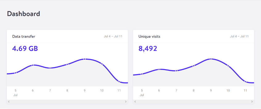
    For web pages, data transfer for a single visit can be most easily estimated by measuring the page weight, meaning the transfer size of the page in kilobytes the first time someone visits the page. It’s fairly easy to measure using the developer tools in any modern web browser. Often your web hosting account will include statistics for the total data transfer of any web application (Fig 2.1).

    The nice thing about page weight as a metric is that it allows us to compare the efficiency of web pages on a level playing field without confusing the issue with constantly changing traffic volumes. 

    Reducing page weight requires a large scope. By early 2020, the median page weight was 1.97 MB for setups the HTTP Archive classifies as “desktop” and 1.77 MB for “mobile,” with desktop increasing 36 percent since January 2016 and mobile page weights nearly doubling in the same period (Fig 2.2). Roughly half of this data transfer is image files, making images the single biggest source of carbon emissions on the average website. 

    History clearly shows us that our web pages can be smaller, if only we set our minds to it. While most technologies become ever more energy efficient, including the underlying technology of the web such as data centers and transmission networks, websites themselves are a technology that becomes less efficient as time goes on.

    You might be familiar with the concept of performance budgeting as a way of focusing a project team on creating faster user experiences. For example, we might specify that the website must load in a maximum of one second on a broadband connection and three seconds on a 3G connection. Much like speed limits while driving, performance budgets are upper limits rather than vague suggestions, so the goal should always be to come in under budget.

    Designing for fast performance does often lead to reduced data transfer and emissions, but it isn’t always the case. Web performance is often more about the subjective perception of load times than it is about the true efficiency of the underlying system, whereas page weight and transfer size are more objective measures and more reliable benchmarks for sustainable web design. 

    We can set a page weight budget in reference to a benchmark of industry averages, using data from sources like HTTP Archive. We can also benchmark page weight against competitors or the old version of the website we’re replacing. For example, we might set a maximum page weight budget as equal to our most efficient competitor, or we could set the benchmark lower to guarantee we are best in class. 

    If we want to take it to the next level, then we could also start looking at the transfer size of our web pages for repeat visitors. Although page weight for the first time someone visits is the easiest thing to measure, and easy to compare on a like-for-like basis, we can learn even more if we start looking at transfer size in other scenarios too. For example, visitors who load the same page multiple times will likely have a high percentage of the files cached in their browser, meaning they don’t need to transfer all of the files on subsequent visits. Likewise, a visitor who navigates to new pages on the same website will likely not need to load the full page each time, as some global assets from areas like the header and footer may already be cached in their browser. Measuring transfer size at this next level of detail can help us learn even more about how we can optimize efficiency for users who regularly visit our pages, and enable us to set page weight budgets for additional scenarios beyond the first visit.

    Page weight budgets are easy to track throughout a design and development process. Although they don’t actually tell us carbon emission and energy consumption analytics directly, they give us a clear indication of efficiency relative to other websites. And as transfer size is an effective analog for energy consumption, we can actually use it to estimate energy consumption too.

    In summary, reduced data transfer translates to energy efficiency, a key factor to reducing carbon emissions of web products. The more efficient our products, the less electricity they use, and the less fossil fuels need to be burned to produce the electricity to power them. But as we’ll see next, since all web products demand some power, it’s important to consider the source of that electricity, too.

    Carbon intensity of electricity

    Regardless of energy efficiency, the level of pollution caused by digital products depends on the carbon intensity of the energy being used to power them. Carbon intensity is a term used to define the grams of CO2 produced for every kilowatt-hour of electricity (gCO2/kWh). This varies widely, with renewable energy sources and nuclear having an extremely low carbon intensity of less than 10 gCO2/kWh (even when factoring in their construction); whereas fossil fuels have very high carbon intensity of approximately 200–400 gCO2/kWh. 

    Most electricity comes from national or state grids, where energy from a variety of different sources is mixed together with varying levels of carbon intensity. The distributed nature of the internet means that a single user of a website or app might be using energy from multiple different grids simultaneously; a website user in Paris uses electricity from the French national grid to power their home internet and devices, but the website’s data center could be in Dallas, USA, pulling electricity from the Texas grid, while the telecoms networks use energy from everywhere between Dallas and Paris.

    We don’t have control over the full energy supply of web services, but we do have some control over where we host our projects. With a data center using a significant proportion of the energy of any website, locating the data center in an area with low carbon energy will tangibly reduce its carbon emissions. Danish startup Tomorrow reports and maps this user-contributed data, and a glance at their map shows how, for example, choosing a data center in France will have significantly lower carbon emissions than a data center in the Netherlands (Fig 2.3).

    That said, we don’t want to locate our servers too far away from our users; it takes energy to transmit data through the telecom’s networks, and the further the data travels, the more energy is consumed. Just like food miles, we can think of the distance from the data center to the website’s core user base as “megabyte miles”—and we want it to be as small as possible.

    Using the distance itself as a benchmark, we can use website analytics to identify the country, state, or even city where our core user group is located and measure the distance from that location to the data center used by our hosting company. This will be a somewhat fuzzy metric as we don’t know the precise center of mass of our users or the exact location of a data center, but we can at least get a rough idea. 

    For example, if a website is hosted in London but the primary user base is on the West Coast of the USA, then we could look up the distance from London to San Francisco, which is 5,300 miles. That’s a long way! We can see that hosting it somewhere in North America, ideally on the West Coast, would significantly reduce the distance and thus the energy used to transmit the data. In addition, locating our servers closer to our visitors helps reduce latency and delivers better user experience, so it’s a win-win.

    Converting it back to carbon emissions

    If we combine carbon intensity with a calculation for energy consumption, we can calculate the carbon emissions of our websites and apps. A tool my team created does this by measuring the data transfer over the wire when loading a web page, calculating the amount of electricity associated, and then converting that into a figure for CO2 (Fig 2.4). It also factors in whether or not the web hosting is powered by renewable energy.

    If you want to take it to the next level and tailor the data more accurately to the unique aspects of your project, the Energy and Emissions Worksheet accompanying this book shows you how.

    With the ability to calculate carbon emissions for our projects, we could actually take a page weight budget one step further and set carbon budgets as well. CO2 is not a metric commonly used in web projects; we’re more familiar with kilobytes and megabytes, and can fairly easily look at design options and files to assess how big they are. Translating that into carbon adds a layer of abstraction that isn’t as intuitive—but carbon budgets do focus our minds on the primary thing we’re trying to reduce, and support the core objective of sustainable web design: reducing carbon emissions.

    Browser Energy

    Data transfer might be the simplest and most complete analog for energy consumption in our digital projects, but by giving us one number to represent the energy used in the data center, the telecoms networks, and the end user’s devices, it can’t offer us insights into the efficiency in any specific part of the system.

    One part of the system we can look at in more detail is the energy used by end users’ devices. As front-end web technologies become more advanced, the computational load is increasingly moving from the data center to users’ devices, whether they be phones, tablets, laptops, desktops, or even smart TVs. Modern web browsers allow us to implement more complex styling and animation on the fly using CSS and JavaScript. Furthermore, JavaScript libraries such as Angular and React allow us to create applications where the “thinking” work is done partly or entirely in the browser. 

    All of these advances are exciting and open up new possibilities for what the web can do to serve society and create positive experiences. However, more computation in the user’s web browser means more energy used by their devices. This has implications not just environmentally, but also for user experience and inclusivity. Applications that put a heavy processing load on the user’s device can inadvertently exclude users with older, slower devices and cause batteries on phones and laptops to drain faster. Furthermore, if we build web applications that require the user to have up-to-date, powerful devices, people throw away old devices much more frequently. This isn’t just bad for the environment, but it puts a disproportionate financial burden on the poorest in society.

    In part because the tools are limited, and partly because there are so many different models of devices, it’s difficult to measure website energy consumption on end users’ devices. One tool we do currently have is the Energy Impact monitor inside the developer console of the Safari browser (Fig 2.5).

    You know when you load a website and your computer’s cooling fans start spinning so frantically you think it might actually take off? That’s essentially what this tool is measuring. 

    It shows us the percentage of CPU used and the duration of CPU usage when loading the web page, and uses these figures to generate an energy impact rating. It doesn’t give us precise data for the amount of electricity used in kilowatts, but the information it does provide can be used to benchmark how efficiently your websites use energy and set targets for improvement.