Category: Blog

Your blog category

  • User Research Is Storytelling

    User Research Is Storytelling

    Ever since I was a boy, I’ve been fascinated with movies. I loved the characters and the excitement—but most of all the stories. I wanted to be an actor. And I believed that I’d get to do the things that Indiana Jones did and go on exciting adventures. I even dreamed up ideas for movies that my friends and I could make and star in. But they never went any further. I did, however, end up working in user experience (UX). Now, I realize that there’s an element of theater to UX—I hadn’t really considered it before, but user research is storytelling. And to get the most out of user research, you need to tell a good story where you bring stakeholders—the product team and decision makers—along and get them interested in learning more.

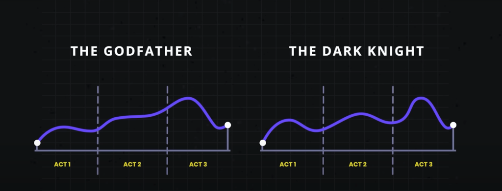
    Think of your favorite movie. More than likely it follows a three-act structure that’s commonly seen in storytelling: the setup, the conflict, and the resolution. The first act shows what exists today, and it helps you get to know the characters and the challenges and problems that they face. Act two introduces the conflict, where the action is. Here, problems grow or get worse. And the third and final act is the resolution. This is where the issues are resolved and the characters learn and change. I believe that this structure is also a great way to think about user research, and I think that it can be especially helpful in explaining user research to others.

    Use storytelling as a structure to do research

    It’s sad to say, but many have come to see research as being expendable. If budgets or timelines are tight, research tends to be one of the first things to go. Instead of investing in research, some product managers rely on designers or—worse—their own opinion to make the “right” choices for users based on their experience or accepted best practices. That may get teams some of the way, but that approach can so easily miss out on solving users’ real problems. To remain user-centered, this is something we should avoid. User research elevates design. It keeps it on track, pointing to problems and opportunities. Being aware of the issues with your product and reacting to them can help you stay ahead of your competitors.

    In the three-act structure, each act corresponds to a part of the process, and each part is critical to telling the whole story. Let’s look at the different acts and how they align with user research.

    Act one: setup

    The setup is all about understanding the background, and that’s where foundational research comes in. Foundational research (also called generative, discovery, or initial research) helps you understand users and identify their problems. You’re learning about what exists today, the challenges users have, and how the challenges affect them—just like in the movies. To do foundational research, you can conduct contextual inquiries or diary studies (or both!), which can help you start to identify problems as well as opportunities. It doesn’t need to be a huge investment in time or money.

    Erika Hall writes about minimum viable ethnography, which can be as simple as spending 15 minutes with a user and asking them one thing: “‘Walk me through your day yesterday.’ That’s it. Present that one request. Shut up and listen to them for 15 minutes. Do your damndest to keep yourself and your interests out of it. Bam, you’re doing ethnography.” According to Hall, [This] will probably prove quite illuminating. In the highly unlikely case that you didn’t learn anything new or useful, carry on with enhanced confidence in your direction.”  

    This makes total sense to me. And I love that this makes user research so accessible. You don’t need to prepare a lot of documentation; you can just recruit participants and do it! This can yield a wealth of information about your users, and it’ll help you better understand them and what’s going on in their lives. That’s really what act one is all about: understanding where users are coming from. 

    Jared Spool talks about the importance of foundational research and how it should form the bulk of your research. If you can draw from any additional user data that you can get your hands on, such as surveys or analytics, that can supplement what you’ve heard in the foundational studies or even point to areas that need further investigation. Together, all this data paints a clearer picture of the state of things and all its shortcomings. And that’s the beginning of a compelling story. It’s the point in the plot where you realize that the main characters—or the users in this case—are facing challenges that they need to overcome. Like in the movies, this is where you start to build empathy for the characters and root for them to succeed. And hopefully stakeholders are now doing the same. Their sympathy may be with their business, which could be losing money because users can’t complete certain tasks. Or maybe they do empathize with users’ struggles. Either way, act one is your initial hook to get the stakeholders interested and invested.

    Once stakeholders begin to understand the value of foundational research, that can open doors to more opportunities that involve users in the decision-making process. And that can guide product teams toward being more user-centered. This benefits everyone—users, the product, and stakeholders. It’s like winning an Oscar in movie terms—it often leads to your product being well received and successful. And this can be an incentive for stakeholders to repeat this process with other products. Storytelling is the key to this process, and knowing how to tell a good story is the only way to get stakeholders to really care about doing more research. 

    This brings us to act two, where you iteratively evaluate a design or concept to see whether it addresses the issues.

    Act two: conflict

    Act two is all about digging deeper into the problems that you identified in act one. This usually involves directional research, such as usability tests, where you assess a potential solution (such as a design) to see whether it addresses the issues that you found. The issues could include unmet needs or problems with a flow or process that’s tripping users up. Like act two in a movie, more issues will crop up along the way. It’s here that you learn more about the characters as they grow and develop through this act. 

    Usability tests should typically include around five participants according to Jakob Nielsen, who found that that number of users can usually identify most of the problems: “As you add more and more users, you learn less and less because you will keep seeing the same things again and again… After the fifth user, you are wasting your time by observing the same findings repeatedly but not learning much new.” 

    There are parallels with storytelling here too; if you try to tell a story with too many characters, the plot may get lost. Having fewer participants means that each user’s struggles will be more memorable and easier to relay to other stakeholders when talking about the research. This can help convey the issues that need to be addressed while also highlighting the value of doing the research in the first place.

    Researchers have run usability tests in person for decades, but you can also conduct usability tests remotely using tools like Microsoft Teams, Zoom, or other teleconferencing software. This approach has become increasingly popular since the beginning of the pandemic, and it works well. You can think of in-person usability tests like going to a play and remote sessions as more like watching a movie. There are advantages and disadvantages to each. In-person usability research is a much richer experience. Stakeholders can experience the sessions with other stakeholders. You also get real-time reactions—including surprise, agreement, disagreement, and discussions about what they’re seeing. Much like going to a play, where audiences get to take in the stage, the costumes, the lighting, and the actors’ interactions, in-person research lets you see users up close, including their body language, how they interact with the moderator, and how the scene is set up.

    If in-person usability testing is like watching a play—staged and controlled—then conducting usability testing in the field is like immersive theater where any two sessions might be very different from one another. You can take usability testing into the field by creating a replica of the space where users interact with the product and then conduct your research there. Or you can go out to meet users at their location to do your research. With either option, you get to see how things work in context, things come up that wouldn’t have in a lab environment—and conversion can shift in entirely different directions. As researchers, you have less control over how these sessions go, but this can sometimes help you understand users even better. Meeting users where they are can provide clues to the external forces that could be affecting how they use your product. In-person usability tests provide another level of detail that’s often missing from remote usability tests. 

    That’s not to say that the “movies”—remote sessions—aren’t a good option. Remote sessions can reach a wider audience. They allow a lot more stakeholders to be involved in the research and to see what’s going on. And they open the doors to a much wider geographical pool of users. But with any remote session there is the potential of time wasted if participants can’t log in or get their microphone working. 

    The benefit of usability testing, whether remote or in person, is that you get to see real users interact with the designs in real time, and you can ask them questions to understand their thought processes and grasp of the solution. This can help you not only identify problems but also glean why they’re problems in the first place. Furthermore, you can test hypotheses and gauge whether your thinking is correct. By the end of the sessions, you’ll have a much clearer picture of how usable the designs are and whether they work for their intended purposes. Act two is the heart of the story—where the excitement is—but there can be surprises too. This is equally true of usability tests. Often, participants will say unexpected things, which change the way that you look at things—and these twists in the story can move things in new directions. 

    Unfortunately, user research is sometimes seen as expendable. And too often usability testing is the only research process that some stakeholders think that they ever need. In fact, if the designs that you’re evaluating in the usability test aren’t grounded in a solid understanding of your users (foundational research), there’s not much to be gained by doing usability testing in the first place. That’s because you’re narrowing the focus of what you’re getting feedback on, without understanding the users’ needs. As a result, there’s no way of knowing whether the designs might solve a problem that users have. It’s only feedback on a particular design in the context of a usability test.  

    On the other hand, if you only do foundational research, while you might have set out to solve the right problem, you won’t know whether the thing that you’re building will actually solve that. This illustrates the importance of doing both foundational and directional research. 

    In act two, stakeholders will—hopefully—get to watch the story unfold in the user sessions, which creates the conflict and tension in the current design by surfacing their highs and lows. And in turn, this can help motivate stakeholders to address the issues that come up.

    Act three: resolution

    While the first two acts are about understanding the background and the tensions that can propel stakeholders into action, the third part is about resolving the problems from the first two acts. While it’s important to have an audience for the first two acts, it’s crucial that they stick around for the final act. That means the whole product team, including developers, UX practitioners, business analysts, delivery managers, product managers, and any other stakeholders that have a say in the next steps. It allows the whole team to hear users’ feedback together, ask questions, and discuss what’s possible within the project’s constraints. And it lets the UX research and design teams clarify, suggest alternatives, or give more context behind their decisions. So you can get everyone on the same page and get agreement on the way forward.

    This act is mostly told in voiceover with some audience participation. The researcher is the narrator, who paints a picture of the issues and what the future of the product could look like given the things that the team has learned. They give the stakeholders their recommendations and their guidance on creating this vision.

    Nancy Duarte in the Harvard Business Review offers an approach to structuring presentations that follow a persuasive story. “The most effective presenters use the same techniques as great storytellers: By reminding people of the status quo and then revealing the path to a better way, they set up a conflict that needs to be resolved,” writes Duarte. “That tension helps them persuade the audience to adopt a new mindset or behave differently.”

    This type of structure aligns well with research results, and particularly results from usability tests. It provides evidence for “what is”—the problems that you’ve identified. And “what could be”—your recommendations on how to address them. And so on and so forth.

    You can reinforce your recommendations with examples of things that competitors are doing that could address these issues or with examples where competitors are gaining an edge. Or they can be visual, like quick mockups of how a new design could look that solves a problem. These can help generate conversation and momentum. And this continues until the end of the session when you’ve wrapped everything up in the conclusion by summarizing the main issues and suggesting a way forward. This is the part where you reiterate the main themes or problems and what they mean for the product—the denouement of the story. This stage gives stakeholders the next steps and hopefully the momentum to take those steps!

    While we are nearly at the end of this story, let’s reflect on the idea that user research is storytelling. All the elements of a good story are there in the three-act structure of user research: 

    • Act one: You meet the protagonists (the users) and the antagonists (the problems affecting users). This is the beginning of the plot. In act one, researchers might use methods including contextual inquiry, ethnography, diary studies, surveys, and analytics. The output of these methods can include personas, empathy maps, user journeys, and analytics dashboards.
    • Act two: Next, there’s character development. There’s conflict and tension as the protagonists encounter problems and challenges, which they must overcome. In act two, researchers might use methods including usability testing, competitive benchmarking, and heuristics evaluation. The output of these can include usability findings reports, UX strategy documents, usability guidelines, and best practices.
    • Act three: The protagonists triumph and you see what a better future looks like. In act three, researchers may use methods including presentation decks, storytelling, and digital media. The output of these can be: presentation decks, video clips, audio clips, and pictures. 

    The researcher has multiple roles: they’re the storyteller, the director, and the producer. The participants have a small role, but they are significant characters (in the research). And the stakeholders are the audience. But the most important thing is to get the story right and to use storytelling to tell users’ stories through research. By the end, the stakeholders should walk away with a purpose and an eagerness to resolve the product’s ills. 

    So the next time that you’re planning research with clients or you’re speaking to stakeholders about research that you’ve done, think about how you can weave in some storytelling. Ultimately, user research is a win-win for everyone, and you just need to get stakeholders interested in how the story ends.


  • Good designers, bad websites: a proposal

    Good designers, bad websites: a proposal

    I want to discuss accessibility because it is the most important thing for making websites. Other A List Apart articles give you innovation and insight. This article will give you homework. These are just my personal views, but they’re pretty good.

    I want to start off with a couple of statements, and you will agree:

    1. Designers are good people. I have never heard a designer say, “I don’t care if somebody can’t read this text”, “Not my fault if somebody can’t use this device”, or “Who cares if this is confusing?”
    2. Some designs exclude people. You have seen people unable to read the text on a website or app that somebody designed. You’ve seen people unable to use a physical device that somebody has designed. You’ve seen people utterly bamboozled while trying to use a service that somebody designed.

    So what?

    The first question is, “Is this life-or-death stuff?” The answer is, “Yes.” In my favorite essay, This Is All There Is, Aral Balkan makes the point that pretty much everything that we design can affect life events and death events. Aral gives the example of how even a straightforward bus timetable app can affect life and death events, if we design it badly:

    • somebody might miss a life event, such as their daughter’s fifth birthday party; or
    • somebody might miss a death event, such as the chance to say goodbye to a dying grandmother.

    The next—and frustrating—question is, “Why do some designs still exclude people?” After all, we know that:

    • not everybody can see perfectly;
    • not everybody can hear perfectly;
    • not everybody thinks the same way; and
    • not everybody moves the same way.

    I think the answer is that there’s too much to recall. Consider, if you will, the wide variety of topics that A List Apart articles cover. Designers are expected to remember all of that guidance, plus all of the accessibility guidance, plus so much more. It is too much.

    Recognizing accessibility issues while designing

    I’d like to point toward one possible solution, starting from Jakob Nielsen’s 10 Usability Heuristics for User Interface Design. These are from the mid-1990s, and—although there’s a good chance that you, gentle reader, are a lot younger than that—please bear with me. 

    Seeing as the problem is that there’s too much to recall, I want to look at heuristic № 6, “Recognition rather than Recall.” Jakob Nielsen said that for users, information required to use the design should be visible or easily retrievable when needed. I suggest we tweak that to make life easier for designers. Let’s say that the information required to produce the design should be visible or easily retrievable when needed. In other words, let’s make it easier to recognise accessibility issues while we’re designing.

    How are we going to do that? I really like the book A Web for Everyone—Designing Accessible User Experiences by Sarah Horton and Whitney Quesenbery. I really like this book not only because it includes a quote from me—actually two quotes, but I don’t like to boast—but because it includes personas that are perfect for helping us to recognise accessibility issues. That’s the good news. The even better news is that these personas are available now for free on the companion website to the book What Every Engineer Should Know About Digital Accessibility, again by Sarah Horton, with David Sloan this time.

    Meet your users

    I’m going to introduce you to these personas now:

    I want to throw one more persona at you now, because, well, A List Apart readers are overachievers. One of my favorite authors, Cennydd Bowles—who literally wrote the book on Future Ethics—says to create Personas Non Grata. In other words, every time we design something, we have to think about what a bad guy could do with that thing, and whom that might affect.

    To actually use these personas while designing, I like what Eric Meyer and Sara Wachter-Boettcher in Design for Real Life call the Designated Dissenter: for each project that you work on, one of your teams should be responsible for asking, “Will this work for Vishnu?”, “How’s Trevor going to get on with this?”, and so on. 

    Then, once you’ve used the personas to recognise the accessibility issues, you can look up the guidelines for whichever platforms you’re designing for: 

    Your mission, should you choose to accept it

    I told you in the introduction of this article that I would give you homework. You thought I was joking. So, here’s your homework: I want you to grab the personas from the Know About Accessibility website, and use them throughout every design project to help you recognise accessibility issues while you work—and reclaim design for everyone.


    NOTE: This article is based on “Recognise,” my five-minute presentation from Interaction Design Association (IxDA) Dublin’s Defuse (Design for Use) event in 2025.

  • Design for Amiability: Lessons from Vienna

    Design for Amiability: Lessons from Vienna

    Today’s web is not always an amiable place. Sites greet you with a popover that demands assent to their cookie policy, and leave you with Taboola ads promising “One Weird Trick!” to cure your ailments. Social media sites are tuned for engagement, and few things are more engaging than a fight. Today it seems that people want to quarrel; I have seen flame wars among birders.  

    These tensions are often at odds with a site’s goals. If we are providing support and advice to customers, we don’t want those customers to wrangle with each other. If we offer news about the latest research, we want readers to feel at ease; if we promote upcoming marches, we want our core supporters to feel comfortable and we want curious newcomers to feel welcome. 

    In a study for a conference on the History of the Web, I looked to the origins of Computer Science in Vienna (1928-1934)  for a case study of the importance of amiability in a research community and the disastrous consequences of its loss. That story has interesting implications for web environments that promote amiable interaction among disparate, difficult (and sometimes disagreeable) people.

    The Vienna Circle

    Though people had been thinking about calculating engines and thinking machines from antiquity, Computing really got going in Depression-era Vienna.  The people who worked out the theory had no interest in building machines; they wanted to puzzle out the limits of reason in the absence of divine authority. If we could not rely on God or Aristotle to tell us how to think, could we instead build arguments that were self-contained and demonstrably correct? Can we be sure that mathematics is consistent? Are there things that are true but that cannot be expressed in language? 

    The core ideas were worked out in the weekly meetings (Thursdays at 6) of a group remembered as the Vienna Circle. They got together in the office of Professor Moritz Schlick at the University of Vienna to discuss problems in philosophy, math, and language. The intersection of physics and philosophy had long been a specialty of this Vienna department, and this work had placed them among the world leaders.  Schlick’s colleague Hans Hahn was a central participant, and by 1928 Hahn brought along his graduate students Karl Menger and Kurt Gödel. Other frequent participants included philosopher Rudolf Carnap, psychologist Karl Popper, economist Ludwig von Mises (brought by his brother Frederick, a physicist),  graphic designer Otto Neurath (inventor of infographics), and architect Josef Frank (brought by his physicist brother, Phillip).  Out-of-town visitors often joined, including the young Johnny von Neumann, Alfred Tarski, and the irascible Ludwig Wittgenstein. 

    When Schlick’s office grew too dim, participants adjourned to a nearby café for additional discussion with an even larger circle of participants.  This convivial circle was far from unique.  An intersecting circle–Neurath, von Mises, Oskar Morgenstern–established the Austrian School of free-market economics. There were theatrical circles (Peter Lorre, Hedy Lamarr, Max Reinhardt), and literary circles. The café was where things happened.

    The interdisciplinarity of the group posed real challenges of temperament and understanding. Personalities were often a challenge. Gödel was convinced people were trying to poison him. Architect Josef Frank depended on contracts for public housing, which Mises opposed as wasteful. Wittgenstein’s temper had lost him his job as a secondary school teacher, and for some of these years he maintained a detailed list of whom he was willing to meet. Neurath was eager to detect muddled thinking and would interrupt a speaker with a shouted “Metaphysics!” The continuing amity of these meetings was facilitated by the personality of their leader, Moritz Schlick, who would be remembered as notably adept in keeping disagreements from becoming quarrels.

    In the Café

    The Viennese café of this era was long remembered as a particularly good place to argue with your friends, to read, and to write. Built to serve an imperial capital, the cafés found themselves with too much space and too few customers now that the Empire was gone. There was no need to turn tables: a café could only survive by coaxing customers to linger. Perhaps they would order another coffee, or one of their friends might drop by. One could play chess, or billiards, or read newspapers from abroad. Coffee was invariably served with a glass of purified spring water, still a novelty in an era in which most water was still unsafe to drink. That water glass would be refilled indefinitely. 

    In the basement of one café, the poet Jura Soyfer staged “The End Of The World,” a musical comedy in which Professor Peep has discovered a comet heading for earth.

    Prof. Peep: The comet is going to destroy everybody!

    Hitler:  Destroying everybody is my business.

    Of course, coffee can be prepared in many ways, and the Viennese café developed a broad vocabulary to represent precisely how one preferred to drink it: melange, Einspänner, Brauner, Schwarzer, Kapuziner. This extensive customization, with correspondingly esoteric conventions of service, established the café as a comfortable and personal third space, a neutral ground in which anyone who could afford a coffee would be welcome. Viennese of this era were fastidious in their use of personal titles, of which an abundance were in common use. Café waiters greeted regular customers with titles too, but were careful to address their patrons with titles a notch or two greater than they deserved. A graduate student would be Doktor, an unpaid postdoc Professor.  This assurance mattered all the more because so many members of the Circle (and so many other Viennese) came from elsewhere: Carnap from Wuppertal, Gödel from Brno, von Neumann from Budapest. No one was going to make fun of your clothes, mannerisms, or accent. Your friends wouldn’t be bothered by the pram in the hall. Everyone shared a Germanic Austrian literary and philosophical culture, not least those whose ancestors had been Eastern European Jews who knew that culture well, having read all about it in books.

    The amiability of the café circle was enhanced by its openness. Because the circle sometimes extended to architects and actors, people could feel less constrained to admit shortfalls in their understanding. It was soon discovered that marble tabletops made a useful surface for pencil sketches, serving all as an improvised and accessible blackboard.

    Comedies like “The End Of The World” and fictional newspaper sketches or feuilletons of writers like Joseph Roth and Stefan Zweig served as a second defense against disagreeable or churlish behavior. The knowledge that, if one got carried away, a parody of one’s remarks might shortly appear in Neue Freie Presse surely helped Professor Schlick keep matters in hand.

    The End Of Red Vienna

    Though Austria’s government drifted to the right after the War, Vienna’s city council had been Socialist, dedicated to public housing based on user-centered design, and embracing  ambitious programs of public outreach and adult education. In 1934 the Socialists lost a local election, and this era soon came to its end as the new administration focused on the imagined threat of the International Jewish Conspiracy. Most members of the Circle fled within months: von Neumann to Princeton, Neurath to Holland and Oxford, Popper to New Zealand, Carnap to Chicago. Prof. Schlick was murdered on the steps of the University by a student outraged by his former association with Jews.  Jura Soyfer, who wrote “The End Of The World,” died in Buchenwald.

    In 1939, von Neumann finally convinced Gödel to accept a job in Princeton. Gödel was required to pay large fines to emigrate. The officer in charge of these fees would look back on this as the best posting of his career; his name was Eichmann.

    Design for Amiability

    An impressive literature recounts those discussions and the environment that facilitated the development of computing. How can we design for amiability?  This is not just a matter of choosing rounded typefaces and a cheerful pastel palette. I believe we may identify eight distinct issues that exert design forces in usefully amiable directions.

    Seriousness: The Vienna Circle was wrestling with a notoriously difficult book—Wittgenstein’s Tractus Logico-Philosophicus—and a catalog of outstanding open questions in mathematics. They were concerned with consequential problems, not merely scoring points for debating. Constant reminders that the questions you are considering matter—not only that they are consequential or that those opposing you are scoundrels—help promote amity.

    Empiricism: The characteristic approach of the Vienna Circle demanded that knowledge be grounded either in direct observation or in rigorous reasoning. Disagreement, when it arose, could be settled by observation or by proof. If neither seemed ready to hand, the matter could not be settled. On these terms, one can seldom if ever demolish an opposing argument, and trolling is pointless.

    Abstraction: Disputes grow worse when losing the argument entails lost face or lost jobs. The Vienna Circle’s focus on theory—the limits of mathematics, the capability of language—promoted amity. Without seriousness, abstraction could have been merely academic, but the limits of reason and the consistency of mathematics were clearly serious.

    Formality: The punctilious demeanor of waiters and the elaborated rituals of coffee service helped to establish orderly attitudes amongst the argumentative participants. This stands in contrast to the contemptuous sneer that now dominates social media.  

    Schlamperei: Members of the Vienna Circle maintained a global correspondence, and they knew their work was at the frontier of research. Still, this was Vienna, at the margins of Europe: old-fashioned, frumpy, and dingy. Many participants came from even more obscure backwaters. Most or all harbored the suspicion that they were really schleppers, and a tinge of the ridiculous helped to moderate tempers. The director of “The End Of The World” had to pass the hat for money to purchase a moon for the set, and thought it was funny enough to write up for publication.

    Openness: All sorts of people were involved in discussion, anyone might join in. Each week would bring different participants. Fluid borders reduce tension, and provide opportunities to broaden the range of discussion and the terms of engagement. Low entrance friction was characteristic of the café: anyone could come, and if you came twice you were virtually a regular. Permeable boundaries and café culture made it easier for moderating influences to draw in raconteurs and storytellers to defuse awkward moments, and Vienna’s cafés had no shortage of humorists. Openness counteracts the suspicion that promoters of amiability are exerting censorship.

    Parody: The environs of the Circle—the university office and the café—were unmistakably public. There were writers about, some of them renowned humorists. The prospect that one’s bad taste or bad behavior might be ridiculed in print kept discussion within bounds. The sanction of public humiliation, however, was itself made mild by the veneer of fiction; even if you got a little carried away and a character based on you made a splash in some newspaper fiction, it wasn’t the end of the world.

    Engagement: The subject matter was important to the participants, but it was esoteric: it did not matter very much to their mothers or their siblings. A small stumble or a minor humiliation could be shrugged off in ways that major media confrontations cannot.

    I believe it is notable that this environment was designed to promote amiability through several different voices.  The café waiter flattered each newcomer and served everyone, and also kept out local pickpockets and drunks who would be mere disruptions. Schlick and other regulars kept discussion moving and on track. The fiction writers and raconteurs—perhaps the most peripheral of the participants—kept people in a good mood and reminded them that bad behavior could make anyone ridiculous.  Crucially, each of these voices were human: you could reason with them. Algorithmic or AI moderators, however clever, are seldom perceived as reasonable. The café circles had no central authority or Moderator against whom everyone’s resentments might be focused. Even after the disaster of 1934, what people remembered were those cheerful arguments.

  • Design Dialects: Breaking the Rules, Not the System

    Design Dialects: Breaking the Rules, Not the System

    “Language is not merely a set of unrelated sounds, clauses, rules, and meanings; it is a totally coherent system bound to context and behavior.” — Kenneth L. Pike

    The web has accents. So should our design systems.

    Design Systems as Living Languages

    Design systems aren’t component libraries—they’re living languages. Tokens are phonemes, components are words, patterns are phrases, layouts are sentences. The conversations we build with users become the stories our products tell.

    But here’s what we’ve forgotten: the more fluently a language is spoken, the more accents it can support without losing meaning. English in Scotland differs from English in Sydney, yet both are unmistakably English. The language adapts to context while preserving core meaning. This couldn’t be more obvious to me, a Brazilian Portuguese speaker, who learned English with an American accent, and lives in Sydney.

    Our design systems must work the same way. Rigid adherence to visual rules creates brittle systems that break under contextual pressure. Fluent systems bend without breaking.

    Consistency becomes a prison

    The promise of design systems was simple: consistent components would accelerate development and unify experiences. But as systems matured and products grew more complex, that promise has become a prison. Teams file “exception” requests by the hundreds. Products launch with workarounds instead of system components. Designers spend more time defending consistency than solving user problems.

    Our design systems must learn to speak dialects.

    A design dialect is a systematic adaptation of a design system that maintains core principles while developing new patterns for specific contexts. Unlike one-off customizations or brand themes, dialects preserve the system’s essential grammar while expanding its vocabulary to serve different users, environments, or constraints.

    When Perfect Consistency Fails

    At Booking.com, I learned this lesson the hard way. We A/B-tested everything—color, copy, button shapes, even logo colors. As a professional with a graphic design education and experience building brand style guides, I found this shocking. While everyone fell in love with Airbnb’s pristine design system, Booking grew into a giant without ever considering visual consistency.  

    The chaos taught me something profound: consistency isn’t ROI; solved problems are.

    At Shopify. Polaris () was our crown jewel—a mature design language perfect for merchants on laptops. As a product team, we were expected to adopt Polaris as-is. Then my fulfillment team hit an “Oh, Ship!” moment, as we faced the challenge of building an app for warehouse pickers using our interface on shared, battered Android scanners in dim aisles, wearing thick gloves, scanning dozens of items per minute, many with limited levels of English understanding.

    Task completion with standard Polaris: 0%.

    Every component that worked beautifully for merchants failed completely for pickers. White backgrounds created glare. 44px tap targets were invisible to gloved fingers. Sentence-case labels took too long to parse. Multi-step flows confused non-native speakers.

    We faced a choice: abandon Polaris entirely, or teach it to speak warehouse.

    The Birth of a Dialect

    We chose evolution over revolution. Working within Polaris’s core principles—clarity, efficiency, consistency—we developed what we now call a design dialect:

    ConstraintFluent MoveRationale
    Glare & low lightDark surfaces + light textReduce glare on low-DPI screens
    Gloves & haste90px tap targets (~2cm)Accommodate thick gloves
    MultilingualSingle-task screens, plain languageReduce cognitive load

    Result: Task completion jumped from 0% to 100%. Onboarding time dropped from three weeks to one shift.

    This wasn’t customization or theming—this was a dialect: a systematic adaptation that maintained Polaris’s core grammar while developing new vocabulary for a specific context. Polaris hadn’t failed; it had learned to speak warehouse.

    The Flexibility Framework

    At Atlassian, working on the Jira platform—itself a system within the larger Atlassian system—I pushed for formalizing this insight. With dozens of products sharing a design language across different codebases, we needed systematic flexibility so we built directly into our ways of working. The old model—exception requests and special approvals—was failing at scale.

    We developed the Flexibility Framework to help designers define how flexible they wanted their components to be:

    TierActionOwnership
    ConsistentAdopt unchangedPlatform locks design + code
    OpinionatedAdapt within boundsPlatform provides smart defaults, products customize
    FlexibleExtend freelyPlatform defines behavior, products own presentation

    During a navigation redesign, we tiered every element. Logo and global search stayed Consistent. Breadcrumbs and contextual actions became Flexible. Product teams could immediately see where innovation was welcome and where consistency mattered.

    The Decision Ladder

    Flexibility needs boundaries. We created a simple ladder for evaluating when rules should bend:

    Good: Ship with existing system components. Fast, consistent, proven.

    Better: Stretch a component slightly. Document the change. Contribute improvements back to the system for all to use.

    Best: Prototype the ideal experience first. If user testing validates the benefit, update the system to support it.

    The key question: “Which option lets users succeed fastest?”

    Rules are tools, not relics.

    Unity Beats Uniformity

    Gmail, Drive, and Maps are unmistakably Google—yet each speaks with its own accent. They achieve unity through shared principles, not cloned components. One extra week of debate over button color costs roughly $30K in engineer time.

    Unity is a brand outcome; fluency is a user outcome. When the two clash, side with the user.

    Governance Without Gates

    How do you maintain coherence while enabling dialects? Treat your system like a living vocabulary:

    Document every deviation – e.g., dialects/warehouse.md with before/after screenshots and rationale.

    Promote shared patterns – when three teams adopt a dialect independently, review it for core inclusion.

    Deprecate with context – retire old idioms via flags and migration notes, never a big-bang purge.

    A living dictionary scales better than a frozen rulebook.

    Start Small: Your First Dialect

    Ready to introduce dialects? Start with one broken experience:

    This week: Find one user flow where perfect consistency blocks task completion. Could be mobile users struggling with desktop-sized components, or accessibility needs your standard patterns don’t address.

    Document the context: What makes standard patterns fail here? Environmental constraints? User capabilities? Task urgency?

    Design one systematic change: Focus on behavior over aesthetics. If gloves are the problem, bigger targets aren’t “”breaking the system””—they’re serving the user. Earn the variations and make them intentional.

    Test and measure: Does the change improve task completion? Time to productivity? User satisfaction?

    Show the savings: If that dialect frees even half a sprint, fluency has paid for itself.

    Beyond the Component Library

    We’re not managing design systems anymore—we’re cultivating design languages. Languages that grow with their speakers. Languages that develop accents without losing meaning. Languages that serve human needs over aesthetic ideals.

    The warehouse workers who went from 0% to 100% task completion didn’t care that our buttons broke the style guide. They cared that the buttons finally worked.

    Your users feel the same way. Give your system permission to speak their language.

  • An Holistic Framework for Shared Design Leadership

    An Holistic Framework for Shared Design Leadership

    Picture this: You’re in a meeting room at your tech company, and two people are having what looks like the same conversation about the same design problem. One is talking about whether the team has the right skills to tackle it. The other is diving deep into whether the solution actually solves the user’s problem. Same room, same problem, completely different lenses.

    This is the beautiful, sometimes messy reality of having both a Design Manager and a Lead Designer on the same team. And if you’re wondering how to make this work without creating confusion, overlap, or the dreaded “too many cooks” scenario, you’re asking the right question.

    The traditional answer has been to draw clean lines on an org chart. The Design Manager handles people, the Lead Designer handles craft. Problem solved, right? Except clean org charts are fantasy. In reality, both roles care deeply about team health, design quality, and shipping great work. 

    The magic happens when you embrace the overlap instead of fighting it—when you start thinking of your design org as a design organism.

    The Anatomy of a Healthy Design Team

    Here’s what I’ve learned from years of being on both sides of this equation: think of your design team as a living organism. The Design Manager tends to the mind (the psychological safety, the career growth, the team dynamics). The Lead Designer tends to the body (the craft skills, the design standards, the hands-on work that ships to users).

    But just like mind and body aren’t completely separate systems, so, too, do these roles overlap in important ways. You can’t have a healthy person without both working in harmony. The trick is knowing where those overlaps are and how to navigate them gracefully.

    When we look at how healthy teams actually function, three critical systems emerge. Each requires both roles to work together, but with one taking primary responsibility for keeping that system strong.

    The Nervous System: People & Psychology

    Primary caretaker: Design Manager
    Supporting role: Lead Designer

    The nervous system is all about signals, feedback, and psychological safety. When this system is healthy, information flows freely, people feel safe to take risks, and the team can adapt quickly to new challenges.

    The Design Manager is the primary caretaker here. They’re monitoring the team’s psychological pulse, ensuring feedback loops are healthy, and creating the conditions for people to grow. They’re hosting career conversations, managing workload, and making sure no one burns out.

    But the Lead Designer plays a crucial supporting role. They’re providing sensory input about craft development needs, spotting when someone’s design skills are stagnating, and helping identify growth opportunities that the Design Manager might miss.

    Design Manager tends to:

    • Career conversations and growth planning
    • Team psychological safety and dynamics
    • Workload management and resource allocation
    • Performance reviews and feedback systems
    • Creating learning opportunities

    Lead Designer supports by:

    • Providing craft-specific feedback on team member development
    • Identifying design skill gaps and growth opportunities
    • Offering design mentorship and guidance
    • Signaling when team members are ready for more complex challenges

    The Muscular System: Craft & Execution

    Primary caretaker: Lead Designer
    Supporting role: Design Manager

    The muscular system is about strength, coordination, and skill development. When this system is healthy, the team can execute complex design work with precision, maintain consistent quality, and adapt their craft to new challenges.

    The Lead Designer is the primary caretaker here. They’re setting design standards, providing craft coaching, and ensuring that shipping work meets the quality bar. They’re the ones who can tell you if a design decision is sound or if we’re solving the right problem.

    But the Design Manager plays a crucial supporting role. They’re ensuring the team has the resources and support to do their best craft work, like proper nutrition and recovery time for an athlete.

    Lead Designer tends to:

    • Definition of design standards and system usage
    • Feedback on what design work meets the standard
    • Experience direction for the product
    • Design decisions and product-wide alignment
    • Innovation and craft advancement

    Design Manager supports by:

    • Ensuring design standards are understood and adopted across the team
    • Confirming experience direction is being followed
    • Supporting practices and systems that scale without bottlenecking
    • Facilitating design alignment across teams
    • Providing resources and removing obstacles to great craft work

    The Circulatory System: Strategy & Flow

    Shared caretakers: Both Design Manager and Lead Designer

    The circulatory system is about how information, decisions, and energy flow through the team. When this system is healthy, strategic direction is clear, priorities are aligned, and the team can respond quickly to new opportunities or challenges.

    This is where true partnership happens. Both roles are responsible for keeping the circulation strong, but they’re bringing different perspectives to the table.

    Lead Designer contributes:

    • User needs are met by the product
    • Overall product quality and experience
    • Strategic design initiatives
    • Research-based user needs for each initiative

    Design Manager contributes:

    • Communication to team and stakeholders
    • Stakeholder management and alignment
    • Cross-functional team accountability
    • Strategic business initiatives

    Both collaborate on:

    • Co-creation of strategy with leadership
    • Team goals and prioritization approach
    • Organizational structure decisions
    • Success measures and frameworks

    Keeping the Organism Healthy

    The key to making this partnership sing is understanding that all three systems need to work together. A team with great craft skills but poor psychological safety will burn out. A team with great culture but weak craft execution will ship mediocre work. A team with both but poor strategic circulation will work hard on the wrong things.

    Be Explicit About Which System You’re Tending

    When you’re in a meeting about a design problem, it helps to acknowledge which system you’re primarily focused on. “I’m thinking about this from a team capacity perspective” (nervous system) or “I’m looking at this through the lens of user needs” (muscular system) gives everyone context for your input.

    This isn’t about staying in your lane. It’s about being transparent as to which lens you’re using, so the other person knows how to best add their perspective.

    Create Healthy Feedback Loops

    The most successful partnerships I’ve seen establish clear feedback loops between the systems:

    Nervous system signals to muscular system: “The team is struggling with confidence in their design skills” → Lead Designer provides more craft coaching and clearer standards.

    Muscular system signals to nervous system: “The team’s craft skills are advancing faster than their project complexity” → Design Manager finds more challenging growth opportunities.

    Both systems signal to circulatory system: “We’re seeing patterns in team health and craft development that suggest we need to adjust our strategic priorities.”

    Handle Handoffs Gracefully

    The most critical moments in this partnership are when something moves from one system to another. This might be when a design standard (muscular system) needs to be rolled out across the team (nervous system), or when a strategic initiative (circulatory system) needs specific craft execution (muscular system).

    Make these transitions explicit. “I’ve defined the new component standards. Can you help me think through how to get the team up to speed?” or “We’ve agreed on this strategic direction. I’m going to focus on the specific user experience approach from here.”

    Stay Curious, Not Territorial

    The Design Manager who never thinks about craft, or the Lead Designer who never considers team dynamics, is like a doctor who only looks at one body system. Great design leadership requires both people to care about the whole organism, even when they’re not the primary caretaker.

    This means asking questions rather than making assumptions. “What do you think about the team’s craft development in this area?” or “How do you see this impacting team morale and workload?” keeps both perspectives active in every decision.

    When the Organism Gets Sick

    Even with clear roles, this partnership can go sideways. Here are the most common failure modes I’ve seen:

    System Isolation

    The Design Manager focuses only on the nervous system and ignores craft development. The Lead Designer focuses only on the muscular system and ignores team dynamics. Both people retreat to their comfort zones and stop collaborating.

    The symptoms: Team members get mixed messages, work quality suffers, morale drops.

    The treatment: Reconnect around shared outcomes. What are you both trying to achieve? Usually it’s great design work that ships on time from a healthy team. Figure out how both systems serve that goal.

    Poor Circulation

    Strategic direction is unclear, priorities keep shifting, and neither role is taking responsibility for keeping information flowing.

    The symptoms: Team members are confused about priorities, work gets duplicated or dropped, deadlines are missed.

    The treatment: Explicitly assign responsibility for circulation. Who’s communicating what to whom? How often? What’s the feedback loop?

    Autoimmune Response

    One person feels threatened by the other’s expertise. The Design Manager thinks the Lead Designer is undermining their authority. The Lead Designer thinks the Design Manager doesn’t understand craft.

    The symptoms: Defensive behavior, territorial disputes, team members caught in the middle.

    The treatment: Remember that you’re both caretakers of the same organism. When one system fails, the whole team suffers. When both systems are healthy, the team thrives.

    The Payoff

    Yes, this model requires more communication. Yes, it requires both people to be secure enough to share responsibility for team health. But the payoff is worth it: better decisions, stronger teams, and design work that’s both excellent and sustainable.

    When both roles are healthy and working well together, you get the best of both worlds: deep craft expertise and strong people leadership. When one person is out sick, on vacation, or overwhelmed, the other can help maintain the team’s health. When a decision requires both the people perspective and the craft perspective, you’ve got both right there in the room.

    Most importantly, the framework scales. As your team grows, you can apply the same system thinking to new challenges. Need to launch a design system? Lead Designer tends to the muscular system (standards and implementation), Design Manager tends to the nervous system (team adoption and change management), and both tend to circulation (communication and stakeholder alignment).

    The Bottom Line

    The relationship between a Design Manager and Lead Designer isn’t about dividing territories. It’s about multiplying impact. When both roles understand they’re tending to different aspects of the same healthy organism, magic happens.

    The mind and body work together. The team gets both the strategic thinking and the craft excellence they need. And most importantly, the work that ships to users benefits from both perspectives.

    So the next time you’re in that meeting room, wondering why two people are talking about the same problem from different angles, remember: you’re watching shared leadership in action. And if it’s working well, both the mind and body of your design team are getting stronger.

  • From Beta to Bedrock: Build Products that Stick.

    From Beta to Bedrock: Build Products that Stick.

    As a product builder over too many years to mention, I’ve lost count of the number of times I’ve seen promising ideas go from zero to hero in a few weeks, only to fizzle out within months.

    Financial products, which is the field I work in, are no exception. With people’s real hard-earned money on the line, user expectations running high, and a crowded market, it’s tempting to throw as many features at the wall as possible and hope something sticks. But this approach is a recipe for disaster. Here’s why:

    The pitfalls of feature-first development

    When you start building a financial product from the ground up, or are migrating existing customer journeys from paper or telephony channels onto online banking or mobile apps, it’s easy to get caught up in the excitement of creating new features. You might think, “If I can just add one more thing that solves this particular user problem, they’ll love me!” But what happens when you inevitably hit a roadblock because the narcs (your security team!) don’t like it? When a hard-fought feature isn’t as popular as you thought, or it breaks due to unforeseen complexity?

    This is where the concept of Minimum Viable Product (MVP) comes in. Jason Fried’s book Getting Real and his podcast Rework often touch on this idea, even if he doesn’t always call it that. An MVP is a product that provides just enough value to your users to keep them engaged, but not so much that it becomes overwhelming or difficult to maintain. It sounds like an easy concept but it requires a razor sharp eye, a ruthless edge and having the courage to stick by your opinion because it is easy to be seduced by “the Columbo Effect”… when there’s always “just one more thing…” that someone wants to add.

    The problem with most finance apps, however, is that they often become a reflection of the internal politics of the business rather than an experience solely designed around the customer. This means that the focus is on delivering as many features and functionalities as possible to satisfy the needs and desires of competing internal departments, rather than providing a clear value proposition that is focused on what the people out there in the real world want. As a result, these products can very easily bloat to become a mixed bag of confusing, unrelated and ultimately unlovable customer experiences—a feature salad, you might say.

    The importance of bedrock

    So what’s a better approach? How can we build products that are stable, user-friendly, and—most importantly—stick?

    That’s where the concept of “bedrock” comes in. Bedrock is the core element of your product that truly matters to users. It’s the fundamental building block that provides value and stays relevant over time.

    In the world of retail banking, which is where I work, the bedrock has got to be in and around the regular servicing journeys. People open their current account once in a blue moon but they look at it every day. They sign up for a credit card every year or two, but they check their balance and pay their bill at least once a month.

    Identifying the core tasks that people want to do and then relentlessly striving to make them easy to do, dependable, and trustworthy is where the gravy’s at.

    But how do you get to bedrock? By focusing on the “MVP” approach, prioritizing simplicity, and iterating towards a clear value proposition. This means cutting out unnecessary features and focusing on delivering real value to your users.

    It also means having some guts, because your colleagues might not always instantly share your vision to start with. And controversially, sometimes it can even mean making it clear to customers that you’re not going to come to their house and make their dinner. The occasional “opinionated user interface design” (i.e. clunky workaround for edge cases) might sometimes be what you need to use to test a concept or buy you space to work on something more important.

    Practical strategies for building financial products that stick

    So what are the key strategies I’ve learned from my own experience and research?

    1. Start with a clear “why”: What problem are you trying to solve? For whom? Make sure your mission is crystal clear before building anything. Make sure it aligns with your company’s objectives, too.
    2. Focus on a single, core feature and obsess on getting that right before moving on to something else: Resist the temptation to add too many features at once. Instead, choose one that delivers real value and iterate from there.
    3. Prioritize simplicity over complexity: Less is often more when it comes to financial products. Cut out unnecessary bells and whistles and keep the focus on what matters most.
    4. Embrace continuous iteration: Bedrock isn’t a fixed destination—it’s a dynamic process. Continuously gather user feedback, refine your product, and iterate towards that bedrock state.
    5. Stop, look and listen: Don’t just test your product as part of your delivery process—test it repeatedly in the field. Use it yourself. Run A/B tests. Gather user feedback. Talk to people who use it, and refine accordingly.

    The bedrock paradox

    There’s an interesting paradox at play here: building towards bedrock means sacrificing some short-term growth potential in favour of long-term stability. But the payoff is worth it—products built with a focus on bedrock will outlast and outperform their competitors, and deliver sustained value to users over time.

    So, how do you start your journey towards bedrock? Take it one step at a time. Start by identifying those core elements that truly matter to your users. Focus on building and refining a single, powerful feature that delivers real value. And above all, test obsessively—for, in the words of Abraham Lincoln, Alan Kay, or Peter Drucker (whomever you believe!!), “The best way to predict the future is to create it.”

  • Turn Talks Into Your Most Effective Marketing Tool

    Turn Talks Into Your Most Effective Marketing Tool

    Turn Talks Into Your Most Effective Marketing Tool written by John Jantsch read more at Duct Tape Marketing

    Catch the Full Episode: Overview Most small business owners are sitting on one of the most powerful marketing channels available and never use it. In this episode, John Jantsch welcomes back Jess Ekstrom, founder of Mic Drop Workshop, to make the case that speaking from a stage is not a vanity play. It is a […]

    Turn Talks Into Your Most Effective Marketing Tool written by John Jantsch read more at Duct Tape Marketing

    Catch the Full Episode:

    Jess EkstromOverview

    Most small business owners are sitting on one of the most powerful marketing channels available and never use it. In this episode, John Jantsch welcomes back Jess Ekstrom, founder of Mic Drop Workshop, to make the case that speaking from a stage is not a vanity play. It is a lead generation, brand building, and audience growth strategy that compounds over time.

    Jess built her first company, Headbands of Hope, almost entirely by convincing professors to let her speak in class. She did not know she could charge for keynotes until a university emailed asking for her fee. Now she teaches entrepreneurs and founders how to turn their story into a signature talk that earns bookings, builds an audience, and drives business without ever feeling like a sales pitch.

    This episode covers the difference between keynote speaking and lead gen speaking, why sharing your failures lands better than your wins, how to build a talk backwards from the outcome, and the mindset shift that dissolves stage fright almost instantly.

    About Jess Ekstrom

    Jess Ekstrom is an entrepreneur, two-time bestselling author, and Forbes top-rated speaker. She founded Headbands of Hope as a broke college student and grew it into a nationally recognized brand before it was acquired. She is the founder of Mic Drop Workshop, where she helps women step into their voice and build careers as confident, paid speakers. Her TED talk on the spotlight vs. lighthouse speaker mindset has driven significant attention to her framework. She hosts the Amplify podcast and can be found at micdropworkshop.com.

    Key Takeaways

    • Speaking is a marketing channel, not just a career. The keynote can drive awareness, build an audience, and generate leads without ever directly selling anything from the stage.
    • Know which lane you are in. Keynote speaking means the talk is the product. Lead gen speaking means you waive your fee in exchange for the right to sell from the stage. Both work. Pick one and be intentional about it.
    • Build the talk backwards. Start with a transformation promise: after people hear you speak, what do you want them to do, believe, think, or feel? Everything else builds toward that outcome.
    • Spotlight speakers ask what everyone thinks of them. Lighthouse speakers ask what everyone needs from them. The second mindset makes you a better speaker and kills stage fright faster than any rehearsal trick.
    • Share what went wrong, not just what went right. Audiences do not connect with wins. They connect with the arc. Admitting the $10,000 wire to a fraudulent manufacturer landed better than any highlight reel.
    • Build one signature talk and stick with it for three to five years. Changing your topic every year means no one has time to associate your name with a solution.
    • Use the slide deck as a lead magnet. Offer to send notes, discussion questions, and slides via a QR code before your closing. It converts better than almost any other stage-based list building tactic.
    • The false finish line is the biggest trap. You do not need a certain follower count, revenue number, or website to start pitching yourself to speak. You need a topic you are excitedly curious about and the willingness to do the reps.
    • Simplify, do not complicate. The best speakers remind people of something they already knew but forgot. Novelty is overrated. Clarity wins.

    Timestamps

    [00:00] Opening hook: the most underused marketing channel for small business owners is a stage.

    [00:37] Jess’s background: building Headbands of Hope by speaking in college classrooms before knowing speaking was a paid profession.

    [01:37] The moment she realized speaking could be a revenue channel, not just an advertising channel.

    [02:22] The difference between an elevator pitch and a keynote, and why the keynote becomes the product.

    [03:18] Keynote speaking vs. lead gen speaking: two lanes, two different business models.

    [05:03] How to weave what you do into a keynote without it feeling like a sales pitch.

    [07:14] Using a QR code slide deck as a lead magnet from the stage.

    [08:26] The difference between wanting to be on a stage and actually having something worth saying.

    [09:09] The spotlight vs. lighthouse framework from her TED talk, and why it changes everything about how you show up.

    [11:18] Why sharing failures lands better than sharing wins, and what that requires you to give up.

    [11:36] Her framework for building a keynote: transformation promise, work backwards, simplify.

    [17:35] Why having one signature talk beats being a Cheesecake Factory speaker.

    [19:52] The billboard exercise: the simplest way to figure out what you should be speaking about.

    Memorable Quotes

    “The keynote becomes the product. It’s not about selling your product through the keynote. It’s about raising awareness for it and most importantly, sharing a story in a way that inspires someone to do something about it.”

    “The more you give, the less nervous you’ll be. And sometimes that means not looking good.”

    “No one wants to learn from someone who’s always been at the top. We need the arc.”

    “Stop making people think too hard. The best speakers remind people of something they once knew that maybe they forgot.”

    “If you’re not willing to stick with a keynote for three to five years, don’t do it. You’re not giving anyone time to associate your name with a solution.”


    Connect with Jess Ekstrom at micdropworkshop.com or find her on LinkedIn.

    John Jantsch (00:00.977)

    So what if the most underused marketing channel for a small business owner isn’t a new platform or a bigger ad budget, but the founder standing up and telling their own story from a stage? Hello and welcome to another episode of the Duct Tape Marketing Podcast. This is John Jantsch. My guest today is Jess Ekstrom. Entrepreneur speaker, mom of two and founder of Mike Drop Workshop, where she helps women step into their voice and become confident speakers. Started her first company.

    Headbands of Hope. Longtime listeners may recall we talked about that so many years ago on this show. At the time she was a broke college student, built her entire marketing engine by begging professors to let her speak for five minutes in class. That scrappy beginning turned into a career as a Forbes top rated speaker and two time bestselling authors. She’s also the host of the Amplify podcast. So Jess, welcome back.

    Jess (00:57.162)

    It is good to be back. We’re going to have to do a fact check on how many years ago I was on this show, but I know two kids and a new business later. Here we are.

    John Jantsch (01:06.471)

    Well, how old is oldest child?

    Jess (01:09.07)

    three. But it was long before that. It was long before that.

    John Jantsch (01:10.219)

    okay. It was, yeah, I was gonna say, I thought that was gonna be arch. Well, I’ll go back and research it. So let’s talk, we don’t have to go back and relive the headbands of hope, although are you still doing anything with that? Okay, okay, cool.

    Jess (01:23.01)

    Yep. It got acquired, which was really exciting. Yeah, very exciting. And it was great for me to be able to fully step into my drop workshop and let new people in. And it’s doing great.

    John Jantsch (01:37.127)

    So when, at what point did you realize that speaking was, you know, a lot of people talk about it as free marketing and certainly a lot of people want to be highly paid speakers. When did you just decide, hey, that’s really a great way, I mean, that’s a marketing channel all by itself.

    Jess (01:52.492)

    I remember the first email I got from Marshall University that said, what is your fee to come speak to our students? And I had to ask about a dozen people what they meant because I was like, what are they talking about? A fee? I pay? I was so confused. I didn’t even realize that this was a channel for income because it had been such a good channel for advertising for me. And one of the things that I teach now in my drop to a lot of founders,

    John Jantsch (02:03.301)

    You’re welcome.

    Jess (02:22.416)

    is the difference between an elevator pitch and a keynote. You know, an elevator pitch is around what you’re selling, you know, the problem you’re solving. But a keynote is around the story of your startup and making that story transferable to someone else. and then the keynote becomes the product. So it’s not about selling your product through the keynote. It’s about raising awareness for it, but most importantly,

    John Jantsch (02:25.969)

    Mm-hmm.

    Jess (02:49.238)

    sharing the story in a way that inspires someone to do something about it.

    John Jantsch (02:52.903)

    So maybe there’s not either or, you maybe just tell people both can be true. certainly, well, I haven’t asked the question yet. Here are two things. Because I have a lot of people that, there are a lot of people that want to be speakers and they start out at a low fee and maybe they work up, I don’t know, let’s say $10,000 for a keynote. But then.

    Jess (02:58.658)

    Both can be true.

    John Jantsch (03:18.247)

    There were other speakers, myself included, when I was getting started that if I got in a room of 50 prospects, I would come away with $100,000 worth of business. I didn’t care about being paid because I knew the opportunity to get in that room was more important than what I might make as a speaker. How do you balance those? And again, like I said, can both be true.

    Jess (03:38.796)

    I think that there are two different lanes that you have to decide what you want to run in. The keynote is your product, which means it’s not about selling a product. It’s about delivering a keynote. And then the other lane is called lead gen speaking or selling from stage, which means you get no fee, which is exactly what you’re talking about, John, but you have free rein to sell from the stage. And in that case, whatever money you make in the back of the room becomes your fee for being there.

    But I am a big advocate for the keynote being the product. And in my drop workshop, I teach people a framework called moment to meaning, where you share a moment, a lived experience, and then what’s the takeaway for the audience. Your moment can be a story in your business. It can be for me, you know, I told the story probably on your podcast, losing money to a fraudulent manufacturer, starting my business, Headbands of Hope.

    John Jantsch (04:09.223)

    Mm-hmm.

    John Jantsch (04:35.62)

    Mm-hmm.

    Jess (04:37.206)

    And then the meaning is, you know, failures don’t have to be the end. It can be, you know, just a pivot in your story. But now I’m not going up there selling headbands of hope, but now everybody knows about it. And so I don’t necessarily think that you have to choose between being a lead gen speaker and a keynote speaker. I think use the story of your company in your keynote and that way it becomes a both and.

    John Jantsch (04:49.884)

    Right.

    John Jantsch (05:03.995)

    Yeah, you know, it’s funny, I do remember early on, I certainly took that very much that approach of I’m just here to deliver lots of value teach you guys lots of stuff. Hopefully it’s awesome. And I remember early on a couple times where people come up to me say, like, what do you actually do? You know, how could I actually hire you? And I thought, maybe I somehow need to work that in more than just I’m just here to teach you stuff. So so how do you kind of balance that? I

    Jess (05:21.486)

    Mm-hmm. Yeah.

    Exactly.

    John Jantsch (05:33.605)

    I never call it selling from the stage because I didn’t have like a $500 course that they could go back there and buy. It was really more that at some point, in fact, I had a speaking engagement that early on in my career, I’m sure I wasn’t paid for it. And a gentleman came up and said, I really liked what you said. Can you come talk to us? And that was in 2004. They still the client today. So millions of dollars worth of business from that client came from.

    Jess (05:36.056)

    Right.

    Jess (05:40.301)

    Yep.

    John Jantsch (06:03.245)

    him actually coming up to me and saying, I like what you had to say, but like, how do I hire you? So how do you balance kind of that, you know, that you do want people to know that you can help them solve the problem you just described?

    Jess (06:09.826)

    So.

    Jess (06:14.668)

    Yeah, right, exactly.

    I think alongside with using how you help people as an anecdote in your keynote as a way to get a point across, are, you know, with I work with coaches, they can say, when I coach people on this topic, I tell them this. Or if you’re a podcaster, and you want to promote your podcasts, but without being like, scan this QR code and listen to my podcast and leave a review, you can say here’s some really interesting guests I’ve had on my podcast.

    And here’s what they said. And it’s continuing to further the value that you’re delivering to the audience without selling them something. But one kind of hack I will give to that, John, you can still use your keynote as an audience building technique that still delivers value in a way where you’re delivering them the notes or the recap or the slide deck from your presentation.

    in exchange for an email. So when I speak right before my conclusion, I tell them that they can scan a QR code and it’s going to send the slide deck to them so that they have it, they can remember it, it’s going to give them discussion questions to bring back to their team. But that is also where they’re now in my orbit. Now I can also, they want to hear what I’m doing. The next email I send will probably be about mic drop workshop or my book or my podcast.

    And so there are ways that you can use that time on stage to just get people into your orbit in a way that provides value. I’ve tested a lot of different lead magnets from the stage. The slides or the notes convert higher than anything else that I’ve done.

    John Jantsch (07:57.968)

    Mm-hmm.

    John Jantsch (08:01.807)

    Yeah, yeah. So.

    How do you also balance? mean, there’s a lot of people that look at speaking and think that’s also kind of a very, you know, statusy thing, right? I’m doing a keynote here. You see people on LinkedIn all the time talking about the status thing. But what’s the difference between wanting to be on the stage and actually having something worth saying from it?

    Jess (08:16.354)

    Yeah.

    Jess (08:26.094)

    Such a good question. And I would say most of the women that I work with lean towards the what do I have to say? And how I teach this, this is actually a concept I gave in my TED talk last year that has done really well. So I’ll share it here. It’s usually when you have that imposter syndrome coming from

    what I call a spotlight mindset. Spotlight speakers go up there, spotlights on them. How do I look? How do I sound? They’re concerned with public perception. They want to appear impressive. What does everyone think of me? If a spotlight asks, what does everyone think of me? Then the other kind of speaker is a lighthouse, is, what does everyone need of me? You go up there with, I’m going to solve a problem. Where are they at now? Where are they hoping to go? How can I help? And so when you switch from like, how do I be admired?

    John Jantsch (08:57.093)

    Mm-hmm. Mm-hmm.

    John Jantsch (09:14.097)

    Mm-hmm.

    Jess (09:25.458)

    how can I be helpful? All the sudden speaking is less of a flashy opportunity and more of a impactful moment for you. And the irony is, is that you become better for it, your keynote gets better, my nerves got better. When I stopped going up there trying to be impressive. Instead, I would do my research on the

    audience. Okay. This is accountants. What are accountants experiencing in 2026? What are their, what keeps them up at night? Okay. Now that I know where they’re at, I can help where they want to go. So I think that shift can help people a lot.

    John Jantsch (10:04.813)

    you know, what’s interesting is, you mentioned it, but I felt this, for sure. You know, a lot of people talk about being afraid of public speaking, you know, and a lot of it’s that mentality of I’m on stage, everybody’s looking at me. but when it’s, what am I here to give? yeah, all of a sudden the stress kind of melts away. least that’s been my experience. Yeah. Yeah.

    Jess (10:16.76)

    Mm-hmm.

    Jess (10:24.288)

    Yeah. The more you give the less nervous you’ll be. And to be real, that sometimes means not looking good. I think sometimes when we speak from a place of a lighthouse, we want to share all the wins that we’ve had as a business owner. look at this thing I did. I’m on the today show. I sold millions of copies, blah, blah, blah. I did that. It didn’t land. I didn’t get booked from it. When I started to share moments that went wrong and what I did about it.

    That’s when the rubber started meeting the road because it wasn’t about making me look good. had to admit, yeah, I wired $10,000 to a fraudulent manufacturer. That, that sucked. But here’s what I did. That’s when I think things started to get noticed. So also just getting out of your head that you have to paint yourself as the hero and paint yourself in the best light. No one wants to learn from someone who’s always been at the top. We need the arc.

    John Jantsch (11:03.6)

    Mm-hmm.

    John Jantsch (11:18.439)

    No questions, because it’s true. Nobody’s always been at the top. So it’s a lie. So do you have a specific framework that you teach for building a talk that really kind of lands?

    Jess (11:21.184)

    Mm-hmm. No, true. Yeah, they want to root for you.

    Jess (11:36.566)

    Yeah. I would say start with the aftermath. Before you think about what you want to say, think about what you want to stay. Like, what do you want to stay in the room after you leave? And so I give, we call it a transformation promise. After people hear you speak, what do want them to do? What do you want them to believe? What do you want them to think? What do you want them to feel?

    And then once you have that transformation promise, maybe it’s after people hear me speak, I’ll give like my example. I speak about motivation and how to create motivation that lasts. So after people hear me speak, I want their whole team to be intrinsically motivated to create lasting motivation. Now I have a North star. Now I have the outcome in mind that I can build my keynote around. So then you work backwards. Well, what are the things that people need to understand in order to create motivation that lasts?

    Well, they need to know the science behind motivation, how our brain works. They need to know how to be intrinsically motivated instead of extrinsically validated. They need to know how to define their success. So then I start going down the list of what’s a checklist that someone needs to understand in order to arrive at that transformation? And then of course, fill those with, well, when did I learn this? What’s the story I can answer here? What’s a data point?

    But I think one of the most important things you can do as a speaker is to simplify, not complicate. I think the spotlight speakers in us want to sound fancy and want to words and stuff that just is hard to understand. And I think one of the most misconceptions about speaking is to be revelatory and groundbreaking and novel. But the best speakers out there,

    are reminding people of something they once knew that maybe they forgot. mean, James clear, like simple habits stack up Mel Robbins, you know, and her like, just go for it with her five second rule. Shonda Rhimes, just say yes. None of these things are new. None of these things are groundbreaking, but they saw a path to own it and put their context and their spin on it. So I would say,

    Jess (13:57.782)

    work backwards, create a transformation promise, and then stop making people think too hard.

    John Jantsch (14:06.543)

    It’s funny, I remember again, early on in my career of speaking, I’d think, how am I gonna talk for 45 minutes? I need 247 slides in order to fill that 45 minutes, right? And then you find yourself just rushing through. And now the same talk, 10 or 12 slides that you actually live in the moment with the people is a lot.

    Jess (14:13.241)

    yeah.

    Jess (14:16.759)

    Yeah.

    Jess (14:21.431)

    Yeah.

    Jess (14:29.102)

    totally. It’s daunting. That’s why it’s kind of like, you know, if you’re a runner or something, it’s like instead of running a marathon and thinking 26.2 miles, it’s like, how do you break it into five races of five? And so breaking your talk into smaller talks in that way, because now it’s pretty variable. I don’t know if you’ve gotten this, but I get asked to speak for an hour, which typically was a norm. And now it’ll be like 45 minutes, 30 minutes.

    50. So that way you can just plus or minus some of these microtox within it instead of having to start over every time.

    John Jantsch (15:05.511)

    Yeah, actually, I had the opposite happen one time. One time somebody didn’t show, and so they said, can you fill 90 minutes? And by the way, you’re on in about half an hour.

    Jess (15:12.204)

    Mmm.

    Jess (15:16.428)

    Yes, that is, you gotta be ready to go at any time, but you did it.

    John Jantsch (15:21.095)

    So you work with a lot of women. don’t know if it’s predominantly, but you work with a lot of women. And women have their own brand of head trash, I think, around some of this topic that men don’t seem to suffer from sometimes. We don’t have imposter syndrome because we think everybody’s… That we’ve arrived all the time, right? So…

    Jess (15:26.946)

    Mm-hmm. Yeah.

    Jess (15:36.909)

    Yep.

    Jess (15:40.534)

    Mm-hmm. Right. Yeah. Why not? Why? Of course someone should listen to me. Yeah.

    John Jantsch (15:48.903)

    You’ve built multiple companies, you’re a mom of two, you work with a lot of folks who have ambition. Do you see that, what are the places where they’re quietly kind of sabotaging their balance, you know, before they even notice?

    Jess (16:02.766)

    That’s great question. I think that they have this facade or like this false sense of a finish line that exists somewhere that is never there. Well, in order for me to be a speaker, I have to reach this amount of revenue or I have to have this amount of status or I have to have this many followers or I need to have this accolade. I see that all the time.

    People are like, well, I can’t pitch myself to speak because my website isn’t live yet. I’m like, you have a LinkedIn. Go for it. And so I think it’s, can be comforting to people to, and myself included to say, well, I can’t do that yet because I don’t have this. It’s not, I’m not saying never, but I’m saying this. And I would say that pitching yourself and becoming a speaker is less about this.

    John Jantsch (16:35.121)

    Yeah.

    Jess (17:01.112)

    false finish line of being an expert in something and more about being excitedly curious about a topic and willing to put in the work. It doesn’t mean that there is like some number or something out there that you have to hit in order to be qualified to pitch yourself. It’s like, what are you curious enough about? What’s been a theme in your life? What have people asked you for advice on that you’re willing to put in the work? Put a keynote together, further your research around it every week and

    Put your name out there for opportunities. That’s probably the number one thing I would say.

    John Jantsch (17:35.911)

    So do you specifically try to coach people? Because you’ve mentioned this several times, your keynote. Is that your thing that you’re always working on? And if somebody asks you to speak, that’s what you’re going to tell them? You’re not like, what do you need? But it’s like, no, here’s what I do.

    Jess (17:42.158)

    Mm-hmm.

    Jess (17:49.738)

    Yes. So this, I’m so glad you brought this up because this is another, again, I call it a trap. That sounds like a lot, but mistakes. Sometimes I see speakers come into is they think by being dynamic and being able to speak about 20 different things, it’s helping them as a speaker when it’s actually hurting them. People want your greatest hit. Like I call it being a cheesecake factory speaker where you go. It’s like, no one wants

    Alfredo sushi and you know, a burger. It’s what is your chef’s special? What’s the thing that you’re really good at? And so tell them what you deliver and how it’s going to help them. Don’t necessarily ask them what they need and create a talk around that. Doesn’t mean you can’t find ways to customize your talk to that audience. But if you’re starting from scratch, every single time you speak, one, it’s a lot more work for you. And two, it’s a lot less benefit to them because they are not getting something proven.

    Like no one wants to be your trial run at this. Do the reps. Yeah, yeah, get good at it. And they want something that’s like, yeah, I’ve given this talk at Coca-Cola. I’ve given this talk at Chick-fil-A. You know, I’ve given this talk here. So build one signature talk. That’s what I would recommend.

    John Jantsch (18:49.735)

    Try out some new material.

    John Jantsch (18:58.801)

    Right. Right.

    John Jantsch (19:06.119)

    And I think from a practical reality, you’ll just get better at it. You’ll see where people laugh. You’ll see where people get really engaged. And all of a sudden it’s like, okay, I can make that better at that moment. And so as opposed to like, have to figure out the structure of this thing.

    Jess (19:11.288)

    Mm-hmm. Totally.

    Jess (19:16.736)

    Yeah, absolutely.

    Jess (19:22.742)

    Absolutely. mean, you can always keep iterating and always should be iterating. think a keynote is a living and breathing thing. Like I’m never done with a keynote. It’s, I’m always editing and improving, but I would say if you’re not willing to stick with it for three to five years, then don’t do it. I see so many speakers that like every year are changing their thing that they’re known for. I’m like, you’re not given anyone time to associate your name with a solution.

    John Jantsch (19:25.637)

    Yeah, right.

    Yeah.

    John Jantsch (19:41.009)

    Yeah, it’s funny.

    John Jantsch (19:46.172)

    Yeah.

    John Jantsch (19:52.977)

    funny, I’m sure comedians experience this all the time, but I’ve always puzzled how like same talk, different parts are funny one time and they’re not at all to the audience the next time. Same with like, you know, some bit that’s supposed to be really touching and like, it doesn’t look like anybody got it. I just always, there’s no question that really, I just always find that really odd. So.

    Jess (20:13.901)

    Yeah.

    Yeah, exactly.

    John Jantsch (20:20.217)

    I appreciate just you stopping by the Duct Tape Marketing Podcast. Is there some place you’d invite people to, who want to do more speaking, who want to actually learn how to do it right? What would be the next step for them? What would be the first step I should say for them? And then also how can they find out more about working with you?

    Jess (20:40.238)

    I would say if you want to start speaking, ask yourself, I actually said this to someone today, so I’ll say it here. Imagine I gave you money to buy a billboard in your town and or on your local highway. And it was up to you to put whatever phrase or slogan that you wanted to on that billboard.

    what would be the thing that you would put on that billboard? Like what is like a mantra, a theme, like something that you keep coming back to that helps people. And so if you wanna just get started, I would think about like, what would you put on an empty billboard and start there? And then you also…

    John Jantsch (21:20.485)

    All it comes to mind to me is eat more chicken, but that’s already taken, so sorry.

    Jess (21:23.777)

    Yeah.

    That’s a place to start, John. And then you have the greatest test group of all time with social media, like test, test, and test again. And then if you want help with that, you can come to us at micdropworkshop.com or follow us anywhere. I’m also on LinkedIn, Jess Ekstrom, where you can find me.

    John Jantsch (21:46.853)

    Awesome. Well, again, appreciate you taking a moment to stop by and hopefully we’ll run into you one of these days out there on the road.

    Jess (21:52.672)

    Yeah, thanks, John.

    powered by

  • 15 Movies Everyone Pretends to Understand, But Probably Don’t

    15 Movies Everyone Pretends to Understand, But Probably Don’t

    Not every movie is a complex statement on the nature of being human, or the flow of time, or mortality; some are simple blockbuster fun. But for those films that do try to capture the complex nuances of said topics, understanding them is certainly a complicated task. One not everyone succeeds at.

    Tackling concepts like time travel, dream logic, and looping narratives, these films need to be watched several times before their themes come across. While audiences praise and appear to understand them, most only ever watched them once, making proper comprehension impossible. These are films you should watch again in case you missed key details.

    The post 15 Movies Everyone Pretends to Understand, But Probably Don’t appeared first on Den of Geek.

    Many animated shows from the 1990s were marketed as kid friendly entertainment, but carried surprisingly dark themes beneath their colorful visuals. These series explored topics like identity, fear, morality, and even dystopian futures in ways that feel more intense than what children should have been watching. Maybe that’s why we all are the way we are. Here are fifteen ’90s cartoons that were way darker than you remember.

    IMDb

    Courage the Cowardly Dog (1999)

    Blends horror aesthetics with themes of isolation and fear in almost every episode.

    cnx.cmd.push(function() {
    cnx({
    playerId: “106e33c0-3911-473c-b599-b1426db57530”,

    }).render(“0270c398a82f44f49c23c16122516796”);
    });

    IMDb

    Duckman (1994)

    Adult oriented storytelling with cynicism, social critique, and emotional dysfunction.

    IMDb

    Gargoyles (1994)

    Deals with betrayal, immortality, and violence in a serialized story that feels closer to dark fantasy than kids’ TV.

    IMDb

    Mighty Max (1993)

    Time travel, apocalyptic threats, and supernatural enemies give it a surprisingly intense tone.

    IMDb

    ReBoot (1994)

    Set inside a computer system where characters can be deleted permanently, raising the stakes unusually high for animation.

    IMDb

    Spawn (1997)

    Dark supernatural themes, violence, and moral decay make it one of the most mature animated shows of its era.

    IMDb

    Spider-Man: The Animated Series (1994)

    Features complex arcs involving loss, alternate realities, and moral compromise.

    IMDb

    Swat Kats: The Radical Squadron (1993)

    Post-apocalyptic setting and high stakes action give it a much darker feel than typical Saturday morning cartoons.

    IMDb

    The Angry Beavers (1997)

    Often includes surreal and existential humor that borders on absurd and unsettling.

    IMDb

    The Real Adventures of Jonny Quest (1996)

    Introduces darker sci-fi and conspiracy driven plots compared to earlier adventure tones.

    IMDb

    The Ren & Stimpy Show (1991)

    Beneath the absurd humour lie unsettling imagery and tonal shifts that often lean into discomfort.

    IMDb

    X-Men: The Animated Series (1992)

    Explores discrimination, war, and persecution with an unusually serious tone for its time.

    IMDb

    Aaahh!!! Real Monsters (1994)

    Focuses on monsters training in a terrifying underworld, often exploring fear as a daily reality.

    IMDb

    Batman: The Animated Series (1992)

    Gotham is portrayed as deeply noir and psychologically intense, with villains driven by trauma and moral ambiguity.

    IMDb

    Beavis and B-Head (1993)

    Satirical but often bleak portrayal of apathy, media influence, and teenage decay.

    The post ’90s Cartoons That Were Way Darker Than You Remember appeared first on Den of Geek.

  • Daredevil: Kingpin’s Best Grudge Matches from the Comics

    Daredevil: Kingpin’s Best Grudge Matches from the Comics

    It’s easy to underestimate Wilson Fisk. He is, after all, a large man, with a body shape often associated with laziness and poor health. Moreover, despite his “Kingpin of Crime” title, Fisk often relies on underlings to do his dirty work, letting Typhoid Mary, Sandman, and James Wesley enforce his will so he can keep […]

    The post Daredevil: Kingpin’s Best Grudge Matches from the Comics appeared first on Den of Geek.

    Many animated shows from the 1990s were marketed as kid friendly entertainment, but carried surprisingly dark themes beneath their colorful visuals. These series explored topics like identity, fear, morality, and even dystopian futures in ways that feel more intense than what children should have been watching. Maybe that’s why we all are the way we are. Here are fifteen ’90s cartoons that were way darker than you remember.

    IMDb

    Courage the Cowardly Dog (1999)

    Blends horror aesthetics with themes of isolation and fear in almost every episode.

    cnx.cmd.push(function() {
    cnx({
    playerId: “106e33c0-3911-473c-b599-b1426db57530”,

    }).render(“0270c398a82f44f49c23c16122516796”);
    });

    IMDb

    Duckman (1994)

    Adult oriented storytelling with cynicism, social critique, and emotional dysfunction.

    IMDb

    Gargoyles (1994)

    Deals with betrayal, immortality, and violence in a serialized story that feels closer to dark fantasy than kids’ TV.

    IMDb

    Mighty Max (1993)

    Time travel, apocalyptic threats, and supernatural enemies give it a surprisingly intense tone.

    IMDb

    ReBoot (1994)

    Set inside a computer system where characters can be deleted permanently, raising the stakes unusually high for animation.

    IMDb

    Spawn (1997)

    Dark supernatural themes, violence, and moral decay make it one of the most mature animated shows of its era.

    IMDb

    Spider-Man: The Animated Series (1994)

    Features complex arcs involving loss, alternate realities, and moral compromise.

    IMDb

    Swat Kats: The Radical Squadron (1993)

    Post-apocalyptic setting and high stakes action give it a much darker feel than typical Saturday morning cartoons.

    IMDb

    The Angry Beavers (1997)

    Often includes surreal and existential humor that borders on absurd and unsettling.

    IMDb

    The Real Adventures of Jonny Quest (1996)

    Introduces darker sci-fi and conspiracy driven plots compared to earlier adventure tones.

    IMDb

    The Ren & Stimpy Show (1991)

    Beneath the absurd humour lie unsettling imagery and tonal shifts that often lean into discomfort.

    IMDb

    X-Men: The Animated Series (1992)

    Explores discrimination, war, and persecution with an unusually serious tone for its time.

    IMDb

    Aaahh!!! Real Monsters (1994)

    Focuses on monsters training in a terrifying underworld, often exploring fear as a daily reality.

    IMDb

    Batman: The Animated Series (1992)

    Gotham is portrayed as deeply noir and psychologically intense, with villains driven by trauma and moral ambiguity.

    IMDb

    Beavis and B-Head (1993)

    Satirical but often bleak portrayal of apathy, media influence, and teenage decay.

    The post ’90s Cartoons That Were Way Darker Than You Remember appeared first on Den of Geek.

  • The Boys: What Really Went Down with Clara Vought?

    The Boys: What Really Went Down with Clara Vought?

    Homelander has always been the biggest villain in The Boys, but season 2 also introduced a woman named Clara Vought (Aya Cash) who rivalled even the Seven’s antagonistic leader. A terrifying white supremacist who seemed to have already gotten away with murder for decades, Clara Vought was eventually revealed to have been there from the […]

    The post The Boys: What Really Went Down with Clara Vought? appeared first on Den of Geek.

    Many animated shows from the 1990s were marketed as kid friendly entertainment, but carried surprisingly dark themes beneath their colorful visuals. These series explored topics like identity, fear, morality, and even dystopian futures in ways that feel more intense than what children should have been watching. Maybe that’s why we all are the way we are. Here are fifteen ’90s cartoons that were way darker than you remember.

    IMDb

    Courage the Cowardly Dog (1999)

    Blends horror aesthetics with themes of isolation and fear in almost every episode.

    cnx.cmd.push(function() {
    cnx({
    playerId: “106e33c0-3911-473c-b599-b1426db57530”,

    }).render(“0270c398a82f44f49c23c16122516796”);
    });

    IMDb

    Duckman (1994)

    Adult oriented storytelling with cynicism, social critique, and emotional dysfunction.

    IMDb

    Gargoyles (1994)

    Deals with betrayal, immortality, and violence in a serialized story that feels closer to dark fantasy than kids’ TV.

    IMDb

    Mighty Max (1993)

    Time travel, apocalyptic threats, and supernatural enemies give it a surprisingly intense tone.

    IMDb

    ReBoot (1994)

    Set inside a computer system where characters can be deleted permanently, raising the stakes unusually high for animation.

    IMDb

    Spawn (1997)

    Dark supernatural themes, violence, and moral decay make it one of the most mature animated shows of its era.

    IMDb

    Spider-Man: The Animated Series (1994)

    Features complex arcs involving loss, alternate realities, and moral compromise.

    IMDb

    Swat Kats: The Radical Squadron (1993)

    Post-apocalyptic setting and high stakes action give it a much darker feel than typical Saturday morning cartoons.

    IMDb

    The Angry Beavers (1997)

    Often includes surreal and existential humor that borders on absurd and unsettling.

    IMDb

    The Real Adventures of Jonny Quest (1996)

    Introduces darker sci-fi and conspiracy driven plots compared to earlier adventure tones.

    IMDb

    The Ren & Stimpy Show (1991)

    Beneath the absurd humour lie unsettling imagery and tonal shifts that often lean into discomfort.

    IMDb

    X-Men: The Animated Series (1992)

    Explores discrimination, war, and persecution with an unusually serious tone for its time.

    IMDb

    Aaahh!!! Real Monsters (1994)

    Focuses on monsters training in a terrifying underworld, often exploring fear as a daily reality.

    IMDb

    Batman: The Animated Series (1992)

    Gotham is portrayed as deeply noir and psychologically intense, with villains driven by trauma and moral ambiguity.

    IMDb

    Beavis and B-Head (1993)

    Satirical but often bleak portrayal of apathy, media influence, and teenage decay.

    The post ’90s Cartoons That Were Way Darker Than You Remember appeared first on Den of Geek.