Picture this: You’re in a meeting room at your tech company, and two people are having what looks like the same conversation about the same design problem. One is talking about whether the team has the right skills to tackle it. The other is diving deep into whether the solution actually solves the user’s problem. Same room, same problem, completely different lenses.
This is the beautiful, sometimes messy reality of having both a Design Manager and a Lead Designer on the same team. And if you’re wondering how to make this work without creating confusion, overlap, or the dreaded “too many cooks” scenario, you’re asking the right question.
The traditional answer has been to draw clean lines on an org chart. The Design Manager handles people, the Lead Designer handles craft. Problem solved, right? Except clean org charts are fantasy. In reality, both roles care deeply about team health, design quality, and shipping great work.
The magic happens when you embrace the overlap instead of fighting it—when you start thinking of your design org as a design organism.
The Anatomy of a Healthy Design Team
Here’s what I’ve learned from years of being on both sides of this equation: think of your design team as a living organism. The Design Manager tends to the mind (the psychological safety, the career growth, the team dynamics). The Lead Designer tends to the body (the craft skills, the design standards, the hands-on work that ships to users).
But just like mind and body aren’t completely separate systems, so, too, do these roles overlap in important ways. You can’t have a healthy person without both working in harmony. The trick is knowing where those overlaps are and how to navigate them gracefully.
When we look at how healthy teams actually function, three critical systems emerge. Each requires both roles to work together, but with one taking primary responsibility for keeping that system strong.
The Nervous System: People & Psychology
Primary caretaker: Design Manager Supporting role: Lead Designer
The nervous system is all about signals, feedback, and psychological safety. When this system is healthy, information flows freely, people feel safe to take risks, and the team can adapt quickly to new challenges.
The Design Manager is the primary caretaker here. They’re monitoring the team’s psychological pulse, ensuring feedback loops are healthy, and creating the conditions for people to grow. They’re hosting career conversations, managing workload, and making sure no one burns out.
But the Lead Designer plays a crucial supporting role. They’re providing sensory input about craft development needs, spotting when someone’s design skills are stagnating, and helping identify growth opportunities that the Design Manager might miss.
Design Manager tends to:
Career conversations and growth planning
Team psychological safety and dynamics
Workload management and resource allocation
Performance reviews and feedback systems
Creating learning opportunities
Lead Designer supports by:
Providing craft-specific feedback on team member development
Identifying design skill gaps and growth opportunities
Offering design mentorship and guidance
Signaling when team members are ready for more complex challenges
The Muscular System: Craft & Execution
Primary caretaker: Lead Designer Supporting role: Design Manager
The muscular system is about strength, coordination, and skill development. When this system is healthy, the team can execute complex design work with precision, maintain consistent quality, and adapt their craft to new challenges.
The Lead Designer is the primary caretaker here. They’re setting design standards, providing craft coaching, and ensuring that shipping work meets the quality bar. They’re the ones who can tell you if a design decision is sound or if we’re solving the right problem.
But the Design Manager plays a crucial supporting role. They’re ensuring the team has the resources and support to do their best craft work, like proper nutrition and recovery time for an athlete.
Lead Designer tends to:
Definition of design standards and system usage
Feedback on what design work meets the standard
Experience direction for the product
Design decisions and product-wide alignment
Innovation and craft advancement
Design Manager supports by:
Ensuring design standards are understood and adopted across the team
Confirming experience direction is being followed
Supporting practices and systems that scale without bottlenecking
Facilitating design alignment across teams
Providing resources and removing obstacles to great craft work
The Circulatory System: Strategy & Flow
Shared caretakers: Both Design Manager and Lead Designer
The circulatory system is about how information, decisions, and energy flow through the team. When this system is healthy, strategic direction is clear, priorities are aligned, and the team can respond quickly to new opportunities or challenges.
This is where true partnership happens. Both roles are responsible for keeping the circulation strong, but they’re bringing different perspectives to the table.
Lead Designer contributes:
User needs are met by the product
Overall product quality and experience
Strategic design initiatives
Research-based user needs for each initiative
Design Manager contributes:
Communication to team and stakeholders
Stakeholder management and alignment
Cross-functional team accountability
Strategic business initiatives
Both collaborate on:
Co-creation of strategy with leadership
Team goals and prioritization approach
Organizational structure decisions
Success measures and frameworks
Keeping the Organism Healthy
The key to making this partnership sing is understanding that all three systems need to work together. A team with great craft skills but poor psychological safety will burn out. A team with great culture but weak craft execution will ship mediocre work. A team with both but poor strategic circulation will work hard on the wrong things.
Be Explicit About Which System You’re Tending
When you’re in a meeting about a design problem, it helps to acknowledge which system you’re primarily focused on. “I’m thinking about this from a team capacity perspective” (nervous system) or “I’m looking at this through the lens of user needs” (muscular system) gives everyone context for your input.
This isn’t about staying in your lane. It’s about being transparent as to which lens you’re using, so the other person knows how to best add their perspective.
Create Healthy Feedback Loops
The most successful partnerships I’ve seen establish clear feedback loops between the systems:
Nervous system signals to muscular system: “The team is struggling with confidence in their design skills” → Lead Designer provides more craft coaching and clearer standards.
Muscular system signals to nervous system: “The team’s craft skills are advancing faster than their project complexity” → Design Manager finds more challenging growth opportunities.
Both systems signal to circulatory system: “We’re seeing patterns in team health and craft development that suggest we need to adjust our strategic priorities.”
Handle Handoffs Gracefully
The most critical moments in this partnership are when something moves from one system to another. This might be when a design standard (muscular system) needs to be rolled out across the team (nervous system), or when a strategic initiative (circulatory system) needs specific craft execution (muscular system).
Make these transitions explicit. “I’ve defined the new component standards. Can you help me think through how to get the team up to speed?” or “We’ve agreed on this strategic direction. I’m going to focus on the specific user experience approach from here.”
Stay Curious, Not Territorial
The Design Manager who never thinks about craft, or the Lead Designer who never considers team dynamics, is like a doctor who only looks at one body system. Great design leadership requires both people to care about the whole organism, even when they’re not the primary caretaker.
This means asking questions rather than making assumptions. “What do you think about the team’s craft development in this area?” or “How do you see this impacting team morale and workload?” keeps both perspectives active in every decision.
When the Organism Gets Sick
Even with clear roles, this partnership can go sideways. Here are the most common failure modes I’ve seen:
System Isolation
The Design Manager focuses only on the nervous system and ignores craft development. The Lead Designer focuses only on the muscular system and ignores team dynamics. Both people retreat to their comfort zones and stop collaborating.
The symptoms: Team members get mixed messages, work quality suffers, morale drops.
The treatment: Reconnect around shared outcomes. What are you both trying to achieve? Usually it’s great design work that ships on time from a healthy team. Figure out how both systems serve that goal.
Poor Circulation
Strategic direction is unclear, priorities keep shifting, and neither role is taking responsibility for keeping information flowing.
The symptoms: Team members are confused about priorities, work gets duplicated or dropped, deadlines are missed.
The treatment: Explicitly assign responsibility for circulation. Who’s communicating what to whom? How often? What’s the feedback loop?
Autoimmune Response
One person feels threatened by the other’s expertise. The Design Manager thinks the Lead Designer is undermining their authority. The Lead Designer thinks the Design Manager doesn’t understand craft.
The symptoms: Defensive behavior, territorial disputes, team members caught in the middle.
The treatment: Remember that you’re both caretakers of the same organism. When one system fails, the whole team suffers. When both systems are healthy, the team thrives.
The Payoff
Yes, this model requires more communication. Yes, it requires both people to be secure enough to share responsibility for team health. But the payoff is worth it: better decisions, stronger teams, and design work that’s both excellent and sustainable.
When both roles are healthy and working well together, you get the best of both worlds: deep craft expertise and strong people leadership. When one person is out sick, on vacation, or overwhelmed, the other can help maintain the team’s health. When a decision requires both the people perspective and the craft perspective, you’ve got both right there in the room.
Most importantly, the framework scales. As your team grows, you can apply the same system thinking to new challenges. Need to launch a design system? Lead Designer tends to the muscular system (standards and implementation), Design Manager tends to the nervous system (team adoption and change management), and both tend to circulation (communication and stakeholder alignment).
The Bottom Line
The relationship between a Design Manager and Lead Designer isn’t about dividing territories. It’s about multiplying impact. When both roles understand they’re tending to different aspects of the same healthy organism, magic happens.
The mind and body work together. The team gets both the strategic thinking and the craft excellence they need. And most importantly, the work that ships to users benefits from both perspectives.
So the next time you’re in that meeting room, wondering why two people are talking about the same problem from different angles, remember: you’re watching shared leadership in action. And if it’s working well, both the mind and body of your design team are getting stronger.
As a product builder over too many years to mention, I’ve lost count of the number of times I’ve seen promising ideas go from zero to hero in a few weeks, only to fizzle out within months.
Financial products, which is the field I work in, are no exception. With people’s real hard-earned money on the line, user expectations running high, and a crowded market, it’s tempting to throw as many features at the wall as possible and hope something sticks. But this approach is a recipe for disaster. Here’s why:
The pitfalls of feature-first development
When you start building a financial product from the ground up, or are migrating existing customer journeys from paper or telephony channels onto online banking or mobile apps, it’s easy to get caught up in the excitement of creating new features. You might think, “If I can just add one more thing that solves this particular user problem, they’ll love me!” But what happens when you inevitably hit a roadblock because the narcs (your security team!) don’t like it? When a hard-fought feature isn’t as popular as you thought, or it breaks due to unforeseen complexity?
This is where the concept of Minimum Viable Product (MVP) comes in. Jason Fried’s book Getting Real and his podcast Rework often touch on this idea, even if he doesn’t always call it that. An MVP is a product that provides just enough value to your users to keep them engaged, but not so much that it becomes overwhelming or difficult to maintain. It sounds like an easy concept but it requires a razor sharp eye, a ruthless edge and having the courage to stick by your opinion because it is easy to be seduced by “the Columbo Effect”… when there’s always “just one more thing…” that someone wants to add.
The problem with most finance apps, however, is that they often become a reflection of the internal politics of the business rather than an experience solely designed around the customer. This means that the focus is on delivering as many features and functionalities as possible to satisfy the needs and desires of competing internal departments, rather than providing a clear value proposition that is focused on what the people out there in the real world want. As a result, these products can very easily bloat to become a mixed bag of confusing, unrelated and ultimately unlovable customer experiences—a feature salad, you might say.
The importance of bedrock
So what’s a better approach? How can we build products that are stable, user-friendly, and—most importantly—stick?
That’s where the concept of “bedrock” comes in. Bedrock is the core element of your product that truly matters to users. It’s the fundamental building block that provides value and stays relevant over time.
In the world of retail banking, which is where I work, the bedrock has got to be in and around the regular servicing journeys. People open their current account once in a blue moon but they look at it every day. They sign up for a credit card every year or two, but they check their balance and pay their bill at least once a month.
Identifying the core tasks that people want to do and then relentlessly striving to make them easy to do, dependable, and trustworthy is where the gravy’s at.
But how do you get to bedrock? By focusing on the “MVP” approach, prioritizing simplicity, and iterating towards a clear value proposition. This means cutting out unnecessary features and focusing on delivering real value to your users.
It also means having some guts, because your colleagues might not always instantly share your vision to start with. And controversially, sometimes it can even mean making it clear to customers that you’re not going to come to their house and make their dinner. The occasional “opinionated user interface design” (i.e. clunky workaround for edge cases) might sometimes be what you need to use to test a concept or buy you space to work on something more important.
Practical strategies for building financial products that stick
So what are the key strategies I’ve learned from my own experience and research?
Start with a clear “why”: What problem are you trying to solve? For whom? Make sure your mission is crystal clear before building anything. Make sure it aligns with your company’s objectives, too.
Focus on a single, core feature and obsess on getting that right before moving on to something else: Resist the temptation to add too many features at once. Instead, choose one that delivers real value and iterate from there.
Prioritize simplicity over complexity: Less is often more when it comes to financial products. Cut out unnecessary bells and whistles and keep the focus on what matters most.
Embrace continuous iteration: Bedrock isn’t a fixed destination—it’s a dynamic process. Continuously gather user feedback, refine your product, and iterate towards that bedrock state.
Stop, look and listen: Don’t just test your product as part of your delivery process—test it repeatedly in the field. Use it yourself. Run A/B tests. Gather user feedback. Talk to people who use it, and refine accordingly.
The bedrock paradox
There’s an interesting paradox at play here: building towards bedrock means sacrificing some short-term growth potential in favour of long-term stability. But the payoff is worth it—products built with a focus on bedrock will outlast and outperform their competitors, and deliver sustained value to users over time.
So, how do you start your journey towards bedrock? Take it one step at a time. Start by identifying those core elements that truly matter to your users. Focus on building and refining a single, powerful feature that delivers real value. And above all, test obsessively—for, in the words of Abraham Lincoln, Alan Kay, or Peter Drucker (whomever you believe!!), “The best way to predict the future is to create it.”
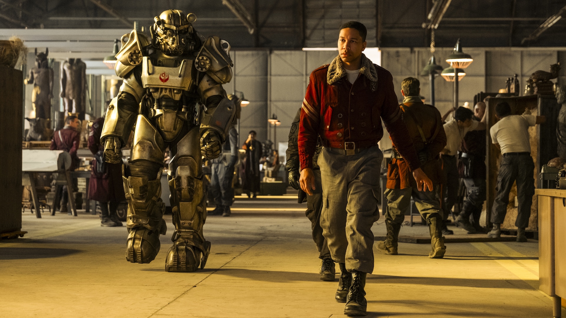
This article contains spoilers for FALLOUT season 2 episode 2. Though Fallout is set in the distant future, it’s not fully accurate to call it “science fiction.” Like Bethesda’s iconic video game franchise upon which it’s based, the Prime Video series adopts a retro-futuristic aesthetic. As nuclear weaponry proliferates, all other technology stagnates, with personal computers essentially […]
The end is never the end in the Marvel Cinematic Universe. Post-credits sequences have become supremely important to the MCU, convincing the masses to sit through several minutes listing the names of underpaid and overworked VFX artists to get just a little more time with our favorite heroes.
Beloved as they are, not every post-credits scene is equally compelling or entertaining. Sometimes, they’re outright annoying. So let’s go ahead and sort them out.
Of course, there are a lot of post-credits scenes in the MCU. So, to keep this list from being too unwieldy, we’re putting in some limitations. This list won’t include post-credits scenes that are just pulled from later movies, such as Nick Fury giving Steve Rogers a new mission, which first played in Captain America: The First Avenger but was part of The Avengers. The list also won’t include anything from the One-Shots, Special Presentations, or TV series, as most of those set up something resolved in a later episode or, as in the case of Bruno telling Kamala that she’s a mutant in Ms. Marvel, get ignored altogether.
Even with those qualifications, we still have a lot of scenes to discuss, so no more waiting! Here are the MCU post-credits scenes ranked!
54. Still Not Ready (Eternals)
The second post-credits scene from Eternals was bad when it first played, and has now become embarrassing. It makes perfect sense to add a scene in which Dane Whitman (Kit Harington) takes the Ebony Blade, getting one step closer to becoming the Avenger Black Knight. But the decision to have him stopped by the voice of Blade (Mahershala Ali), completely off-screen and completely unidentified, is baffling. The fact that this is still, and may likely always be, the only bit of Ali’s Blade that the MCU ever gets makes the scene ten times worse.
53. Ant Rocks (Ant-Man and the Wasp)
By the time Ant-Man and the Wasp rolled around late in Phase Three, everyone had come to expect post-credits scenes. But the last bit in Ant-Man and the Wasp feels perfunctory, just a couple seconds of giant-sized Antony playing the drums. More than any of the others, the movie’s post-credits feel like an insult to the audience, even more so than the scene that actually teases the viewers for waiting around through the credits.
52. Tony Stark Walks Into a Bar (The Incredible Hulk)
Up until recently, The Incredible Hulk was the black sheep of the MCU, and not just because it featured Edward Norton’s one turn as Bruce Banner. The movie began life as a pseudo-sequel to And Lee’s Hulk, not as the second entry in a shared universe. Ironically, the one scene that ties Incredible Hulk to the MCU most underscores that difference, a clearly tacked-on moment in which Tony Stark (Robert Downey Jr.) meets with Thunderbolt Ross (William Hurt) to say something vaguely Avenger-y.
51. Leading Nowhere (Captain America: Brave New World)
Den of Geek gave Captain America: Brave New Worlda relatively positive review, but even we can’t justify the way the film squanders Tim Blake Nelson’s return as Samuel Sterns. They don’t even bother calling him the Leader, and obvious reshoots make him feel disconnected from the rest of the movie. Those problems only compound in the final scene, in which Sterns warns Cap (Anthony Mackie) about other heroes from across the Multiverse, which leads into Avengers: Doomsday and Secret Wars, but isn’t exactly new information.
50. A Happy Embrace (Thor: The Dark World)
There’s nothing inherently wrong with the last post-credits scene in Thor: The Dark World. We like Thor (Chris Hemsworth) and Jane Foster (Natalie Portman), we like seeing them hug, and the bit with the rampaging frost monster is humorous. But all of that should have been in the actual movie. Saving it for the post-credits adds nothing.
49. A Gathering of Losers (Ant-Man and the Wasp: Quantumania)
Behold, the most cursed post-credits sequence in Marvel history! When Immortus, Rama-Tut, and the Centurion gather their fellow Variants in the Council of Cross-Time Kangs, it was supposed to set up the next major arc across Phases Five and Six. Instead, the off-screen actions of Kang actor Jonathan Majors forced Marvel to scuttle the idea, making the scene feel like a clip from another franchise in another reality.
48. Not Nick Fury (Spider-Man: Far From Home)
After Spider-Man: Far From Home, we learn that Nick Fury and Maria Hill are not in fact the human leaders of SHIELD, but rather the Skrulls Talos (Ben Mendelsohn) and Soren (Sharon Blynn), filling in for their friends off-planet. The reveal is kind of cute, until you realize that it absolutely doesn’t jibe with what we have just been watching—even Samuel L. Jackson and Cobie Smulders had no idea, and so they played Fury and Hill straight. Worse, the scene leads directly into Secret Invasion, and nobody wants Secret Invasion.
47. Bucky Belongs in a Museum (Captain America: The Winter Soldier)
Look, Bucky Barnes (Sebastian Stan) has established himself as one of the bedrocks of the MCU. And that turn began in Winter Soldier, in which he changed from Steve’s (Chris Evans) old war buddy to a conflicted hero doing his best. But the bit of him visiting the Captain America museum to learn about himself adds no pathos or plot, and feels just like a scene cut from the main part of the movie and just shoved into the end.
46. Harry Styles, What a Pip (Eternals)
Eternals has the sad distinction of being the movie with not one, but two post-credits scenes teasing things that have never come to pass. Getting Harry Styles to play Starfox, an Avenger with questionable emotion-manipulating powers, made teens in the audience squeal—as did getting Patton Oswalt to voice Pip the Troll, just for cynical Gen Xers. But whatever excitement they generated has long since dissipated.
45. Too Many Sorcerers (Doctor Strange)
Doctor Strange gives us another end credit that sets up an immediately ignored plot point. The scene finds Baron Mordo (Chiwetel Ejiofor) continuing the heel turn hinted by the film’s climax by stripping away the magic from a paraplegic man played by Benjamin Bratt. Had Mordo actually become the villain he is in the comics, then this scene would be fine, perhaps even good. But when Ejiofor returns for Mutliverse of Madness, he’s playing a good Mordo from another reality, so what was the point?
44. It’s Wasp’s Damn Time (Ant-Man)
Film critic Tasha Robinson may have coined the term Trinity Syndrome in 2014, but the best example came a few years later in Ant-Man. Trinity Syndrome refers to a female character who already has all the skills to be a hero, but must train a doofy male instead… which is exactly what Hope Van Dyne (Evangeline Lily) does for Scott Lang (Paul Rudd). The fact Hank Pym (Michael Douglas) teases her becoming Wasp at the end only makes things worse, a sting somewhat lessened by the fact that she’s a co-headliner from there on out.
43. The Spider-Signal Activates (Captain America: Civil War)
Tom Holland makes for a delightful Spider-Man, and we only get a bit of him in Civil War, so more is good right? Well, mostly. It is nice to see Peter activate the Spider-Signal, a weird gadget from the comics that hasn’t shown up in any film adaptation. But at the same time, the scene only underscores how much Tony Stark becomes Peter’s rich benefactor, totally supplanting ol’ blue collar Uncle Ben.
42. Asgard Gone for Good (Thor: Ragnarok)
The first of Thor: Ragnarok‘s two post-credits scenes is a joke, and not a great one. After watching their home get destroyed, Thor and Loki (Tom Hiddleston) stand on the bridge of their ship, talk about how Asgard is a place and not a people, and say everything is going to be okay. And then Thanos’ massive ship arrives. Look, most of the jokes in Ragnarok land, so we can’t get too mad at a misfire. But it is a misfire that undercuts whatever thematic elements Ragnarok may have had going for it, especially when we see what Thanos has wrought in Infinity War.
41. Goose Coughs Up Continuity (Captain Marvel)
By the time we get to the post-credits scene in Captain Marvel, we already know the joke about Nick Fury’s scars. He didn’t get them by doing something cool. He got them when Goose the catflerkin scratched him. But even if that reveal annoyed you, you can’t get too mad at the bit in which Goose coughs up the Tessaract like a hairball. Did we need the continuity patch that the scene provided, tracking the Tesseract from the First Avenger to The Avengers? No. Was it irritating? Not if you’re a cat person.
40. Jane Foster’s Just Reward (Thor: Love and Thunder)
In a better movie, Jane Foster meeting Heimdall (Idris Elba) in the afterlife and being welcomed to the land of the gods would be sweet and cathartic. Jane’s return as the Mighty Thor carried weight, and it would allow us to see her one last time without undercutting her sacrifice. But because it occurs in Love and Thunder, the scene feels like an Old Spice commercial, from the shoddy special effects to Portman’s awkward and “cute” take on Jane going to Valhalla.
39. Bucky’s Back (Black Panther)
When Shuri (Letitia Wright) comes to roust Bucky back into action, she’s setting up Infinity War, in which the Winter Soldier will reunite with the heroes who had a huge fight with him in Civil War. That’s exciting, but the execution of the scene fails to live up to its potential. Instead, the scene feels more like a reminder to audiences that Cap left his pal in Wakanda, before Bucky (literally) rearms to fight Thanos.
38. Selvig Comes to SHIELD (Thor)
Now we’re firmly in the part of the list that consists of just fine teases for future projects. Is there anything bad about seeing Dr. Erik Selvig (Stellan Skarsgård) already mind-controlled by Loki and inside SHIELD headquarters? No. Is there anything compelling about it? Not really. It’s just a tease for what’s coming next, nothing more or less.
37. It’s Just Jeff Goldblum (Thor: Ragnarok)
Thor: Ragnarok gives us just one more taste of Jeff Goldblum doing his thing. Even though you can hardly turn on your TV without seeing Goldbum doing his thing on commercials for Wicked and apartments, it’s still funny, so we can’t get too upset about one more minute of Goldblum as the Grandmaster faces Sakaar’s rabble after his deposal.
36. He’s Here, He’s There… (Thor: Love and Thunder)
For a C-list hero, the Mighty Hercules has a surprising amount of great stories and he absolutely belongs in the MCU. And even though most of us only know Brett Goldstein from Ted Lasso, his hairy chest certainly means that he looks the part. But there’s been absolutely no word of Goldstein or Hercules appearing again in the MCU, making this post-credits scene feel more like a lark than a sign of things to come.
Black Panther: Wakanda Forever begins as a celebration of late star Chadwick Boseman and the world that Ryan Coogler and co-writer Joe Robert Cole created. And then it gets overtaken by Valentina Allegra de la Fontaine (Julia Louis-Dreyfus), Everett K. Ross (Martin Freeman), and Riri Williams (Dominique Thorne), all setting up future Marvel stuff. However, the post-credits sequence briefly establishes that former tone by introducing Toussaint (Divine Love Konadu-Sun), the son of T’Challa and Nakia (Lupita Nyong’o).
34. Here Comes Clea (Doctor Strange in the Multiverse of Madness)
As with Love and Thunder, the post-credits scene from Doctor Strange and the Multiverse of Madness brings a long-established character into the MCU, where they’re promptly ignored. In this case, it’s Charlize Theron as Strange’s main squeeze, and sometime Sorcerer Supreme, Clea. The only reason that Clea edges out Hercules is that she talks about Incursions, events that will actually be part of the upcoming Avengers movies Doomsday and Secret Wars.
33. The Coming of the Beast (The Marvels)
If Marvel just let the post-credits scene of The Marvels play out, then it would have been a fun surprise. Monica Rambeau (Teyonah Parris) wakes up in an alternate reality, where she’s greeted by a Variant of her mother Maria (Lashana Lynch) as Binary and Beast of the X-Men (Kelsey Grammer). But because Marvel really hyped up the scene as the dawn of a new era in the MCU, specifically the coming of the X-Men, the scene gained way too much weight and cannot help but disappoint.
32. The Fantastic Four Power Hour (The Fantastic Four: First Steps)
The opening of a cheap ’60s cartoon about a Fantastic Four cartoon is fun and harmless, and it is. But one cannot help but wonder why in the world it comes at the end, instead of part of the world-building in the first 30 minutes. It’s a fun extra, but totally unnecessary.
31. Quill’s Breakfast (Guardians of the Galaxy Vol. 3)
The cynical among us might say that the second post-credits scene in Guardians of the Galaxy Vol. 3 rips off a much better and much more famous scene. And they aren’t completely wrong, as it only consists of Quill eating breakfast at his grandfather’s house and talking about lawn mowing. But you know what? Guardians 3 was an intense watch, so we’ll gladly take a bit of downtime with our favorite legendary outlaw.
30. White Guy Deposit (Captain America: Civil War)
The scene in which Steve takes his pal Bucky to Wakanda is one of the rare (non-Thanos-related) teases for the future that actually pays off. Directed by Ryan Coogler instead of Civil War helmers the Russo Brothers, the scene gives us our first taste of Wakanda proper, whetting our appetite for the world we’ll fully meet in Black Panther. Plus, it cements the relationship between Steve and T’Challa, something that pays off in Infinity War.
29. Arrow Practice (Guardians of the Galaxy Vol. 2)
Guardians of the Galaxy Vol. 2has five post-credits scenes and all of them are fine. They play like gangbusters when watched after the film, as fans just want to keep the good times going. To that end, the bit with Kraglin (Sean Gunn) accidentally sticking Drax (Dave Bautista) while using the arrow he inherited from Yondu (Michael Rooker) is just good harmless fun. It doesn’t overstay its welcome and it pays off with a goofy gag.
28. Adding to the Collection (Thor: The Dark World)
On the surface, the scene in which Volstagg (Ray Stevenson) and Lady Sif (Jaimie Alexander) bring the Aether to the Collector (Benicio Del Toro) works just as a taste for the next movie, Guardians of the Galaxy. To that end, it’s great, showing the viewers that the MCU is about to get much weirder. But the scene also is the first time someone says the words “Infinity Stones” (not, crucially, Infinity Gems, as they were called in Marvel Comics), thus tying the scene into the franchise’s first grand narrative.
27. The Sinister Two (Spider-Man: Homecoming)
Given that the next time we see Michael Keaton’s Vulture after this scene, he’s trying to recruit Jared Leto in Morbius, the post-credits scene of Spider-Man: Homecoming probably deserves to be a lot lower. That’s especially true since we’ve still never seen Michael Mando as the actual Scorpion. Still, we love Keaton and we love Mando, so we can’t completely hate this (still somewhat squandered) moment.
26. Ten Rings Reformed (Shang-Chi and the Legend of the Ten Rings)
One of the better post-Endgame Marvel movies, Shang-Chi and the Legend of the Ten Rings has a lot of heavy lifting to do. Not only does it need to introduce new hero Shang-Chi (Simu Liu), but it must also reestablish the Mandarin, leader of the terrorist group the Ten Rings from Iron Man, in the form of Xu Wenwu (Tony Leung). Obviously, there’s still work to be done, as we learn in the post-credits scene that sees Wenwu’s other child Xialing (Meng’er Zhang) ascend the throne as the new leader of the Ten Rings. We haven’t seen what she’ll do in that role yet, but that hasn’t become disappointment… yet.
25. Groot Goes Bad (Guardians of the Galaxy Vol. 2)
Really, the confrontation between Peter Quill (Chris Pratt) and adolescent Groot at the end of Guardians 2 is just another example of the tree-like alien doing something silly. However, this one gets a little more weight for the way it ties into the themes of the movie that proceeded it, as Quill—forced to walk a bit in his adoptive father Yondu’s shoes—has to be the scolding adult.
24. When Howard Met Cosmo (Guardians of the Galaxy)
Howard the Duck belongs in the MCU, but only a little. Before Blade in 1997, Howard was the one Marvel character to actually get his own movie, and an awful one at that. So it’s only fitting that Howard (voiced by Seth Green) get a little screentime at the end of Guardians, in the ruins of the Collector’s home. Even better, the scene lets him interact with fan-favorite Cosmo, long before Maria Bakalova started voicing the Russian space dog.
23. Wong Rocks Out (Shang-Chi and the Legend of the Ten Rings)
Half of the other Shang-Chi post-credits scene is irritating, as it teases a team-up we may never get. Via holographic Zoom, Captain Marvel (Brie Larson) and a no-longer green Bruce Banner (Mark Ruffalo) promise to investigate Shang-Chi’s bands and seem to hint that he’ll be joining the Avengers. But nothing can take away from the pleasure of watching Shang-Chi and Katy (Awkwafina) sing karaoke with Wong (Benedict Wong). Team-ups are temporary, but Wong is eternal.
22. The Creation of Adam (Guardians of the Galaxy Vol. 2)
Ever since viewers noticed a cocoon in the Collector’s museum, fans have awaited the coming of Adam Warlock. Turns out, they’d have to wait a bit longer, as Guardians director James Gunn decided to do away with that cocoon and give us another one, this time in one of the post-credits of the second movie. Sitting in her golden palace, a defeated Ayesha (Elizabeth Debicki) looks at her own cocoon and pronounces her creation, “Adam.”
21. Dr. Banner Psych Out (Iron Man 3)
As the bottom of this list demonstrates, some of the worst post-credits scenes are the simple gags, jokes that aren’t funny enough to justify making audiences sit through the credits. Some may lump the post-credits scene of Iron Man 3 (certainly a divisive film) in with those, as it simply reveals that the voiceover throughout the movie comes from Tony Stark treating Bruce Banner as his unwilling psychiatrist. But as the joke provides genuine catharsis for the high stakes of the movie that precedes it, we kinda like the Iron Man 3 post-credits scene.
20. Thunderbolts, Assemble (Black Widow)
In one of the few examples of a TV post-credits scene actually mattering, The Falcon and the Winter Soldier actually introduced CIA head Val before she showed up on the big screen. And when she appears in Black Widow, visiting Yelena Balova (Florence Pugh) at Natasha Romanoff’s grave, she’s there to set up a plot beat in Hawkeye. But even more than her conversation with John Walker (Wyatt Russell) in Winter Soldier, Val’s Black Widow appearance shows that she’s got something devious up her sleeve, which eventually come to fruition with the Thunderbolts.
19. Spilled Venom (Spider-Man: No Way Home)
The Venom-focused post-credits scene from Spider-Man: No Way Home probably doesn’t belong on this list, as it’s a scene that gets used (in some form) in Venom: The Last Dance, nor does it belong this high, as it teases something that probably won’t happen when a bit of the Symbiote gets left on a Mexican bar. But we can’t help but love watching Eddie Brock (Tom Hardy), transported to the MCU by the magical nonsense in the main movie, try to make sense of this new world he’s (briefly) in.
18. The New Guardians (Guardians of the Galaxy Vol. 3)
By the time Guardians of the Galaxy Vol. 3hit theaters, fans knew that James Gunn was leaving Marvel to be co-Head of DC Studios, leaving many to assume that most of the Guardians would die in his final outing. Instead, Gunn not only kept most of the team alive, but he also introduced a new team called the Annihilators of the Galaxy, which adds Adam Strange (Will Poulter) and Phyla-Vell (Kai Zen) alongside Kraglin, Rocket, Cosmo, and Groot. We haven’t seen much of this new incarnation yet, but it’s good to know they’re still out there.
17. Watchers, Not Listeners (Guardians of the Galaxy Vol. 2)
Stan Lee cameos are just as much a part of the MCU as post-credits scenes, so it’s surprising that the two elements came together only once. In one of Guardians 2‘s post-credits scenes, we see that the astronaut played by Lee has finally bored members of an ancient race known as the Watchers, who quietly shuffle off. It’s a good joke that doesn’t take too long and leaves room for Jeffrey Wright’s more conventional take on the Watcher in the animated show What If….
16. Wade Knows He’s in a Movie (Deadpool & Wolverine)
People come to Deadpool movies to hear the Merc’ With a Mouth make jokes about superhero movie tropes. But it’s a very welcome relief to find that he doesn’t spend the post-credits scene of Deadpool & Wolverine commenting upon post-credit scenes. Instead, Wade breaks into the TVA to assuage (some) of his guilt for getting Johnny Storm (Chris Evans, of course) killed by editing footage from earlier in the film, now showing the Human Torch unleash a string of vile insults about Cassandra Nova, thus justifying the hero’s horrible death.
15. Meet the Maximoffs (Captain America: The Winter Soldier)
The three characters introduced during the end credits scene of Captain America: The Winter Soldier have changed a lot from that first meeting. Baron Strucker, a great villain wasted by the movies, dies off-screen at Ultron’s hand. Pietro Maximoff (Aaron Taylor-Johnson) is annoying for a while and then dies in that same movie. But Wanda Maximoff (Elizabeth Olsen) goes on to become one of the franchise’s best characters, a story that starts with this weird scene.
14. Breakfast of Champions (Thunderbolts*)
Who can hate Alexei Shostakov, the lovable Russian supersoldier played by David Harbour? Sure, he may be an enemy of America as the Red Guardian, and he may let his desire for fame and acceptance lead him into entanglements with Val. But he has a good heart, even when he looks stupid, which is exactly what happens at his highest moment. Alexei may have made it onto a Wheaties box in Thunderbolts*, but he’s still big nobody.
13. Ant-Man Lost (Ant-Man and the Wasp)
It’s hard to replicate the power of Infinity War‘s ending. The good guys lose to Thanos, and we have to watch as Spider-Man, Black Panther, and other beloved heroes waste away to nothing. Somehow, Ant-Man and the Wasp admirably repeats that moment in its (good) post-credits scene, showing Scott get stranded in the Quantum Zone after Hope, Hank, and Janet (Michelle Pfeiffer) get turned to dust in the Blip. Even better, the scene sets up an incredibly emotional beat for Scott in Endgame.
12. Pizza Poppa Pops Off (Doctor Strange in the Multiverse of Madness)
With the exception of James Gunn, Sam Raimi is the greatest director of superhero movies. And there’s nothing Sam Raimi loves more than making his childhood pal Bruce Campbell look stupid. He, of course, gets to do that in the main part of Multiverse of Madness, when Strange (Benedict Cumberbatch) curses Campbell’s Pizza Poppa to punch himself in the face. But it’s even better when we revisit the Pizza Poppa in the post-credits scene, to see his suffering end long enough for Campbell to do a take to the camera.
11. The Original Guardians Unite (Guardians of the Galaxy Vol. 2)
James Gunn is a comic book nerd, and comic book nerds that Star-Lord actually leads the second incarnation of the Guardians. The first incarnation is a group of alien freedom fighters in the 30th century, who carried their own book for a while in the 1990s. That team shows up during Yondu’s funeral in Guardians 2, but they really come together in a post-credit scene. That’s where Stakar Ogord (Sylvester Stallone), Charlie-27 (Ving Rhames), Martinex (Michael Rosenbaum), Aleta Ogord (Michelle Yeoh), Krugarr, and Mainframe (voiced by Miley Cyrus) band together once again.
10. Carol Calls Upon the Avengers (Captain Marvel)
As a movie, Captain Marvel belongs firmly toward the bottom half of rankings, hampered by its 1990s setting and a confusing flashback-heavy structure. But when the post-credit sscene gives us a fully-powered Carol Danvers meeting up with the Avengers in a post-Infinity War present, it doesn’t disappoint. While the rag-tag Avengers try to figure out what to do in the wake of the Blip, Captain Marvel flies in and demands answers. She may initially rub her soon-to-be teammates the wrong way, but Carol immediately establishes that she has incredible power, something the Avengers will need to fight Thanos.
9. T’Challa Shows Them Who He Is (Black Panther)
Most of the entries on this list are either jokes or plot points. Black Panther features one of the few post-credits scenes built around the movie’s theme. The film has followed the newly-installed king T’Challa as he moves Wakanda from isolationism to embracing its responsibility to the world. So when T’Challa, joined by Nakia and Okoye (Danai Gurira), is challenged by a UN delegate about what his country can offer the world, we know that his response will be the fruit of his character development.
8. Paging Captain Marvel (Avengers: Infinity War)
While her first solo movie may have fumbled her introduction in the 1990s, Captain Marvel had one of the best overall introductions in the entire franchise. At the end of Infinity War, after the heroes have lost, just as he fades to dust, Nick Fury produces a pager and contacts Captain Marvel. Most MCU fans have no idea who Captain Marvel is or what she can do. But when her logo shows up on the pager, one thing is certain: help, very powerful help, is on the way.
7. Mad Titans Doin’ It For Themselves (Avengers: Age of Ultron)
Revisionists complaining about Marvel’s last few phases seem to think that Thanos had a much bigger presence in the movies before Infinity War. The truth is, he really didn’t appear outside of the first Guardians film, and even then in just one scene. Yet, the moment in which Thanos, finally voiced by Josh Brolin, grabs the Infinity Gauntlet and declares that he’ll find the Stones himself feels so notable that we believe he’s been there all along, a constant—if unseen—presence.
6. J. J.J. is Back (Spider-Man: Far From Home)
One of the MCU’s greatest strengths is its casting, finding pitch-perfect actors to portray Tony Stark, Steve Rogers, and other comic book faves. But even Kevin Feige’s people couldn’t outdo Sam Raimi’s casting team from the first Spider-Man films. So when J.K. Simmons reprised his role as J. Jonah Jameson for Spider-Man: Far From Home, we all let out a cheer—a cheer so loud that we almost missed that he was revealing Spidey’s secret identity to everyone.
5. Groot Grooves (Guardians of the Galaxy)
Groot first appeared in comics as an alien invader from Planet X, one of the many sci-fi monsters that Stan Lee, his brother Larry Lieber, and Jack Kirby came up with before the Marvel Age of Comics. But it was the Guardians of the Galaxy movies that made Groot into an A-list character, specifically the post-credits scene from the first film. Watch Groot, now as a sprout after his sacrifice, dance to “I Want You Back” forever won over everyone… well, everyone except for Drax.
4. So, You Want to Watch a Post-Credits Scene (Spider-Man: Homecoming)
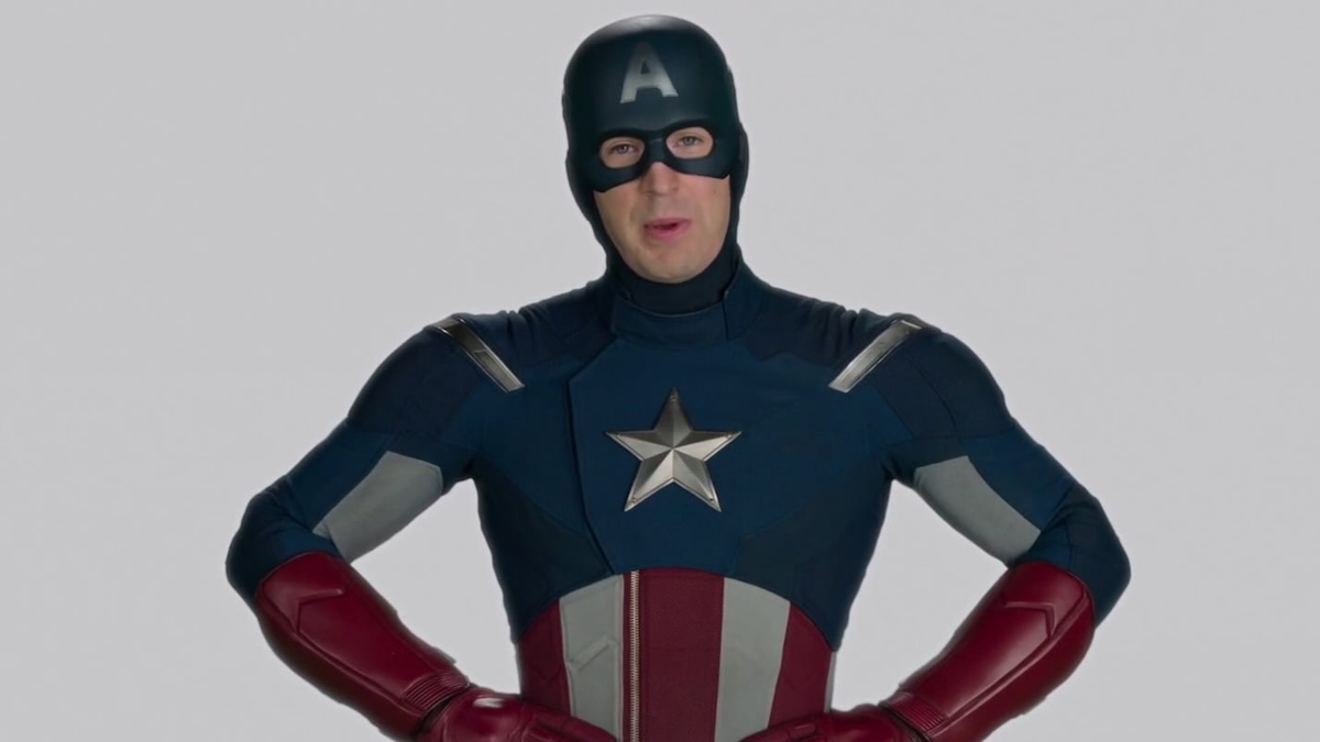
Throughout this list, we’ve bemoaned the post-credits scenes that seem to insult the viewer for sitting through the credits. But Captain America is so wholesome that he can make an insult feel like a compliment, which is what happens in his post-credits scene from Spider-Man: Homecoming. An extension of the video that Peter watches while in detention, the scene finds Cap extolling the virtues of patience, even if that patience doesn’t pay off with anything more than a jokey post-credits scene.
3. The Avengers Initiative (Iron Man)
The first MCU post-credits scene is still one of the most important. For most of its running time, Iron Man is just a better done version of any superhero movie we’ve seen up to that point, laying out the origin of the hero. But when Samuel L. Jackson appears on screen, looking exactly like the Nick Fury from Marvel’s Ultimate Universe (whom artist Bryan Hitch did base on Jackson), and name drops the Avengers, we realize we’re seeing something more than just a superhero movie. We’re seeing the birth of a cinematic universe.
2. Courting Death (The Avengers)
As stated earlier, people remember Thanos being a much more consistent presence in the first three phases than he actually was. Part of the reason he feels so omnipresent is, of course, the “I’ll do it myself” scene and especially his first appearance at the end of The Avengers, when he’s revealed to be the big bad behind the attack on New York. The simple image of Thanos smiling to the camera, the in-joke pun about courting death (in the comics, Thanos is in love with the physical embodiment of Death); all of it works like a victory lap for the already triumphant film that somehow brought together several solo heroes.
1. Schwarma Dinner (The Avengers)
Some may say that MCU movies are sci-fi films, others call them action films, and still others see them as fantasies of a sort. While the franchise has all of those elements, Marvel movies are first and foremost light comedies about likable characters hanging out together. For that reason, the finale scene in The Avengers is not just the best post-credits scene, but it’s also the most important moment in the MCU. In that moment, we realize that even more than watching heroes fight supervillains, we like watching these particular characters hang out together, even if it’s just to eat schwarma.
In some ways, Debbie Isitt’s 2009 musical-comedy Nativity! is an unlikely Christmas classic. Its partially improvised dialogue and use of local, untrained child actors could have turned it into an unwatchable nightmare. Instead, these factors helped to create one of the most rewatchable Christmas movies of all time. Since its release, Nativity! has become a […]
The end is never the end in the Marvel Cinematic Universe. Post-credits sequences have become supremely important to the MCU, convincing the masses to sit through several minutes listing the names of underpaid and overworked VFX artists to get just a little more time with our favorite heroes.
Beloved as they are, not every post-credits scene is equally compelling or entertaining. Sometimes, they’re outright annoying. So let’s go ahead and sort them out.
Of course, there are a lot of post-credits scenes in the MCU. So, to keep this list from being too unwieldy, we’re putting in some limitations. This list won’t include post-credits scenes that are just pulled from later movies, such as Nick Fury giving Steve Rogers a new mission, which first played in Captain America: The First Avenger but was part of The Avengers. The list also won’t include anything from the One-Shots, Special Presentations, or TV series, as most of those set up something resolved in a later episode or, as in the case of Bruno telling Kamala that she’s a mutant in Ms. Marvel, get ignored altogether.
Even with those qualifications, we still have a lot of scenes to discuss, so no more waiting! Here are the MCU post-credits scenes ranked!
54. Still Not Ready (Eternals)
The second post-credits scene from Eternals was bad when it first played, and has now become embarrassing. It makes perfect sense to add a scene in which Dane Whitman (Kit Harington) takes the Ebony Blade, getting one step closer to becoming the Avenger Black Knight. But the decision to have him stopped by the voice of Blade (Mahershala Ali), completely off-screen and completely unidentified, is baffling. The fact that this is still, and may likely always be, the only bit of Ali’s Blade that the MCU ever gets makes the scene ten times worse.
53. Ant Rocks (Ant-Man and the Wasp)
By the time Ant-Man and the Wasp rolled around late in Phase Three, everyone had come to expect post-credits scenes. But the last bit in Ant-Man and the Wasp feels perfunctory, just a couple seconds of giant-sized Antony playing the drums. More than any of the others, the movie’s post-credits feel like an insult to the audience, even more so than the scene that actually teases the viewers for waiting around through the credits.
52. Tony Stark Walks Into a Bar (The Incredible Hulk)
Up until recently, The Incredible Hulk was the black sheep of the MCU, and not just because it featured Edward Norton’s one turn as Bruce Banner. The movie began life as a pseudo-sequel to And Lee’s Hulk, not as the second entry in a shared universe. Ironically, the one scene that ties Incredible Hulk to the MCU most underscores that difference, a clearly tacked-on moment in which Tony Stark (Robert Downey Jr.) meets with Thunderbolt Ross (William Hurt) to say something vaguely Avenger-y.
51. Leading Nowhere (Captain America: Brave New World)
Den of Geek gave Captain America: Brave New Worlda relatively positive review, but even we can’t justify the way the film squanders Tim Blake Nelson’s return as Samuel Sterns. They don’t even bother calling him the Leader, and obvious reshoots make him feel disconnected from the rest of the movie. Those problems only compound in the final scene, in which Sterns warns Cap (Anthony Mackie) about other heroes from across the Multiverse, which leads into Avengers: Doomsday and Secret Wars, but isn’t exactly new information.
50. A Happy Embrace (Thor: The Dark World)
There’s nothing inherently wrong with the last post-credits scene in Thor: The Dark World. We like Thor (Chris Hemsworth) and Jane Foster (Natalie Portman), we like seeing them hug, and the bit with the rampaging frost monster is humorous. But all of that should have been in the actual movie. Saving it for the post-credits adds nothing.
49. A Gathering of Losers (Ant-Man and the Wasp: Quantumania)
Behold, the most cursed post-credits sequence in Marvel history! When Immortus, Rama-Tut, and the Centurion gather their fellow Variants in the Council of Cross-Time Kangs, it was supposed to set up the next major arc across Phases Five and Six. Instead, the off-screen actions of Kang actor Jonathan Majors forced Marvel to scuttle the idea, making the scene feel like a clip from another franchise in another reality.
48. Not Nick Fury (Spider-Man: Far From Home)
After Spider-Man: Far From Home, we learn that Nick Fury and Maria Hill are not in fact the human leaders of SHIELD, but rather the Skrulls Talos (Ben Mendelsohn) and Soren (Sharon Blynn), filling in for their friends off-planet. The reveal is kind of cute, until you realize that it absolutely doesn’t jibe with what we have just been watching—even Samuel L. Jackson and Cobie Smulders had no idea, and so they played Fury and Hill straight. Worse, the scene leads directly into Secret Invasion, and nobody wants Secret Invasion.
47. Bucky Belongs in a Museum (Captain America: The Winter Soldier)
Look, Bucky Barnes (Sebastian Stan) has established himself as one of the bedrocks of the MCU. And that turn began in Winter Soldier, in which he changed from Steve’s (Chris Evans) old war buddy to a conflicted hero doing his best. But the bit of him visiting the Captain America museum to learn about himself adds no pathos or plot, and feels just like a scene cut from the main part of the movie and just shoved into the end.
46. Harry Styles, What a Pip (Eternals)
Eternals has the sad distinction of being the movie with not one, but two post-credits scenes teasing things that have never come to pass. Getting Harry Styles to play Starfox, an Avenger with questionable emotion-manipulating powers, made teens in the audience squeal—as did getting Patton Oswalt to voice Pip the Troll, just for cynical Gen Xers. But whatever excitement they generated has long since dissipated.
45. Too Many Sorcerers (Doctor Strange)
Doctor Strange gives us another end credit that sets up an immediately ignored plot point. The scene finds Baron Mordo (Chiwetel Ejiofor) continuing the heel turn hinted by the film’s climax by stripping away the magic from a paraplegic man played by Benjamin Bratt. Had Mordo actually become the villain he is in the comics, then this scene would be fine, perhaps even good. But when Ejiofor returns for Mutliverse of Madness, he’s playing a good Mordo from another reality, so what was the point?
44. It’s Wasp’s Damn Time (Ant-Man)
Film critic Tasha Robinson may have coined the term Trinity Syndrome in 2014, but the best example came a few years later in Ant-Man. Trinity Syndrome refers to a female character who already has all the skills to be a hero, but must train a doofy male instead… which is exactly what Hope Van Dyne (Evangeline Lily) does for Scott Lang (Paul Rudd). The fact Hank Pym (Michael Douglas) teases her becoming Wasp at the end only makes things worse, a sting somewhat lessened by the fact that she’s a co-headliner from there on out.
43. The Spider-Signal Activates (Captain America: Civil War)
Tom Holland makes for a delightful Spider-Man, and we only get a bit of him in Civil War, so more is good right? Well, mostly. It is nice to see Peter activate the Spider-Signal, a weird gadget from the comics that hasn’t shown up in any film adaptation. But at the same time, the scene only underscores how much Tony Stark becomes Peter’s rich benefactor, totally supplanting ol’ blue collar Uncle Ben.
42. Asgard Gone for Good (Thor: Ragnarok)
The first of Thor: Ragnarok‘s two post-credits scenes is a joke, and not a great one. After watching their home get destroyed, Thor and Loki (Tom Hiddleston) stand on the bridge of their ship, talk about how Asgard is a place and not a people, and say everything is going to be okay. And then Thanos’ massive ship arrives. Look, most of the jokes in Ragnarok land, so we can’t get too mad at a misfire. But it is a misfire that undercuts whatever thematic elements Ragnarok may have had going for it, especially when we see what Thanos has wrought in Infinity War.
41. Goose Coughs Up Continuity (Captain Marvel)
By the time we get to the post-credits scene in Captain Marvel, we already know the joke about Nick Fury’s scars. He didn’t get them by doing something cool. He got them when Goose the catflerkin scratched him. But even if that reveal annoyed you, you can’t get too mad at the bit in which Goose coughs up the Tessaract like a hairball. Did we need the continuity patch that the scene provided, tracking the Tesseract from the First Avenger to The Avengers? No. Was it irritating? Not if you’re a cat person.
40. Jane Foster’s Just Reward (Thor: Love and Thunder)
In a better movie, Jane Foster meeting Heimdall (Idris Elba) in the afterlife and being welcomed to the land of the gods would be sweet and cathartic. Jane’s return as the Mighty Thor carried weight, and it would allow us to see her one last time without undercutting her sacrifice. But because it occurs in Love and Thunder, the scene feels like an Old Spice commercial, from the shoddy special effects to Portman’s awkward and “cute” take on Jane going to Valhalla.
39. Bucky’s Back (Black Panther)
When Shuri (Letitia Wright) comes to roust Bucky back into action, she’s setting up Infinity War, in which the Winter Soldier will reunite with the heroes who had a huge fight with him in Civil War. That’s exciting, but the execution of the scene fails to live up to its potential. Instead, the scene feels more like a reminder to audiences that Cap left his pal in Wakanda, before Bucky (literally) rearms to fight Thanos.
38. Selvig Comes to SHIELD (Thor)
Now we’re firmly in the part of the list that consists of just fine teases for future projects. Is there anything bad about seeing Dr. Erik Selvig (Stellan Skarsgård) already mind-controlled by Loki and inside SHIELD headquarters? No. Is there anything compelling about it? Not really. It’s just a tease for what’s coming next, nothing more or less.
37. It’s Just Jeff Goldblum (Thor: Ragnarok)
Thor: Ragnarok gives us just one more taste of Jeff Goldblum doing his thing. Even though you can hardly turn on your TV without seeing Goldbum doing his thing on commercials for Wicked and apartments, it’s still funny, so we can’t get too upset about one more minute of Goldblum as the Grandmaster faces Sakaar’s rabble after his deposal.
36. He’s Here, He’s There… (Thor: Love and Thunder)
For a C-list hero, the Mighty Hercules has a surprising amount of great stories and he absolutely belongs in the MCU. And even though most of us only know Brett Goldstein from Ted Lasso, his hairy chest certainly means that he looks the part. But there’s been absolutely no word of Goldstein or Hercules appearing again in the MCU, making this post-credits scene feel more like a lark than a sign of things to come.
Black Panther: Wakanda Forever begins as a celebration of late star Chadwick Boseman and the world that Ryan Coogler and co-writer Joe Robert Cole created. And then it gets overtaken by Valentina Allegra de la Fontaine (Julia Louis-Dreyfus), Everett K. Ross (Martin Freeman), and Riri Williams (Dominique Thorne), all setting up future Marvel stuff. However, the post-credits sequence briefly establishes that former tone by introducing Toussaint (Divine Love Konadu-Sun), the son of T’Challa and Nakia (Lupita Nyong’o).
34. Here Comes Clea (Doctor Strange in the Multiverse of Madness)
As with Love and Thunder, the post-credits scene from Doctor Strange and the Multiverse of Madness brings a long-established character into the MCU, where they’re promptly ignored. In this case, it’s Charlize Theron as Strange’s main squeeze, and sometime Sorcerer Supreme, Clea. The only reason that Clea edges out Hercules is that she talks about Incursions, events that will actually be part of the upcoming Avengers movies Doomsday and Secret Wars.
33. The Coming of the Beast (The Marvels)
If Marvel just let the post-credits scene of The Marvels play out, then it would have been a fun surprise. Monica Rambeau (Teyonah Parris) wakes up in an alternate reality, where she’s greeted by a Variant of her mother Maria (Lashana Lynch) as Binary and Beast of the X-Men (Kelsey Grammer). But because Marvel really hyped up the scene as the dawn of a new era in the MCU, specifically the coming of the X-Men, the scene gained way too much weight and cannot help but disappoint.
32. The Fantastic Four Power Hour (The Fantastic Four: First Steps)
The opening of a cheap ’60s cartoon about a Fantastic Four cartoon is fun and harmless, and it is. But one cannot help but wonder why in the world it comes at the end, instead of part of the world-building in the first 30 minutes. It’s a fun extra, but totally unnecessary.
31. Quill’s Breakfast (Guardians of the Galaxy Vol. 3)
The cynical among us might say that the second post-credits scene in Guardians of the Galaxy Vol. 3 rips off a much better and much more famous scene. And they aren’t completely wrong, as it only consists of Quill eating breakfast at his grandfather’s house and talking about lawn mowing. But you know what? Guardians 3 was an intense watch, so we’ll gladly take a bit of downtime with our favorite legendary outlaw.
30. White Guy Deposit (Captain America: Civil War)
The scene in which Steve takes his pal Bucky to Wakanda is one of the rare (non-Thanos-related) teases for the future that actually pays off. Directed by Ryan Coogler instead of Civil War helmers the Russo Brothers, the scene gives us our first taste of Wakanda proper, whetting our appetite for the world we’ll fully meet in Black Panther. Plus, it cements the relationship between Steve and T’Challa, something that pays off in Infinity War.
29. Arrow Practice (Guardians of the Galaxy Vol. 2)
Guardians of the Galaxy Vol. 2has five post-credits scenes and all of them are fine. They play like gangbusters when watched after the film, as fans just want to keep the good times going. To that end, the bit with Kraglin (Sean Gunn) accidentally sticking Drax (Dave Bautista) while using the arrow he inherited from Yondu (Michael Rooker) is just good harmless fun. It doesn’t overstay its welcome and it pays off with a goofy gag.
28. Adding to the Collection (Thor: The Dark World)
On the surface, the scene in which Volstagg (Ray Stevenson) and Lady Sif (Jaimie Alexander) bring the Aether to the Collector (Benicio Del Toro) works just as a taste for the next movie, Guardians of the Galaxy. To that end, it’s great, showing the viewers that the MCU is about to get much weirder. But the scene also is the first time someone says the words “Infinity Stones” (not, crucially, Infinity Gems, as they were called in Marvel Comics), thus tying the scene into the franchise’s first grand narrative.
27. The Sinister Two (Spider-Man: Homecoming)
Given that the next time we see Michael Keaton’s Vulture after this scene, he’s trying to recruit Jared Leto in Morbius, the post-credits scene of Spider-Man: Homecoming probably deserves to be a lot lower. That’s especially true since we’ve still never seen Michael Mando as the actual Scorpion. Still, we love Keaton and we love Mando, so we can’t completely hate this (still somewhat squandered) moment.
26. Ten Rings Reformed (Shang-Chi and the Legend of the Ten Rings)
One of the better post-Endgame Marvel movies, Shang-Chi and the Legend of the Ten Rings has a lot of heavy lifting to do. Not only does it need to introduce new hero Shang-Chi (Simu Liu), but it must also reestablish the Mandarin, leader of the terrorist group the Ten Rings from Iron Man, in the form of Xu Wenwu (Tony Leung). Obviously, there’s still work to be done, as we learn in the post-credits scene that sees Wenwu’s other child Xialing (Meng’er Zhang) ascend the throne as the new leader of the Ten Rings. We haven’t seen what she’ll do in that role yet, but that hasn’t become disappointment… yet.
25. Groot Goes Bad (Guardians of the Galaxy Vol. 2)
Really, the confrontation between Peter Quill (Chris Pratt) and adolescent Groot at the end of Guardians 2 is just another example of the tree-like alien doing something silly. However, this one gets a little more weight for the way it ties into the themes of the movie that proceeded it, as Quill—forced to walk a bit in his adoptive father Yondu’s shoes—has to be the scolding adult.
24. When Howard Met Cosmo (Guardians of the Galaxy)
Howard the Duck belongs in the MCU, but only a little. Before Blade in 1997, Howard was the one Marvel character to actually get his own movie, and an awful one at that. So it’s only fitting that Howard (voiced by Seth Green) get a little screentime at the end of Guardians, in the ruins of the Collector’s home. Even better, the scene lets him interact with fan-favorite Cosmo, long before Maria Bakalova started voicing the Russian space dog.
23. Wong Rocks Out (Shang-Chi and the Legend of the Ten Rings)
Half of the other Shang-Chi post-credits scene is irritating, as it teases a team-up we may never get. Via holographic Zoom, Captain Marvel (Brie Larson) and a no-longer green Bruce Banner (Mark Ruffalo) promise to investigate Shang-Chi’s bands and seem to hint that he’ll be joining the Avengers. But nothing can take away from the pleasure of watching Shang-Chi and Katy (Awkwafina) sing karaoke with Wong (Benedict Wong). Team-ups are temporary, but Wong is eternal.
22. The Creation of Adam (Guardians of the Galaxy Vol. 2)
Ever since viewers noticed a cocoon in the Collector’s museum, fans have awaited the coming of Adam Warlock. Turns out, they’d have to wait a bit longer, as Guardians director James Gunn decided to do away with that cocoon and give us another one, this time in one of the post-credits of the second movie. Sitting in her golden palace, a defeated Ayesha (Elizabeth Debicki) looks at her own cocoon and pronounces her creation, “Adam.”
21. Dr. Banner Psych Out (Iron Man 3)
As the bottom of this list demonstrates, some of the worst post-credits scenes are the simple gags, jokes that aren’t funny enough to justify making audiences sit through the credits. Some may lump the post-credits scene of Iron Man 3 (certainly a divisive film) in with those, as it simply reveals that the voiceover throughout the movie comes from Tony Stark treating Bruce Banner as his unwilling psychiatrist. But as the joke provides genuine catharsis for the high stakes of the movie that precedes it, we kinda like the Iron Man 3 post-credits scene.
20. Thunderbolts, Assemble (Black Widow)
In one of the few examples of a TV post-credits scene actually mattering, The Falcon and the Winter Soldier actually introduced CIA head Val before she showed up on the big screen. And when she appears in Black Widow, visiting Yelena Balova (Florence Pugh) at Natasha Romanoff’s grave, she’s there to set up a plot beat in Hawkeye. But even more than her conversation with John Walker (Wyatt Russell) in Winter Soldier, Val’s Black Widow appearance shows that she’s got something devious up her sleeve, which eventually come to fruition with the Thunderbolts.
19. Spilled Venom (Spider-Man: No Way Home)
The Venom-focused post-credits scene from Spider-Man: No Way Home probably doesn’t belong on this list, as it’s a scene that gets used (in some form) in Venom: The Last Dance, nor does it belong this high, as it teases something that probably won’t happen when a bit of the Symbiote gets left on a Mexican bar. But we can’t help but love watching Eddie Brock (Tom Hardy), transported to the MCU by the magical nonsense in the main movie, try to make sense of this new world he’s (briefly) in.
18. The New Guardians (Guardians of the Galaxy Vol. 3)
By the time Guardians of the Galaxy Vol. 3hit theaters, fans knew that James Gunn was leaving Marvel to be co-Head of DC Studios, leaving many to assume that most of the Guardians would die in his final outing. Instead, Gunn not only kept most of the team alive, but he also introduced a new team called the Annihilators of the Galaxy, which adds Adam Strange (Will Poulter) and Phyla-Vell (Kai Zen) alongside Kraglin, Rocket, Cosmo, and Groot. We haven’t seen much of this new incarnation yet, but it’s good to know they’re still out there.
17. Watchers, Not Listeners (Guardians of the Galaxy Vol. 2)
Stan Lee cameos are just as much a part of the MCU as post-credits scenes, so it’s surprising that the two elements came together only once. In one of Guardians 2‘s post-credits scenes, we see that the astronaut played by Lee has finally bored members of an ancient race known as the Watchers, who quietly shuffle off. It’s a good joke that doesn’t take too long and leaves room for Jeffrey Wright’s more conventional take on the Watcher in the animated show What If….
16. Wade Knows He’s in a Movie (Deadpool & Wolverine)
People come to Deadpool movies to hear the Merc’ With a Mouth make jokes about superhero movie tropes. But it’s a very welcome relief to find that he doesn’t spend the post-credits scene of Deadpool & Wolverine commenting upon post-credit scenes. Instead, Wade breaks into the TVA to assuage (some) of his guilt for getting Johnny Storm (Chris Evans, of course) killed by editing footage from earlier in the film, now showing the Human Torch unleash a string of vile insults about Cassandra Nova, thus justifying the hero’s horrible death.
15. Meet the Maximoffs (Captain America: The Winter Soldier)
The three characters introduced during the end credits scene of Captain America: The Winter Soldier have changed a lot from that first meeting. Baron Strucker, a great villain wasted by the movies, dies off-screen at Ultron’s hand. Pietro Maximoff (Aaron Taylor-Johnson) is annoying for a while and then dies in that same movie. But Wanda Maximoff (Elizabeth Olsen) goes on to become one of the franchise’s best characters, a story that starts with this weird scene.
14. Breakfast of Champions (Thunderbolts*)
Who can hate Alexei Shostakov, the lovable Russian supersoldier played by David Harbour? Sure, he may be an enemy of America as the Red Guardian, and he may let his desire for fame and acceptance lead him into entanglements with Val. But he has a good heart, even when he looks stupid, which is exactly what happens at his highest moment. Alexei may have made it onto a Wheaties box in Thunderbolts*, but he’s still big nobody.
13. Ant-Man Lost (Ant-Man and the Wasp)
It’s hard to replicate the power of Infinity War‘s ending. The good guys lose to Thanos, and we have to watch as Spider-Man, Black Panther, and other beloved heroes waste away to nothing. Somehow, Ant-Man and the Wasp admirably repeats that moment in its (good) post-credits scene, showing Scott get stranded in the Quantum Zone after Hope, Hank, and Janet (Michelle Pfeiffer) get turned to dust in the Blip. Even better, the scene sets up an incredibly emotional beat for Scott in Endgame.
12. Pizza Poppa Pops Off (Doctor Strange in the Multiverse of Madness)
With the exception of James Gunn, Sam Raimi is the greatest director of superhero movies. And there’s nothing Sam Raimi loves more than making his childhood pal Bruce Campbell look stupid. He, of course, gets to do that in the main part of Multiverse of Madness, when Strange (Benedict Cumberbatch) curses Campbell’s Pizza Poppa to punch himself in the face. But it’s even better when we revisit the Pizza Poppa in the post-credits scene, to see his suffering end long enough for Campbell to do a take to the camera.
11. The Original Guardians Unite (Guardians of the Galaxy Vol. 2)
James Gunn is a comic book nerd, and comic book nerds that Star-Lord actually leads the second incarnation of the Guardians. The first incarnation is a group of alien freedom fighters in the 30th century, who carried their own book for a while in the 1990s. That team shows up during Yondu’s funeral in Guardians 2, but they really come together in a post-credit scene. That’s where Stakar Ogord (Sylvester Stallone), Charlie-27 (Ving Rhames), Martinex (Michael Rosenbaum), Aleta Ogord (Michelle Yeoh), Krugarr, and Mainframe (voiced by Miley Cyrus) band together once again.
10. Carol Calls Upon the Avengers (Captain Marvel)
As a movie, Captain Marvel belongs firmly toward the bottom half of rankings, hampered by its 1990s setting and a confusing flashback-heavy structure. But when the post-credit sscene gives us a fully-powered Carol Danvers meeting up with the Avengers in a post-Infinity War present, it doesn’t disappoint. While the rag-tag Avengers try to figure out what to do in the wake of the Blip, Captain Marvel flies in and demands answers. She may initially rub her soon-to-be teammates the wrong way, but Carol immediately establishes that she has incredible power, something the Avengers will need to fight Thanos.
9. T’Challa Shows Them Who He Is (Black Panther)
Most of the entries on this list are either jokes or plot points. Black Panther features one of the few post-credits scenes built around the movie’s theme. The film has followed the newly-installed king T’Challa as he moves Wakanda from isolationism to embracing its responsibility to the world. So when T’Challa, joined by Nakia and Okoye (Danai Gurira), is challenged by a UN delegate about what his country can offer the world, we know that his response will be the fruit of his character development.
8. Paging Captain Marvel (Avengers: Infinity War)
While her first solo movie may have fumbled her introduction in the 1990s, Captain Marvel had one of the best overall introductions in the entire franchise. At the end of Infinity War, after the heroes have lost, just as he fades to dust, Nick Fury produces a pager and contacts Captain Marvel. Most MCU fans have no idea who Captain Marvel is or what she can do. But when her logo shows up on the pager, one thing is certain: help, very powerful help, is on the way.
7. Mad Titans Doin’ It For Themselves (Avengers: Age of Ultron)
Revisionists complaining about Marvel’s last few phases seem to think that Thanos had a much bigger presence in the movies before Infinity War. The truth is, he really didn’t appear outside of the first Guardians film, and even then in just one scene. Yet, the moment in which Thanos, finally voiced by Josh Brolin, grabs the Infinity Gauntlet and declares that he’ll find the Stones himself feels so notable that we believe he’s been there all along, a constant—if unseen—presence.
6. J. J.J. is Back (Spider-Man: Far From Home)
One of the MCU’s greatest strengths is its casting, finding pitch-perfect actors to portray Tony Stark, Steve Rogers, and other comic book faves. But even Kevin Feige’s people couldn’t outdo Sam Raimi’s casting team from the first Spider-Man films. So when J.K. Simmons reprised his role as J. Jonah Jameson for Spider-Man: Far From Home, we all let out a cheer—a cheer so loud that we almost missed that he was revealing Spidey’s secret identity to everyone.
5. Groot Grooves (Guardians of the Galaxy)
Groot first appeared in comics as an alien invader from Planet X, one of the many sci-fi monsters that Stan Lee, his brother Larry Lieber, and Jack Kirby came up with before the Marvel Age of Comics. But it was the Guardians of the Galaxy movies that made Groot into an A-list character, specifically the post-credits scene from the first film. Watch Groot, now as a sprout after his sacrifice, dance to “I Want You Back” forever won over everyone… well, everyone except for Drax.
4. So, You Want to Watch a Post-Credits Scene (Spider-Man: Homecoming)
Throughout this list, we’ve bemoaned the post-credits scenes that seem to insult the viewer for sitting through the credits. But Captain America is so wholesome that he can make an insult feel like a compliment, which is what happens in his post-credits scene from Spider-Man: Homecoming. An extension of the video that Peter watches while in detention, the scene finds Cap extolling the virtues of patience, even if that patience doesn’t pay off with anything more than a jokey post-credits scene.
3. The Avengers Initiative (Iron Man)
The first MCU post-credits scene is still one of the most important. For most of its running time, Iron Man is just a better done version of any superhero movie we’ve seen up to that point, laying out the origin of the hero. But when Samuel L. Jackson appears on screen, looking exactly like the Nick Fury from Marvel’s Ultimate Universe (whom artist Bryan Hitch did base on Jackson), and name drops the Avengers, we realize we’re seeing something more than just a superhero movie. We’re seeing the birth of a cinematic universe.
2. Courting Death (The Avengers)
As stated earlier, people remember Thanos being a much more consistent presence in the first three phases than he actually was. Part of the reason he feels so omnipresent is, of course, the “I’ll do it myself” scene and especially his first appearance at the end of The Avengers, when he’s revealed to be the big bad behind the attack on New York. The simple image of Thanos smiling to the camera, the in-joke pun about courting death (in the comics, Thanos is in love with the physical embodiment of Death); all of it works like a victory lap for the already triumphant film that somehow brought together several solo heroes.
1. Schwarma Dinner (The Avengers)
Some may say that MCU movies are sci-fi films, others call them action films, and still others see them as fantasies of a sort. While the franchise has all of those elements, Marvel movies are first and foremost light comedies about likable characters hanging out together. For that reason, the finale scene in The Avengers is not just the best post-credits scene, but it’s also the most important moment in the MCU. In that moment, we realize that even more than watching heroes fight supervillains, we like watching these particular characters hang out together, even if it’s just to eat schwarma.
The end is never the end in the Marvel Cinematic Universe. Post-credits sequences have become supremely important to the MCU, convincing the masses to sit through several minutes listing the names of underpaid and overworked VFX artists to get just a little more time with our favorite heroes. Beloved as they are, not every post-credits […]
The end is never the end in the Marvel Cinematic Universe. Post-credits sequences have become supremely important to the MCU, convincing the masses to sit through several minutes listing the names of underpaid and overworked VFX artists to get just a little more time with our favorite heroes.
Beloved as they are, not every post-credits scene is equally compelling or entertaining. Sometimes, they’re outright annoying. So let’s go ahead and sort them out.
Of course, there are a lot of post-credits scenes in the MCU. So, to keep this list from being too unwieldy, we’re putting in some limitations. This list won’t include post-credits scenes that are just pulled from later movies, such as Nick Fury giving Steve Rogers a new mission, which first played in Captain America: The First Avenger but was part of The Avengers. The list also won’t include anything from the One-Shots, Special Presentations, or TV series, as most of those set up something resolved in a later episode or, as in the case of Bruno telling Kamala that she’s a mutant in Ms. Marvel, get ignored altogether.
Even with those qualifications, we still have a lot of scenes to discuss, so no more waiting! Here are the MCU post-credits scenes ranked!
54. Still Not Ready (Eternals)
The second post-credits scene from Eternals was bad when it first played, and has now become embarrassing. It makes perfect sense to add a scene in which Dane Whitman (Kit Harington) takes the Ebony Blade, getting one step closer to becoming the Avenger Black Knight. But the decision to have him stopped by the voice of Blade (Mahershala Ali), completely off-screen and completely unidentified, is baffling. The fact that this is still, and may likely always be, the only bit of Ali’s Blade that the MCU ever gets makes the scene ten times worse.
53. Ant Rocks (Ant-Man and the Wasp)
By the time Ant-Man and the Wasp rolled around late in Phase Three, everyone had come to expect post-credits scenes. But the last bit in Ant-Man and the Wasp feels perfunctory, just a couple seconds of giant-sized Antony playing the drums. More than any of the others, the movie’s post-credits feel like an insult to the audience, even more so than the scene that actually teases the viewers for waiting around through the credits.
52. Tony Stark Walks Into a Bar (The Incredible Hulk)
Up until recently, The Incredible Hulk was the black sheep of the MCU, and not just because it featured Edward Norton’s one turn as Bruce Banner. The movie began life as a pseudo-sequel to And Lee’s Hulk, not as the second entry in a shared universe. Ironically, the one scene that ties Incredible Hulk to the MCU most underscores that difference, a clearly tacked-on moment in which Tony Stark (Robert Downey Jr.) meets with Thunderbolt Ross (William Hurt) to say something vaguely Avenger-y.
51. Leading Nowhere (Captain America: Brave New World)
Den of Geek gave Captain America: Brave New Worlda relatively positive review, but even we can’t justify the way the film squanders Tim Blake Nelson’s return as Samuel Sterns. They don’t even bother calling him the Leader, and obvious reshoots make him feel disconnected from the rest of the movie. Those problems only compound in the final scene, in which Sterns warns Cap (Anthony Mackie) about other heroes from across the Multiverse, which leads into Avengers: Doomsday and Secret Wars, but isn’t exactly new information.
50. A Happy Embrace (Thor: The Dark World)
There’s nothing inherently wrong with the last post-credits scene in Thor: The Dark World. We like Thor (Chris Hemsworth) and Jane Foster (Natalie Portman), we like seeing them hug, and the bit with the rampaging frost monster is humorous. But all of that should have been in the actual movie. Saving it for the post-credits adds nothing.
49. A Gathering of Losers (Ant-Man and the Wasp: Quantumania)
Behold, the most cursed post-credits sequence in Marvel history! When Immortus, Rama-Tut, and the Centurion gather their fellow Variants in the Council of Cross-Time Kangs, it was supposed to set up the next major arc across Phases Five and Six. Instead, the off-screen actions of Kang actor Jonathan Majors forced Marvel to scuttle the idea, making the scene feel like a clip from another franchise in another reality.
48. Not Nick Fury (Spider-Man: Far From Home)
After Spider-Man: Far From Home, we learn that Nick Fury and Maria Hill are not in fact the human leaders of SHIELD, but rather the Skrulls Talos (Ben Mendelsohn) and Soren (Sharon Blynn), filling in for their friends off-planet. The reveal is kind of cute, until you realize that it absolutely doesn’t jibe with what we have just been watching—even Samuel L. Jackson and Cobie Smulders had no idea, and so they played Fury and Hill straight. Worse, the scene leads directly into Secret Invasion, and nobody wants Secret Invasion.
47. Bucky Belongs in a Museum (Captain America: The Winter Soldier)
Look, Bucky Barnes (Sebastian Stan) has established himself as one of the bedrocks of the MCU. And that turn began in Winter Soldier, in which he changed from Steve’s (Chris Evans) old war buddy to a conflicted hero doing his best. But the bit of him visiting the Captain America museum to learn about himself adds no pathos or plot, and feels just like a scene cut from the main part of the movie and just shoved into the end.
46. Harry Styles, What a Pip (Eternals)
Eternals has the sad distinction of being the movie with not one, but two post-credits scenes teasing things that have never come to pass. Getting Harry Styles to play Starfox, an Avenger with questionable emotion-manipulating powers, made teens in the audience squeal—as did getting Patton Oswalt to voice Pip the Troll, just for cynical Gen Xers. But whatever excitement they generated has long since dissipated.
45. Too Many Sorcerers (Doctor Strange)
Doctor Strange gives us another end credit that sets up an immediately ignored plot point. The scene finds Baron Mordo (Chiwetel Ejiofor) continuing the heel turn hinted by the film’s climax by stripping away the magic from a paraplegic man played by Benjamin Bratt. Had Mordo actually become the villain he is in the comics, then this scene would be fine, perhaps even good. But when Ejiofor returns for Mutliverse of Madness, he’s playing a good Mordo from another reality, so what was the point?
44. It’s Wasp’s Damn Time (Ant-Man)
Film critic Tasha Robinson may have coined the term Trinity Syndrome in 2014, but the best example came a few years later in Ant-Man. Trinity Syndrome refers to a female character who already has all the skills to be a hero, but must train a doofy male instead… which is exactly what Hope Van Dyne (Evangeline Lily) does for Scott Lang (Paul Rudd). The fact Hank Pym (Michael Douglas) teases her becoming Wasp at the end only makes things worse, a sting somewhat lessened by the fact that she’s a co-headliner from there on out.
43. The Spider-Signal Activates (Captain America: Civil War)
Tom Holland makes for a delightful Spider-Man, and we only get a bit of him in Civil War, so more is good right? Well, mostly. It is nice to see Peter activate the Spider-Signal, a weird gadget from the comics that hasn’t shown up in any film adaptation. But at the same time, the scene only underscores how much Tony Stark becomes Peter’s rich benefactor, totally supplanting ol’ blue collar Uncle Ben.
42. Asgard Gone for Good (Thor: Ragnarok)
The first of Thor: Ragnarok‘s two post-credits scenes is a joke, and not a great one. After watching their home get destroyed, Thor and Loki (Tom Hiddleston) stand on the bridge of their ship, talk about how Asgard is a place and not a people, and say everything is going to be okay. And then Thanos’ massive ship arrives. Look, most of the jokes in Ragnarok land, so we can’t get too mad at a misfire. But it is a misfire that undercuts whatever thematic elements Ragnarok may have had going for it, especially when we see what Thanos has wrought in Infinity War.
41. Goose Coughs Up Continuity (Captain Marvel)
By the time we get to the post-credits scene in Captain Marvel, we already know the joke about Nick Fury’s scars. He didn’t get them by doing something cool. He got them when Goose the catflerkin scratched him. But even if that reveal annoyed you, you can’t get too mad at the bit in which Goose coughs up the Tessaract like a hairball. Did we need the continuity patch that the scene provided, tracking the Tesseract from the First Avenger to The Avengers? No. Was it irritating? Not if you’re a cat person.
40. Jane Foster’s Just Reward (Thor: Love and Thunder)
In a better movie, Jane Foster meeting Heimdall (Idris Elba) in the afterlife and being welcomed to the land of the gods would be sweet and cathartic. Jane’s return as the Mighty Thor carried weight, and it would allow us to see her one last time without undercutting her sacrifice. But because it occurs in Love and Thunder, the scene feels like an Old Spice commercial, from the shoddy special effects to Portman’s awkward and “cute” take on Jane going to Valhalla.
39. Bucky’s Back (Black Panther)
When Shuri (Letitia Wright) comes to roust Bucky back into action, she’s setting up Infinity War, in which the Winter Soldier will reunite with the heroes who had a huge fight with him in Civil War. That’s exciting, but the execution of the scene fails to live up to its potential. Instead, the scene feels more like a reminder to audiences that Cap left his pal in Wakanda, before Bucky (literally) rearms to fight Thanos.
38. Selvig Comes to SHIELD (Thor)
Now we’re firmly in the part of the list that consists of just fine teases for future projects. Is there anything bad about seeing Dr. Erik Selvig (Stellan Skarsgård) already mind-controlled by Loki and inside SHIELD headquarters? No. Is there anything compelling about it? Not really. It’s just a tease for what’s coming next, nothing more or less.
37. It’s Just Jeff Goldblum (Thor: Ragnarok)
Thor: Ragnarok gives us just one more taste of Jeff Goldblum doing his thing. Even though you can hardly turn on your TV without seeing Goldbum doing his thing on commercials for Wicked and apartments, it’s still funny, so we can’t get too upset about one more minute of Goldblum as the Grandmaster faces Sakaar’s rabble after his deposal.
36. He’s Here, He’s There… (Thor: Love and Thunder)
For a C-list hero, the Mighty Hercules has a surprising amount of great stories and he absolutely belongs in the MCU. And even though most of us only know Brett Goldstein from Ted Lasso, his hairy chest certainly means that he looks the part. But there’s been absolutely no word of Goldstein or Hercules appearing again in the MCU, making this post-credits scene feel more like a lark than a sign of things to come.
Black Panther: Wakanda Forever begins as a celebration of late star Chadwick Boseman and the world that Ryan Coogler and co-writer Joe Robert Cole created. And then it gets overtaken by Valentina Allegra de la Fontaine (Julia Louis-Dreyfus), Everett K. Ross (Martin Freeman), and Riri Williams (Dominique Thorne), all setting up future Marvel stuff. However, the post-credits sequence briefly establishes that former tone by introducing Toussaint (Divine Love Konadu-Sun), the son of T’Challa and Nakia (Lupita Nyong’o).
34. Here Comes Clea (Doctor Strange in the Multiverse of Madness)
As with Love and Thunder, the post-credits scene from Doctor Strange and the Multiverse of Madness brings a long-established character into the MCU, where they’re promptly ignored. In this case, it’s Charlize Theron as Strange’s main squeeze, and sometime Sorcerer Supreme, Clea. The only reason that Clea edges out Hercules is that she talks about Incursions, events that will actually be part of the upcoming Avengers movies Doomsday and Secret Wars.
33. The Coming of the Beast (The Marvels)
If Marvel just let the post-credits scene of The Marvels play out, then it would have been a fun surprise. Monica Rambeau (Teyonah Parris) wakes up in an alternate reality, where she’s greeted by a Variant of her mother Maria (Lashana Lynch) as Binary and Beast of the X-Men (Kelsey Grammer). But because Marvel really hyped up the scene as the dawn of a new era in the MCU, specifically the coming of the X-Men, the scene gained way too much weight and cannot help but disappoint.
32. The Fantastic Four Power Hour (The Fantastic Four: First Steps)
The opening of a cheap ’60s cartoon about a Fantastic Four cartoon is fun and harmless, and it is. But one cannot help but wonder why in the world it comes at the end, instead of part of the world-building in the first 30 minutes. It’s a fun extra, but totally unnecessary.
31. Quill’s Breakfast (Guardians of the Galaxy Vol. 3)
The cynical among us might say that the second post-credits scene in Guardians of the Galaxy Vol. 3 rips off a much better and much more famous scene. And they aren’t completely wrong, as it only consists of Quill eating breakfast at his grandfather’s house and talking about lawn mowing. But you know what? Guardians 3 was an intense watch, so we’ll gladly take a bit of downtime with our favorite legendary outlaw.
30. White Guy Deposit (Captain America: Civil War)
The scene in which Steve takes his pal Bucky to Wakanda is one of the rare (non-Thanos-related) teases for the future that actually pays off. Directed by Ryan Coogler instead of Civil War helmers the Russo Brothers, the scene gives us our first taste of Wakanda proper, whetting our appetite for the world we’ll fully meet in Black Panther. Plus, it cements the relationship between Steve and T’Challa, something that pays off in Infinity War.
29. Arrow Practice (Guardians of the Galaxy Vol. 2)
Guardians of the Galaxy Vol. 2has five post-credits scenes and all of them are fine. They play like gangbusters when watched after the film, as fans just want to keep the good times going. To that end, the bit with Kraglin (Sean Gunn) accidentally sticking Drax (Dave Bautista) while using the arrow he inherited from Yondu (Michael Rooker) is just good harmless fun. It doesn’t overstay its welcome and it pays off with a goofy gag.
28. Adding to the Collection (Thor: The Dark World)
On the surface, the scene in which Volstagg (Ray Stevenson) and Lady Sif (Jaimie Alexander) bring the Aether to the Collector (Benicio Del Toro) works just as a taste for the next movie, Guardians of the Galaxy. To that end, it’s great, showing the viewers that the MCU is about to get much weirder. But the scene also is the first time someone says the words “Infinity Stones” (not, crucially, Infinity Gems, as they were called in Marvel Comics), thus tying the scene into the franchise’s first grand narrative.
27. The Sinister Two (Spider-Man: Homecoming)
Given that the next time we see Michael Keaton’s Vulture after this scene, he’s trying to recruit Jared Leto in Morbius, the post-credits scene of Spider-Man: Homecoming probably deserves to be a lot lower. That’s especially true since we’ve still never seen Michael Mando as the actual Scorpion. Still, we love Keaton and we love Mando, so we can’t completely hate this (still somewhat squandered) moment.
26. Ten Rings Reformed (Shang-Chi and the Legend of the Ten Rings)
One of the better post-Endgame Marvel movies, Shang-Chi and the Legend of the Ten Rings has a lot of heavy lifting to do. Not only does it need to introduce new hero Shang-Chi (Simu Liu), but it must also reestablish the Mandarin, leader of the terrorist group the Ten Rings from Iron Man, in the form of Xu Wenwu (Tony Leung). Obviously, there’s still work to be done, as we learn in the post-credits scene that sees Wenwu’s other child Xialing (Meng’er Zhang) ascend the throne as the new leader of the Ten Rings. We haven’t seen what she’ll do in that role yet, but that hasn’t become disappointment… yet.
25. Groot Goes Bad (Guardians of the Galaxy Vol. 2)
Really, the confrontation between Peter Quill (Chris Pratt) and adolescent Groot at the end of Guardians 2 is just another example of the tree-like alien doing something silly. However, this one gets a little more weight for the way it ties into the themes of the movie that proceeded it, as Quill—forced to walk a bit in his adoptive father Yondu’s shoes—has to be the scolding adult.
24. When Howard Met Cosmo (Guardians of the Galaxy)
Howard the Duck belongs in the MCU, but only a little. Before Blade in 1997, Howard was the one Marvel character to actually get his own movie, and an awful one at that. So it’s only fitting that Howard (voiced by Seth Green) get a little screentime at the end of Guardians, in the ruins of the Collector’s home. Even better, the scene lets him interact with fan-favorite Cosmo, long before Maria Bakalova started voicing the Russian space dog.
23. Wong Rocks Out (Shang-Chi and the Legend of the Ten Rings)
Half of the other Shang-Chi post-credits scene is irritating, as it teases a team-up we may never get. Via holographic Zoom, Captain Marvel (Brie Larson) and a no-longer green Bruce Banner (Mark Ruffalo) promise to investigate Shang-Chi’s bands and seem to hint that he’ll be joining the Avengers. But nothing can take away from the pleasure of watching Shang-Chi and Katy (Awkwafina) sing karaoke with Wong (Benedict Wong). Team-ups are temporary, but Wong is eternal.
22. The Creation of Adam (Guardians of the Galaxy Vol. 2)
Ever since viewers noticed a cocoon in the Collector’s museum, fans have awaited the coming of Adam Warlock. Turns out, they’d have to wait a bit longer, as Guardians director James Gunn decided to do away with that cocoon and give us another one, this time in one of the post-credits of the second movie. Sitting in her golden palace, a defeated Ayesha (Elizabeth Debicki) looks at her own cocoon and pronounces her creation, “Adam.”
21. Dr. Banner Psych Out (Iron Man 3)
As the bottom of this list demonstrates, some of the worst post-credits scenes are the simple gags, jokes that aren’t funny enough to justify making audiences sit through the credits. Some may lump the post-credits scene of Iron Man 3 (certainly a divisive film) in with those, as it simply reveals that the voiceover throughout the movie comes from Tony Stark treating Bruce Banner as his unwilling psychiatrist. But as the joke provides genuine catharsis for the high stakes of the movie that precedes it, we kinda like the Iron Man 3 post-credits scene.
20. Thunderbolts, Assemble (Black Widow)
In one of the few examples of a TV post-credits scene actually mattering, The Falcon and the Winter Soldier actually introduced CIA head Val before she showed up on the big screen. And when she appears in Black Widow, visiting Yelena Balova (Florence Pugh) at Natasha Romanoff’s grave, she’s there to set up a plot beat in Hawkeye. But even more than her conversation with John Walker (Wyatt Russell) in Winter Soldier, Val’s Black Widow appearance shows that she’s got something devious up her sleeve, which eventually come to fruition with the Thunderbolts.
19. Spilled Venom (Spider-Man: No Way Home)
The Venom-focused post-credits scene from Spider-Man: No Way Home probably doesn’t belong on this list, as it’s a scene that gets used (in some form) in Venom: The Last Dance, nor does it belong this high, as it teases something that probably won’t happen when a bit of the Symbiote gets left on a Mexican bar. But we can’t help but love watching Eddie Brock (Tom Hardy), transported to the MCU by the magical nonsense in the main movie, try to make sense of this new world he’s (briefly) in.
18. The New Guardians (Guardians of the Galaxy Vol. 3)
By the time Guardians of the Galaxy Vol. 3hit theaters, fans knew that James Gunn was leaving Marvel to be co-Head of DC Studios, leaving many to assume that most of the Guardians would die in his final outing. Instead, Gunn not only kept most of the team alive, but he also introduced a new team called the Annihilators of the Galaxy, which adds Adam Strange (Will Poulter) and Phyla-Vell (Kai Zen) alongside Kraglin, Rocket, Cosmo, and Groot. We haven’t seen much of this new incarnation yet, but it’s good to know they’re still out there.
17. Watchers, Not Listeners (Guardians of the Galaxy Vol. 2)
Stan Lee cameos are just as much a part of the MCU as post-credits scenes, so it’s surprising that the two elements came together only once. In one of Guardians 2‘s post-credits scenes, we see that the astronaut played by Lee has finally bored members of an ancient race known as the Watchers, who quietly shuffle off. It’s a good joke that doesn’t take too long and leaves room for Jeffrey Wright’s more conventional take on the Watcher in the animated show What If….
16. Wade Knows He’s in a Movie (Deadpool & Wolverine)
People come to Deadpool movies to hear the Merc’ With a Mouth make jokes about superhero movie tropes. But it’s a very welcome relief to find that he doesn’t spend the post-credits scene of Deadpool & Wolverine commenting upon post-credit scenes. Instead, Wade breaks into the TVA to assuage (some) of his guilt for getting Johnny Storm (Chris Evans, of course) killed by editing footage from earlier in the film, now showing the Human Torch unleash a string of vile insults about Cassandra Nova, thus justifying the hero’s horrible death.
15. Meet the Maximoffs (Captain America: The Winter Soldier)
The three characters introduced during the end credits scene of Captain America: The Winter Soldier have changed a lot from that first meeting. Baron Strucker, a great villain wasted by the movies, dies off-screen at Ultron’s hand. Pietro Maximoff (Aaron Taylor-Johnson) is annoying for a while and then dies in that same movie. But Wanda Maximoff (Elizabeth Olsen) goes on to become one of the franchise’s best characters, a story that starts with this weird scene.
14. Breakfast of Champions (Thunderbolts*)
Who can hate Alexei Shostakov, the lovable Russian supersoldier played by David Harbour? Sure, he may be an enemy of America as the Red Guardian, and he may let his desire for fame and acceptance lead him into entanglements with Val. But he has a good heart, even when he looks stupid, which is exactly what happens at his highest moment. Alexei may have made it onto a Wheaties box in Thunderbolts*, but he’s still big nobody.
13. Ant-Man Lost (Ant-Man and the Wasp)
It’s hard to replicate the power of Infinity War‘s ending. The good guys lose to Thanos, and we have to watch as Spider-Man, Black Panther, and other beloved heroes waste away to nothing. Somehow, Ant-Man and the Wasp admirably repeats that moment in its (good) post-credits scene, showing Scott get stranded in the Quantum Zone after Hope, Hank, and Janet (Michelle Pfeiffer) get turned to dust in the Blip. Even better, the scene sets up an incredibly emotional beat for Scott in Endgame.
12. Pizza Poppa Pops Off (Doctor Strange in the Multiverse of Madness)
With the exception of James Gunn, Sam Raimi is the greatest director of superhero movies. And there’s nothing Sam Raimi loves more than making his childhood pal Bruce Campbell look stupid. He, of course, gets to do that in the main part of Multiverse of Madness, when Strange (Benedict Cumberbatch) curses Campbell’s Pizza Poppa to punch himself in the face. But it’s even better when we revisit the Pizza Poppa in the post-credits scene, to see his suffering end long enough for Campbell to do a take to the camera.
11. The Original Guardians Unite (Guardians of the Galaxy Vol. 2)
James Gunn is a comic book nerd, and comic book nerds that Star-Lord actually leads the second incarnation of the Guardians. The first incarnation is a group of alien freedom fighters in the 30th century, who carried their own book for a while in the 1990s. That team shows up during Yondu’s funeral in Guardians 2, but they really come together in a post-credit scene. That’s where Stakar Ogord (Sylvester Stallone), Charlie-27 (Ving Rhames), Martinex (Michael Rosenbaum), Aleta Ogord (Michelle Yeoh), Krugarr, and Mainframe (voiced by Miley Cyrus) band together once again.
10. Carol Calls Upon the Avengers (Captain Marvel)
As a movie, Captain Marvel belongs firmly toward the bottom half of rankings, hampered by its 1990s setting and a confusing flashback-heavy structure. But when the post-credit sscene gives us a fully-powered Carol Danvers meeting up with the Avengers in a post-Infinity War present, it doesn’t disappoint. While the rag-tag Avengers try to figure out what to do in the wake of the Blip, Captain Marvel flies in and demands answers. She may initially rub her soon-to-be teammates the wrong way, but Carol immediately establishes that she has incredible power, something the Avengers will need to fight Thanos.
9. T’Challa Shows Them Who He Is (Black Panther)
Most of the entries on this list are either jokes or plot points. Black Panther features one of the few post-credits scenes built around the movie’s theme. The film has followed the newly-installed king T’Challa as he moves Wakanda from isolationism to embracing its responsibility to the world. So when T’Challa, joined by Nakia and Okoye (Danai Gurira), is challenged by a UN delegate about what his country can offer the world, we know that his response will be the fruit of his character development.
8. Paging Captain Marvel (Avengers: Infinity War)
While her first solo movie may have fumbled her introduction in the 1990s, Captain Marvel had one of the best overall introductions in the entire franchise. At the end of Infinity War, after the heroes have lost, just as he fades to dust, Nick Fury produces a pager and contacts Captain Marvel. Most MCU fans have no idea who Captain Marvel is or what she can do. But when her logo shows up on the pager, one thing is certain: help, very powerful help, is on the way.
7. Mad Titans Doin’ It For Themselves (Avengers: Age of Ultron)
Revisionists complaining about Marvel’s last few phases seem to think that Thanos had a much bigger presence in the movies before Infinity War. The truth is, he really didn’t appear outside of the first Guardians film, and even then in just one scene. Yet, the moment in which Thanos, finally voiced by Josh Brolin, grabs the Infinity Gauntlet and declares that he’ll find the Stones himself feels so notable that we believe he’s been there all along, a constant—if unseen—presence.
6. J. J.J. is Back (Spider-Man: Far From Home)
One of the MCU’s greatest strengths is its casting, finding pitch-perfect actors to portray Tony Stark, Steve Rogers, and other comic book faves. But even Kevin Feige’s people couldn’t outdo Sam Raimi’s casting team from the first Spider-Man films. So when J.K. Simmons reprised his role as J. Jonah Jameson for Spider-Man: Far From Home, we all let out a cheer—a cheer so loud that we almost missed that he was revealing Spidey’s secret identity to everyone.
5. Groot Grooves (Guardians of the Galaxy)
Groot first appeared in comics as an alien invader from Planet X, one of the many sci-fi monsters that Stan Lee, his brother Larry Lieber, and Jack Kirby came up with before the Marvel Age of Comics. But it was the Guardians of the Galaxy movies that made Groot into an A-list character, specifically the post-credits scene from the first film. Watch Groot, now as a sprout after his sacrifice, dance to “I Want You Back” forever won over everyone… well, everyone except for Drax.
4. So, You Want to Watch a Post-Credits Scene (Spider-Man: Homecoming)
Throughout this list, we’ve bemoaned the post-credits scenes that seem to insult the viewer for sitting through the credits. But Captain America is so wholesome that he can make an insult feel like a compliment, which is what happens in his post-credits scene from Spider-Man: Homecoming. An extension of the video that Peter watches while in detention, the scene finds Cap extolling the virtues of patience, even if that patience doesn’t pay off with anything more than a jokey post-credits scene.
3. The Avengers Initiative (Iron Man)
The first MCU post-credits scene is still one of the most important. For most of its running time, Iron Man is just a better done version of any superhero movie we’ve seen up to that point, laying out the origin of the hero. But when Samuel L. Jackson appears on screen, looking exactly like the Nick Fury from Marvel’s Ultimate Universe (whom artist Bryan Hitch did base on Jackson), and name drops the Avengers, we realize we’re seeing something more than just a superhero movie. We’re seeing the birth of a cinematic universe.
2. Courting Death (The Avengers)
As stated earlier, people remember Thanos being a much more consistent presence in the first three phases than he actually was. Part of the reason he feels so omnipresent is, of course, the “I’ll do it myself” scene and especially his first appearance at the end of The Avengers, when he’s revealed to be the big bad behind the attack on New York. The simple image of Thanos smiling to the camera, the in-joke pun about courting death (in the comics, Thanos is in love with the physical embodiment of Death); all of it works like a victory lap for the already triumphant film that somehow brought together several solo heroes.
1. Schwarma Dinner (The Avengers)
Some may say that MCU movies are sci-fi films, others call them action films, and still others see them as fantasies of a sort. While the franchise has all of those elements, Marvel movies are first and foremost light comedies about likable characters hanging out together. For that reason, the finale scene in The Avengers is not just the best post-credits scene, but it’s also the most important moment in the MCU. In that moment, we realize that even more than watching heroes fight supervillains, we like watching these particular characters hang out together, even if it’s just to eat schwarma.
I’m not sure when I first heard this quote, but it’s something that has stayed with me over the years. How do you create services for situations you can’t imagine? Or design products that work on devices yet to be invented?
Flash, Photoshop, and responsive design
When I first started designing websites, my go-to software was Photoshop. I created a 960px canvas and set about creating a layout that I would later drop content in. The development phase was about attaining pixel-perfect accuracy using fixed widths, fixed heights, and absolute positioning.
Ethan Marcotte’s talk at An Event Apart and subsequent article “Responsive Web Design” in A List Apart in 2010 changed all this. I was sold on responsive design as soon as I heard about it, but I was also terrified. The pixel-perfect designs full of magic numbers that I had previously prided myself on producing were no longer good enough.
The fear wasn’t helped by my first experience with responsive design. My first project was to take an existing fixed-width website and make it responsive. What I learned the hard way was that you can’t just add responsiveness at the end of a project. To create fluid layouts, you need to plan throughout the design phase.
A new way to design
Designing responsive or fluid sites has always been about removing limitations, producing content that can be viewed on any device. It relies on the use of percentage-based layouts, which I initially achieved with native CSS and utility classes:
The second ingredient for responsive design is media queries. Without them, content would shrink to fit the available space regardless of whether that content remained readable (The exact opposite problem occurred with the introduction of a mobile-first approach).
Media queries prevented this by allowing us to add breakpoints where the design could adapt. Like most people, I started out with three breakpoints: one for desktop, one for tablets, and one for mobile. Over the years, I added more and more for phablets, wide screens, and so on.
For years, I happily worked this way and improved both my design and front-end skills in the process. The only problem I encountered was making changes to content, since with our Sass grid system in place, there was no way for the site owners to add content without amending the markup—something a small business owner might struggle with. This is because each row in the grid was defined using a div as a container. Adding content meant creating new row markup, which requires a level of HTML knowledge.
Row markup was a staple of early responsive design, present in all the widely used frameworks like Bootstrap and Skeleton.
  1 of 7
  2 of 7
  3 of 7


  4 of 7
  5 of 7
  6 of 7


  7 of 7
Another problem arose as I moved from a design agency building websites for small- to medium-sized businesses, to larger in-house teams where I worked across a suite of related sites. In those roles I started to work much more with reusable components.
Our reliance on media queries resulted in components that were tied to common viewport sizes. If the goal of component libraries is reuse, then this is a real problem because you can only use these components if the devices you’re designing for correspond to the viewport sizes used in the pattern library—in the process not really hitting that “devices that don’t yet exist”goal.
Then there’s the problem of space. Media queries allow components to adapt based on the viewport size, but what if I put a component into a sidebar, like in the figure below?
Container queries: our savior or a false dawn?
Container queries have long been touted as an improvement upon media queries, but at the time of writing are unsupported in most browsers. There are JavaScript workarounds, but they can create dependency and compatibility issues. The basic theory underlying container queries is that elements should change based on the size of their parent container and not the viewport width, as seen in the following illustrations.
One of the biggest arguments in favor of container queries is that they help us create components or design patterns that are truly reusable because they can be picked up and placed anywhere in a layout. This is an important step in moving toward a form of component-based design that works at any size on any device.
In other words, responsive components to replace responsive layouts.
Container queries will help us move from designing pages that respond to the browser or device size to designing components that can be placed in a sidebar or in the main content, and respond accordingly.
My concern is that we are still using layout to determine when a design needs to adapt. This approach will always be restrictive, as we will still need pre-defined breakpoints. For this reason, my main question with container queries is, How would we decide when to change the CSS used by a component?
A component library removed from context and real content is probably not the best place for that decision.
As the diagrams below illustrate, we can use container queries to create designs for specific container widths, but what if I want to change the design based on the image size or ratio?
In this example, the dimensions of the container are not what should dictate the design; rather, the image is.
It’s hard to say for sure whether container queries will be a success story until we have solid cross-browser support for them. Responsive component libraries would definitely evolve how we design and would improve the possibilities for reuse and design at scale. But maybe we will always need to adjust these components to suit our content.
CSS is changing
Whilst the container query debate rumbles on, there have been numerous advances in CSS that change the way we think about design. The days of fixed-width elements measured in pixels and floated div elements used to cobble layouts together are long gone, consigned to history along with table layouts. Flexbox and CSS Grid have revolutionized layouts for the web. We can now create elements that wrap onto new rows when they run out of space, not when the device changes.
The repeat() function paired with auto-fit or auto-fill allows us to specify how much space each column should use while leaving it up to the browser to decide when to spill the columns onto a new line. Similar things can be achieved with Flexbox, as elements can wrap over multiple rows and “flex” to fill available space.
The biggest benefit of all this is you don’t need to wrap elements in container rows. Without rows, content isn’t tied to page markup in quite the same way, allowing for removals or additions of content without additional development.
This is a big step forward when it comes to creating designs that allow for evolving content, but the real game changer for flexible designs is CSS Subgrid.
Remember the days of crafting perfectly aligned interfaces, only for the customer to add an unbelievably long header almost as soon as they’re given CMS access, like the illustration below?
Subgrid allows elements to respond to adjustments in their own content and in the content of sibling elements, helping us create designs more resilient to change.
CSS Grid allows us to separate layout and content, thereby enabling flexible designs. Meanwhile, Subgrid allows us to create designs that can adapt in order to suit morphing content. Subgrid at the time of writing is only supported in Firefox but the above code can be implemented behind an @supports feature query.
Intrinsic layouts
I’d be remiss not to mention intrinsic layouts, the term created by Jen Simmons to describe a mixture of new and old CSS features used to create layouts that respond to available space.
Responsive layouts have flexible columns using percentages. Intrinsic layouts, on the other hand, use the fr unit to create flexible columns that won’t ever shrink so much that they render the content illegible.
fr units is a way to say I want you to distribute the extra space in this way, but…don’t ever make it smaller than the content that’s inside of it.
—Jen Simmons, “Designing Intrinsic Layouts”
Intrinsic layouts can also utilize a mixture of fixed and flexible units, allowing the content to dictate the space it takes up.
What makes intrinsic design stand out is that it not only creates designs that can withstand future devices but also helps scale design without losing flexibility. Components and patterns can be lifted and reused without the prerequisite of having the same breakpoints or the same amount of content as in the previous implementation.
We can now create designs that adapt to the space they have, the content within them, and the content around them. With an intrinsic approach, we can construct responsive components without depending on container queries.
Another 2010 moment?
This intrinsic approach should in my view be every bit as groundbreaking as responsive web design was ten years ago. For me, it’s another “everything changed” moment.
But it doesn’t seem to be moving quite as fast; I haven’t yet had that same career-changing moment I had with responsive design, despite the widely shared and brilliant talk that brought it to my attention.
One reason for that could be that I now work in a large organization, which is quite different from the design agency role I had in 2010. In my agency days, every new project was a clean slate, a chance to try something new. Nowadays, projects use existing tools and frameworks and are often improvements to existing websites with an existing codebase.
Another could be that I feel more prepared for change now. In 2010 I was new to design in general; the shift was frightening and required a lot of learning. Also, an intrinsic approach isn’t exactly all-new; it’s about using existing skills and existing CSS knowledge in a different way.
You can’t framework your way out of a content problem
Another reason for the slightly slower adoption of intrinsic design could be the lack of quick-fix framework solutions available to kick-start the change.
Responsive grid systems were all over the place ten years ago. With a framework like Bootstrap or Skeleton, you had a responsive design template at your fingertips.
Intrinsic design and frameworks do not go hand in hand quite so well because the benefit of having a selection of units is a hindrance when it comes to creating layout templates. The beauty of intrinsic design is combining different units and experimenting with techniques to get the best for your content.
And then there are design tools. We probably all, at some point in our careers, used Photoshop templates for desktop, tablet, and mobile devices to drop designs in and show how the site would look at all three stages.
How do you do that now, with each component responding to content and layouts flexing as and when they need to? This type of design must happen in the browser, which personally I’m a big fan of.
The debate about “whether designers should code” is another that has rumbled on for years. When designing a digital product, we should, at the very least, design for a best- and worst-case scenario when it comes to content. To do this in a graphics-based software package is far from ideal. In code, we can add longer sentences, more radio buttons, and extra tabs, and watch in real time as the design adapts. Does it still work? Is the design too reliant on the current content?
Personally, I look forward to the day intrinsic design is the standard for design, when a design component can be truly flexible and adapt to both its space and content with no reliance on device or container dimensions.
Content first
Content is not constant. After all, to design for the unknown or unexpected we need to account for content changes like our earlier Subgrid card example that allowed the cards to respond to adjustments to their own content and the content of sibling elements.
Thankfully, there’s more to CSS than layout, and plenty of properties and values can help us put content first. Subgrid and pseudo-elements like ::first-line and ::first-letter help to separate design from markup so we can create designs that allow for changes.
Much bigger additions to CSS include logical properties, which change the way we construct designs using logical dimensions (start and end) instead of physical ones (left and right), something CSS Grid also does with functions like min(), max(), and clamp().
This flexibility allows for directional changes according to content, a common requirement when we need to present content in multiple languages. In the past, this was often achieved with Sass mixins but was often limited to switching from left-to-right to right-to-left orientation.
In the Sass version, directional variables need to be set.
However, now we have native logical properties, removing the reliance on both Sass (or a similar tool) and pre-planning that necessitated using variables throughout a codebase. These properties also start to break apart the tight coupling between a design and strict physical dimensions, creating more flexibility for changes in language and in direction.
There are also native start and end values for properties like text-align, which means we can replace text-align: right with text-align: start.
Like the earlier examples, these properties help to build out designs that aren’t constrained to one language; the design will reflect the content’s needs.
Fixed and fluid
We briefly covered the power of combining fixed widths with fluid widths with intrinsic layouts. The min() and max() functions are a similar concept, allowing you to specify a fixed value with a flexible alternative.
For min() this means setting a fluid minimum value and a maximum fixed value.
.element {
  width: min(50%, 300px);
}
The element in the figure above will be 50% of its container as long as the element’s width doesn’t exceed 300px.
For max() we can set a flexible max value and a minimum fixed value.
.element {
  width: max(50%, 300px);
}
Now the element will be 50% of its container as long as the element’s width is at least 300px. This means we can set limits but allow content to react to the available space.
The clamp() function builds on this by allowing us to set a preferred value with a third parameter. Now we can allow the element to shrink or grow if it needs to without getting to a point where it becomes unusable.
.element {
  width: clamp(300px, 50%, 600px);
}
This time, the element’s width will be 50% (the preferred value) of its container but never less than 300px and never more than 600px.
With these techniques, we have a content-first approach to responsive design. We can separate content from markup, meaning the changes users make will not affect the design. We can start to future-proof designs by planning for unexpected changes in language or direction. And we can increase flexibility by setting desired dimensions alongside flexible alternatives, allowing for more or less content to be displayed correctly.
Situation first
Thanks to what we’ve discussed so far, we can cover device flexibility by changing our approach, designing around content and space instead of catering to devices. But what about that last bit of Jeffrey Zeldman’s quote, “…situations you haven’t imagined”?
It’s a very different thing to design for someone seated at a desktop computer as opposed to someone using a mobile phone and moving through a crowded street in glaring sunshine. Situations and environments are hard to plan for or predict because they change as people react to their own unique challenges and tasks.
This is why choice is so important. One size never fits all, so we need to design for multiple scenarios to create equal experiences for all our users.
Thankfully, there is a lot we can do to provide choice.
Responsible design
“There are parts of the world where mobile data is prohibitively expensive, and where there is little or no broadband infrastructure.”
One of the biggest assumptions we make is that people interacting with our designs have a good wifi connection and a wide screen monitor. But in the real world, our users may be commuters traveling on trains or other forms of transport using smaller mobile devices that can experience drops in connectivity. There is nothing more frustrating than a web page that won’t load, but there are ways we can help users use less data or deal with sporadic connectivity.
The srcset attribute allows the browser to decide which image to serve. This means we can create smaller ‘cropped’ images to display on mobile devices in turn using less bandwidth and less data.
The preload attribute can also help us to think about how and when media is downloaded. It can be used to tell a browser about any critical assets that need to be downloaded with high priority, improving perceived performance and the user experience.
There’s also native lazy loading, which indicates assets that should only be downloaded when they are needed.
With srcset, preload, and lazy loading, we can start to tailor a user’s experience based on the situation they find themselves in. What none of this does, however, is allow the user themselves to decide what they want downloaded, as the decision is usually the browser’s to make.
So how can we put users in control?
The return of media queries
Media queries have always been about much more than device sizes. They allow content to adapt to different situations, with screen size being just one of them.
We’ve long been able to check for media types like print and speech and features such as hover, resolution, and color. These checks allow us to provide options that suit more than one scenario; it’s less about one-size-fits-all and more about serving adaptable content.
As of this writing, the Media Queries Level 5 spec is still under development. It introduces some really exciting queries that in the future will help us design for multiple other unexpected situations.
For example, there’s a light-level feature that allows you to modify styles if a user is in sunlight or darkness. Paired with custom properties, these features allow us to quickly create designs or themes for specific environments.
Another key feature of the Level 5 spec is personalization. Instead of creating designs that are the same for everyone, users can choose what works for them. This is achieved by using features like prefers-reduced-data, prefers-color-scheme, and prefers-reduced-motion, the latter two of which already enjoy broad browser support. These features tap into preferences set via the operating system or browser so people don’t have to spend time making each site they visit more usable.
Media queries like this go beyond choices made by a browser to grant more control to the user.
Expect the unexpected
In the end, the one thing we should always expect is for things to change. Devices in particular change faster than we can keep up, with foldable screens already on the market.
We can’t design the same way we have for this ever-changing landscape, but we can design for content. By putting content first and allowing that content to adapt to whatever space surrounds it, we can create more robust, flexible designs that increase the longevity of our products.
A lot of the CSS discussed here is about moving away from layouts and putting content at the heart of design. From responsive components to fixed and fluid units, there is so much more we can do to take a more intrinsic approach. Even better, we can test these techniques during the design phase by designing in-browser and watching how our designs adapt in real-time.
When it comes to unexpected situations, we need to make sure our products are usable when people need them, whenever and wherever that might be. We can move closer to achieving this by involving users in our design decisions, by creating choice via browsers, and by giving control to our users with user-preference-based media queries.
Good design for the unexpected should allow for change, provide choice, and give control to those we serve: our users themselves.
In the 1950s, many in the elite running community had begun to believe it wasn’t possible to run a mile in less than four minutes. Runners had been attempting it since the late 19th century and were beginning to draw the conclusion that the human body simply wasn’t built for the task.
But on May 6, 1956, Roger Bannister took everyone by surprise. It was a cold, wet day in Oxford, England—conditions no one expected to lend themselves to record-setting—and yet Bannister did just that, running a mile in 3:59.4 and becoming the first person in the record books to run a mile in under four minutes.
This shift in the benchmark had profound effects; the world now knew that the four-minute mile was possible. Bannister’s record lasted only forty-six days, when it was snatched away by Australian runner John Landy. Then a year later, three runners all beat the four-minute barrier together in the same race. Since then, over 1,400 runners have officially run a mile in under four minutes; the current record is 3:43.13, held by Moroccan athlete Hicham El Guerrouj.
We achieve far more when we believe that something is possible, and we will believe it’s possible only when we see someone else has already done it—and as with human running speed, so it is with what we believe are the hard limits for how a website needs to perform.
Establishing standards for a sustainable web
In most major industries, the key metrics of environmental performance are fairly well established, such as miles per gallon for cars or energy per square meter for homes. The tools and methods for calculating those metrics are standardized as well, which keeps everyone on the same page when doing environmental assessments. In the world of websites and apps, however, we aren’t held to any particular environmental standards, and only recently have gained the tools and methods we need to even make an environmental assessment.
The primary goal in sustainable web design is to reduce carbon emissions. However, it’s almost impossible to actually measure the amount of CO2 produced by a web product. We can’t measure the fumes coming out of the exhaust pipes on our laptops. The emissions of our websites are far away, out of sight and out of mind, coming out of power stations burning coal and gas. We have no way to trace the electrons from a website or app back to the power station where the electricity is being generated and actually know the exact amount of greenhouse gas produced. So what do we do?
If we can’t measure the actual carbon emissions, then we need to find what we can measure. The primary factors that could be used as indicators of carbon emissions are:
Data transfer
Carbon intensity of electricity
Let’s take a look at how we can use these metrics to quantify the energy consumption, and in turn the carbon footprint, of the websites and web apps we create.
Data transfer
Most researchers use kilowatt-hours per gigabyte (kWh/GB) as a metric of energy efficiency when measuring the amount of data transferred over the internet when a website or application is used. This provides a great reference point for energy consumption and carbon emissions. As a rule of thumb, the more data transferred, the more energy used in the data center, telecoms networks, and end user devices.
For web pages, data transfer for a single visit can be most easily estimated by measuring the page weight, meaning the transfer size of the page in kilobytes the first time someone visits the page. It’s fairly easy to measure using the developer tools in any modern web browser. Often your web hosting account will include statistics for the total data transfer of any web application (Fig 2.1).
The nice thing about page weight as a metric is that it allows us to compare the efficiency of web pages on a level playing field without confusing the issue with constantly changing traffic volumes.
Reducing page weight requires a large scope. By early 2020, the median page weight was 1.97 MB for setups the HTTP Archive classifies as “desktop” and 1.77 MB for “mobile,” with desktop increasing 36 percent since January 2016 and mobile page weights nearly doubling in the same period (Fig 2.2). Roughly half of this data transfer is image files, making images the single biggest source of carbon emissions on the average website.
History clearly shows us that our web pages can be smaller, if only we set our minds to it. While most technologies become ever more energy efficient, including the underlying technology of the web such as data centers and transmission networks, websites themselves are a technology that becomes less efficient as time goes on.
You might be familiar with the concept of performance budgeting as a way of focusing a project team on creating faster user experiences. For example, we might specify that the website must load in a maximum of one second on a broadband connection and three seconds on a 3G connection. Much like speed limits while driving, performance budgets are upper limits rather than vague suggestions, so the goal should always be to come in under budget.
Designing for fast performance does often lead to reduced data transfer and emissions, but it isn’t always the case. Web performance is often more about the subjective perception of load times than it is about the true efficiency of the underlying system, whereas page weight and transfer size are more objective measures and more reliable benchmarks for sustainable web design.
We can set a page weight budget in reference to a benchmark of industry averages, using data from sources like HTTP Archive. We can also benchmark page weight against competitors or the old version of the website we’re replacing. For example, we might set a maximum page weight budget as equal to our most efficient competitor, or we could set the benchmark lower to guarantee we are best in class.
If we want to take it to the next level, then we could also start looking at the transfer size of our web pages for repeat visitors. Although page weight for the first time someone visits is the easiest thing to measure, and easy to compare on a like-for-like basis, we can learn even more if we start looking at transfer size in other scenarios too. For example, visitors who load the same page multiple times will likely have a high percentage of the files cached in their browser, meaning they don’t need to transfer all of the files on subsequent visits. Likewise, a visitor who navigates to new pages on the same website will likely not need to load the full page each time, as some global assets from areas like the header and footer may already be cached in their browser. Measuring transfer size at this next level of detail can help us learn even more about how we can optimize efficiency for users who regularly visit our pages, and enable us to set page weight budgets for additional scenarios beyond the first visit.
Page weight budgets are easy to track throughout a design and development process. Although they don’t actually tell us carbon emission and energy consumption analytics directly, they give us a clear indication of efficiency relative to other websites. And as transfer size is an effective analog for energy consumption, we can actually use it to estimate energy consumption too.
In summary, reduced data transfer translates to energy efficiency, a key factor to reducing carbon emissions of web products. The more efficient our products, the less electricity they use, and the less fossil fuels need to be burned to produce the electricity to power them. But as we’ll see next, since all web products demand some power, it’s important to consider the source of that electricity, too.
Carbon intensity of electricity
Regardless of energy efficiency, the level of pollution caused by digital products depends on the carbon intensity of the energy being used to power them. Carbon intensity is a term used to define the grams of CO2 produced for every kilowatt-hour of electricity (gCO2/kWh). This varies widely, with renewable energy sources and nuclear having an extremely low carbon intensity of less than 10 gCO2/kWh (even when factoring in their construction); whereas fossil fuels have very high carbon intensity of approximately 200–400 gCO2/kWh.
Most electricity comes from national or state grids, where energy from a variety of different sources is mixed together with varying levels of carbon intensity. The distributed nature of the internet means that a single user of a website or app might be using energy from multiple different grids simultaneously; a website user in Paris uses electricity from the French national grid to power their home internet and devices, but the website’s data center could be in Dallas, USA, pulling electricity from the Texas grid, while the telecoms networks use energy from everywhere between Dallas and Paris.
We don’t have control over the full energy supply of web services, but we do have some control over where we host our projects. With a data center using a significant proportion of the energy of any website, locating the data center in an area with low carbon energy will tangibly reduce its carbon emissions. Danish startup Tomorrow reports and maps this user-contributed data, and a glance at their map shows how, for example, choosing a data center in France will have significantly lower carbon emissions than a data center in the Netherlands (Fig 2.3).
That said, we don’t want to locate our servers too far away from our users; it takes energy to transmit data through the telecom’s networks, and the further the data travels, the more energy is consumed. Just like food miles, we can think of the distance from the data center to the website’s core user base as “megabyte miles”—and we want it to be as small as possible.
Using the distance itself as a benchmark, we can use website analytics to identify the country, state, or even city where our core user group is located and measure the distance from that location to the data center used by our hosting company. This will be a somewhat fuzzy metric as we don’t know the precise center of mass of our users or the exact location of a data center, but we can at least get a rough idea.
For example, if a website is hosted in London but the primary user base is on the West Coast of the USA, then we could look up the distance from London to San Francisco, which is 5,300 miles. That’s a long way! We can see that hosting it somewhere in North America, ideally on the West Coast, would significantly reduce the distance and thus the energy used to transmit the data. In addition, locating our servers closer to our visitors helps reduce latency and delivers better user experience, so it’s a win-win.
Converting it back to carbon emissions
If we combine carbon intensity with a calculation for energy consumption, we can calculate the carbon emissions of our websites and apps. A tool my team created does this by measuring the data transfer over the wire when loading a web page, calculating the amount of electricity associated, and then converting that into a figure for CO2 (Fig 2.4). It also factors in whether or not the web hosting is powered by renewable energy.
If you want to take it to the next level and tailor the data more accurately to the unique aspects of your project, the Energy and Emissions Worksheet accompanying this book shows you how.
With the ability to calculate carbon emissions for our projects, we could actually take a page weight budget one step further and set carbon budgets as well. CO2 is not a metric commonly used in web projects; we’re more familiar with kilobytes and megabytes, and can fairly easily look at design options and files to assess how big they are. Translating that into carbon adds a layer of abstraction that isn’t as intuitive—but carbon budgets do focus our minds on the primary thing we’re trying to reduce, and support the core objective of sustainable web design: reducing carbon emissions.
Browser Energy
Data transfer might be the simplest and most complete analog for energy consumption in our digital projects, but by giving us one number to represent the energy used in the data center, the telecoms networks, and the end user’s devices, it can’t offer us insights into the efficiency in any specific part of the system.
One part of the system we can look at in more detail is the energy used by end users’ devices. As front-end web technologies become more advanced, the computational load is increasingly moving from the data center to users’ devices, whether they be phones, tablets, laptops, desktops, or even smart TVs. Modern web browsers allow us to implement more complex styling and animation on the fly using CSS and JavaScript. Furthermore, JavaScript libraries such as Angular and React allow us to create applications where the “thinking” work is done partly or entirely in the browser.
All of these advances are exciting and open up new possibilities for what the web can do to serve society and create positive experiences. However, more computation in the user’s web browser means more energy used by their devices. This has implications not just environmentally, but also for user experience and inclusivity. Applications that put a heavy processing load on the user’s device can inadvertently exclude users with older, slower devices and cause batteries on phones and laptops to drain faster. Furthermore, if we build web applications that require the user to have up-to-date, powerful devices, people throw away old devices much more frequently. This isn’t just bad for the environment, but it puts a disproportionate financial burden on the poorest in society.
In part because the tools are limited, and partly because there are so many different models of devices, it’s difficult to measure website energy consumption on end users’ devices. One tool we do currently have is the Energy Impact monitor inside the developer console of the Safari browser (Fig 2.5).
You know when you load a website and your computer’s cooling fans start spinning so frantically you think it might actually take off? That’s essentially what this tool is measuring.
It shows us the percentage of CPU used and the duration of CPU usage when loading the web page, and uses these figures to generate an energy impact rating. It doesn’t give us precise data for the amount of electricity used in kilowatts, but the information it does provide can be used to benchmark how efficiently your websites use energy and set targets for improvement.
We’ve been having conversations for thousands of years. Whether to convey information, conduct transactions, or simply to check in on one another, people have yammered away, chattering and gesticulating, through spoken conversation for countless generations. Only in the last few millennia have we begun to commit our conversations to writing, and only in the last few decades have we begun to outsource them to the computer, a machine that shows much more affinity for written correspondence than for the slangy vagaries of spoken language.
Computers have trouble because between spoken and written language, speech is more primordial. To have successful conversations with us, machines must grapple with the messiness of human speech: the disfluencies and pauses, the gestures and body language, and the variations in word choice and spoken dialect that can stymie even the most carefully crafted human-computer interaction. In the human-to-human scenario, spoken language also has the privilege of face-to-face contact, where we can readily interpret nonverbal social cues.
In contrast, written language immediately concretizes as we commit it to record and retains usages long after they become obsolete in spoken communication (the salutation “To whom it may concern,” for example), generating its own fossil record of outdated terms and phrases. Because it tends to be more consistent, polished, and formal, written text is fundamentally much easier for machines to parse and understand.
Spoken language has no such luxury. Besides the nonverbal cues that decorate conversations with emphasis and emotional context, there are also verbal cues and vocal behaviors that modulate conversation in nuanced ways: how something is said, not what. Whether rapid-fire, low-pitched, or high-decibel, whether sarcastic, stilted, or sighing, our spoken language conveys much more than the written word could ever muster. So when it comes to voice interfaces—the machines we conduct spoken conversations with—we face exciting challenges as designers and content strategists.
Voice Interactions
We interact with voice interfaces for a variety of reasons, but according to Michael McTear, Zoraida Callejas, and David Griol in The Conversational Interface, those motivations by and large mirror the reasons we initiate conversations with other people, too (). Generally, we start up a conversation because:
we need something done (such as a transaction),
we want to know something (information of some sort), or
we are social beings and want someone to talk to (conversation for conversation’s sake).
These three categories—which I call transactional, informational, and prosocial—also characterize essentially every voice interaction: a single conversation from beginning to end that realizes some outcome for the user, starting with the voice interface’s first greeting and ending with the user exiting the interface. Note here that a conversation in our human sense—a chat between people that leads to some result and lasts an arbitrary length of time—could encompass multiple transactional, informational, and prosocial voice interactions in succession. In other words, a voice interaction is a conversation, but a conversation is not necessarily a single voice interaction.
Purely prosocial conversations are more gimmicky than captivating in most voice interfaces, because machines don’t yet have the capacity to really want to know how we’re doing and to do the sort of glad-handing humans crave. There’s also ongoing debate as to whether users actually prefer the sort of organic human conversation that begins with a prosocial voice interaction and shifts seamlessly into other types. In fact, in Voice User Interface Design, Michael Cohen, James Giangola, and Jennifer Balogh recommend sticking to users’ expectations by mimicking how they interact with other voice interfaces rather than trying too hard to be human—potentially alienating them in the process ().
That leaves two genres of conversations we can have with one another that a voice interface can easily have with us, too: a transactional voice interaction realizing some outcome (“buy iced tea”) and an informational voice interaction teaching us something new (“discuss a musical”).
Transactional voice interactions
Unless you’re tapping buttons on a food delivery app, you’re generally having a conversation—and therefore a voice interaction—when you order a Hawaiian pizza with extra pineapple. Even when we walk up to the counter and place an order, the conversation quickly pivots from an initial smattering of neighborly small talk to the real mission at hand: ordering a pizza (generously topped with pineapple, as it should be).
Alison: Hey, how’s it going?
Burhan: Hi, welcome to Crust Deluxe! It’s cold out there. How can I help you?
Alison: Can I get a Hawaiian pizza with extra pineapple?
Burhan: Sure, what size?
Alison: Large.
Burhan: Anything else?
Alison: No thanks, that’s it.
Burhan: Something to drink?
Alison: I’ll have a bottle of Coke.
Burhan: You got it. That’ll be $13.55 and about fifteen minutes.
Each progressive disclosure in this transactional conversation reveals more and more of the desired outcome of the transaction: a service rendered or a product delivered. Transactional conversations have certain key traits: they’re direct, to the point, and economical. They quickly dispense with pleasantries.
Informational voice interactions
Meanwhile, some conversations are primarily about obtaining information. Though Alison might visit Crust Deluxe with the sole purpose of placing an order, she might not actually want to walk out with a pizza at all. She might be just as interested in whether they serve halal or kosher dishes, gluten-free options, or something else. Here, though we again have a prosocial mini-conversation at the beginning to establish politeness, we’re after much more.
Alison: Hey, how’s it going?
Burhan: Hi, welcome to Crust Deluxe! It’s cold out there. How can I help you?
Alison: Can I ask a few questions?
Burhan: Of course! Go right ahead.
Alison: Do you have any halal options on the menu?
Burhan: Absolutely! We can make any pie halal by request. We also have lots of vegetarian, ovo-lacto, and vegan options. Are you thinking about any other dietary restrictions?
Alison: What about gluten-free pizzas?
Burhan: We can definitely do a gluten-free crust for you, no problem, for both our deep-dish and thin-crust pizzas. Anything else I can answer for you?
Alison: That’s it for now. Good to know. Thanks!
Burhan: Anytime, come back soon!
This is a very different dialogue. Here, the goal is to get a certain set of facts. Informational conversations are investigative quests for the truth—research expeditions to gather data, news, or facts. Voice interactions that are informational might be more long-winded than transactional conversations by necessity. Responses tend to be lengthier, more informative, and carefully communicated so the customer understands the key takeaways.
Voice Interfaces
At their core, voice interfaces employ speech to support users in reaching their goals. But simply because an interface has a voice component doesn’t mean that every user interaction with it is mediated through voice. Because multimodal voice interfaces can lean on visual components like screens as crutches, we’re most concerned in this book with pure voice interfaces, which depend entirely on spoken conversation, lack any visual component whatsoever, and are therefore much more nuanced and challenging to tackle.
Though voice interfaces have long been integral to the imagined future of humanity in science fiction, only recently have those lofty visions become fully realized in genuine voice interfaces.
Interactive voice response (IVR) systems
Though written conversational interfaces have been fixtures of computing for many decades, voice interfaces first emerged in the early 1990s with text-to-speech (TTS) dictation programs that recited written text aloud, as well as speech-enabled in-car systems that gave directions to a user-provided address. With the advent of interactive voice response (IVR) systems, intended as an alternative to overburdened customer service representatives, we became acquainted with the first true voice interfaces that engaged in authentic conversation.
IVR systems allowed organizations to reduce their reliance on call centers but soon became notorious for their clunkiness. Commonplace in the corporate world, these systems were primarily designed as metaphorical switchboards to guide customers to a real phone agent (“Say Reservations to book a flight or check an itinerary”); chances are you will enter a conversation with one when you call an airline or hotel conglomerate. Despite their functional issues and users’ frustration with their inability to speak to an actual human right away, IVR systems proliferated in the early 1990s across a variety of industries (, PDF).
While IVR systems are great for highly repetitive, monotonous conversations that generally don’t veer from a single format, they have a reputation for less scintillating conversation than we’re used to in real life (or even in science fiction).
Screen readers
Parallel to the evolution of IVR systems was the invention of the screen reader, a tool that transcribes visual content into synthesized speech. For Blind or visually impaired website users, it’s the predominant method of interacting with text, multimedia, or form elements. Screen readers represent perhaps the closest equivalent we have today to an out-of-the-box implementation of content delivered through voice.
Among the first screen readers known by that moniker was the Screen Reader for the BBC Micro and NEEC Portable developed by the Research Centre for the Education of the Visually Handicapped (RCEVH) at the University of Birmingham in 1986 (). That same year, Jim Thatcher created the first IBM Screen Reader for text-based computers, later recreated for computers with graphical user interfaces (GUIs) ().
With the rapid growth of the web in the 1990s, the demand for accessible tools for websites exploded. Thanks to the introduction of semantic HTML and especially ARIA roles beginning in 2008, screen readers started facilitating speedy interactions with web pages that ostensibly allow disabled users to traverse the page as an aural and temporal space rather than a visual and physical one. In other words, screen readers for the web “provide mechanisms that translate visual design constructs—proximity, proportion, etc.—into useful information,” writes Aaron Gustafson in A List Apart. “At least they do when documents are authored thoughtfully” ().
Though deeply instructive for voice interface designers, there’s one significant problem with screen readers: they’re difficult to use and unremittingly verbose. The visual structures of websites and web navigation don’t translate well to screen readers, sometimes resulting in unwieldy pronouncements that name every manipulable HTML element and announce every formatting change. For many screen reader users, working with web-based interfaces exacts a cognitive toll.
In Wired, accessibility advocate and voice engineer Chris Maury considers why the screen reader experience is ill-suited to users relying on voice:
From the beginning, I hated the way that Screen Readers work. Why are they designed the way they are? It makes no sense to present information visually and then, and only then, translate that into audio. All of the time and energy that goes into creating the perfect user experience for an app is wasted, or even worse, adversely impacting the experience for blind users. ()
In many cases, well-designed voice interfaces can speed users to their destination better than long-winded screen reader monologues. After all, visual interface users have the benefit of darting around the viewport freely to find information, ignoring areas irrelevant to them. Blind users, meanwhile, are obligated to listen to every utterance synthesized into speech and therefore prize brevity and efficiency. Disabled users who have long had no choice but to employ clunky screen readers may find that voice interfaces, particularly more modern voice assistants, offer a more streamlined experience.
Voice assistants
When we think of voice assistants (the subset of voice interfaces now commonplace in living rooms, smart homes, and offices), many of us immediately picture HAL from 2001: A Space Odyssey or hear Majel Barrett’s voice as the omniscient computer in Star Trek. Voice assistants are akin to personal concierges that can answer questions, schedule appointments, conduct searches, and perform other common day-to-day tasks. And they’re rapidly gaining more attention from accessibility advocates for their assistive potential.
Before the earliest IVR systems found success in the enterprise, Apple published a demonstration video in 1987 depicting the Knowledge Navigator, a voice assistant that could transcribe spoken words and recognize human speech to a great degree of accuracy. Then, in 2001, Tim Berners-Lee and others formulated their vision for a Semantic Web “agent” that would perform typical errands like “checking calendars, making appointments, and finding locations” (, behind paywall). It wasn’t until 2011 that Apple’s Siri finally entered the picture, making voice assistants a tangible reality for consumers.
Thanks to the plethora of voice assistants available today, there is considerable variation in how programmable and customizable certain voice assistants are over others (Fig 1.1). At one extreme, everything except vendor-provided features is locked down; for example, at the time of their release, the core functionality of Apple’s Siri and Microsoft’s Cortana couldn’t be extended beyond their existing capabilities. Even today, it isn’t possible to program Siri to perform arbitrary functions, because there’s no means by which developers can interact with Siri at a low level, apart from predefined categories of tasks like sending messages, hailing rideshares, making restaurant reservations, and certain others.
At the opposite end of the spectrum, voice assistants like Amazon Alexa and Google Home offer a core foundation on which developers can build custom voice interfaces. For this reason, programmable voice assistants that lend themselves to customization and extensibility are becoming increasingly popular for developers who feel stifled by the limitations of Siri and Cortana. Amazon offers the Alexa Skills Kit, a developer framework for building custom voice interfaces for Amazon Alexa, while Google Home offers the ability to program arbitrary Google Assistant skills. Today, users can choose from among thousands of custom-built skills within both the Amazon Alexa and Google Assistant ecosystems.
As corporations like Amazon, Apple, Microsoft, and Google continue to stake their territory, they’re also selling and open-sourcing an unprecedented array of tools and frameworks for designers and developers that aim to make building voice interfaces as easy as possible, even without code.
Often by necessity, voice assistants like Amazon Alexa tend to be monochannel—they’re tightly coupled to a device and can’t be accessed on a computer or smartphone instead. By contrast, many development platforms like Google’s Dialogflow have introduced omnichannel capabilities so users can build a single conversational interface that then manifests as a voice interface, textual chatbot, and IVR system upon deployment. I don’t prescribe any specific implementation approaches in this design-focused book, but in Chapter 4 we’ll get into some of the implications these variables might have on the way you build out your design artifacts.
Voice Content
Simply put, voice content is content delivered through voice. To preserve what makes human conversation so compelling in the first place, voice content needs to be free-flowing and organic, contextless and concise—everything written content isn’t.
Our world is replete with voice content in various forms: screen readers reciting website content, voice assistants rattling off a weather forecast, and automated phone hotline responses governed by IVR systems. In this book, we’re most concerned with content delivered auditorily—not as an option, but as a necessity.
For many of us, our first foray into informational voice interfaces will be to deliver content to users. There’s only one problem: any content we already have isn’t in any way ready for this new habitat. So how do we make the content trapped on our websites more conversational? And how do we write new copy that lends itself to voice interactions?
Lately, we’ve begun slicing and dicing our content in unprecedented ways. Websites are, in many respects, colossal vaults of what I call macrocontent: lengthy prose that can extend for infinitely scrollable miles in a browser window, like microfilm viewers of newspaper archives. Back in 2002, well before the present-day ubiquity of voice assistants, technologist Anil Dash defined microcontent as permalinked pieces of content that stay legible regardless of environment, such as email or text messages:
A day’s weather forcast [sic], the arrival and departure times for an airplane flight, an abstract from a long publication, or a single instant message can all be examples of microcontent. ()
I’d update Dash’s definition of microcontent to include all examples of bite-sized content that go well beyond written communiqués. After all, today we encounter microcontent in interfaces where a small snippet of copy is displayed alone, unmoored from the browser, like a textbot confirmation of a restaurant reservation. Microcontent offers the best opportunity to gauge how your content can be stretched to the very edges of its capabilities, informing delivery channels both established and novel.
As microcontent, voice content is unique because it’s an example of how content is experienced in time rather than in space. We can glance at a digital sign underground for an instant and know when the next train is arriving, but voice interfaces hold our attention captive for periods of time that we can’t easily escape or skip, something screen reader users are all too familiar with.
Because microcontent is fundamentally made up of isolated blobs with no relation to the channels where they’ll eventually end up, we need to ensure that our microcontent truly performs well as voice content—and that means focusing on the two most important traits of robust voice content: voice content legibility and voice content discoverability.
Fundamentally, the legibility and discoverability of our voice content both have to do with how voice content manifests in perceived time and space.
Do you remember when having a great website was enough? Now, people are getting answers from Siri, Google search snippets, and mobile apps, not just our websites. Forward-thinking organizations have adopted an omnichannel content strategy, whose mission is to reach audiences across multiple digital channels and platforms.
But how do you set up a content management system (CMS) to reach your audience now and in the future? I learned the hard way that creating a content model—a definition of content types, attributes, and relationships that let people and systems understand content—with my more familiar design-system thinking would capsize my customer’s omnichannel content strategy. You can avoid that outcome by creating content models that are semantic and that also connect related content.
I recently had the opportunity to lead the CMS implementation for a Fortune 500 company. The client was excited by the benefits of an omnichannel content strategy, including content reuse, multichannel marketing, and robot delivery—designing content to be intelligible to bots, Google knowledge panels, snippets, and voice user interfaces.
A content model is a critical foundation for an omnichannel content strategy, and for our content to be understood by multiple systems, the model needed semantic types—types named according to their meaning instead of their presentation. Our goal was to let authors create content and reuse it wherever it was relevant. But as the project proceeded, I realized that supporting content reuse at the scale that my customer needed required the whole team to recognize a new pattern.
Despite our best intentions, we kept drawing from what we were more familiar with: design systems. Unlike web-focused content strategies, an omnichannel content strategy can’t rely on WYSIWYG tools for design and layout. Our tendency to approach the content model with our familiar design-system thinking constantly led us to veer away from one of the primary purposes of a content model: delivering content to audiences on multiple marketing channels.
Two essential principles for an effective content model
We needed to help our designers, developers, and stakeholders understand that we were doing something very different from their prior web projects, where it was natural for everyone to think about content as visual building blocks fitting into layouts. The previous approach was not only more familiar but also more intuitive—at least at first—because it made the designs feel more tangible. We discovered two principles that helped the team understand how a content model differs from the design systems that we were used to:
Content models must define semantics instead of layout.
And content models should connect content that belongs together.
Semantic content models
A semantic content model uses type and attribute names that reflect the meaning of the content, not how it will be displayed. For example, in a nonsemantic model, teams might create types like teasers, media blocks, and cards. Although these types might make it easy to lay out content, they don’t help delivery channels understand the content’s meaning, which in turn would have opened the door to the content being presented in each marketing channel. In contrast, a semantic content model uses type names like product, service, and testimonial so that each delivery channel can understand the content and use it as it sees fit.
When you’re creating a semantic content model, a great place to start is to look over the types and properties defined by Schema.org, a community-driven resource for type definitions that are intelligible to platforms like Google search.
A semantic content model has several benefits:
Even if your team doesn’t care about omnichannel content, a semantic content model decouples content from its presentation so that teams can evolve the website’s design without needing to refactor its content. In this way, content can withstand disruptive website redesigns.
A semantic content model also provides a competitive edge. By addingstructured data based on Schema.org’s types and properties, a website can provide hints to help Google understand the content, display it in search snippets or knowledge panels, and use it to answer voice-interface user questions. Potential visitors could discover your content without ever setting foot in your website.
Beyond those practical benefits, you’ll also need a semantic content model if you want to deliver omnichannel content. To use the same content in multiple marketing channels, delivery channels need to be able to understand it. For example, if your content model were to provide a list of questions and answers, it could easily be rendered on a frequently asked questions (FAQ) page, but it could also be used in a voice interface or by a bot that answers common questions.
For example, using a semantic content model for articles, events, people, and locations lets A List Apart provide cleanly structured data for search engines so that users can read the content on the website, in Google knowledge panels, and even with hypothetical voice interfaces in the future.
Content models that connect
After struggling to describe what makes a good content model, I’ve come to realize that the best models are those that are semantic and that also connect related content components (such as a FAQ item’s question and answer pair), instead of slicing up related content across disparate content components. A good content model connects content that should remain together so that multiple delivery channels can use it without needing to first put those pieces back together.
Think about writing an article or essay. An article’s meaning and usefulness depends upon its parts being kept together. Would one of the headings or paragraphs be meaningful on their own without the context of the full article? On our project, our familiar design-system thinking often led us to want to create content models that would slice content into disparate chunks to fit the web-centric layout. This had a similar impact to an article that were to have been separated from its headline. Because we were slicing content into standalone pieces based on layout, content that belonged together became difficult to manage and nearly impossible for multiple delivery channels to understand.
To illustrate, let’s look at how connecting related content applies in a real-world scenario. The design team for our customer presented a complex layout for a software product page that included multiple tabs and sections. Our instincts were to follow suit with the content model. Shouldn’t we make it as easy and as flexible as possible to add any number of tabs in the future?
Because our design-system instincts were so familiar, it felt like we had needed a content type called “tab section” so that multiple tab sections could be added to a page. Each tab section would display various types of content. One tab might provide the software’s overview or its specifications. Another tab might provide a list of resources.
Our inclination to break down the content model into “tab section” pieces would have led to an unnecessarily complex model and a cumbersome editing experience, and it would have also created content that couldn’t have been understood by additional delivery channels. For example, how would another system have been able to tell which “tab section” referred to a product’s specifications or its resource list—would that other system have to have resorted to counting tab sections and content blocks? This would have prevented the tabs from ever being reordered, and it would have required adding logic in every other delivery channel to interpret the design system’s layout. Furthermore, if the customer were to have no longer wanted to display this content in a tab layout, it would have been tedious to migrate to a new content model to reflect the new page redesign.
We had a breakthrough when we discovered that our customer had a specific purpose in mind for each tab: it would reveal specific information such as the software product’s overview, specifications, related resources, and pricing. Once implementation began, our inclination to focus on what’s visual and familiar had obscured the intent of the designs. With a little digging, it didn’t take long to realize that the concept of tabs wasn’t relevant to the content model. The meaning of the content that they were planning to display in the tabs was what mattered.
In fact, the customer could have decided to display this content in a different way—without tabs—somewhere else. This realization prompted us to define content types for the software product based on the meaningful attributes that the customer had wanted to render on the web. There were obvious semantic attributes like name and description as well as rich attributes like screenshots, software requirements, and feature lists. The software’s product information stayed together because it wasn’t sliced across separate components like “tab sections” that were derived from the content’s presentation. Any delivery channel—including future ones—could understand and present this content.
Conclusion
In this omnichannel marketing project, we discovered that the best way to keep our content model on track was to ensure that it was semantic (with type and attribute names that reflected the meaning of the content) and that it kept content together that belonged together (instead of fragmenting it). These two concepts curtailed our temptation to shape the content model based on the design. So if you’re working on a content model to support an omnichannel content strategy—or even if you just want to make sure that Google and other interfaces understand your content—remember:
A design system isn’t a content model. Team members may be tempted to conflate them and to make your content model mirror your design system, so you should protect the semantic value and contextual structure of the content strategy during the entire implementation process. This will let every delivery channel consume the content without needing a magic decoder ring.
If your team is struggling to make this transition, you can still reap some of the benefits by using Schema.org–based structured data in your website. Even if additional delivery channels aren’t on the immediate horizon, the benefit to search engine optimization is a compelling reason on its own.
Additionally, remind the team that decoupling the content model from the design will let them update the designs more easily because they won’t be held back by the cost of content migrations. They’ll be able to create new designs without the obstacle of compatibility between the design and the content, and they’ll be ready for the next big thing.
By rigorously advocating for these principles, you’ll help your team treat content the way that it deserves—as the most critical asset in your user experience and the best way to connect with your audience.
Antiracist economist Kim Crayton says that “intention without strategy is chaos.” We’ve discussed how our biases, assumptions, and inattention toward marginalized and vulnerable groups lead to dangerous and unethical tech—but what, specifically, do we need to do to fix it? The intention to make our tech safer is not enough; we need a strategy.
This chapter will equip you with that plan of action. It covers how to integrate safety principles into your design work in order to create tech that’s safe, how to convince your stakeholders that this work is necessary, and how to respond to the critique that what we actually need is more diversity. (Spoiler: we do, but diversity alone is not the antidote to fixing unethical, unsafe tech.)
The process for inclusive safety
When you are designing for safety, your goals are to:
identify ways your product can be used for abuse,
design ways to prevent the abuse, and
provide support for vulnerable users to reclaim power and control.
The Process for Inclusive Safety is a tool to help you reach those goals (Fig 5.1). It’s a methodology I created in 2018 to capture the various techniques I was using when designing products with safety in mind. Whether you are creating an entirely new product or adding to an existing feature, the Process can help you make your product safe and inclusive. The Process includes five general areas of action:
Conducting research
Creating archetypes
Brainstorming problems
Designing solutions
Testing for safety
The Process is meant to be flexible—it won’t make sense for teams to implement every step in some situations. Use the parts that are relevant to your unique work and context; this is meant to be something you can insert into your existing design practice.
And once you use it, if you have an idea for making it better or simply want to provide context of how it helped your team, please get in touch with me. It’s a living document that I hope will continue to be a useful and realistic tool that technologists can use in their day-to-day work.
If you’re working on a product specifically for a vulnerable group or survivors of some form of trauma, such as an app for survivors of domestic violence, sexual assault, or drug addiction, be sure to read Chapter 7, which covers that situation explicitly and should be handled a bit differently. The guidelines here are for prioritizing safety when designing a more general product that will have a wide user base (which, we already know from statistics, will include certain groups that should be protected from harm). Chapter 7 is focused on products that are specifically for vulnerable groups and people who have experienced trauma.
Step 1: Conduct research
Design research should include a broad analysis of how your tech might be weaponized for abuse as well as specific insights into the experiences of survivors and perpetrators of that type of abuse. At this stage, you and your team will investigate issues of interpersonal harm and abuse, and explore any other safety, security, or inclusivity issues that might be a concern for your product or service, like data security, racist algorithms, and harassment.
Broad research
Your project should begin with broad, general research into similar products and issues around safety and ethical concerns that have already been reported. For example, a team building a smart home device would do well to understand the multitude of ways that existing smart home devices have been used as tools of abuse. If your product will involve AI, seek to understand the potentials for racism and other issues that have been reported in existing AI products. Nearly all types of technology have some kind of potential or actual harm that’s been reported on in the news or written about by academics. Google Scholar is a useful tool for finding these studies.
Specific research: Survivors
When possible and appropriate, include direct research (surveys and interviews) with people who are experts in the forms of harm you have uncovered. Ideally, you’ll want to interview advocates working in the space of your research first so that you have a more solid understanding of the topic and are better equipped to not retraumatize survivors. If you’ve uncovered possible domestic violence issues, for example, the experts you’ll want to speak with are survivors themselves, as well as workers at domestic violence hotlines, shelters, other related nonprofits, and lawyers.
Especially when interviewing survivors of any kind of trauma, it is important to pay people for their knowledge and lived experiences. Don’t ask survivors to share their trauma for free, as this is exploitative. While some survivors may not want to be paid, you should always make the offer in the initial ask. An alternative to payment is to donate to an organization working against the type of violence that the interviewee experienced. We’ll talk more about how to appropriately interview survivors in Chapter 6.
Specific research: Abusers
It’s unlikely that teams aiming to design for safety will be able to interview self-proclaimed abusers or people who have broken laws around things like hacking. Don’t make this a goal; rather, try to get at this angle in your general research. Aim to understand how abusers or bad actors weaponize technology to use against others, how they cover their tracks, and how they explain or rationalize the abuse.
Step 2: Create archetypes
Once you’ve finished conducting your research, use your insights to create abuser and survivor archetypes. Archetypes are not personas, as they’re not based on real people that you interviewed and surveyed. Instead, they’re based on your research into likely safety issues, much like when we design for accessibility: we don’t need to have found a group of blind or low-vision users in our interview pool to create a design that’s inclusive of them. Instead, we base those designs on existing research into what this group needs. Personas typically represent real users and include many details, while archetypes are broader and can be more generalized.
The abuser archetype is someone who will look at the product as a tool to perform harm (Fig 5.2). They may be trying to harm someone they don’t know through surveillance or anonymous harassment, or they may be trying to control, monitor, abuse, or torment someone they know personally.
The survivor archetype is someone who is being abused with the product. There are various situations to consider in terms of the archetype’s understanding of the abuse and how to put an end to it: Do they need proof of abuse they already suspect is happening, or are they unaware they’ve been targeted in the first place and need to be alerted (Fig 5.3)?
You may want to make multiple survivor archetypes to capture a range of different experiences. They may know that the abuse is happening but not be able to stop it, like when an abuser locks them out of IoT devices; or they know it’s happening but don’t know how, such as when a stalker keeps figuring out their location (Fig 5.4). Include as many of these scenarios as you need to in your survivor archetype. You’ll use these later on when you design solutions to help your survivor archetypes achieve their goals of preventing and ending abuse.
It may be useful for you to create persona-like artifacts for your archetypes, such as the three examples shown. Instead of focusing on the demographic information we often see in personas, focus on their goals. The goals of the abuser will be to carry out the specific abuse you’ve identified, while the goals of the survivor will be to prevent abuse, understand that abuse is happening, make ongoing abuse stop, or regain control over the technology that’s being used for abuse. Later, you’ll brainstorm how to prevent the abuser’s goals and assist the survivor’s goals.
And while the “abuser/survivor” model fits most cases, it doesn’t fit all, so modify it as you need to. For example, if you uncovered an issue with security, such as the ability for someone to hack into a home camera system and talk to children, the malicious hacker would get the abuser archetype and the child’s parents would get survivor archetype.
Step 3: Brainstorm problems
After creating archetypes, brainstorm novel abuse cases and safety issues. “Novel” means things not found in your research; you’re trying to identify completely new safety issues that are unique to your product or service. The goal with this step is to exhaust every effort of identifying harms your product could cause. You aren’t worrying about how to prevent the harm yet—that comes in the next step.
How could your product be used for any kind of abuse, outside of what you’ve already identified in your research? I recommend setting aside at least a few hours with your team for this process.
If you’re looking for somewhere to start, try doing a Black Mirror brainstorm. This exercise is based on the show Black Mirror, which features stories about the dark possibilities of technology. Try to figure out how your product would be used in an episode of the show—the most wild, awful, out-of-control ways it could be used for harm. When I’ve led Black Mirror brainstorms, participants usually end up having a good deal of fun (which I think is great—it’s okay to have fun when designing for safety!). I recommend time-boxing a Black Mirror brainstorm to half an hour, and then dialing it back and using the rest of the time thinking of more realistic forms of harm.
After you’ve identified as many opportunities for abuse as possible, you may still not feel confident that you’ve uncovered every potential form of harm. A healthy amount of anxiety is normal when you’re doing this kind of work. It’s common for teams designing for safety to worry, “Have we really identified every possible harm? What if we’ve missed something?” If you’ve spent at least four hours coming up with ways your product could be used for harm and have run out of ideas, go to the next step.
It’s impossible to guarantee you’ve thought of everything; instead of aiming for 100 percent assurance, recognize that you’ve taken this time and have done the best you can, and commit to continuing to prioritize safety in the future. Once your product is released, your users may identify new issues that you missed; aim to receive that feedback graciously and course-correct quickly.
Step 4: Design solutions
At this point, you should have a list of ways your product can be used for harm as well as survivor and abuser archetypes describing opposing user goals. The next step is to identify ways to design against the identified abuser’s goals and to support the survivor’s goals. This step is a good one to insert alongside existing parts of your design process where you’re proposing solutions for the various problems your research uncovered.
Some questions to ask yourself to help prevent harm and support your archetypes include:
Can you design your product in such a way that the identified harm cannot happen in the first place? If not, what roadblocks can you put up to prevent the harm from happening?
How can you make the victim aware that abuse is happening through your product?
How can you help the victim understand what they need to do to make the problem stop?
Can you identify any types of user activity that would indicate some form of harm or abuse? Could your product help the user access support?
In some products, it’s possible to proactively recognize that harm is happening. For example, a pregnancy app might be modified to allow the user to report that they were the victim of an assault, which could trigger an offer to receive resources for local and national organizations. This sort of proactiveness is not always possible, but it’s worth taking a half hour to discuss if any type of user activity would indicate some form of harm or abuse, and how your product could assist the user in receiving help in a safe manner.
That said, use caution: you don’t want to do anything that could put a user in harm’s way if their devices are being monitored. If you do offer some kind of proactive help, always make it voluntary, and think through other safety issues, such as the need to keep the user in-app in case an abuser is checking their search history. We’ll walk through a good example of this in the next chapter.
Step 5: Test for safety
The final step is to test your prototypes from the point of view of your archetypes: the person who wants to weaponize the product for harm and the victim of the harm who needs to regain control over the technology. Just like any other kind of product testing, at this point you’ll aim to rigorously test out your safety solutions so that you can identify gaps and correct them, validate that your designs will help keep your users safe, and feel more confident releasing your product into the world.
Ideally, safety testing happens along with usability testing. If you’re at a company that doesn’t do usability testing, you might be able to use safety testing to cleverly perform both; a user who goes through your design attempting to weaponize the product against someone else can also be encouraged to point out interactions or other elements of the design that don’t make sense to them.
You’ll want to conduct safety testing on either your final prototype or the actual product if it’s already been released. There’s nothing wrong with testing an existing product that wasn’t designed with safety goals in mind from the onset—“retrofitting” it for safety is a good thing to do.
Remember that testing for safety involves testing from the perspective of both an abuser and a survivor, though it may not make sense for you to do both. Alternatively, if you made multiple survivor archetypes to capture multiple scenarios, you’ll want to test from the perspective of each one.
As with other sorts of usability testing, you as the designer are most likely too close to the product and its design by this point to be a valuable tester; you know the product too well. Instead of doing it yourself, set up testing as you would with other usability testing: find someone who is not familiar with the product and its design, set the scene, give them a task, encourage them to think out loud, and observe how they attempt to complete it.
Abuser testing
The goal of this testing is to understand how easy it is for someone to weaponize your product for harm. Unlike with usability testing, you want to make it impossible, or at least difficult, for them to achieve their goal. Reference the goals in the abuser archetype you created earlier, and use your product in an attempt to achieve them.
For example, for a fitness app with GPS-enabled location features, we can imagine that the abuser archetype would have the goal of figuring out where his ex-girlfriend now lives. With this goal in mind, you’d try everything possible to figure out the location of another user who has their privacy settings enabled. You might try to see her running routes, view any available information on her profile, view anything available about her location (which she has set to private), and investigate the profiles of any other users somehow connected with her account, such as her followers.
If by the end of this you’ve managed to uncover some of her location data, despite her having set her profile to private, you know now that your product enables stalking. Your next step is to go back to step 4 and figure out how to prevent this from happening. You may need to repeat the process of designing solutions and testing them more than once.
Survivor testing
Survivor testing involves identifying how to give information and power to the survivor. It might not always make sense based on the product or context. Thwarting the attempt of an abuser archetype to stalk someone also satisfies the goal of the survivor archetype to not be stalked, so separate testing wouldn’t be needed from the survivor’s perspective.
However, there are cases where it makes sense. For example, for a smart thermostat, a survivor archetype’s goals would be to understand who or what is making the temperature change when they aren’t doing it themselves. You could test this by looking for the thermostat’s history log and checking for usernames, actions, and times; if you couldn’t find that information, you would have more work to do in step 4.
Another goal might be regaining control of the thermostat once the survivor realizes the abuser is remotely changing its settings. Your test would involve attempting to figure out how to do this: are there instructions that explain how to remove another user and change the password, and are they easy to find? This might again reveal that more work is needed to make it clear to the user how they can regain control of the device or account.
Stress testing
To make your product more inclusive and compassionate, consider adding stress testing. This concept comes from Design for Real Life by Eric Meyer and Sara Wachter-Boettcher. The authors pointed out that personas typically center people who are having a good day—but real users are often anxious, stressed out, having a bad day, or even experiencing tragedy. These are called “stress cases,” and testing your products for users in stress-case situations can help you identify places where your design lacks compassion. Design for Real Life has more details about what it looks like to incorporate stress cases into your design as well as many other great tactics for compassionate design.