Category: Blog

Your blog category

  • Designing for the Unexpected

    Designing for the Unexpected

    I’m not sure when I first heard this quote, but it’s something that has stayed with me over the years. How do you create services for situations you can’t imagine? Or design products that work on devices yet to be invented?

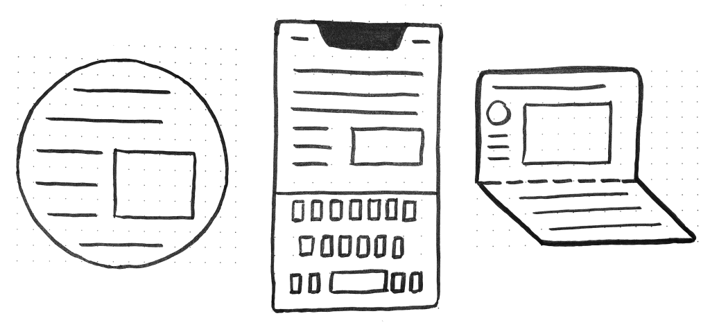
    Flash, Photoshop, and responsive design

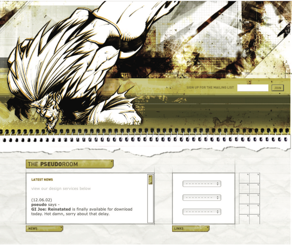
    When I first started designing websites, my go-to software was Photoshop. I created a 960px canvas and set about creating a layout that I would later drop content in. The development phase was about attaining pixel-perfect accuracy using fixed widths, fixed heights, and absolute positioning.

    Ethan Marcotte’s talk at An Event Apart and subsequent article “Responsive Web Design” in A List Apart in 2010 changed all this. I was sold on responsive design as soon as I heard about it, but I was also terrified. The pixel-perfect designs full of magic numbers that I had previously prided myself on producing were no longer good enough.

    The fear wasn’t helped by my first experience with responsive design. My first project was to take an existing fixed-width website and make it responsive. What I learned the hard way was that you can’t just add responsiveness at the end of a project. To create fluid layouts, you need to plan throughout the design phase.

    A new way to design

    Designing responsive or fluid sites has always been about removing limitations, producing content that can be viewed on any device. It relies on the use of percentage-based layouts, which I initially achieved with native CSS and utility classes:

    .column-span-6 {
      width: 49%;
      float: left;
      margin-right: 0.5%;
      margin-left: 0.5%;
    }
    
    
    .column-span-4 {
      width: 32%;
      float: left;
      margin-right: 0.5%;
      margin-left: 0.5%;
    }
    
    .column-span-3 {
      width: 24%;
      float: left;
      margin-right: 0.5%;
      margin-left: 0.5%;
    }

    Then with Sass so I could take advantage of @includes to re-use repeated blocks of code and move back to more semantic markup:

    .logo {
      @include colSpan(6);
    }
    
    .search {
      @include colSpan(3);
    }
    
    .social-share {
      @include colSpan(3);
    }

    Media queries

    The second ingredient for responsive design is media queries. Without them, content would shrink to fit the available space regardless of whether that content remained readable (The exact opposite problem occurred with the introduction of a mobile-first approach).

    Media queries prevented this by allowing us to add breakpoints where the design could adapt. Like most people, I started out with three breakpoints: one for desktop, one for tablets, and one for mobile. Over the years, I added more and more for phablets, wide screens, and so on. 

    For years, I happily worked this way and improved both my design and front-end skills in the process. The only problem I encountered was making changes to content, since with our Sass grid system in place, there was no way for the site owners to add content without amending the markup—something a small business owner might struggle with. This is because each row in the grid was defined using a div as a container. Adding content meant creating new row markup, which requires a level of HTML knowledge.

    Row markup was a staple of early responsive design, present in all the widely used frameworks like Bootstrap and Skeleton.

    1 of 7
    2 of 7
    3 of 7
    4 of 7
    5 of 7
    6 of 7
    7 of 7

    Another problem arose as I moved from a design agency building websites for small- to medium-sized businesses, to larger in-house teams where I worked across a suite of related sites. In those roles I started to work much more with reusable components. 

    Our reliance on media queries resulted in components that were tied to common viewport sizes. If the goal of component libraries is reuse, then this is a real problem because you can only use these components if the devices you’re designing for correspond to the viewport sizes used in the pattern library—in the process not really hitting that “devices that don’t yet exist”  goal.

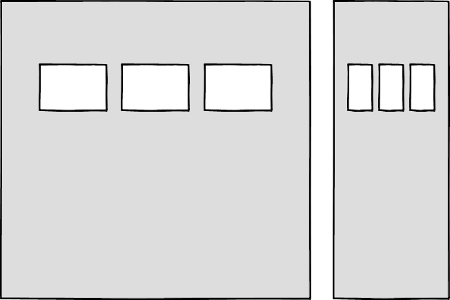
    Then there’s the problem of space. Media queries allow components to adapt based on the viewport size, but what if I put a component into a sidebar, like in the figure below?

    Container queries: our savior or a false dawn?

    Container queries have long been touted as an improvement upon media queries, but at the time of writing are unsupported in most browsers. There are JavaScript workarounds, but they can create dependency and compatibility issues. The basic theory underlying container queries is that elements should change based on the size of their parent container and not the viewport width, as seen in the following illustrations.

    One of the biggest arguments in favor of container queries is that they help us create components or design patterns that are truly reusable because they can be picked up and placed anywhere in a layout. This is an important step in moving toward a form of component-based design that works at any size on any device.

    In other words, responsive components to replace responsive layouts.

    Container queries will help us move from designing pages that respond to the browser or device size to designing components that can be placed in a sidebar or in the main content, and respond accordingly.

    My concern is that we are still using layout to determine when a design needs to adapt. This approach will always be restrictive, as we will still need pre-defined breakpoints. For this reason, my main question with container queries is, How would we decide when to change the CSS used by a component? 

    A component library removed from context and real content is probably not the best place for that decision. 

    As the diagrams below illustrate, we can use container queries to create designs for specific container widths, but what if I want to change the design based on the image size or ratio?

    In this example, the dimensions of the container are not what should dictate the design; rather, the image is.

    It’s hard to say for sure whether container queries will be a success story until we have solid cross-browser support for them. Responsive component libraries would definitely evolve how we design and would improve the possibilities for reuse and design at scale. But maybe we will always need to adjust these components to suit our content.

    CSS is changing

    Whilst the container query debate rumbles on, there have been numerous advances in CSS that change the way we think about design. The days of fixed-width elements measured in pixels and floated div elements used to cobble layouts together are long gone, consigned to history along with table layouts. Flexbox and CSS Grid have revolutionized layouts for the web. We can now create elements that wrap onto new rows when they run out of space, not when the device changes.

    .wrapper {
      display: grid;
      grid-template-columns: repeat(auto-fit, 450px);
      gap: 10px;
    }

    The repeat() function paired with auto-fit or auto-fill allows us to specify how much space each column should use while leaving it up to the browser to decide when to spill the columns onto a new line. Similar things can be achieved with Flexbox, as elements can wrap over multiple rows and “flex” to fill available space. 

    .wrapper {
      display: flex;
      flex-wrap: wrap;
      justify-content: space-between;
    }
    
    .child {
      flex-basis: 32%;
      margin-bottom: 20px;
    }

    The biggest benefit of all this is you don’t need to wrap elements in container rows. Without rows, content isn’t tied to page markup in quite the same way, allowing for removals or additions of content without additional development.

    This is a big step forward when it comes to creating designs that allow for evolving content, but the real game changer for flexible designs is CSS Subgrid. 

    Remember the days of crafting perfectly aligned interfaces, only for the customer to add an unbelievably long header almost as soon as they’re given CMS access, like the illustration below?

    Subgrid allows elements to respond to adjustments in their own content and in the content of sibling elements, helping us create designs more resilient to change.

    .wrapper {
      display: grid;
      grid-template-columns: repeat(auto-fit, minmax(150px, 1fr));
         grid-template-rows: auto 1fr auto;
      gap: 10px;
    }
    
    .sub-grid {
      display: grid;
      grid-row: span 3;
      grid-template-rows: subgrid; /* sets rows to parent grid */
    }

    CSS Grid allows us to separate layout and content, thereby enabling flexible designs. Meanwhile, Subgrid allows us to create designs that can adapt in order to suit morphing content. Subgrid at the time of writing is only supported in Firefox but the above code can be implemented behind an @supports feature query. 

    Intrinsic layouts 

    I’d be remiss not to mention intrinsic layouts, the term created by Jen Simmons to describe a mixture of new and old CSS features used to create layouts that respond to available space. 

    Responsive layouts have flexible columns using percentages. Intrinsic layouts, on the other hand, use the fr unit to create flexible columns that won’t ever shrink so much that they render the content illegible.

    fr units is a way to say I want you to distribute the extra space in this way, but…don’t ever make it smaller than the content that’s inside of it.

    —Jen Simmons, “Designing Intrinsic Layouts”

    Intrinsic layouts can also utilize a mixture of fixed and flexible units, allowing the content to dictate the space it takes up.

    What makes intrinsic design stand out is that it not only creates designs that can withstand future devices but also helps scale design without losing flexibility. Components and patterns can be lifted and reused without the prerequisite of having the same breakpoints or the same amount of content as in the previous implementation. 

    We can now create designs that adapt to the space they have, the content within them, and the content around them. With an intrinsic approach, we can construct responsive components without depending on container queries.

    Another 2010 moment?

    This intrinsic approach should in my view be every bit as groundbreaking as responsive web design was ten years ago. For me, it’s another “everything changed” moment. 

    But it doesn’t seem to be moving quite as fast; I haven’t yet had that same career-changing moment I had with responsive design, despite the widely shared and brilliant talk that brought it to my attention. 

    One reason for that could be that I now work in a large organization, which is quite different from the design agency role I had in 2010. In my agency days, every new project was a clean slate, a chance to try something new. Nowadays, projects use existing tools and frameworks and are often improvements to existing websites with an existing codebase. 

    Another could be that I feel more prepared for change now. In 2010 I was new to design in general; the shift was frightening and required a lot of learning. Also, an intrinsic approach isn’t exactly all-new; it’s about using existing skills and existing CSS knowledge in a different way. 

    You can’t framework your way out of a content problem

    Another reason for the slightly slower adoption of intrinsic design could be the lack of quick-fix framework solutions available to kick-start the change. 

    Responsive grid systems were all over the place ten years ago. With a framework like Bootstrap or Skeleton, you had a responsive design template at your fingertips.

    Intrinsic design and frameworks do not go hand in hand quite so well because the benefit of having a selection of units is a hindrance when it comes to creating layout templates. The beauty of intrinsic design is combining different units and experimenting with techniques to get the best for your content.

    And then there are design tools. We probably all, at some point in our careers, used Photoshop templates for desktop, tablet, and mobile devices to drop designs in and show how the site would look at all three stages.

    How do you do that now, with each component responding to content and layouts flexing as and when they need to? This type of design must happen in the browser, which personally I’m a big fan of. 

    The debate about “whether designers should code” is another that has rumbled on for years. When designing a digital product, we should, at the very least, design for a best- and worst-case scenario when it comes to content. To do this in a graphics-based software package is far from ideal. In code, we can add longer sentences, more radio buttons, and extra tabs, and watch in real time as the design adapts. Does it still work? Is the design too reliant on the current content?

    Personally, I look forward to the day intrinsic design is the standard for design, when a design component can be truly flexible and adapt to both its space and content with no reliance on device or container dimensions.

    Content first 

    Content is not constant. After all, to design for the unknown or unexpected we need to account for content changes like our earlier Subgrid card example that allowed the cards to respond to adjustments to their own content and the content of sibling elements.

    Thankfully, there’s more to CSS than layout, and plenty of properties and values can help us put content first. Subgrid and pseudo-elements like ::first-line and ::first-letter help to separate design from markup so we can create designs that allow for changes.

    Instead of old markup hacks like this—

    First line of text with different styling...

    —we can target content based on where it appears.

    .element::first-line {
      font-size: 1.4em;
    }
    
    .element::first-letter {
      color: red;
    }

    Much bigger additions to CSS include logical properties, which change the way we construct designs using logical dimensions (start and end) instead of physical ones (left and right), something CSS Grid also does with functions like min(), max(), and clamp().

    This flexibility allows for directional changes according to content, a common requirement when we need to present content in multiple languages. In the past, this was often achieved with Sass mixins but was often limited to switching from left-to-right to right-to-left orientation.

    In the Sass version, directional variables need to be set.

    $direction: rtl;
    $opposite-direction: ltr;
    
    $start-direction: right;
    $end-direction: left;

    These variables can be used as values—

    body {
      direction: $direction;
      text-align: $start-direction;
    }

    —or as properties.

    margin-#{$end-direction}: 10px;
    padding-#{$start-direction}: 10px;

    However, now we have native logical properties, removing the reliance on both Sass (or a similar tool) and pre-planning that necessitated using variables throughout a codebase. These properties also start to break apart the tight coupling between a design and strict physical dimensions, creating more flexibility for changes in language and in direction.

    margin-block-end: 10px;
    padding-block-start: 10px;

    There are also native start and end values for properties like text-align, which means we can replace text-align: right with text-align: start.

    Like the earlier examples, these properties help to build out designs that aren’t constrained to one language; the design will reflect the content’s needs.

    Fixed and fluid 

    We briefly covered the power of combining fixed widths with fluid widths with intrinsic layouts. The min() and max() functions are a similar concept, allowing you to specify a fixed value with a flexible alternative. 

    For min() this means setting a fluid minimum value and a maximum fixed value.

    .element {
      width: min(50%, 300px);
    }

    The element in the figure above will be 50% of its container as long as the element’s width doesn’t exceed 300px.

    For max() we can set a flexible max value and a minimum fixed value.

    .element {
      width: max(50%, 300px);
    }

    Now the element will be 50% of its container as long as the element’s width is at least 300px. This means we can set limits but allow content to react to the available space. 

    The clamp() function builds on this by allowing us to set a preferred value with a third parameter. Now we can allow the element to shrink or grow if it needs to without getting to a point where it becomes unusable.

    .element {
      width: clamp(300px, 50%, 600px);
    }

    This time, the element’s width will be 50% (the preferred value) of its container but never less than 300px and never more than 600px.

    With these techniques, we have a content-first approach to responsive design. We can separate content from markup, meaning the changes users make will not affect the design. We can start to future-proof designs by planning for unexpected changes in language or direction. And we can increase flexibility by setting desired dimensions alongside flexible alternatives, allowing for more or less content to be displayed correctly.

    Situation first

    Thanks to what we’ve discussed so far, we can cover device flexibility by changing our approach, designing around content and space instead of catering to devices. But what about that last bit of Jeffrey Zeldman’s quote, “…situations you haven’t imagined”?

    It’s a very different thing to design for someone seated at a desktop computer as opposed to someone using a mobile phone and moving through a crowded street in glaring sunshine. Situations and environments are hard to plan for or predict because they change as people react to their own unique challenges and tasks.

    This is why choice is so important. One size never fits all, so we need to design for multiple scenarios to create equal experiences for all our users.

    Thankfully, there is a lot we can do to provide choice.

    Responsible design 

    “There are parts of the world where mobile data is prohibitively expensive, and where there is little or no broadband infrastructure.”

    I Used the Web for a Day on a 50 MB Budget

    Chris Ashton

    One of the biggest assumptions we make is that people interacting with our designs have a good wifi connection and a wide screen monitor. But in the real world, our users may be commuters traveling on trains or other forms of transport using smaller mobile devices that can experience drops in connectivity. There is nothing more frustrating than a web page that won’t load, but there are ways we can help users use less data or deal with sporadic connectivity.

    The srcset attribute allows the browser to decide which image to serve. This means we can create smaller ‘cropped’ images to display on mobile devices in turn using less bandwidth and less data.

    Image alt text

    The preload attribute can also help us to think about how and when media is downloaded. It can be used to tell a browser about any critical assets that need to be downloaded with high priority, improving perceived performance and the user experience. 


    There’s also native lazy loading, which indicates assets that should only be downloaded when they are needed.

    …

    With srcset, preload, and lazy loading, we can start to tailor a user’s experience based on the situation they find themselves in. What none of this does, however, is allow the user themselves to decide what they want downloaded, as the decision is usually the browser’s to make. 

    So how can we put users in control?

    The return of media queries 

    Media queries have always been about much more than device sizes. They allow content to adapt to different situations, with screen size being just one of them.

    We’ve long been able to check for media types like print and speech and features such as hover, resolution, and color. These checks allow us to provide options that suit more than one scenario; it’s less about one-size-fits-all and more about serving adaptable content. 

    As of this writing, the Media Queries Level 5 spec is still under development. It introduces some really exciting queries that in the future will help us design for multiple other unexpected situations.

    For example, there’s a light-level feature that allows you to modify styles if a user is in sunlight or darkness. Paired with custom properties, these features allow us to quickly create designs or themes for specific environments.

    @media (light-level: normal) {
      --background-color: #fff;
      --text-color: #0b0c0c;  
    }
    
    @media (light-level: dim) {
      --background-color: #efd226;
      --text-color: #0b0c0c;
    }

    Another key feature of the Level 5 spec is personalization. Instead of creating designs that are the same for everyone, users can choose what works for them. This is achieved by using features like prefers-reduced-data, prefers-color-scheme, and prefers-reduced-motion, the latter two of which already enjoy broad browser support. These features tap into preferences set via the operating system or browser so people don’t have to spend time making each site they visit more usable. 

    Media queries like this go beyond choices made by a browser to grant more control to the user.

    Expect the unexpected

    In the end, the one thing we should always expect is for things to change. Devices in particular change faster than we can keep up, with foldable screens already on the market.

    We can’t design the same way we have for this ever-changing landscape, but we can design for content. By putting content first and allowing that content to adapt to whatever space surrounds it, we can create more robust, flexible designs that increase the longevity of our products. 

    A lot of the CSS discussed here is about moving away from layouts and putting content at the heart of design. From responsive components to fixed and fluid units, there is so much more we can do to take a more intrinsic approach. Even better, we can test these techniques during the design phase by designing in-browser and watching how our designs adapt in real-time.

    When it comes to unexpected situations, we need to make sure our products are usable when people need them, whenever and wherever that might be. We can move closer to achieving this by involving users in our design decisions, by creating choice via browsers, and by giving control to our users with user-preference-based media queries. 

    Good design for the unexpected should allow for change, provide choice, and give control to those we serve: our users themselves.


  • Asynchronous Design Critique: Getting Feedback

    Asynchronous Design Critique: Getting Feedback

    ” Any feedback?” is perhaps one of the worst ways to ask for suggestions. It’s obscure and unfocused, and it doesn’t give a clear picture of what we’re looking for. Getting good opinions starts sooner than we might hope: it starts with the demand.

    Starting the process of receiving feedback with a question may seem counterintuitive, but it makes sense if we consider that receiving feedback can be considered a form of pattern research. In the same way that we wouldn’t perform any studies without the correct questions to get the insight that we need, the best way to ask for feedback is also to build strong issues.

    Design criticism is not a one-time procedure. Sure, any great comments process continues until the project is finished, but this is especially true for layout because architecture work continues iteration after iteration, from a high level to the finest details. Each stage requires its unique set of questions.

    And suddenly, as with any great research, we need to examine what we got up, get to the base of its perspectives, and take action. Iteration, evaluation, and problem. This look at each of those.

    The query

    Being available to input is important, but we need to be specific about what we’re looking for. Any comments,” What do you think,” or” I’d love to hear your mind” at the conclusion of a presentation are likely to garner a lot of different ideas, or worse, to make everyone follow the lead of the first speaker. And next… we get frustrated because vague issues like those you turn a high-level moves review into folks rather commenting on the borders of buttons. Which topic may be significant, so it might be difficult to get the team to choose the one you wanted to concentrate on.

    But how do we get into this scenario? It’s a combination of various aspects. One is that we don’t often consider asking as a part of the input method. Another is how healthy it is to assume that everyone else will agree with the problem and leave it alone. Another is that in nonprofessional conversations, there’s usually no need to be that exact. In summary, we tend to undervalue the value of the issues, and we don’t work to improve them.

    The work of asking good questions guidelines and focuses the criticism. It also serves as a form of acceptance, outlining your willingness to make remarks and the types of comments you want to receive. It puts people in the right emotional position, especially in situations when they weren’t expecting to give opinions.

    There isn’t a second best way to ask for opinions. It simply needs to be certain, and precision may take several shapes. The one of level than depth is a design for design criticism that I’ve found to be particularly helpful in my coaching.

    Stage” refers to each of the steps of the process—in our event, the design process. The kind of feedback changes as the consumer research moves forward to the final design. But within a single stage, one might also examine whether some assumptions are correct and whether there’s been a suitable language of the amassed opinions into updated designs as the job has evolved. The layers of user experience could serve as a starting point for potential questions. What do you want to know: Project objectives? user requirements? Functionality? the content Interaction design? Information architecture UI design? navigation planning Visual design? Branding?

    Here’re a few example questions that are precise and to the point that refer to different layers:

    • Functionality: Is it desirable to automate account creation?
    • Interaction design: Take a look through the updated flow and let me know whether you see any steps or error states that I might’ve missed.
    • Information architecture: This page contains two competing pieces of information. Is the structure effective in communicating them both?
    • User interface design: What do you think about the top-most error counter, which ensures that you can see the next error even when the error is outside the viewport?
    • Navigation design: From research, we identified these second-level navigation items, but once you’re on the page, the list feels too long and hard to navigate. Are there any ways to deal with this?
    • Visual design: Are the sticky notifications in the bottom-right corner visible enough?

    The other axis of specificity is determined by how far you would like to go with the presentation. For example, we might have introduced a new end-to-end flow, but there was a specific view that you found particularly challenging and you’d like a detailed review of that. This can be especially helpful when switching between iterations because it’s crucial to highlight the changes made.

    There are other things that we can consider when we want to achieve more specific—and more effective—questions.

    Eliminating generic qualifiers from your questions like “good,” “well,” “nice,” “bad,” “okay,” and” cool” is a simple trick. For example, asking,” When the block opens and the buttons appear, is this interaction good”? is it possible to look specific, but you can spot the “good” qualifier and make the question” When the block opens and the buttons appear, is it clear what the next action is” look like?

    Sometimes we actually do want broad feedback. That’s uncommon, but it can occur. In that sense, you might still make it explicit that you’re looking for a wide range of opinions, whether at a high level or with details. Or perhaps just say,” At first glance, what do you think”? so that it’s clear that what you’re asking is open ended but focused on someone’s impression after their first five seconds of looking at it.

    Sometimes the project is particularly broad, and some areas may have already been thoroughly explored. In these situations, it might be useful to explicitly say that some parts are already locked in and aren’t open to feedback. Although it’s not something I’d recommend in general, I’ve found it helpful in avoiding getting back into rabbit holes like those that could lead to further refinement but aren’t currently what matters most.

    Asking specific questions can completely change the quality of the feedback that you receive. Even experienced designers will appreciate the clarity and efficiency gained from concentrating solely on what is required, and those with less refined critique skills will now be able to offer more actionable feedback. It can save a lot of time and frustration.

    The iteration

    Design iterations are probably the most visible part of the design work, and they provide a natural checkpoint for feedback. Many design tools have inline commenting, but many of them only display changes as a single fluid stream in the same file. These types of design tools cause conversations to end after they are resolved, update shared UI components automatically, and require designers to always display the most recent version unless these would-be useful features were manually disabled. The implied goal that these design tools seem to have is to arrive at just one final copy with all discussions closed, probably because they inherited patterns from how written documents are collaboratively edited. That’s probably not the most effective way to go about designing critiques, but even if I don’t want to be too prescriptive, it might work for some teams.

    The asynchronous design-critique approach that I find most effective is to create explicit checkpoints for discussion. For this, I’m going to use the term iteration post. It refers to a write-up or presentation of the design iteration followed by a discussion thread of some kind. This can be used on any platform that can accommodate this structure. By the way, when I refer to a “write-up or presentation“, I’m including video recordings or other media too: as long as it’s asynchronous, it works.

    There are many benefits to using iteration posts:

    • It creates a rhythm in the design work so that the designer can review feedback from each iteration and prepare for the next.
    • Decisions are always available, and conversations are also made accessible for future review.
    • It creates a record of how the design changed over time.
    • It might also make it simpler to collect and act on feedback depending on the tool.

    These posts of course don’t mean that no other feedback approach should be used, just that iteration posts could be the primary rhythm for a remote design team to use. And from there, there can develop additional feedback techniques ( such as live critique, pair designing, or inline comments ).

    I don’t think there’s a standard format for iteration posts. However, there are a few high-level components that make sense to include as a baseline:

    1. The goal
    2. The layout
    3. The list of changes
    4. The querys

    Each project is likely to have a goal, and hopefully it’s something that’s already been summarized in a single sentence somewhere else, such as the client brief, the product manager’s outline, or the project owner’s request. In other words, I would copy and paste this into every iteration post to make it work. The idea is to provide context and to repeat what’s essential to make each iteration post complete so that there’s no need to find information spread across multiple posts. The most recent iteration post will have everything I need if I want to know about the most recent design.

    This copy-and-paste part introduces another relevant concept: alignment comes from repetition. Therefore, repeating information in posts helps to ensure that everyone is on the same page.

    The design is then the actual series of information-architecture outlines, diagrams, flows, maps, wireframes, screens, visuals, and any other kind of design work that’s been done. It’s any design object, to put it briefly. For the final stages of work, I prefer the term blueprint to emphasize that I’ll be showing full flows instead of individual screens to make it easier to understand the bigger picture.

    It might also be helpful to have clear names on the objects since it makes them look better to refer to. Write the post in a way that helps people understand the work. It’s not much different from creating a strong live presentation.

    For an efficient discussion, you should also include a bullet list of the changes from the previous iteration to let people focus on what’s new, which can be especially useful for larger pieces of work where keeping track, iteration after iteration, could become a challenge.

    Finally, as mentioned earlier, a list of the questions must be included in order to help you guide the design critique in the desired direction. Doing this as a numbered list can also help make it easier to refer to each question by its number.

    Not every iteration is the same. Earlier iterations don’t need to be as tightly focused—they can be more exploratory and experimental, maybe even breaking some of the design-language guidelines to see what’s possible. Then, later, the iterations begin coming to a decision and improving it until the feature development is complete.

    I want to highlight that even if these iteration posts are written and conceived as checkpoints, by no means do they need to be exhaustive. A post might be a draft, just a concept to start a discussion, or it might be a cumulative list of every feature that was added over the course of each iteration until the full picture is achieved.

    Over time, I also started using specific labels for incremental iterations: i1, i2, i3, and so on. Although this may seem like a minor labeling tip, it can be useful in many ways:

    • Unique—It’s a clear unique marker. Everyone knows where to go to review things, and it’s simple to say” This was discussed in i4″ with each project.
    • Unassuming—It works like versions ( such as v1, v2, and v3 ) but in contrast, versions create the impression of something that’s big, exhaustive, and complete. Attempts must be exploratory, incomplete, or partial.
    • Future proof—It resolves the “final” naming problem that you can run into with versions. No more files with the title “final final complete no-really-its-done” Within each project, the largest number always represents the latest iteration.

    The wording release candidate (RC ) could be used to indicate when a design is finished enough to be worked on, even if there are some bits that still need work and, in turn, need more iterations:” with i8 we reached RC” or “i12 is an RC” to illustrate this.

    The review

    What typically occurs during a design critique is an open discussion that can be very productive between two people. This approach is particularly effective during live, synchronous feedback. However, using a different approach when we work asynchronously is more effective: adopting a user-research mindset. Written feedback from teammates, stakeholders, or others can be treated as if it were the result of user interviews and surveys, and we can analyze it accordingly.

    Asynchronous feedback is particularly effective because of this shift, especially around these friction points:

    1. It removes the pressure to reply to everyone.
    2. It lessens the annoyance of snoop-by comments.
    3. It lessens our personal stake.

    The first friction is being forced to respond to every comment. Sometimes we write the iteration post, and we get replies from our team. It’s just a few of them, it’s simple, and there isn’t much of a problem with it. But other times, some solutions might require more in-depth discussions, and the amount of replies can quickly increase, which can create a tension between trying to be a good team player by replying to everyone and doing the next design iteration. This might be especially true if the respondent is a stakeholder or a person who is directly involved in the project and whom we feel we need to speak with. We need to accept that this pressure is absolutely normal, and it’s human nature to try to accommodate people who we care about. When responding to all comments, it can be effective, but when we consider a design critique more like user research, we realize that we don’t need to respond to every comment, and there are alternatives in asynchronous spaces:

      One is to let the next iteration speak for itself. The response is received when the design changes and a follow-up iteration is made. You might tag all the people who were involved in the previous discussion, but even that’s a choice, not a requirement.
    • Another option is to respond politely to acknowledge each comment, such as” Understood. Thank you”,” Good points— I’ll review”, or” Thanks. These will be included in the upcoming iteration. In some cases, this could also be just a single top-level comment along the lines of” Thanks for all the feedback everyone—the next iteration is coming soon”!
    • Another option is to quickly summarize the comments before moving on. Depending on your workflow, this can be particularly useful as it can provide a simplified checklist that you can then use for the next iteration.

    The swoop-by comment, which is the kind of feedback that comes from a member of a team or non-project who might not be aware of the context, restrictions, decisions, or requirements, or of the discussions from earlier iterations, is the second friction point. On their side, there’s something that one can hope that they might learn: they could start to acknowledge that they’re doing this and they could be more conscious in outlining where they’re coming from. Swoop-by comments frequently prompt the simple thought,” We’ve already discussed this,” and it can be frustrating to have to keep coming back and forth.

    Let’s begin by acknowledging again that there’s no need to reply to every comment. However, a brief response with a link to the previous discussion for additional information is typically sufficient if responding to a previously litigated point might be helpful. Remember, alignment comes from repetition, so it’s okay to repeat things sometimes!

    Swoop-by commenting has two benefits: first, they might point out something that isn’t clear, and second, they might serve as a reference point for someone who is first viewing the design. Sure, you’ll still be frustrated, but that might at least help in dealing with it.

    The personal stake we might have in the design could be the third friction point, which might cause us to feel defensive if the review turned into a discussion. Treating feedback as user research helps us create a healthy distance between the people giving us feedback and our ego ( because yes, even if we don’t want to admit it, it’s there ). In the end, putting everything in aggregate form helps us to prioritize our work more.

    Always remember that while you need to listen to stakeholders, project owners, and specific advice, you don’t have to accept every piece of feedback. You must examine it and come up with a conclusion that you can support, but sometimes “no” is the best choice.

    As the designer leading the project, you’re in charge of that decision. In the end, everyone has their area of specialization, and the designer has the most background and knowledge to make the best choice. And by listening to the feedback that you’ve received, you’re making sure that it’s also the best and most balanced decision.

    Thanks to Mike Shelton and Brie Anne Demkiw for their contributions to the initial draft of this article.

  • Voice Content and Usability

    Voice Content and Usability

    We’ve been having conversations for thousands of years. Whether to convey information, conduct transactions, or simply to check in on one another, people have yammered away, chattering and gesticulating, through spoken conversation for countless generations. Only in the last few millennia have we begun to commit our conversations to writing, and only in the last few decades have we begun to outsource them to the computer, a machine that shows much more affinity for written correspondence than for the slangy vagaries of spoken language.

    Computers have trouble because between spoken and written language, speech is more primordial. To have successful conversations with us, machines must grapple with the messiness of human speech: the disfluencies and pauses, the gestures and body language, and the variations in word choice and spoken dialect that can stymie even the most carefully crafted human-computer interaction. In the human-to-human scenario, spoken language also has the privilege of face-to-face contact, where we can readily interpret nonverbal social cues.

    In contrast, written language immediately concretizes as we commit it to record and retains usages long after they become obsolete in spoken communication (the salutation “To whom it may concern,” for example), generating its own fossil record of outdated terms and phrases. Because it tends to be more consistent, polished, and formal, written text is fundamentally much easier for machines to parse and understand.

    Spoken language has no such luxury. Besides the nonverbal cues that decorate conversations with emphasis and emotional context, there are also verbal cues and vocal behaviors that modulate conversation in nuanced ways: how something is said, not what. Whether rapid-fire, low-pitched, or high-decibel, whether sarcastic, stilted, or sighing, our spoken language conveys much more than the written word could ever muster. So when it comes to voice interfaces—the machines we conduct spoken conversations with—we face exciting challenges as designers and content strategists.

    Voice Interactions

    We interact with voice interfaces for a variety of reasons, but according to Michael McTear, Zoraida Callejas, and David Griol in The Conversational Interface, those motivations by and large mirror the reasons we initiate conversations with other people, too (). Generally, we start up a conversation because:

    • we need something done (such as a transaction),
    • we want to know something (information of some sort), or
    • we are social beings and want someone to talk to (conversation for conversation’s sake).

    These three categories—which I call transactional, informational, and prosocial—also characterize essentially every voice interaction: a single conversation from beginning to end that realizes some outcome for the user, starting with the voice interface’s first greeting and ending with the user exiting the interface. Note here that a conversation in our human sense—a chat between people that leads to some result and lasts an arbitrary length of time—could encompass multiple transactional, informational, and prosocial voice interactions in succession. In other words, a voice interaction is a conversation, but a conversation is not necessarily a single voice interaction.

    Purely prosocial conversations are more gimmicky than captivating in most voice interfaces, because machines don’t yet have the capacity to really want to know how we’re doing and to do the sort of glad-handing humans crave. There’s also ongoing debate as to whether users actually prefer the sort of organic human conversation that begins with a prosocial voice interaction and shifts seamlessly into other types. In fact, in Voice User Interface Design, Michael Cohen, James Giangola, and Jennifer Balogh recommend sticking to users’ expectations by mimicking how they interact with other voice interfaces rather than trying too hard to be human—potentially alienating them in the process ().

    That leaves two genres of conversations we can have with one another that a voice interface can easily have with us, too: a transactional voice interaction realizing some outcome (“buy iced tea”) and an informational voice interaction teaching us something new (“discuss a musical”).

    Transactional voice interactions

    Unless you’re tapping buttons on a food delivery app, you’re generally having a conversation—and therefore a voice interaction—when you order a Hawaiian pizza with extra pineapple. Even when we walk up to the counter and place an order, the conversation quickly pivots from an initial smattering of neighborly small talk to the real mission at hand: ordering a pizza (generously topped with pineapple, as it should be).

    Alison: Hey, how’s it going?

    Burhan: Hi, welcome to Crust Deluxe! It’s cold out there. How can I help you?

    Alison: Can I get a Hawaiian pizza with extra pineapple?

    Burhan: Sure, what size?

    Alison: Large.

    Burhan: Anything else?

    Alison: No thanks, that’s it.

    Burhan: Something to drink?

    Alison: I’ll have a bottle of Coke.

    Burhan: You got it. That’ll be $13.55 and about fifteen minutes.

    Each progressive disclosure in this transactional conversation reveals more and more of the desired outcome of the transaction: a service rendered or a product delivered. Transactional conversations have certain key traits: they’re direct, to the point, and economical. They quickly dispense with pleasantries.

    Informational voice interactions

    Meanwhile, some conversations are primarily about obtaining information. Though Alison might visit Crust Deluxe with the sole purpose of placing an order, she might not actually want to walk out with a pizza at all. She might be just as interested in whether they serve halal or kosher dishes, gluten-free options, or something else. Here, though we again have a prosocial mini-conversation at the beginning to establish politeness, we’re after much more.

    Alison: Hey, how’s it going?

    Burhan: Hi, welcome to Crust Deluxe! It’s cold out there. How can I help you?

    Alison: Can I ask a few questions?

    Burhan: Of course! Go right ahead.

    Alison: Do you have any halal options on the menu?

    Burhan: Absolutely! We can make any pie halal by request. We also have lots of vegetarian, ovo-lacto, and vegan options. Are you thinking about any other dietary restrictions?

    Alison: What about gluten-free pizzas?

    Burhan: We can definitely do a gluten-free crust for you, no problem, for both our deep-dish and thin-crust pizzas. Anything else I can answer for you?

    Alison: That’s it for now. Good to know. Thanks!

    Burhan: Anytime, come back soon!

    This is a very different dialogue. Here, the goal is to get a certain set of facts. Informational conversations are investigative quests for the truth—research expeditions to gather data, news, or facts. Voice interactions that are informational might be more long-winded than transactional conversations by necessity. Responses tend to be lengthier, more informative, and carefully communicated so the customer understands the key takeaways.

    Voice Interfaces

    At their core, voice interfaces employ speech to support users in reaching their goals. But simply because an interface has a voice component doesn’t mean that every user interaction with it is mediated through voice. Because multimodal voice interfaces can lean on visual components like screens as crutches, we’re most concerned in this book with pure voice interfaces, which depend entirely on spoken conversation, lack any visual component whatsoever, and are therefore much more nuanced and challenging to tackle.

    Though voice interfaces have long been integral to the imagined future of humanity in science fiction, only recently have those lofty visions become fully realized in genuine voice interfaces.

    Interactive voice response (IVR) systems

    Though written conversational interfaces have been fixtures of computing for many decades, voice interfaces first emerged in the early 1990s with text-to-speech (TTS) dictation programs that recited written text aloud, as well as speech-enabled in-car systems that gave directions to a user-provided address. With the advent of interactive voice response (IVR) systems, intended as an alternative to overburdened customer service representatives, we became acquainted with the first true voice interfaces that engaged in authentic conversation.

    IVR systems allowed organizations to reduce their reliance on call centers but soon became notorious for their clunkiness. Commonplace in the corporate world, these systems were primarily designed as metaphorical switchboards to guide customers to a real phone agent (“Say Reservations to book a flight or check an itinerary”); chances are you will enter a conversation with one when you call an airline or hotel conglomerate. Despite their functional issues and users’ frustration with their inability to speak to an actual human right away, IVR systems proliferated in the early 1990s across a variety of industries (, PDF).

    While IVR systems are great for highly repetitive, monotonous conversations that generally don’t veer from a single format, they have a reputation for less scintillating conversation than we’re used to in real life (or even in science fiction).

    Screen readers

    Parallel to the evolution of IVR systems was the invention of the screen reader, a tool that transcribes visual content into synthesized speech. For Blind or visually impaired website users, it’s the predominant method of interacting with text, multimedia, or form elements. Screen readers represent perhaps the closest equivalent we have today to an out-of-the-box implementation of content delivered through voice.

    Among the first screen readers known by that moniker was the Screen Reader for the BBC Micro and NEEC Portable developed by the Research Centre for the Education of the Visually Handicapped (RCEVH) at the University of Birmingham in 1986 (). That same year, Jim Thatcher created the first IBM Screen Reader for text-based computers, later recreated for computers with graphical user interfaces (GUIs) ().

    With the rapid growth of the web in the 1990s, the demand for accessible tools for websites exploded. Thanks to the introduction of semantic HTML and especially ARIA roles beginning in 2008, screen readers started facilitating speedy interactions with web pages that ostensibly allow disabled users to traverse the page as an aural and temporal space rather than a visual and physical one. In other words, screen readers for the web “provide mechanisms that translate visual design constructs—proximity, proportion, etc.—into useful information,” writes Aaron Gustafson in A List Apart. “At least they do when documents are authored thoughtfully” ().

    Though deeply instructive for voice interface designers, there’s one significant problem with screen readers: they’re difficult to use and unremittingly verbose. The visual structures of websites and web navigation don’t translate well to screen readers, sometimes resulting in unwieldy pronouncements that name every manipulable HTML element and announce every formatting change. For many screen reader users, working with web-based interfaces exacts a cognitive toll.

    In Wired, accessibility advocate and voice engineer Chris Maury considers why the screen reader experience is ill-suited to users relying on voice:

    From the beginning, I hated the way that Screen Readers work. Why are they designed the way they are? It makes no sense to present information visually and then, and only then, translate that into audio. All of the time and energy that goes into creating the perfect user experience for an app is wasted, or even worse, adversely impacting the experience for blind users. ()

    In many cases, well-designed voice interfaces can speed users to their destination better than long-winded screen reader monologues. After all, visual interface users have the benefit of darting around the viewport freely to find information, ignoring areas irrelevant to them. Blind users, meanwhile, are obligated to listen to every utterance synthesized into speech and therefore prize brevity and efficiency. Disabled users who have long had no choice but to employ clunky screen readers may find that voice interfaces, particularly more modern voice assistants, offer a more streamlined experience.

    Voice assistants

    When we think of voice assistants (the subset of voice interfaces now commonplace in living rooms, smart homes, and offices), many of us immediately picture HAL from 2001: A Space Odyssey or hear Majel Barrett’s voice as the omniscient computer in Star Trek. Voice assistants are akin to personal concierges that can answer questions, schedule appointments, conduct searches, and perform other common day-to-day tasks. And they’re rapidly gaining more attention from accessibility advocates for their assistive potential.

    Before the earliest IVR systems found success in the enterprise, Apple published a demonstration video in 1987 depicting the Knowledge Navigator, a voice assistant that could transcribe spoken words and recognize human speech to a great degree of accuracy. Then, in 2001, Tim Berners-Lee and others formulated their vision for a Semantic Web “agent” that would perform typical errands like “checking calendars, making appointments, and finding locations” (, behind paywall). It wasn’t until 2011 that Apple’s Siri finally entered the picture, making voice assistants a tangible reality for consumers.

    Thanks to the plethora of voice assistants available today, there is considerable variation in how programmable and customizable certain voice assistants are over others (Fig 1.1). At one extreme, everything except vendor-provided features is locked down; for example, at the time of their release, the core functionality of Apple’s Siri and Microsoft’s Cortana couldn’t be extended beyond their existing capabilities. Even today, it isn’t possible to program Siri to perform arbitrary functions, because there’s no means by which developers can interact with Siri at a low level, apart from predefined categories of tasks like sending messages, hailing rideshares, making restaurant reservations, and certain others.

    At the opposite end of the spectrum, voice assistants like Amazon Alexa and Google Home offer a core foundation on which developers can build custom voice interfaces. For this reason, programmable voice assistants that lend themselves to customization and extensibility are becoming increasingly popular for developers who feel stifled by the limitations of Siri and Cortana. Amazon offers the Alexa Skills Kit, a developer framework for building custom voice interfaces for Amazon Alexa, while Google Home offers the ability to program arbitrary Google Assistant skills. Today, users can choose from among thousands of custom-built skills within both the Amazon Alexa and Google Assistant ecosystems.

    As corporations like Amazon, Apple, Microsoft, and Google continue to stake their territory, they’re also selling and open-sourcing an unprecedented array of tools and frameworks for designers and developers that aim to make building voice interfaces as easy as possible, even without code.

    Often by necessity, voice assistants like Amazon Alexa tend to be monochannel—they’re tightly coupled to a device and can’t be accessed on a computer or smartphone instead. By contrast, many development platforms like Google’s Dialogflow have introduced omnichannel capabilities so users can build a single conversational interface that then manifests as a voice interface, textual chatbot, and IVR system upon deployment. I don’t prescribe any specific implementation approaches in this design-focused book, but in Chapter 4 we’ll get into some of the implications these variables might have on the way you build out your design artifacts.

    Voice Content

    Simply put, voice content is content delivered through voice. To preserve what makes human conversation so compelling in the first place, voice content needs to be free-flowing and organic, contextless and concise—everything written content isn’t.

    Our world is replete with voice content in various forms: screen readers reciting website content, voice assistants rattling off a weather forecast, and automated phone hotline responses governed by IVR systems. In this book, we’re most concerned with content delivered auditorily—not as an option, but as a necessity.

    For many of us, our first foray into informational voice interfaces will be to deliver content to users. There’s only one problem: any content we already have isn’t in any way ready for this new habitat. So how do we make the content trapped on our websites more conversational? And how do we write new copy that lends itself to voice interactions?

    Lately, we’ve begun slicing and dicing our content in unprecedented ways. Websites are, in many respects, colossal vaults of what I call macrocontent: lengthy prose that can extend for infinitely scrollable miles in a browser window, like microfilm viewers of newspaper archives. Back in 2002, well before the present-day ubiquity of voice assistants, technologist Anil Dash defined microcontent as permalinked pieces of content that stay legible regardless of environment, such as email or text messages:

    A day’s weather forcast [sic], the arrival and departure times for an airplane flight, an abstract from a long publication, or a single instant message can all be examples of microcontent. ()

    I’d update Dash’s definition of microcontent to include all examples of bite-sized content that go well beyond written communiqués. After all, today we encounter microcontent in interfaces where a small snippet of copy is displayed alone, unmoored from the browser, like a textbot confirmation of a restaurant reservation. Microcontent offers the best opportunity to gauge how your content can be stretched to the very edges of its capabilities, informing delivery channels both established and novel.

    As microcontent, voice content is unique because it’s an example of how content is experienced in time rather than in space. We can glance at a digital sign underground for an instant and know when the next train is arriving, but voice interfaces hold our attention captive for periods of time that we can’t easily escape or skip, something screen reader users are all too familiar with.

    Because microcontent is fundamentally made up of isolated blobs with no relation to the channels where they’ll eventually end up, we need to ensure that our microcontent truly performs well as voice content—and that means focusing on the two most important traits of robust voice content: voice content legibility and voice content discoverability.

    Fundamentally, the legibility and discoverability of our voice content both have to do with how voice content manifests in perceived time and space.

  • A Content Model Is Not a Design System

    A Content Model Is Not a Design System

    Do you recall the days gone by when having a successful site was sufficient? Today, people are getting answers from Siri, Google search fragments, and mobile applications, not only our websites. Companies with forward-thinking goals have adopted an holistic information plan whose goal is to reach people across a variety of digital stations and platforms.

    However, how can a content management system ( CMS ) be set up to reach your audience both now and in the future? I learned the hard way that creating a content model—a concept of information types, attributes, and relationships that let people and systems understand content—with my more comfortable design-system wondering would collapse my patient’s holistic information strategy. By developing content versions that are lexical and even join related content, you can avoid that result.

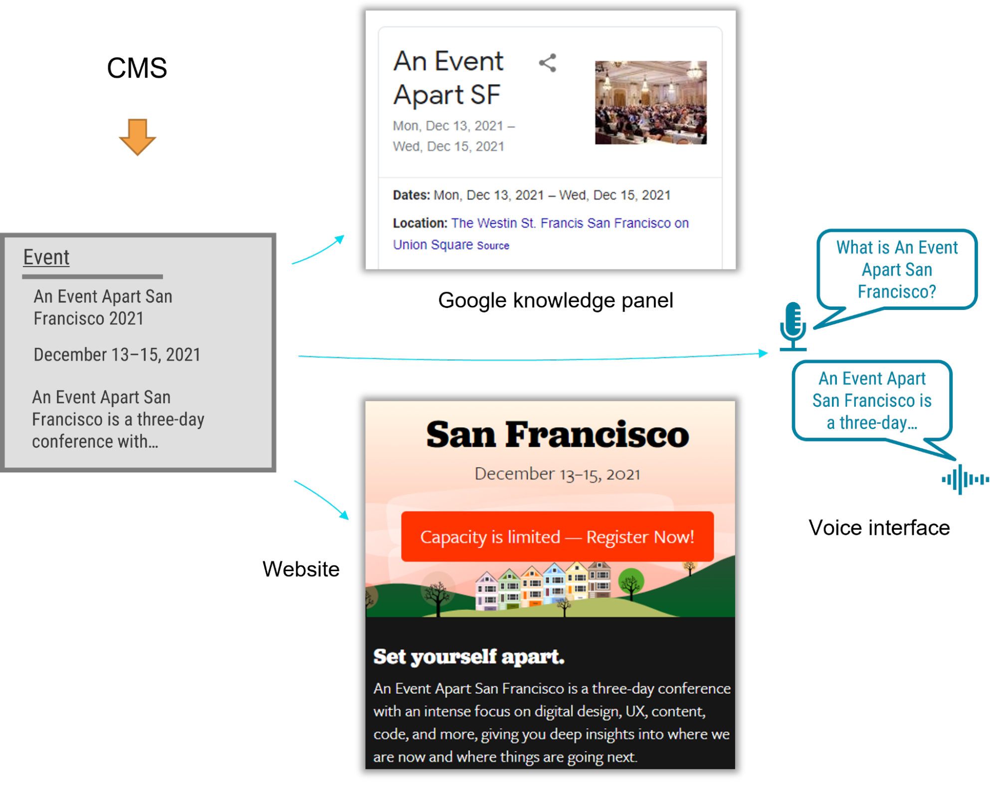
    A Fortune 500 company recently tapped me to guide the CMS application. The customer was excited by the benefits of an holistic information plan, including material modify, multichannel marketing, and robot delivery—designing content to be comprehensible to bots, Google knowledge panels, snippets, and voice user interfaces.

    A content type is essential for an omnichannel articles strategy, and the model needed conceptual types, which are types of types that are categorized according to their meaning rather than their presentation. Our aim was to allow writers to write articles and use it where necessary. But as the job proceeded, I realized that supporting material utilize at the range that my client needed required the whole group to identify a new pattern.

    Despite our best efforts, we remained influenced by what we were more common with: design methods. An holistic content strategy doesn’t rely on WYSIWYG equipment for design and layout, unlike web-focused willing strategies. Our tendency to approach the material model with our common design-system thinking frequently led us to veer away from one of the main purposes of a material model: delivering content to audiences on various marketing channels.

    Two fundamental tenets must be followed in order to create a successful content model

    We needed to explain to our designers, developers, and stakeholders that we were doing something completely different from their previous web projects, where everyone assumed that content would fit into layouts as visual building blocks. The previous approach was not only more familiar but also more intuitive—at least at first—because it made the designs feel more tangible. The team was able to understand how a content model differs from the design systems we were familiar with by discovering two principles:

    1. Instead of layout, content models must define semantics.
    2. And content models should connect content that belongs together.

    Semantic content models

    Type and attribute names for semantic content models are used to reflect the content’s intended purpose and not its intended display. For example, in a nonsemantic model, teams might create types like teasers, media blocks, and cards. These types may make it simple to present content, but they do not aid in understanding the meaning of the content, which would have opened the door to the content presented in each marketing channel. To allow each delivery channel to comprehend the content and use it as it sees fit, a semantic content model uses type names like product, service, and testimonial.

    When you’re creating a semantic content model, a great place to start is to look over the types and properties defined by Schema. a community-driven resource for type definitions that are understandable on platforms like Google search.

    Benefits of a semantic content model include:

      Even if your team doesn’t care about omnichannel content, a semantic content model decouples content from its presentation so that teams can evolve the website’s design without needing to refactor its content. In this way, content can withstand irrational website redesigns.
    • A semantic content model also gives you a competitive advantage. By adding structured data based on Schema. Using its types and properties, a website can provide hints to help Google understand the content, display it in search snippets or knowledge panels, and use it to respond to voice-interface user questions. Potential customers could access your content without ever visiting your website.
    • Beyond those practical benefits, you’ll also need a semantic content model if you want to deliver omnichannel content. Delivery channels must be able to comprehend the same content in order to use it across multiple marketing channels. For instance, if your content model provided a list of questions and answers, it could be used as a voice interface or by a bot to answer frequently asked questions ( FAQ ) pages.

    For example, using a semantic content model for articles, events, people, and locations lets A List Apart provide cleanly structured data for search engines so that users can read the content on the website, in Google knowledge panels, and even with hypothetical voice interfaces in the future.

    connective content models

    Instead of slicing up related content across disparate content components, I’ve come to the realization that the best models are those that are semantic and also connect related content components ( such as a FAQ item’s question and answer pair ). A good content model connects content that should remain together so that multiple delivery channels can use it without needing to first put those pieces back together.

    Consider creating an essay or article. The meaning and usefulness of an article depend on how well its components are kept together. Would one of the headings or paragraphs be meaningful on their own without the context of the full article? Our well-versed in designing systems frequently led us to want to develop content models that would break content into smaller pieces to fit the web-centric layout. Similar effects could have been felt to an article that had its headline removed. Because we were slicing content into standalone pieces based on layout, content that belonged together became difficult to manage and nearly impossible for multiple delivery channels to understand.

    Let’s examine how connecting related content can be used in a practical setting to illustrate. A complex layout for a software product page that included multiple tabs and sections was presented by the client’s design team. Our instincts were to follow suit with the content model. Shouldn’t we make adding any number of tabs in the future as simple and flexible as possible?

    We felt like we needed a “tab section” content type because our design-system instincts allowed for the addition of multiple tab sections to a page because they were so well-versed. Each tab section would display various types of content. One tab might contain the software’s information or specifications. A list of resources might be found under another tab.

    Our inclination to break down the content model into “tab section” pieces would have led to an unnecessarily complex model and a cumbersome editing experience, and it would have also created content that couldn’t have been understood by additional delivery channels. How would a different system have been able to determine which “tab section” referred to a product’s specifications or resource list, for instance? Would that system have had to have used tab sections and content blocks to calculate these terms? This would have prevented the tabs from ever being rearranged, and logic would have had to be added to each other delivery channel to interpret the layout of the design system. Furthermore, if the customer were to have no longer wanted to display this content in a tab layout, it would have been tedious to migrate to a new content model to reflect the new page redesign.

    Our customer had a breakthrough when we realized that for each tab, their customer had a specific purpose in mind: it would reveal specific information like the software product’s overview, specifications, related resources, and pricing. Once implementation began, our inclination to focus on what’s visual and familiar had obscured the intent of the designs. It wasn’t long after a little digging that the content model didn’t like the idea of tabs. What was important was the meaning of the information that was intended to be displayed in the tabs.

    In fact, the customer could have decided to display this content in a different way—without tabs—somewhere else. In response to this realization, we created content types for the software product based on the meaningful attributes the client wanted to display on the web. There were rich attributes like screenshots, software requirements, and feature lists as well as obvious semantic attributes like name and description. The software’s product information stayed together because it wasn’t sliced across separate components like “tab sections” that were derived from the content’s presentation. This content could be understood and presented by any delivery channel, including those that come up in the future.

    Conclusion

    In this omnichannel marketing project, we discovered that the best way to keep our content model on track was to ensure that it was semantic ( with type and attribute names that reflected the meaning of the content ) and that it kept content together that belonged together ( instead of fragmenting it ). These two ideas made it easier for us to decide what to do with the content model based on the design. Remember: If you’re developing a content model to support an omnichannel content strategy, or even if you just want to make sure Google and other interfaces understand your content, keep in mind:

    • A design system isn’t a content model. Team members may be persuaded to combine them and have their content model resemble their design system, so you should guard the semantic and contextual integrity of the content strategy throughout the entire implementation process. Without the use of a magic decoder ring, every delivery channel can now consume the content.
    • If your team is struggling to make this transition, you can still reap some of the benefits by using Schema. Your website uses structured data from org. The benefit of search engine optimization is a compelling reason on its own, even if additional delivery channels aren’t on the horizon in the near future.
    • Additionally, remind the team that decoupling the content model from the design will let them update the designs more easily because they won’t be held back by the cost of content migrations. They will be prepared for the upcoming big thing, and they will be able to create new designs without compromising the compatibility between the content and the design.

    You’ll help your team understand these principles by firmly defending them in their efforts to give content the attention it deserves as both your most valuable resource and your most effective way to engage with your audience.

  • Design for Safety, An Excerpt

    Design for Safety, An Excerpt

    Antiracist economist Kim Crayton says that “intention without strategy is chaos.” We’ve discussed how our biases, assumptions, and inattention toward marginalized and vulnerable groups lead to dangerous and unethical tech—but what, specifically, do we need to do to fix it? The intention to make our tech safer is not enough; we need a strategy.

    This chapter will equip you with that plan of action. It covers how to integrate safety principles into your design work in order to create tech that’s safe, how to convince your stakeholders that this work is necessary, and how to respond to the critique that what we actually need is more diversity. (Spoiler: we do, but diversity alone is not the antidote to fixing unethical, unsafe tech.)

    The process for inclusive safety

    When you are designing for safety, your goals are to:

    • identify ways your product can be used for abuse,
    • design ways to prevent the abuse, and
    • provide support for vulnerable users to reclaim power and control.

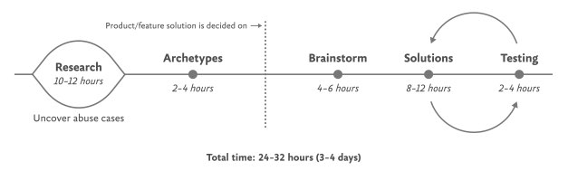
    The Process for Inclusive Safety is a tool to help you reach those goals (Fig 5.1). It’s a methodology I created in 2018 to capture the various techniques I was using when designing products with safety in mind. Whether you are creating an entirely new product or adding to an existing feature, the Process can help you make your product safe and inclusive. The Process includes five general areas of action:

    • Conducting research
    • Creating archetypes
    • Brainstorming problems
    • Designing solutions
    • Testing for safety

    The Process is meant to be flexible—it won’t make sense for teams to implement every step in some situations. Use the parts that are relevant to your unique work and context; this is meant to be something you can insert into your existing design practice.

    And once you use it, if you have an idea for making it better or simply want to provide context of how it helped your team, please get in touch with me. It’s a living document that I hope will continue to be a useful and realistic tool that technologists can use in their day-to-day work.

    If you’re working on a product specifically for a vulnerable group or survivors of some form of trauma, such as an app for survivors of domestic violence, sexual assault, or drug addiction, be sure to read Chapter 7, which covers that situation explicitly and should be handled a bit differently. The guidelines here are for prioritizing safety when designing a more general product that will have a wide user base (which, we already know from statistics, will include certain groups that should be protected from harm). Chapter 7 is focused on products that are specifically for vulnerable groups and people who have experienced trauma.

    Step 1: Conduct research

    Design research should include a broad analysis of how your tech might be weaponized for abuse as well as specific insights into the experiences of survivors and perpetrators of that type of abuse. At this stage, you and your team will investigate issues of interpersonal harm and abuse, and explore any other safety, security, or inclusivity issues that might be a concern for your product or service, like data security, racist algorithms, and harassment.

    Broad research

    Your project should begin with broad, general research into similar products and issues around safety and ethical concerns that have already been reported. For example, a team building a smart home device would do well to understand the multitude of ways that existing smart home devices have been used as tools of abuse. If your product will involve AI, seek to understand the potentials for racism and other issues that have been reported in existing AI products. Nearly all types of technology have some kind of potential or actual harm that’s been reported on in the news or written about by academics. Google Scholar is a useful tool for finding these studies.

    Specific research: Survivors

    When possible and appropriate, include direct research (surveys and interviews) with people who are experts in the forms of harm you have uncovered. Ideally, you’ll want to interview advocates working in the space of your research first so that you have a more solid understanding of the topic and are better equipped to not retraumatize survivors. If you’ve uncovered possible domestic violence issues, for example, the experts you’ll want to speak with are survivors themselves, as well as workers at domestic violence hotlines, shelters, other related nonprofits, and lawyers.

    Especially when interviewing survivors of any kind of trauma, it is important to pay people for their knowledge and lived experiences. Don’t ask survivors to share their trauma for free, as this is exploitative. While some survivors may not want to be paid, you should always make the offer in the initial ask. An alternative to payment is to donate to an organization working against the type of violence that the interviewee experienced. We’ll talk more about how to appropriately interview survivors in Chapter 6.

    Specific research: Abusers

    It’s unlikely that teams aiming to design for safety will be able to interview self-proclaimed abusers or people who have broken laws around things like hacking. Don’t make this a goal; rather, try to get at this angle in your general research. Aim to understand how abusers or bad actors weaponize technology to use against others, how they cover their tracks, and how they explain or rationalize the abuse.

    Step 2: Create archetypes

    Once you’ve finished conducting your research, use your insights to create abuser and survivor archetypes. Archetypes are not personas, as they’re not based on real people that you interviewed and surveyed. Instead, they’re based on your research into likely safety issues, much like when we design for accessibility: we don’t need to have found a group of blind or low-vision users in our interview pool to create a design that’s inclusive of them. Instead, we base those designs on existing research into what this group needs. Personas typically represent real users and include many details, while archetypes are broader and can be more generalized.

    The abuser archetype is someone who will look at the product as a tool to perform harm (Fig 5.2). They may be trying to harm someone they don’t know through surveillance or anonymous harassment, or they may be trying to control, monitor, abuse, or torment someone they know personally.

    The survivor archetype is someone who is being abused with the product. There are various situations to consider in terms of the archetype’s understanding of the abuse and how to put an end to it: Do they need proof of abuse they already suspect is happening, or are they unaware they’ve been targeted in the first place and need to be alerted (Fig 5.3)?

    You may want to make multiple survivor archetypes to capture a range of different experiences. They may know that the abuse is happening but not be able to stop it, like when an abuser locks them out of IoT devices; or they know it’s happening but don’t know how, such as when a stalker keeps figuring out their location (Fig 5.4). Include as many of these scenarios as you need to in your survivor archetype. You’ll use these later on when you design solutions to help your survivor archetypes achieve their goals of preventing and ending abuse.

    It may be useful for you to create persona-like artifacts for your archetypes, such as the three examples shown. Instead of focusing on the demographic information we often see in personas, focus on their goals. The goals of the abuser will be to carry out the specific abuse you’ve identified, while the goals of the survivor will be to prevent abuse, understand that abuse is happening, make ongoing abuse stop, or regain control over the technology that’s being used for abuse. Later, you’ll brainstorm how to prevent the abuser’s goals and assist the survivor’s goals.

    And while the “abuser/survivor” model fits most cases, it doesn’t fit all, so modify it as you need to. For example, if you uncovered an issue with security, such as the ability for someone to hack into a home camera system and talk to children, the malicious hacker would get the abuser archetype and the child’s parents would get survivor archetype.

    Step 3: Brainstorm problems

    After creating archetypes, brainstorm novel abuse cases and safety issues. “Novel” means things not found in your research; you’re trying to identify completely new safety issues that are unique to your product or service. The goal with this step is to exhaust every effort of identifying harms your product could cause. You aren’t worrying about how to prevent the harm yet—that comes in the next step.

    How could your product be used for any kind of abuse, outside of what you’ve already identified in your research? I recommend setting aside at least a few hours with your team for this process.

    If you’re looking for somewhere to start, try doing a Black Mirror brainstorm. This exercise is based on the show Black Mirror, which features stories about the dark possibilities of technology. Try to figure out how your product would be used in an episode of the show—the most wild, awful, out-of-control ways it could be used for harm. When I’ve led Black Mirror brainstorms, participants usually end up having a good deal of fun (which I think is great—it’s okay to have fun when designing for safety!). I recommend time-boxing a Black Mirror brainstorm to half an hour, and then dialing it back and using the rest of the time thinking of more realistic forms of harm.

    After you’ve identified as many opportunities for abuse as possible, you may still not feel confident that you’ve uncovered every potential form of harm. A healthy amount of anxiety is normal when you’re doing this kind of work. It’s common for teams designing for safety to worry, “Have we really identified every possible harm? What if we’ve missed something?” If you’ve spent at least four hours coming up with ways your product could be used for harm and have run out of ideas, go to the next step.

    It’s impossible to guarantee you’ve thought of everything; instead of aiming for 100 percent assurance, recognize that you’ve taken this time and have done the best you can, and commit to continuing to prioritize safety in the future. Once your product is released, your users may identify new issues that you missed; aim to receive that feedback graciously and course-correct quickly.

    Step 4: Design solutions

    At this point, you should have a list of ways your product can be used for harm as well as survivor and abuser archetypes describing opposing user goals. The next step is to identify ways to design against the identified abuser’s goals and to support the survivor’s goals. This step is a good one to insert alongside existing parts of your design process where you’re proposing solutions for the various problems your research uncovered.

    Some questions to ask yourself to help prevent harm and support your archetypes include:

    • Can you design your product in such a way that the identified harm cannot happen in the first place? If not, what roadblocks can you put up to prevent the harm from happening?
    • How can you make the victim aware that abuse is happening through your product?
    • How can you help the victim understand what they need to do to make the problem stop?
    • Can you identify any types of user activity that would indicate some form of harm or abuse? Could your product help the user access support?

    In some products, it’s possible to proactively recognize that harm is happening. For example, a pregnancy app might be modified to allow the user to report that they were the victim of an assault, which could trigger an offer to receive resources for local and national organizations. This sort of proactiveness is not always possible, but it’s worth taking a half hour to discuss if any type of user activity would indicate some form of harm or abuse, and how your product could assist the user in receiving help in a safe manner.

    That said, use caution: you don’t want to do anything that could put a user in harm’s way if their devices are being monitored. If you do offer some kind of proactive help, always make it voluntary, and think through other safety issues, such as the need to keep the user in-app in case an abuser is checking their search history. We’ll walk through a good example of this in the next chapter.

    Step 5: Test for safety

    The final step is to test your prototypes from the point of view of your archetypes: the person who wants to weaponize the product for harm and the victim of the harm who needs to regain control over the technology. Just like any other kind of product testing, at this point you’ll aim to rigorously test out your safety solutions so that you can identify gaps and correct them, validate that your designs will help keep your users safe, and feel more confident releasing your product into the world.

    Ideally, safety testing happens along with usability testing. If you’re at a company that doesn’t do usability testing, you might be able to use safety testing to cleverly perform both; a user who goes through your design attempting to weaponize the product against someone else can also be encouraged to point out interactions or other elements of the design that don’t make sense to them.

    You’ll want to conduct safety testing on either your final prototype or the actual product if it’s already been released. There’s nothing wrong with testing an existing product that wasn’t designed with safety goals in mind from the onset—“retrofitting” it for safety is a good thing to do.

    Remember that testing for safety involves testing from the perspective of both an abuser and a survivor, though it may not make sense for you to do both. Alternatively, if you made multiple survivor archetypes to capture multiple scenarios, you’ll want to test from the perspective of each one.

    As with other sorts of usability testing, you as the designer are most likely too close to the product and its design by this point to be a valuable tester; you know the product too well. Instead of doing it yourself, set up testing as you would with other usability testing: find someone who is not familiar with the product and its design, set the scene, give them a task, encourage them to think out loud, and observe how they attempt to complete it.

    Abuser testing

    The goal of this testing is to understand how easy it is for someone to weaponize your product for harm. Unlike with usability testing, you want to make it impossible, or at least difficult, for them to achieve their goal. Reference the goals in the abuser archetype you created earlier, and use your product in an attempt to achieve them.

    For example, for a fitness app with GPS-enabled location features, we can imagine that the abuser archetype would have the goal of figuring out where his ex-girlfriend now lives. With this goal in mind, you’d try everything possible to figure out the location of another user who has their privacy settings enabled. You might try to see her running routes, view any available information on her profile, view anything available about her location (which she has set to private), and investigate the profiles of any other users somehow connected with her account, such as her followers.

    If by the end of this you’ve managed to uncover some of her location data, despite her having set her profile to private, you know now that your product enables stalking. Your next step is to go back to step 4 and figure out how to prevent this from happening. You may need to repeat the process of designing solutions and testing them more than once.

    Survivor testing

    Survivor testing involves identifying how to give information and power to the survivor. It might not always make sense based on the product or context. Thwarting the attempt of an abuser archetype to stalk someone also satisfies the goal of the survivor archetype to not be stalked, so separate testing wouldn’t be needed from the survivor’s perspective.

    However, there are cases where it makes sense. For example, for a smart thermostat, a survivor archetype’s goals would be to understand who or what is making the temperature change when they aren’t doing it themselves. You could test this by looking for the thermostat’s history log and checking for usernames, actions, and times; if you couldn’t find that information, you would have more work to do in step 4.

    Another goal might be regaining control of the thermostat once the survivor realizes the abuser is remotely changing its settings. Your test would involve attempting to figure out how to do this: are there instructions that explain how to remove another user and change the password, and are they easy to find? This might again reveal that more work is needed to make it clear to the user how they can regain control of the device or account.

    Stress testing

    To make your product more inclusive and compassionate, consider adding stress testing. This concept comes from Design for Real Life by Eric Meyer and Sara Wachter-Boettcher. The authors pointed out that personas typically center people who are having a good day—but real users are often anxious, stressed out, having a bad day, or even experiencing tragedy. These are called “stress cases,” and testing your products for users in stress-case situations can help you identify places where your design lacks compassion. Design for Real Life has more details about what it looks like to incorporate stress cases into your design as well as many other great tactics for compassionate design.

  • Sustainable Web Design, An Excerpt

    Sustainable Web Design, An Excerpt

    In the 1950s, many in the elite running community had begun to believe it wasn’t possible to run a mile in less than four minutes. Runners had been attempting it since the late 19th century and were beginning to draw the conclusion that the human body simply wasn’t built for the task. 

    But on May 6, 1956, Roger Bannister took everyone by surprise. It was a cold, wet day in Oxford, England—conditions no one expected to lend themselves to record-setting—and yet Bannister did just that, running a mile in 3:59.4 and becoming the first person in the record books to run a mile in under four minutes. 

    This shift in the benchmark had profound effects; the world now knew that the four-minute mile was possible. Bannister’s record lasted only forty-six days, when it was snatched away by Australian runner John Landy. Then a year later, three runners all beat the four-minute barrier together in the same race. Since then, over 1,400 runners have officially run a mile in under four minutes; the current record is 3:43.13, held by Moroccan athlete Hicham El Guerrouj.

    We achieve far more when we believe that something is possible, and we will believe it’s possible only when we see someone else has already done it—and as with human running speed, so it is with what we believe are the hard limits for how a website needs to perform.

    Establishing standards for a sustainable web

    In most major industries, the key metrics of environmental performance are fairly well established, such as miles per gallon for cars or energy per square meter for homes. The tools and methods for calculating those metrics are standardized as well, which keeps everyone on the same page when doing environmental assessments. In the world of websites and apps, however, we aren’t held to any particular environmental standards, and only recently have gained the tools and methods we need to even make an environmental assessment.

    The primary goal in sustainable web design is to reduce carbon emissions. However, it’s almost impossible to actually measure the amount of CO2 produced by a web product. We can’t measure the fumes coming out of the exhaust pipes on our laptops. The emissions of our websites are far away, out of sight and out of mind, coming out of power stations burning coal and gas. We have no way to trace the electrons from a website or app back to the power station where the electricity is being generated and actually know the exact amount of greenhouse gas produced. So what do we do? 

    If we can’t measure the actual carbon emissions, then we need to find what we can measure. The primary factors that could be used as indicators of carbon emissions are:

    1. Data transfer 
    2. Carbon intensity of electricity

    Let’s take a look at how we can use these metrics to quantify the energy consumption, and in turn the carbon footprint, of the websites and web apps we create.

    Data transfer

    Most researchers use kilowatt-hours per gigabyte (kWh/GB) as a metric of energy efficiency when measuring the amount of data transferred over the internet when a website or application is used. This provides a great reference point for energy consumption and carbon emissions. As a rule of thumb, the more data transferred, the more energy used in the data center, telecoms networks, and end user devices.

    For web pages, data transfer for a single visit can be most easily estimated by measuring the page weight, meaning the transfer size of the page in kilobytes the first time someone visits the page. It’s fairly easy to measure using the developer tools in any modern web browser. Often your web hosting account will include statistics for the total data transfer of any web application (Fig 2.1).

    The nice thing about page weight as a metric is that it allows us to compare the efficiency of web pages on a level playing field without confusing the issue with constantly changing traffic volumes. 

    Reducing page weight requires a large scope. By early 2020, the median page weight was 1.97 MB for setups the HTTP Archive classifies as “desktop” and 1.77 MB for “mobile,” with desktop increasing 36 percent since January 2016 and mobile page weights nearly doubling in the same period (Fig 2.2). Roughly half of this data transfer is image files, making images the single biggest source of carbon emissions on the average website. 

    History clearly shows us that our web pages can be smaller, if only we set our minds to it. While most technologies become ever more energy efficient, including the underlying technology of the web such as data centers and transmission networks, websites themselves are a technology that becomes less efficient as time goes on.

    You might be familiar with the concept of performance budgeting as a way of focusing a project team on creating faster user experiences. For example, we might specify that the website must load in a maximum of one second on a broadband connection and three seconds on a 3G connection. Much like speed limits while driving, performance budgets are upper limits rather than vague suggestions, so the goal should always be to come in under budget.

    Designing for fast performance does often lead to reduced data transfer and emissions, but it isn’t always the case. Web performance is often more about the subjective perception of load times than it is about the true efficiency of the underlying system, whereas page weight and transfer size are more objective measures and more reliable benchmarks for sustainable web design. 

    We can set a page weight budget in reference to a benchmark of industry averages, using data from sources like HTTP Archive. We can also benchmark page weight against competitors or the old version of the website we’re replacing. For example, we might set a maximum page weight budget as equal to our most efficient competitor, or we could set the benchmark lower to guarantee we are best in class. 

    If we want to take it to the next level, then we could also start looking at the transfer size of our web pages for repeat visitors. Although page weight for the first time someone visits is the easiest thing to measure, and easy to compare on a like-for-like basis, we can learn even more if we start looking at transfer size in other scenarios too. For example, visitors who load the same page multiple times will likely have a high percentage of the files cached in their browser, meaning they don’t need to transfer all of the files on subsequent visits. Likewise, a visitor who navigates to new pages on the same website will likely not need to load the full page each time, as some global assets from areas like the header and footer may already be cached in their browser. Measuring transfer size at this next level of detail can help us learn even more about how we can optimize efficiency for users who regularly visit our pages, and enable us to set page weight budgets for additional scenarios beyond the first visit.

    Page weight budgets are easy to track throughout a design and development process. Although they don’t actually tell us carbon emission and energy consumption analytics directly, they give us a clear indication of efficiency relative to other websites. And as transfer size is an effective analog for energy consumption, we can actually use it to estimate energy consumption too.

    In summary, reduced data transfer translates to energy efficiency, a key factor to reducing carbon emissions of web products. The more efficient our products, the less electricity they use, and the less fossil fuels need to be burned to produce the electricity to power them. But as we’ll see next, since all web products demand some power, it’s important to consider the source of that electricity, too.

    Carbon intensity of electricity

    Regardless of energy efficiency, the level of pollution caused by digital products depends on the carbon intensity of the energy being used to power them. Carbon intensity is a term used to define the grams of CO2 produced for every kilowatt-hour of electricity (gCO2/kWh). This varies widely, with renewable energy sources and nuclear having an extremely low carbon intensity of less than 10 gCO2/kWh (even when factoring in their construction); whereas fossil fuels have very high carbon intensity of approximately 200–400 gCO2/kWh. 

    Most electricity comes from national or state grids, where energy from a variety of different sources is mixed together with varying levels of carbon intensity. The distributed nature of the internet means that a single user of a website or app might be using energy from multiple different grids simultaneously; a website user in Paris uses electricity from the French national grid to power their home internet and devices, but the website’s data center could be in Dallas, USA, pulling electricity from the Texas grid, while the telecoms networks use energy from everywhere between Dallas and Paris.

    We don’t have control over the full energy supply of web services, but we do have some control over where we host our projects. With a data center using a significant proportion of the energy of any website, locating the data center in an area with low carbon energy will tangibly reduce its carbon emissions. Danish startup Tomorrow reports and maps this user-contributed data, and a glance at their map shows how, for example, choosing a data center in France will have significantly lower carbon emissions than a data center in the Netherlands (Fig 2.3).

    That said, we don’t want to locate our servers too far away from our users; it takes energy to transmit data through the telecom’s networks, and the further the data travels, the more energy is consumed. Just like food miles, we can think of the distance from the data center to the website’s core user base as “megabyte miles”—and we want it to be as small as possible.

    Using the distance itself as a benchmark, we can use website analytics to identify the country, state, or even city where our core user group is located and measure the distance from that location to the data center used by our hosting company. This will be a somewhat fuzzy metric as we don’t know the precise center of mass of our users or the exact location of a data center, but we can at least get a rough idea. 

    For example, if a website is hosted in London but the primary user base is on the West Coast of the USA, then we could look up the distance from London to San Francisco, which is 5,300 miles. That’s a long way! We can see that hosting it somewhere in North America, ideally on the West Coast, would significantly reduce the distance and thus the energy used to transmit the data. In addition, locating our servers closer to our visitors helps reduce latency and delivers better user experience, so it’s a win-win.

    Converting it back to carbon emissions

    If we combine carbon intensity with a calculation for energy consumption, we can calculate the carbon emissions of our websites and apps. A tool my team created does this by measuring the data transfer over the wire when loading a web page, calculating the amount of electricity associated, and then converting that into a figure for CO2 (Fig 2.4). It also factors in whether or not the web hosting is powered by renewable energy.

    If you want to take it to the next level and tailor the data more accurately to the unique aspects of your project, the Energy and Emissions Worksheet accompanying this book shows you how.

    With the ability to calculate carbon emissions for our projects, we could actually take a page weight budget one step further and set carbon budgets as well. CO2 is not a metric commonly used in web projects; we’re more familiar with kilobytes and megabytes, and can fairly easily look at design options and files to assess how big they are. Translating that into carbon adds a layer of abstraction that isn’t as intuitive—but carbon budgets do focus our minds on the primary thing we’re trying to reduce, and support the core objective of sustainable web design: reducing carbon emissions.

    Browser Energy

    Data transfer might be the simplest and most complete analog for energy consumption in our digital projects, but by giving us one number to represent the energy used in the data center, the telecoms networks, and the end user’s devices, it can’t offer us insights into the efficiency in any specific part of the system.

    One part of the system we can look at in more detail is the energy used by end users’ devices. As front-end web technologies become more advanced, the computational load is increasingly moving from the data center to users’ devices, whether they be phones, tablets, laptops, desktops, or even smart TVs. Modern web browsers allow us to implement more complex styling and animation on the fly using CSS and JavaScript. Furthermore, JavaScript libraries such as Angular and React allow us to create applications where the “thinking” work is done partly or entirely in the browser. 

    All of these advances are exciting and open up new possibilities for what the web can do to serve society and create positive experiences. However, more computation in the user’s web browser means more energy used by their devices. This has implications not just environmentally, but also for user experience and inclusivity. Applications that put a heavy processing load on the user’s device can inadvertently exclude users with older, slower devices and cause batteries on phones and laptops to drain faster. Furthermore, if we build web applications that require the user to have up-to-date, powerful devices, people throw away old devices much more frequently. This isn’t just bad for the environment, but it puts a disproportionate financial burden on the poorest in society.

    In part because the tools are limited, and partly because there are so many different models of devices, it’s difficult to measure website energy consumption on end users’ devices. One tool we do currently have is the Energy Impact monitor inside the developer console of the Safari browser (Fig 2.5).

    You know when you load a website and your computer’s cooling fans start spinning so frantically you think it might actually take off? That’s essentially what this tool is measuring. 

    It shows us the percentage of CPU used and the duration of CPU usage when loading the web page, and uses these figures to generate an energy impact rating. It doesn’t give us precise data for the amount of electricity used in kilowatts, but the information it does provide can be used to benchmark how efficiently your websites use energy and set targets for improvement.

  • Designers, (Re)define Success First

    Designers, (Re)define Success First

    About two and a half years before, I introduced the concept of normal social style. It was born out of my disappointment with the many obstacles to achieving style that’s accessible and equal, protects people’s protection, firm, and target, benefits society, and restores nature. I argued that we must address the difficulties that prevent us from acting morally and that we must functionally integrate style ethics into our normal routines, procedures, and tools to achieve this goal.

    However, we’re still very far from this best.

    At the time, I didn’t realize yet how to functionally incorporate morality. Yes, I did discover some tools in past projects that had worked for me, such as using checklists, notion monitoring, and “dark fact” sessions, but I wasn’t able to use them in every task. I was still struggling for time and support, and at best I had only partially achieved a higher ( moral ) quality of design—which is far from my definition of structurally integrated.

    I made the decision to investigate deeper the causes of organization that prevent us from practicing regular social style. Today, after much research and experimentation, I believe that I’ve found the code that will let us functionally combine morality. And it’s unexpectedly easy! However, we must second move out to understand what we’re going through.

    Control the program

    Unfortunately, we’re confined to a capitalist system that encourages consumerism and inequality and is obsessed with the irrationality of infinite expansion. Sea levels, temperature, and our demand for energy continue to rise unquestioned, while the divide between rich and poor continues to increase. Owners expect ever-higher returns on their investments, and firms feel forced to set short-term goals that reflect this. Our well-meaning human-centered mentality has been transformed into a powerful device that encourages ever-higher levels of consumption over the past ten years due to these objectives. When we’re working for an organization that pursues “double-digit growth” or “aggressive sales targets” ( which is 99 percent of us ), that’s very hard to resist while remaining human friendly. Yet with our best motives, and despite the fact that we like to claim that we provide solutions for people, we’re a part of the issue.

    What can we do to alter this?

    We may start by acting on the appropriate level of the system. System intellectual Donna H. Meadows when outlined ways to increase the effectiveness of a system. When you apply these to architecture, you get:

      You can change figures like functionality results or the number of layout critiques at the lowest level of effectiveness. But none of that may change the direction of a business.
    • Similarly, affecting buffers ( such as team budgets ), stocks ( such as the number of designers ), flows ( such as the number of new hires ), and delays ( such as the time that it takes to hear about the effect of design ) won’t significantly affect a company.
    • Instead of focusing on feedback loops like control power, employee reputation, or design-system investments, a company can improve its ability to achieve its goals. But that doesn’t alter the goals themselves, which means that the business may also work against your ethical-design ideals.
    • The change of honest methods, toolkits, articles, conferences, workshops, and other topics are what most ethical-design initiatives are currently focusing on at the next level, details flows. This is also where moral style has remained largely theoretical. We’ve been focusing on the wrong level of the system all this day.
    • Get rules, for instance; they consistently defeat information. There can be commonly accepted guidelines, such as how fund works, or a sprint group’s concept of done. However, illegal laws intended to maintain income, frequently revealed through comments like” the customer didn’t ask for it” or “don’t make it too big” can smother social style.
    • Changing the rules without holding established energy is extremely difficult. That’s why the next stage is thus important: self-organization. Bottom-up initiatives, love projects, self-steering teams, and experiment all contribute to a company’s resilience and creativity. It’s precisely this diversity of viewpoints that’s needed to functionally address major structural issues like materialism, money injustice, and climate change.
    • But goals and measures are even more powerful than self-organization. Our businesses want to make more money, which means that everything and everyone in the business does their best to… make the company more income. And when I realized that income is nothing more than a measurement, I understood how important a very particular, defined measurement may be toward pushing a company in a specific direction.

    What is the takeaway? If we truly want to incorporate ethics into our daily design practice, we must first change the measurable objectives of the company we work for, from the bottom up.

    Redefine success

    Traditionally, we consider a product or service successful if it’s desirable to humans, technologically feasible, and financially viable. You tend to see these represented as equals, if you type the three words in a search engine, you’ll find diagrams of three equally sized, evenly arranged circles.

    However, we all know that the three dimensions are not equally important: viability is ultimately what determines whether a product will go live. So a more realistic representation might look like this:

    The means are feasibility and desire, while viability is the objective. Companies—outside of nonprofits and charities—exist to make money.

    A genuinely purpose-driven company would try to reverse this dynamic: it would recognize finance for what it was intended for: a means. Therefore, both the company’s goals and its viability are important in order to realize what they are trying to accomplish. It makes intuitive sense: to achieve most anything, you need resources, people, and money. Fun fact: Italian speakers are completely unaware of the distinction between feasibility and viability; both terms are merely fattibilità.

    But simply swapping viable for desirable isn’t enough to achieve an ethical outcome. Desirability is still linked to consumerism because the associated activities aim to identify what people want—whether it’s good for them or not. When it comes to a product’s desirability goals, such as user satisfaction or conversion, don’t take into account whether it is good for people. They don’t prevent us from creating products that distract or manipulate people or stop us from contributing to society’s wealth inequality. They are ineffective for maintaining a healthy relationship with nature.

    There’s a fourth dimension of success that’s missing: our designs also need to be ethical in the effect that they have on the world.

    This is hardly a new idea. There are many variations of these models, some calling the fourth dimension accountability, integrity, or responsibility. What I’ve never seen before, however, is the necessary step that comes after: to influence the system as designers and to make ethical design more practical, we must create objectives for ethical design that are achievable and inspirational. There is no single way to accomplish this because it depends greatly on your country’s values, culture, and industry. But I’ll give you the version that I developed with a group of colleagues at a design agency. Consider it a template to get started.

    Ensure social justice, equity, and sustainability.

    We created objectives that address design’s effect on three levels: individual, societal, and global.

    An objective on a personal level teaches us that success transcends the typical area of user experience and satisfaction, taking into account factors like how much time and effort are required of users. We pursued well-being:

    We create products and services that allow for people’s health and happiness. Our solutions are non-misleading, transparent, and calm. We respect our users ‘ time, attention, and privacy, and help them make healthy and respectful choices.

    A societal goal requires us to consider our impact beyond the mere user, widening our focus to the economy, communities, and other involuntary parties. We called this objective equity:

    We create products and services that have a positive social impact. We think of racial justice, inclusiveness and diversity of people as teams, users, and customer segments, as well as racial justice and economic equality. We listen to local culture, communities, and those we affect.

    Finally, the global goal of maintaining harmony with humanity’s only home is the one we have. Referring to it simply as sustainability, our definition was:

    We create products and services that reward sufficiency and reusability. Our products are repurposed, given, and given priority to making sustainable choices in order to support the circular economy. We deliver functionality instead of ownership, and we limit energy use.

    In essence, ethical design ( to us ) meant achieving the wellbeing of each user and an equitable value distribution within society through a design that can sustain our living planet. When we introduced these objectives in the company, for many colleagues, design ethics and responsible design suddenly became tangible and achievable through practical—and even familiar—actions.

    Measure impact

    However, defining these goals is still insufficient. What truly caught the attention of senior management was the fact that we created a way to measure every design project’s well-being, equity, and sustainability.

    This overview provides examples of metrics you can use to measure your progress toward equity, well-being, and sustainability:

    There’s a lot of power in measurement. As the saying goes, what gets measured gets done. This example was once provided by Donella Meadows:

    ” If the desired system state is national security, and that is defined as the amount of money spent on the military, the system will produce military spending. It may or may not lead to national security.

    This phenomenon explains why desirability is a poor indicator of success: it’s typically defined as the increase in customer satisfaction, session length, frequency of use, conversion rate, churn rate, download rate, and so on. But none of these metrics increase the health of people, communities, or ecosystems. What if we instead used metrics for ( digital ) well-being, like ( reduced ) screen time or software energy consumption, to measure success?

    There’s another important message here. If we set an objective to create a calm interface, we might still end up with a screen that makes people anxious, even if we set the wrong metric for calmness, such as the number of interface elements. Choosing the wrong metric can completely undo good intentions.

    Additionally, choosing the right metric is enormously helpful in focusing the design team. Once you complete the task of selecting metrics for our goals, you are forced to consider what success looks like in terms of words and how you can demonstrate that you’ve accomplished your ethical goals. It also forces you to consider what we as designers have control over: what can I include in my design or change in my process that will lead to the right type of success? The response to this query provides a lot of insight and clarity.

    And finally, it’s good to remember that traditional businesses run on measurements, and managers love to spend much time discussing charts ( ideally hockey-stick shaped ) —especially if they concern profit, the one-above-all of metrics. For good or ill, to improve the system, to have a serious discussion about ethical design with managers, we’ll need to speak that business language.

    Practice daily ethical design

    Once you’ve defined your objectives and you have a reasonable idea of the potential metrics for your design project, only then do you have a chance to structurally practice ethical design. It” simply” becomes a matter of using your imagination and sifting through the knowledge and tools that are already at your disposal.

    I think this is quite exciting! It opens a whole new set of challenges and considerations for the design process. Would a simple illustration suffice, or should you go with that energizing video? Which typeface is the most calm and inclusive? What brand-new equipment and techniques do you employ? When is the website’s end of life? How can you provide the same service while requiring less attention from users? How can you ensure that those who are impacted by decisions are present when they are made? How can you measure our effects?

    The definition of success will fundamentally alter what doing good design entails.

    There is, however, a final piece of the puzzle that’s missing: convincing your client, product owner, or manager to be mindful of well-being, equity, and sustainability. For this, it’s essential to engage stakeholders in a dedicated kickoff session.

    Start it off or return to the pre-existing

    The kickoff is the most important meeting that can be so easy to forget to include. There are two main stages in it: 1 ) coordinating expectations; 2 ) defining success as a goal.

    In the first phase, the entire ( design ) team goes over the project brief and meets with all the relevant stakeholders. Everyone gets to know one another and express their expectations on the outcome and their contributions to achieving it. Possumptions are raised and discussed. The aim is to get on the same level of understanding and to in turn avoid preventable miscommunications and surprises later in the project.

    For instance, we conducted an online kickoff meeting with the client, a subject-matter expert, and two other designers for a recent freelance project that aimed to create a digital platform that facilitates US student advisors ‘ documentation and communication. We used a combination of canvases on Miro: one with questions from” Manual of Me” ( to get to know each other ), a Team Canvas ( to express expectations ), and a version of the Project Canvas to align on scope, timeline, and other practical matters.

    The above is the traditional purpose of a kickoff. However, agreeing on the project’s success means expressing expectations just as crucial as expressing expectations in terms of desire, viability, feasibility, and ethics. What are the objectives in each dimension?

    You need to be sure that you can trust success at this early stage because it will determine the project’s future. If, for example, the design team wants to build an inclusive app for a diverse user group, they can raise diversity as a specific success criterion during the kickoff. If the client agrees, the team can refer back to that promise throughout the project. As we agreed in our first meeting, having A and B’s diverse user group is essential to creating a successful product. So we do activity X and follow research process Y”. Compare those odds to a situation where the team had to ask for permission halfway through the project and didn’t agree to that beforehand. The client might argue that that came on top of the agreed scope—and she’d be right.

    In the case of this freelance project, to define success I prepared a round canvas that I call the Wheel of Success. An inner ring with the intention of capturing ideas for objectives and an outer ring with the intention of capturing ideas for measuring those objectives are included. The rings are divided into five dimensions of successful design: healthy, equitable, sustainable, desirable, feasible, and viable.

    We explored each dimension and recorded ideas on digital sticky notes. Then we discussed our ideas and verbally agreed on the most important ones. For example, our client agreed that sustainability and progressive enhancement are important success criteria for the platform. Additionally, the subject-matter expert stressed the value of involving students from underprivileged and low-income groups in the design process.

    After the kickoff, we summarized our ideas and shared understanding in a project brief that captured these aspects:

      the project’s history and purpose: Why do we work on this project?
    • the problem definition: what do we want to solve?
    • the concrete goals and metrics for each success dimension: what do we want to achieve?
    • the objectives, procedures, and role descriptions: how will we accomplish them?

    With such a brief in place, you can use the agreed-upon objectives and concrete metrics as a checklist of success, and your design team will be ready to pursue the right objective—using the tools, methods, and metrics at their disposal to achieve ethical outcomes.

    Conclusion

    A number of my coworkers have questioned me over the past year,” Where do I begin with ethical design?” My answer has always been the same: organize a session with your stakeholders to ( re ) define success. Even though you might not always be 100 percent successful in agreeing on goals that cover all responsibility objectives, that beats the alternative ( the status quo ) every time. There is no skipping this step if you want to be an ethical, responsible designer.

    To be even more specific: if you consider yourself a strategic designer, your challenge is to define ethical objectives, set the right metrics, and conduct those kick-off sessions. If you think of yourself as a system designer, you need to first understand how your industry influences consumerism and inequality, how finance drives business, and how to think creatively about how to best influence the system. Then redefine success to create the space to exercise those levers.

    And for those who consider themselves service designers or UX designers or UI designers: if you truly want to have a positive, meaningful impact, stay away from the toolkits and meetups and conferences for a while. Gather your coworkers to set design goals for sustainability, well-being, and equity. Engage your stakeholders in a workshop and challenge them to think of ways to achieve and measure those ethical goals. Give them their opinions, clarify them, and demand their consent.

    Otherwise, I’m genuinely sorry to say, you’re wasting your precious time and creative energy.

    Of course, engaging your stakeholders in this way can be uncomfortable. Many of my coworkers had questions to ask, such as” Will they take this seriously”?,” Will they take it seriously?” and “Can’t we just do it within the design team instead”? In fact, a product manager once asked me why ethics couldn’t just be a structured part of the design process—to just do it without spending the effort to define ethical objectives. It’s a tempting thought, isn’t it? We wouldn’t have to have difficult discussions with stakeholders about what values or which key-performance indicators to pursue. It would let us focus on what we like and do best: designing.

    That’s not enough, according to systems theory. For those of us who aren’t from marginalized groups and have the privilege to be able to speak up and be heard, that uncomfortable space is exactly where we need to be if we truly want to make a difference. We can’t allow ourselves to be disconnected from the real world and enjoy our preferred working-from-home lifestyle while remaining trapped in the design-for-design bubble. For those of us who have the possibility to speak up and be heard: if we solely keep talking about ethical design and it remains at the level of articles and toolkits—we’re not designing ethically. It’s just theory. By challenging them to redefine success in business, we must actively engage with our coworkers and clients.

    With a bit of courage, determination, and focus, we can break out of this cage that finance and business-as-usual have built around us and become facilitators of a new type of business that can see beyond financial value. We simply need to come to terms with the right goals at the start of each design project, identify the appropriate metrics, and acknowledge that we already have everything in place to begin. That’s what it means to do daily ethical design.

    For their inspiration and support over the years, I would like to thank Emanuela Cozzi Schettini, José Gallegos, Annegret Bönemann, Ian Dorr, Vera Rademaker, Virginia Rispoli, Cecilia Scolaro, Rouzbeh Amini, and many others.

  • Breaking Out of the Box

    Breaking Out of the Box

    CSS is all about styling containers. In fact, the whole website is made of containers, from the computer viewport to components on a webpage. However, every now and then a new element appears that prompts us to reevaluate our style philosophy.

    Square features, for instance, make it fun to play with round picture areas. Mobile display holes and electronic keyboards offer issues to best manage content that stays clear of them. Additionally, dual-screen or portable devices force us to consider how to make the most of the available room in various device configurations.

    The design of products has become more challenging and interesting as a result of new changes to the internet system. They’re wonderful opportunities for us to break out of our triangular boxes.

    I’d like to talk about a new feature similar to the above: the Window Controls Overlay for Progressive Web Apps ( PWAs ).

    Democratic Web Apps are bridging the gap between websites and apps. They combine the best of both worlds. On the one hand, they are flexible, linkable, and stable, just like websites. On the other hand, they provide more effective features, work online, and read documents just like local apps.

    As a style area, PWAs are really exciting because they challenge us to think about what mixing online and device-native user interface can get. We have more than 40 years of experience telling us what software may look like, especially on desktop computers, and it can be challenging to get out of this psychological design.

    At the end of the day though, PWAs on desktops are constrained to the glass they appear in: a square with a name bar at the top.

    What a standard pc PWA app looks like:

    Sure, as the author of a PWA, you get to choose the color of the title bar (using the Web Application Manifest theme_color house ), but that’s about it.

    What if we could consider other ways and reclaim the whole screen in the app? Doing so would give us a chance to create our programs more wonderful and feel more included in the operating system.

    This is exactly what the Window Controls Overlay provides. This innovative PWA operation makes it possible to take advantage of the full floor area of the app, including where the name bar usually appears.

    About the subject bar and glass controls

    Let’s get started with an explanation of what the window and name controls are.

    The title bar is the place displayed at the top of an game windows, which frequently contains the phone’s name. The buttons or buttons that are displayed at the top of an app’s window are the ones that allow it to reduce, increase, or close its window.

    Window Controls Overlay removes the actual requirement of the name bar and windows controls areas. The title bar and glass control buttons are overlayed on top of the user’s web content, allowing for total height to be the game window.

    If you are reading this article on a desktop computer, get a quick glance at another software. Odds are they’re currently doing something similar to this. In fact, the internet browser you are using uses the major area to show tabs.

    Spotify displays album artwork to the top of the application window at the very top.

    Microsoft Word uses the available title bar space to display the auto-save and search functionalities, and more.

    The whole point of this feature is to allow you to make use of this space with your own content while providing a way to account for the window control buttons. And it makes it possible to offer this modified experience on a variety of platforms without having a negative impact on the experience on browsers or other devices that don’t support Window Controls Overlay. After all, PWAs are all about progressive enhancement, so this feature is a chance to enhance your app to use this extra space when it’s available.

    Let’s use the feature.

    For the rest of this article, we’ll be working on a demo app to learn more about using the feature.

    The demo app is called 1DIV. Users can create designs using CSS and a single HTML element in a simple CSS playground.

    The app has two pages. The first lists the CSS designs you’ve already created:

    The second page enables you to create and edit CSS designs:

    We can install the app as a PWA on the desktop because I added a straightforward web manifest and service worker. Here is what it looks like on macOS:

    And on Windows:

    Our app is looking good, but the white title bar in the first page is wasted space. It would be really nice if the design area reached the top of the app window on the second page.

    Let’s use the Window Controls Overlay feature to improve this.

    enabling overlay for window control

    The feature is still experimental at the moment. To try it, you need to enable it in one of the supported browsers.

    It has currently been incorporated into Chromium as a result of a collaboration between Microsoft and Google. We can therefore use it in Chrome or Edge by going to the internal about: //flags page, and enabling the Desktop PWA Window Controls Overlay flag.

    Using the overlay of Window Controls

    To use the feature, we need to add the following display_override member to our web app’s manifest file:

    { "name": "1DIV", "description": "1DIV is a mini CSS playground", "lang": "en-US", "start_url": "/", "theme_color": "#ffffff", "background_color": "#ffffff", "display_override": [ "window-controls-overlay" ], "icons": [ ... ]}

    On the surface, the feature is really simple to use. The only thing required is for the title bar to disappear and the window controls to become an overlay as a result of this manifest change.

    However, to provide a great experience for all users regardless of what device or browser they use, and to make the most of the title bar area in our design, we’ll need a bit of CSS and JavaScript code.

    Here is how the app currently looks:

    Our logo, search field, and NEW button are now partially covered by the window controls, but the title bar has been removed, which is what we wanted. Our layout now begins at the top of the window.

    It’s similar on Windows, with the difference that the close, maximize, and minimize buttons appear on the right side, grouped together with the PWA control buttons:

    Screenshot of the Windows operating system’s Window Controls Overlay-enabled 1DIV app thumbnail display. The separate top bar area is gone, but the window controls are now blocking some of the app’s content.

    Using CSS to keep clear of the window controls

    New CSS environment variables have also been introduced along with the feature:

    • titlebar-area-x
    • titlebar-area-y
    • titlebar-area-width
    • titlebar-area-height

    You use these variables with the CSS env ( ) function to position your content where the title bar would have been while ensuring it won’t overlap with the window controls. In our case, we’ll position our header, which includes the logo, search bar, and NEW button, using two of the variables.

    header { position: absolute; left: env(titlebar-area-x, 0); width: env(titlebar-area-width, 100%); height: var(--toolbar-height);}

    The titlebar-area-x variable gives us the distance from the left of the viewport to where the title bar would appear, and titlebar-area-width is its width. (Remember, this is not equivalent to the width of the entire viewport, just the title bar portion, which as noted earlier, doesn’t include the window controls.)

    By doing this, we make sure our content remains fully visible. We’re also defining fallback values (the second parameter in the env() function) for when the variables are not defined (such as on non-supporting browsers, or when the Windows Control Overlay feature is disabled).

    Now surroundings, and it doesn’t feel like the window control buttons have been added as an ur he a afterthought. The app appears much more like a native app.

    Changing the window controls background color so it blends in

    Now let’s take a closer look at our second page: the CSS playground editor.

    Not very good. Our CSS demo area does go all the way to the top, which is what we wanted, but the way the window controls appear as white rectangles on top of it is quite jarring.

    We can fix this by changing the app’s theme color. There are a few ways to define it:

      PWAs can define a theme color in the web app manifest file using the theme_color manifest member. The OS then uses this color in various ways. On desktop platforms, it is used to provide a background color to the title bar and window controls.
    • Websites can use the theme-color meta tag as well. It’s used by browsers to customize the color of the UI around the web page. For PWAs, this color can override the manifest theme_color.

    In our case, we can set the manifest theme_color to white to provide the right default color for our app. The OS will read this color value when the app is installed and use it to make the window controls background color white. This color works great for our main page with the list of demos.

    The theme-color meta tag can be changed at runtime, using JavaScript. So we can do that to override the white with the right demo background color when one is opened.

    Here is the method we’ll employ:

    function themeWindow(bgColor) { document.querySelector("meta[name=theme-color]").setAttribute('content', bgColor);}

    With this in place, we can imagine how using color and CSS transitions can produce a smooth change from the list page to the demo page, and enable the window control buttons to blend in with the rest of the app’s interface.

    Dragging the window

    Now, getting rid of the title bar entirely does have an important accessibility consequence: it’s much more difficult to move the application window around.

    Users can drag and click their way to a sizable area in the title bar, but when using the Window Controls Overlay feature, they are limited to where the control buttons are, and must carefully place their fingers in between these buttons to move the window.

    Fortunately, this can be fixed using CSS with the app-region property. This property is, for now, only supported in Chromium-based browsers and needs the -webkit- vendor prefix. 

    We can use the following to make any feature of the app a dragging target for the window:

    -webkit-app-region: drag;

    It is also possible to explicitly make an element non-draggable:

    -webkit-app-region: no-drag; 

    These choices might be beneficial to us. We can make the entire header a dragging target, but make the search field and NEW button within it non-draggable so they can still be used as normal.

    However, because the editor page doesn’t display the header, users wouldn’t be able to drag the window while editing code. So let’s take a different strategy. We’ll create another element before our header, also absolutely positioned, and dedicated to dragging the window.

    ...
    .drag { position: absolute; top: 0; width: 100%; height: env(titlebar-area-height, 0); -webkit-app-region: drag;}

    With the above code, we’re making the draggable area span the entire viewport width, and using the titlebar-area-height variable to make it as tall as what the title bar would have been. This way, our draggable area is aligned with the window control buttons as shown below.

    And, now, to make sure our search field and button remain usable:

    header .search,header .new { -webkit-app-region: no-drag;}

    Users can now click and drag the title bar back into the above code. It is an area that users expect to be able to use to move windows on desktop, and we’re not breaking this expectation, which is good.

    Adapting to window resize

    It may be useful for an app to know both whether the window controls overlay is visible and when its size changes. In our situation, there wouldn’t be enough room for the search field, logo, and button to fit because the user made the window very narrow. We would want to push them a little lower.

    The Window Controls Overlay feature comes with a JavaScript API we can use to do this: navigator.windowControlsOverlay.

    Three intriguing things are provided by the API:

    • navigator.windowControlsOverlay.visiblelets us know whether the overlay is visible.
    • navigator.windowControlsOverlay.getBoundingClientRect()lets us know the position and size of the title bar area.
    • navigator.windowControlsOverlay.ongeometrychangelets us know when the visibility or size change.

    Let’s use this to be aware of the size of the title bar area and move the header down if it’s too narrow.

    if (navigator.windowControlsOverlay) { navigator.windowControlsOverlay.addEventListener('geometrychange', () => { const { width } = navigator.windowControlsOverlay.getBoundingClientRect(); document.body.classList.toggle('narrow', width < 250); });}

    In the example above, we set the narrow class on the body of the app if the title bar area is narrower than 250px. We could do something similar with a media query, but using the windowControlsOverlay API has two advantages for our use case:

    • It’s only fired when the feature is supported and used, we don’t want to adapt the design otherwise.
    • We can see the title bar area on different operating systems, which is great because Mac and Windows have different title bar sizes. Using a media query wouldn’t make it possible for us to know exactly how much space remains.
    .narrow header { top: env(titlebar-area-height, 0); left: 0; width: 100%;}

    When the window is too small, we can use the above CSS code to move our header down and the thumbnails down in accordance with this.

    Thirty pixels of exciting design opportunities


    We were able to convert our simple demo app to something that felt much more connected to desktop devices by using the Window Controls Overlay feature. Something that reaches out of the usual window constraints and provides a custom experience for its users.

    In reality, this feature only gives us about 30 more pixels of room and presents challenges when using the window controls. And yet, this extra room and those challenges can be turned into exciting design opportunities.

    More devices of all shapes and forms get invented all the time, and the web keeps on evolving to adapt to them. To make it easier for us web authors to integrate more and more fully with those devices, new features are added to the web platform. From watches or foldable devices to desktop computers, we need to evolve our design approach for the web. We can now think outside the rectangular box when building for the web.

    So let’s embrace this. Let’s use the standard technologies already at our disposal, and experiment with new ideas to provide tailored experiences for all devices, all from a single codebase!


    You can open issues on the spec’s repository if you get the chance to try the Window Controls Overlay feature and have feedback on it. It’s still early in the development of this feature, and you can help make it even better. You can also look at this demo app and the source code, the feature’s existing documentation, or the feature’s existing documentation.

  • How to Sell UX Research with Two Simple Questions

    How to Sell UX Research with Two Simple Questions

    Do you find yourself designing screens with only a vague idea of how the things on the screen relate to the things elsewhere in the system? Do you leave stakeholder meetings with unclear directives that often seem to contradict previous conversations? You know a better understanding of user needs would help the team get clear on what you are actually trying to accomplish, but time and budget for research is tight. When it comes to asking for more direct contact with your users, you might feel like poor Oliver Twist, timidly asking, “Please, sir, I want some more.” 

    Here’s the trick. You need to get stakeholders themselves to identify high-risk assumptions and hidden complexity, so that they become just as motivated as you to get answers from users. Basically, you need to make them think it’s their idea. 

    In this article, I’ll show you how to collaboratively expose misalignment and gaps in the team’s shared understanding by bringing the team together around two simple questions:

    1. What are the objects?
    2. What are the relationships between those objects?

    A gauntlet between research and screen design

    These two questions align to the first two steps of the ORCA process, which might become your new best friend when it comes to reducing guesswork. Wait, what’s ORCA?! Glad you asked.

    ORCA stands for Objects, Relationships, CTAs, and Attributes, and it outlines a process for creating solid object-oriented user experiences. Object-oriented UX is my design philosophy. ORCA is an iterative methodology for synthesizing user research into an elegant structural foundation to support screen and interaction design. OOUX and ORCA have made my work as a UX designer more collaborative, effective, efficient, fun, strategic, and meaningful.

    The ORCA process has four iterative rounds and a whopping fifteen steps. In each round we get more clarity on our Os, Rs, Cs, and As.

    I sometimes say that ORCA is a “garbage in, garbage out” process. To ensure that the testable prototype produced in the final round actually tests well, the process needs to be fed by good research. But if you don’t have a ton of research, the beginning of the ORCA process serves another purpose: it helps you sell the need for research.

    In other words, the ORCA process serves as a gauntlet between research and design. With good research, you can gracefully ride the killer whale from research into design. But without good research, the process effectively spits you back into research and with a cache of specific open questions.

    Getting in the same curiosity-boat

    What gets us into trouble is not what we don’t know. It’s what we know for sure that just ain’t so.

    Mark Twain

    The first two steps of the ORCA process—Object Discovery and Relationship Discovery—shine a spotlight on the dark, dusty corners of your team’s misalignments and any inherent complexity that’s been swept under the rug. It begins to expose what this classic comic so beautifully illustrates:

    This is one reason why so many UX designers are frustrated in their job and why many projects fail. And this is also why we often can’t sell research: every decision-maker is confident in their own mental picture. 

    Once we expose hidden fuzzy patches in each picture and the differences between them all, the case for user research makes itself.

    But how we do this is important. However much we might want to, we can’t just tell everyone, “YOU ARE WRONG!” Instead, we need to facilitate and guide our team members to self-identify holes in their picture. When stakeholders take ownership of assumptions and gaps in understanding, BAM! Suddenly, UX research is not such a hard sell, and everyone is aboard the same curiosity-boat.

    Say your users are doctors. And you have no idea how doctors use the system you are tasked with redesigning.

    You might try to sell research by honestly saying: “We need to understand doctors better! What are their pain points? How do they use the current app?” But here’s the problem with that. Those questions are vague, and the answers to them don’t feel acutely actionable.

    Instead, you want your stakeholders themselves to ask super-specific questions. This is more like the kind of conversation you need to facilitate. Let’s listen in:

    “Wait a sec, how often do doctors share patients? Does a patient in this system have primary and secondary doctors?”

    “Can a patient even have more than one primary doctor?”

    “Is it a ‘primary doctor’ or just a ‘primary caregiver’… Can’t that role be a nurse practitioner?”

    “No, caregivers are something else… That’s the patient’s family contacts, right?”

    “So are caregivers in scope for this redesign?”

    “Yeah, because if a caregiver is present at an appointment, the doctor needs to note that. Like, tag the caregiver on the note… Or on the appointment?”

    Now we are getting somewhere. Do you see how powerful it can be getting stakeholders to debate these questions themselves? The diabolical goal here is to shake their confidence—gently and diplomatically.

    When these kinds of questions bubble up collaboratively and come directly from the mouths of your stakeholders and decision-makers, suddenly, designing screens without knowing the answers to these questions seems incredibly risky, even silly.

    If we create software without understanding the real-world information environment of our users, we will likely create software that does not align to the real-world information environment of our users. And this will, hands down, result in a more confusing, more complex, and less intuitive software product.

    The two questions

    But how do we get to these kinds of meaty questions diplomatically, efficiently, collaboratively, and reliably

    We can do this by starting with those two big questions that align to the first two steps of the ORCA process:

    1. What are the objects?
    2. What are the relationships between those objects?

    In practice, getting to these answers is easier said than done. I’m going to show you how these two simple questions can provide the outline for an Object Definition Workshop. During this workshop, these “seed” questions will blossom into dozens of specific questions and shine a spotlight on the need for more user research.

    Prep work: Noun foraging

    In the next section, I’ll show you how to run an Object Definition Workshop with your stakeholders (and entire cross-functional team, hopefully). But first, you need to do some prep work.

    Basically, look for nouns that are particular to the business or industry of your project, and do it across at least a few sources. I call this noun foraging.

    Here are just a few great noun foraging sources:

    • the product’s marketing site
    • the product’s competitors’ marketing sites (competitive analysis, anyone?)
    • the existing product (look at labels!)
    • user interview transcripts
    • notes from stakeholder interviews or vision docs from stakeholders

    Put your detective hat on, my dear Watson. Get resourceful and leverage what you have. If all you have is a marketing website, some screenshots of the existing legacy system, and access to customer service chat logs, then use those.

    As you peruse these sources, watch for the nouns that are used over and over again, and start listing them (preferably on blue sticky notes if you’ll be creating an object map later!).

    You’ll want to focus on nouns that might represent objects in your system. If you are having trouble determining if a noun might be object-worthy, remember the acronym SIP and test for:

    1. Structure
    2. Instances
    3. Purpose

    Think of a library app, for example. Is “book” an object?

    Structure: can you think of a few attributes for this potential object? Title, author, publish date… Yep, it has structure. Check!

    Instance: what are some examples of this potential “book” object? Can you name a few? The Alchemist, Ready Player One, Everybody Poops… OK, check!

    Purpose: why is this object important to the users and business? Well, “book” is what our library client is providing to people and books are why people come to the library… Check, check, check!

    As you are noun foraging, focus on capturing the nouns that have SIP. Avoid capturing components like dropdowns, checkboxes, and calendar pickers—your UX system is not your design system! Components are just the packaging for objects—they are a means to an end. No one is coming to your digital place to play with your dropdown! They are coming for the VALUABLE THINGS and what they can do with them. Those things, or objects, are what we are trying to identify.

    Let’s say we work for a startup disrupting the email experience. This is how I’d start my noun foraging.

    First I’d look at my own email client, which happens to be Gmail. I’d then look at Outlook and the new HEY email. I’d look at Yahoo, Hotmail…I’d even look at Slack and Basecamp and other so-called “email replacers.” I’d read some articles, reviews, and forum threads where people are complaining about email. While doing all this, I would look for and write down the nouns.

    (Before moving on, feel free to go noun foraging for this hypothetical product, too, and then scroll down to see how much our lists match up. Just don’t get lost in your own emails! Come back to me!)

    Drumroll, please…

    Here are a few nouns I came up with during my noun foraging:

    • email message
    • thread
    • contact
    • client
    • rule/automation
    • email address that is not a contact?
    • contact groups
    • attachment
    • Google doc file / other integrated file
    • newsletter? (HEY treats this differently)
    • saved responses and templates

    Scan your list of nouns and pick out words that you are completely clueless about. In our email example, it might be client or automation. Do as much homework as you can before your session with stakeholders: google what’s googleable. But other terms might be so specific to the product or domain that you need to have a conversation about them.

    Aside: here are some real nouns foraged during my own past project work that I needed my stakeholders to help me understand:

    • Record Locator
    • Incentive Home
    • Augmented Line Item
    • Curriculum-Based Measurement Probe

    This is really all you need to prepare for the workshop session: a list of nouns that represent potential objects and a short list of nouns that need to be defined further.

    Facilitate an Object Definition Workshop

    You could actually start your workshop with noun foraging—this activity can be done collaboratively. If you have five people in the room, pick five sources, assign one to every person, and give everyone ten minutes to find the objects within their source. When the time’s up, come together and find the overlap. Affinity mapping is your friend here!

    If your team is short on time and might be reluctant to do this kind of grunt work (which is usually the case) do your own noun foraging beforehand, but be prepared to show your work. I love presenting screenshots of documents and screens with all the nouns already highlighted. Bring the artifacts of your process, and start the workshop with a five-minute overview of your noun foraging journey.

    HOT TIP: before jumping into the workshop, frame the conversation as a requirements-gathering session to help you better understand the scope and details of the system. You don’t need to let them know that you’re looking for gaps in the team’s understanding so that you can prove the need for more user research—that will be our little secret. Instead, go into the session optimistically, as if your knowledgeable stakeholders and PMs and biz folks already have all the answers. 

    Then, let the question whack-a-mole commence.

    1. What is this thing?

    Want to have some real fun? At the beginning of your session, ask stakeholders to privately write definitions for the handful of obscure nouns you might be uncertain about. Then, have everyone show their cards at the same time and see if you get different definitions (you will). This is gold for exposing misalignment and starting great conversations.

    As your discussion unfolds, capture any agreed-upon definitions. And when uncertainty emerges, quietly (but visibly) start an “open questions” parking lot. 😉

    After definitions solidify, here’s a great follow-up:

    2. Do our users know what these things are? What do users call this thing?

    Stakeholder 1: They probably call email clients “apps.” But I’m not sure.

    Stakeholder 2: Automations are often called “workflows,” I think. Or, maybe users think workflows are something different.

    If a more user-friendly term emerges, ask the group if they can agree to use only that term moving forward. This way, the team can better align to the users’ language and mindset.

    OK, moving on. 

    If you have two or more objects that seem to overlap in purpose, ask one of these questions:

    3. Are these the same thing? Or are these different? If they are not the same, how are they different?

    You: Is a saved response the same as a template?

    Stakeholder 1: Yes! Definitely.

    Stakeholder 2: I don’t think so… A saved response is text with links and variables, but a template is more about the look and feel, like default fonts, colors, and placeholder images. 

    Continue to build out your growing glossary of objects. And continue to capture areas of uncertainty in your “open questions” parking lot.

    If you successfully determine that two similar things are, in fact, different, here’s your next follow-up question:

    4. What’s the relationship between these objects?

    You: Are saved responses and templates related in any way?

    Stakeholder 3:  Yeah, a template can be applied to a saved response.

    You, always with the follow-ups: When is the template applied to a saved response? Does that happen when the user is constructing the saved response? Or when they apply the saved response to an email? How does that actually work?

    Listen. Capture uncertainty. Once the list of “open questions” grows to a critical mass, pause to start assigning questions to groups or individuals. Some questions might be for the dev team (hopefully at least one developer is in the room with you). One question might be specifically for someone who couldn’t make it to the workshop. And many questions will need to be labeled “user.” 

    Do you see how we are building up to our UXR sales pitch?

    5. Is this object in scope?

    Your next question narrows the team’s focus toward what’s most important to your users. You can simply ask, “Are saved responses in scope for our first release?,” but I’ve got a better, more devious strategy.

    By now, you should have a list of clearly defined objects. Ask participants to sort these objects from most to least important, either in small breakout groups or individually. Then, like you did with the definitions, have everyone reveal their sort order at once. Surprisingly—or not so surprisingly—it’s not unusual for the VP to rank something like “saved responses” as #2 while everyone else puts it at the bottom of the list. Try not to look too smug as you inevitably expose more misalignment.

    I did this for a startup a few years ago. We posted the three groups’ wildly different sort orders on the whiteboard.

    The CEO stood back, looked at it, and said, “This is why we haven’t been able to move forward in two years.”

    Admittedly, it’s tragic to hear that, but as a professional, it feels pretty awesome to be the one who facilitated a watershed realization.

    Once you have a good idea of in-scope, clearly defined things, this is when you move on to doing more relationship mapping.

    6. Create a visual representation of the objects’ relationships

    We’ve already done a bit of this while trying to determine if two things are different, but this time, ask the team about every potential relationship. For each object, ask how it relates to all the other objects. In what ways are the objects connected? To visualize all the connections, pull out your trusty boxes-and-arrows technique. Here, we are connecting our objects with verbs. I like to keep my verbs to simple “has a” and “has many” statements.

    This system modeling activity brings up all sorts of new questions:

    • Can a saved response have attachments?
    • Can a saved response use a template? If so, if an email uses a saved response with a template, can the user override that template?
    • Do users want to see all the emails they sent that included a particular attachment? For example, “show me all the emails I sent with ProfessionalImage.jpg attached. I’ve changed my professional photo and I want to alert everyone to update it.” 

    Solid answers might emerge directly from the workshop participants. Great! Capture that new shared understanding. But when uncertainty surfaces, continue to add questions to your growing parking lot.

    Light the fuse

    You’ve positioned the explosives all along the floodgates. Now you simply have to light the fuse and BOOM. Watch the buy-in for user research flooooow.

    Before your workshop wraps up, have the group reflect on the list of open questions. Make plans for getting answers internally, then focus on the questions that need to be brought before users.

    Here’s your final step. Take those questions you’ve compiled for user research and discuss the level of risk associated with NOT answering them. Ask, “if we design without an answer to this question, if we make up our own answer and we are wrong, how bad might that turn out?” 

    With this methodology, we are cornering our decision-makers into advocating for user research as they themselves label questions as high-risk. Sorry, not sorry. 

    Now is your moment of truth. With everyone in the room, ask for a reasonable budget of time and money to conduct 6–8 user interviews focused specifically on these questions. 

    HOT TIP: if you are new to UX research, please note that you’ll likely need to rephrase the questions that came up during the workshop before you present them to users. Make sure your questions are open-ended and don’t lead the user into any default answers.

    Final words: Hold the screen design!

    Seriously, if at all possible, do not ever design screens again without first answering these fundamental questions: what are the objects and how do they relate?

    I promise you this: if you can secure a shared understanding between the business, design, and development teams before you start designing screens, you will have less heartache and save more time and money, and (it almost feels like a bonus at this point!) users will be more receptive to what you put out into the world. 

    I sincerely hope this helps you win time and budget to go talk to your users and gain clarity on what you are designing before you start building screens. If you find success using noun foraging and the Object Definition Workshop, there’s more where that came from in the rest of the ORCA process, which will help prevent even more late-in-the-game scope tugs-of-war and strategy pivots. 

    All the best of luck! Now go sell research!

  • Humility: An Essential Value

    Humility: An Essential Value

    Humility, a designer’s essential value—that has a nice ring to it. What about humility, an office manager’s essential value? Or a dentist’s? Or a librarian’s? They all sound great. When humility is our guiding light, the path is always open for fulfillment, evolution, connection, and engagement. In this chapter, we’re going to talk about why.

    That said, this is a book for designers, and to that end, I’d like to start with a story—well, a journey, really. It’s a personal one, and I’m going to make myself a bit vulnerable along the way. I call it:

    The Tale of Justin’s Preposterous Pate

    When I was coming out of art school, a long-haired, goateed neophyte, print was a known quantity to me; design on the web, however, was rife with complexities to navigate and discover, a problem to be solved. Though I had been formally trained in graphic design, typography, and layout, what fascinated me was how these traditional skills might be applied to a fledgling digital landscape. This theme would ultimately shape the rest of my career.

    So rather than graduate and go into print like many of my friends, I devoured HTML and JavaScript books into the wee hours of the morning and taught myself how to code during my senior year. I wanted—nay, needed—to better understand the underlying implications of what my design decisions would mean once rendered in a browser.

    The late ’90s and early 2000s were the so-called “Wild West” of web design. Designers at the time were all figuring out how to apply design and visual communication to the digital landscape. What were the rules? How could we break them and still engage, entertain, and convey information? At a more macro level, how could my values, inclusive of humility, respect, and connection, align in tandem with that? I was hungry to find out.

    Though I’m talking about a different era, those are timeless considerations between non-career interactions and the world of design. What are your core passions, or values, that transcend medium? It’s essentially the same concept we discussed earlier on the direct parallels between what fulfills you, agnostic of the tangible or digital realms; the core themes are all the same.

    First within tables, animated GIFs, Flash, then with Web Standards, divs, and CSS, there was personality, raw unbridled creativity, and unique means of presentment that often defied any semblance of a visible grid. Splash screens and “browser requirement” pages aplenty. Usability and accessibility were typically victims of such a creation, but such paramount facets of any digital design were largely (and, in hindsight, unfairly) disregarded at the expense of experimentation.

    For example, this iteration of my personal portfolio site (“the pseudoroom”) from that era was experimental, if not a bit heavy- handed, in the visual communication of the concept of a living sketchbook. Very skeuomorphic. I collaborated with fellow designer and dear friend Marc Clancy (now a co-founder of the creative project organizing app Milanote) on this one, where we’d first sketch and then pass a Photoshop file back and forth to trick things out and play with varied user interactions. Then, I’d break it down and code it into a digital layout.

    Along with design folio pieces, the site also offered free downloads for Mac OS customizations: desktop wallpapers that were effectively design experimentation, custom-designed typefaces, and desktop icons.

    From around the same time, GUI Galaxy was a design, pixel art, and Mac-centric news portal some graphic designer friends and I conceived, designed, developed, and deployed.

    Design news portals were incredibly popular during this period, featuring (what would now be considered) Tweet-size, small-format snippets of pertinent news from the categories I previously mentioned. If you took Twitter, curated it to a few categories, and wrapped it in a custom-branded experience, you’d have a design news portal from the late 90s / early 2000s.

    We as designers had evolved and created a bandwidth-sensitive, web standards award-winning, much more accessibility-conscious website. Still ripe with experimentation, yet more mindful of equitable engagement. You can see a couple of content panes here, noting general news (tech, design) and Mac-centric news below. We also offered many of the custom downloads I cited before as present on my folio site but branded and themed to GUI Galaxy.

    The site’s backbone was a homegrown CMS, with the presentation layer consisting of global design + illustration + news author collaboration. And the collaboration effort here, in addition to experimentation on a ‘brand’ and content delivery, was hitting my core. We were designing something bigger than any single one of us and connecting with a global audience.

    Collaboration and connection transcend medium in their impact, immensely fulfilling me as a designer.

    Now, why am I taking you down this trip of design memory lane? Two reasons.

    First, there’s a reason for the nostalgia for that design era (the “Wild West” era, as I called it earlier): the inherent exploration, personality, and creativity that saturated many design portals and personal portfolio sites. Ultra-finely detailed pixel art UI, custom illustration, bespoke vector graphics, all underpinned by a strong design community.

    Today’s web design has been in a period of stagnation. I suspect there’s a strong chance you’ve seen a site whose structure looks something like this: a hero image / banner with text overlaid, perhaps with a lovely rotating carousel of images (laying the snark on heavy there), a call to action, and three columns of sub-content directly beneath. Maybe an icon library is employed with selections that vaguely relate to their respective content.

    Design, as it’s applied to the digital landscape, is in dire need of thoughtful layout, typography, and visual engagement that goes hand-in-hand with all the modern considerations we now know are paramount: usability. Accessibility. Load times and bandwidth- sensitive content delivery. A responsive presentation that meets human beings wherever they’re engaging from. We must be mindful of, and respectful toward, those concerns—but not at the expense of creativity of visual communication or via replicating cookie-cutter layouts.

    Pixel Problems

    Websites during this period were often designed and built on Macs whose OS and desktops looked something like this. This is Mac OS 7.5, but 8 and 9 weren’t that different.

    Desktop icons fascinated me: how could any single one, at any given point, stand out to get my attention? In this example, the user’s desktop is tidy, but think of a more realistic example with icon pandemonium. Or, say an icon was part of a larger system grouping (fonts, extensions, control panels)—how did it also maintain cohesion amongst a group?

    These were 32 x 32 pixel creations, utilizing a 256-color palette, designed pixel-by-pixel as mini mosaics. To me, this was the embodiment of digital visual communication under such ridiculous constraints. And often, ridiculous restrictions can yield the purification of concept and theme.

    So I began to research and do my homework. I was a student of this new medium, hungry to dissect, process, discover, and make it my own.

    Expanding upon the notion of exploration, I wanted to see how I could push the limits of a 32×32 pixel grid with that 256-color palette. Those ridiculous constraints forced a clarity of concept and presentation that I found incredibly appealing. The digital gauntlet had been tossed, and that challenge fueled me. And so, in my dorm room into the wee hours of the morning, I toiled away, bringing conceptual sketches into mini mosaic fruition.

    These are some of my creations, utilizing the only tool available at the time to create icons called ResEdit. ResEdit was a clunky, built-in Mac OS utility not really made for exactly what we were using it for. At the core of all of this work: Research. Challenge. Problem- solving. Again, these core connection-based values are agnostic of medium.

    There’s one more design portal I want to talk about, which also serves as the second reason for my story to bring this all together.

    This is K10k, short for Kaliber 1000. K10k was founded in 1998 by Michael Schmidt and Toke Nygaard, and was the design news portal on the web during this period. With its pixel art-fueled presentation, ultra-focused care given to every facet and detail, and with many of the more influential designers of the time who were invited to be news authors on the site, well… it was the place to be, my friend. With respect where respect is due, GUI Galaxy’s concept was inspired by what these folks were doing.

    For my part, the combination of my web design work and pixel art exploration began to get me some notoriety in the design scene. Eventually, K10k noticed and added me as one of their very select group of news authors to contribute content to the site.

    Amongst my personal work and side projects—and now with this inclusion—in the design community, this put me on the map. My design work also began to be published in various printed collections, in magazines domestically and overseas, and featured on other design news portals. With that degree of success while in my early twenties, something else happened:

    I evolved—devolved, really—into a colossal asshole (and in just about a year out of art school, no less). The press and the praise became what fulfilled me, and they went straight to my head. They inflated my ego. I actually felt somewhat superior to my fellow designers.

    The casualties? My design stagnated. Its evolution—my evolution— stagnated.

    I felt so supremely confident in my abilities that I effectively stopped researching and discovering. When previously sketching concepts or iterating ideas in lead was my automatic step one, I instead leaped right into Photoshop. I drew my inspiration from the smallest of sources (and with blinders on). Any critique of my work from my peers was often vehemently dismissed. The most tragic loss: I had lost touch with my values.

    My ego almost cost me some of my friendships and burgeoning professional relationships. I was toxic in talking about design and in collaboration. But thankfully, those same friends gave me a priceless gift: candor. They called me out on my unhealthy behavior.

    Admittedly, it was a gift I initially did not accept but ultimately was able to deeply reflect upon. I was soon able to accept, and process, and course correct. The realization laid me low, but the re-awakening was essential. I let go of the “reward” of adulation and re-centered upon what stoked the fire for me in art school. Most importantly: I got back to my core values.

    Always Students

    Following that short-term regression, I was able to push forward in my personal design and career. And I could self-reflect as I got older to facilitate further growth and course correction as needed.

    As an example, let’s talk about the Large Hadron Collider. The LHC was designed “to help answer some of the fundamental open questions in physics, which concern the basic laws governing the interactions and forces among the elementary objects, the deep structure of space and time, and in particular the interrelation between quantum mechanics and general relativity.” Thanks, Wikipedia.

    Around fifteen years ago, in one of my earlier professional roles, I designed the interface for the application that generated the LHC’s particle collision diagrams. These diagrams are the rendering of what’s actually happening inside the Collider during any given particle collision event and are often considered works of art unto themselves.

    Designing the interface for this application was a fascinating process for me, in that I worked with Fermilab physicists to understand what the application was trying to achieve, but also how the physicists themselves would be using it. To that end, in this role,

    I cut my teeth on usability testing, working with the Fermilab team to iterate and improve the interface. How they spoke and what they spoke about was like an alien language to me. And by making myself humble and working under the mindset that I was but a student, I made myself available to be a part of their world to generate that vital connection.

    I also had my first ethnographic observation experience: going to the Fermilab location and observing how the physicists used the tool in their actual environment, on their actual terminals. For example, one takeaway was that due to the level of ambient light-driven contrast within the facility, the data columns ended up using white text on a dark gray background instead of black text-on-white. This enabled them to pore over reams of data during the day and ease their eye strain. And Fermilab and CERN are government entities with rigorous accessibility standards, so my knowledge in that realm also grew. The barrier-free design was another essential form of connection.

    So to those core drivers of my visual problem-solving soul and ultimate fulfillment: discovery, exposure to new media, observation, human connection, and evolution. What opened the door for those values was me checking my ego before I walked through it.

    An evergreen willingness to listen, learn, understand, grow, evolve, and connect yields our best work. In particular, I want to focus on the words ‘grow’ and ‘evolve’ in that statement. If we are always students of our craft, we are also continually making ourselves available to evolve. Yes, we have years of applicable design study under our belt. Or the focused lab sessions from a UX bootcamp. Or the monogrammed portfolio of our work. Or, ultimately, decades of a career behind us.

    But all that said: experience does not equal “expert.”

    As soon as we close our minds via an inner monologue of ‘knowing it all’ or branding ourselves a “#thoughtleader” on social media, the designer we are is our final form. The designer we can be will never exist.