Category: Blog

Your blog category

  • Personalization Pyramid: A Framework for Designing with User Data

    Personalization Pyramid: A Framework for Designing with User Data

    As a UX professional in today’s data-driven landscape, it’s increasingly likely that you’ve been asked to design a personalized digital experience, whether it’s a public website, user portal, or native application. Yet while there continues to be no shortage of marketing hype around personalization platforms, we still have very few standardized approaches for implementing personalized UX.

    That’s where we come in. After completing dozens of personalization projects over the past few years, we gave ourselves a goal: could you create a holistic personalization framework specifically for UX practitioners? The Personalization Pyramid is a designer-centric model for standing up human-centered personalization programs, spanning data, segmentation, content delivery, and overall goals. By using this approach, you will be able to understand the core components of a contemporary, UX-driven personalization program (or at the very least know enough to get started). 

    Getting Started

    For the sake of this article, we’ll assume you’re already familiar with the basics of digital personalization. A good overview can be found here: Website Personalization Planning. While UX projects in this area can take on many different forms, they often stem from similar starting points.      

    Common scenarios for starting a personalization project:

    • Your organization or client purchased a content management system (CMS) or marketing automation platform (MAP) or related technology that supports personalization
    • The CMO, CDO, or CIO has identified personalization as a goal
    • Customer data is disjointed or ambiguous
    • You are running some isolated targeting campaigns or A/B testing
    • Stakeholders disagree on personalization approach
    • Mandate of customer privacy rules (e.g. GDPR) requires revisiting existing user targeting practices

    Regardless of where you begin, a successful personalization program will require the same core building blocks. We’ve captured these as the “levels” on the pyramid. Whether you are a UX designer, researcher, or strategist, understanding the core components can help make your contribution successful.  

    From top to bottom, the levels include:

    1. North Star: What larger strategic objective is driving the personalization program? 
    2. Goals: What are the specific, measurable outcomes of the program? 
    3. Touchpoints: Where will the personalized experience be served?
    4. Contexts and Campaigns: What personalization content will the user see?
    5. User Segments: What constitutes a unique, usable audience? 
    6. Actionable Data: What reliable and authoritative data is captured by our technical platform to drive personalization?  
    7. Raw Data: What wider set of data is conceivably available (already in our setting) allowing you to personalize?

    We’ll go through each of these levels in turn. To help make this actionable, we created an accompanying deck of cards to illustrate specific examples from each level. We’ve found them helpful in personalization brainstorming sessions, and will include examples for you here.

    Starting at the Top

    The components of the pyramid are as follows:

    North Star

    A north star is what you are aiming for overall with your personalization program (big or small). The North Star defines the (one) overall mission of the personalization program. What do you wish to accomplish? North Stars cast a shadow. The bigger the star, the bigger the shadow. Example of North Starts might include: 

    1. Function: Personalize based on basic user inputs. Examples: “Raw” notifications, basic search results, system user settings and configuration options, general customization, basic optimizations
    2. Feature: Self-contained personalization componentry. Examples: “Cooked” notifications, advanced optimizations (geolocation), basic dynamic messaging, customized modules, automations, recommenders
    3. Experience: Personalized user experiences across multiple interactions and user flows. Examples: Email campaigns, landing pages, advanced messaging (i.e. C2C chat) or conversational interfaces, larger user flows and content-intensive optimizations (localization).
    4. Product: Highly differentiating personalized product experiences. Examples: Standalone, branded experiences with personalization at their core, like the “algotorial” playlists by Spotify such as Discover Weekly.

    Goals

    As in any good UX design, personalization can help accelerate designing with customer intentions. Goals are the tactical and measurable metrics that will prove the overall program is successful. A good place to start is with your current analytics and measurement program and metrics you can benchmark against. In some cases, new goals may be appropriate. The key thing to remember is that personalization itself is not a goal, rather it is a means to an end. Common goals include:

    • Conversion
    • Time on task
    • Net promoter score (NPS)
    • Customer satisfaction 

    Touchpoints

    Touchpoints are where the personalization happens. As a UX designer, this will be one of your largest areas of responsibility. The touchpoints available to you will depend on how your personalization and associated technology capabilities are instrumented, and should be rooted in improving a user’s experience at a particular point in the journey. Touchpoints can be multi-device (mobile, in-store, website) but also more granular (web banner, web pop-up etc.). Here are some examples:

    Channel-level Touchpoints

    • Email: Role
    • Email: Time of open
    • In-store display (JSON endpoint)
    • Native app
    • Search

    Wireframe-level Touchpoints

    • Web overlay
    • Web alert bar
    • Web banner
    • Web content block
    • Web menu

    If you’re designing for web interfaces, for example, you will likely need to include personalized “zones” in your wireframes. The content for these can be presented programmatically in touchpoints based on our next step, contexts and campaigns.

    Contexts and Campaigns

    Once you’ve outlined some touchpoints, you can consider the actual personalized content a user will receive. Many personalization tools will refer to these as “campaigns” (so, for example, a campaign on a web banner for new visitors to the website). These will programmatically be shown at certain touchpoints to certain user segments, as defined by user data. At this stage, we find it helpful to consider two separate models: a context model and a content model. The context helps you consider the level of engagement of the user at the personalization moment, for example a user casually browsing information vs. doing a deep-dive. Think of it in terms of information retrieval behaviors. The content model can then help you determine what type of personalization to serve based on the context (for example, an “Enrich” campaign that shows related articles may be a suitable supplement to extant content).

    Personalization Context Model:

    1. Browse
    2. Skim
    3. Nudge
    4. Feast

    Personalization Content Model:

    1. Alert
    2. Make Easier
    3. Cross-Sell
    4. Enrich

    We’ve written extensively about each of these models elsewhere, so if you’d like to read more you can check out Colin’s Personalization Content Model and Jeff’s Personalization Context Model

    User Segments

    User segments can be created prescriptively or adaptively, based on user research (e.g. via rules and logic tied to set user behaviors or via A/B testing). At a minimum you will likely need to consider how to treat the unknown or first-time visitor, the guest or returning visitor for whom you may have a stateful cookie (or equivalent post-cookie identifier), or the authenticated visitor who is logged in. Here are some examples from the personalization pyramid:

    • Unknown
    • Guest
    • Authenticated
    • Default
    • Referred
    • Role
    • Cohort
    • Unique ID

    Actionable Data

    Every organization with any digital presence has data. It’s a matter of asking what data you can ethically collect on users, its inherent reliability and value, as to how can you use it (sometimes known as “data activation.”) Fortunately, the tide is turning to first-party data: a recent study by Twilio estimates some 80% of businesses are using at least some type of first-party data to personalize the customer experience. 

    First-party data represents multiple advantages on the UX front, including being relatively simple to collect, more likely to be accurate, and less susceptible to the “creep factor” of third-party data. So a key part of your UX strategy should be to determine what the best form of data collection is on your audiences. Here are some examples:

    There is a progression of profiling when it comes to recognizing and making decisioning about different audiences and their signals. It tends to move towards more granular constructs about smaller and smaller cohorts of users as time and confidence and data volume grow.

    While some combination of implicit / explicit data is generally a prerequisite for any implementation (more commonly referred to as first party and third-party data) ML efforts are typically not cost-effective directly out of the box. This is because a strong data backbone and content repository is a prerequisite for optimization. But these approaches should be considered as part of the larger roadmap and may indeed help accelerate the organization’s overall progress. Typically at this point you will partner with key stakeholders and product owners to design a profiling model. The profiling model includes defining approach to configuring profiles, profile keys, profile cards and pattern cards. A multi-faceted approach to profiling which makes it scalable.

    Pulling it Together

    While the cards comprise the starting point to an inventory of sorts (we provide blanks for you to tailor your own), a set of potential levers and motivations for the style of personalization activities you aspire to deliver, they are more valuable when thought of in a grouping. 

    In assembling a card “hand”, one can begin to trace the entire trajectory from leadership focus down through a strategic and tactical execution. It is also at the heart of the way both co-authors have conducted workshops in assembling a program backlog—which is a fine subject for another article.

    In the meantime, what is important to note is that each colored class of card is helpful to survey in understanding the range of choices potentially at your disposal, it is threading through and making concrete decisions about for whom this decisioning will be made: where, when, and how.

    Lay Down Your Cards

    Any sustainable personalization strategy must consider near, mid and long-term goals. Even with the leading CMS platforms like Sitecore and Adobe or the most exciting composable CMS DXP out there, there is simply no “easy button” wherein a personalization program can be stood up and immediately view meaningful results. That said, there is a common grammar to all personalization activities, just like every sentence has nouns and verbs. These cards attempt to map that territory.

  • The White Lotus Season 3 Too Slow? No, This is All Heading Somewhere Big

    The White Lotus Season 3 Too Slow? No, This is All Heading Somewhere Big

    Very small changes are made between the first and fifth episodes of The White Lotus year three, which you can plot it all out on papers. By the end of the first hours, we had everything we needed to know about the new figures: the Ratliffs are a rat colony of wealthy, prescription-pill-popping dysfunction.[…]

    The third season of The White Lotus was very sluggish. No, Den of Geek‘s first post was This Is All Heading There Big.

    The time three episode of Reacher has clues in this article.

    We’ve all been waiting for the battle in Reacher’s year three episode. Even for those who haven’t read the book Reacher vs. Paulie, or as I like to visit it, Big Boy vs. Paulie, this time is based on. Bigger Boy has been immortalized in the hearts of these two lovers since their first encounter. In show 2, we had a brief glimpse of what a fight between them may look like, but it isn’t as epic as the bloody yet terrible last fight in episode 8″ Empty Business,” which was so brutal it knocked star Alan Ritchson incapacitated during filming.

    Reacher ( Alan Ritchson ) and his small but formidable team have arrived at the Beck’s mansion to take care of Quinn ( Brian Tee ) permanently. Paulie ( Olivier Richters ), Quinn’s massive henchman, is standing in their way. Reacher then does what he does best: sends the others away while attempting to beat Paulie to pieces.

    cnx. command. push ( function ( ) {cnx ( {playerId:” 106e33c0-3911-473c-b599-b1426db57530″, }). render ( “0270c398a82f44f49c23c16122516796” ), }),

    Reacher uses the element of surprise to gain control of the situation, but he quickly finds himself fighting for his life against a man half his size. Soon their conflict spreads into a nearby door, where Paulie hurls Reacher through the doorway, through a blog, and later into a table.

    Because Ritchson was knocked unconscious while filming this stunt, it appears as though Reacher definitely got the weather in this time. Even with the support of his crew, Richson insisted on performing this stunt because he wanted the audience to see it as true. And I get the brilliant idea to perform a daredevil because I wanted the viewers to know that I was doing it for us. I&#8217, m taking one for Reacher and we&#8217, re all in this together, &#8217″, Ritchson told Entertainment Weekly. And so I set up the camera so that the camera would only stay on my experience the entire time while I was smashed through a board on the house floor. &#8221,

    The comedian a day and a half after was “waking up” having explained to his children, who were on set during shooting, that he was fine after being smashed through the board and into” the seventh circle of hell,” as Ritchson describes it.

    Sadly, Ritchson came out fairly well and was able to eventually proceed filming this fight. It took three days to picture the entire series, according to the artist, which is not surprising given that the car is just one of many locations across the Beck house these two circle off in.

    Reacher even discovers a way to get back away after being knocked through the board. It seems like both of these hefty guys are essentially invincible for a while as they continue to survive whatever the other throws at them. Paulie also finds his way back to shore after Reacher finds him atop the rough sea waters that borders the castle. &nbsp,

    Reacher finally discovers a way to outwit Paulie, just as he did in the gym at the beginning of the season. Reacher encroaches on Paulie’s small security shed, causing it to backfire when Paulie tries to fire it at him. Even for Paulie, recovering from an explosive gunshot to the throat is a nearly impossible task.

    Even though we are aware that Reacher will eventually emerge victorious, it’s a fascinating fight to watch. The 28-minute or so that the show is dedicated to giving the viewers what they want from these long action scenes is a fact that took three weeks for them to complete. Ravichson put himself in danger by doing this right because he was so dedicated to doing it right. &nbsp,

    Book fans have been anticipating this conflict ever since it was revealed that this season’s Persuader adaptation will be shown, and the show did just that. Not every day does Jack Reacher meet his slightly bigger match and miraculously survive. One of the best things that this show has accomplished so far is Reacher vs. Paulie, and we’re eager to see what this beefy action hero’s next project will be.

    The first post from Den of Geek was Reacher&#8217’s Season 3 Finale Fight Was Even More Grueling Than It Looked.

  • User Research Is Storytelling

    User Research Is Storytelling

    I’ve been fascinated by shows since I was a child. I loved the heroes and the excitement—but most of all the stories. I aspired to be an artist. And I believed that I’d get to do the things that Indiana Jones did and go on interesting activities. Perhaps my friends and I had movie ideas to make and sun in. But they never went any farther. However, I did end up in the user experience ( UX) field. Today, I realize that there’s an element of drama to UX— I hadn’t actually considered it before, but consumer analysis is story. And you must show a compelling story to entice stakeholders, such as the product team and decision-makers, to learn more in order to get the most out of consumer research.

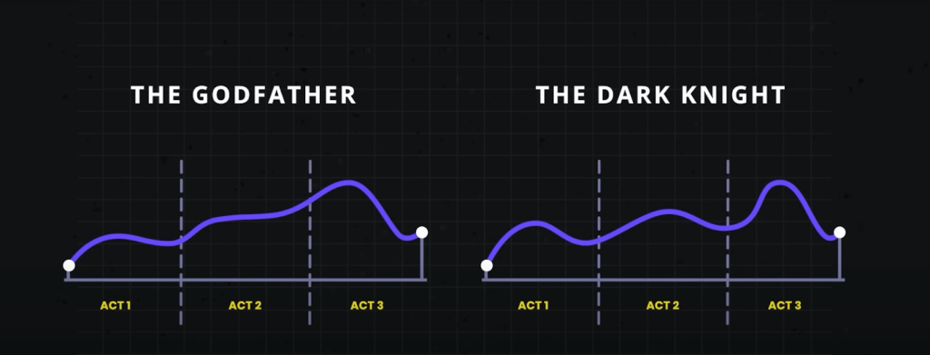
    Think of your favorite film. It more than likely follows a three-act narrative construction: the installation, the turmoil, and the resolution. The second act shows what exists now, and it helps you get to know the characters and the challenges and problems that they face. Act two sets the scene for the fight and introduces the action. Here, difficulties grow or get worse. The solution is the third and final work. This is where the issues are resolved and the figures learn and change. This architecture, in my opinion, is also a fantastic way to think about consumer research, and it might be particularly useful for introducing user research to others.

    Use story as a framework for conducting research

    It’s sad to say, but many have come to view studies as being inconsequential. Research is typically one of the first things to go when finances or deadlines are tight. Instead of investing in study, some goods professionals rely on manufacturers or—worse—their personal judgment to make the “right” options for users based on their experience or accepted best practices. That may lead some groups, but that approach can so easily miss the chance to solve people ‘ real issues. To be user-centered, this is something we really avoid. Design is enhanced by customer research. It keeps it on trail, pointing to problems and opportunities. Being aware of problems with your goods and taking corrective actions can help you keep ahead of your competition.

    In the three-act structure, each action corresponds to a part of the process, and each part is important to telling the whole story. Let’s take a look at the various functions and how they relate to consumer research.

    Act one: layout

    The basic study comes in handy because the layout is all about understanding the background. Basic research ( also called conceptual, discovery, or original research ) helps you understand people and identify their problems. Like in the movies, you’re learning about the difficulties customers face, what options are available, and how they are affected by them. To do basic research, you may conduct cultural inquiries or journal studies ( or both! ), which may assist you in identifying both prospects and problems. It doesn’t need to be a great investment in time or money.

    Erika Hall discusses the most effective anthropology, which can be as straightforward as spending 15 hours with a customer and asking them to” Walk me through your morning yesterday.” That’s it. Provide that one ask. Locked up and listen to them for 15 days. Do everything in your power to protect both your objectives and yourself. Bam, you’re doing ethnography”. Hall predicts that “[This ] will likely prove quite fascinating. In the very unlikely event that you didn’t learn anything new or helpful, carry on with increased confidence in your way”.

    I think this makes sense. And I love that this makes consumer studies so visible. You can simply attract individuals and carry out the recruitment process without having to make a lot of paperwork! This can offer a wealth of knowledge about your customers, and it’ll help you better understand them and what’s going on in their life. Understanding where people are coming from is what action one is really all about.

    Maybe Spool talks about the importance of basic research and how it may type the bulk of your research. If you can supplement what you’ve heard in the basic studies by using any more user data that you can obtain, such as surveys or analytics, to make recommendations that may need to be investigated further, you might as well use those that can be drawn from those that you can obtain. Together, all this information creates a clearer picture of the state of things and all its inadequacies. And that’s the start of a gripping tale. It’s the place in the story where you realize that the principal characters—or the people in this case—are facing issues that they need to conquer. This is where you begin to develop compassion for the figures and support their success, much like in the movies. And finally participants are now doing the same. Their concern may be with their company, which could be losing money because people are unable to complete specific tasks. Or probably they do connect with people ‘ problems. In any case, work one serves as your main strategy to pique the interest and interest of the participants.

    When partners begin to understand the value of basic research, that is open doors to more opportunities that involve users in the decision-making approach. And that can help product team become more user-centric. This gains everyone—users, the goods, and partners. It’s similar to winning an Oscar for a film; it frequently results in a favorable reception and success for your item. And this can be an opportunity for participants to repeat this process with different products. The secret to this method is storytelling, and knowing how to tell a compelling story is the only way to entice participants to do more research.

    This brings us to work two, where you incrementally review a design or idea to see whether it addresses the problems.

    Act two: fight

    Act two is all about digging deeper into the problems that you identified in operate one. In order to evaluate a potential alternative ( such as a design ), you typically conduct vertical research, such as usability tests, to see if it addresses the problems you identified. The issues may include unfulfilled needs or problems with a circulation or procedure that’s tripping users away. More issues may come up in the process, much like in action two of a movie. It’s ok that you learn more about the characters as they grow and develop through this work.

    Usability tests should generally consist of five participants, according to Jakob Nielsen, who found that that number of users can usually identify the majority of the issues:” As you add more and more users, you learn less and less because you will keep seeing the same things again and again… After the second user, you are wasting your time by observing the same findings regularly but hardly learning much new.”

    There are parallels with storytelling here too, if you try to tell a story with too many characters, the plot may get lost. With fewer participants, each user’s struggles will be more memorable and accessible to other stakeholders when presenting the research. This can help convey the issues that need to be addressed while also highlighting the value of doing the research in the first place.

    Usability tests have been conducted in person for decades, but you can also conduct them remotely using software like Microsoft Teams, Zoom, or other teleconferencing software. This approach has become increasingly popular since the beginning of the pandemic, and it works well. You might consider in-person usability tests like watching a movie as opposed to remote testing like attending a play. There are advantages and disadvantages to each. Usability research in person is a much more extensive experience. Stakeholders can experience the sessions with other stakeholders. Additionally, you get real-time reactions, including surprises, disagreements, and discussions about what they’re seeing. Much like going to a play, where audiences get to take in the stage, the costumes, the lighting, and the actors ‘ interactions, in-person research lets you see users up close, including their body language, how they interact with the moderator, and how the scene is set up.

    If conducting usability testing in the field is like watching a play that is staged and controlled, where any two sessions may be very different from one another. You can take usability testing into the field by creating a replica of the space where users interact with the product and then conduct your research there. Or you can conduct your research by meeting users at their locations. With either option, you get to see how things work in context, things come up that wouldn’t have in a lab environment—and conversion can shift in entirely different directions. You have less control over how these sessions end as researchers, but this can occasionally help you understand users even better. Meeting users where they are can provide clues to the external forces that could be affecting how they use your product. In-person usability tests add a level of detail that remote usability tests frequently lack.

    That’s not to say that the “movies” —remote sessions—aren’t a good option. A wider audience can be reached through remote sessions. They allow a lot more stakeholders to be involved in the research and to see what’s going on. And they make access to a much wider range of users in their own country. But with any remote session there is the potential of time wasted if participants can’t log in or get their microphone working.

    You can ask real users questions to understand their thoughts and understanding of the solution as a result of usability testing, whether it is done remotely or in person. This can help you not only identify problems but also glean why they’re problems in the first place. Additionally, you can test your own hypotheses and determine whether your reasoning is correct. By the end of the sessions, you’ll have a much clearer picture of how usable the designs are and whether they work for their intended purposes. The excitement centers on Act 2, but there are also potential surprises in that Act. This is equally true of usability tests. Sometimes, participants will say unexpected things that alter the way you look at them, which can lead to unexpected turns in the story.

    Unfortunately, user research is sometimes seen as expendable. Usability testing is frequently the only method of research that some stakeholders believe they ever need, and it’s too frequently the case. In fact, if the designs that you’re evaluating in the usability test aren’t grounded in a solid understanding of your users ( foundational research ), there’s not much to be gained by doing usability testing in the first place. That’s because you’re narrowing down the area of focus on without considering the needs of the users. As a result, there’s no way of knowing whether the designs might solve a problem that users have. In the context of a usability test, it’s only feedback on a particular design.

    On the other hand, if you only do foundational research, while you might have set out to solve the right problem, you won’t know whether the thing that you’re building will actually solve that. This demonstrates the value of conducting both directional and foundational research.

    In act two, stakeholders will—hopefully—get to watch the story unfold in the user sessions, which creates the conflict and tension in the current design by surfacing their highs and lows. And in turn, this can encourage stakeholders to take action on the issues raised.

    Act three: resolution

    The third act is about resolving the issues from the first two acts, while the first two acts are about understanding the background and the tensions that can compel stakeholders to take action. While it’s important to have an audience for the first two acts, it’s crucial that they stick around for the final act. That includes the entire product team, including developers, UX experts, business analysts, delivery managers, product managers, and any other interested parties who have a say in the coming development. It allows the whole team to hear users ‘ feedback together, ask questions, and discuss what’s possible within the project’s constraints. And it gives the UX design and research teams more time to clarify, suggest alternatives, or provide more context for their choices. So you can get everyone on the same page and get agreement on the way forward.

    This act is primarily told through voiceover with some audience participation. The researcher is the narrator, who paints a picture of the issues and what the future of the product could look like given the things that the team has learned. They provide the stakeholders with their suggestions and direction for developing this vision.

    Nancy Duarte in the Harvard Business Review offers an approach to structuring presentations that follow a persuasive story. The most effective presenters” set up a conflict that needs to be resolved” using the same methods as great storytellers, Duarte writes. ” That tension helps them persuade the audience to adopt a new mindset or behave differently”.

    This type of structure aligns well with research results, and particularly results from usability tests. It provides proof for “what is “—the issues you’ve identified. And “what could be “—your recommendations on how to address them. And so forth and forth.

    You can reinforce your recommendations with examples of things that competitors are doing that could address these issues or with examples where competitors are gaining an edge. Or they can be as visual as quick sketches of a potential solution to a problem. These can help generate conversation and momentum. And this continues until the session is over, when you’ve concluded by bridging the gaps and offering suggestions for improvement. This is the part where you reiterate the main themes or problems and what they mean for the product—the denouement of the story. This stage provides stakeholders with the next steps and, hoped, the motivation to take those steps!

    While we are nearly at the end of this story, let’s reflect on the idea that user research is storytelling. The three-act structure of user research contains all the components for a good story:

      Act one: You meet the protagonists ( the users ) and the antagonists ( the problems affecting users ). The plot begins here. In act one, researchers might use methods including contextual inquiry, ethnography, diary studies, surveys, and analytics. These techniques can produce personas, empathy maps, user journeys, and analytics dashboards as output.
      Act two: Next, there’s character development. The protagonists encounter problems and challenges, which they must overcome, and there is conflict and tension. In act two, researchers might use methods including usability testing, competitive benchmarking, and heuristics evaluation. Usability findings reports, UX strategy documents, usability guidelines, and best practices can be included in the output of these.
      Act three: The protagonists triumph and you see what a better future looks like. Researchers may use techniques like presentation decks, storytelling, and digital media in act three. The output of these can be: presentation decks, video clips, audio clips, and pictures.

    The researcher plays a variety of roles, including producer, director, and storyteller. The participants have a small role, but they are significant characters ( in the research ). And the audience are the stakeholders. But the most important thing is to get the story right and to use storytelling to tell users ‘ stories through research. In the end, the parties should leave with a goal and an eagerness to fix the product’s flaws.

    So the next time that you’re planning research with clients or you’re speaking to stakeholders about research that you’ve done, think about how you can weave in some storytelling. In the end, user research is beneficial to everyone, and all parties must be interested in the conclusion.

  • Warfare Review: Alex Garland’s Snapshot of Iraq War Hell

    Warfare Review: Alex Garland’s Snapshot of Iraq War Hell

    Someone once said that waiting for something makes for such nice pain. Sure, as demonstrated in Ray Mendoza and Alex Garland’s Warfare, it can also be the cause of all fear, dread, and unyielding despair. That is until the name of the event, flames and thunder, shock and awe, descends. Then, [ ] ] comes the loud screaming and [ ]…

    The first article on Den of Geek‘s Warfare Review: Alex Garland’s Preview of Iraq War Hell appeared second.

    This article contains spoilers for Reacher’s year three episode.

    We’ve all been waiting for the battle in Reacher’s year three episode. For those who haven’t read Reacher vs. Paulie, or as I like to visit it, Big Boy vs. Paulie, that this year is based on. Bigger Boy has been immortalized in the hearts of the constellations since these two first met. In episode 2, we were given a brief glimpse of how a fight between them might look, but that is far beyond the glorious yet terrible final confrontation in episode 8 of” Unfinished Business,” which was so terrible that it knocked actor Alan Ritchson unconscious while filming.

    Reacher ( Alan Ritchson ) and his small but formidable team have arrived at the Beck’s mansion to take care of Quinn ( Brian Tee ) permanently. Paulie ( Olivier Richters ), Quinn’s massive henchman, is standing in their way. Reacher then does what he does best: sends the others away while attempting to beat Paulie to pieces.

    cnx. powershell. push ( function ( ) {cnx ( {playerId:” 106e33c0-3911-473c-b599-b1426db57530″, }). render ( “0270c398a82f44f49c23c16122516796” ), }),

    Reacher uses the element of surprise to gain control of the situation, but he quickly finds himself fighting for his life against a man half his size. Soon their conflict spreads into a nearby door, where Paulie hurls Reacher through the doorway, through a blog, and later into a table.

    If Reacher appeared to have actually gotten the wind out of him at this point, it was because Ritchson was incapacitated during the ploy. Even despite the opposition from his group, Richson insisted on performing this stunt because he wanted the audience to see it as true. And I get the brilliant idea to do a prank because I wanted the viewers to know that I was doing it for us. I&#8217, m taking one for Reacher and we&#8217, re all in this together, &#8217″, Ritchson told Entertainment Weekly. And so I wanted the lens to come up and just kept putting it on my experience the entire time while getting smashed through a board on the house floors. &#8221,

    The comedian a day and a half after woke up having explained to his children, who were on set during shooting, that he was fine after being smashed through the board and into” the seventh circle of hell,” as Ritchson claims.

    Ritchson was finally able to continue filming this fight because he came out reasonably well and relatively alive. The artist claims that the entire collection was shot in three weeks, which is not surprising given that the garage is just one of the many locations where these two square off across the Beck property.

    Reacher even discovers a way to get back away after being knocked through the board. It seems like both of these hefty guys are essentially invincible for a while as they continue to survive whatever the other throws at them. Paulie also finds his way back to shore after Reacher finds him atop the rough sea waters that borders the castle. &nbsp,

    Finally, Reacher discovers a way to outwit Paulie, just as he did in the gym at the beginning of the season. Reacher encroaches on Paulie’s small security shed, causing it to backfire when Paulie tries to fire it at him. Even for Paulie, recovering from an explosive gunshot to the throat is nearly impossible.

    Even though we are aware that Reacher will ultimately emerge victorious, it’s an exciting fight to watch. The 28-minute or so that the show is dedicated to giving the viewers what they want from these long action scenes is a fact that took three weeks for them to complete. Ravichson put himself in danger by doing this right because he was so dedicated to doing it in the first place. &nbsp,

    Book fans have been anticipating this conflict ever since it was revealed that this season would adapt Persuader, and the show did just that on this occasion. Not every day does Jack Reacher meet his slightly bigger match and miraculously live to tell the story. We can’t wait to see what this beefy action hero’s next up to with Reacher vs. Paulie, one of the best things this show has done so far.

    The first post from Den of Geek was Reacher&#8217’s Season 3 Finale Fight Was Even More Grueling Than It Looked.

  • Hunt for Red October’s English Switch Is Still the Best Way to Handle Languages in Movies

    Hunt for Red October’s English Switch Is Still the Best Way to Handle Languages in Movies

    ” Armageddon”. Putin used the phrase in the 1990 Tom Clancy film version The Hunt for Red October, which has a strong weight. The Hunt for Red October is a Cold War drama about the Russian and American Navies ‘ search for the mythical nuclear submarine, a potential conflict.

    The article Hunt for Red October’s English Switch Is Still the Best Method for Handling Language in Movies first appeared on Den of Geek.

    The Reacher period three episode has spoilers in this article.

    The Reacher winter 3 episode has finally given us the battle we’ve all been waiting for. Even for those who haven’t read the book Reacher vs. Paulie, or as I like to call it Great Child vs. Paulie, this time is based on. Bigger Boy, has been immortalized in the imagination of the constellations since these two first spied on one another. In show 2, we were given a small glimpse of what a fight between them may look like, but that doesn’t compare to the bloody yet terrible last fight in episode 8″ Unfinished Business,” which was so brutal that it knocked actor Alan Ritchson unconscious while filming.

    Quinn ( Brian Tee ) has been cared for permanently by Reacher ( Alan Ritchson ) and his small but powerful team at the Beck’s mansion. Paulie ( Olivier Richters ), Quinn’s massive henchman, is standing in their way. Reacher then does what he does best: sends the others away while attempting to beat Paulie to pieces.

    cnx. powershell. push ( function ( ) {cnx ( {playerId:” 106e33c0-3911-473c-b599-b1426db57530″, }). render ( “0270c398a82f44f49c23c16122516796” ), }),

    Reacher initially has the advantage of surprise, but he quickly finds himself fighting for his career against a man twice his size. Soon their conflict spreads into a nearby car, where Paulie hurls Reacher through the doorway, through a blog, and later into a table.

    If Reacher appeared to have really gotten the wind out of him at this point, it was because Ritchson was incapacitated during the stunt. Even with the support of his crew, Richson insisted on performing this stunt because he wanted the audience to see it as true. And I get the brilliant idea to do a prank because I wanted the market to know that I was doing this for us. I&#8217, m taking one for Reacher and we&#8217, re all in this together, &#8217″, Ritchson told Entertainment Weekly. ” And so I wanted the lens to come up and keep my face the entire time while I was smashed through a board on the house ground.” &#8221,

    The comedian a day and a half after woke up having explained to his children, who were on set during shooting, that he was fine after being smashed through the board and into” the seventh circle of hell,” as Ritchson claims.

    Ritchson was finally able to continue filming this fight because he came out reasonably well and relatively alive. The artist claims that the entire collection was shot in three weeks, which is not surprising given that the garage is just one of the many locations where these two square off across the Beck property.

    Reacher even discovers a way to climb back up after being knocked through the board. Both of these hefty guys seem to be almost invincible for a while as they continue to survive whatever the other throws at them. Paulie also finds his way back to shore after Reacher finds him atop the rough sea waters that encircle the castle. &nbsp,

    Lastly, Reacher discovers a way to outwit Paulie, only as he did in the gym at the beginning of the year. Reacher encroaches on Paulie’s small protection shed, causing it to backfire when Paulie tries to blaze it at him. Also for Paulie, recovering from an explosive bullet to the neck is nearly impossible.

    It’s a fascinating fight to observe, despite the fact that we are aware of the good chances that Reacher will ultimately prevail. The 28-minute or so that the present is dedicated to giving the viewers what they want from these long action scenes is a fact that took three months for them to complete. Ravichson put himself in danger by doing this proper because he was so dedicated to doing it correctly. &nbsp,

    Text fans have been anticipating this conflict ever since it was revealed that this season’s Persuader adaptation will be shown, and the show did just that on this occasion. Not every day does Jack Reacher satisfy his somewhat bigger match and unexpectedly survive. One of the best things that this show has accomplished so far is Reacher vs. Paulie, and we’re eager to see what this hefty action hero’s next project will be.

    The second post Reacher&#8217, s Season 3 Finale Fight Was Even More Tough Than It Looked appeared second on Den of Geek.

  • Assassin’s Creed Shadows: Best Legendary Weapons for Naoe and Yasuke

    Assassin’s Creed Shadows: Best Legendary Weapons for Naoe and Yasuke

    Assassin’s Creed Shadows is a clear winner for best conflict in franchise history, but it’s up for debate where it ranks among the Assassin’s Creed activities in the order. [ ] The disparate styles and weaponry combinations between Naoe and Yasuke keeps the fighting moving well into the game, and the improved AI makes challenging enemy battles feel more difficult.

    The second article was Assassin’s Creed Shadows: Best Legendary Weapons for Naoe and Yasuke on Den of Geek.

    The year three episode of Reacher has clues in this article.

    The Reacher year 3 episode has finally given us the battle we’ve all been waiting for. Even for those who haven’t read the book Reacher vs. Paulie, or as I like to visit it, Big Boy vs. Paulie, this year is based on. Bigger Boy, has been immortalized in the imagination of the constellations since these two first spied on one another. In episode 2, we were given a brief glimpse of how a fight between them might look, but that is far beyond the glorious yet terrible last confrontation in episode 8 of” Empty Business,” which was so harsh that it knocked actor Alan Ritchson unconscious while filming.

    Reacher ( Alan Ritchson ) and his small but formidable team have arrived at the Beck’s mansion to take care of Quinn ( Brian Tee ) permanently. Paulie ( Olivier Richters ), Quinn’s massive henchman, is standing in their way. Reacher then does what he does ideal, leading the pack while attempting to outclass Paulie.

    cnx. powershell. push ( function ( ) {cnx ( {playerId:” 106e33c0-3911-473c-b599-b1426db57530″, }). render ( “0270c398a82f44f49c23c16122516796” ), }),

    Reacher uses the element of surprise to gain control of the situation, but he quickly finds himself fighting for his life against a man half his size. Immediately Paulie and Reacher cross paths through a blog, a nearby car, and later into a table.

    If Reacher appeared to really get the wind out of him at this point, it’s because Ritchson was knocked unconscious by the ploy during filming. Even despite the opposition from his team, Richson insisted on performing this stunt because he wanted the audience to see it as true. And I get the brilliant idea to do a prank because I wanted the audience to know that I was doing it for us. I&#8217, m taking one for Reacher and we&#8217, re all in this together, &#8217″, Ritchson told Entertainment Weekly. And so I set up the camera so that the camera would only stay on my experience the entire time while I was smashed through a board on the house floor. &#8221,

    The comedian a day and a half after woke up having explained to his children, who were on set during shooting, that he was fine after being smashed through the board and into” the seventh circle of hell,” as Ritchson claims.

    Sadly, Ritchson survived and was able to finish filming this battle. The artist claims that it took three weeks to complete the collection, which is not surprising given that the car is just one of the many locations across the Beck house where these two circle off.

    Reacher recovers after being knocked through the board. It seems like both of these hefty guys are essentially invincible for a while as they continue to survive whatever the other throws at them. Paulie also finds his way back to shore after Reacher finds him atop the rough sea waters that borders the castle. &nbsp,

    Finally, Reacher discovers a way to outwit Paulie, just as he did in the gym at the beginning of the season. Reacher encroaches on Paulie’s small security shed, causing it to backfire when she tries to fire it at him. Even for Paulie, recovering from an explosive gunshot to the throat is a nearly impossible task.

    Even though we are aware that Reacher will eventually emerge victorious, it’s a fascinating fight to watch. The 28-minute or so that the show is dedicated to giving fans what they want out of these lengthy action scenes is a fact that took three weeks to complete. Ravichson put himself in danger by doing this right because he was so dedicated to doing it right. &nbsp,

    Book fans have been anticipating this conflict ever since it was revealed that this season’s Persuader adaptation will be shown, and the show did just that on this occasion. Not every day does Jack Reacher meet his slightly bigger match and miraculously survive. We can’t wait to see what this beefy action hero’s next up to with Reacher vs. Paulie, one of the best things this show has done so far.

    The first post Reacher&#8217, s Season 3 Finale Fight Was Even More Grueling Than It Looked appeared first on Den of Geek.

  • WEBTOON Unscrolled’s Viral Hit Is A Must-Read Modern Classic

    WEBTOON Unscrolled’s Viral Hit Is A Must-Read Modern Classic

    When a great title arrives at the absolute best moment, it’s often exciting, and it seems like everything works together to make the story even stronger. The visually stunning film” Popular Beat” by WEBTOON Unscrolled, starring Taejun Pak and illustrated by Kim Junghyun, is a breath of fresh air that […]…

    The second post Den of Geek: The Viral Hit Is A Must-Read Modern Classic was a result of the blog WEBTOON Unscrolled.

    This article contains spoilers for Reacher’s year three episode.

    The Reacher year 3 episode has suddenly given us the battle we’ve been anticipating. Even for those who haven’t read the book Reacher vs. Paulie, or as I like to visit it, Big Boy vs. Paulie, this year is based on. Bigger Boy has been immortalized in the hearts of the constellations since these two first met. In show 2, we had a brief glimpse of what a fight between them may look like, but it isn’t as epic as the bloody yet terrible last fight in episode 8″ Untouched Business,” which was so brutal it knocked star Alan Ritchson incapacitated during filming.

    Quinn ( Brian Tee ) has been cared for permanently by Reacher ( Alan Ritchson ) and his small but powerful team at the Beck’s mansion. Paulie ( Olivier Richters ), Quinn’s massive henchman, is standing in their way. Reacher then does what he does best: sends the others away while attempting to beat Paulie to pieces.

    cnx. powershell. push ( function ( ) {cnx ( {playerId:” 106e33c0-3911-473c-b599-b1426db57530″, }). render ( “0270c398a82f44f49c23c16122516796” ), }),

    Reacher initially enjoys the advantage of surprise, but he quickly finds himself fighting for his career against a man twice his size. Soon their conflict spreads into a nearby door, where Paulie hurls Reacher through the doorway, through a blog, and later into a table.

    If Reacher appeared to really get the wind out of him at this point, it’s because Ritchson was knocked unconscious by the ploy during filming. Even with the support of his crew, Richson insisted on performing this stunt because he wanted the audience to see it as true. And I get the brilliant idea to do a prank because I wanted the viewers to know that I was doing it for us. I&#8217, m taking one for Reacher and we&#8217, re all in this together, &#8217″, Ritchson told Entertainment Weekly. And so I wanted the lens to come up and just kept putting it on my experience the entire time while getting smashed through a board on the house floors. &#8221,

    The comedian a day and a half after woke up having explained to his children, who were on set during shooting, that he was fine after being smashed through the board and into” the seventh circle of hell,” as Ritchson claims.

    Luckily, Ritchson survived and was able to finish filming this battle. The artist claims that it took three weeks to complete the collection, which is not surprising given that the car is just one of the many locations across the Beck house where these two circle off.

    Reacher recovers after being knocked through the board. Both of these hefty guys seem to be almost invincible for a while as they continue to survive whatever the other throws at them. Paulie also finds his way back to shore after Reacher finds him atop the rough sea waters that encircle the castle. &nbsp,

    Lastly, Reacher discovers a way to outwit Paulie, only as he did in the gym at the beginning of the time. Reacher encroaches on Paulie’s small protection shed, causing it to backfire when she tries to flame it at him. Yet for Paulie, recovering from an explosive bullet to the neck is almost impossible.

    Even though we are aware that Reacher will ultimately emerge victorious, it’s an interesting fight to see. The 28-minute or so that the present is dedicated to giving the viewers what they want from these long action scenes is a fact that took three months for them to complete. Ravichson put himself in danger by doing this right because he was so dedicated to doing it correctly. &nbsp,

    Text enthusiasts have been anticipating this conflict ever since it was revealed that this season’s Persuader adaptation will be shown, and the show did just that. Not every day does Jack Reacher fulfill his somewhat bigger match and unexpectedly survive. One of the best things that this present has accomplished so far is Reacher vs. Paulie, and we can’t wait to see what this meaty action hero’s next project will be.

    The second post From Den of Geek appeared in Reacher&#8217, s Season 3 Finale Fight Was Even More Tough Than It Looked.

  • Beware the Cut ‘n’ Paste Persona

    Beware the Cut ‘n’ Paste Persona

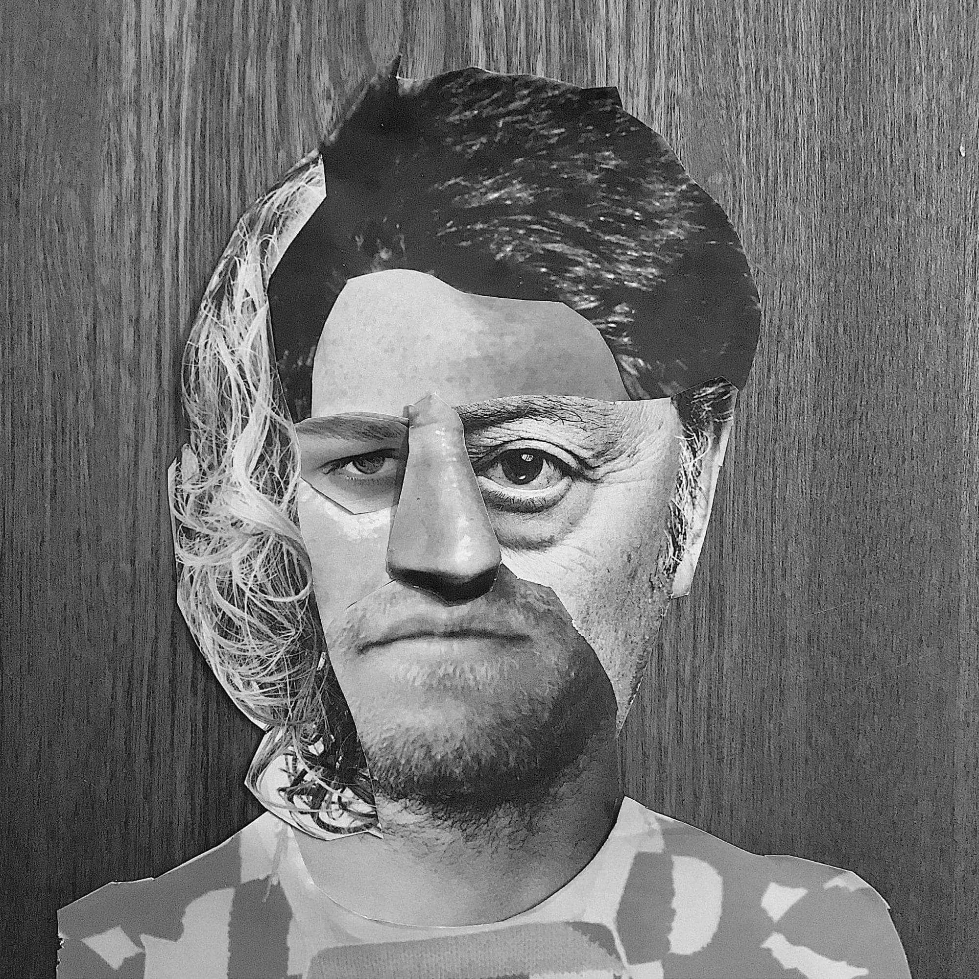
    This Person Does Not Exist is a website that uses a machine learning algorithm to create individual heads. It takes actual photos and recombines them into false human faces. We just squirted past a LinkedIn article that claimed this site might be helpful “if you are developing a image and looking for a photo.”

    We agree: the computer-generated eyes could be a great fit for personas—but not for the purpose you might think. Ironically, the website highlights the core issue of this very common design method: the person ( a ) does not exist. Personas are deliberately created, just like in the photos. Knowledge is taken out of natural environment and recombined into an isolated preview that’s detached from reality.

    However, oddly enough, developers use personalities to inform their designs for the real world.

    Personas: A action up

    Most manufacturers have created, used, or come across personalities at least once in their profession. The Interaction Design Foundation defines profile as “fictional characters that you create based upon your research in order to represent the various consumer types that might use your company, product, page, or brand,” according to their article” Personas- A Simple Introduction.” In their most complete expression, personas typically consist of a name, profile picture, quotes, demographics, goals, needs, behavior in relation to a certain service/product, emotions, and motivations ( for example, see Creative Companion’s Persona Core Poster ). According to design firm Designit, the goal of personas is to “make the research relateable, ]and ] easy to communicate, digest, reference, and apply to product and service development.”

    The decontextualization of identities

    Personas are common because they make “dry” research information more realistic, more people. However, this approach places a cap on the study’s data research, making it impossible for the investigated users to be excluded from their particular contexts. As a result, personalities don’t describe important factors that make you realize their decision-making method or allow you to connect to users ‘ thoughts and behavior, they lack stories. You are aware of the persona’s actions, but you lack the history knowledge to understand why. You end up with images of people that are really less people.

    This “decontextualization” we see in identities happens in four way, which we’ll discuss below.

    People are assumed to be stable, according to individuals.

    Although many companies still try to box in their employees and customers with outdated personality tests ( referring to you, Myers-Briggs ), here’s a painfully obvious truth: people are not a fixed set of features. You think, act, and think differently in various circumstances. You appear distinct to different people, you may act helpful to some, tough to others. And you change your mind all the time about judgments you’ve taken.

    Modern therapists agree that while people typically act in accordance with specific patterns, how they act and make decisions is influenced by a combination of both their environment and history. The context—the atmosphere, the effect of other people, your feelings, the whole story that led up to a situation—determines the kind of person you are in each particular time.

    Personalities do not account for this variation in their attempt to reduce reality; instead, they present a consumer as a predetermined set of features. Like character testing, personas seize people away from real life. Even worse, individuals are reduced to a brand and categorized as” that kind of guy” with no means to practice their inherent flexibility. This behavior discredits diversity, perpetuates stereotypes, and doesn’t reveal reality.

    Personas rely on people, not the setting

    You’re designing for a environment, not an individual, in the real world. Each individual lives in a community, a group, an habitat, where there are environmental, social, and cultural factors you need to consider. A pattern is not meant for a single customer. Instead, you create a design for one or more specific situations where a large number of people may use that product. Personas, yet, show the customer alone rather than explain how the consumer relates to the environment.

    Would you choose the exact course of action repeatedly? Maybe you’re a dedicated vegan but also decide to buy some meats when your family are coming across. As they depend on various situations and characteristics, your decisions—and behavior, thoughts, and comments —are no absolute but extremely contextual. Because it doesn’t explain the grounds of your decisions, the persona that “represents” you doesn’t take into account this interdependence. It doesn’t provide a rationale of why you act the way you do. People practice the well-known attribution error, which states that they too often attribute others ‘ behavior to their personalities and not to the circumstances.

    As mentioned by the Interaction Design Foundation, identities are often placed in a situation that’s a” specific environment with a problem they want to or have to solve “—does that mean environment actually is considered? Unfortunately, what often happens is that you take a fictional character and based on that fiction determine how this character might deal with a certain situation. How could you possibly understand how someone you want to represent behave in new circumstances if you hadn’t even fully investigated and understood the current context of the people you want to represent?

    Personas are meaningless averages

    A persona is depicted as a specific person but is not a real person, as stated in Shlomo Goltz’s introduction article on Smashing Magazine; rather, it is made up of observations from numerous people. A well-known critique to this aspect of personas is that the average person does not exist, as per the famous example of the USA Air Force designing planes based on the average of 140 of their pilots ‘ physical dimensions and not a single pilot actually fitting within that average seat.

    The same limitation applies to mental aspects of people. Have you ever heard a famous person say something was taken out of context? They used my words, but I didn’t mean it like that”. The reporter didn’t explain the context of the celebrity’s statement or explain the non-verbal expressions, but the celebrity’s statement was literally reported. As a result, the intended meaning was lost. You do the same when you create personas: you collect somebody’s statement ( or goal, or need, or emotion ), of which the meaning can only be understood if you provide its own specific context, yet report it as an isolated finding.

    However, personas go one step further, combining a decontextualized finding with another decontextualized finding from another. The resulting set of findings often does not make sense: it’s unclear, or even contrasting, because it lacks the underlying reasons on why and how that finding has arisen. It lacks any significance. And the persona doesn’t give you the full background of the person ( s ) to uncover this meaning: you would need to dive into the raw data for each single persona item to find it. What, then, is the usefulness of the persona?

    The validity of personas is deceiving.

    To a certain extent, designers realize that a persona is a lifeless average. To combat this, designers create and add “relatable” details to personas to make them appear to be real people. Nothing captures the absurdity of this better than a sentence by the Interaction Design Foundation:” Add a few fictional personal details to make the persona a realistic character”. In other words, you add non-realism in an attempt to create more realism. Wouldn’t it be much more responsible to emphasize that John is only an abstraction if you purposefully conceal the fact that” John Doe” is an abstract representation of research findings? If something is artificial, let’s present it as such.

    After accepting that people’s personalities are fixed, ignored the importance of their environment, and hidden meaning by joining isolated, non-generalizable findings, designers create new context to create ( their own ) meaning. In doing so, as with everything they create, they introduce a host of biases. As phrased by Designit, as designers we can” contextualize]the persona ] based on our reality and experience. We make connections that are well-known to us. This practice reinforces stereotypes, doesn’t reflect real-world diversity, and gets further away from people’s actual reality with every detail added.

    Everyone should use their own empathy and develop their own interpretation and emotional response if we want to conduct good design research by reporting the reality “as-is” and making it relatable for our audience.

    Dynamic Selves: The alternative to personas

    If we shouldn’t use personas, what should we do instead?

    Designit suggests using mindsets rather than personas. Each Mindset is a” spectrum of attitudes and emotional responses that different people have within the same context or life experience”. It challenges designers to avoid becoming fixated on just one person’s way of being. Unfortunately, while being a step in the right direction, this proposal doesn’t take into account that people are part of an environment that determines their personality, their behavior, and, yes, their mindset. Therefore, Mindsets are also not absolute but change in regard to the situation. What determines a particular Mindset, remains to be seen.

    Another alternative comes from Margaret P., author of the article” Kill Your Personas“, who has argued for replacing personas with persona spectrums that consist of a range of user abilities. For instance, a visual impairment could be permanent ( blindness ), temporary ( recovery from eye surgery ), or situational (screen glare ). Persona spectrums are highly useful for more inclusive and context-based design, as they’re based on the understanding that the context is the pattern, not the personality. Their limitation, however, is that they have a very functional take on users that misses the relatability of a real person taken from within a spectrum.

    We want to change the traditional design process to be context-based by creating an alternative to personas. Contexts are generalizable and have patterns that we can identify, just like we tried to do previously with people. So how do we learn these patterns? How do we ensure truly context-based design?

    Understand real individuals in multiple contexts

    Nothing about reality can be more relatable and inspiring. Therefore, we have to understand real individuals in their multi-faceted contexts, and use this understanding to fuel our design. Dynamic Selves is how we define it.

    Let’s take a look at what the approach looks like, based on an example of how one of us applied it in a recent project that researched habits of Italians around energy consumption. We drafted a design research plan aimed at investigating people’s attitudes toward energy consumption and sustainable behavior, with a focus on smart thermostats.

    1. Choose the right sample

    We frequently get slammed for saying,” Where are you going to find a single person that encapsulates all the information from one of these advanced personas ]” when we debate personas. The answer is simple: you don’t have to. You don’t need to have information about many people for your insights to be deep and meaningful.

    Quantity is key to qualitative research, but sampling accuracy is key to its validity. You select the people that best represent the “population” you’re designing for. If this sample is chosen wisely and you have a deep understanding of the sampled people, you can infer how the rest of the population thinks and acts. There’s no need to study seven Susans and five Yuriys, one of each will do.

    Similarly, you don’t need to understand Susan in fifteen different contexts. Once you’ve seen her in a few different settings, you’ve come to understand how Susan responds to various circumstances. Not Susan as an atomic being but Susan in relation to the surrounding environment: how she might act, feel, and think in different situations.

    It becomes clear why each person should be portrayed as an individual because each already represents an abstraction of a larger group of people in similar circumstances because each person is representative of a portion of the population you’re researching. You don’t want abstractions of abstractions! These selected people need to be understood and shown in their full expression, remaining in their microcosmos—and if you want to identify patterns you can focus on identifying patterns in contexts.

    However, the question persists: how do you choose a sample representative? First of all, you have to consider what’s the target audience of the product or service you are designing: it might be useful to look at the company’s goals and strategy, the current customer base, and/or a possible future target audience.

    We were creating an application for those who own a smart thermostat in our example project. In the future, everyone could have a smart thermostat in their house. Right now, though, only early adopters own one. We needed to understand the reason behind these early adopters in order to build a significant sample. We therefore recruited by asking people why they had a smart thermostat and how they got it. There were those who had made the decision to purchase it, those who had been influenced by others to do so, and those who had located it in their homes. So we selected representatives of these three situations, from different age groups and geographical locations, with an equal balance of tech savvy and non-tech savvy participants.

    2. Conduct your research

    After having chosen and recruited your sample, conduct your research using ethnographic methodologies. This will give you more examples and anecdotes to enrich your qualitative data. In our example project, given COVID-19 restrictions, we converted an in-house ethnographic research effort into remote family interviews, conducted from home and accompanied by diary studies.

    To gain an in-depth understanding of attitudes and decision-making trade-offs, the research focus was not limited to the interviewee alone but deliberately included the whole family. With the additions or corrections made by wives, husbands, children, or occasionally even pets, each interviewee would tell a story that would then become much more engaging and precise. We also focused on the relationships with other meaningful people ( such as colleagues or distant family ) and all the behaviors that resulted from those relationships. This extensive field of study gave us the ability to create a vivid mental image of dynamic situations involving multiple actors.

    It’s essential that the scope of the research remains broad enough to be able to include all possible actors. Therefore, it normally works best to define broad research areas with macro questions. Follow-up questions will be written down in a way that is best suited for an interview, and they should be conducted in a semi-structured manner. This open-minded “plan to be surprised” will yield the most insightful findings. One of our participants responded,” My wife doesn’t have the thermostat’s app installed; she uses WhatsApp instead,” when we asked how his family controlled the temperature in the house. If she wants to turn on the heater and she is not home, she will text me. I am her thermostat”.

    3. Analysis: Create the Dynamic Selves

    You begin to represent each individual with several Dynamic Selves, each” Self” representing one of the circumstances you have examined throughout the research analysis. The core of each Dynamic Self is a quote, which comes supported by a photo and a few relevant demographics that illustrate the wider context. The research findings themselves will show which demographics are relevant to show. The key demographics were family type, number and type of homes owned, economic status, and technological maturity in our case because our research focused on families and their way of life to understand their needs for thermal regulation. ( We also included the individual’s name and age, but they’re optional—we included them to ease the stakeholders ‘ transition from personas and be able to connect multiple actions and contexts to the same person ).

    Interviews must be recorded on video and verbatim whenever possible in order to capture precise quotations. This is essential to the truthfulness of the several Selves of each participant. In the case of real-life ethnographic research, photos of the context and anonymized actors are essential to build realistic Selves. As long as these photos are realistic and depict meaningful actions that you associate with your participants, they should be taken directly from field research, but an evocative and representative image can also work. For example, one of our interviewees told us about his mountain home where he used to spend every weekend with his family. Therefore, we depicted him taking a hike with his young daughter.

    At the end of the research analysis, we displayed all of the Selves ‘” cards” on a single canvas, categorized by activities. Each card displayed a situation, represented by a quote and a unique photo. All participants had several cards about themselves.

    4. Identify creative uses

    Once you have collected all main quotes from the interview transcripts and diaries, and laid them all down as Self cards, you will see patterns emerge. These patterns will highlight the opportunity areas for new product creation, new functionalities, and new services—for new design.

    There was a particularly intriguing insight around the concept of humidity in our example project. We realized that people don’t know what humidity is and why it is important to monitor it for health: an environment that’s too dry or too wet can cause respiratory problems or worsen existing ones. This made clear that our client had a significant opportunity to train users about the concept and work as a health advisor.

    Benefits of Dynamic Selves

    When you use the Dynamic Selves approach in your research, you start to notice unique social relations, peculiar situations real people face and the actions that follow, and that people are surrounded by changing environments. One of the participants in our thermostat project, Davide, has come to know as a boyfriend, dog lover, and tech nut.

    Davide is an individual we might have once reduced to a persona called “tech enthusiast”. However, there are also those who are wealthy or poor, who are tech enthusiasts and have families or are single. Their motivations and priorities when deciding to purchase a new thermostat can be opposite according to these different frames.

    Once you have understood Davide in multiple situations, and for each situation have understood in sufficient depth the underlying reasons for his behavior, you’re able to generalize how he would act in another situation. You can infer what he would think and do in the circumstances ( or scenarios ) you design for using your understanding of him.

    The Dynamic Selves approach aims to dismiss the conflicted dual purpose of personas—to summarize and empathize at the same time—by separating your research summary from the people you’re seeking to empathize with. This is crucial because scale affects how we feel about people and how difficult it is to feel empathy for others. We feel the strongest empathy for individuals we can personally relate to.

    If you take a real person as inspiration for your design, you no longer need to create an artificial character. No more developing plot devices to “realize” the character, and no more need for additional bias. It’s simply how this person is in real life. In fact, as we all know, personas quickly turn into nothing more than a name in our priority guides and prototype screens because we all know these characters don’t really exist.

    Another powerful benefit of the Dynamic Selves approach is that it raises the stakes of your work: if you mess up your design, someone real, a person you and the team know and have met, is going to feel the consequences. It might stop you from taking shortcuts and will remind you to conduct daily checks on your designs.

    Finally, real people in their specific contexts provide a better foundation for anecdotal storytelling and are thus more effective at persuasion. Documentation of real research is essential in achieving this result. It reinforces your design arguments by adding more weight and urgency:” When I met Alessandra, the conditions of her workplace struck me. Noise, bad ergonomics, lack of light, you name it. If we go for this functionality, I’m afraid we’re going to add complexity to her life”.

    Conclusion

    In their article on Mindsets, Designit mentioned that “design thinking tools provide a shortcut to deal with reality’s complexities, but this process of simplification can occasionally flatten out people’s lives into a few general characteristics.” Unfortunately, personas have been culprits in a crime of oversimplification. They fail to account for the complex nature of our users ‘ decision-making processes and don’t take into account the fact that people are immersed in environments.

    Design needs simplification but not generalization. You have to look at the research elements that stand out: the sentences that captured your attention, the images that struck you, the sounds that linger. Use those as metaphors for the person in all of their contexts. Both insights and people come with a context, they cannot be cut from that context because it would remove meaning.

    It’s high time for design to break away from fiction and use reality as our guide and inspiration, in all of its messy, surprising, and unquantifiable beauty.

  • Asynchronous Design Critique: Giving Feedback

    Asynchronous Design Critique: Giving Feedback

    One of the most successful soft knowledge we have at our disposal is the ability to work together to improve our patterns while developing our own abilities and opinions, in whatever form it takes, and whatever it may be called.

    Feedback is also one of the most underestimated equipment, and generally by assuming that we’re now great at it, we settle, forgetting that it’s a skill that can be trained, grown, and improved. Bad opinions can lead to conflict in projects, lower morale, and long-term, undermine trust and teamwork. Quality opinions can be a revolutionary force.

    Practicing our knowledge is absolutely a good way to enhance, but the learning gets yet faster when it’s paired with a good base that programs and focuses the exercise. What are some fundamental components of providing effective opinions? And how can input be adjusted for isolated and distributed function settings?

    We can find a long history of sequential comments on the web: code was written and discussed on mailing lists since the beginning of open source. Currently, engineers engage on pull calls, developers post in their favourite design tools, project managers and sprint masters exchange ideas on tickets, and so on.

    Design analysis is often the label used for a type of input that’s provided to make our job better, jointly. It generally shares many of the concepts with comments, but it also has some differences.

    The material

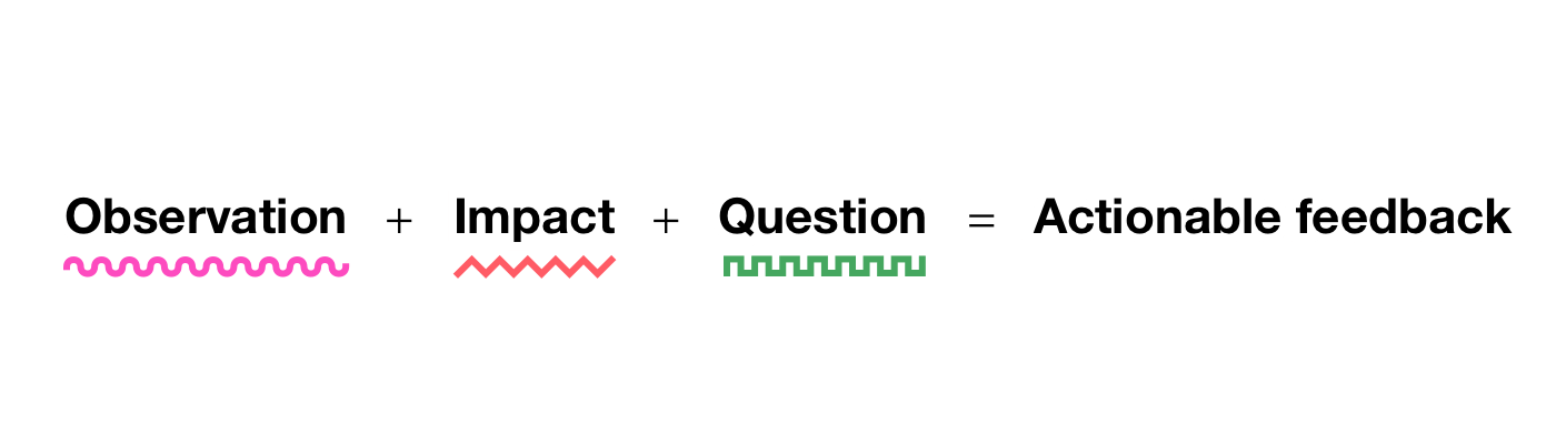
    The material of the feedback serves as the foundation for all effective critiques, so we need to start there. There are many versions that you can use to design your content. The one that I personally like best—because it’s obvious and actionable—is this one from Lara Hogan.

    This equation, which is typically used to provide feedback to users, even fits really well in a design critique because it finally addresses one of the main issues that we address: What? Where? Why? How? Imagine that you’re giving some comments about some pattern function that spans several screens, like an onboard movement: there are some pages shown, a stream blueprint, and an outline of the decisions made. You notice a flaw in the situation. If you keep the three elements of the equation in mind, you’ll have a mental model that can help you be more precise and effective.

    Here is a comment that could be included in some feedback, and it might appear reasonable at first glance because it appears to partially fulfill the requirements. But does it?

    Not sure about the buttons ‘ styles and hierarchy—it feels off. Can you alter them?

    Observation for design feedback doesn’t just mean pointing out which part of the interface your feedback refers to, but it also refers to offering a perspective that’s as specific as possible. Do you offer the user’s viewpoint? Your expert perspective? A business perspective? From the perspective of the project manager? A first-time user’s perspective?

    When I see these two buttons, I anticipate one to go forward and the other to go back.

    Impact is about the why. Just pointing out a UI element might sometimes be enough if the issue may be obvious, but more often than not, you should add an explanation of what you’re pointing out.

    When I see these two buttons, I anticipate one to go forward and the other to go back. But this is the only screen where this happens, as before we just used a single button and an “×” to close. This seems to be breaking the consistency in the flow.

    The question approach is meant to provide open guidance by eliciting the critical thinking in the designer receiving the feedback. Notably, in Lara’s equation she provides a second approach: request, which instead provides guidance toward a specific solution. While that’s a viable option for general feedback, in my experience, going back to the question approach typically leads to the best solutions because designers are generally more at ease with having an open space to experiment with.

    The difference between the two can be exemplified with, for the question approach:

    When I see these two buttons, I anticipate one to go forward and the other to go back. But this is the only screen where this happens, as before we just used a single button and an “×” to close. This seems to be breaking the consistency in the flow. Would it make sense to unify them?

    Or, for the request approach:

    When I see these two buttons, I anticipate one to go forward and the other to go back. But this is the only screen where this happens, as before we just used a single button and an “×” to close. This seems to be breaking the consistency in the flow. Let’s make sure that all screens have the same pair of forward and back buttons.

    At this point in some situations, it might be useful to integrate with an extra why: why you consider the given suggestion to be better.

    When I see these two buttons, I anticipate one to go forward and the other to go back. But this is the only screen where this happens, as before we just used a single button and an “×” to close. This seems to be breaking the consistency in the flow. Let’s make sure that all screens have the same two forward and back buttons so that users don’t get confused.

    Choosing the question approach or the request approach can also at times be a matter of personal preference. I did rounds of anonymous feedback and reviewed feedback with other people before putting a lot of effort into improving it a while ago. After a few rounds of this work and a year later, I got a positive response: my feedback came across as effective and grounded. Until I changed teams. Surprise surprise, my next round of criticism from a specific person wasn’t very positive. The reason is that I had previously tried not to be prescriptive in my advice—because the people who I was previously working with preferred the open-ended question format over the request style of suggestions. However, there was a member of this other team who preferred specific guidance. So I adapted my feedback for them to include requests.

    One comment that I heard come up a few times is that this kind of feedback is quite long, and it doesn’t seem very efficient. Yes, but no. Let’s explore both sides.

    No, this kind of feedback is effective because the length is a byproduct of clarity, and giving this kind of feedback can provide precisely enough information for a sound fix. Also if we zoom out, it can reduce future back-and-forth conversations and misunderstandings, improving the overall efficiency and effectiveness of collaboration beyond the single comment. Imagine that in the example above the feedback were instead just,” Let’s make sure that all screens have the same two forward and back buttons”. The designer receiving this feedback wouldn’t have much to go by, so they might just implement the change. In later iterations, the interface might change or they might introduce new features—and maybe that change might not make sense anymore. Without explaining the why, the designer might assume that the change is one of consistency, but what if it wasn’t? So there could now be an underlying concern that changing the buttons would be perceived as a regression.

    Yes, this style of feedback is not always efficient because the points in some comments don’t always need to be exhaustive, sometimes because certain changes may be obvious (” The font used doesn’t follow our guidelines” ) and sometimes because the team may have a lot of internal knowledge such that some of the whys may be implied.

    The equation above is not intended to provide a predetermined template for feedback, but rather a mnemonic to reflect and enhance the practice. Even after years of active work on my critiques, I still from time to time go back to this formula and reflect on whether what I just wrote is effective.

    The tone

    Well-grounded content is the foundation of feedback, but that’s not really enough. The soft skills of the person who’s providing the critique can multiply the likelihood that the feedback will be well received and understood. It has been demonstrated that only positive feedback can lead to sustained change in people. It can be determined by tone alone whether content is rejected or welcomed.

    Since our goal is to be understood and to have a positive working environment, tone is essential to work on. I’ve tried to summarize the necessary soft skills over the years using a formula that resembles the one for content: the receptivity equation.

    Respectful feedback comes across as grounded, solid, and constructive. It’s the kind of feedback that, whether it’s positive or negative, is perceived as useful and fair.

    The term “timing” describes the moment when the feedback occurs. To-the-point feedback doesn’t have much hope of being well received if it’s given at the wrong time. When a new feature’s entire high-level information architecture is about to go on sale, it might still be relevant if the questioning raises a significant blocker that no one saw, but those concerns are much more likely to have to wait for a later revision. So in general, attune your feedback to the stage of the project. Early iteration? Iteration later? Polishing work in progress? Each of these needs a different one. The right timing will make it more likely that your feedback will be well received.

    Attitude is the equivalent of intent, and in the context of person-to-person feedback, it can be referred to as radical candor. Before writing, it’s important to make sure the person we’re writing will actually benefit them and improve the overall project. This might be a hard reflection at times because maybe we don’t want to admit that we don’t really appreciate that person. Hopefully that’s not the case, but it can happen, and that’s okay. Acknowledging and owning that can help you make up for that: how would I write if I really cared about them? How can I avoid being passive aggressive? How can I be more helpful?

    Form is relevant especially in a diverse and cross-cultural work environments because having great content, perfect timing, and the right attitude might not come across if the way that we write creates misunderstandings. There could be many reasons for this, including the fact that occasionally certain words may cause specific reactions, that non-native speakers may not be able to comprehend all thenuances of some sentences, that our brains may be different, and that we may perceive the world differently. Neurodiversity is a requirement. Whatever the reason, it’s important to review not just what we write but how.

    A few years back, I was asking for some feedback on how I give feedback. I was given some sound advice, but I also got a surprise comment. They pointed out that when I wrote” Oh, ]… ]”, I made them feel stupid. That wasn’t my intention at all! I felt really bad, and I just realized that I provided feedback to them for months, and every time I might have made them feel stupid. I was horrified … but also thankful. I quickly changed my spelling mistake by adding “oh” to my list of replaced words (your choice between aText, TextExpander, or others ) so that when I typed “oh,” it was immediately deleted.

    Something to highlight because it’s quite frequent—especially in teams that have a strong group spirit—is that people tend to beat around the bush. It’s important to keep in mind that having a positive attitude doesn’t necessarily mean passing judgment on the feedback; rather, it simply means that even when you give difficult, or difficult feedback, you do so in a way that’s respectful and constructive. The nicest thing that you can do for someone is to help them grow.

    We have a great advantage in giving feedback in written form: it can be reviewed by another person who isn’t directly involved, which can help to reduce or remove any bias that might be there. When I shared a comment and asked someone I trusted,” How does this sound,”” How can I do it better,” or even” How would you have written it,” I discovered that the best, most insightful moments for me occurred when I saw the two versions side by side.

    The format

    Asynchronous feedback also has a significant inherent benefit: we can devote more time to making sure that the suggestions ‘ clarity of communication and actionability meet two main objectives.

    Let’s imagine that someone shared a design iteration for a project. You are reviewing it and leaving a comment. There are many ways to accomplish this, and context is of course important, but let’s try to think about some things that might be worthwhile to take into account.

    In terms of clarity, start by grounding the critique that you’re about to give by providing context. This includes specifically describing where you’re coming from: do you have a thorough understanding of the project, or is this your first time seeing it? Are you coming from a high-level perspective, or are you figuring out the details? Are there regressions? Which user’s point of view are you addressing when offering feedback? Is the design iteration at a point where it would be okay to ship this, or are there major things that need to be addressed first?

    Even if you’re giving feedback to a team that already has some background information on the project, providing context is helpful. And context is absolutely essential when giving cross-team feedback. If I were to review a design that might be indirectly related to my work, and if I had no knowledge about how the project arrived at that point, I would say so, highlighting my take as external.

    We frequently concentrate on the negatives and attempt to list all the things that could be improved. That’s of course important, but it’s just as important—if not more—to focus on the positives, especially if you saw progress from the previous iteration. Although this may seem superfluous, it’s important to keep in mind that design is a field with hundreds of possible solutions to each problem. So pointing out that the design solution that was chosen is good and explaining why it’s good has two major benefits: it confirms that the approach taken was solid, and it helps to ground your negative feedback. In the longer term, sharing positive feedback can help prevent regressions on things that are going well because those things will have been highlighted as important. Positive feedback can also help, as an added bonus, prevent impostor syndrome.

    There’s one powerful approach that combines both context and a focus on the positives: frame how the design is better than the status quo ( compared to a previous iteration, competitors, or benchmarks ) and why, and then on that foundation, you can add what could be improved. This is powerful because there is a big difference between a critique of a design that is already in good shape and one that is critiqued for a design that isn’t quite there yet.

    Another way that you can improve your feedback is to depersonalize the feedback: the comments should always be about the work, never about the person who made it. It’s” This button isn’t well aligned” versus” You haven’t aligned this button well”. This can be changed in your writing very quickly by reviewing it just before sending.

    In terms of actionability, one of the best approaches to help the designer who’s reading through your feedback is to split it into bullet points or paragraphs, which are easier to review and analyze one by one. You might want to break up the feedback into sections or even between several comments for longer pieces. Of course, adding screenshots or signifying markers of the specific part of the interface you’re referring to can also be especially useful.

    One approach that I’ve personally used effectively in some contexts is to enhance the bullet points with four markers using emojis. A red square indicates that it is something I consider blocking, a yellow diamond indicates that it needs to be changed, and a green circle provides a thorough, positive confirmation. I also use a blue spiral � � for either something that I’m not sure about, an exploration, an open alternative, or just a note. However, I’d only use this strategy on teams where I’ve already established a high level of trust because the impact could be quite demoralizing if I had to deliver a lot of red squares, and I’d change how I’d communicate that a little.

    Let’s see how this would work by reusing the example that we used earlier as the first bullet point in this list:

    • 🔶 Navigation—When I see these two buttons, I anticipate one to go forward and the other to go back. But this is the only screen where this happens, as before we just used a single button and an “×” to close. This seems to be breaking the consistency in the flow. Let’s make sure that all screens have the same two forward and back buttons so that users don’t get confused.
    • � � Overall— I think the page is solid, and this is good enough to be our release candidate for a version 1.0.
    • � � Metrics—Good improvement in the buttons on the metrics area, the improved contrast and new focus style make them more accessible.
    • Button Style: Using the green accent in this context gives the impression that it’s a positive action because green is typically seen as a confirmation color. Do we need to explore a different color?
    • Considering the number of items on the page and the overall page hierarchy, it seems to me that the tiles should use Subtitle 2 instead of Subtitle 1. This will keep the visual hierarchy more consistent.
    • � � Background—Using a light texture works well, but I wonder whether it adds too much noise in this kind of page. What is the purpose of using that?

    What about giving feedback directly in Figma or another design tool that allows in-place feedback? These are generally difficult to use because they conceal discussions and are harder to follow, but they can be very useful in the right context. Just make sure that each of the comments is separate so that it’s easier to match each discussion to a single task, similar to the idea of splitting mentioned above.

    One final note: say the obvious. Sometimes we might feel that something is clearly right or wrong, and we don’t say it. Or sometimes we might have a doubt that we don’t express because the question might sound stupid. Say it, that’s fine. You might have to reword it a little bit to make the reader feel more comfortable, but don’t hold it back. Good feedback is transparent, even when it may be obvious.

    Another benefit of asynchronous feedback is that written feedback automatically monitors decisions. Especially in large projects,” Why did we do this”? There’s nothing better than open, transparent discussions that can be reviewed at any time, which could be a question that arises from time to time. For this reason, I recommend using software that saves these discussions, without hiding them once they are resolved.

    Content, tone, and format. Although each of these subjects offers a useful model, focusing on improving eight of the subjects ‘ focus points, including observation, impact, question, timing, attitude, form, clarity, and actionability, is a lot of work to complete at once. One effective approach is to take them one by one: first identify the area that you lack the most (either from your perspective or from feedback from others ) and start there. Then the second, followed by the third, and so on. At first you’ll have to put in extra time for every piece of feedback that you give, but after a while, it’ll become second nature, and your impact on the work will multiply.

    Thanks to Brie Anne Demkiw and Mike Shelton for reviewing the first draft of this article.

  • That’s Not My Burnout

    That’s Not My Burnout

    Do you like to read about people who are dying as they experience exhaustion and are unable to connect to me? Do you feel like your feelings are invisible to the earth because you’re experiencing burnout different? Our main comes through more when stress starts to press down on us. Beautiful, quiet souls get softer and dissipate into that remote and distracted fatigue we’ve all read about. But some of us, those with fires constantly burning on the sides of our key, getting hotter. I am hearth in my brain. When I face fatigue I twice over, triple down, burning hotter and hotter to try to best the issue. I don’t fade; I’m consumed by passionate stress.

    But what on earth is a passionate burnout?

    Envision a person determined to do it all. She is homeschooling two wonderful children while her husband, who is also working mildly, is likewise homeschooling. She has a demanding customer weight at work—all of whom she loves. She wakes up early to get some movement in ( or frequently catch up on work ), prepares dinner as the kids are having breakfast, and works while positioning herself near “fourth grade” to listen in as she balances clients, tasks, and budgets. Sound like a bit? Yet with a supportive group both at home and at work, it is.

    This girl seems to need self-care because she has too much going on. But no, she doesn’t have occasion for that. In reality, she begins to feel as though she’s dropping balloons. Never accomplishing much. There’s not enough of her to be here and that, she is trying to divide her head in two all the time, all day, every day. She begins to question herself. And as those thoughts creep in more and more, her domestic tale becomes more and more important.

    She immediately KNOWS what she must would! She really Would MORE.

    This is a painful and dangerous period. Know the reason. Because when she doesn’t end that new purpose, that storyline will get worse. She immediately starts failing. She isn’t doing much. SHE is not enough. She does fail, she might refuse her family, but she’ll discover more to do. She doesn’t nap as much, proceed because much, all in the attempts to do more. caught in this pattern of attempting to prove herself to herself without ever succeeding. Always feeling “enough”.

    But, yeah, that’s what zealous burnout looks like for me. It doesn’t develop over in some grand gesture, but it does rather develop gradually over the course of several weeks and months. My burning out process looks like speeding up, hardly a man losing focus. I move up and up and up, and therefore I simply quit.

    I am the one who had

    It’s amusing the things that shape us. Through the camera of my youth, I witnessed the battles, sacrifices, and fears of a person who had to make it all work without having much. I was happy that my mom was so competent and my dad sympathetic, I never went without and also got an extra here or there.

    When my mother gave me food stamps as a child, I didn’t think shame; rather, I would have good started any debates about the subject, orally eviscerating anyone who dared to criticize the handicapped girl who was attempting to ensure all of our needs were met with so little. As a child, I watched the way the worry of not making those begins meet impacted people I love. As the non-disabled people in my home, I did take on many of the real things because I was” the one who was” make our lives a little easier. I soon realized that I had to put more of myself into it because I was the one who could. I learned first that when something frightens me, I may double down and work harder to make it better. I am in charge of the problem. When people have seen this in me as an child, I’ve been told I seem brave, but make no mistake, I’m not. If I seem courageous, it’s because this behavior was forged from another people’s worries.

    And here I am, more than 30 years later, despite the overwhelming pressures that come with putting my mind to work on them when I have many things to do and that I may. I find myself driven to show that I may make things happen if I work longer hours, take on more responsibility, and do more.

    Because I have seen how powerful a fiscally challenged person can be, I do not see people who struggle economically as problems because they are pulled along the way. I really get that I have been privileged to be able to prevent many of the problems that were current in my children. That said, I am also” the one who can” who feels she does, but if I were faced with not having much to make ends meet for my own home, I do see myself as having failed. Despite my best efforts and education, the majority of this is due to great riches. I will, yet, permit myself the pride of saying I have been cautious with my options to have encouraged that success. My sense of identity comes from the notion that I am” the one who can” and feel compelled to accomplish the most. I can choose to halt, and with some pretty precise warm water splashed in my experience, I’ve made the choice to previously. But that choosing to stop is not my go-to, I move forward, driven by a concern that is so a part of me that I hardly notice it’s it until I’m feeling absolutely worn away.

    Why all this story, then? You see, stress is a volatile thing. Over the years, I’ve read and heard a bit about stress. Stress is true. Particularly today, with COVID, many of us are balancing more than we ever have before—all at once! It’s challenging, and so many wonderful experts are affected by the mitigation, the shutting down, and the procrastination. There are critical posts that relate to what I imagine must be the majority of people out there, but not me. No at the time of my fatigue, though.

    The harmful visibility of passionate burnout

    A lot of labor conditions see the more time, more effort, and general focused responsibility as an asset ( and sometimes that’s all it is ). They see a person attempting to overcome obstacles, not a person trapped in fear. Many well-meaning organizations have safeguards in place to protect their teams from burnout. However, in situations like this, those alarms don’t always go off, and some organization members are surprised and depressed when the inevitable stop occurs. And sometimes maybe even betrayed.

    Parents—more so mothers, statistically speaking—are praised as being so on top of it all when they can work, be involved in the after-school activities, practice self-care in the form of diet and exercise, and still meet friends for coffee or wine. Many of us have watched endless streaming episodes of COVID to see how challenging the female protagonist is, but she is strong and funny, and can do it. It’s a “very special episode” when she breaks down, cries in the bathroom, woefully admits she needs help, and just stops for a bit. Truth be told, countless people are hidden in tears or doom-scrolling to escape. We know that the media is a lie to amuse us, but often the perception that it’s what we should strive for has penetrated much of society.

    Women and burnout

    I cherish men. And though I don’t love every man ( heads up, I don’t love every woman or nonbinary person either ), I think there is a beautiful spectrum of individuals who represent that particular binary gender.

    Despite this, women are still more likely than their male counterparts to burn out, especially in these COVID stressful times. Mothers in the workplace feel the pressure to do all the “mom” things while giving 110 %. Mothers not in the workplace feel they need to do more to” justify” their lack of traditional employment. Women who are not mothers frequently feel the need to work even more at home because of the pressure. It’s vicious and systemic and so a part of our culture that we’re often not even aware of the enormity of the pressures we put on ourselves and each other.

    And there are costs that go beyond happiness. Harvard Health Publishing released a study a decade ago that “uncovered strong links between women’s job stress and cardiovascular disease”. The CDC noted,” Heart disease is the leading cause of death for women in the United States, killing 299, 578 women in 2017—or about 1 in every 5 female deaths”.

    According to what I’ve read, this connection between work stress and health is more dangerous for women than it is for their non-female counterparts.

    But what if your burnout isn’t like that either?

    That might not be you either. After all, each of us is so different and how we respond to stressors is too. It’s part of what makes us human. Don’t put too much emphasis on how burnout manifests; rather, learn to recognize it in yourself. Here are a few questions I sometimes ask friends if I am concerned about them.

    Are you content? This simple question should be the first thing you ask yourself. Chances are, even if you’re burning out doing all the things you love, as you approach burnout you’ll just stop taking as much joy from it all.

    Do you feel like you have the authority to refuse? I have observed in myself and others that when someone is burning out, they no longer feel they can say no to things. Even those who don’t” speed up” feel pressured to say “yes” and not let the people around them be disappointed.

    What are three things you’ve done for yourself? Another observance is that we all tend to stop doing things for ourselves. anything from avoiding conversations with friends to skipping showers and eating poorly. These can be red flags.

    Are you using justifications? Many of us try to disregard feelings of burnout. Over and over I have heard,” It’s just crunch time”,” As soon as I do this one thing, it will all be better”, and” Well I should be able to handle this, so I’ll figure it out”. And it might actually be crunch time, a single objective, and/or a set of skills you need to master. That happens—life happens. Be open to yourself if this continues to happen. If you’ve worked more 50-hour weeks since January than not, maybe it’s not crunch time—maybe it’s a bad situation that you’re burning out from.

    Do you have a plan to stop feeling this way? If something has an exit route with a pause button if it is only temporary and you have to push through it.
    defined end.

    Take the time to listen to yourself as you would a friend. Be honest, allow yourself to be uncomfortable, and break the thought cycles that prevent you from healing.

    So now what?

    What I just described has a different path to burnout, but it’s still burnout. There are well-established approaches to working through burnout:

    • Get enough sleep.
    • Eat healthy.
    • Work out.
    • Go outside.
    • Take a break.
    • Practice self-care in general.

    Those are hard for me because they feel like more tasks. If I’m in the burnout cycle, doing any of the above for me feels like a waste. Why would I take care of myself when I’m dropping all those other balls, according to the narrative? People need me, right?

    Your inner voice might already be pretty bad if you’re deeply in the cycle. If you need to, tell yourself you need to take care of the person your people depend on. If your roles are pushing you toward burnout, use them to help make healing easier by justifying the time spent working on you.

    I have come up with a few suggestions for me to help me remember the airline attendant’s advice to put on your face first when I feel burned out.

    Cook an elaborate meal for someone!

    Okay, since I’m a “food-focused” person, I’ve always been a fan. There are countless tales in my home of someone walking into the kitchen and turning right around and walking out when they noticed I was” chopping angrily”. But it’s more than that, and you should give it a try. Seriously. It’s the perfect go-to if you don’t feel worthy of taking time for yourself—do it for someone else. Because the majority of us work in a digital world, cooking can pique all of your senses and make you immerse in the moment in all your ways of seeing the world. It can break you out of your head and help you gain a better perspective. In my house, I’ve been known to pick a place on the map and cook food that comes from wherever that is ( thank you, Pinterest ). I enjoy making Indian food because it’s warm and the bread needs just enough kneading to keep my hands busy, and the process requires real attention because it’s not what I was raised to do. And in the end, we all win!

    Vent like a sniveling jerk.

    Be careful with this one!

    I have been making an effort to practice more gratitude over the past few years, and I recognize the true benefits of that. Having said that, sometimes you just need to let it all out, even the ugly ones. Hell, I’m a big fan of not sugarcoating our lives, and that sometimes means that to get past the big pile of poop, you’re gonna wanna complain about it a bit.

    When that is required, turn to a trusted friend and give yourself some pure verbal diarrhea by expressing all your concerns. You need to trust this friend not to judge, to see your pain, and, most importantly, to tell you to remove your cranium from your own rectal cavity. Seriously, it’s about getting a reality check here! One of the things that I admire most about my husband is how he can simplify things down to the simplest of terms, even though sometimes after the fact. ” We’re spending our lives together, of course you’re going to disappoint me from time to time, so get over it” has been his way of speaking his dedication, love, and acceptance of me—and I could not be more grateful. Of course, it required that I remove my head from that rectal cavity. So, again, usually those moments are appreciated in hindsight.

    Pick up a book!

    There are many books out there that are more like you sharing their stories and how they’ve come to find greater balance than they are self-help. Maybe you’ll find something that speaks to you. Among the titles that have stood out to me are:

    • Thrive by Arianna Huffington
    • Tools of Titans by Tim Ferriss
    • Girl, Stop Apologizing by Rachel Hollis
    • Dare to Lead by Brené Brown

    Or, another method I enjoy using is to read or listen to a book that is NOTHING to do with my work-life balance. I’ve read the following books and found they helped balance me out because my mind was pondering their interesting topics instead of running in circles:

    • The Drunken Botanist by Amy Stewart
    • Darin Olien’s Superlife
    • A Brief History of Everyone Who Ever Lived by Adam Rutherford
    • Toby Hemenway’s Gaia’s Garden

    If you’re not into reading, pick up a topic on YouTube or choose a podcast to subscribe to. I’ve watched countless permaculture and gardening topics in addition to how to raise chickens and ducks. I don’t currently own any livestock of any kind, nor do I have a particularly large food garden. I just find the topic interesting, and it has nothing to do with any aspect of my life that needs anything from me.

    Give yourself a break.

    You are never going to be perfect—hell, it would be boring if you were. It’s OK to be broken and flawed. Being tired, depressed, and worried is human nature. It’s OK to not do it all. You can’t be brave without being imperfect, which is terrifying.

    This last one is the most important: allow yourself permission to NOT do it all. You never promised to be everything to everyone at all times. We are stronger than the anxieties that motivate us.

    This is hard. I struggle with it. It’s what’s driven me to write this—that it’s OK to stop. It’s OK that your unhealthy habit that might even benefit those around you needs to end. You can continue to succeed in life.

    I recently read that we are all writing our eulogy in how we live. What will your professional accomplishments say, knowing that yours won’t be mentioned in that speech? What do you want it to say?

    Look, I get that none of these ideas will “fix it”, and that’s not their purpose. Only how we react to the things around us is what we control. These suggestions are to help stop the spiral effect so that you are empowered to address the underlying issues and choose your response. They are things that most of the time work for me. Maybe they’ll work for you.

    Does this sound familiar?

    If something resounds familiar to you, it’s not just you. Don’t let your negative self-talk tell you that you “even burn out wrong”. It is not improper. Even if rooted in fear like my own drivers, I believe that this need to do more comes from a place of love, determination, motivation, and other wonderful attributes that make you the amazing person you are. We’re going to be OK, ya know. The lives that come before us might never have the same meaning as the one we’re striving for, which is acceptable because the only way to judge is in the mirror when we stop and look around.

    Do you remember that Winnie the Pooh sketch that had Pooh eat so much at Rabbit’s house that his buttocks couldn’t fit through the door? Well, I already have a strong connection to Rabbit, so it was surprising when he unexpectedly declared that this was unacceptable. But do you recall what happened next? He put a shelf across poor Pooh’s ankles and decorations on his back, and made the best of the big butt in his kitchen.

    We are resourceful and aware that we can push ourselves when we are needed, even when we are exhausted to the core or have a ton of clutter in our room. None of us has to be afraid, as we can manage any obstacle put in front of us. And maybe that means we need to redefine success in order to make room for comfort in human nature, but that doesn’t really sound so bad either.

    So, wherever you are right now, please breathe. Do what you need to do to get out of your head. Give thanks and be considerate.