Blog

  • An Holistic Framework for Shared Design Leadership

    An Holistic Framework for Shared Design Leadership

    Picture this: You’re in a meeting room at your tech company, and two people are having what looks like the same conversation about the same design problem. One is talking about whether the team has the right skills to tackle it. The other is diving deep into whether the solution actually solves the user’s problem. Same room, same problem, completely different lenses.

    This is the beautiful, sometimes messy reality of having both a Design Manager and a Lead Designer on the same team. And if you’re wondering how to make this work without creating confusion, overlap, or the dreaded “too many cooks” scenario, you’re asking the right question.

    The traditional answer has been to draw clean lines on an org chart. The Design Manager handles people, the Lead Designer handles craft. Problem solved, right? Except clean org charts are fantasy. In reality, both roles care deeply about team health, design quality, and shipping great work. 

    The magic happens when you embrace the overlap instead of fighting it—when you start thinking of your design org as a design organism.

    The Anatomy of a Healthy Design Team

    Here’s what I’ve learned from years of being on both sides of this equation: think of your design team as a living organism. The Design Manager tends to the mind (the psychological safety, the career growth, the team dynamics). The Lead Designer tends to the body (the craft skills, the design standards, the hands-on work that ships to users).

    But just like mind and body aren’t completely separate systems, so, too, do these roles overlap in important ways. You can’t have a healthy person without both working in harmony. The trick is knowing where those overlaps are and how to navigate them gracefully.

    When we look at how healthy teams actually function, three critical systems emerge. Each requires both roles to work together, but with one taking primary responsibility for keeping that system strong.

    The Nervous System: People & Psychology

    Primary caretaker: Design Manager
    Supporting role: Lead Designer

    The nervous system is all about signals, feedback, and psychological safety. When this system is healthy, information flows freely, people feel safe to take risks, and the team can adapt quickly to new challenges.

    The Design Manager is the primary caretaker here. They’re monitoring the team’s psychological pulse, ensuring feedback loops are healthy, and creating the conditions for people to grow. They’re hosting career conversations, managing workload, and making sure no one burns out.

    But the Lead Designer plays a crucial supporting role. They’re providing sensory input about craft development needs, spotting when someone’s design skills are stagnating, and helping identify growth opportunities that the Design Manager might miss.

    Design Manager tends to:

    • Career conversations and growth planning
    • Team psychological safety and dynamics
    • Workload management and resource allocation
    • Performance reviews and feedback systems
    • Creating learning opportunities

    Lead Designer supports by:

    • Providing craft-specific feedback on team member development
    • Identifying design skill gaps and growth opportunities
    • Offering design mentorship and guidance
    • Signaling when team members are ready for more complex challenges

    The Muscular System: Craft & Execution

    Primary caretaker: Lead Designer
    Supporting role: Design Manager

    The muscular system is about strength, coordination, and skill development. When this system is healthy, the team can execute complex design work with precision, maintain consistent quality, and adapt their craft to new challenges.

    The Lead Designer is the primary caretaker here. They’re setting design standards, providing craft coaching, and ensuring that shipping work meets the quality bar. They’re the ones who can tell you if a design decision is sound or if we’re solving the right problem.

    But the Design Manager plays a crucial supporting role. They’re ensuring the team has the resources and support to do their best craft work, like proper nutrition and recovery time for an athlete.

    Lead Designer tends to:

    • Definition of design standards and system usage
    • Feedback on what design work meets the standard
    • Experience direction for the product
    • Design decisions and product-wide alignment
    • Innovation and craft advancement

    Design Manager supports by:

    • Ensuring design standards are understood and adopted across the team
    • Confirming experience direction is being followed
    • Supporting practices and systems that scale without bottlenecking
    • Facilitating design alignment across teams
    • Providing resources and removing obstacles to great craft work

    The Circulatory System: Strategy & Flow

    Shared caretakers: Both Design Manager and Lead Designer

    The circulatory system is about how information, decisions, and energy flow through the team. When this system is healthy, strategic direction is clear, priorities are aligned, and the team can respond quickly to new opportunities or challenges.

    This is where true partnership happens. Both roles are responsible for keeping the circulation strong, but they’re bringing different perspectives to the table.

    Lead Designer contributes:

    • User needs are met by the product
    • Overall product quality and experience
    • Strategic design initiatives
    • Research-based user needs for each initiative

    Design Manager contributes:

    • Communication to team and stakeholders
    • Stakeholder management and alignment
    • Cross-functional team accountability
    • Strategic business initiatives

    Both collaborate on:

    • Co-creation of strategy with leadership
    • Team goals and prioritization approach
    • Organizational structure decisions
    • Success measures and frameworks

    Keeping the Organism Healthy

    The key to making this partnership sing is understanding that all three systems need to work together. A team with great craft skills but poor psychological safety will burn out. A team with great culture but weak craft execution will ship mediocre work. A team with both but poor strategic circulation will work hard on the wrong things.

    Be Explicit About Which System You’re Tending

    When you’re in a meeting about a design problem, it helps to acknowledge which system you’re primarily focused on. “I’m thinking about this from a team capacity perspective” (nervous system) or “I’m looking at this through the lens of user needs” (muscular system) gives everyone context for your input.

    This isn’t about staying in your lane. It’s about being transparent as to which lens you’re using, so the other person knows how to best add their perspective.

    Create Healthy Feedback Loops

    The most successful partnerships I’ve seen establish clear feedback loops between the systems:

    Nervous system signals to muscular system: “The team is struggling with confidence in their design skills” → Lead Designer provides more craft coaching and clearer standards.

    Muscular system signals to nervous system: “The team’s craft skills are advancing faster than their project complexity” → Design Manager finds more challenging growth opportunities.

    Both systems signal to circulatory system: “We’re seeing patterns in team health and craft development that suggest we need to adjust our strategic priorities.”

    Handle Handoffs Gracefully

    The most critical moments in this partnership are when something moves from one system to another. This might be when a design standard (muscular system) needs to be rolled out across the team (nervous system), or when a strategic initiative (circulatory system) needs specific craft execution (muscular system).

    Make these transitions explicit. “I’ve defined the new component standards. Can you help me think through how to get the team up to speed?” or “We’ve agreed on this strategic direction. I’m going to focus on the specific user experience approach from here.”

    Stay Curious, Not Territorial

    The Design Manager who never thinks about craft, or the Lead Designer who never considers team dynamics, is like a doctor who only looks at one body system. Great design leadership requires both people to care about the whole organism, even when they’re not the primary caretaker.

    This means asking questions rather than making assumptions. “What do you think about the team’s craft development in this area?” or “How do you see this impacting team morale and workload?” keeps both perspectives active in every decision.

    When the Organism Gets Sick

    Even with clear roles, this partnership can go sideways. Here are the most common failure modes I’ve seen:

    System Isolation

    The Design Manager focuses only on the nervous system and ignores craft development. The Lead Designer focuses only on the muscular system and ignores team dynamics. Both people retreat to their comfort zones and stop collaborating.

    The symptoms: Team members get mixed messages, work quality suffers, morale drops.

    The treatment: Reconnect around shared outcomes. What are you both trying to achieve? Usually it’s great design work that ships on time from a healthy team. Figure out how both systems serve that goal.

    Poor Circulation

    Strategic direction is unclear, priorities keep shifting, and neither role is taking responsibility for keeping information flowing.

    The symptoms: Team members are confused about priorities, work gets duplicated or dropped, deadlines are missed.

    The treatment: Explicitly assign responsibility for circulation. Who’s communicating what to whom? How often? What’s the feedback loop?

    Autoimmune Response

    One person feels threatened by the other’s expertise. The Design Manager thinks the Lead Designer is undermining their authority. The Lead Designer thinks the Design Manager doesn’t understand craft.

    The symptoms: Defensive behavior, territorial disputes, team members caught in the middle.

    The treatment: Remember that you’re both caretakers of the same organism. When one system fails, the whole team suffers. When both systems are healthy, the team thrives.

    The Payoff

    Yes, this model requires more communication. Yes, it requires both people to be secure enough to share responsibility for team health. But the payoff is worth it: better decisions, stronger teams, and design work that’s both excellent and sustainable.

    When both roles are healthy and working well together, you get the best of both worlds: deep craft expertise and strong people leadership. When one person is out sick, on vacation, or overwhelmed, the other can help maintain the team’s health. When a decision requires both the people perspective and the craft perspective, you’ve got both right there in the room.

    Most importantly, the framework scales. As your team grows, you can apply the same system thinking to new challenges. Need to launch a design system? Lead Designer tends to the muscular system (standards and implementation), Design Manager tends to the nervous system (team adoption and change management), and both tend to circulation (communication and stakeholder alignment).

    The Bottom Line

    The relationship between a Design Manager and Lead Designer isn’t about dividing territories. It’s about multiplying impact. When both roles understand they’re tending to different aspects of the same healthy organism, magic happens.

    The mind and body work together. The team gets both the strategic thinking and the craft excellence they need. And most importantly, the work that ships to users benefits from both perspectives.

    So the next time you’re in that meeting room, wondering why two people are talking about the same problem from different angles, remember: you’re watching shared leadership in action. And if it’s working well, both the mind and body of your design team are getting stronger.


  • Design Dialects: Breaking the Rules, Not the System

    Design Dialects: Breaking the Rules, Not the System

    “Language is not merely a set of unrelated sounds, clauses, rules, and meanings; it is a totally coherent system bound to context and behavior.” — Kenneth L. Pike

    The web has accents. So should our design systems.

    Design Systems as Living Languages

    Design systems aren’t component libraries—they’re living languages. Tokens are phonemes, components are words, patterns are phrases, layouts are sentences. The conversations we build with users become the stories our products tell.

    But here’s what we’ve forgotten: the more fluently a language is spoken, the more accents it can support without losing meaning. English in Scotland differs from English in Sydney, yet both are unmistakably English. The language adapts to context while preserving core meaning. This couldn’t be more obvious to me, a Brazilian Portuguese speaker, who learned English with an American accent, and lives in Sydney.

    Our design systems must work the same way. Rigid adherence to visual rules creates brittle systems that break under contextual pressure. Fluent systems bend without breaking.

    Consistency becomes a prison

    The promise of design systems was simple: consistent components would accelerate development and unify experiences. But as systems matured and products grew more complex, that promise has become a prison. Teams file “exception” requests by the hundreds. Products launch with workarounds instead of system components. Designers spend more time defending consistency than solving user problems.

    Our design systems must learn to speak dialects.

    A design dialect is a systematic adaptation of a design system that maintains core principles while developing new patterns for specific contexts. Unlike one-off customizations or brand themes, dialects preserve the system’s essential grammar while expanding its vocabulary to serve different users, environments, or constraints.

    When Perfect Consistency Fails

    At Booking.com, I learned this lesson the hard way. We A/B-tested everything—color, copy, button shapes, even logo colors. As a professional with a graphic design education and experience building brand style guides, I found this shocking. While everyone fell in love with Airbnb’s pristine design system, Booking grew into a giant without ever considering visual consistency.  

    The chaos taught me something profound: consistency isn’t ROI; solved problems are.

    At Shopify. Polaris () was our crown jewel—a mature design language perfect for merchants on laptops. As a product team, we were expected to adopt Polaris as-is. Then my fulfillment team hit an “Oh, Ship!” moment, as we faced the challenge of building an app for warehouse pickers using our interface on shared, battered Android scanners in dim aisles, wearing thick gloves, scanning dozens of items per minute, many with limited levels of English understanding.

    Task completion with standard Polaris: 0%.

    Every component that worked beautifully for merchants failed completely for pickers. White backgrounds created glare. 44px tap targets were invisible to gloved fingers. Sentence-case labels took too long to parse. Multi-step flows confused non-native speakers.

    We faced a choice: abandon Polaris entirely, or teach it to speak warehouse.

    The Birth of a Dialect

    We chose evolution over revolution. Working within Polaris’s core principles—clarity, efficiency, consistency—we developed what we now call a design dialect:

    ConstraintFluent MoveRationale
    Glare & low lightDark surfaces + light textReduce glare on low-DPI screens
    Gloves & haste90px tap targets (~2cm)Accommodate thick gloves
    MultilingualSingle-task screens, plain languageReduce cognitive load

    Result: Task completion jumped from 0% to 100%. Onboarding time dropped from three weeks to one shift.

    This wasn’t customization or theming—this was a dialect: a systematic adaptation that maintained Polaris’s core grammar while developing new vocabulary for a specific context. Polaris hadn’t failed; it had learned to speak warehouse.

    The Flexibility Framework

    At Atlassian, working on the Jira platform—itself a system within the larger Atlassian system—I pushed for formalizing this insight. With dozens of products sharing a design language across different codebases, we needed systematic flexibility so we built directly into our ways of working. The old model—exception requests and special approvals—was failing at scale.

    We developed the Flexibility Framework to help designers define how flexible they wanted their components to be:

    TierActionOwnership
    ConsistentAdopt unchangedPlatform locks design + code
    OpinionatedAdapt within boundsPlatform provides smart defaults, products customize
    FlexibleExtend freelyPlatform defines behavior, products own presentation

    During a navigation redesign, we tiered every element. Logo and global search stayed Consistent. Breadcrumbs and contextual actions became Flexible. Product teams could immediately see where innovation was welcome and where consistency mattered.

    The Decision Ladder

    Flexibility needs boundaries. We created a simple ladder for evaluating when rules should bend:

    Good: Ship with existing system components. Fast, consistent, proven.

    Better: Stretch a component slightly. Document the change. Contribute improvements back to the system for all to use.

    Best: Prototype the ideal experience first. If user testing validates the benefit, update the system to support it.

    The key question: “Which option lets users succeed fastest?”

    Rules are tools, not relics.

    Unity Beats Uniformity

    Gmail, Drive, and Maps are unmistakably Google—yet each speaks with its own accent. They achieve unity through shared principles, not cloned components. One extra week of debate over button color costs roughly $30K in engineer time.

    Unity is a brand outcome; fluency is a user outcome. When the two clash, side with the user.

    Governance Without Gates

    How do you maintain coherence while enabling dialects? Treat your system like a living vocabulary:

    Document every deviation – e.g., dialects/warehouse.md with before/after screenshots and rationale.

    Promote shared patterns – when three teams adopt a dialect independently, review it for core inclusion.

    Deprecate with context – retire old idioms via flags and migration notes, never a big-bang purge.

    A living dictionary scales better than a frozen rulebook.

    Start Small: Your First Dialect

    Ready to introduce dialects? Start with one broken experience:

    This week: Find one user flow where perfect consistency blocks task completion. Could be mobile users struggling with desktop-sized components, or accessibility needs your standard patterns don’t address.

    Document the context: What makes standard patterns fail here? Environmental constraints? User capabilities? Task urgency?

    Design one systematic change: Focus on behavior over aesthetics. If gloves are the problem, bigger targets aren’t “”breaking the system””—they’re serving the user. Earn the variations and make them intentional.

    Test and measure: Does the change improve task completion? Time to productivity? User satisfaction?

    Show the savings: If that dialect frees even half a sprint, fluency has paid for itself.

    Beyond the Component Library

    We’re not managing design systems anymore—we’re cultivating design languages. Languages that grow with their speakers. Languages that develop accents without losing meaning. Languages that serve human needs over aesthetic ideals.

    The warehouse workers who went from 0% to 100% task completion didn’t care that our buttons broke the style guide. They cared that the buttons finally worked.

    Your users feel the same way. Give your system permission to speak their language.

  • Design for Amiability: Lessons from Vienna

    Design for Amiability: Lessons from Vienna

    Today’s web is not always an amiable place. Sites greet you with a popover that demands assent to their cookie policy, and leave you with Taboola ads promising “One Weird Trick!” to cure your ailments. Social media sites are tuned for engagement, and few things are more engaging than a fight. Today it seems that people want to quarrel; I have seen flame wars among birders.  

    These tensions are often at odds with a site’s goals. If we are providing support and advice to customers, we don’t want those customers to wrangle with each other. If we offer news about the latest research, we want readers to feel at ease; if we promote upcoming marches, we want our core supporters to feel comfortable and we want curious newcomers to feel welcome. 

    In a study for a conference on the History of the Web, I looked to the origins of Computer Science in Vienna (1928-1934)  for a case study of the importance of amiability in a research community and the disastrous consequences of its loss. That story has interesting implications for web environments that promote amiable interaction among disparate, difficult (and sometimes disagreeable) people.

    The Vienna Circle

    Though people had been thinking about calculating engines and thinking machines from antiquity, Computing really got going in Depression-era Vienna.  The people who worked out the theory had no interest in building machines; they wanted to puzzle out the limits of reason in the absence of divine authority. If we could not rely on God or Aristotle to tell us how to think, could we instead build arguments that were self-contained and demonstrably correct? Can we be sure that mathematics is consistent? Are there things that are true but that cannot be expressed in language? 

    The core ideas were worked out in the weekly meetings (Thursdays at 6) of a group remembered as the Vienna Circle. They got together in the office of Professor Moritz Schlick at the University of Vienna to discuss problems in philosophy, math, and language. The intersection of physics and philosophy had long been a specialty of this Vienna department, and this work had placed them among the world leaders.  Schlick’s colleague Hans Hahn was a central participant, and by 1928 Hahn brought along his graduate students Karl Menger and Kurt Gödel. Other frequent participants included philosopher Rudolf Carnap, psychologist Karl Popper, economist Ludwig von Mises (brought by his brother Frederick, a physicist),  graphic designer Otto Neurath (inventor of infographics), and architect Josef Frank (brought by his physicist brother, Phillip).  Out-of-town visitors often joined, including the young Johnny von Neumann, Alfred Tarski, and the irascible Ludwig Wittgenstein. 

    When Schlick’s office grew too dim, participants adjourned to a nearby café for additional discussion with an even larger circle of participants.  This convivial circle was far from unique.  An intersecting circle–Neurath, von Mises, Oskar Morgenstern–established the Austrian School of free-market economics. There were theatrical circles (Peter Lorre, Hedy Lamarr, Max Reinhardt), and literary circles. The café was where things happened.

    The interdisciplinarity of the group posed real challenges of temperament and understanding. Personalities were often a challenge. Gödel was convinced people were trying to poison him. Architect Josef Frank depended on contracts for public housing, which Mises opposed as wasteful. Wittgenstein’s temper had lost him his job as a secondary school teacher, and for some of these years he maintained a detailed list of whom he was willing to meet. Neurath was eager to detect muddled thinking and would interrupt a speaker with a shouted “Metaphysics!” The continuing amity of these meetings was facilitated by the personality of their leader, Moritz Schlick, who would be remembered as notably adept in keeping disagreements from becoming quarrels.

    In the Café

    The Viennese café of this era was long remembered as a particularly good place to argue with your friends, to read, and to write. Built to serve an imperial capital, the cafés found themselves with too much space and too few customers now that the Empire was gone. There was no need to turn tables: a café could only survive by coaxing customers to linger. Perhaps they would order another coffee, or one of their friends might drop by. One could play chess, or billiards, or read newspapers from abroad. Coffee was invariably served with a glass of purified spring water, still a novelty in an era in which most water was still unsafe to drink. That water glass would be refilled indefinitely. 

    In the basement of one café, the poet Jura Soyfer staged “The End Of The World,” a musical comedy in which Professor Peep has discovered a comet heading for earth.

    Prof. Peep: The comet is going to destroy everybody!

    Hitler:  Destroying everybody is my business.

    Of course, coffee can be prepared in many ways, and the Viennese café developed a broad vocabulary to represent precisely how one preferred to drink it: melange, Einspänner, Brauner, Schwarzer, Kapuziner. This extensive customization, with correspondingly esoteric conventions of service, established the café as a comfortable and personal third space, a neutral ground in which anyone who could afford a coffee would be welcome. Viennese of this era were fastidious in their use of personal titles, of which an abundance were in common use. Café waiters greeted regular customers with titles too, but were careful to address their patrons with titles a notch or two greater than they deserved. A graduate student would be Doktor, an unpaid postdoc Professor.  This assurance mattered all the more because so many members of the Circle (and so many other Viennese) came from elsewhere: Carnap from Wuppertal, Gödel from Brno, von Neumann from Budapest. No one was going to make fun of your clothes, mannerisms, or accent. Your friends wouldn’t be bothered by the pram in the hall. Everyone shared a Germanic Austrian literary and philosophical culture, not least those whose ancestors had been Eastern European Jews who knew that culture well, having read all about it in books.

    The amiability of the café circle was enhanced by its openness. Because the circle sometimes extended to architects and actors, people could feel less constrained to admit shortfalls in their understanding. It was soon discovered that marble tabletops made a useful surface for pencil sketches, serving all as an improvised and accessible blackboard.

    Comedies like “The End Of The World” and fictional newspaper sketches or feuilletons of writers like Joseph Roth and Stefan Zweig served as a second defense against disagreeable or churlish behavior. The knowledge that, if one got carried away, a parody of one’s remarks might shortly appear in Neue Freie Presse surely helped Professor Schlick keep matters in hand.

    The End Of Red Vienna

    Though Austria’s government drifted to the right after the War, Vienna’s city council had been Socialist, dedicated to public housing based on user-centered design, and embracing  ambitious programs of public outreach and adult education. In 1934 the Socialists lost a local election, and this era soon came to its end as the new administration focused on the imagined threat of the International Jewish Conspiracy. Most members of the Circle fled within months: von Neumann to Princeton, Neurath to Holland and Oxford, Popper to New Zealand, Carnap to Chicago. Prof. Schlick was murdered on the steps of the University by a student outraged by his former association with Jews.  Jura Soyfer, who wrote “The End Of The World,” died in Buchenwald.

    In 1939, von Neumann finally convinced Gödel to accept a job in Princeton. Gödel was required to pay large fines to emigrate. The officer in charge of these fees would look back on this as the best posting of his career; his name was Eichmann.

    Design for Amiability

    An impressive literature recounts those discussions and the environment that facilitated the development of computing. How can we design for amiability?  This is not just a matter of choosing rounded typefaces and a cheerful pastel palette. I believe we may identify eight distinct issues that exert design forces in usefully amiable directions.

    Seriousness: The Vienna Circle was wrestling with a notoriously difficult book—Wittgenstein’s Tractus Logico-Philosophicus—and a catalog of outstanding open questions in mathematics. They were concerned with consequential problems, not merely scoring points for debating. Constant reminders that the questions you are considering matter—not only that they are consequential or that those opposing you are scoundrels—help promote amity.

    Empiricism: The characteristic approach of the Vienna Circle demanded that knowledge be grounded either in direct observation or in rigorous reasoning. Disagreement, when it arose, could be settled by observation or by proof. If neither seemed ready to hand, the matter could not be settled. On these terms, one can seldom if ever demolish an opposing argument, and trolling is pointless.

    Abstraction: Disputes grow worse when losing the argument entails lost face or lost jobs. The Vienna Circle’s focus on theory—the limits of mathematics, the capability of language—promoted amity. Without seriousness, abstraction could have been merely academic, but the limits of reason and the consistency of mathematics were clearly serious.

    Formality: The punctilious demeanor of waiters and the elaborated rituals of coffee service helped to establish orderly attitudes amongst the argumentative participants. This stands in contrast to the contemptuous sneer that now dominates social media.  

    Schlamperei: Members of the Vienna Circle maintained a global correspondence, and they knew their work was at the frontier of research. Still, this was Vienna, at the margins of Europe: old-fashioned, frumpy, and dingy. Many participants came from even more obscure backwaters. Most or all harbored the suspicion that they were really schleppers, and a tinge of the ridiculous helped to moderate tempers. The director of “The End Of The World” had to pass the hat for money to purchase a moon for the set, and thought it was funny enough to write up for publication.

    Openness: All sorts of people were involved in discussion, anyone might join in. Each week would bring different participants. Fluid borders reduce tension, and provide opportunities to broaden the range of discussion and the terms of engagement. Low entrance friction was characteristic of the café: anyone could come, and if you came twice you were virtually a regular. Permeable boundaries and café culture made it easier for moderating influences to draw in raconteurs and storytellers to defuse awkward moments, and Vienna’s cafés had no shortage of humorists. Openness counteracts the suspicion that promoters of amiability are exerting censorship.

    Parody: The environs of the Circle—the university office and the café—were unmistakably public. There were writers about, some of them renowned humorists. The prospect that one’s bad taste or bad behavior might be ridiculed in print kept discussion within bounds. The sanction of public humiliation, however, was itself made mild by the veneer of fiction; even if you got a little carried away and a character based on you made a splash in some newspaper fiction, it wasn’t the end of the world.

    Engagement: The subject matter was important to the participants, but it was esoteric: it did not matter very much to their mothers or their siblings. A small stumble or a minor humiliation could be shrugged off in ways that major media confrontations cannot.

    I believe it is notable that this environment was designed to promote amiability through several different voices.  The café waiter flattered each newcomer and served everyone, and also kept out local pickpockets and drunks who would be mere disruptions. Schlick and other regulars kept discussion moving and on track. The fiction writers and raconteurs—perhaps the most peripheral of the participants—kept people in a good mood and reminded them that bad behavior could make anyone ridiculous.  Crucially, each of these voices were human: you could reason with them. Algorithmic or AI moderators, however clever, are seldom perceived as reasonable. The café circles had no central authority or Moderator against whom everyone’s resentments might be focused. Even after the disaster of 1934, what people remembered were those cheerful arguments.

  • The Pitt Season 2 Episode 1 Review: The Hilum Flip

    The Pitt Season 2 Episode 1 Review: The Hilum Flip

    This article contains spoilers for The Pitt season 2 episode 1.  “A miracle what a little soap, water, and human decency can do sometimes,” says Pittsburgh Trauma Medical Center ER charge nurse Dana Evans (Katherine LaNasa) near the end of The Pitt season 2 premiere. The “miracle” she’s referring to is the freshly clean condition […]

    The post The Pitt Season 2 Episode 1 Review: The Hilum Flip appeared first on Den of Geek.

    Even before the first episode has released, the promotional material for Star Trek: Starfleet Academy has been generating a lot of buzz. There’s been talk about Paul Giamatti getting to indulge his inner-Trekkie while chewing scenery, whether CW-style teen drama belongs in Star Trek, and about still not giving us Star Trek: Legacy. But there’s one part of the early Starfleet Academy footage we’ve seen that deserves more attention: the fact that Captain Nahla Ake of the USS Athena, chancellor of Starfleet Academy, wears glasses.

    In the first scene released from the show, Nahla Ake (Holly Hunter) deals with a sudden threat in classic Star Trek fashion, getting information from her bridge crew. To take a better look at a monitor, Ake pulls on a pair of peepers. That’s a surprising choice, one that tells us everything we need to know about this new leader.

    Seeing the Future

    Eyeglasses may be common in our world, but they rarely show up in Trek. There are two famous examples of people with eyewear in the Star Trek franchise. One, of course, is Geordi LaForge, who wore a VISOR (Visual Instrument and Sensory Organ Replacement) across all seven seasons ofStar Trek: The Next Generation.

    But those weren’t glasses. They fed Geordi’s brain different types of sensory impulses, which were similar to those of eyesight, but functioned differently. Not only did they pick up things that human eyes could not, such as UV light, but the signals produced images that made no sense to sighted people. When Picard looks through Geordi’s VISOR in season 1’s “The Heart of Glory,” the images make no sense to them because he’s interpreting them through different processes. Thus, when Geordi starts wearing ocular implants in Star Trek: First Contact, effectively gaining a new set of eyes, he stops wearing the VISOR.

    cnx.cmd.push(function() {
    cnx({
    playerId: “106e33c0-3911-473c-b599-b1426db57530”,

    }).render(“0270c398a82f44f49c23c16122516796”);
    });

    The technological advancements of Geordi’s VISOR and implants underscore a point made by the second most pronounced use of glasses in Star Trek, the pair that Bones gives Kirk in Star Trek II: The Wrath of Khan.

    The glasses are McCoy’s way of ribbing Jim about his advancing age (a topic they’ll revisit in each of the next four movies). It’s not just that Kirk is old and his eyesight is failing; it’s also that they are an antique, a relic of the past, just like the Captain-turned-Admiral himself. In fact, Bones even states that he usually prescribes something called Retinax V for vision loss.

    Between the reference to Retinax V and the gift, McCoy highlights a fact about the 24th Century and beyond: people don’t need glasses. Of course, Trek has always tried to be forward-looking, finding a balance between celebrating scientific achievements and not erasing different abilities or modes of expression. As Stephanie Roehler wrote for StarTrek.com, Geordi keeps his VISOR and implants (and Picard stays bald) because “accommodations, function, and acceptance are prized over being more ‘normal.’”

    An Intentional Look

    Which brings us back to Nahla Ake’s decision to strap on a pair of spectacles. She obviously puts them on to serve a purpose, getting a better look at the screen. And she seems to treat them like any other piece of ship’s equipment, as demonstrated by the way she hands them to her XO Lura Thok (Gina Yashere) before dispensing orders.

    Thus, her decision to wear glasses isn’t a mere fashion choice. Rather, it’s a strategic choice, part of the mentality that makes her a captain and a teacher. Nahla Ake is part Lanthanite, a new species introduced with Pelia in Star Trek: Strange New Worlds. While we still don’t know much about Lanthanites, we do know this: they live for a very long time and they develop attachments to the chotchkes they collect. Sometimes, these collections can help out in a jam, as when Pelia had to run landline phones throughout the Enterprise in “The Sehlat Who Ate Its Tail” from season 3. But usually, Lanthanites collect things to remember the past, to keep record of the connections they make to people who have come in gone in their long lifetimes.

    When Nahla Ake puts on a pair of glasses, she’s making a connection to the past. She’s grounding herself in some long gone moment before making a decision like the orders she gives. That connection to the past is particularly important when one remembers that Starfleet Academy takes place after the final seasons of Discovery, in the 32nd century. The connection she made may very well go all the way back to before The Original Series, possibly even Enterprise.

    We can read two things from Nahla Ake’s decision to wear glasses. One, that she cares about people. Presumably, she keeps the glasses because they remind her of someone from the past, someone now long since expired. The fact that she, a person who lives so long and forms so many relationships would prioritize a single person, tells us that she’s not going to be one who too quickly puts the needs of the many before the needs of the few.

    Second, the decision tells us that she trusts what she knows. She’s certainly not a luddite and will make use of modern technology. She’s the captain of a 32nd century starship, after all. But she clearly has faith in a simple pair of eyeglasses that she doesn’t extend to a VISOR or ocular implants. This tells us that she’s not the type of captain who will go chasing after the latest fad. She makes her decisions slowly and thoughtfully.

    The Captain’s Style

    These two qualities of Nahla Ake matter precisely because there are so many questions around Starfleet Academy. Trek has never done teen drama before and there are legitimate concerns about melding a genre known for big emotions and bad decisions with a franchise that prioritizes reason and professionalism.

    It’s still too early to say if Starfleet Academy will work as a Star Trek show, but when Nahla Ake puts on her glasses, we can plainly see she’s the right type of captain.

    Star Trek: Starfleet Academy premieres on Paramount+ on January 15, 2026.

    The post Star Trek: Starfleet Academy’s Captain Wears Glasses and That Matters appeared first on Den of Geek.

  • Avengers: Doomsday Teaser Sets Up Marvel’s Most Infamous Love Triangle

    Avengers: Doomsday Teaser Sets Up Marvel’s Most Infamous Love Triangle

    Where the first three teasers for Avengers: Doomsday have been about returning favorites from the start of the MCU and before, the fourth release goes no further back than 2018’s Black Panther. As the current Black Panther Shuri monologues about the duties of a king, we see not just her fellow Wakandan M’Baku but also […]

    The post Avengers: Doomsday Teaser Sets Up Marvel’s Most Infamous Love Triangle appeared first on Den of Geek.

    Even before the first episode has released, the promotional material for Star Trek: Starfleet Academy has been generating a lot of buzz. There’s been talk about Paul Giamatti getting to indulge his inner-Trekkie while chewing scenery, whether CW-style teen drama belongs in Star Trek, and about still not giving us Star Trek: Legacy. But there’s one part of the early Starfleet Academy footage we’ve seen that deserves more attention: the fact that Captain Nahla Ake of the USS Athena, chancellor of Starfleet Academy, wears glasses.

    In the first scene released from the show, Nahla Ake (Holly Hunter) deals with a sudden threat in classic Star Trek fashion, getting information from her bridge crew. To take a better look at a monitor, Ake pulls on a pair of peepers. That’s a surprising choice, one that tells us everything we need to know about this new leader.

    Seeing the Future

    Eyeglasses may be common in our world, but they rarely show up in Trek. There are two famous examples of people with eyewear in the Star Trek franchise. One, of course, is Geordi LaForge, who wore a VISOR (Visual Instrument and Sensory Organ Replacement) across all seven seasons ofStar Trek: The Next Generation.

    But those weren’t glasses. They fed Geordi’s brain different types of sensory impulses, which were similar to those of eyesight, but functioned differently. Not only did they pick up things that human eyes could not, such as UV light, but the signals produced images that made no sense to sighted people. When Picard looks through Geordi’s VISOR in season 1’s “The Heart of Glory,” the images make no sense to them because he’s interpreting them through different processes. Thus, when Geordi starts wearing ocular implants in Star Trek: First Contact, effectively gaining a new set of eyes, he stops wearing the VISOR.

    cnx.cmd.push(function() {
    cnx({
    playerId: “106e33c0-3911-473c-b599-b1426db57530”,

    }).render(“0270c398a82f44f49c23c16122516796”);
    });

    The technological advancements of Geordi’s VISOR and implants underscore a point made by the second most pronounced use of glasses in Star Trek, the pair that Bones gives Kirk in Star Trek II: The Wrath of Khan.

    The glasses are McCoy’s way of ribbing Jim about his advancing age (a topic they’ll revisit in each of the next four movies). It’s not just that Kirk is old and his eyesight is failing; it’s also that they are an antique, a relic of the past, just like the Captain-turned-Admiral himself. In fact, Bones even states that he usually prescribes something called Retinax V for vision loss.

    Between the reference to Retinax V and the gift, McCoy highlights a fact about the 24th Century and beyond: people don’t need glasses. Of course, Trek has always tried to be forward-looking, finding a balance between celebrating scientific achievements and not erasing different abilities or modes of expression. As Stephanie Roehler wrote for StarTrek.com, Geordi keeps his VISOR and implants (and Picard stays bald) because “accommodations, function, and acceptance are prized over being more ‘normal.’”

    An Intentional Look

    Which brings us back to Nahla Ake’s decision to strap on a pair of spectacles. She obviously puts them on to serve a purpose, getting a better look at the screen. And she seems to treat them like any other piece of ship’s equipment, as demonstrated by the way she hands them to her XO Lura Thok (Gina Yashere) before dispensing orders.

    Thus, her decision to wear glasses isn’t a mere fashion choice. Rather, it’s a strategic choice, part of the mentality that makes her a captain and a teacher. Nahla Ake is part Lanthanite, a new species introduced with Pelia in Star Trek: Strange New Worlds. While we still don’t know much about Lanthanites, we do know this: they live for a very long time and they develop attachments to the chotchkes they collect. Sometimes, these collections can help out in a jam, as when Pelia had to run landline phones throughout the Enterprise in “The Sehlat Who Ate Its Tail” from season 3. But usually, Lanthanites collect things to remember the past, to keep record of the connections they make to people who have come in gone in their long lifetimes.

    When Nahla Ake puts on a pair of glasses, she’s making a connection to the past. She’s grounding herself in some long gone moment before making a decision like the orders she gives. That connection to the past is particularly important when one remembers that Starfleet Academy takes place after the final seasons of Discovery, in the 32nd century. The connection she made may very well go all the way back to before The Original Series, possibly even Enterprise.

    We can read two things from Nahla Ake’s decision to wear glasses. One, that she cares about people. Presumably, she keeps the glasses because they remind her of someone from the past, someone now long since expired. The fact that she, a person who lives so long and forms so many relationships would prioritize a single person, tells us that she’s not going to be one who too quickly puts the needs of the many before the needs of the few.

    Second, the decision tells us that she trusts what she knows. She’s certainly not a luddite and will make use of modern technology. She’s the captain of a 32nd century starship, after all. But she clearly has faith in a simple pair of eyeglasses that she doesn’t extend to a VISOR or ocular implants. This tells us that she’s not the type of captain who will go chasing after the latest fad. She makes her decisions slowly and thoughtfully.

    The Captain’s Style

    These two qualities of Nahla Ake matter precisely because there are so many questions around Starfleet Academy. Trek has never done teen drama before and there are legitimate concerns about melding a genre known for big emotions and bad decisions with a franchise that prioritizes reason and professionalism.

    It’s still too early to say if Starfleet Academy will work as a Star Trek show, but when Nahla Ake puts on her glasses, we can plainly see she’s the right type of captain.

    Star Trek: Starfleet Academy premieres on Paramount+ on January 15, 2026.

    The post Star Trek: Starfleet Academy’s Captain Wears Glasses and That Matters appeared first on Den of Geek.

  • X-Men: The On-Screen Deaths of Patrick Stewart as Professor X, Ranked

    X-Men: The On-Screen Deaths of Patrick Stewart as Professor X, Ranked

    Professor Charles Xavier is back! The third teaser for Avengers: Doomsday shows Patrick Stewart in his Professor X digs once again, sitting in the Xavier Mansion alongside his old frenemy Magneto, once again portrayed by Ian McKellan. While the teaser boasts the return of the cast of the 2000s X-Men movies, including James Marsden as […]

    The post X-Men: The On-Screen Deaths of Patrick Stewart as Professor X, Ranked appeared first on Den of Geek.

    Even before the first episode has released, the promotional material for Star Trek: Starfleet Academy has been generating a lot of buzz. There’s been talk about Paul Giamatti getting to indulge his inner-Trekkie while chewing scenery, whether CW-style teen drama belongs in Star Trek, and about still not giving us Star Trek: Legacy. But there’s one part of the early Starfleet Academy footage we’ve seen that deserves more attention: the fact that Captain Nahla Ake of the USS Athena, chancellor of Starfleet Academy, wears glasses.

    In the first scene released from the show, Nahla Ake (Holly Hunter) deals with a sudden threat in classic Star Trek fashion, getting information from her bridge crew. To take a better look at a monitor, Ake pulls on a pair of peepers. That’s a surprising choice, one that tells us everything we need to know about this new leader.

    Seeing the Future

    Eyeglasses may be common in our world, but they rarely show up in Trek. There are two famous examples of people with eyewear in the Star Trek franchise. One, of course, is Geordi LaForge, who wore a VISOR (Visual Instrument and Sensory Organ Replacement) across all seven seasons ofStar Trek: The Next Generation.

    But those weren’t glasses. They fed Geordi’s brain different types of sensory impulses, which were similar to those of eyesight, but functioned differently. Not only did they pick up things that human eyes could not, such as UV light, but the signals produced images that made no sense to sighted people. When Picard looks through Geordi’s VISOR in season 1’s “The Heart of Glory,” the images make no sense to them because he’s interpreting them through different processes. Thus, when Geordi starts wearing ocular implants in Star Trek: First Contact, effectively gaining a new set of eyes, he stops wearing the VISOR.

    cnx.cmd.push(function() {
    cnx({
    playerId: “106e33c0-3911-473c-b599-b1426db57530”,

    }).render(“0270c398a82f44f49c23c16122516796”);
    });

    The technological advancements of Geordi’s VISOR and implants underscore a point made by the second most pronounced use of glasses in Star Trek, the pair that Bones gives Kirk in Star Trek II: The Wrath of Khan.

    The glasses are McCoy’s way of ribbing Jim about his advancing age (a topic they’ll revisit in each of the next four movies). It’s not just that Kirk is old and his eyesight is failing; it’s also that they are an antique, a relic of the past, just like the Captain-turned-Admiral himself. In fact, Bones even states that he usually prescribes something called Retinax V for vision loss.

    Between the reference to Retinax V and the gift, McCoy highlights a fact about the 24th Century and beyond: people don’t need glasses. Of course, Trek has always tried to be forward-looking, finding a balance between celebrating scientific achievements and not erasing different abilities or modes of expression. As Stephanie Roehler wrote for StarTrek.com, Geordi keeps his VISOR and implants (and Picard stays bald) because “accommodations, function, and acceptance are prized over being more ‘normal.’”

    An Intentional Look

    Which brings us back to Nahla Ake’s decision to strap on a pair of spectacles. She obviously puts them on to serve a purpose, getting a better look at the screen. And she seems to treat them like any other piece of ship’s equipment, as demonstrated by the way she hands them to her XO Lura Thok (Gina Yashere) before dispensing orders.

    Thus, her decision to wear glasses isn’t a mere fashion choice. Rather, it’s a strategic choice, part of the mentality that makes her a captain and a teacher. Nahla Ake is part Lanthanite, a new species introduced with Pelia in Star Trek: Strange New Worlds. While we still don’t know much about Lanthanites, we do know this: they live for a very long time and they develop attachments to the chotchkes they collect. Sometimes, these collections can help out in a jam, as when Pelia had to run landline phones throughout the Enterprise in “The Sehlat Who Ate Its Tail” from season 3. But usually, Lanthanites collect things to remember the past, to keep record of the connections they make to people who have come in gone in their long lifetimes.

    When Nahla Ake puts on a pair of glasses, she’s making a connection to the past. She’s grounding herself in some long gone moment before making a decision like the orders she gives. That connection to the past is particularly important when one remembers that Starfleet Academy takes place after the final seasons of Discovery, in the 32nd century. The connection she made may very well go all the way back to before The Original Series, possibly even Enterprise.

    We can read two things from Nahla Ake’s decision to wear glasses. One, that she cares about people. Presumably, she keeps the glasses because they remind her of someone from the past, someone now long since expired. The fact that she, a person who lives so long and forms so many relationships would prioritize a single person, tells us that she’s not going to be one who too quickly puts the needs of the many before the needs of the few.

    Second, the decision tells us that she trusts what she knows. She’s certainly not a luddite and will make use of modern technology. She’s the captain of a 32nd century starship, after all. But she clearly has faith in a simple pair of eyeglasses that she doesn’t extend to a VISOR or ocular implants. This tells us that she’s not the type of captain who will go chasing after the latest fad. She makes her decisions slowly and thoughtfully.

    The Captain’s Style

    These two qualities of Nahla Ake matter precisely because there are so many questions around Starfleet Academy. Trek has never done teen drama before and there are legitimate concerns about melding a genre known for big emotions and bad decisions with a franchise that prioritizes reason and professionalism.

    It’s still too early to say if Starfleet Academy will work as a Star Trek show, but when Nahla Ake puts on her glasses, we can plainly see she’s the right type of captain.

    Star Trek: Starfleet Academy premieres on Paramount+ on January 15, 2026.

    The post Star Trek: Starfleet Academy’s Captain Wears Glasses and That Matters appeared first on Den of Geek.

  • Star Trek: Starfleet Academy’s Captain Wears Glasses and That Matters

    Star Trek: Starfleet Academy’s Captain Wears Glasses and That Matters

    Even before the first episode has released, the promotional material for Star Trek: Starfleet Academy has been generating a lot of buzz. There’s been talk about Paul Giamatti getting to indulge his inner-Trekkie while chewing scenery, whether CW-style teen drama belongs in Star Trek, and about still not giving us Star Trek: Legacy. But there’s […]

    The post Star Trek: Starfleet Academy’s Captain Wears Glasses and That Matters appeared first on Den of Geek.

    Even before the first episode has released, the promotional material for Star Trek: Starfleet Academy has been generating a lot of buzz. There’s been talk about Paul Giamatti getting to indulge his inner-Trekkie while chewing scenery, whether CW-style teen drama belongs in Star Trek, and about still not giving us Star Trek: Legacy. But there’s one part of the early Starfleet Academy footage we’ve seen that deserves more attention: the fact that Captain Nahla Ake of the USS Athena, chancellor of Starfleet Academy, wears glasses.

    In the first scene released from the show, Nahla Ake (Holly Hunter) deals with a sudden threat in classic Star Trek fashion, getting information from her bridge crew. To take a better look at a monitor, Ake pulls on a pair of peepers. That’s a surprising choice, one that tells us everything we need to know about this new leader.

    Seeing the Future

    Eyeglasses may be common in our world, but they rarely show up in Trek. There are two famous examples of people with eyewear in the Star Trek franchise. One, of course, is Geordi LaForge, who wore a VISOR (Visual Instrument and Sensory Organ Replacement) across all seven seasons ofStar Trek: The Next Generation.

    But those weren’t glasses. They fed Geordi’s brain different types of sensory impulses, which were similar to those of eyesight, but functioned differently. Not only did they pick up things that human eyes could not, such as UV light, but the signals produced images that made no sense to sighted people. When Picard looks through Geordi’s VISOR in season 1’s “The Heart of Glory,” the images make no sense to them because he’s interpreting them through different processes. Thus, when Geordi starts wearing ocular implants in Star Trek: First Contact, effectively gaining a new set of eyes, he stops wearing the VISOR.

    cnx.cmd.push(function() {
    cnx({
    playerId: “106e33c0-3911-473c-b599-b1426db57530”,

    }).render(“0270c398a82f44f49c23c16122516796”);
    });

    The technological advancements of Geordi’s VISOR and implants underscore a point made by the second most pronounced use of glasses in Star Trek, the pair that Bones gives Kirk in Star Trek II: The Wrath of Khan.

    The glasses are McCoy’s way of ribbing Jim about his advancing age (a topic they’ll revisit in each of the next four movies). It’s not just that Kirk is old and his eyesight is failing; it’s also that they are an antique, a relic of the past, just like the Captain-turned-Admiral himself. In fact, Bones even states that he usually prescribes something called Retinax V for vision loss.

    Between the reference to Retinax V and the gift, McCoy highlights a fact about the 24th Century and beyond: people don’t need glasses. Of course, Trek has always tried to be forward-looking, finding a balance between celebrating scientific achievements and not erasing different abilities or modes of expression. As Stephanie Roehler wrote for StarTrek.com, Geordi keeps his VISOR and implants (and Picard stays bald) because “accommodations, function, and acceptance are prized over being more ‘normal.’”

    An Intentional Look

    Which brings us back to Nahla Ake’s decision to strap on a pair of spectacles. She obviously puts them on to serve a purpose, getting a better look at the screen. And she seems to treat them like any other piece of ship’s equipment, as demonstrated by the way she hands them to her XO Lura Thok (Gina Yashere) before dispensing orders.

    Thus, her decision to wear glasses isn’t a mere fashion choice. Rather, it’s a strategic choice, part of the mentality that makes her a captain and a teacher. Nahla Ake is part Lanthanite, a new species introduced with Pelia in Star Trek: Strange New Worlds. While we still don’t know much about Lanthanites, we do know this: they live for a very long time and they develop attachments to the chotchkes they collect. Sometimes, these collections can help out in a jam, as when Pelia had to run landline phones throughout the Enterprise in “The Sehlat Who Ate Its Tail” from season 3. But usually, Lanthanites collect things to remember the past, to keep record of the connections they make to people who have come in gone in their long lifetimes.

    When Nahla Ake puts on a pair of glasses, she’s making a connection to the past. She’s grounding herself in some long gone moment before making a decision like the orders she gives. That connection to the past is particularly important when one remembers that Starfleet Academy takes place after the final seasons of Discovery, in the 32nd century. The connection she made may very well go all the way back to before The Original Series, possibly even Enterprise.

    We can read two things from Nahla Ake’s decision to wear glasses. One, that she cares about people. Presumably, she keeps the glasses because they remind her of someone from the past, someone now long since expired. The fact that she, a person who lives so long and forms so many relationships would prioritize a single person, tells us that she’s not going to be one who too quickly puts the needs of the many before the needs of the few.

    Second, the decision tells us that she trusts what she knows. She’s certainly not a luddite and will make use of modern technology. She’s the captain of a 32nd century starship, after all. But she clearly has faith in a simple pair of eyeglasses that she doesn’t extend to a VISOR or ocular implants. This tells us that she’s not the type of captain who will go chasing after the latest fad. She makes her decisions slowly and thoughtfully.

    The Captain’s Style

    These two qualities of Nahla Ake matter precisely because there are so many questions around Starfleet Academy. Trek has never done teen drama before and there are legitimate concerns about melding a genre known for big emotions and bad decisions with a franchise that prioritizes reason and professionalism.

    It’s still too early to say if Starfleet Academy will work as a Star Trek show, but when Nahla Ake puts on her glasses, we can plainly see she’s the right type of captain.

    Star Trek: Starfleet Academy premieres on Paramount+ on January 15, 2026.

    The post Star Trek: Starfleet Academy’s Captain Wears Glasses and That Matters appeared first on Den of Geek.

  • Why The Traitors Season 4 Secret Twist Didn’t Work

    Why The Traitors Season 4 Secret Twist Didn’t Work

    This article contains spoilers for The Traitors season 4 episodes 1-3. The Traitors is back with another season packed with stars, lies, and strategy. And this time, it has introduced a secret traitor twist. It’s a clever idea in theory, but one that immediately fell apart thanks to one fatal flaw. For those uninitiated, The […]

    The post Why The Traitors Season 4 Secret Twist Didn’t Work appeared first on Den of Geek.

    Even before the first episode has released, the promotional material for Star Trek: Starfleet Academy has been generating a lot of buzz. There’s been talk about Paul Giamatti getting to indulge his inner-Trekkie while chewing scenery, whether CW-style teen drama belongs in Star Trek, and about still not giving us Star Trek: Legacy. But there’s one part of the early Starfleet Academy footage we’ve seen that deserves more attention: the fact that Captain Nahla Ake of the USS Athena, chancellor of Starfleet Academy, wears glasses.

    In the first scene released from the show, Nahla Ake (Holly Hunter) deals with a sudden threat in classic Star Trek fashion, getting information from her bridge crew. To take a better look at a monitor, Ake pulls on a pair of peepers. That’s a surprising choice, one that tells us everything we need to know about this new leader.

    Seeing the Future

    Eyeglasses may be common in our world, but they rarely show up in Trek. There are two famous examples of people with eyewear in the Star Trek franchise. One, of course, is Geordi LaForge, who wore a VISOR (Visual Instrument and Sensory Organ Replacement) across all seven seasons ofStar Trek: The Next Generation.

    But those weren’t glasses. They fed Geordi’s brain different types of sensory impulses, which were similar to those of eyesight, but functioned differently. Not only did they pick up things that human eyes could not, such as UV light, but the signals produced images that made no sense to sighted people. When Picard looks through Geordi’s VISOR in season 1’s “The Heart of Glory,” the images make no sense to them because he’s interpreting them through different processes. Thus, when Geordi starts wearing ocular implants in Star Trek: First Contact, effectively gaining a new set of eyes, he stops wearing the VISOR.

    cnx.cmd.push(function() {
    cnx({
    playerId: “106e33c0-3911-473c-b599-b1426db57530”,

    }).render(“0270c398a82f44f49c23c16122516796”);
    });

    The technological advancements of Geordi’s VISOR and implants underscore a point made by the second most pronounced use of glasses in Star Trek, the pair that Bones gives Kirk in Star Trek II: The Wrath of Khan.

    The glasses are McCoy’s way of ribbing Jim about his advancing age (a topic they’ll revisit in each of the next four movies). It’s not just that Kirk is old and his eyesight is failing; it’s also that they are an antique, a relic of the past, just like the Captain-turned-Admiral himself. In fact, Bones even states that he usually prescribes something called Retinax V for vision loss.

    Between the reference to Retinax V and the gift, McCoy highlights a fact about the 24th Century and beyond: people don’t need glasses. Of course, Trek has always tried to be forward-looking, finding a balance between celebrating scientific achievements and not erasing different abilities or modes of expression. As Stephanie Roehler wrote for StarTrek.com, Geordi keeps his VISOR and implants (and Picard stays bald) because “accommodations, function, and acceptance are prized over being more ‘normal.’”

    An Intentional Look

    Which brings us back to Nahla Ake’s decision to strap on a pair of spectacles. She obviously puts them on to serve a purpose, getting a better look at the screen. And she seems to treat them like any other piece of ship’s equipment, as demonstrated by the way she hands them to her XO Lura Thok (Gina Yashere) before dispensing orders.

    Thus, her decision to wear glasses isn’t a mere fashion choice. Rather, it’s a strategic choice, part of the mentality that makes her a captain and a teacher. Nahla Ake is part Lanthanite, a new species introduced with Pelia in Star Trek: Strange New Worlds. While we still don’t know much about Lanthanites, we do know this: they live for a very long time and they develop attachments to the chotchkes they collect. Sometimes, these collections can help out in a jam, as when Pelia had to run landline phones throughout the Enterprise in “The Sehlat Who Ate Its Tail” from season 3. But usually, Lanthanites collect things to remember the past, to keep record of the connections they make to people who have come in gone in their long lifetimes.

    When Nahla Ake puts on a pair of glasses, she’s making a connection to the past. She’s grounding herself in some long gone moment before making a decision like the orders she gives. That connection to the past is particularly important when one remembers that Starfleet Academy takes place after the final seasons of Discovery, in the 32nd century. The connection she made may very well go all the way back to before The Original Series, possibly even Enterprise.

    We can read two things from Nahla Ake’s decision to wear glasses. One, that she cares about people. Presumably, she keeps the glasses because they remind her of someone from the past, someone now long since expired. The fact that she, a person who lives so long and forms so many relationships would prioritize a single person, tells us that she’s not going to be one who too quickly puts the needs of the many before the needs of the few.

    Second, the decision tells us that she trusts what she knows. She’s certainly not a luddite and will make use of modern technology. She’s the captain of a 32nd century starship, after all. But she clearly has faith in a simple pair of eyeglasses that she doesn’t extend to a VISOR or ocular implants. This tells us that she’s not the type of captain who will go chasing after the latest fad. She makes her decisions slowly and thoughtfully.

    The Captain’s Style

    These two qualities of Nahla Ake matter precisely because there are so many questions around Starfleet Academy. Trek has never done teen drama before and there are legitimate concerns about melding a genre known for big emotions and bad decisions with a franchise that prioritizes reason and professionalism.

    It’s still too early to say if Starfleet Academy will work as a Star Trek show, but when Nahla Ake puts on her glasses, we can plainly see she’s the right type of captain.

    Star Trek: Starfleet Academy premieres on Paramount+ on January 15, 2026.

    The post Star Trek: Starfleet Academy’s Captain Wears Glasses and That Matters appeared first on Den of Geek.

  • Breaking Down the Big Changes in A Thousand Blows Season 2

    Breaking Down the Big Changes in A Thousand Blows Season 2

    The following contains spoilers for A Thousand Blows season 2. Hulu series A Thousand Blows was one of last year’s most intriguing offerings, a Victorian-set period drama about bare-knuckle boxing and the vaguely criminal underworld at the heart of London’s gritty East End. From the mind of Steven Knight, the man behind such shows like […]

    The post Breaking Down the Big Changes in A Thousand Blows Season 2 appeared first on Den of Geek.

    Even before the first episode has released, the promotional material for Star Trek: Starfleet Academy has been generating a lot of buzz. There’s been talk about Paul Giamatti getting to indulge his inner-Trekkie while chewing scenery, whether CW-style teen drama belongs in Star Trek, and about still not giving us Star Trek: Legacy. But there’s one part of the early Starfleet Academy footage we’ve seen that deserves more attention: the fact that Captain Nahla Ake of the USS Athena, chancellor of Starfleet Academy, wears glasses.

    In the first scene released from the show, Nahla Ake (Holly Hunter) deals with a sudden threat in classic Star Trek fashion, getting information from her bridge crew. To take a better look at a monitor, Ake pulls on a pair of peepers. That’s a surprising choice, one that tells us everything we need to know about this new leader.

    Seeing the Future

    Eyeglasses may be common in our world, but they rarely show up in Trek. There are two famous examples of people with eyewear in the Star Trek franchise. One, of course, is Geordi LaForge, who wore a VISOR (Visual Instrument and Sensory Organ Replacement) across all seven seasons ofStar Trek: The Next Generation.

    But those weren’t glasses. They fed Geordi’s brain different types of sensory impulses, which were similar to those of eyesight, but functioned differently. Not only did they pick up things that human eyes could not, such as UV light, but the signals produced images that made no sense to sighted people. When Picard looks through Geordi’s VISOR in season 1’s “The Heart of Glory,” the images make no sense to them because he’s interpreting them through different processes. Thus, when Geordi starts wearing ocular implants in Star Trek: First Contact, effectively gaining a new set of eyes, he stops wearing the VISOR.

    cnx.cmd.push(function() {
    cnx({
    playerId: “106e33c0-3911-473c-b599-b1426db57530”,

    }).render(“0270c398a82f44f49c23c16122516796”);
    });

    The technological advancements of Geordi’s VISOR and implants underscore a point made by the second most pronounced use of glasses in Star Trek, the pair that Bones gives Kirk in Star Trek II: The Wrath of Khan.

    The glasses are McCoy’s way of ribbing Jim about his advancing age (a topic they’ll revisit in each of the next four movies). It’s not just that Kirk is old and his eyesight is failing; it’s also that they are an antique, a relic of the past, just like the Captain-turned-Admiral himself. In fact, Bones even states that he usually prescribes something called Retinax V for vision loss.

    Between the reference to Retinax V and the gift, McCoy highlights a fact about the 24th Century and beyond: people don’t need glasses. Of course, Trek has always tried to be forward-looking, finding a balance between celebrating scientific achievements and not erasing different abilities or modes of expression. As Stephanie Roehler wrote for StarTrek.com, Geordi keeps his VISOR and implants (and Picard stays bald) because “accommodations, function, and acceptance are prized over being more ‘normal.’”

    An Intentional Look

    Which brings us back to Nahla Ake’s decision to strap on a pair of spectacles. She obviously puts them on to serve a purpose, getting a better look at the screen. And she seems to treat them like any other piece of ship’s equipment, as demonstrated by the way she hands them to her XO Lura Thok (Gina Yashere) before dispensing orders.

    Thus, her decision to wear glasses isn’t a mere fashion choice. Rather, it’s a strategic choice, part of the mentality that makes her a captain and a teacher. Nahla Ake is part Lanthanite, a new species introduced with Pelia in Star Trek: Strange New Worlds. While we still don’t know much about Lanthanites, we do know this: they live for a very long time and they develop attachments to the chotchkes they collect. Sometimes, these collections can help out in a jam, as when Pelia had to run landline phones throughout the Enterprise in “The Sehlat Who Ate Its Tail” from season 3. But usually, Lanthanites collect things to remember the past, to keep record of the connections they make to people who have come in gone in their long lifetimes.

    When Nahla Ake puts on a pair of glasses, she’s making a connection to the past. She’s grounding herself in some long gone moment before making a decision like the orders she gives. That connection to the past is particularly important when one remembers that Starfleet Academy takes place after the final seasons of Discovery, in the 32nd century. The connection she made may very well go all the way back to before The Original Series, possibly even Enterprise.

    We can read two things from Nahla Ake’s decision to wear glasses. One, that she cares about people. Presumably, she keeps the glasses because they remind her of someone from the past, someone now long since expired. The fact that she, a person who lives so long and forms so many relationships would prioritize a single person, tells us that she’s not going to be one who too quickly puts the needs of the many before the needs of the few.

    Second, the decision tells us that she trusts what she knows. She’s certainly not a luddite and will make use of modern technology. She’s the captain of a 32nd century starship, after all. But she clearly has faith in a simple pair of eyeglasses that she doesn’t extend to a VISOR or ocular implants. This tells us that she’s not the type of captain who will go chasing after the latest fad. She makes her decisions slowly and thoughtfully.

    The Captain’s Style

    These two qualities of Nahla Ake matter precisely because there are so many questions around Starfleet Academy. Trek has never done teen drama before and there are legitimate concerns about melding a genre known for big emotions and bad decisions with a franchise that prioritizes reason and professionalism.

    It’s still too early to say if Starfleet Academy will work as a Star Trek show, but when Nahla Ake puts on her glasses, we can plainly see she’s the right type of captain.

    Star Trek: Starfleet Academy premieres on Paramount+ on January 15, 2026.

    The post Star Trek: Starfleet Academy’s Captain Wears Glasses and That Matters appeared first on Den of Geek.

  • Designing for the Unexpected

    Designing for the Unexpected

    I’m not sure when I first heard this quote, but it’s something that has stayed with me over the years. How do you create services for situations you can’t imagine? Or design products that work on devices yet to be invented?

    Flash, Photoshop, and responsive design

    When I first started designing websites, my go-to software was Photoshop. I created a 960px canvas and set about creating a layout that I would later drop content in. The development phase was about attaining pixel-perfect accuracy using fixed widths, fixed heights, and absolute positioning.

    Ethan Marcotte’s talk at An Event Apart and subsequent article “Responsive Web Design” in A List Apart in 2010 changed all this. I was sold on responsive design as soon as I heard about it, but I was also terrified. The pixel-perfect designs full of magic numbers that I had previously prided myself on producing were no longer good enough.

    The fear wasn’t helped by my first experience with responsive design. My first project was to take an existing fixed-width website and make it responsive. What I learned the hard way was that you can’t just add responsiveness at the end of a project. To create fluid layouts, you need to plan throughout the design phase.

    A new way to design

    Designing responsive or fluid sites has always been about removing limitations, producing content that can be viewed on any device. It relies on the use of percentage-based layouts, which I initially achieved with native CSS and utility classes:

    .column-span-6 {
      width: 49%;
      float: left;
      margin-right: 0.5%;
      margin-left: 0.5%;
    }
    
    
    .column-span-4 {
      width: 32%;
      float: left;
      margin-right: 0.5%;
      margin-left: 0.5%;
    }
    
    .column-span-3 {
      width: 24%;
      float: left;
      margin-right: 0.5%;
      margin-left: 0.5%;
    }

    Then with Sass so I could take advantage of @includes to re-use repeated blocks of code and move back to more semantic markup:

    .logo {
      @include colSpan(6);
    }
    
    .search {
      @include colSpan(3);
    }
    
    .social-share {
      @include colSpan(3);
    }

    Media queries

    The second ingredient for responsive design is media queries. Without them, content would shrink to fit the available space regardless of whether that content remained readable (The exact opposite problem occurred with the introduction of a mobile-first approach).

    Media queries prevented this by allowing us to add breakpoints where the design could adapt. Like most people, I started out with three breakpoints: one for desktop, one for tablets, and one for mobile. Over the years, I added more and more for phablets, wide screens, and so on. 

    For years, I happily worked this way and improved both my design and front-end skills in the process. The only problem I encountered was making changes to content, since with our Sass grid system in place, there was no way for the site owners to add content without amending the markup—something a small business owner might struggle with. This is because each row in the grid was defined using a div as a container. Adding content meant creating new row markup, which requires a level of HTML knowledge.

    Row markup was a staple of early responsive design, present in all the widely used frameworks like Bootstrap and Skeleton.

    1 of 7
    2 of 7
    3 of 7
    4 of 7
    5 of 7
    6 of 7
    7 of 7

    Another problem arose as I moved from a design agency building websites for small- to medium-sized businesses, to larger in-house teams where I worked across a suite of related sites. In those roles I started to work much more with reusable components. 

    Our reliance on media queries resulted in components that were tied to common viewport sizes. If the goal of component libraries is reuse, then this is a real problem because you can only use these components if the devices you’re designing for correspond to the viewport sizes used in the pattern library—in the process not really hitting that “devices that don’t yet exist”  goal.

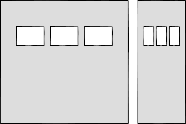
    Then there’s the problem of space. Media queries allow components to adapt based on the viewport size, but what if I put a component into a sidebar, like in the figure below?

    Container queries: our savior or a false dawn?

    Container queries have long been touted as an improvement upon media queries, but at the time of writing are unsupported in most browsers. There are JavaScript workarounds, but they can create dependency and compatibility issues. The basic theory underlying container queries is that elements should change based on the size of their parent container and not the viewport width, as seen in the following illustrations.

    One of the biggest arguments in favor of container queries is that they help us create components or design patterns that are truly reusable because they can be picked up and placed anywhere in a layout. This is an important step in moving toward a form of component-based design that works at any size on any device.

    In other words, responsive components to replace responsive layouts.

    Container queries will help us move from designing pages that respond to the browser or device size to designing components that can be placed in a sidebar or in the main content, and respond accordingly.

    My concern is that we are still using layout to determine when a design needs to adapt. This approach will always be restrictive, as we will still need pre-defined breakpoints. For this reason, my main question with container queries is, How would we decide when to change the CSS used by a component? 

    A component library removed from context and real content is probably not the best place for that decision. 

    As the diagrams below illustrate, we can use container queries to create designs for specific container widths, but what if I want to change the design based on the image size or ratio?

    In this example, the dimensions of the container are not what should dictate the design; rather, the image is.

    It’s hard to say for sure whether container queries will be a success story until we have solid cross-browser support for them. Responsive component libraries would definitely evolve how we design and would improve the possibilities for reuse and design at scale. But maybe we will always need to adjust these components to suit our content.

    CSS is changing

    Whilst the container query debate rumbles on, there have been numerous advances in CSS that change the way we think about design. The days of fixed-width elements measured in pixels and floated div elements used to cobble layouts together are long gone, consigned to history along with table layouts. Flexbox and CSS Grid have revolutionized layouts for the web. We can now create elements that wrap onto new rows when they run out of space, not when the device changes.

    .wrapper {
      display: grid;
      grid-template-columns: repeat(auto-fit, 450px);
      gap: 10px;
    }

    The repeat() function paired with auto-fit or auto-fill allows us to specify how much space each column should use while leaving it up to the browser to decide when to spill the columns onto a new line. Similar things can be achieved with Flexbox, as elements can wrap over multiple rows and “flex” to fill available space. 

    .wrapper {
      display: flex;
      flex-wrap: wrap;
      justify-content: space-between;
    }
    
    .child {
      flex-basis: 32%;
      margin-bottom: 20px;
    }

    The biggest benefit of all this is you don’t need to wrap elements in container rows. Without rows, content isn’t tied to page markup in quite the same way, allowing for removals or additions of content without additional development.

    This is a big step forward when it comes to creating designs that allow for evolving content, but the real game changer for flexible designs is CSS Subgrid. 

    Remember the days of crafting perfectly aligned interfaces, only for the customer to add an unbelievably long header almost as soon as they’re given CMS access, like the illustration below?

    Subgrid allows elements to respond to adjustments in their own content and in the content of sibling elements, helping us create designs more resilient to change.

    .wrapper {
      display: grid;
      grid-template-columns: repeat(auto-fit, minmax(150px, 1fr));
         grid-template-rows: auto 1fr auto;
      gap: 10px;
    }
    
    .sub-grid {
      display: grid;
      grid-row: span 3;
      grid-template-rows: subgrid; /* sets rows to parent grid */
    }

    CSS Grid allows us to separate layout and content, thereby enabling flexible designs. Meanwhile, Subgrid allows us to create designs that can adapt in order to suit morphing content. Subgrid at the time of writing is only supported in Firefox but the above code can be implemented behind an @supports feature query. 

    Intrinsic layouts 

    I’d be remiss not to mention intrinsic layouts, the term created by Jen Simmons to describe a mixture of new and old CSS features used to create layouts that respond to available space. 

    Responsive layouts have flexible columns using percentages. Intrinsic layouts, on the other hand, use the fr unit to create flexible columns that won’t ever shrink so much that they render the content illegible.

    fr units is a way to say I want you to distribute the extra space in this way, but…don’t ever make it smaller than the content that’s inside of it.

    —Jen Simmons, “Designing Intrinsic Layouts”

    Intrinsic layouts can also utilize a mixture of fixed and flexible units, allowing the content to dictate the space it takes up.

    What makes intrinsic design stand out is that it not only creates designs that can withstand future devices but also helps scale design without losing flexibility. Components and patterns can be lifted and reused without the prerequisite of having the same breakpoints or the same amount of content as in the previous implementation. 

    We can now create designs that adapt to the space they have, the content within them, and the content around them. With an intrinsic approach, we can construct responsive components without depending on container queries.

    Another 2010 moment?

    This intrinsic approach should in my view be every bit as groundbreaking as responsive web design was ten years ago. For me, it’s another “everything changed” moment. 

    But it doesn’t seem to be moving quite as fast; I haven’t yet had that same career-changing moment I had with responsive design, despite the widely shared and brilliant talk that brought it to my attention. 

    One reason for that could be that I now work in a large organization, which is quite different from the design agency role I had in 2010. In my agency days, every new project was a clean slate, a chance to try something new. Nowadays, projects use existing tools and frameworks and are often improvements to existing websites with an existing codebase. 

    Another could be that I feel more prepared for change now. In 2010 I was new to design in general; the shift was frightening and required a lot of learning. Also, an intrinsic approach isn’t exactly all-new; it’s about using existing skills and existing CSS knowledge in a different way. 

    You can’t framework your way out of a content problem

    Another reason for the slightly slower adoption of intrinsic design could be the lack of quick-fix framework solutions available to kick-start the change. 

    Responsive grid systems were all over the place ten years ago. With a framework like Bootstrap or Skeleton, you had a responsive design template at your fingertips.

    Intrinsic design and frameworks do not go hand in hand quite so well because the benefit of having a selection of units is a hindrance when it comes to creating layout templates. The beauty of intrinsic design is combining different units and experimenting with techniques to get the best for your content.

    And then there are design tools. We probably all, at some point in our careers, used Photoshop templates for desktop, tablet, and mobile devices to drop designs in and show how the site would look at all three stages.

    How do you do that now, with each component responding to content and layouts flexing as and when they need to? This type of design must happen in the browser, which personally I’m a big fan of. 

    The debate about “whether designers should code” is another that has rumbled on for years. When designing a digital product, we should, at the very least, design for a best- and worst-case scenario when it comes to content. To do this in a graphics-based software package is far from ideal. In code, we can add longer sentences, more radio buttons, and extra tabs, and watch in real time as the design adapts. Does it still work? Is the design too reliant on the current content?

    Personally, I look forward to the day intrinsic design is the standard for design, when a design component can be truly flexible and adapt to both its space and content with no reliance on device or container dimensions.

    Content first 

    Content is not constant. After all, to design for the unknown or unexpected we need to account for content changes like our earlier Subgrid card example that allowed the cards to respond to adjustments to their own content and the content of sibling elements.

    Thankfully, there’s more to CSS than layout, and plenty of properties and values can help us put content first. Subgrid and pseudo-elements like ::first-line and ::first-letter help to separate design from markup so we can create designs that allow for changes.

    Instead of old markup hacks like this—

    First line of text with different styling...

    —we can target content based on where it appears.

    .element::first-line {
      font-size: 1.4em;
    }
    
    .element::first-letter {
      color: red;
    }

    Much bigger additions to CSS include logical properties, which change the way we construct designs using logical dimensions (start and end) instead of physical ones (left and right), something CSS Grid also does with functions like min(), max(), and clamp().

    This flexibility allows for directional changes according to content, a common requirement when we need to present content in multiple languages. In the past, this was often achieved with Sass mixins but was often limited to switching from left-to-right to right-to-left orientation.

    In the Sass version, directional variables need to be set.

    $direction: rtl;
    $opposite-direction: ltr;
    
    $start-direction: right;
    $end-direction: left;

    These variables can be used as values—

    body {
      direction: $direction;
      text-align: $start-direction;
    }

    —or as properties.

    margin-#{$end-direction}: 10px;
    padding-#{$start-direction}: 10px;

    However, now we have native logical properties, removing the reliance on both Sass (or a similar tool) and pre-planning that necessitated using variables throughout a codebase. These properties also start to break apart the tight coupling between a design and strict physical dimensions, creating more flexibility for changes in language and in direction.

    margin-block-end: 10px;
    padding-block-start: 10px;

    There are also native start and end values for properties like text-align, which means we can replace text-align: right with text-align: start.

    Like the earlier examples, these properties help to build out designs that aren’t constrained to one language; the design will reflect the content’s needs.

    Fixed and fluid 

    We briefly covered the power of combining fixed widths with fluid widths with intrinsic layouts. The min() and max() functions are a similar concept, allowing you to specify a fixed value with a flexible alternative. 

    For min() this means setting a fluid minimum value and a maximum fixed value.

    .element {
      width: min(50%, 300px);
    }

    The element in the figure above will be 50% of its container as long as the element’s width doesn’t exceed 300px.

    For max() we can set a flexible max value and a minimum fixed value.

    .element {
      width: max(50%, 300px);
    }

    Now the element will be 50% of its container as long as the element’s width is at least 300px. This means we can set limits but allow content to react to the available space. 

    The clamp() function builds on this by allowing us to set a preferred value with a third parameter. Now we can allow the element to shrink or grow if it needs to without getting to a point where it becomes unusable.

    .element {
      width: clamp(300px, 50%, 600px);
    }

    This time, the element’s width will be 50% (the preferred value) of its container but never less than 300px and never more than 600px.

    With these techniques, we have a content-first approach to responsive design. We can separate content from markup, meaning the changes users make will not affect the design. We can start to future-proof designs by planning for unexpected changes in language or direction. And we can increase flexibility by setting desired dimensions alongside flexible alternatives, allowing for more or less content to be displayed correctly.

    Situation first

    Thanks to what we’ve discussed so far, we can cover device flexibility by changing our approach, designing around content and space instead of catering to devices. But what about that last bit of Jeffrey Zeldman’s quote, “…situations you haven’t imagined”?

    It’s a very different thing to design for someone seated at a desktop computer as opposed to someone using a mobile phone and moving through a crowded street in glaring sunshine. Situations and environments are hard to plan for or predict because they change as people react to their own unique challenges and tasks.

    This is why choice is so important. One size never fits all, so we need to design for multiple scenarios to create equal experiences for all our users.

    Thankfully, there is a lot we can do to provide choice.

    Responsible design 

    “There are parts of the world where mobile data is prohibitively expensive, and where there is little or no broadband infrastructure.”

    “I Used the Web for a Day on a 50 MB Budget”

    Chris Ashton

    One of the biggest assumptions we make is that people interacting with our designs have a good wifi connection and a wide screen monitor. But in the real world, our users may be commuters traveling on trains or other forms of transport using smaller mobile devices that can experience drops in connectivity. There is nothing more frustrating than a web page that won’t load, but there are ways we can help users use less data or deal with sporadic connectivity.

    The srcset attribute allows the browser to decide which image to serve. This means we can create smaller ‘cropped’ images to display on mobile devices in turn using less bandwidth and less data.

    Image alt text

    The preload attribute can also help us to think about how and when media is downloaded. It can be used to tell a browser about any critical assets that need to be downloaded with high priority, improving perceived performance and the user experience. 


    There’s also native lazy loading, which indicates assets that should only be downloaded when they are needed.

    …

    With srcset, preload, and lazy loading, we can start to tailor a user’s experience based on the situation they find themselves in. What none of this does, however, is allow the user themselves to decide what they want downloaded, as the decision is usually the browser’s to make. 

    So how can we put users in control?

    The return of media queries 

    Media queries have always been about much more than device sizes. They allow content to adapt to different situations, with screen size being just one of them.

    We’ve long been able to check for media types like print and speech and features such as hover, resolution, and color. These checks allow us to provide options that suit more than one scenario; it’s less about one-size-fits-all and more about serving adaptable content. 

    As of this writing, the Media Queries Level 5 spec is still under development. It introduces some really exciting queries that in the future will help us design for multiple other unexpected situations.

    For example, there’s a light-level feature that allows you to modify styles if a user is in sunlight or darkness. Paired with custom properties, these features allow us to quickly create designs or themes for specific environments.

    @media (light-level: normal) {
      --background-color: #fff;
      --text-color: #0b0c0c;  
    }
    
    @media (light-level: dim) {
      --background-color: #efd226;
      --text-color: #0b0c0c;
    }

    Another key feature of the Level 5 spec is personalization. Instead of creating designs that are the same for everyone, users can choose what works for them. This is achieved by using features like prefers-reduced-data, prefers-color-scheme, and prefers-reduced-motion, the latter two of which already enjoy broad browser support. These features tap into preferences set via the operating system or browser so people don’t have to spend time making each site they visit more usable. 

    Media queries like this go beyond choices made by a browser to grant more control to the user.

    Expect the unexpected

    In the end, the one thing we should always expect is for things to change. Devices in particular change faster than we can keep up, with foldable screens already on the market.

    We can’t design the same way we have for this ever-changing landscape, but we can design for content. By putting content first and allowing that content to adapt to whatever space surrounds it, we can create more robust, flexible designs that increase the longevity of our products. 

    A lot of the CSS discussed here is about moving away from layouts and putting content at the heart of design. From responsive components to fixed and fluid units, there is so much more we can do to take a more intrinsic approach. Even better, we can test these techniques during the design phase by designing in-browser and watching how our designs adapt in real-time.

    When it comes to unexpected situations, we need to make sure our products are usable when people need them, whenever and wherever that might be. We can move closer to achieving this by involving users in our design decisions, by creating choice via browsers, and by giving control to our users with user-preference-based media queries. 

    Good design for the unexpected should allow for change, provide choice, and give control to those we serve: our users themselves.