Blog

  • How to Sell UX Research with Two Simple Questions

    How to Sell UX Research with Two Simple Questions

    Do you find yourself designing screens with only a vague idea of how the things on the screen relate to the things elsewhere in the system? Do you leave stakeholder meetings with unclear directives that often seem to contradict previous conversations? You know a better understanding of user needs would help the team get clear on what you are actually trying to accomplish, but time and budget for research is tight. When it comes to asking for more direct contact with your users, you might feel like poor Oliver Twist, timidly asking, “Please, sir, I want some more.” 

    Here’s the trick. You need to get stakeholders themselves to identify high-risk assumptions and hidden complexity, so that they become just as motivated as you to get answers from users. Basically, you need to make them think it’s their idea. 

    In this article, I’ll show you how to collaboratively expose misalignment and gaps in the team’s shared understanding by bringing the team together around two simple questions:

    1. What are the objects?
    2. What are the relationships between those objects?

    A gauntlet between research and screen design

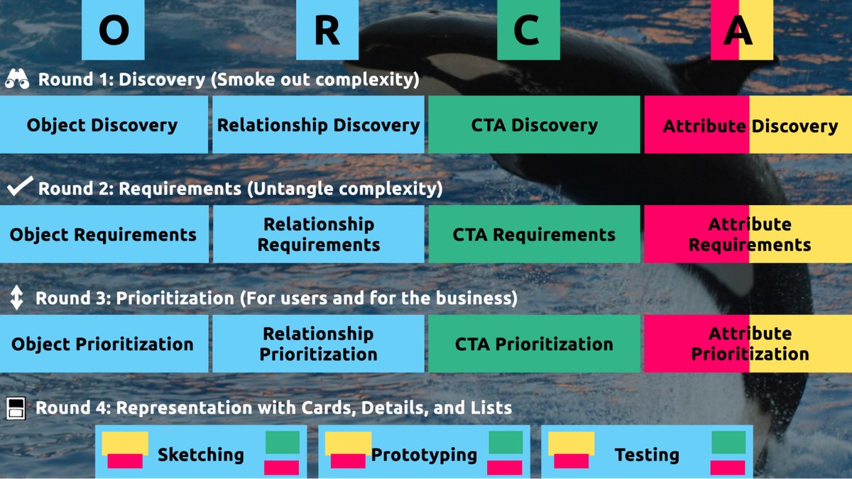
    These two questions align to the first two steps of the ORCA process, which might become your new best friend when it comes to reducing guesswork. Wait, what’s ORCA?! Glad you asked.

    ORCA stands for Objects, Relationships, CTAs, and Attributes, and it outlines a process for creating solid object-oriented user experiences. Object-oriented UX is my design philosophy. ORCA is an iterative methodology for synthesizing user research into an elegant structural foundation to support screen and interaction design. OOUX and ORCA have made my work as a UX designer more collaborative, effective, efficient, fun, strategic, and meaningful.

    The ORCA process has four iterative rounds and a whopping fifteen steps. In each round we get more clarity on our Os, Rs, Cs, and As.

    I sometimes say that ORCA is a “garbage in, garbage out” process. To ensure that the testable prototype produced in the final round actually tests well, the process needs to be fed by good research. But if you don’t have a ton of research, the beginning of the ORCA process serves another purpose: it helps you sell the need for research.

    In other words, the ORCA process serves as a gauntlet between research and design. With good research, you can gracefully ride the killer whale from research into design. But without good research, the process effectively spits you back into research and with a cache of specific open questions.

    Getting in the same curiosity-boat

    What gets us into trouble is not what we don’t know. It’s what we know for sure that just ain’t so.

    Mark Twain

    The first two steps of the ORCA process—Object Discovery and Relationship Discovery—shine a spotlight on the dark, dusty corners of your team’s misalignments and any inherent complexity that’s been swept under the rug. It begins to expose what this classic comic so beautifully illustrates:

    This is one reason why so many UX designers are frustrated in their job and why many projects fail. And this is also why we often can’t sell research: every decision-maker is confident in their own mental picture. 

    Once we expose hidden fuzzy patches in each picture and the differences between them all, the case for user research makes itself.

    But how we do this is important. However much we might want to, we can’t just tell everyone, “YOU ARE WRONG!” Instead, we need to facilitate and guide our team members to self-identify holes in their picture. When stakeholders take ownership of assumptions and gaps in understanding, BAM! Suddenly, UX research is not such a hard sell, and everyone is aboard the same curiosity-boat.

    Say your users are doctors. And you have no idea how doctors use the system you are tasked with redesigning.

    You might try to sell research by honestly saying: “We need to understand doctors better! What are their pain points? How do they use the current app?” But here’s the problem with that. Those questions are vague, and the answers to them don’t feel acutely actionable.

    Instead, you want your stakeholders themselves to ask super-specific questions. This is more like the kind of conversation you need to facilitate. Let’s listen in:

    “Wait a sec, how often do doctors share patients? Does a patient in this system have primary and secondary doctors?”

    “Can a patient even have more than one primary doctor?”

    “Is it a ‘primary doctor’ or just a ‘primary caregiver’… Can’t that role be a nurse practitioner?”

    “No, caregivers are something else… That’s the patient’s family contacts, right?”

    “So are caregivers in scope for this redesign?”

    “Yeah, because if a caregiver is present at an appointment, the doctor needs to note that. Like, tag the caregiver on the note… Or on the appointment?”

    Now we are getting somewhere. Do you see how powerful it can be getting stakeholders to debate these questions themselves? The diabolical goal here is to shake their confidence—gently and diplomatically.

    When these kinds of questions bubble up collaboratively and come directly from the mouths of your stakeholders and decision-makers, suddenly, designing screens without knowing the answers to these questions seems incredibly risky, even silly.

    If we create software without understanding the real-world information environment of our users, we will likely create software that does not align to the real-world information environment of our users. And this will, hands down, result in a more confusing, more complex, and less intuitive software product.

    The two questions

    But how do we get to these kinds of meaty questions diplomatically, efficiently, collaboratively, and reliably

    We can do this by starting with those two big questions that align to the first two steps of the ORCA process:

    1. What are the objects?
    2. What are the relationships between those objects?

    In practice, getting to these answers is easier said than done. I’m going to show you how these two simple questions can provide the outline for an Object Definition Workshop. During this workshop, these “seed” questions will blossom into dozens of specific questions and shine a spotlight on the need for more user research.

    Prep work: Noun foraging

    In the next section, I’ll show you how to run an Object Definition Workshop with your stakeholders (and entire cross-functional team, hopefully). But first, you need to do some prep work.

    Basically, look for nouns that are particular to the business or industry of your project, and do it across at least a few sources. I call this noun foraging.

    Here are just a few great noun foraging sources:

    • the product’s marketing site
    • the product’s competitors’ marketing sites (competitive analysis, anyone?)
    • the existing product (look at labels!)
    • user interview transcripts
    • notes from stakeholder interviews or vision docs from stakeholders

    Put your detective hat on, my dear Watson. Get resourceful and leverage what you have. If all you have is a marketing website, some screenshots of the existing legacy system, and access to customer service chat logs, then use those.

    As you peruse these sources, watch for the nouns that are used over and over again, and start listing them (preferably on blue sticky notes if you’ll be creating an object map later!).

    You’ll want to focus on nouns that might represent objects in your system. If you are having trouble determining if a noun might be object-worthy, remember the acronym SIP and test for:

    1. Structure
    2. Instances
    3. Purpose

    Think of a library app, for example. Is “book” an object?

    Structure: can you think of a few attributes for this potential object? Title, author, publish date… Yep, it has structure. Check!

    Instance: what are some examples of this potential “book” object? Can you name a few? The Alchemist, Ready Player One, Everybody Poops… OK, check!

    Purpose: why is this object important to the users and business? Well, “book” is what our library client is providing to people and books are why people come to the library… Check, check, check!

    As you are noun foraging, focus on capturing the nouns that have SIP. Avoid capturing components like dropdowns, checkboxes, and calendar pickers—your UX system is not your design system! Components are just the packaging for objects—they are a means to an end. No one is coming to your digital place to play with your dropdown! They are coming for the VALUABLE THINGS and what they can do with them. Those things, or objects, are what we are trying to identify.

    Let’s say we work for a startup disrupting the email experience. This is how I’d start my noun foraging.

    First I’d look at my own email client, which happens to be Gmail. I’d then look at Outlook and the new HEY email. I’d look at Yahoo, Hotmail…I’d even look at Slack and Basecamp and other so-called “email replacers.” I’d read some articles, reviews, and forum threads where people are complaining about email. While doing all this, I would look for and write down the nouns.

    (Before moving on, feel free to go noun foraging for this hypothetical product, too, and then scroll down to see how much our lists match up. Just don’t get lost in your own emails! Come back to me!)

    Drumroll, please…

    Here are a few nouns I came up with during my noun foraging:

    • email message
    • thread
    • contact
    • client
    • rule/automation
    • email address that is not a contact?
    • contact groups
    • attachment
    • Google doc file / other integrated file
    • newsletter? (HEY treats this differently)
    • saved responses and templates

    Scan your list of nouns and pick out words that you are completely clueless about. In our email example, it might be client or automation. Do as much homework as you can before your session with stakeholders: google what’s googleable. But other terms might be so specific to the product or domain that you need to have a conversation about them.

    Aside: here are some real nouns foraged during my own past project work that I needed my stakeholders to help me understand:

    • Record Locator
    • Incentive Home
    • Augmented Line Item
    • Curriculum-Based Measurement Probe

    This is really all you need to prepare for the workshop session: a list of nouns that represent potential objects and a short list of nouns that need to be defined further.

    Facilitate an Object Definition Workshop

    You could actually start your workshop with noun foraging—this activity can be done collaboratively. If you have five people in the room, pick five sources, assign one to every person, and give everyone ten minutes to find the objects within their source. When the time’s up, come together and find the overlap. Affinity mapping is your friend here!

    If your team is short on time and might be reluctant to do this kind of grunt work (which is usually the case) do your own noun foraging beforehand, but be prepared to show your work. I love presenting screenshots of documents and screens with all the nouns already highlighted. Bring the artifacts of your process, and start the workshop with a five-minute overview of your noun foraging journey.

    HOT TIP: before jumping into the workshop, frame the conversation as a requirements-gathering session to help you better understand the scope and details of the system. You don’t need to let them know that you’re looking for gaps in the team’s understanding so that you can prove the need for more user research—that will be our little secret. Instead, go into the session optimistically, as if your knowledgeable stakeholders and PMs and biz folks already have all the answers. 

    Then, let the question whack-a-mole commence.

    1. What is this thing?

    Want to have some real fun? At the beginning of your session, ask stakeholders to privately write definitions for the handful of obscure nouns you might be uncertain about. Then, have everyone show their cards at the same time and see if you get different definitions (you will). This is gold for exposing misalignment and starting great conversations.

    As your discussion unfolds, capture any agreed-upon definitions. And when uncertainty emerges, quietly (but visibly) start an “open questions” parking lot. 😉

    After definitions solidify, here’s a great follow-up:

    2. Do our users know what these things are? What do users call this thing?

    Stakeholder 1: They probably call email clients “apps.” But I’m not sure.

    Stakeholder 2: Automations are often called “workflows,” I think. Or, maybe users think workflows are something different.

    If a more user-friendly term emerges, ask the group if they can agree to use only that term moving forward. This way, the team can better align to the users’ language and mindset.

    OK, moving on. 

    If you have two or more objects that seem to overlap in purpose, ask one of these questions:

    3. Are these the same thing? Or are these different? If they are not the same, how are they different?

    You: Is a saved response the same as a template?

    Stakeholder 1: Yes! Definitely.

    Stakeholder 2: I don’t think so… A saved response is text with links and variables, but a template is more about the look and feel, like default fonts, colors, and placeholder images. 

    Continue to build out your growing glossary of objects. And continue to capture areas of uncertainty in your “open questions” parking lot.

    If you successfully determine that two similar things are, in fact, different, here’s your next follow-up question:

    4. What’s the relationship between these objects?

    You: Are saved responses and templates related in any way?

    Stakeholder 3:  Yeah, a template can be applied to a saved response.

    You, always with the follow-ups: When is the template applied to a saved response? Does that happen when the user is constructing the saved response? Or when they apply the saved response to an email? How does that actually work?

    Listen. Capture uncertainty. Once the list of “open questions” grows to a critical mass, pause to start assigning questions to groups or individuals. Some questions might be for the dev team (hopefully at least one developer is in the room with you). One question might be specifically for someone who couldn’t make it to the workshop. And many questions will need to be labeled “user.” 

    Do you see how we are building up to our UXR sales pitch?

    5. Is this object in scope?

    Your next question narrows the team’s focus toward what’s most important to your users. You can simply ask, “Are saved responses in scope for our first release?,” but I’ve got a better, more devious strategy.

    By now, you should have a list of clearly defined objects. Ask participants to sort these objects from most to least important, either in small breakout groups or individually. Then, like you did with the definitions, have everyone reveal their sort order at once. Surprisingly—or not so surprisingly—it’s not unusual for the VP to rank something like “saved responses” as #2 while everyone else puts it at the bottom of the list. Try not to look too smug as you inevitably expose more misalignment.

    I did this for a startup a few years ago. We posted the three groups’ wildly different sort orders on the whiteboard.

    The CEO stood back, looked at it, and said, “This is why we haven’t been able to move forward in two years.”

    Admittedly, it’s tragic to hear that, but as a professional, it feels pretty awesome to be the one who facilitated a watershed realization.

    Once you have a good idea of in-scope, clearly defined things, this is when you move on to doing more relationship mapping.

    6. Create a visual representation of the objects’ relationships

    We’ve already done a bit of this while trying to determine if two things are different, but this time, ask the team about every potential relationship. For each object, ask how it relates to all the other objects. In what ways are the objects connected? To visualize all the connections, pull out your trusty boxes-and-arrows technique. Here, we are connecting our objects with verbs. I like to keep my verbs to simple “has a” and “has many” statements.

    This system modeling activity brings up all sorts of new questions:

    • Can a saved response have attachments?
    • Can a saved response use a template? If so, if an email uses a saved response with a template, can the user override that template?
    • Do users want to see all the emails they sent that included a particular attachment? For example, “show me all the emails I sent with ProfessionalImage.jpg attached. I’ve changed my professional photo and I want to alert everyone to update it.” 

    Solid answers might emerge directly from the workshop participants. Great! Capture that new shared understanding. But when uncertainty surfaces, continue to add questions to your growing parking lot.

    Light the fuse

    You’ve positioned the explosives all along the floodgates. Now you simply have to light the fuse and BOOM. Watch the buy-in for user research flooooow.

    Before your workshop wraps up, have the group reflect on the list of open questions. Make plans for getting answers internally, then focus on the questions that need to be brought before users.

    Here’s your final step. Take those questions you’ve compiled for user research and discuss the level of risk associated with NOT answering them. Ask, “if we design without an answer to this question, if we make up our own answer and we are wrong, how bad might that turn out?” 

    With this methodology, we are cornering our decision-makers into advocating for user research as they themselves label questions as high-risk. Sorry, not sorry. 

    Now is your moment of truth. With everyone in the room, ask for a reasonable budget of time and money to conduct 6–8 user interviews focused specifically on these questions. 

    HOT TIP: if you are new to UX research, please note that you’ll likely need to rephrase the questions that came up during the workshop before you present them to users. Make sure your questions are open-ended and don’t lead the user into any default answers.

    Final words: Hold the screen design!

    Seriously, if at all possible, do not ever design screens again without first answering these fundamental questions: what are the objects and how do they relate?

    I promise you this: if you can secure a shared understanding between the business, design, and development teams before you start designing screens, you will have less heartache and save more time and money, and (it almost feels like a bonus at this point!) users will be more receptive to what you put out into the world. 

    I sincerely hope this helps you win time and budget to go talk to your users and gain clarity on what you are designing before you start building screens. If you find success using noun foraging and the Object Definition Workshop, there’s more where that came from in the rest of the ORCA process, which will help prevent even more late-in-the-game scope tugs-of-war and strategy pivots. 

    All the best of luck! Now go sell research!

  • Breaking Out of the Box

    Breaking Out of the Box

    Containers are used to style CSS. In fact, the whole website is made of containers, from the computer viewport to components on a webpage. However, every now and then a new function emerges that prompts us to reevaluate our design philosophy.

    Square features, for instance, make it fun to play with round picture areas. Mobile display holes and electronic keyboards offer issues to best manage content that stays clear of them. Additionally, dual-screen or portable devices force us to consider how to make the most of the available room in various device configurations.

    These latest changes to the online platform have made it both more challenging and fascinating to design items. They’re wonderful opportunities for us to break out of our triangular containers.

    I’d like to talk about a new feature similar to the above: the Window Controls Overlay for Progressive Web Apps ( PWAs ).

    Democratic Web Apps are bridging the gap between websites and apps. They combine the best of both worlds. On the one hand, they’re flexible, relatable, and stable, just like sites. On the other hand, they provide more effective features, work online, and read documents just like local apps.

    As a style area, PWAs are really exciting because they challenge us to think about what mixing online and device-native user interface can get. We have more than 40 years of experience telling us what software may look like on desktop products in particular, and it can be challenging to get out of this psychological design.

    At the end of the day though, PWAs on desktops are constrained to the glass they appear in: a square with a name bar at the top.

    What does a standard desktop PWA app look like:

    Sure, as the author of a PWA, you get to choose the color of the title bar (using the Web Application Manifest theme_color house ), but that’s about it.

    What if we could consider other ways and reclaim the whole screen in the app? Doing so would give us a chance to create our programs more wonderful and feel more included in the operating system.

    The Window Controls Overlay offers precisely this. This innovative PWA operation makes it possible to take advantage of the full floor area of the app, including where the name bar usually appears.

    About the subject bar and screen controls

    Let’s get started with an explanation of the screen and title bar settings.

    The title bar is the place displayed at the top of an game windows, which frequently contains the phone’s name. The buttons or buttons that are displayed at the top of an app’s window allow you to reduce, increase, or close it.

    Window Controls Overlay removes the actual requirement of the name bar and windows controls areas. The title bar and glass control buttons can be overlayed on top of the application’s web content, allowing it to free up the entire height of the game window.

    If you are reading this article on a desktop computer, take a quick look at other apps. Chances are they’re already doing something similar to this. In fact, the web browser you are using uses the top area to display tabs.

    Spotify displays album artwork to the top of the application window all the way up.

    Microsoft Word uses the available title bar space to display the auto-save and search functionalities, and more.

    The whole point of this feature is to allow you to make use of this space with your own content while providing a way to account for the window control buttons. And it makes it possible to offer this modified experience on a variety of platforms without having a negative impact on the experience on browsers or other devices that don’t support Window Controls Overlay. After all, PWAs are all about progressive enhancement, so this feature is a chance to enhance your app to use this extra space when it’s available.

    Let’s use the feature.

    For the rest of this article, we’ll be working on a demo app to learn more about using the feature.

    The demo app is called 1DIV. Users can create designs using CSS and a single HTML element in a simple CSS playground.

    The app has two pages. The first lists the CSS designs you’ve already created:

    The second page enables you to create and edit CSS designs:

    We can install the app as a PWA on the desktop because I added a straightforward web manifest and service worker. Here is what it looks like on macOS:

    And on Windows:

    Our app is looking good, but the white title bar in the first page is wasted space. It would be really nice if the design area reached the top of the app window on the second page.

    Let’s use the Window Controls Overlay feature to improve this.

    Enabling Window Controls Overlay

    The feature is still experimental at the moment. To try it, you need to enable it in one of the supported browsers.

    It has currently been implemented in Chromium as a result of a collaboration between Microsoft and Google. We can therefore use it in Chrome or Edge by going to the internal about: //flags page, and enabling the Desktop PWA Window Controls Overlay flag.

    Using Window Controls Overlay

    To use the feature, we need to add the following display_override member to our web app’s manifest file:

    { "name": "1DIV", "description": "1DIV is a mini CSS playground", "lang": "en-US", "start_url": "/", "theme_color": "#ffffff", "background_color": "#ffffff", "display_override": [ "window-controls-overlay" ], "icons": [ ... ]}

    On the surface, the feature is really simple to use. The only thing required is for this manifest change to transform the window controls into an overlay and make the title bar disappear.

    However, to provide a great experience for all users regardless of what device or browser they use, and to make the most of the title bar area in our design, we’ll need a bit of CSS and JavaScript code.

    Here is how the app currently looks:

    Our logo, search field, and NEW button are now partially covered by the window controls, but the title bar has been removed, which is what we wanted. Our layout now begins at the top of the window.

    It’s similar on Windows, with the difference that the close, maximize, and minimize buttons appear on the right side, grouped together with the PWA control buttons:

    Screenshot of the Windows operating system’s Window Controls Overlay-enabled 1DIV app thumbnail display. The separate top bar area is gone, but the window controls are now blocking some of the app’s content.

    Using CSS to keep clear of the window controls

    New CSS environment variables have also been introduced along with the feature:

    • titlebar-area-x
    • titlebar-area-y
    • titlebar-area-width
    • titlebar-area-height

    You use these variables with the CSS env ( ) function to position your content where the title bar would have been while ensuring it won’t overlap with the window controls. We’ll position our header, which includes the logo, search bar, and NEW button, using two of the variables in our case.

    header { position: absolute; left: env(titlebar-area-x, 0); width: env(titlebar-area-width, 100%); height: var(--toolbar-height);}

    The titlebar-area-x variable gives us the distance from the left of the viewport to where the title bar would appear, and titlebar-area-width is its width. (Remember, this is not equivalent to the width of the entire viewport, just the title bar portion, which as noted earlier, doesn’t include the window controls.)

    By doing this, we make sure our content remains fully visible. We’re also defining fallback values (the second parameter in the env() function) for when the variables are not defined (such as on non-supporting browsers, or when the Windows Control Overlay feature is disabled).

    Now our header adapts to its surroundings, and it doesn’t feel like the window control buttons have been added as an afterthought. The app appears much more like a native app.

    Changing the window controls background color so it blends in

    Now let’s take a closer look at our second page: the CSS playground editor.

    Not very good. Our CSS demo area does go all the way to the top, which is what we wanted, but the way the window controls appear as white rectangles on top of it is quite jarring.

    We can fix this by changing the app’s theme color. There are a few ways to define it:

      PWAs can define a theme color in the web app manifest file using the theme_color manifest member. The OS then uses this color in a variety of ways. On desktop platforms, it is used to provide a background color to the title bar and window controls.
    • Websites can use the theme-color meta tag as well. It’s used by browsers to customize the color of the UI around the web page. For PWAs, this color can override the manifest theme_color.

    In our case, we can set the manifest theme_color to white to provide the right default color for our app. The OS will read this color value when the app is installed and use it to make the window controls background color white. This color works great for our main page with the list of demos.

    The theme-color meta tag can be changed at runtime, using JavaScript. So we can do that to override the white with the right demo background color when one is opened.

    What will we do with this function:

    function themeWindow(bgColor) { document.querySelector("meta[name=theme-color]").setAttribute('content', bgColor);}

    With this in place, we can imagine how using color and CSS transitions can produce a smooth change from the list page to the demo page, and enable the window control buttons to blend in with the rest of the app’s interface.

    Dragging the window

    Now, getting rid of the title bar entirely does have an important accessibility consequence: it’s much more difficult to move the application window around.

    Users can drag and click their way to a sizable area in the title bar, but when using the Window Controls Overlay feature, they are limited to where the control buttons are, and must carefully place their fingers in between these buttons to move the window.

    Fortunately, this can be fixed using CSS with the app-region property. This property is, for now, only supported in Chromium-based browsers and needs the -webkit- vendor prefix. 

    We can use the following to animate any aspect of the app so that the window can drag it toward any point:

    -webkit-app-region: drag;

    It is also possible to explicitly make an element non-draggable:

    -webkit-app-region: no-drag; 

    These choices might be beneficial to us. We can make the entire header a dragging target, but make the search field and NEW button within it non-draggable so they can still be used as normal.

    However, because the editor page doesn’t display the header, users wouldn’t be able to drag the window while editing code. So let’s take a different strategy. We’ll create another element before our header, also absolutely positioned, and dedicated to dragging the window.

    ...
    .drag { position: absolute; top: 0; width: 100%; height: env(titlebar-area-height, 0); -webkit-app-region: drag;}

    With the above code, we’re making the draggable area span the entire viewport width, and using the titlebar-area-height variable to make it as tall as what the title bar would have been. This way, our draggable area is aligned with the window control buttons as shown below.

    And, now, to make sure our search field and button remain usable:

    header .search,header .new { -webkit-app-region: no-drag;}

    Users can click and drag where the title bar used to be with the above code. It is an area that users expect to be able to use to move windows on desktop, and we’re not breaking this expectation, which is good.

    Adapting to window resize

    It may be useful for an app to know both whether the window controls overlay is visible and when its size changes. The search field, logo, and button would need to be pushed down a little bit if the user made the window very narrow.

    The Window Controls Overlay feature comes with a JavaScript API we can use to do this: navigator.windowControlsOverlay.

    The API offers three intriguing features:

    • navigator.windowControlsOverlay.visiblelets us know whether the overlay is visible.
    • navigator.windowControlsOverlay.getBoundingClientRect()lets us know the position and size of the title bar area.
    • navigator.windowControlsOverlay.ongeometrychangelets us know when something changes in size or visibility.

    Let’s use this to be aware of the size of the title bar area and move the header down if it’s too narrow.

    if (navigator.windowControlsOverlay) { navigator.windowControlsOverlay.addEventListener('geometrychange', () => { const { width } = navigator.windowControlsOverlay.getBoundingClientRect(); document.body.classList.toggle('narrow', width < 250); });}

    In the example above, we set the narrow class on the body of the app if the title bar area is narrower than 250px. We could do something similar with a media query, but using the windowControlsOverlay API has two advantages for our use case:

    • It’s only fired when the feature is supported and used, we don’t want to adapt the design otherwise.
    • We can see the title bar area across different operating systems, which is great because the window controls ‘ size is different on Mac and Windows. Using a media query wouldn’t make it possible for us to know exactly how much space remains.
    .narrow header { top: env(titlebar-area-height, 0); left: 0; width: 100%;}

    When the window is too small, we can use the above CSS code to move our header down and move the thumbnails down in accordance with this.

    Thirty pixels of exciting design opportunities


    We were able to turn our simple demo app into something that felt so much more integrated on desktop devices by using the Window Controls Overlay feature. Something that reaches out of the usual window constraints and provides a custom experience for its users.

    In reality, this feature only gives us about 30 more pixels of room, and it presents challenges for using the window controls. And yet, this extra room and those challenges can be turned into exciting design opportunities.

    More devices of all shapes and forms get invented all the time, and the web keeps on evolving to adapt to them. To make it easier for us, web authors, to integrate more and more deeply with those devices, new features are added to the web platform. From watches or foldable devices to desktop computers, we need to evolve our design approach for the web. We can now think outside the rectangular box when building for the web.

    So let’s embrace this. Let’s use the standard technologies already at our disposal, and experiment with new ideas to provide tailored experiences for all devices, all from a single codebase!


    If you have the chance to try the Window Controls Overlay feature and have feedback on it, you can open issues in the spec’s repository. It’s still early in the development of this feature, and you can help make it even better. You can also look at this demo app and the source code, the feature’s existing documentation, or the feature’s existing documentation.

  • Designers, (Re)define Success First

    Designers, (Re)define Success First

    I introduced the concept of normal social style about two and a half years earlier. It was born out of my disappointment with the many obstacles to achieving style that’s accessible and equal, protects people’s protection, firm, and target, benefits society, and restores nature. I argued that we must overcome the difficulties that prevent us from acting morally and that we must functionally integrate design ethics into our daily routine, procedures, and tools to raise it to a more realistic level.

    However, we’re still very far from this best.

    At the time, I didn’t realize yet how to functionally combine morality. Yes, I did discover some tools in past projects that had worked for me, such as using checklists, notion tracking, and “dark fact” sessions, but I wasn’t able to use them in every task. I was still struggling for time and support, and at best I had only partially achieved a higher ( moral ) quality of design—which is far from my definition of structurally integrated.

    I made a deeper investigation into the causes of business failure that prevent us from practicing social pattern every day. Today, after much research and experimentation, I believe that I’ve found the code that will let us functionally combine ethics. And it’s amazingly easy! However, we must first move out to understand what we’re going through.

    Control the system

    Unfortunately, we’re confined to a capitalist system that encourages consumerism and inequality and is obsessed with the irrationality of infinite expansion. Sea levels, temperature, and our demand for energy continue to rise unquestioned, while the divide between rich and poor continues to increase. Owners expect ever-higher returns on their investments, and firms feel forced to set short-term goals that reflect this. Our well-meaning human-centered thinking has been transformed into a powerful machine that encourages ever-higher levels of consumption over the past ten years due to these objectives. When we’re working for an organization that pursues “double-digit growth” or “aggressive sales targets” ( which is 99 percent of us ), that’s very hard to resist while remaining human friendly. We’re a part of the problem, even with our best intentions, and we’re doing it despite our best efforts to declare that we provide solutions for people.

    What can we do to alter this?

    We may start by acting on the appropriate level of the system. System scholar Donna H. Meadows after outlined ways to increase the effectiveness of a system. When you apply these to architecture, you get:

      You can change figures like functionality results or the number of layout critiques at the lowest level of effectiveness. But none of that may change the direction of a business.
    • Similarly, affecting buffers ( such as team budgets ), stocks ( such as the number of designers ), flows ( such as the number of new hires ), and delays ( such as the time that it takes to hear about the effect of design ) won’t significantly affect a company.
    • Instead of focusing on feedback loops like control power, employee reputation, or design-system investments, a company can improve its ability to achieve its goals. But that doesn’t alter the goals themselves, which means that the business will also work against your ethical-design ideals.
    • The change of honest methods, toolkits, articles, conferences, workshops, and other topics are what most ethical-design initiatives are currently focusing on at the next level, details flows. This is also where moral style has remained largely theoretical. We’ve been focusing on the wrong level of the system all this day.
    • Take, for instance, the principles; they consistently outwit information. There can be commonly accepted guidelines, such as how fund works, or a sprint group’s concept of done. However, illegal laws intended to maintain profits is also smother social design, which are frequently revealed through statements like” the customer didn’t ask for it” or “don’t make it very big.”
    • Changing the rules without holding formal power is extremely difficult. That’s why the next stage is so significant: self-organization. Research, bottom-up initiatives, love projects, self-steering teams, and other such self-organization techniques all contribute to a company’s resilience and creativity. It’s precisely this diversity of viewpoints that’s needed to functionally address major structural issues like materialism, wealth inequality, and climate change.
    • But objectives and metrics are even more powerful than self-organization. Our companies want to make more money, which means that everything and everyone in the company does their best to… make the company more money. And once I realized that profit is nothing more than a measurement, I understood how crucial a very specific, defined metric can be toward pushing a company in a certain direction.

    What is the conclusion? If we truly want to incorporate ethics into our daily design practice, we must first change the measurable objectives of the company we work for, from the bottom up.

    Redefine success

    Traditionally, we consider a product or service successful if it’s desirable to humans, technologically feasible, and financially viable. You tend to see these represented as equals, if you type the three words in a search engine, you’ll find diagrams of three equally sized, evenly arranged circles.

    However, we all know that the three dimensions are not equally important: viability is ultimately what determines whether a product will become functional. So a more realistic representation might look like this:

    The means are feasibility and desire, while viability is the objective. Companies—outside of nonprofits and charities—exist to make money.

    A genuinely purpose-driven company would try to reverse this dynamic: it would recognize finance for what it was intended for: a means. Therefore, both the company’s goals and its viability are important in order to realize what they are trying to accomplish. It makes intuitive sense: to achieve most anything, you need resources, people, and money. Fun fact: Italian speakers are completely unaware of the distinction between feasibility and viability; both terms are merely fattibilità.

    But simply swapping viable for desirable isn’t enough to achieve an ethical outcome. Desirability is still linked to consumerism because the associated activities aim to identify what people want—whether it’s good for them or not. When it comes to a product’s desirability goals, such as user satisfaction or conversion, don’t take into account whether it is good for people. They don’t prevent us from creating products that distract or manipulate people or stop us from contributing to society’s wealth inequality. They are unable to restore a healthy relationship with nature.

    There’s a fourth dimension of success that’s missing: our designs also need to be ethical in the effect that they have on the world.

    This is hardly a new idea. There are many variations of these models, some calling them “imputability, integrity, or responsibility.” What I’ve never seen before, however, is the necessary step that comes after: to influence the system as designers and to make ethical design more practical, we must create objectives for ethical design that are achievable and inspirational. There is no single way to accomplish this because it depends greatly on your country’s values, culture, and industry. But I’ll give you the version that I developed with a group of colleagues at a design agency. Consider it a template to get started.

    pursue equity, sustainability, and well-being.

    We created objectives that address design’s effect on three levels: individual, societal, and global.

    An individual’s goal on the individual level clarifies what success entails in contrast to the typical user-centric focus on usability and satisfaction, taking into account factors like how much time and effort are required of users. We pursued well-being:

    We create products and services that allow for people’s health and happiness. Our solutions are non-misleading, transparent, non-addictive, and non-misleading. We respect our users ‘ time, attention, and privacy, and help them make healthy and respectful choices.

    A societal goal requires us to consider our impact beyond the mere user, widening our focus to the economy, communities, and other involuntary parties. We called this objective equity:

    We create products and services that have a positive social impact. We think of racial justice, racial justice, and the inclusion and diversity of people as teams, users, and customer segments. We listen to local culture, communities, and those we affect.

    Finally, the global goal on the global level aims to keep us in harmony with our only true home, humanity. Referring to it simply as sustainability, our definition was:

    We create products and services that reward sufficiency and reusability. Our products are repurposed, given, and given priority to making sustainable choices in order to support the circular economy. We deliver functionality instead of ownership, and we limit energy use.

    In essence, ethical design ( to us ) meant achieving well-being for each user and an equitable value distribution within society through a design that can sustain our living planet. When we introduced these objectives in the company, for many colleagues, design ethics and responsible design suddenly became tangible and achievable through practical—and even familiar—actions.

    Measure impact

    However, defining these goals is still insufficient. What truly caught the attention of senior management was the fact that we created a way to measure every design project’s well-being, equity, and sustainability.

    This overview includes some examples of metrics you can use to measure your progress toward equity, well-being, and sustainability:

    There’s a lot of power in measurement. As the saying goes, what gets measured gets done. Donella Meadows once provided this illustration:

    ” If the desired system state is national security, and that is defined as the amount of money spent on the military, the system will produce military spending. It may or may not lead to national security.

    This phenomenon explains why desirability is a poor indicator of success: it’s typically defined as the increase in customer satisfaction, session length, frequency of use, conversion rate, churn rate, download rate, and so on. But none of these metrics increase the health of people, communities, or ecosystems. What if we instead used metrics for ( digital ) well-being, like ( reduced ) screen time or software energy consumption, to measure success?

    There’s another important message here. If we were to choose the wrong metric for calmness, such as the number of interface elements, we might still end up with a screen that makes us anxious, even if we set an objective to create a calm interface. Choosing the wrong metric can completely undo good intentions.

    Additionally, choosing the right metric is enormously helpful in focusing the design team. When you perform the task of selecting metrics for our goals, you are made to consider what success looks like in terms of words and how you can demonstrate that you have met your ethical goals. It also forces you to consider what we as designers have control over: what can I include in my design or change in my process that will lead to the right type of success? The response to this query provides a lot of insight and clarity.

    And finally, it’s good to remember that traditional businesses run on measurements, and managers love to spend much time discussing charts ( ideally hockey-stick shaped ) —especially if they concern profit, the one-above-all of metrics. For good or ill, to improve the system, to have a serious discussion about ethical design with managers, we’ll need to speak that business language.

    daily ethical design

    Once you’ve defined your objectives and you have a reasonable idea of the potential metrics for your design project, only then do you have a chance to structurally practice ethical design. It” simply” turns into a matter of using your imagination and sprinkling from the knowledge and tools that are already at your disposal.

    I think this is quite exciting! It opens a whole new set of challenges and considerations for the design process. Would a simple illustration suffice, or should you go with that energizing video? Which typeface is the most calm and inclusive? What fresh techniques and tools do you employ? When is the website’s end of life? How can you provide the same service while requiring less attention from users? How can you ensure that those who are impacted by decisions are present when they are made? How can you measure our effects?

    What doing good design means will be completely altered by the new definition of success.

    There is, however, a final piece of the puzzle that’s missing: convincing your client, product owner, or manager to be mindful of well-being, equity, and sustainability. For this, it’s essential to engage stakeholders in a dedicated kickoff session.

    Start it off or return to the pre-existing

    The kickoff is the most important meeting that can be so easy to forget to include. There are two main stages in it: 1 ) coordinating expectations; 2 ) defining success as a goal.

    In the first phase, the entire ( design ) team goes over the project brief and meets with all the relevant stakeholders. Everyone gets to know one another and express their expectations on the outcome and their contributions to achieving it. Discussion and assumptions are raised. The aim is to get on the same level of understanding and to in turn avoid preventable miscommunications and surprises later in the project.

    For instance, we had an online kickoff meeting with the client, a subject matter expert, and two other designers for a recent freelance project that aimed to create a digital platform that facilitates the documentation and communication of US student advisors. We used a combination of canvases on Miro: one with questions from” Manual of Me” ( to get to know each other ), a Team Canvas ( to express expectations ), and a version of the Project Canvas to align on scope, timeline, and other practical matters.

    The above is the traditional purpose of a kickoff. However, agreeing on what success means for the project in terms of desirability, viability, feasibility, and ethics is just as crucial as expressing expectations. What are the objectives in each dimension?

    It’s crucial to reach an understanding of what success means at this early stage because you can depend on it for the duration of the project. If, for example, the design team wants to build an inclusive app for a diverse user group, they can raise diversity as a specific success criterion during the kickoff. If the client agrees, the team can refer back to that promise throughout the project. As we agreed in our first meeting, having A and B’s diverse user group is essential to creating a successful product. So we do activity X and follow research process Y”. Compare those odds to a situation where the team had to ask for permission halfway through the project and didn’t agree to that beforehand. The client might argue that that came on top of the agreed scope—and she’d be right.

    In the case of this freelance project, to define success I prepared a round canvas that I call the Wheel of Success. It consists of a set of outer rings and an inner ring, which are intended to capture ideas for measuring those objectives. The rings are divided into five dimensions of successful design: healthy, equitable, sustainable, desirable, feasible, and viable.

    We explored each dimension and recorded ideas on digital sticky notes. Then we discussed our ideas and verbally agreed on the most important ones. For example, our client agreed that sustainability and progressive enhancement are important success criteria for the platform. Additionally, the subject-matter expert stressed the importance of including students from underprivileged and low-income groups in the design process.

    After the kickoff, we summarized our ideas and shared understanding in a project brief that captured these aspects:

      the project’s history and purpose: Why do we do this project?
    • the problem definition: what do we want to solve?
    • the concrete goals and metrics for each success dimension: what do we want to achieve?
    • how will we go about defining the scope, process, and role descriptions?

    With such a brief in place, you can use the agreed-upon objectives and concrete metrics as a checklist of success, and your design team will be ready to pursue the right objective—using the tools, methods, and metrics at their disposal to achieve ethical outcomes.

    Conclusion

    How do I begin with ethical design? have a number of coworkers asked me over the past year. My answer has always been the same: organize a session with your stakeholders to ( re ) define success. Even though you might not always be 100 percent successful in agreeing on goals that cover all responsibility objectives, that beats the alternative ( the status quo ) every time. There’s no skipping this step if you want to be an ethical, responsible designer.

    To be even more specific: if you consider yourself a strategic designer, your challenge is to define ethical objectives, set the right metrics, and conduct those kick-off sessions. If you think of yourself as a system designer, you need to first understand how your industry influences consumerism and inequality, how finance drives business, and how to think creatively about how to best influence the system. Then redefine success to create the space to exercise those levers.

    And for those who consider themselves service designers or UX designers or UI designers: if you truly want to have a positive, meaningful impact, stay away from the toolkits and meetups and conferences for a while. Gather your coworkers and instead define design goals for well-being, equity, and sustainability. Engage your stakeholders in a workshop and challenge them to think of ways to achieve and measure those ethical goals. Take their ideas, make them clear and tangible, ask for their consent, and hold them to it.

    Otherwise, I’m genuinely sorry to say, you’re wasting your precious time and creative energy.

    Of course, engaging your stakeholders in this way can be uncomfortable. Many of my coworkers had questions to ask, such as” Will they take this seriously?” and” Wouldn’t we just do it within the design team instead”? In fact, a product manager once asked me why ethics couldn’t just be a structured part of the design process—to just do it without spending the effort to define ethical objectives. It’s a tempting thought, isn’t it? We wouldn’t have to have difficult discussions with stakeholders about what values or which key-performance indicators to pursue. It would let us focus on what we like and do best: designing.

    That’s not enough, according to systems theory. For those of us who aren’t from marginalized groups and have the privilege to be able to speak up and be heard, that uncomfortable space is exactly where we need to be if we truly want to make a difference. We can’t continue to live in the design-for-designers bubble and enjoy our privileged working-from-home environment without access to the real world. For those of us who have the possibility to speak up and be heard: if we solely keep talking about ethical design and it remains at the level of articles and toolkits—we’re not designing ethically. It’s just theory. By challenging them to redefine success in business, we must actively engage with our colleagues and clients.

    With a bit of courage, determination, and focus, we can break out of this cage that finance and business-as-usual have built around us and become facilitators of a new type of business that can see beyond financial value. We simply need to come to terms with the right goals when starting each design project, identify the appropriate metrics, and acknowledge that we already have everything in place. That’s what it means to do daily ethical design.

    For their inspiration and support over the years, I would like to thank Emanuela Cozzi Schettini, José Gallegos, Annegret Bönemann, Ian Dorr, Vera Rademaker, Virginia Rispoli, Cecilia Scolaro, Rouzbeh Amini, and many others.

  • Mobile-First CSS: Is It Time for a Rethink?

    Mobile-First CSS: Is It Time for a Rethink?

    The mobile-first style approach is fantastic because it concentrates on what is most important to the consumer, it’s well-practiced, and it’s a well-known style design for years. But developing your CSS mobile-first should also be wonderful, too…right?

    Well, not necessarily. Classic mobile-first CSS development is based on the principle of overwriting style declarations: you begin your CSS with default style declarations, and overwrite and/or add new styles as you add breakpoints with min-width media queries for larger viewports (for a good overview see “What is Mobile First CSS and Why Does It Rock?”). But all those exceptions create complexity and inefficiency, which in turn can lead to an increased testing effort and a code base that’s harder to maintain. Admit it—how many of us willingly want that?

    Mobile-first CSS may yet be the best option for your own projects, but you need to first determine how acceptable it is in light of the physical design and user interactions you’re working on. To help you get started, here’s how I go about tackling the elements you need to watch for, and I’ll discuss some alternative remedies if mobile-first doesn’t seem to fit your job.

    benefits of mobile-first technology

    Some of the benefits of mobile-first CSS creation, and why it’s been the de facto growth practice for so long, make a lot of sense:

    Development order. A good development hierarchy is something you can definitely expect from mobile-first; you just concentrate on the mobile view and start developing.

    tested and verified. It’s a tried and tested technique that’s worked for years for a cause: it solves a problem actually also.

    prioritizes the smart see. The smart watch is the simplest and arguably the most significant because it covers all of the crucial user journeys and frequently accounts for more user visits ( depending on the project ) in terms of complexity.

    Inhibits desktop-centric growth. It can be tempting to first focus on the desktop perspective because enhancement is done using pc servers. However, considering mobile from the beginning prevents us from getting stuck eventually; no one wants to spend their time getting a site that is focused on desktops to operate on mobile devices!

    Drawbacks of mobile-first

    Model declarations can be set at higher breakpoints and therefore overwritten at higher breakpoints:

    more complicated stuff. The farther up the target order you go, the more unnecessary script you inherit from lower thresholds.

    higher CSS precision A class name declaration with a restored default value for a style has a higher specificity today. This can be a pain on big projects when you want to preserve the CSS candidates as simple as possible.

    Requires more analysis assessment. All higher thresholds must be regression tested if modifications to CSS at a lower watch ( such as adding a new style ) are required.

    The browser can’t prioritize CSS downloads. At wider breakpoints, classic mobile-first min-width media queries don’t leverage the browser’s capability to download CSS files in priority order.

    Property price issue: override

    There is nothing intrinsically wrong with overwriting principles, CSS was designed to do just that. However, inheriting incorrect principles can be laborious and ineffective, which is counterproductive. When you need to replace styles to restore them to their defaults, which may cause issues after, especially if you’re using a combination of bespoke CSS and power classes, does this also lead to more style specificity. We won’t be able to use a power course for a design that has been restore with a higher precision.

    With this in mind, I’m developing CSS with a focus on the default values much more these days. Since there’s no specific order, and no chains of specific values to keep track of, this frees me to develop breakpoints simultaneously. I concentrate on finding common styles and isolating the specific exceptions in closed media query ranges (that is, any range with a max-width set). 

    As you can view each target as a blank slate, this technique opens up some opportunities. If a product’s layout appears to be based on Flexbox at all thresholds, that is acceptable and can be coded in the definition style sheet. But if it looks like Grid would be much better for large windows and Flexbox for portable, these can both be done entirely freely when the CSS is put into finished media keyword ranges. Additionally, having a thorough understanding of any given element in all breakpoints upfront is necessary for developing together. This can help identify design flaws earlier in the creation process. We don’t want to get stuck down a rabbit hole building a sophisticated component for wireless, and then get the designs for desktop and find they are extremely difficult and inconsistent with the HTML we created for the cellular view!

    Although this strategy won’t work for everyone, I urge you to try it. There are plenty of tools available to support concurrent development, including Responsively App, Blisk, and many others.

    Having said that, I don’t feel the order itself is particularly relevant. If you like to work on one device at a time, are comfortable with focusing on the mobile view, and have a good understanding of the requirements for other breakpoints, then you should definitely stick to the classic development order. It’s crucial to find common styles and exceptions in the appropriate stylesheet, which is a manual tree-shaking procedure! Personally, I find this a little easier when working on a component across breakpoints, but that’s by no means a requirement.

    In practice, closed media query ranges

    We overwrite the styles in the traditional mobile-first CSS, but media query ranges can be used to prevent this. To illustrate the difference ( I’m using SCSS for brevity ), let’s assume there are three visual designs:

    • smaller than 768
    • from 768 to less than 1024
    • 1024 and anything larger

    Take a simple example where a block-level element has a default padding of “20px,” which is overwritten at tablet to be “40px” and set back to “20px” on desktop.

    Classic min-width mobile-first

    .my-block { padding: 20px; @media (min-width: 768px) { padding: 40px; } @media (min-width: 1024px) { padding: 20px; }}

    Closed media query range

    .my-block { padding: 20px; @media (min-width: 768px) and (max-width: 1023.98px) { padding: 40px; }}

    The subtle difference is that the mobile-first example sets the default padding to “20px” and then overwrites it at each breakpoint, setting it three times in total. In contrast, the second example sets the default padding to “20px” and only overrides it at the relevant breakpoint where it isn’t the default value (in this instance, tablet is the exception).

    The goal is to: 

    • Only set styles when needed. 
    • Not set them with the expectation of overwriting them later on, again and again. 

    To this end, closed media query ranges are our best friend. If we need to make a change to any given view, we make it in the CSS media query range that applies to the specific breakpoint. We’ll be much less likely to introduce unwanted alterations, and our regression testing only needs to focus on the breakpoint we have actually edited. 

    Taking the above example, if we find that .my-block spacing on desktop is already accounted for by the margin at that breakpoint, and since we want to remove the padding altogether, we could do this by setting the mobile padding in a closed media query range.

    .my-block {  @media (max-width: 767.98px) {    padding: 20px;  }  @media (min-width: 768px) and (max-width: 1023.98px) {    padding: 40px;  }}

    The browser default padding for our block is “0,” so instead of adding a desktop media query and using unset or “0” for the padding value (which we would need with mobile-first), we can wrap the mobile padding in a closed media query (since it is now also an exception) so it won’t get picked up at wider breakpoints. At the desktop breakpoint, we won’t need to set any padding style, as we want the browser default value.

    Bundling versus separating the CSS

    Back in the day, keeping the number of requests to a minimum was very important because the browser's concurrent request limit (typically around six ) was high. In consequence, using image sprites and CSS bundling was the norm, with all the CSS being downloaded as a single stylesheet with the highest priority.

    With HTTP/2 and HTTP/3 now on the scene, the number of requests is no longer the big deal it used to be. This enables us to use a media query to break CSS into multiple files. The obvious benefit of this is that the browser can now request the CSS it currently requires with a higher priority than the CSS it doesn't. This is more performant and can reduce the overall time page rendering is blocked.

    What version of HTTP do you use?

    Go to your website and open the dev tools in your browser to find out which version of HTTP you're using. Next, select the Network tab and make sure the Protocol column is visible. If "h2" is included in the protocol list, that indicates that HTTP/2 is being used.

    Note: To check the Protocol column in your browser's dev tools, right-click any column header ( such as Name ), go to the Network tab, reload your page, and then check the Protocol column.

    Also, if your website is still using HTTP/1... WHILE!! What are you waiting for? Excellent user support exists for HTTP/2.

    CSS is split in half.

    Separating the CSS into individual files is a worthwhile task. Linking the separate CSS files using the relevant media attribute allows the browser to identify which files are needed immediately (because they’re render-blocking) and which can be deferred. Based on this, it allocates each file an appropriate priority.

    In the following example of a website visited on a mobile breakpoint, we can see the mobile and default CSS are loaded with" Highest" priority, as they are currently needed to render the page. In case they are needed later, the remaining CSS files ( print, tablet, and desktop ) are still being downloaded with" Lowest" priority, though they are still needed.

    Before rendering can begin, the browser will need to download the CSS file and parse it using bundled CSS before rendering can begin.

    While, as noted, with the CSS separated into different files linked and marked up with the relevant media attribute, the browser can prioritize the files it currently needs. Using closed media query ranges allows the browser to do this at all widths, as opposed to classic mobile-first min-width queries, where the desktop browser would have to download all the CSS with Highest priority. We can’t assume that desktop users always have a fast connection. For instance, in many rural areas, internet connection speeds are still slow. 

    Depending on project requirements, the media queries and the number of separate CSS files will vary from project to project, but the example below might look similar.

    bundled CSS


    This single file contains all the CSS, including all media queries, and it will be downloaded with Highest priority.

    CSS that is separated


    Separating the CSS and specifying a media attribute value on each link tag allows the browser to prioritize what it currently needs. Out of the five files listed above, two will be downloaded with Highest priority: the default file, and the file that matches the current media query. The others will be downloaded with Lowest priority.

    Depending on the project’s deployment strategy, a change to one file (mobile.css, for example) would only require the QA team to regression test on devices in that specific media query range. Compare that to the prospect of deploying the single bundled site.css file, an approach that would normally trigger a full regression test.

    Moving on

    The adoption of mobile-first CSS was a significant milestone in web development because it allowed front-end developers to concentrate on mobile web applications rather than creating websites for desktop use and attempting to retrofit them to work on other devices.

    I don't think anyone wants to return to that development model again, but it's important we don't lose sight of the issue it highlighted: that things can easily get convoluted and less efficient if we prioritize one particular device—any device—over others. For this reason, it seems natural to concentrate on the CSS in its own right, always mindful of what is the default setting and what constitutes an exception, as a result. I've started to notice subtle simplifications in the CSS I write for myself as well as other developers, and that the testing and maintenance work is also a little more organized and effective.

    In general, simplifying CSS rule creation whenever we can is ultimately a cleaner approach than going around in circles of overrides. However, the project must fit the methodology you choose. Mobile-first may turn out to be the best option for the situation at hand or not, but first you need to fully comprehend the trade-offs you're entering.

  • Personalization Pyramid: A Framework for Designing with User Data

    Personalization Pyramid: A Framework for Designing with User Data

    In today’s data-driven environment, it’s becoming more and more possible for you to be asked to create a personal electronic expertise, whether it’s a common website, consumer portal, or indigenous application. However while there continues to be no lack of marketing buzz around personalization systems, we also have very few defined approaches for implementing personalized UX.

    That’s where we begin. After completing tens of personalisation projects over the past few years, we gave ourselves a purpose: could you make a systematic personalization platform especially for UX practitioners? A human-centered personalization program that includes data, classification, content delivery, and total objectives can be compared to the Personalization Pyramid, a design-focused design. By using this strategy, you will be able to understand the core components of a modern, UX-driven personalization system ( or at the very least understand enough to get started ).

    Getting Started

    We’ll assume that you are already comfortable with the fundamentals of modern personalization for the purposes of this article. A nice guide can be found these: Website Personalization Planning. Although Graphic jobs in this field can take a variety of forms, they frequently start from the same place.

    Common scenarios for starting a personalisation task:

    • Your business or client made a purchase to support personalization of a content management system ( CMS ), marketing automation platform ( MAP ), or other related technology.
    • The CMO, CDO, or CIO has identified customisation as a target
    • User data is unclear or disjointed.
    • You are running some secluded targeting strategies or A/B tests
    • On personalization strategy, participants disagree.
    • Mandate of customer privacy rules ( e. g. GDPR ) requires revisiting existing user targeting practices

    Regardless of where you begin, a powerful personalization system will require the same key building stones. These are the “levels” on the tower, as we’ve made them. Whether you are a UX artist, scholar, or planner, understanding the core components may help make your contribution effective.

    From top to bottom, the amounts include:

      North Star: What larger geopolitical goal is the personalisation initiative pursuing?
    1. Objectives: What are the specific, tangible benefits of the system?
    2. Touchpoints: Where will you get a personal knowledge?
    3. Contexts and Campaigns: What personalization information does the person view?
    4. What makes up a distinct, useable viewers according to consumer segments?
    5. Actionable Data: What dependable and credible information is captured by our professional platform to generate personalization?
    6. Natural Data: What wider set of data is conceivable ( now in our environment ) to allow you to optimize?

    We’ll go through each of these amounts in change. To make this more bearable, we created a deck of cards that accompany it to show specific instances from each stage. We’ve found them helpful in customisation pondering periods, and will include cases for you here.

    Starting at the Top

    The elements of the pyramids are as follows:

    North Star

    With your personalisation plan, whether large or small, you aim for a general north star. The North Star defines the (one ) overall mission of the personalization program. What are your goals, exactly? North Stars cast a ghost. The darkness is bigger the sun the bigger the sun. Example of North Starts may contain:

      Function: Personalized based on fundamental consumer sources. Examples:” Raw” messages, basic search effects, system user settings and settings options, general flexibility, basic improvements
    1. Self-contained personalisation component is a feature. Examples:” Cooked” notifications, advanced optimizations ( geolocation ), basic dynamic messaging, customized modules, automations, recommenders
    2. User experience: Personal consumer experiences across various user flows and interactions. Examples: Email campaigns, landing pages, advanced messaging ( i. e. C2C chat ) or conversational interfaces, larger user flows and content-intensive optimizations ( localization ).
    3. Solution: Highly distinctive, personalized solution experiences. Example: Standalone, branded encounters with personalization at their base, like the “algotorial” songs by Spotify quite as Discover Weekly.

    Goals

    Personalization can help speed up designing with user intentions, as in any great UX design. Goals are the military and tangible metrics that may prove the entire program is effective. A good place to begin is with your existing analytics and assessment software and metrics you can standard against. In some cases, new targets may be suitable. The most important thing to consider is that personalisation is more of a means of achieving an objective than a desired result. Common targets include:

    • Conversion
    • Time spent on work
    • Net promoter score ( NPS)
    • Client satisfaction

    Touchpoints

    Touchpoints are where the personalisation happens. One of your main responsibilities as a UX artist will be in this area. The connections available to you will depend on how your personalization and associated technology features are instrumented, and should be rooted in improving a person’s experience at a certain point in the trip. Touchpoints can be multi-device ( mobile, in-store, website ), but they can also be more specific ( web banner, web pop-up, etc. ). Voici some illustrations:

    Channel-level contacts

    • Email: Role
    • Contact opens at what occasion?
    • In-store display ( JSON endpoint )
    • Native game
    • Search

    Wireframe-level Touchpoints

    • Web overlay
    • Web call club
    • Web symbol
    • Web content wall
    • Menu on the web

    If you’re designing for web interface, for instance, you will likely need to include personal “zones” in your wireframes. Based on our next stage, settings, and campaigns, the articles for these can be presented dynamically in touchpoints.

    Contexts and Campaigns

    Once you’ve identified some touchpoints, you can decide what kind of customized content a user may get. Many personalization tools will refer to these as” campaigns” ( so, for example, a campaign on a web banner for new visitors to the website ). These will be displayed to specific customer segments automatically, as defined by consumer data. At this stage, we find it helpful to consider two distinct versions: a framework design and a willing design. The context helps you consider the level of user engagement at the personalization moment, for instance, if they are just casually browsing information rather than engaging in a deep dive. Think of it in terms of information retrieval behaviors. The content model can then guide you in deciding what kind of personalization to use in the context ( for instance, an” Enrich” campaign that features related articles might be a good substitute for extant content ).

    Personalization Context Model:

    1. Browse
    2. Skim
    3. Nudge
    4. Feast

    Personalization Content Model

    1. Alert
    2. Make Easier
    3. Cross-Sell
    4. Enrich

    We’ve written a lot about each of these models elsewhere, so if you’d like to read more, check out Colin’s Personalization Content Model and Jeff’s Personalization Context Model.

    User Groups

    User segments can be created prescriptively or adaptively, based on user research ( e. g. via rules and logic tied to set user behaviors or via A/B testing ). You will need to consider how to treat the logged-in visitor, the guest or returning visitor, for whom you may have a stateful cookie ( or another post-cookie identifier ), or the authenticated visitor at the least. Here are some examples from the personalization pyramid:

    • Unknown
    • Guest
    • Authenticated
    • Default
    • Referred
    • Role
    • Cohort
    • Unique ID

    Actionable Data

    Every organization with any digital presence has data. It’s a matter of examining what user data you can ethically collect, its inherent reliability and value, and how you can use it ( sometimes referred to as “data activation” ). Fortunately, the tide is turning to first-party data: a recent study by Twilio estimates some 80 % of businesses are using at least some type of first-party data to personalize the customer experience.

    First-party data has a number of benefits on the user experience front, including being relatively simple to collect, more likely to be accurate, and less susceptible to the” creep factor” of third-party data. So a key part of your UX strategy should be to determine what the best form of data collection is on your audiences. Voici some illustrations:

    There is a progression of profiling when it comes to recognizing and making decisioning about different audiences and their signals. As user numbers increase in terms of time, confidence, and data volume, it varies more granularly.

    While some combination of implicit / explicit data is generally a prerequisite for any implementation ( more commonly referred to as first party and third-party data ) ML efforts are typically not cost-effective directly out of the box. This is because optimization requires a strong content repository and data backbone. But these approaches should be considered as part of the larger roadmap and may indeed help accelerate the organization’s overall progress. At this point, you will typically work with important stakeholders and product owners to create a profiling model. The profiling model includes defining approach to configuring profiles, profile keys, profile cards and pattern cards. A multi-faceted method of profiling that is adaptable.

    Pulling it Together

    The cards serve as a starting point for an inventory of sorts ( we offer blanks for you to customize your own ), a set of potential levers and motivations for the personalization activities you aspire to deliver, but they are more valuable when grouped together.

    In assembling a card “hand”, one can begin to trace the entire trajectory from leadership focus down through a strategic and tactical execution. It serves as the foundation for the workshops that both co-authors have conducted to build a program backlog, which would make a good article topic.

    In the meantime, what is important to note is that each colored class of card is helpful to survey in understanding the range of choices potentially at your disposal, it is threading through and making concrete decisions about for whom this decisioning will be made: where, when, and how.

    Lay Down Your Cards

    Any effective personalization strategy must take into account near, middle, and long-term objectives. Even with the leading CMS platforms like Sitecore and Adobe or the most exciting composable CMS DXP out there, there is simply no “easy button” wherein a personalization program can be stood up and immediately view meaningful results. Having said that, all personalization activities follow a common grammar, similar to how every sentence contains nouns and verbs. These cards attempt to map that territory.

  • Humility: An Essential Value

    Humility: An Essential Value

    Humility, a writer’s most important quality, has a great circle to it. What about sincerity, an business manager’s important value? Or a doctor’s? Or a student’s? They all have fantastic sounds. When humility is our guiding light, the course is usually available for fulfillment, development, relation, and commitment. We’re going to discuss why in this book.

    That said, this is a guide for developers, and to that conclusion, I’d like to begin with a story—well, a voyage, actually. Along the way, I’m going to render myself a little vulnerable. I call it:

    The Ludicrous Pate of Justin: The Tale of Justin

    When I was coming out of arts school, a long-haired, goateed novice, write was a known quantity to me, design on the web, however, was riddled with complexities to understand and learn, a problem to be solved. Although I had formal training in typography, layout, and creative design, what piqued my interest was how these traditional skills could be applied to a young online landscape. This theme may eventually form the rest of my job.

    But I drained HTML and JavaScript publications until the early hours of the morning and self-taught myself how to code during my freshman year rather than student and go into write like many of my friends. I wanted—nay, needed—to better understand the underlying relevance of what my design decisions may think when rendered in a website.

    The so-called” Wild West” of website architecture was the late 1990s and early 2000s. Manufacturers at the time were all figuring out how to use layout and visual connection to the online environment. What regulations were in place? How may we break them and also engage, entertain, and present information? How was my values, which include sincerity, respect, and connection, coincide with that on a more general level? I was eager to find out.

    Those are amazing factors between non-career relationships and the world of design, even though I’m talking about a different time. What are your main passions, or ideals, that elevate medium? The main themes are the same, basically the same as what we previously discussed on the immediate parallels between what fulfills you, independent of the physical or digital realms.

    First within tables, animated GIFs, Flash, then with Web Standards, divs, and CSS, there was personality, raw unbridled creativity, and unique means of presentment that often defied any semblance of a visible grid. Splash screens and “browser requirement” pages aplenty. Usability and accessibility were typically victims of such a creation, but such paramount facets of any digital design were largely (and, in hindsight, unfairly) disregarded at the expense of experimentation.

    For instance, this iteration of my personal portfolio site (” the pseudoroom” ) from that time was experimental if not a little overt in terms of visualizing how the idea of a living sketchbook was conveyed. Quite skeuomorphic. On this one, we would first picture and then slip a Photoshop record back and forth to trap things up and play with various customer interactions. I co-founded the creative task organizing app Milanote and my dear friend, fellow designer Marc Clancy. Finally, I’d break it down and script it into a modern layout.

    Along with pattern book pieces, the site even offered free downloads for Mac OS customizations: pc wallpapers that were successfully design experimentation, custom-designed typefaces, and desktop icons.

    GUI Galaxy was a design, pixel art, and Mac-centric news portal that graphic designer friends and I developed from around the same time.

    Design news portals were incredibly popular at the time, and they now accept tweet-sized, small-format excerpts from relevant news from the categories I previously covered. If you took Twitter, curated it to a few categories, and wrapped it in a custom-branded experience, you’d have a design news portal from the late 90s / early 2000s.

    We had evolved into a bandwidth-sensitive, award-winning, much more accessibility-conscious website using web standards. Still ripe with experimentation, yet more mindful of equitable engagement. There are a few content panes here, with both Mac-focused news and general news (tech, design ) to be seen. We also offered many of the custom downloads I cited before as present on my folio site but branded and themed to GUI Galaxy.

    The presentation layer of the website’s backbone was made up of global design + illustration + news author collaboration. The backbone was a homegrown CMS. And the collaboration effort here, in addition to experimentation on a’ brand’ and content delivery, was hitting my core. We were creating something bigger than just one of us and establishing a global audience.

    Collaboration and connection transcend medium in their impact, immensely fulfilling me as a designer.

    Now, why am I taking you on this trip through design memory lane? Two reasons.

    First, there’s a reason for the nostalgia for that design era ( the” Wild West” era, as I put it ): the inherent exploration, personality, and creativity that dominated many design portals and personal portfolio websites. Ultra-finely detailed pixel art UI, custom illustration, bespoke vector graphics, all underpinned by a strong design community.

    The web design industry has been in a state of stagnation right now. I suspect there’s a strong chance you’ve seen a site whose structure looks something like this: a hero image / banner with text overlaid, perhaps with a lovely rotating carousel of images ( laying the snark on heavy there ), a call to action, and three columns of sub-content directly beneath. Perhaps there are selections that vaguely relate to their respective content in an icon library.

    Design, as it’s applied to the digital landscape, is in dire need of thoughtful layout, typography, and visual engagement that goes hand-in-hand with all the modern considerations we now know are paramount: usability. accessibility. Load times and bandwidth- sensitive content delivery. A user-friendly presentation that connects with people wherever they are. We must be mindful of, and respectful toward, those concerns—but not at the expense of creativity of visual communication or via replicating cookie-cutter layouts.

    Pixel Issues

    Websites during this period were often designed and built on Macs whose OS and desktops looked something like this. Although Mac OS 7.5 is available, 8 and 9 are not very different.

    How could any single icon, at any given moment, stand out and grab my attention? That is a fascinating question. In this example, the user’s desktop is tidy, but think of a more realistic example with icon pandemonium. Or, let’s say an icon was a part of a larger system grouping ( fonts, extensions, control panels ): how did it maintain cohesion within a group as well?

    These were 32 x 32 pixel creations, utilizing a 256-color palette, designed pixel-by-pixel as mini mosaics. Under such absurd constraints, this seemed to me to be the embodiment of digital visual communication. And often, ridiculous restrictions can yield the purification of concept and theme.

    So I started doing my homework and conducting research. I was a student of this new medium, hungry to dissect, process, discover, and make it my own.

    I wanted to see how I could use that 256-color palette to push the boundaries of a 32×32 pixel grid while expanding the concept of exploration. Those ridiculous constraints forced a clarity of concept and presentation that I found incredibly appealing. I was thrown the digital gauntlet, and that challenge fueled my determination. And so, in my dorm room into the wee hours of the morning, I toiled away, bringing conceptual sketches into mini mosaic fruition.

    These are some of my creations that made use of ResEdit, the only program I had at the time, to create icons. ResEdit was a clunky, built-in Mac OS utility not really made for exactly what we were using it for. Research is at the center of all of this endeavor. Challenge. Problem-solving Again, these core connection-based values are agnostic of medium.

    There’s one more design portal I want to talk about, which also serves as the second reason for my story to bring this all together.

    This is the Kaliber 1000, or K10k, abbreviated. K10k was founded in 1998 by Michael Schmidt and Toke Nygaard, and was the design news portal on the web during this period. With its pixel art-fueled presentation, attention to detail paid to every aspect of every detail, and many of the more well-known designers of the time who were invited to be news authors on the site, well… it was the place to be, my friend. With respect where respect is due, GUI Galaxy’s concept was inspired by what these folks were doing.

    For my part, the combination of my web design work and pixel art exploration began to get me some notoriety in the design scene. K10k eventually added me as one of their very select group of news writers to the website’s content.

    Amongst my personal work and side projects —and now with this inclusion—in the design community, this put me on the map. My design work has also begun to appear on other design news portals, as well as in publications abroad and domestically as well as in various printed collections. With that degree of success while in my early twenties, something else happened:

    I actually changed into a massive asshole in about a year of high school, not less. The press and the praise became what fulfilled me, and they went straight to my head. My ego was inflated by them. I actually felt somewhat superior to my fellow designers.

    The victims? My design stagnated. My evolution has stagnated, as is its evolution.

    I felt so supremely confident in my abilities that I effectively stopped researching and discovering. When my first instinct was to sketch concepts or iterate ideas in lead, I instead leaped right into Photoshop. I drew my inspiration from the smallest of sources ( and with blinders on ). Any criticism of my work from my fellow students was frequently vehemently dissented. The most tragic loss: I had lost touch with my values.

    My ego almost destroyed some of my friendships and blossoming professional relationships. I was toxic in talking about design and in collaboration. But thankfully, candor was a gift from those same friends. They called me out on my unhealthy behavior.

    Although it was something I initially rejected, I eventually had a chance to reflect on it in depth. I was soon able to accept, and process, and course correct. Although the realization made me feel uneasy, the re-awakening was necessary. I let go of the “reward” of adulation and re-centered upon what stoked the fire for me in art school. Most importantly, I returned to my fundamental values.

    Always Students

    Following that temporary regression, I was able to advance in both my personal and professional design. And I could self-reflect as I got older to facilitate further growth and course correction as needed.

    Let’s take the Large Hadron Collider as an example. The LHC was designed” to help answer some of the fundamental open questions in physics, which concern the basic laws governing the interactions and forces among the elementary objects, the deep structure of space and time, and in particular the interrelation between quantum mechanics and general relativity”. Thank you, Wikipedia.

    Around fifteen years ago, in one of my earlier professional roles, I designed the interface for the application that generated the LHC’s particle collision diagrams. These diagrams are the depiction of what is actually happening inside the Collider during any given particle collision event and are frequently regarded as works of art by themselves.

    Designing the interface for this application was a fascinating process for me, in that I worked with Fermilab physicists to understand what the application was trying to achieve, but also how the physicists themselves would be using it. In order to accomplish this, in this role,

    I cut my teeth on usability testing, working with the Fermilab team to iterate and improve the interface. To me, their language and the topics they discussed seemed to me to be foreign languages. And by making myself humble and working under the mindset that I was but a student, I made myself available to be a part of their world to generate that vital connection.

    I also had my first ethnographic observational experience, where I observed how the physicists used the tool in their own environments, on their own terminals. For example, one takeaway was that due to the level of ambient light-driven contrast within the facility, the data columns ended up using white text on a dark gray background instead of black text-on-white. They were able to focus on their eyes while working during the day while poring over enormous amounts of data. And Fermilab and CERN are government entities with rigorous accessibility standards, so my knowledge in that realm also grew. Another crucial form of communication was the barrier-free design.

    So to those core drivers of my visual problem-solving soul and ultimate fulfillment: discovery, exposure to new media, observation, human connection, and evolution. Before I entered those values, I had to check my ego before entering it, which opened the door to those values.

    An evergreen willingness to listen, learn, understand, grow, evolve, and connect yields our best work. I want to pay attention to the words “grow” and “evolve” in that statement in particular. If we are always students of our craft, we are also continually making ourselves available to evolve. Yes, we have years of practical design experience behind us. Or the focused lab sessions from a UX bootcamp. Or the monogrammed portfolio of our work. Or, ultimately, decades of a career behind us.

    However, remember that “experience” does not equate to “expert.”

    As soon as we close our minds via an inner monologue of’ knowing it all’ or branding ourselves a” #thoughtleader” on social media, the designer we are is our final form. The artist we can be will never be there.

  • I am a creative.

    I am a creative.

    I have a creative side. What I do involves science. It is a secret. I prefer to let it be done through me rather than through me.

    I am imaginative. Certainly all creative people approve of this brand. Not everyone see themselves in this manner. Some innovative persons incorporate technology into their work. That is their perception, and I regard it. Perhaps I even have a small fear for them. However, my method is different; my being is unique.

    It distracts one to apologize and qualify in progress. That’s what my head does to destroy me. I’ll leave it alone for today. I may come back later to make amends and define. after I’ve said what I should have. Which is too difficult.

    Except when it is simple and flows like a wine valley.

    Sometimes it does. Maybe what I need to make arrives right away. I’ve learned to avoid saying it right away because they think you don’t work hard enough when you realize that sometimes the plan just comes along and it is the best plan and you know it is the best idea.

    Sometimes I just work until the plan strikes me. It occasionally arrives right away, but I don’t remind people for three weeks. Maybe I get so excited about something that just happened that I blurt it out and didn’t stop myself. like a child who discovered a medal in one of his Cracker Jacks. I occasionally manage to escape this. Yes, that is the best idea, but sometimes another persons disagree. The majority of the time, they don’t, and I regret that passion has faded.

    Passion should only be saved for the meet, when it will matter. Certainly the informal get-together that comes before that meeting with two more meetings. Nothing understands why we hold these gatherings. We keep saying we’re going to get rid of them, but we end up merely trying to. They occasionally also excel. But occasionally they are a hindrance to the actual labor. Depending on what you do and where you do it, the ratio between when conferences are valuable and when they are a sad distraction vary. And who you are and how you go about doing it. I’ll go over it once more. I have a creative side. That is the style.

    Often, a lot of hours of diligent and diligent work ends up with something that is barely useful. Maybe I have to accept that and move on to the next task.

    Don’t inquire about the procedure. I have a creative side.

    I am imaginative. I have no control over my desires. And I have no power over my best tips.

    I can chisel aside, surround myself with information or photos, and occasionally that works. I can go for a move, which occasionally works. There is no connection between sizzling fuel and flowing pots, and I may be making dinner. I frequently have a plan for action when I wake up. The idea that may have saved me disappears almost as frequently as I become aware and part of the world once more in a mindless weather of oblivion. For imagination, in my opinion, comes from that other planet. The one that we enter in goals, and possibly before and after death. But authors should be asking this, and I am not a writer. I have a creative side. Theologians are encouraged to build massive armies in their artistic globe, which they insist is real. But that is yet another diversion. And a miserable one. Whether or not I am innovative or not, this may be on a much larger issue. But this is still a departure from what I said when I came around.

    Often, the outcome is evasion. And suffering. Do you know the actor who is tortured by the cliché? Even when the artist ( this place that noun in quotes ) attempts to write a sweet drink jingle, a call in a worn-out comedy, or a budget ask, it’s true.

    Some individuals who detest the idea of being called artistic perhaps been closeted artists, but that’s between them and their gods. No offence here, that’s meant. Yours is also real. My needs are own, though.

    Designers are recognized as artists.

    Negatives are aware of cons, just like queers are aware of queers, just like real rappers are aware of true rappers are aware of cons. People have a lot of regard for designers. We respect, follow, and nearly deify the excellent ones. Of course, it is dreadful to revere any person. We have been given warning. We are more knowledgeable. We are aware of this. They argue, they are depressed, they regret their most important choices, they are weak and thirsty, they can be cruel, and they can be as terrible as we can because they are clay, just like us. But. But. However, they produce this incredible issue. They give birth to something that may never occur without them and did not exist before them. They are thought’s founders. And I suppose I should add that they are the mother of technology because it’s just lying it. Ba ho backside! Okay, that’s all said and done. Continue.

    Creatives denigrate our personal small accomplishments because they are compared to those of the wonderful people. Wonderful graphics I‘m not Miyazaki, though. That is brilliance right now. That is brilliance straight out of the mouth of God. I created this drained small issue. It essentially fell off the turnip vehicle. And the carrots weren’t actually new.

    Designers is aware that they are at best Salieri. Yet Mozart’s original artists believe that.

    I am imaginative. In my hallucinations, my former innovative managers are the ones who judge me because I haven’t worked in advertising in 30 times. And they are correct to do so. When it really counts, my mind goes flat because I am too lazy and simplistic. There is no treatment for innovative mania.

    I am imaginative. Every experience I create has the potential to make Indiana Jones look older while snoring in a balcony seat. The more I pursue creativity, the faster I can complete my work, and the longer I obsess over my ideas and whizz around in circles before I can complete that task.

    I can move ten times more quickly than those who aren’t innovative, those who have only had a short-cut of creativity, and those who have just had a short-cut of creativity for work. Only that I spend twice as long as they do putting the job away before I work ten times as quickly as they do. When I put my mind to it, I am so confident in my ability to do a great career. I have an addiction to the delay hurry. I also have a fear of the climb.

    I don’t create art.

    I am imaginative. Never a performer. Though as a boy, I had a dream that I would one day become that. Some of us fear and criticize our talents because we are not Michelangelos and Warhols. That is narcissism, but at least we aren’t in elections.

    I am imaginative. Despite my belief in reason and science, I make decisions based on my own senses and instincts. and survive in the aftermath of both the triumphs and disasters.

    I am imaginative. Every word I’ve said these may irritate other artists who see things differently. Ask two artists a problem and find three opinions. No matter how we perhaps think about it, our debate, our passion for it, and our responsibility to our own truth, at least in my opinion, are the best indications that we are artists.

    I am imaginative. I lament my lack of taste in the areas of human knowledge that I know quite small, that is to say about everything. And I put my ego before everything else in the areas that are most important to me, or perhaps more precisely, to my obsessions. Without my passions, I may probably have to spend time staring living in the eye, which almost none of us can do for very long. No seriously. No truly. Because living is so difficult to handle when you really look at it.

    I am imaginative. I think that when I am gone, some of the good parts of me will stay in the head of at least one additional person, just like a family does.

    Working frees me from worrying about my job.

    I am imaginative. I worry that my little product will disappear unexpectedly.

    I am imaginative. I spend way too much time making the next thing, given that almost nothing I create did achieve the level of greatness I conceive of.

    I am imaginative. I think there is the greatest secret in the process. I think it is so important that I’m actually foolish enough to publish an essay I wrote into a small machine without having to go through or edit it. I swear I didn’t accomplish this frequently. But I did it right away because I was even more frightened of forgetting what I was saying because I was afraid of you seeing through my sad movements toward the wonderful.

    There. I believe I’ve said it.

  • Opportunities for AI in Accessibility

    Opportunities for AI in Accessibility

    I was completely moved by Joe Dolson’s subsequent article on the crossroads of AI and convenience, both in terms of the suspicion he has regarding AI in general and how many people have been using it. In fact, I’m very skeptical of AI myself, despite my role at Microsoft as an accessibility technology strategist who helps manage the AI for Accessibility award program. AI can be used in quite creative, inclusive, and accessible ways, as well as harmful, exclusive, and harmful ways, just like with any tool. And there are a lot of uses for the poor midsection as well.

    I’d like you to consider this a “yes … and” piece to complement Joe’s post. I’m just trying to reject what he’s saying, but I’m just trying to give some context to initiatives and opportunities where AI can make a difference for people with disabilities. To be clear, I’m not saying that there aren’t real challenges or pressing problems with AI that need to be addressed; there are, and we’ve needed to address them, like, yesterday; instead, I want to take a moment to talk about what’s possible so that we can find it one day.

    Other words

    Joe’s article spends a lot of time addressing computer-vision models ‘ ability to create other words. He raises a lot of valid points about the state of the world right now. And while computer-vision concepts continue to improve in the quality and complexity of information in their information, their benefits aren’t wonderful. He argues to be accurate that the state of image research is currently very poor, especially for some graphic types, in large part due to the lack of context-based analysis that exists in the AI systems ( which is a result of having separate “foundation” models for text analysis and image analysis ). Today’s models aren’t trained to distinguish between images that are contextually relevant ( which should probably have descriptions ) and those that are purely decorative ( which might not even need a description ) either. However, I still think there’s possible in this area.

    As Joe points out, human-in-the-loop publishing of ctrl text should definitely be a factor. And if AI can intervene and provide a starting point for alt text, even if the rapid reads,” What is this BS?” That’s not correct at all … Let me try to offer a starting point— I think that’s a gain.

    If we can specifically station a design to examine image usage in context, this may help us more quickly determine which images are likely to be elegant and which ones are likely to be descriptive. That will help clarify which situations require image descriptions, and it will increase authors ‘ effectiveness in making their sites more visible.

    While complex images—like graphs and charts—are challenging to describe in any sort of succinct way ( even for humans ), the image example shared in the GPT4 announcement points to an interesting opportunity as well. Let’s say you came across a map that was simply the description of the chart’s name and the type of representation it was: Pie map comparing smartphone usage to have phone usage in US households earning under$ 30, 000 annually. ( That would be a pretty bad alt text for a chart because it would frequently leave many unanswered questions about the data, but let’s just assume that that was the description in place. ) If your website knew that that picture was a pie graph ( because an ship model concluded this ), imagine a world where people could ask questions like these about the creative:

    • Would more people use smartphones or other types of phones?
    • How many more?
    • Is there a group of people that don’t fall into either of these containers?
    • What number is that?

    For a moment, the chance to learn more about graphics and data in this way could be revolutionary for people who are blind and low vision as well as for those with various types of color blindness, cognitive impairments, and other issues. Putting aside the challenges of large language model ( LLM) hallucinations, where a model only makes up plausible-sounding “facts,” It could also be useful in educational contexts to help people who can see these charts, as is, to understand the data in the charts.

    What if you could ask your browser to make a complicated chart simpler? What if you demanded that the line graph be isolated into just one line? What if you could ask your browser to transpose the colors of the different lines to work better for form of color blindness you have? What if you demanded that it switch colors in favor of patterns? That seems like a possibility given the chat-based interfaces and our current ability to manipulate images in modern AI tools.

    Now imagine a purpose-built model that could extract the information from that chart and convert it to another format. Perhaps it could convert that pie chart (or, better yet, a series of pie charts ) into more usable ( and useful ) formats, like spreadsheets, for instance. That would be incredible!

    Matching algorithms

    When Safiya Umoja Noble chose to write her book Algorithms of Oppression, she hit the nail on the head. Although her book focused on the ways that search engines can foster racism, I believe it’s equally true that all computer models have the potential to foster conflict, prejudice, and intolerance. Whether it’s Twitter always showing you the latest tweet from a bored billionaire, YouTube sending us into a Q-hole, or Instagram warping our ideas of what natural bodies look like, we know that poorly authored and maintained algorithms are incredibly harmful. Many of these are the result of a lack of diversity in the people who create and build them. There is real potential for algorithm development when these platforms are built with inclusive features in, though.

    Take Mentra, for example. They serve as a network of employment for people who are neurodivers. They match job seekers with potential employers using an algorithm based on more than 75 data points. On the job-seeker side of things, it considers each candidate’s strengths, their necessary and preferred workplace accommodations, environmental sensitivities, and so on. It takes into account the workplace, the communication environment, and other factors. Mentra made the decision to change the script when it came to traditional employment websites because it was run by neurodivergent people. They use their algorithm to propose available candidates to companies, who can then connect with job seekers that they are interested in, reducing the emotional and physical labor on the job-seeker side of things.

    When more people with disabilities are involved in developing algorithms, this can lower the likelihood that these algorithms will harm their communities. Diverse teams are crucial because of this.

    Imagine that a social media company’s recommendation engine was tuned to analyze who you’re following and if it was tuned to prioritize follow recommendations for people who talked about similar things but who were different in some key ways from your existing sphere of influence. For instance, if you follow a group of white men who are not white or aren’t white and who also discuss AI, it might be wise to follow those who are also disabled or who are not white. If you followed its advice, you might gain a more in-depth and nuanced understanding of what’s happening in the AI field. These same systems should also use their understanding of biases about particular communities—including, for instance, the disability community—to make sure that they aren’t recommending any of their users follow accounts that perpetuate biases against (or, worse, spewing hate toward ) those groups.

    Other ways that AI can assist people with disabilities

    If I weren’t attempting to combine this with other tasks, I’m sure I could go on and on, giving various examples of how AI could be used to assist people with disabilities, but I’m going to make this last section into a bit of a lightning round. In no particular order:

      Voice preservation You may have been aware of the voice-prescribing options from Microsoft, Acapela, or others, or you may have seen the VALL-E paper or Apple’s announcement for Global Accessibility Awareness Day. It’s possible to train an AI model to replicate your voice, which can be a tremendous boon for people who have ALS ( Lou Gehrig’s disease ) or motor-neuron disease or other medical conditions that can lead to an inability to talk. We need to approach this tech responsibly because it has the potential to have a truly transformative impact, which is why it can also be used to create audio deepfakes.
    • Voice recognition. Researchers like those in the Speech Accessibility Project are paying people with disabilities for their help in collecting recordings of people with atypical speech. As I type, they are actively seeking out people who have Parkinson’s and related conditions, and they intend to expand this list as the project develops. More people with disabilities will be able to use voice assistants, dictation software, and voice-response services, as well as to use only their voices to control computers and other devices, according to this research.
    • Text transformation. LLMs of the current generation are quite capable of changing text without creating hallucinations. This is incredibly empowering for those who have cognitive disabilities and who may benefit from text summaries or simplified versions, or even text that has been prepared for bionic reading.

    The importance of diverse teams and data

    We must acknowledge that our differences matter. The intersections of the identities we live in have an impact on our lived experiences. These lived experiences—with all their complexities ( and joys and pain ) —are valuable inputs to the software, services, and societies that we shape. The data we use to train new models must be based on our differences, and those who provide it to us need to be compensated for doing so. Stronger models can be created using inclusive data sets, which lead to more equitable outcomes.

    Want a model that doesn’t demean or patronize or objectify people with disabilities? Make sure that the training data includes information about disabilities written by people with a range of disabilities.

    Want a model that doesn’t speak in ableist language? You may be able to use existing data sets to build a filter that can intercept and remediate ableist language before it reaches readers. Despite this, AI models won’t soon replace human copy editors when it comes to sensitivity reading.

    Want a copilot for coding that provides recomprehensible recommendations after the jump? Train it on code that you know to be accessible.


    I have no doubt that AI has the potential to harm people today, tomorrow, and long into the future. However, I also think that we can acknowledge this and make thoughtful, thoughtful, and intentional changes in our approaches to AI that will reduce harm over time as well. Today, tomorrow, and well into the future.


    Thanks to Kartik Sawhney for assisting me with writing this article, Ashley Bischoff for her invaluable editorial assistance, and of course Joe Dolson for the prompt.

  • The Wax and the Wane of the Web

    The Wax and the Wane of the Web

    When you begin to believe you have all figured out, everyone does change, in my opinion. Simply as you start to get the hang of injections, diapers, and ordinary sleep, it’s time for solid foods, potty training, and nighttime sleep. When those are determined, school and occasional naps are in order. The cycle goes on and on.

    The same holds true for those of us who are currently employed in design and development. Having worked on the web for about three years at this point, I’ve seen the typical wax and wane of concepts, strategies, and systems. Every day we as developers and designers re-enter a routine pattern, a brand-new concept or technology emerges to shake things up and completely alter our world.

    How we got below

    I built my first website in the mid-’90s. Design and development on the web back then was a free-for-all, with few established norms. For any layout aside from a single column, we used table elements, often with empty cells containing a single pixel spacer GIF to add empty space. We styled text with numerous font tags, nesting the tags every time we wanted to vary the font style. And we had only three or four typefaces to choose from: Arial, Courier, or Times New Roman. When Verdana and Georgia came out in 1996, we rejoiced because our options had nearly doubled. The only safe colors to choose from were the 216 “web safe” colors known to work across platforms. The few interactive elements (like contact forms, guest books, and counters) were mostly powered by CGI scripts (predominantly written in Perl at the time). Achieving any kind of unique look involved a pile of hacks all the way down. Interaction was often limited to specific pages in a site.

    online standards were born.

    At the turn of the century, a new cycle started. Crufty code littered with table layouts and font tags waned, and a push for web standards waxed. Newer technologies like CSS got more widespread adoption by browsers makers, developers, and designers. This shift toward standards didn’t happen accidentally or overnight. It took active engagement between the W3C and browser vendors and heavy evangelism from folks like the Web Standards Project to build standards. A List Apart and books like Designing with Web Standards by Jeffrey Zeldman played key roles in teaching developers and designers why standards are important, how to implement them, and how to sell them to their organizations. And approaches like progressive enhancement introduced the idea that content should be available for all browsers—with additional enhancements available for more advanced browsers. Meanwhile, sites like the CSS Zen Garden showcased just how powerful and versatile CSS can be when combined with a solid semantic HTML structure.

    Server-side language like PHP, Java, and.NET took Perl as the primary back-end computers, and the cgi-bin was tossed in the garbage bin. With these improved server-side software, the first period of internet programs started with content-management techniques (especially those used in blogs like Blogger, Grey Matter, Movable Type, and WordPress ) In the mid-2000s, AJAX opened gates for sequential interaction between the front end and back close. Websites now no longer needed to refresh their webpages ‘ content. A grain of Script frameworks like Prototype, YUI, and ruby arose to aid developers develop more credible client-side conversation across browsers that had wildly varying levels of standards support. Techniques like picture alternative enable the use of fonts by skilled developers and developers. And technology like Flash made it possible to include movies, sports, and even more engagement.

    These new methods, requirements, and systems greatly reenergized the sector. Web style flourished as creators and designers explored more different styles and designs. However, we also relied heavily on exploits. Early CSS was a huge improvement over table-based layouts when it came to basic layout and text styling, but its limitations at the time meant that designers and developers still relied heavily on images for complex shapes ( such as rounded or angled corners ) and tiled backgrounds for the appearance of full-length columns (among other hacks ). All kinds of nested floats or absolute positioning were required for complicated layouts ( or both ). Display and photo substitute for specialty styles was a great start toward varying the designs from the big five, but both tricks introduced convenience and efficiency issues. Additionally, JavaScript libraries made it simple to add a dash of interaction to pages without having to spend the money to double or even quadruple the download size for basic websites.

    The web as software platform

    The front-end and back-end symbiosis continued to improve, leading to the development of the modern web application. Between expanded server-side programming languages ( which kept growing to include Ruby, Python, Go, and others ) and newer front-end tools like React, Vue, and Angular, we could build fully capable software on the web. Along with these tools, there were additional options, such as shared package libraries, build automation, and collaborative version control. What was once primarily an environment for linked documents became a realm of infinite possibilities.

    Mobile devices increased in their capabilities as well, and they gave us access to the internet while we were traveling. Mobile apps and responsive design opened up opportunities for new interactions anywhere and any time.

    This fusion of potent mobile devices and potent development tools contributed to the growth of social media and other centralized tools for people to use and interact with. As it became easier and more common to connect with others directly on Twitter, Facebook, and even Slack, the desire for hosted personal sites waned. Social media provided connections on a global scale, with both positive and negative outcomes.

    Want a much more extensive history of how we got here, with some other takes on ways that we can improve? ” Of Time and the Web” was written by Jeremy Keith. Or check out the” Web Design History Timeline” at the Web Design Museum. Additionally, Neal Agarwal takes a fascinating tour of” Internet Artifacts.”

    Where we are now

    It seems like we’ve been at a new significant inflection point over the past couple of years. As social-media platforms fracture and wane, there’s been a growing interest in owning our own content again. There are many different ways to create websites, from the tried-and-true classic of hosting plain HTML files to static site generators to content management systems of all kinds. The fracturing of social media also comes with a cost: we lose crucial infrastructure for discovery and connection. Webmentions, RSS, ActivityPub, and other IndieWeb tools can be useful in this regard, but they’re still largely underdeveloped and difficult to use for the less geeky. We can build amazing personal websites and add to them regularly, but without discovery and connection, it can sometimes feel like we may as well be shouting into the void.

    Browser support for standards like web components like CSS, JavaScript, and other standards has increased, particularly with efforts like Interop. New technologies gain support across the board in a fraction of the time that they used to. I frequently find out about a new feature and check its browser support only to discover that its coverage has already exceeded 80 %. Nowadays, the barrier to using newer techniques often isn’t browser support but simply the limits of how quickly designers and developers can learn what’s available and how to adopt it.

    We can now prototype almost any idea with just a few commands and a few lines of code. All the tools that we now have available make it easier than ever to start something new. However, as we upgrade and maintain these frameworks, we eventually pay the upfront costs that these frameworks may initially save in terms of our technical debt.

    If we rely on third-party frameworks, adopting new standards can sometimes take longer since we may have to wait for those frameworks to adopt those standards. These frameworks, which previously made it easier to adopt new techniques sooner, have since evolved into obstacles. These same frameworks often come with performance costs too, forcing users to wait for scripts to load before they can read or interact with pages. And when scripts fail ( whether due to poor code, network issues, or other environmental factors ), users frequently have no choice but to use blank or broken pages.

    Where do we go from here?

    Hacks of today help to shape standards for tomorrow. And there’s nothing inherently wrong with embracing hacks —for now—to move the present forward. Problems only arise when we refuse to acknowledge that they are hacks or when we refuse to take their place. So what can we do to create the future we want for the web?

    Build for the long haul. Optimize for performance, for accessibility, and for the user. weigh the price of those user-friendly tools. They may make your job a little easier today, but how do they affect everything else? What is the price to the users? To future developers? To adoption of standards? Sometimes the convenience may be worth it. Sometimes it’s just a hack that you’ve gotten used to. And sometimes it’s holding you back from even better options.

    Start with standards. Standards continue to evolve over time, but browsers have done a remarkably good job of continuing to support older standards. Not all third-party frameworks are the same. Sites built with even the hackiest of HTML from the’ 90s still work just fine today. Even after a few years, the same can’t be said about websites created with frameworks.

    Design with care. Consider the effects of each choice, whether your craft is code, pixels, or processes. The convenience of many a modern tool comes at the cost of not always understanding the underlying decisions that have led to its design and not always considering the impact that those decisions can have. Use the time saved by modern tools to think more carefully and make decisions with care rather than rushing to “move fast and break things”

    Always be learning. If you constantly learn, you also develop. Sometimes it may be hard to pinpoint what’s worth learning and what’s just today’s hack. Even if you were to concentrate solely on learning standards, you might end up focusing on something that won’t matter next year. ( Remember XHTML? ) However, ongoing learning opens up new neural connections in your brain, and the techniques you learn in one day may be used to inform different experiments in the future.

    Play, experiment, and be weird! The ultimate experiment is this web we created. It’s the single largest human endeavor in history, and yet each of us can create our own pocket within it. Be brave and make new friends. Build a playground for ideas. In your own bizarre science lab, conduct absurd experiments. Start your own small business. There is no better place for being more creative, risk-taking, and expressing our creativity.

    Share and amplify. As you play, experiment, and learn, share what has worked for you. Write on your own website, post on whichever social media site you prefer, or shout it from a TikTok. Write something for A List Apart! But take the time to amplify others too: find new voices, learn from them, and share what they’ve taught you.

    Go ahead and create.

    As designers and developers for the web ( and beyond ), we’re responsible for building the future every day, whether that may take the shape of personal websites, social media tools used by billions, or anything in between. Let’s give everything we produce a positive vibe by infusing our values into everything we do. Create that thing that only you are uniquely qualified to make. Then share it, improve it, re-use it, or create something new. Learn. Make. Share. Grow. Rinse and repeat. Everything will change whenever you believe you’ve mastered the web.

  • To Ignite a Personalization Practice, Run this Prepersonalization Workshop

    To Ignite a Personalization Practice, Run this Prepersonalization Workshop

    This is in the photo. You’ve joined a club at your business that’s designing innovative product features with an focus on technology or AI. Or perhaps your business only started using a personalization website. Either way, you’re designing with statistics. What’s next? When it comes to designing for personalization, there are many warning stories, no immediately achievement, and some guidelines for the baffled.

    The personalization space is real, between the dream of getting it right and the fear of it going wrong ( like when we encounter “persofails” in the spirit of a company that regularly asks regular people to buy more toilet seats ). It’s an particularly confusing place to be a modern professional without a map, a map, or a strategy.

    Because successful personalization is so dependent on each group’s skill, technology, and market position, there are no Lonely Planet and some tour guides for those of you who want to personalize.

    But you can ensure that your group has packed its bags rationally.

    There’s a DIY method to increase your chances for achievement. You’ll at least at least disarm your boss ‘ irrational exuberance. Before the group you’ll need to properly plan.

    We refer to it as prepersonalization.

    Behind the song

    Take into account Spotify’s DJ element, which debuted this year.

    We’re used to seeing the polished final outcome of a personalization have. A personal have had to be conceived, budgeted, and prioritized before the year-end prize, the making-of-backstory, or the behind-the-scenes success chest. Before any customisation have goes live in your product or service, it lives amid a delay of valuable ideas for expressing consumer experiences more automatically.

    How do you decide where to position customisation wagers? How do you design regular interactions that hasn’t journey up users or—worse—breed mistrust? We’ve found that for many well-known budgeted programs to support their continued investments, they initially required one or more workshops to join vital technologies users and stakeholders. Create it count.

    We’ve closely monitored the same evolution with our consumers, from major software to young companies. In our experiences with working on small and large customisation efforts, a program’s best monitor record—and its capacity to weather tough questions, work steadily toward shared answers, and manage its design and technology efforts—turns on how successfully these prepersonalization activities play out.

    Effective workshops consistently save time, money, and overall well-being by separating successful future endeavors from unsuccessful ones.

    A personalization practice involves a multiyear effort of testing and feature development. Your tech stack is not experiencing a switch-flip. It’s best managed as a backlog that often evolves through three steps:

    1. customer experience optimization ( CXO, also known as A/B testing or experimentation )
    2. always-on automations ( whether rules-based or machine-generated )
    3. mature features or standalone product development ( like Spotify’s DJ experience )?

    This is why we created our progressive personalization framework and why we’re field-testing an accompanying deck of cards: we believe that there’s a base grammar, a set of “nouns and verbs” that your organization can use to design experiences that are customized, personalized, or automated. These cards won’t be necessary for you. But we strongly recommend that you create something similar, whether that might be digital or physical.

    Set the timer for your kitchen.

    How long does it take to cook up a prepersonalization workshop? The activities we suggest including during the assessment can ( and frequently do ) last for weeks. For the core workshop, we recommend aiming for two to three days. Here are a summary of our broad approach and information on the most crucial first-day activities.

    The full arc of the wider workshop is threefold:

      Kickstart: This specifies the terms of engagement as you concentrate on the potential, the readiness and drive of your team, and your leadership.
    1. Plan your work: This is the heart of the card-based workshop activities where you specify a plan of attack and the scope of work.
    2. Work your plan: This stage consists of making it possible for team members to individually pitch their own pilots that each include a proof-of-concept project, business case, and operating model.

    Give yourself at least a day, split into two large time blocks, to power through a concentrated version of those first two phases.

    Kickstart: Apt your appetite

    We call the first lesson the “landscape of connected experience“. It looks at the possibilities for personalization in your organization. A connected experience, in our parlance, is any UX requiring the orchestration of multiple systems of record on the backend. This might be a marketing-automation platform combined with a content-management system. It could be a digital-asset manager combined with a customer-data platform.

    Give examples of connected experience interactions that you admire, find familiar, or even dislike, as examples of consumer and business-to-business examples. This should cover a representative range of personalization patterns, including automated app-based interactions ( such as onboarding sequences or wizards ), notifications, and recommenders. These cards contain a catalog, which we have. Here’s a list of 142 different interactions to jog your thinking.

    It’s all about setting the tone. What are the possible paths for the practice in your organization? Here’s a long-form primer and a strategic framework for a broader view.

    Assess each example that you discuss for its complexity and the level of effort that you estimate that it would take for your team to deliver that feature ( or something similar ). We break down connected experiences into five categories in our cards: functions, features, experiences, complete products, and portfolios. Size your own build here. This will help to draw attention to both the benefits of ongoing investment and the difference between what you currently offer and what you intend to deliver in the future.

    Next, have your team plot each idea on the following 2×2 grid, which lays out the four enduring arguments for a personalized experience. This is crucial because it emphasizes how personalization can affect your own methods of working as well as your external customers. It’s also a reminder ( which is why we used the word argument earlier ) of the broader effort beyond these tactical interventions.

    Each team member should decide where they would like to place your company’s emphasis on your product or service. Naturally, you can’t prioritize all of them. Here, the goal is to demonstrate how various departments may view their own advantages over the effort, which can be different from one department to the next. Documenting your desired outcomes lets you know how the team internally aligns across representatives from different departments or functional areas.

    The third and final Kickstart activity is about filling in the personalization gap. Is your customer journey well documented? Will compliance with data and privacy be a significant challenge? Do you have content metadata needs that you have to address? ( We’re pretty sure you do; it’s just a matter of acknowledging the magnitude of that need and finding a solution. ) In our cards, we’ve noted a number of program risks, including common team dispositions. For instance, our Detractor card lists six protracted behavior that is harmful to the development of our country.

    Effectively collaborating and managing expectations is critical to your success. Consider the potential obstacles to your advancement in the future. Press the participants to name specific steps to overcome or mitigate those barriers in your organization. According to research, personalization initiatives face a number of common obstacles.

    At this point, you’ve hopefully discussed sample interactions, emphasized a key area of benefit, and flagged key gaps? Good, you’re all set to go on.

    Hit that test kitchen

    Next, let’s take a look at what you’ll need to create personalization recipes. Personalization engines, which are robust software suites for automating and expressing dynamic content, can intimidate new customers. They give you a variety of options for how your organization can conduct its activities because of their broad and potent capabilities. This presents the question: Where do you begin when you’re configuring a connected experience?

    The key here is to avoid treating the installed software like some imagined kitchen from a fantasy remodeling project ( as one of our client executives humorously put it ). These software engines are more like test kitchens where your team can begin devising, tasting, and refining the snacks and meals that will become a part of your personalization program’s regularly evolving menu.

    Over the course of the workshop, the ultimate menu of the prioritized backlog will come together. And creating “dishes” is the way that you’ll have individual team stakeholders construct personalized interactions that serve their needs or the needs of others.

    The dishes will be made from recipes, which have predetermined ingredients.

    Verify your ingredients

    You’ll ensure that you have everything you need to create your desired interaction ( or that you can determine what needs to be added to your pantry like a good product manager ) and that you have validated with the right stakeholders present. These ingredients include the audience that you’re targeting, content and design elements, the context for the interaction, and your measure for how it’ll come together.

    This is not just about identifying needs. Documenting your personalizations as a series of if-then statements lets the team:

    1. compare findings to a unified approach for developing features, similar to how artists paint with the same color palette,
    2. specify a consistent set of interactions that users find uniform or familiar,
    3. and establish parity between all important performance indicators and performance metrics.

    This helps you streamline your designs and your technical efforts while you deliver a shared palette of core motifs of your personalized or automated experience.

    Create a recipe.

    What ingredients are important to you? Consider a who-what-when-why construct:

    • Who are your key audience segments or groups?
    • What kind of content will you provide for them, what design elements, and under what circumstances?
    • And for which business and user benefits?

    Five years ago, we created these cards and card categories. We regularly play-test their fit with conference audiences and clients. And there are still fresh possibilities. But they all follow an underlying who-what-when-why logic.

    In the cards in the accompanying photo below, you can typically follow along with right to left in three examples of subscription-based reading apps.

    1. Nurture personalization: When a guest or an unknown visitor interacts with a product title, a banner or alert bar appears that makes it easier for them to encounter a related title they may want to read, saving them time.
    2. Welcome automation: An email is sent to a newly registered user to highlight the breadth of the content catalog and convert them to happy subscribers.
    3. Winback automation: Before their subscription lapses or after a recent failed renewal, a user is sent an email that gives them a promotional offer to suggest that they reconsider renewing or to remind them to renew.

    We’ve also found that sometimes this process comes together more effectively by cocreating the recipes themselves, so a good preworkshop activity might be to think about what these cards might be for your organization. Start with a set of blank cards, and begin labeling and grouping them through the design process, eventually distilling them to a refined subset of highly useful candidate cards.

    The later stages of the workshop could be characterized as moving from focusing on a cookbook to a more nuanced customer-journey mapping. Individual” cooks” will pitch their recipes to the team, using a common jobs-to-be-done format so that measurability and results are baked in, and from there, the resulting collection will be prioritized for finished design and delivery to production.

    Architecture must be improved to produce better kitchens.

    Simplifying a customer experience is a complicated effort for those who are inside delivering it. Beware of anyone who contradicts your advice. With that being said,” Complicated problems can be hard to solve, but they are addressable with rules and recipes“.

    When a team is overfitting, it’s because they aren’t designing with their best data, which is why personalization turns into a laugh line. Like a sparse pantry, every organization has metadata debt to go along with its technical debt, and this creates a drag on personalization effectiveness. For instance, your AI’s output quality is in fact impacted by your IA. Spotify’s poster-child prowess today was unfathomable before they acquired a seemingly modest metadata startup that now powers its underlying information architecture.

    You can withstand the heat without a doubt.

    Personalization technology opens a doorway into a confounding ocean of possible designs. Only a disciplined and highly collaborative approach can achieve the necessary concentration and intention. So banish the dream kitchen. Instead, head to the test kitchen to save time, preserve job security, and avoid imagining the creative concepts that come from your organization’s masters. There are meals to serve and mouths to feed.

    You have a better chance of lasting success and sound beginnings with this workshop framework. Wiring up your information layer isn’t an overnight affair. However, you’ll have solid ground for success if you use the same cookbook and the same recipes. We designed these activities to make your organization’s needs concrete and clear, long before the hazards pile up.

    Although there are associated costs associated with purchasing this kind of technology and product design, your time well spent is on sizing up and confronting your unique situation and digital skills. Don’t squander it. The pudding is the proof, as they say.