Blog

  • Designers, (Re)define Success First

    Designers, (Re)define Success First

    About two and a half years ago, I introduced the idea of daily ethical design. It was born out of my frustration with the many obstacles to achieving design that’s usable and equitable; protects people’s privacy, agency, and focus; benefits society; and restores nature. I argued that we need to overcome the inconveniences that prevent us from acting ethically and that we need to elevate design ethics to a more practical level by structurally integrating it into our daily work, processes, and tools.

    Unfortunately, we’re still very far from this ideal. 

    At the time, I didn’t know yet how to structurally integrate ethics. Yes, I had found some tools that had worked for me in previous projects, such as using checklists, assumption tracking, and “dark reality” sessions, but I didn’t manage to apply those in every project. I was still struggling for time and support, and at best I had only partially achieved a higher (moral) quality of design—which is far from my definition of structurally integrated.

    I decided to dig deeper for the root causes in business that prevent us from practicing daily ethical design. Now, after much research and experimentation, I believe that I’ve found the key that will let us structurally integrate ethics. And it’s surprisingly simple! But first we need to zoom out to get a better understanding of what we’re up against.

    Influence the system

    Sadly, we’re trapped in a capitalistic system that reinforces consumerism and inequality, and it’s obsessed with the fantasy of endless growth. Sea levels, temperatures, and our demand for energy continue to rise unchallenged, while the gap between rich and poor continues to widen. Shareholders expect ever-higher returns on their investments, and companies feel forced to set short-term objectives that reflect this. Over the last decades, those objectives have twisted our well-intended human-centered mindset into a powerful machine that promotes ever-higher levels of consumption. When we’re working for an organization that pursues “double-digit growth” or “aggressive sales targets” (which is 99 percent of us), that’s very hard to resist while remaining human friendly. Even with our best intentions, and even though we like to say that we create solutions for people, we’re a part of the problem.

    What can we do to change this?

    We can start by acting on the right level of the system. Donella H. Meadows, a system thinker, once listed ways to influence a system in order of effectiveness. When you apply these to design, you get:

    • At the lowest level of effectiveness, you can affect numbers such as usability scores or the number of design critiques. But none of that will change the direction of a company.
    • Similarly, affecting buffers (such as team budgets), stocks (such as the number of designers), flows (such as the number of new hires), and delays (such as the time that it takes to hear about the effect of design) won’t significantly affect a company.
    • Focusing instead on feedback loops such as management control, employee recognition, or design-system investments can help a company become better at achieving its objectives. But that doesn’t change the objectives themselves, which means that the organization will still work against your ethical-design ideals.
    • The next level, information flows, is what most ethical-design initiatives focus on now: the exchange of ethical methods, toolkits, articles, conferences, workshops, and so on. This is also where ethical design has remained mostly theoretical. We’ve been focusing on the wrong level of the system all this time.
    • Take rules, for example—they beat knowledge every time. There can be widely accepted rules, such as how finance works, or a scrum team’s definition of done. But ethical design can also be smothered by unofficial rules meant to maintain profits, often revealed through comments such as “the client didn’t ask for it” or “don’t make it too big.”
    • Changing the rules without holding official power is very hard. That’s why the next level is so influential: self-organization. Experimentation, bottom-up initiatives, passion projects, self-steering teams—all of these are examples of self-organization that improve the resilience and creativity of a company. It’s exactly this diversity of viewpoints that’s needed to structurally tackle big systemic issues like consumerism, wealth inequality, and climate change.
    • Yet even stronger than self-organization are objectives and metrics. Our companies want to make more money, which means that everything and everyone in the company does their best to… make the company more money. And once I realized that profit is nothing more than a measurement, I understood how crucial a very specific, defined metric can be toward pushing a company in a certain direction.

    The takeaway? If we truly want to incorporate ethics into our daily design practice, we must first change the measurable objectives of the company we work for, from the bottom up.

    Redefine success

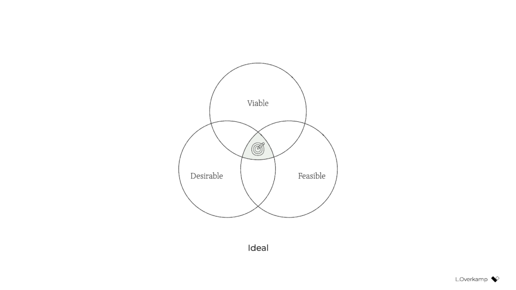
    Traditionally, we consider a product or service successful if it’s desirable to humans, technologically feasible, and financially viable. You tend to see these represented as equals; if you type the three words in a search engine, you’ll find diagrams of three equally sized, evenly arranged circles.

    But in our hearts, we all know that the three dimensions aren’t equally weighted: it’s viability that ultimately controls whether a product will go live. So a more realistic representation might look like this:

    Desirability and feasibility are the means; viability is the goal. Companies—outside of nonprofits and charities—exist to make money.

    A genuinely purpose-driven company would try to reverse this dynamic: it would recognize finance for what it was intended for: a means. So both feasibility and viability are means to achieve what the company set out to achieve. It makes intuitive sense: to achieve most anything, you need resources, people, and money. (Fun fact: the Italian language knows no difference between feasibility and viability; both are simply fattibilità.)

    But simply swapping viable for desirable isn’t enough to achieve an ethical outcome. Desirability is still linked to consumerism because the associated activities aim to identify what people want—whether it’s good for them or not. Desirability objectives, such as user satisfaction or conversion, don’t consider whether a product is healthy for people. They don’t prevent us from creating products that distract or manipulate people or stop us from contributing to society’s wealth inequality. They’re unsuitable for establishing a healthy balance with nature.

    There’s a fourth dimension of success that’s missing: our designs also need to be ethical in the effect that they have on the world.

    This is hardly a new idea. Many similar models exist, some calling the fourth dimension accountability, integrity, or responsibility. What I’ve never seen before, however, is the necessary step that comes after: to influence the system as designers and to make ethical design more practical, we must create objectives for ethical design that are achievable and inspirational. There’s no one way to do this because it highly depends on your culture, values, and industry. But I’ll give you the version that I developed with a group of colleagues at a design agency. Consider it a template to get started.

    Pursue well-being, equity, and sustainability

    We created objectives that address design’s effect on three levels: individual, societal, and global.

    An objective on the individual level tells us what success is beyond the typical focus of usability and satisfaction—instead considering matters such as how much time and attention is required from users. We pursued well-being:

    We create products and services that allow for people’s health and happiness. Our solutions are calm, transparent, nonaddictive, and nonmisleading. We respect our users’ time, attention, and privacy, and help them make healthy and respectful choices.

    An objective on the societal level forces us to consider our impact beyond just the user, widening our attention to the economy, communities, and other indirect stakeholders. We called this objective equity:

    We create products and services that have a positive social impact. We consider economic equality, racial justice, and the inclusivity and diversity of people as teams, users, and customer segments. We listen to local culture, communities, and those we affect.

    Finally, the objective on the global level aims to ensure that we remain in balance with the only home we have as humanity. Referring to it simply as sustainability, our definition was:

    We create products and services that reward sufficiency and reusability. Our solutions support the circular economy: we create value from waste, repurpose products, and prioritize sustainable choices. We deliver functionality instead of ownership, and we limit energy use.

    In short, ethical design (to us) meant achieving wellbeing for each user and an equitable value distribution within society through a design that can be sustained by our living planet. When we introduced these objectives in the company, for many colleagues, design ethics and responsible design suddenly became tangible and achievable through practical—and even familiar—actions.

    Measure impact 

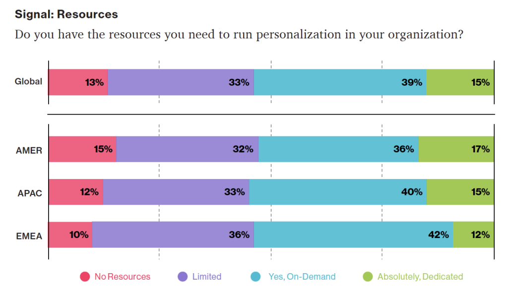
    But defining these objectives still isn’t enough. What truly caught the attention of senior management was the fact that we created a way to measure every design project’s well-being, equity, and sustainability.

    This overview lists example metrics that you can use as you pursue well-being, equity, and sustainability:

    There’s a lot of power in measurement. As the saying goes, what gets measured gets done. Donella Meadows once shared this example:

    “If the desired system state is national security, and that is defined as the amount of money spent on the military, the system will produce military spending. It may or may not produce national security.”

    This phenomenon explains why desirability is a poor indicator of success: it’s typically defined as the increase in customer satisfaction, session length, frequency of use, conversion rate, churn rate, download rate, and so on. But none of these metrics increase the health of people, communities, or ecosystems. What if instead we measured success through metrics for (digital) well-being, such as (reduced) screen time or software energy consumption?

    There’s another important message here. Even if we set an objective to build a calm interface, if we were to choose the wrong metric for calmness—say, the number of interface elements—we could still end up with a screen that induces anxiety. Choosing the wrong metric can completely undo good intentions. 

    Additionally, choosing the right metric is enormously helpful in focusing the design team. Once you go through the exercise of choosing metrics for our objectives, you’re forced to consider what success looks like concretely and how you can prove that you’ve reached your ethical objectives. It also forces you to consider what we as designers have control over: what can I include in my design or change in my process that will lead to the right type of success? The answer to this question brings a lot of clarity and focus.

    And finally, it’s good to remember that traditional businesses run on measurements, and managers love to spend much time discussing charts (ideally hockey-stick shaped)—especially if they concern profit, the one-above-all of metrics. For good or ill, to improve the system, to have a serious discussion about ethical design with managers, we’ll need to speak that business language.

    Practice daily ethical design

    Once you’ve defined your objectives and you have a reasonable idea of the potential metrics for your design project, only then do you have a chance to structurally practice ethical design. It “simply” becomes a matter of using your creativity and choosing from all the knowledge and toolkits already available to you.

    I think this is quite exciting! It opens a whole new set of challenges and considerations for the design process. Should you go with that energy-consuming video or would a simple illustration be enough? Which typeface is the most calm and inclusive? Which new tools and methods do you use? When is the website’s end of life? How can you provide the same service while requiring less attention from users? How do you make sure that those who are affected by decisions are there when those decisions are made? How can you measure our effects?

    The redefinition of success will completely change what it means to do good design.

    There is, however, a final piece of the puzzle that’s missing: convincing your client, product owner, or manager to be mindful of well-being, equity, and sustainability. For this, it’s essential to engage stakeholders in a dedicated kickoff session.

    Kick it off or fall back to status quo

    The kickoff is the most important meeting that can be so easy to forget to include. It consists of two major phases: 1) the alignment of expectations, and 2) the definition of success.

    In the first phase, the entire (design) team goes over the project brief and meets with all the relevant stakeholders. Everyone gets to know one another and express their expectations on the outcome and their contributions to achieving it. Assumptions are raised and discussed. The aim is to get on the same level of understanding and to in turn avoid preventable miscommunications and surprises later in the project.

    For example, for a recent freelance project that aimed to design a digital platform that facilitates US student advisors’ documentation and communication, we conducted an online kickoff with the client, a subject-matter expert, and two other designers. We used a combination of canvases on Miro: one with questions from “Manual of Me” (to get to know each other), a Team Canvas (to express expectations), and a version of the Project Canvas to align on scope, timeline, and other practical matters.

    The above is the traditional purpose of a kickoff. But just as important as expressing expectations is agreeing on what success means for the project—in terms of desirability, viability, feasibility, and ethics. What are the objectives in each dimension?

    Agreement on what success means at such an early stage is crucial because you can rely on it for the remainder of the project. If, for example, the design team wants to build an inclusive app for a diverse user group, they can raise diversity as a specific success criterion during the kickoff. If the client agrees, the team can refer back to that promise throughout the project. “As we agreed in our first meeting, having a diverse user group that includes A and B is necessary to build a successful product. So we do activity X and follow research process Y.” Compare those odds to a situation in which the team didn’t agree to that beforehand and had to ask for permission halfway through the project. The client might argue that that came on top of the agreed scope—and she’d be right.

    In the case of this freelance project, to define success I prepared a round canvas that I call the Wheel of Success. It consists of an inner ring, meant to capture ideas for objectives, and a set of outer rings, meant to capture ideas on how to measure those objectives. The rings are divided into five dimensions of successful design: healthy, equitable, sustainable, desirable, feasible, and viable.

    We went through each dimension, writing down ideas on digital sticky notes. Then we discussed our ideas and verbally agreed on the most important ones. For example, our client agreed that sustainability and progressive enhancement are important success criteria for the platform. And the subject-matter expert emphasized the importance of including students from low-income and disadvantaged groups in the design process.

    After the kickoff, we summarized our ideas and shared understanding in a project brief that captured these aspects:

    • the project’s origin and purpose: why are we doing this project?
    • the problem definition: what do we want to solve?
    • the concrete goals and metrics for each success dimension: what do we want to achieve?
    • the scope, process, and role descriptions: how will we achieve it?

    With such a brief in place, you can use the agreed-upon objectives and concrete metrics as a checklist of success, and your design team will be ready to pursue the right objective—using the tools, methods, and metrics at their disposal to achieve ethical outcomes.

    Conclusion

    Over the past year, quite a few colleagues have asked me, “Where do I start with ethical design?” My answer has always been the same: organize a session with your stakeholders to (re)define success. Even though you might not always be 100 percent successful in agreeing on goals that cover all responsibility objectives, that beats the alternative (the status quo) every time. If you want to be an ethical, responsible designer, there’s no skipping this step.

    To be even more specific: if you consider yourself a strategic designer, your challenge is to define ethical objectives, set the right metrics, and conduct those kick-off sessions. If you consider yourself a system designer, your starting point is to understand how your industry contributes to consumerism and inequality, understand how finance drives business, and brainstorm which levers are available to influence the system on the highest level. Then redefine success to create the space to exercise those levers.

    And for those who consider themselves service designers or UX designers or UI designers: if you truly want to have a positive, meaningful impact, stay away from the toolkits and meetups and conferences for a while. Instead, gather your colleagues and define goals for well-being, equity, and sustainability through design. Engage your stakeholders in a workshop and challenge them to think of ways to achieve and measure those ethical goals. Take their input, make it concrete and visible, ask for their agreement, and hold them to it.

    Otherwise, I’m genuinely sorry to say, you’re wasting your precious time and creative energy.

    Of course, engaging your stakeholders in this way can be uncomfortable. Many of my colleagues expressed doubts such as “What will the client think of this?,” “Will they take me seriously?,” and “Can’t we just do it within the design team instead?” In fact, a product manager once asked me why ethics couldn’t just be a structured part of the design process—to just do it without spending the effort to define ethical objectives. It’s a tempting idea, right? We wouldn’t have to have difficult discussions with stakeholders about what values or which key-performance indicators to pursue. It would let us focus on what we like and do best: designing.

    But as systems theory tells us, that’s not enough. For those of us who aren’t from marginalized groups and have the privilege to be able to speak up and be heard, that uncomfortable space is exactly where we need to be if we truly want to make a difference. We can’t remain within the design-for-designers bubble, enjoying our privileged working-from-home situation, disconnected from the real world out there. For those of us who have the possibility to speak up and be heard: if we solely keep talking about ethical design and it remains at the level of articles and toolkits—we’re not designing ethically. It’s just theory. We need to actively engage our colleagues and clients by challenging them to redefine success in business.

    With a bit of courage, determination, and focus, we can break out of this cage that finance and business-as-usual have built around us and become facilitators of a new type of business that can see beyond financial value. We just need to agree on the right objectives at the start of each design project, find the right metrics, and realize that we already have everything that we need to get started. That’s what it means to do daily ethical design.

    For their inspiration and support over the years, I would like to thank Emanuela Cozzi Schettini, José Gallegos, Annegret Bönemann, Ian Dorr, Vera Rademaker, Virginia Rispoli, Cecilia Scolaro, Rouzbeh Amini, and many others.

  • Mobile-First CSS: Is It Time for a Rethink?

    Mobile-First CSS: Is It Time for a Rethink?

    The mobile-first style approach is fantastic because it concentrates on what is most important to the consumer, it’s well-practiced, and it’s a well-known style design for years. But developing your CSS mobile-first should also be fantastic, too…right?

    Well, not necessarily. Classic mobile-first CSS development is based on the principle of overwriting style declarations: you begin your CSS with default style declarations, and overwrite and/or add new styles as you add breakpoints with min-width media queries for larger viewports (for a good overview see “What is Mobile First CSS and Why Does It Rock?”). But all those exceptions create complexity and inefficiency, which in turn can lead to an increased testing effort and a code base that’s harder to maintain. Admit it—how many of us willingly want that?

    Mobile-first CSS may yet be the best option for your own tasks, but you need to first determine whether it is appropriate in light of the physical design and user interactions you’re creating. To help you get started, here’s how I go about tackling the elements you need to watch for, and I’ll discuss some alternative remedies if mobile-first doesn’t seem to fit your job.

    merits of mobile-first technology

    Some of the benefits of mobile-first CSS creation, and why it’s been the de facto growth practice for so long, make a lot of sense:

    Development order. A good development hierarchy is one thing you definitely get from mobile-first; you just concentrate on the cellular view and start developing.

    tested and verified. It’s a tried and tested technique that’s worked for years for a cause: it solves a problem actually also.

    prioritizes the portable watch. The smart watch is the simplest and arguably the most significant because it covers all of the crucial user journeys and frequently accounts for more user visits ( depending on the project ) in terms of complexity.

    Prevents desktop-centric growth. It can be tempting to first focus on the desktop perspective because enhancement is done using pc servers. However, considering mobile from the beginning prevents us from getting stuck eventually; no one wants to spend their day getting a site that is focused on desktops to work on mobile devices!

    Drawbacks of mobile-first

    Model declarations can be set at higher breakpoints and finally overwritten at higher breakpoints:

    more complicated stuff. The farther up the target order you go, the more unnecessary script you inherit from lower thresholds.

    higher CSS sensitivity A school name declaration with a turned default value for a style has a higher specificity today. This can be a pain on big projects when you want to preserve the CSS candidates as simple as possible.

    Requires more analysis assessment. All higher thresholds must be regression tested if CSS changes at lower views ( such as adding a new fashion ).

    The browser can’t prioritize CSS downloads. At wider breakpoints, classic mobile-first min-width media queries don’t leverage the browser’s capability to download CSS files in priority order.

    Property price issue overrules its own.

    There is nothing intrinsically wrong with overwriting principles, CSS was designed to do just that. Even so, inheriting wrong values can be laborious and ineffective. When you need to replace styles to restore them to their defaults, which may cause issues after, especially if you’re using a combination of bespoke CSS and power classes, does this also lead to more style specificity. We won’t be able to use a power school for a design that has been restore with a higher precision.

    With this in mind, I’m developing CSS with a focus on the default values much more these days. Since there’s no specific order, and no chains of specific values to keep track of, this frees me to develop breakpoints simultaneously. I concentrate on finding common styles and isolating the specific exceptions in closed media query ranges (that is, any range with a max-width set). 

    As you can view each target as a clean slate, this strategy opens up some opportunities. If a product’s layout appears to be based on Flexbox at all thresholds, that is acceptable and can be coded in the definition style sheet. But if it looks like Grid would be much better for large windows and Flexbox for portable, these can both be done entirely freely when the CSS is put into finished media keyword ranges. Additionally, developing simultaneously requires you to have a thorough understanding of any given component in all breakpoints right away. This can help identify design flaws earlier in the development process. We don’t want to get stuck down a rabbit hole building a complex component for mobile, and then get the designs for desktop and find they are equally complex and incompatible with the HTML we created for the mobile view!

    Although this strategy won’t work for everyone, I urge you to try it. There are plenty of resources available to support concurrent development, including Responsively App, Blisk, and many others.

    Having said that, I don’t feel the order itself is particularly relevant. If you like to work on one device at a time, are comfortable with focusing on the mobile view, and have a good understanding of the requirements for other breakpoints, then you should definitely stick to the classic development order. The key is to find common styles and exceptions so that you can include them in the appropriate stylesheet, which is a kind of manual tree-shaking procedure! Personally, I find this a little easier when working on a component across breakpoints, but that’s by no means a requirement.

    Closed media query ranges are used in real life

    We overwrite the styles in the traditional mobile-first CSS, but media query ranges can be used to prevent this. To illustrate the difference ( I’m using SCSS for brevity ), let’s assume there are three visual designs:

    • smaller than 768
    • from 768 to less than 1024
    • 1024 and anything larger

    Take a simple example where a block-level element has a default padding of “20px,” which is overwritten at tablet to be “40px” and set back to “20px” on desktop.

    Classic min-width mobile-first

    .my-block { padding: 20px; @media (min-width: 768px) { padding: 40px; } @media (min-width: 1024px) { padding: 20px; }}

    Closed media query range

    .my-block { padding: 20px; @media (min-width: 768px) and (max-width: 1023.98px) { padding: 40px; }}

    The subtle difference is that the mobile-first example sets the default padding to “20px” and then overwrites it at each breakpoint, setting it three times in total. In contrast, the second example sets the default padding to “20px” and only overrides it at the relevant breakpoint where it isn’t the default value (in this instance, tablet is the exception).

    The goal is to: 

    • Only set styles when needed. 
    • Not set them with the expectation of overwriting them later on, again and again. 

    To this end, closed media query ranges are our best friend. If we need to make a change to any given view, we make it in the CSS media query range that applies to the specific breakpoint. We’ll be much less likely to introduce unwanted alterations, and our regression testing only needs to focus on the breakpoint we have actually edited. 

    Taking the above example, if we find that .my-block spacing on desktop is already accounted for by the margin at that breakpoint, and since we want to remove the padding altogether, we could do this by setting the mobile padding in a closed media query range.

    .my-block {  @media (max-width: 767.98px) {    padding: 20px;  }  @media (min-width: 768px) and (max-width: 1023.98px) {    padding: 40px;  }}

    The browser default padding for our block is “0,” so instead of adding a desktop media query and using unset or “0” for the padding value (which we would need with mobile-first), we can wrap the mobile padding in a closed media query (since it is now also an exception) so it won’t get picked up at wider breakpoints. At the desktop breakpoint, we won’t need to set any padding style, as we want the browser default value.

    Bundling versus separating the CSS

    Back in the day, keeping the number of requests to a minimum was very important because the browser's concurrent request limit (typically around six ) was high. In consequence, using image sprites and CSS bundling was the norm, with all the CSS being downloaded as a single stylesheet with the highest priority.

    With HTTP/2 and HTTP/3 now on the scene, the number of requests is no longer the big deal it used to be. By using a media query, we can separate the CSS into several files. The obvious benefit of this is that the browser can now request the CSS it currently requires with a higher priority than the CSS it doesn't. This is more performant and can reduce the overall time page rendering is blocked.

    What version of HTTP do you use?

    Go to your website and open the dev tools in your browser to find out which version of HTTP you're using. Next, select the Network tab and make sure the Protocol column is visible. If "h2" is included in the protocol list, that indicates that HTTP/2 is being used.

    Note: To check the Protocol column in your browser's dev tools, right-click any column header ( such as Name ), go to the Network tab, reload your page, and then check the Protocol column.

    Also, if your website is still using HTTP/1... WHHY!! What are you waiting for? Excellent user support exists for HTTP/2.

    splitting the CSS

    Separating the CSS into individual files is a worthwhile task. Linking the separate CSS files using the relevant media attribute allows the browser to identify which files are needed immediately (because they’re render-blocking) and which can be deferred. Based on this, it allocates each file an appropriate priority.

    In the following example of a website visited on a mobile breakpoint, we can see the mobile and default CSS are loaded with" Highest" priority, as they are currently needed to render the page. In case they are needed later, the remaining CSS files ( print, tablet, and desktop ) are still being downloaded with" Lowest" priority, though they are still needed.

    Before rendering can begin, the browser will need to download and parse the CSS file when using bundled CSS.

    While, as noted, with the CSS separated into different files linked and marked up with the relevant media attribute, the browser can prioritize the files it currently needs. Using closed media query ranges allows the browser to do this at all widths, as opposed to classic mobile-first min-width queries, where the desktop browser would have to download all the CSS with Highest priority. We can’t assume that desktop users always have a fast connection. For instance, in many rural areas, internet connection speeds are still slow. 

    Depending on project requirements, the media queries and the number of separate CSS files will vary from project to project, but the example below might look similar.

    CSS is bundled


    This single file contains all the CSS, including all media queries, and it will be downloaded with Highest priority.

    Separated CSS


    Separating the CSS and specifying a media attribute value on each link tag allows the browser to prioritize what it currently needs. Out of the five files listed above, two will be downloaded with Highest priority: the default file, and the file that matches the current media query. The others will be downloaded with Lowest priority.

    Depending on the project’s deployment strategy, a change to one file (mobile.css, for example) would only require the QA team to regression test on devices in that specific media query range. Compare that to the prospect of deploying the single bundled site.css file, an approach that would normally trigger a full regression test.

    Moving on

    The adoption of mobile-first CSS was a significant milestone in web development because it allowed front-end developers to concentrate on mobile web applications rather than creating websites for desktop use and attempting to retrofit them to work on other devices.

    I don't think anyone wants to return to that development model again, but it's important we don't lose sight of the issue it highlighted: that things can easily get convoluted and less efficient if we prioritize one particular device—any device—over others. For this reason, it seems natural to concentrate on the CSS in its own right, keeping an eye on both the default setting and the exceptions. I've started to notice subtle simplifications in both the CSS of my own and that of other developers, and that testing and maintenance work is also a little more effective and streamlined.

    In general, simplifying CSS rule creation whenever we can is ultimately a cleaner approach than going around in circles of overrides. However, the project must fit the methodology you choose. For the reasons given, mobile-first may turn out to be the best option for the situation, but first you must fully comprehend the trade-offs you're entering.

  • Personalization Pyramid: A Framework for Designing with User Data

    Personalization Pyramid: A Framework for Designing with User Data

    As a UX professional in today’s data-driven landscape, it’s increasingly likely that you’ve been asked to design a personalized digital experience, whether it’s a public website, user portal, or native application. Yet while there continues to be no shortage of marketing hype around personalization platforms, we still have very few standardized approaches for implementing personalized UX.

    That’s where we come in. After completing dozens of personalization projects over the past few years, we gave ourselves a goal: could you create a holistic personalization framework specifically for UX practitioners? The Personalization Pyramid is a designer-centric model for standing up human-centered personalization programs, spanning data, segmentation, content delivery, and overall goals. By using this approach, you will be able to understand the core components of a contemporary, UX-driven personalization program (or at the very least know enough to get started). 

    Getting Started

    For the sake of this article, we’ll assume you’re already familiar with the basics of digital personalization. A good overview can be found here: Website Personalization Planning. While UX projects in this area can take on many different forms, they often stem from similar starting points.      

    Common scenarios for starting a personalization project:

    • Your organization or client purchased a content management system (CMS) or marketing automation platform (MAP) or related technology that supports personalization
    • The CMO, CDO, or CIO has identified personalization as a goal
    • Customer data is disjointed or ambiguous
    • You are running some isolated targeting campaigns or A/B testing
    • Stakeholders disagree on personalization approach
    • Mandate of customer privacy rules (e.g. GDPR) requires revisiting existing user targeting practices

    Regardless of where you begin, a successful personalization program will require the same core building blocks. We’ve captured these as the “levels” on the pyramid. Whether you are a UX designer, researcher, or strategist, understanding the core components can help make your contribution successful.  

    From top to bottom, the levels include:

    1. North Star: What larger strategic objective is driving the personalization program? 
    2. Goals: What are the specific, measurable outcomes of the program? 
    3. Touchpoints: Where will the personalized experience be served?
    4. Contexts and Campaigns: What personalization content will the user see?
    5. User Segments: What constitutes a unique, usable audience? 
    6. Actionable Data: What reliable and authoritative data is captured by our technical platform to drive personalization?  
    7. Raw Data: What wider set of data is conceivably available (already in our setting) allowing you to personalize?

    We’ll go through each of these levels in turn. To help make this actionable, we created an accompanying deck of cards to illustrate specific examples from each level. We’ve found them helpful in personalization brainstorming sessions, and will include examples for you here.

    Starting at the Top

    The components of the pyramid are as follows:

    North Star

    A north star is what you are aiming for overall with your personalization program (big or small). The North Star defines the (one) overall mission of the personalization program. What do you wish to accomplish? North Stars cast a shadow. The bigger the star, the bigger the shadow. Example of North Starts might include: 

    1. Function: Personalize based on basic user inputs. Examples: “Raw” notifications, basic search results, system user settings and configuration options, general customization, basic optimizations
    2. Feature: Self-contained personalization componentry. Examples: “Cooked” notifications, advanced optimizations (geolocation), basic dynamic messaging, customized modules, automations, recommenders
    3. Experience: Personalized user experiences across multiple interactions and user flows. Examples: Email campaigns, landing pages, advanced messaging (i.e. C2C chat) or conversational interfaces, larger user flows and content-intensive optimizations (localization).
    4. Product: Highly differentiating personalized product experiences. Examples: Standalone, branded experiences with personalization at their core, like the “algotorial” playlists by Spotify such as Discover Weekly.

    Goals

    As in any good UX design, personalization can help accelerate designing with customer intentions. Goals are the tactical and measurable metrics that will prove the overall program is successful. A good place to start is with your current analytics and measurement program and metrics you can benchmark against. In some cases, new goals may be appropriate. The key thing to remember is that personalization itself is not a goal, rather it is a means to an end. Common goals include:

    • Conversion
    • Time on task
    • Net promoter score (NPS)
    • Customer satisfaction 

    Touchpoints

    Touchpoints are where the personalization happens. As a UX designer, this will be one of your largest areas of responsibility. The touchpoints available to you will depend on how your personalization and associated technology capabilities are instrumented, and should be rooted in improving a user’s experience at a particular point in the journey. Touchpoints can be multi-device (mobile, in-store, website) but also more granular (web banner, web pop-up etc.). Here are some examples:

    Channel-level Touchpoints

    • Email: Role
    • Email: Time of open
    • In-store display (JSON endpoint)
    • Native app
    • Search

    Wireframe-level Touchpoints

    • Web overlay
    • Web alert bar
    • Web banner
    • Web content block
    • Web menu

    If you’re designing for web interfaces, for example, you will likely need to include personalized “zones” in your wireframes. The content for these can be presented programmatically in touchpoints based on our next step, contexts and campaigns.

    Contexts and Campaigns

    Once you’ve outlined some touchpoints, you can consider the actual personalized content a user will receive. Many personalization tools will refer to these as “campaigns” (so, for example, a campaign on a web banner for new visitors to the website). These will programmatically be shown at certain touchpoints to certain user segments, as defined by user data. At this stage, we find it helpful to consider two separate models: a context model and a content model. The context helps you consider the level of engagement of the user at the personalization moment, for example a user casually browsing information vs. doing a deep-dive. Think of it in terms of information retrieval behaviors. The content model can then help you determine what type of personalization to serve based on the context (for example, an “Enrich” campaign that shows related articles may be a suitable supplement to extant content).

    Personalization Context Model:

    1. Browse
    2. Skim
    3. Nudge
    4. Feast

    Personalization Content Model:

    1. Alert
    2. Make Easier
    3. Cross-Sell
    4. Enrich

    We’ve written extensively about each of these models elsewhere, so if you’d like to read more you can check out Colin’s Personalization Content Model and Jeff’s Personalization Context Model

    User Segments

    User segments can be created prescriptively or adaptively, based on user research (e.g. via rules and logic tied to set user behaviors or via A/B testing). At a minimum you will likely need to consider how to treat the unknown or first-time visitor, the guest or returning visitor for whom you may have a stateful cookie (or equivalent post-cookie identifier), or the authenticated visitor who is logged in. Here are some examples from the personalization pyramid:

    • Unknown
    • Guest
    • Authenticated
    • Default
    • Referred
    • Role
    • Cohort
    • Unique ID

    Actionable Data

    Every organization with any digital presence has data. It’s a matter of asking what data you can ethically collect on users, its inherent reliability and value, as to how can you use it (sometimes known as “data activation.”) Fortunately, the tide is turning to first-party data: a recent study by Twilio estimates some 80% of businesses are using at least some type of first-party data to personalize the customer experience. 

    First-party data represents multiple advantages on the UX front, including being relatively simple to collect, more likely to be accurate, and less susceptible to the “creep factor” of third-party data. So a key part of your UX strategy should be to determine what the best form of data collection is on your audiences. Here are some examples:

    There is a progression of profiling when it comes to recognizing and making decisioning about different audiences and their signals. It tends to move towards more granular constructs about smaller and smaller cohorts of users as time and confidence and data volume grow.

    While some combination of implicit / explicit data is generally a prerequisite for any implementation (more commonly referred to as first party and third-party data) ML efforts are typically not cost-effective directly out of the box. This is because a strong data backbone and content repository is a prerequisite for optimization. But these approaches should be considered as part of the larger roadmap and may indeed help accelerate the organization’s overall progress. Typically at this point you will partner with key stakeholders and product owners to design a profiling model. The profiling model includes defining approach to configuring profiles, profile keys, profile cards and pattern cards. A multi-faceted approach to profiling which makes it scalable.

    Pulling it Together

    While the cards comprise the starting point to an inventory of sorts (we provide blanks for you to tailor your own), a set of potential levers and motivations for the style of personalization activities you aspire to deliver, they are more valuable when thought of in a grouping. 

    In assembling a card “hand”, one can begin to trace the entire trajectory from leadership focus down through a strategic and tactical execution. It is also at the heart of the way both co-authors have conducted workshops in assembling a program backlog—which is a fine subject for another article.

    In the meantime, what is important to note is that each colored class of card is helpful to survey in understanding the range of choices potentially at your disposal, it is threading through and making concrete decisions about for whom this decisioning will be made: where, when, and how.

    Lay Down Your Cards

    Any sustainable personalization strategy must consider near, mid and long-term goals. Even with the leading CMS platforms like Sitecore and Adobe or the most exciting composable CMS DXP out there, there is simply no “easy button” wherein a personalization program can be stood up and immediately view meaningful results. That said, there is a common grammar to all personalization activities, just like every sentence has nouns and verbs. These cards attempt to map that territory.

  • Humility: An Essential Value

    Humility: An Essential Value

    Humility, a writer’s most important quality, has a great circle to it. What about sincerity, an business manager’s important value? Or a surgeon’s? Or a teacher’s? They all have fantastic sounds. When humility is our guiding light, the course is usually available for fulfillment, development, relation, and commitment. We’re going to speak about why in this book.

    That said, this is a guide for developers, and to that conclusion, I’d like to begin with a story—well, a voyage, actually. It’s a personal one, and I’m going to make myself susceptible as well. I call it:

    The Absurd Pate of Justin: A Tale of its Author

    When I was coming out of arts school, a long-haired, goateed novice, write was a known quantity to me, design on the web, however, was riddled with complexities to understand and learn, a problem to be solved. Although I had formal training in typography, layout, and creative design, what piqued my interest was how these traditional skills could be applied to a young online landscape. This style would eventually form the rest of my profession.

    So I devoured HTML and JavaScript novels into the wee hours of the morning and self-taught myself how to code during my freshman year rather than student and go into print like many of my companions. I wanted—nay, needed—to better understand the underlying relevance of what my design decisions may think when rendered in a website.

    The so-called” Wild West” of website layout existed in the late 1990s and the early 2000s. Manufacturers at the time were all figuring out how to use layout and visual connection to the online environment. What were the guidelines? How may we break them and also engage, entertain, and present information? How could my values, which include value, humility, and relation, go along with that on a more general degree? I was eager to find out.

    Those are classic factors between non-career relationships and the world of design, even though I’m referring to a different era. What are your main passions, or ideals, that elevate medium? The main themes are the same, basically the same as what we previously discussed on the primary parallels between what fulfills you, independent of the physical or digital realms.

    First within tables, animated GIFs, Flash, then with Web Standards, divs, and CSS, there was personality, raw unbridled creativity, and unique means of presentment that often defied any semblance of a visible grid. Splash screens and “browser requirement” pages aplenty. Usability and accessibility were typically victims of such a creation, but such paramount facets of any digital design were largely (and, in hindsight, unfairly) disregarded at the expense of experimentation.

    For instance, this iteration of my personal portfolio site (” the pseudoroom” ) from that time was experimental if not a little overt in terms of the visual presentation of the idea of a living sketchbook. Very skeuomorphic. This one involved sketching and then passing a Photoshop file back and forth to experiment with various user interactions with fellow designer and dear friend Marc Clancy, who is now a co-founder of the creative project organizing app Milanote. Then, I’d break it down and code it into a digital layout.

    Along with design folio pieces, the site also offered free downloads for Mac OS customizations: desktop wallpapers that were effectively design experimentation, custom-designed typefaces, and desktop icons.

    GUI Galaxy was a design, pixel art, and Mac-centric news portal that graphic designer friends and I developed from around the same time.

    Design news portals were incredibly popular at the time, and they now accept Tweet-sized, small-format versions of relevant news from the categories I previously covered. If you took Twitter, curated it to a few categories, and wrapped it in a custom-branded experience, you’d have a design news portal from the late 90s / early 2000s.

    We as designers had changed and developed a bandwidth-sensitive, award-winning, much more accessibility-conscious website. Still ripe with experimentation, yet more mindful of equitable engagement. Below are some content panes that show general news (tech, design ) and news centered on Mac. We also offered many of the custom downloads I cited before as present on my folio site but branded and themed to GUI Galaxy.

    The presentation layer of the website’s backbone was made up of global design + illustration + news author collaboration. The backbone was a homegrown CMS. And the collaboration effort here, in addition to experimentation on a’ brand’ and content delivery, was hitting my core. We were creating something bigger than just one of us and establishing a global audience.

    Collaboration and connection transcend medium in their impact, immensely fulfilling me as a designer.

    Why am I going down this design memory lane with you, now? Two reasons.

    First of all, there’s a reason for the nostalgia for the” Wild West” era of design that so many personal portfolio and design portals sprang from the past. Ultra-finely detailed pixel art UI, custom illustration, bespoke vector graphics, all underpinned by a strong design community.

    The web design industry has experienced stagnation in recent years. I suspect there’s a strong chance you’ve seen a site whose structure looks something like this: a hero image / banner with text overlaid, perhaps with a lovely rotating carousel of images ( laying the snark on heavy there ), a call to action, and three columns of sub-content directly beneath. Perhaps there are selections that vaguely relate to their respective content in an icon library.

    Design, as it’s applied to the digital landscape, is in dire need of thoughtful layout, typography, and visual engagement that goes hand-in-hand with all the modern considerations we now know are paramount: usability. accessibility Load times and bandwidth- sensitive content delivery. A user-friendly presentation that is relevant wherever they are. We must be mindful of, and respectful toward, those concerns—but not at the expense of creativity of visual communication or via replicating cookie-cutter layouts.

    Pixel Issues

    Websites during this period were often designed and built on Macs whose OS and desktops looked something like this. Although Mac OS 7.5 is available, 8 and 9 are not very different.

    How could any single icon, at any point, stand out and grab my attention? This fascinated me. In this example, the user’s desktop is tidy, but think of a more realistic example with icon pandemonium. Or, let’s say an icon was a part of a larger system group ( fonts, extensions, control panels ): how did it maintain cohesion within the group as well?

    These were 32 x 32 pixel creations, utilizing a 256-color palette, designed pixel-by-pixel as mini mosaics. Under such absurd constraints, this seemed to me to be the embodiment of digital visual communication. And often, ridiculous restrictions can yield the purification of concept and theme.

    So I started doing my homework and conducting my research. I was a student of this new medium, hungry to dissect, process, discover, and make it my own.

    I wanted to see how I could push the boundaries of a 32×32 pixel grid with that 256-color palette, expanding upon the idea of exploration. Those ridiculous constraints forced a clarity of concept and presentation that I found incredibly appealing. The challenge of throwing the digital gauntlet had been thrown at me. And so, in my dorm room into the wee hours of the morning, I toiled away, bringing conceptual sketches into mini mosaic fruition.

    These are some of my creations that I made using ResEdit, the only program I had at the time, to create icons. ResEdit was a clunky, built-in Mac OS utility not really made for exactly what we were using it for. Research is at the center of all of this endeavor. Challenge. Problem-solving Again, these core connection-based values are agnostic of medium.

    There’s one more design portal I want to talk about, which also serves as the second reason for my story to bring this all together.

    Kaliber 1000 is short for K10k. K10k was founded in 1998 by Michael Schmidt and Toke Nygaard, and was the design news portal on the web during this period. With its pixel art-fueled presentation, attention to detail paid to every aspect of every detail, and many of the more well-known designers of the time who were invited to be news authors on the site, well… it was the place to be, my friend. With respect where respect is due, GUI Galaxy’s concept was inspired by what these folks were doing.

    For my part, the combination of my web design work and pixel art exploration began to get me some notoriety in the design scene. K10k eventually added me as one of their very select group of news writers to the website’s content.

    Amongst my personal work and side projects —and now with this inclusion—in the design community, this put me on the map. Additionally, my design work has started to appear on other design news portals, as well as be published in various printed collections, in domestic and international magazines, and in various printed collections. With that degree of success while in my early twenties, something else happened:

    I really changed into a colossal asshole in just about a year of school, not less. The press and the praise became what fulfilled me, and they went straight to my head. They inflated my ego. I actually felt somewhat superior to my fellow designers.

    The casualties? My design stagnated. My evolution has stagnated, as is my evolution.

    I felt so supremely confident in my abilities that I effectively stopped researching and discovering. When I used to lead sketch concepts or iterations as my first instinctive step, I instead leaped right into Photoshop. I drew my inspiration from the smallest of sources ( and with blinders on ). My peers frequently vehemently disapproved of any criticism of my work. The most tragic loss: I had lost touch with my values.

    Some of my friendships and blossoming professional relationships almost ended up being destroyed by my ego. I was toxic in talking about design and in collaboration. But thankfully, those same friends gave me a priceless gift: candor. They called me out on my unhealthy behavior.

    It’s true, I initially didn’t accept it, but after much reflection, I was able to accept it. I was soon able to accept, and process, and course correct. Although the re-awakening was necessary, the realization let me down. I let go of the “reward” of adulation and re-centered upon what stoked the fire for me in art school. Most importantly, I returned to my fundamental values.

    Always Students

    Following that temporary decline, my personal and professional design journey advanced. And I could self-reflect as I got older to facilitate further growth and course correction as needed.

    Let’s take the Large Hadron Collider as an example. The LHC was designed” to help answer some of the fundamental open questions in physics, which concern the basic laws governing the interactions and forces among the elementary objects, the deep structure of space and time, and in particular the interrelation between quantum mechanics and general relativity”. Thank you, Wikipedia.

    Around fifteen years ago, in one of my earlier professional roles, I designed the interface for the application that generated the LHC’s particle collision diagrams. These diagrams are often regarded as works of art by themselves because they depict what is actually happening inside the Collider during any given particle collision event.

    Designing the interface for this application was a fascinating process for me, in that I worked with Fermilab physicists to understand what the application was trying to achieve, but also how the physicists themselves would be using it. In order to accomplish this, in this role,

    I cut my teeth on usability testing, working with the Fermilab team to iterate and improve the interface. To me, how they spoke and what they talked about was like an alien tongue. And by making myself humble and working under the mindset that I was but a student, I made myself available to be a part of their world to generate that vital connection.

    I also had the opportunity to observe the physicists ‘ use of the tool in their own homes, on their own terminals, during my first ethnographic observation. For example, one takeaway was that due to the level of ambient light-driven contrast within the facility, the data columns ended up using white text on a dark gray background instead of black text-on-white. They could read through a lot of data at once and relieve their strain in the process. And Fermilab and CERN are government entities with rigorous accessibility standards, so my knowledge in that realm also grew. Another crucial form of communication was the barrier-free design.

    So to those core drivers of my visual problem-solving soul and ultimate fulfillment: discovery, exposure to new media, observation, human connection, and evolution. I checked my ego before entering those values, which opened the door for those values.

    An evergreen willingness to listen, learn, understand, grow, evolve, and connect yields our best work. I want to pay attention to the phrases “grow” and “evolve” in particular. If we are always students of our craft, we are also continually making ourselves available to evolve. Yes, we have years of practical design experience behind us. Or the focused lab sessions from a UX bootcamp. or the work portfolio with monograms. Or, ultimately, decades of a career behind us.

    However, with all that being said, “experience” does not equate to “expert.”

    As soon as we close our minds via an inner monologue of’ knowing it all’ or branding ourselves a” #thoughtleader” on social media, the designer we are is our final form. The artist we can be will never be there.

  • I am a creative.

    I am a creative.

    I am imaginative. What I do is alchemy. It’s a secret. I don’t perform it as much as I let it be done by me.

    I am imaginative. This brand is never appropriate for all creatives. Not all people see themselves in this manner. Some innovative individuals incorporate technology into their work. That is the way they are, and I take that into account. Perhaps I even have a small fear for them. However, my method is unique; my being is unique.

    It distracts one to apologize and qualify in progress. That’s what my head does to destroy me. I’ll leave it alone for today. I may regret and be qualified at any time. after I’ve said what I should have. which is sufficient.

    Except when it is simple and flows like a beverage valley.

    Sometimes it does go that approach. Maybe what I need to make arrives in a flash. When I say something at that moment, I’ve learned not to say it because people often don’t work hard enough to acknowledge that the idea is the best idea even when you know it’s the best idea.

    Maybe I work and work and work until the thought strikes me. Maybe it arrives right away and I don’t remind people for three weeks. Sometimes I get so excited about an thought that just came along that I blurt it out and didn’t stop myself. like a child who discovered a prize in a box of Cracker Jacks. I occasionally manage to escape this. Yes, that is the best plan, per some observers. The majority of the time, they don’t, and I regret that joy has faded.

    Joy should be saved for the meeting, where it will matter. not the informal gathering that two different gatherings precede that appointment. Nothing understands why we hold these gatherings. We keep saying we’re going to get rid of them, but we end up merely trying to. They occasionally yet are good. Sometimes they detract from the real work, though. Depending on what you do and where you do it, the ratio between when conferences are valuable and when they are a sad distraction vary. also who you are and what you do. I’ll go back and forth once more. I am imaginative. That is the design.

    Sometimes, despite many hours of diligent effort, someone is hardly useful. Maybe I have to take that and move on to the next task.

    Don’t inquire about the procedure. I am imaginative.

    I am imaginative. I have no control over my goals. And I have no control over my best tips.

    I can nail ahead, fill in the blanks, or use graphics or information, which occasionally works. Often going for a walk is what I can do. There is a Eureka that has nothing to do with sizzling fuel and flowing pots. I may be making dinner. I frequently know what to do when I awaken. The idea that may have saved me disappears almost as frequently as I become aware and a part of the world once more as a senseless wind of oblivion. For ingenuity, in my opinion, originates in that other world. the one that we enter in ambitions and, possibly, before and after death. I’m not a writer, so that’s up to authors to think about. I am imaginative. And it’s for philosophers to build massive soldiers in their imaginative world that they claim to be true. But that is yet another diversion. And one that is sad. Whether or not I am innovative or not, this may be on a much larger issue. But that’s not how I came around, though.

    Often the result is avoidance. And suffering. Do you know the designer who is tortured by the cliché? Even when the artist ( this place that noun in quotes ) attempts to write a sweet drink jingle, a call in a worn-out comedy, or a budget ask, it’s true.

    Some individuals who detest being called artistic perhaps been closeted artists, but that’s between them and their gods. No offence intended. Your assertions are also accurate. However, mine is for me.

    Artists acknowledge their work.

    Disadvantages know cons, just like real rappers recognize actual rappers, just like queers recognize queers. People have a lot of regard for artists. We revere, follow, and almost deify the great types. Of course, it is dreadful to revere any person. We’ve been given a warning. We are more knowledgeable. We are aware of this. They argue, they are depressed, they regret their most important choices, they are weak and hungry, they can be violent, and they can be as ridiculous as we can because they are clay, just like us. But. But. However, they produce something incredible. They give birth to something that was unable to arise before them or otherwise. They are the inspirations ‘ mother. And since it’s only lying there, I suppose I should add that they are the inventor’s parents. Ba ho backside! Okay, that’s all done. Continue.

    Because we compare our personal small accomplishments to those of the great ones, artists denigrate them. Wonderful video! I‘m not Miyazaki, though. That is glory right now. That is glory straight out of the Bible. This unsatisfied small factor I created? It essentially fell off the pumpkin vehicle. And the carrots weren’t actually new.

    Artists is aware that they are at best Salieri. Also Mozart’s original artists believe that.

    I am imaginative. I haven’t worked in advertising in 30 years, but my former artistic managers have been the ones who make my decisions. They are correct in doing so. When it really matters, my brain goes flat because I am too stupid and complacent. No medication is available to treat artistic function.

    I am imaginative. Every project I create has a goal that makes Indiana Jones appear older and snoring in a deck head. The more I pursue creativity, the faster I can finish my work, and the longer I brood and circle and gaze aimlessly before I can finish that work.

    I can move ten times more quickly than those who aren’t innovative, those who have just been creative for a short while, and those who have just had a short time of creative work. Only that I spend twice as long as they do putting the job off before I work ten times as quickly as they do. When I put my mind to it, I am so confident in my ability to do a fantastic career. I have an addiction to the delay rush. I’m still so frightened of jumping.

    I don’t create art.

    I am imaginative. never a performer. Though as a boy, I had a dream that I would one day become that. Some of us criticize our abilities and fear our own accomplishments because we are not Michelangelos and Warhols. That is narcissism, but at least we aren’t in elections.

    I am imaginative. Despite my belief in reason and science, I make decisions based on my own senses and instincts. and survive in the aftermath of both the triumphs and disasters.

    I am imaginative. Another artists, who see things different, will find every word I’ve said irritate me. Ask a question to two designers, and you’ll find three responses. Our dispute, our interest in it, and our responsibility to our own wisdom, at least in my opinion, are the proof that we are creative, no matter how we does think about it.

    I am imaginative. I lament my lack of taste in almost all of the areas of human understanding, which I know very little about. And I put my preference before all other things in the areas that are most dear to my soul, or perhaps more precisely, to my passions. Without my addictions, I’d probably have to spend the majority of our time looking ourselves in the eye, which is something that almost none of us can do for very long. No actually. Actually, no. Because so much in existence is intolerable if you really look at it.

    I am imaginative. I think that when I leave, a small portion of me will stay in someone else’s head, just like a family does.

    Working frees me from worrying about my job.

    I am imaginative. I fear that my little product will disappear without warning.

    I am imaginative. I’m too busy making the next thing to devote too much time to it, especially since practically everything I create did achieve the level of success I conceive of.

    I am imaginative. I think approach is the most amazing mystery. I think I have to consider it so strongly that I actually made the foolish decision to publish an essay I wrote without having to go through or edit. I swear I didn’t accomplish this frequently. But I did it right away because I was even more frightened of forgetting what I was saying because I was afraid of you seeing through my sad gestures toward the beautiful.

    There. I believe I’ve said it.

  • Opportunities for AI in Accessibility

    Opportunities for AI in Accessibility

    I was completely moved by Joe Dolson’s subsequent article on the crossing of AI and availability because I found it to be both skeptical about how widespread use of AI is. In fact, I’m very skeptical of AI myself, despite my role at Microsoft as an accessibility technology strategist who helps manage the AI for Accessibility award program. AI can be used in quite productive, inclusive, and accessible ways, as well as harmful, exclusive, and harmful ways, just like with any tool. And there are a lot of uses for the poor center as well.

    I’d like you to consider this a “yes … and” piece to complement Joe’s post. Instead of refuting everything he’s saying, I’m pointing out some areas where AI may make real, positive impacts on people with disabilities. I want to take some time to talk about what’s possible in hope that we’ll get there one day. I’m no saying that there aren’t real challenges or pressing problems with AI that need to be addressed; there are.

    Other text

    Joe’s article spends a lot of time examining how computer vision models can create other word. He raises a number of true points about the state of affairs right now. And while computer-vision concepts continue to improve in the quality and complexity of information in their information, their benefits aren’t wonderful. He argues to be accurate that the state of image research is currently very poor, especially for some graphic types, in large part due to the absence of contextual contexts in which to look at images ( as a result of having separate “foundation” models for words analysis and image analysis ). Today’s models aren’t trained to distinguish between images that are contextually relevant ( should probably have descriptions ) and those that are purely decorative ( couldn’t possibly need a description ) either. However, I still think there’s possible in this area.

    As Joe points out, human-in-the-loop editing of ctrl text should definitely be a factor. And if AI can intervene and provide a starting point for alt text, even if the quick reads,” What is this BS?” That’s not correct at all … Let me try to offer a starting point— I think that’s a win.

    If we can specifically station a design to examine image usage in context, this may help us more quickly determine which images are likely to be elegant and which ones are likely to be descriptive. That will help clarify which situations require image descriptions, and it will increase authors ‘ effectiveness in making their sites more visible.

    While complex images—like graphs and charts—are challenging to describe in any sort of succinct way ( even for humans ), the image example shared in the GPT4 announcement points to an interesting opportunity as well. Let’s say you came across a map that merely stated the chart’s name and the type of representation it was:” Pie chart comparing smartphone use to have phone usage in US households making under$ 30, 000 annually.” ( That would be a pretty bad alt text for a chart because it frequently leaves many unanswered questions about the data, but let’s just assume that was the description in place. ) If your browser knew that that image was a pie chart ( because an onboard model concluded this ), imagine a world where users could ask questions like these about the graphic:

    • Are there more smartphone users than feature phones?
    • How many more?
    • Is there a group of people that don’t fall into either of these buckets?
    • How many people are that?

    For a moment, the chance to learn more about images and data in this way could be revolutionary for people who are blind and low vision as well as for those with various forms of color blindness, cognitive disabilities, and other issues. Putting aside the realities of large language model ( LLM) hallucinations, where a model just makes up plausible-sounding “facts,” It could also be useful in educational contexts to help people who can see these charts, as is, to understand the data in the charts.

    What if you could ask your browser to make a complicated chart simpler? What if you asked it to separate a single line from a line graph? What if you could ask your browser to transpose the colors of the different lines to work better for form of color blindness you have? What if you could ask it to switch colors for patterns? That seems like a possibility given the chat-based interfaces and our current ability to manipulate images in today’s AI tools.

    Now imagine a purpose-built model that could extract the information from that chart and convert it to another format. For instance, it might be able to convert that pie chart (or, better yet, a number of pie charts ) into more usable ( and useful ) formats, like spreadsheets. That would be incredible!

    Matching algorithms

    When Safiya Umoja Noble chose to put her book Algorithms of Oppression, she hit the nail on the head. Although her book focused on the ways that search engines can foster racism, I believe it’s equally true that all computer models have the potential to foster conflict, prejudice, and intolerance. Whether it’s Twitter always showing you the latest tweet from a bored billionaire, YouTube sending us into a Q-hole, or Instagram warping our ideas of what natural bodies look like, we know that poorly authored and maintained algorithms are incredibly harmful. A large portion of this is attributable to the lack of diversity in those who create and shape them. There is real potential for algorithm development when these platforms are built with inclusive features in, though.

    Take Mentra, for example. They serve as a network of employment for people who are neurodivers. They match job seekers with potential employers using an algorithm based on more than 75 data points. On the job-seeker side of things, it considers each candidate’s strengths, their necessary and preferred workplace accommodations, environmental sensitivities, and so on. On the employer side, it takes into account each work environment, communication issues relating to each job, and other factors. Mentra made the decision to change the script when it came to the typical employment websites because it was run by neurodivergent people. They use their algorithm to propose available candidates to companies, who can then connect with job seekers that they are interested in, reducing the emotional and physical labor on the job-seeker side of things.

    When more people with disabilities are involved in developing algorithms, this can lower the likelihood that these algorithms will harm their communities. Diverse teams are crucial because of this.

    Imagine that a social media company’s recommendation engine was tuned to analyze who you’re following and if it was tuned to prioritize follow recommendations for people who talked about similar things but who were different in some key ways from your existing sphere of influence. For instance, if you were to follow a group of non-disabled white male academics who talk about AI, it might be advisable to follow those who are disabled, aren’t white, or aren’t men who also talk about AI. If you followed its recommendations, you might learn more about what’s happening in the AI field. These same systems should also use their understanding of biases about particular communities—including, for instance, the disability community—to make sure that they aren’t recommending any of their users follow accounts that perpetuate biases against (or, worse, spewing hate toward ) those groups.

    Other ways that AI can assist people with disabilities

    I’m sure I could go on and on about using AI to assist people with disabilities, but I’m going to make this last section into a bit of a lightning round. In no particular order:

      Voice preservation You may have been aware of the voice-prescribing options from Microsoft, Acapela, or others, or you may have seen the VALL-E paper or Apple’s announcement for Global Accessibility Awareness Day. It’s possible to train an AI model to replicate your voice, which can be a tremendous boon for people who have ALS ( Lou Gehrig’s disease ) or motor-neuron disease or other medical conditions that can lead to an inability to talk. This technology can also be used to create audio deepfakes, so we need to approach it responsibly, but the technology has truly transformative potential.
    • Voice recognition. Researchers like those in the Speech Accessibility Project are paying people with disabilities for their help in collecting recordings of people with atypical speech. As I type, they are actively recruiting people with Parkinson’s and related conditions, and they intend to expand this to other conditions as the project develops. More people with disabilities will be able to use voice assistants, dictation software, and voice-response services, as well as to use only their voices to control computers and other devices, according to this research.
    • Text transformation. LLMs of the current generation are quite capable of changing text without creating hallucinations. This is incredibly empowering for those who have cognitive disabilities and who may benefit from text summaries or simplified versions, or even text that has been prepared for Bionic Reading.

    The importance of diverse teams and data

    We must acknowledge the importance of our differences. The intersections of the identities we exist in have an impact on our lived experiences. These lived experiences—with all their complexities ( and joys and pain ) —are valuable inputs to the software, services, and societies that we shape. Our differences must be reflected in the data we use to develop new models, and those who provide it need to be compensated for doing so. Stronger models can be created using inclusive data sets, which lead to more equitable outcomes.

    Want a model that doesn’t demean or patronize or objectify people with disabilities? Make sure that the training data includes information about disabilities written by people with a range of disabilities.

    Want a model that doesn’t speak in ableist language? You may be able to use existing data sets to build a filter that can intercept and remediate ableist language before it reaches readers. Despite this, AI models won’t soon replace human copy editors when it comes to sensitivity reading.

    Want a copilot for coding that provides recomprehensible recommendations after the jump? Train it on code that you know to be accessible.


    I have no doubts about how dangerous AI can and will be for people today, tomorrow, and for the rest of the world. However, I also think that we can acknowledge this and make thoughtful, thoughtful, and intentional changes in our approaches to AI that will reduce harm over time as well. Today, tomorrow, and well into the future.


    Many thanks to Kartik Sawhney for supporting the development of this article, Ashley Bischoff for providing me with invaluable editorial support, and, of course, Joe Dolson for the prompt.

  • The Wax and the Wane of the Web

    The Wax and the Wane of the Web

    When you begin to believe you have all figured out, everyone does change, in my opinion. Simply as you start to get the hang of injections, diapers, and ordinary sleep, it’s time for solid foods, potty training, and nighttime sleep. When those are determined, school and occasional sleeps are in order. The cycle goes on and on.

    The same holds true for those of us who are currently employed in design and development. Having worked on the web for about three years at this point, I’ve seen the typical wax and wane of concepts, strategies, and systems. Every day we as developers and designers re-enter a routine pattern, a brand-new concept or technology emerges to shake things up and completely alter our world.

    How we got below

    I built my first website in the mid-’90s. Design and development on the web back then was a free-for-all, with few established norms. For any layout aside from a single column, we used table elements, often with empty cells containing a single pixel spacer GIF to add empty space. We styled text with numerous font tags, nesting the tags every time we wanted to vary the font style. And we had only three or four typefaces to choose from: Arial, Courier, or Times New Roman. When Verdana and Georgia came out in 1996, we rejoiced because our options had nearly doubled. The only safe colors to choose from were the 216 “web safe” colors known to work across platforms. The few interactive elements (like contact forms, guest books, and counters) were mostly powered by CGI scripts (predominantly written in Perl at the time). Achieving any kind of unique look involved a pile of hacks all the way down. Interaction was often limited to specific pages in a site.

    website requirements were born.

    At the turn of the century, a new cycle started. Crufty code littered with table layouts and font tags waned, and a push for web standards waxed. Newer technologies like CSS got more widespread adoption by browsers makers, developers, and designers. This shift toward standards didn’t happen accidentally or overnight. It took active engagement between the W3C and browser vendors and heavy evangelism from folks like the Web Standards Project to build standards. A List Apart and books like Designing with Web Standards by Jeffrey Zeldman played key roles in teaching developers and designers why standards are important, how to implement them, and how to sell them to their organizations. And approaches like progressive enhancement introduced the idea that content should be available for all browsers—with additional enhancements available for more advanced browsers. Meanwhile, sites like the CSS Zen Garden showcased just how powerful and versatile CSS can be when combined with a solid semantic HTML structure.

    Server-side language like PHP, Java, and.NET took Perl as the primary back-end computers, and the cgi-bin was tossed in the garbage bin. The first age of internet programs started with content-management systems (especially those used in blogs like Blogger, Grey Matter, Movable Type, and WordPress ), with these better server-side equipment. In the mid-2000s, AJAX opened gates for sequential interaction between the front end and back close. Pages had now revise their content without having to reload it. A grain of Script frameworks like Prototype, YUI, and ruby arose to aid developers develop more credible client-side conversation across browsers that had wildly varying levels of standards support. Techniques like photo replacement enable skilled manufacturers and developers to show fonts of their choosing. And technology like Flash made it possible to include movies, sports, and even more engagement.

    These new methods, requirements, and solutions greatly reenergized the sector. Web style flourished as manufacturers and designers explored more different styles and designs. However, we also relied heavily on tricks. Early CSS was a huge improvement over table-based layouts when it came to basic layout and text styling, but its limitations at the time meant that designers and developers still relied heavily on images for complex shapes ( such as rounded or angled corners ) and tiled backgrounds for the appearance of full-length columns (among other hacks ). All kinds of nested floats or absolute positioning ( or both ) were necessary for complicated layouts. Display and photo substitute for specialty styles was a great start toward varying the designs from the big five, but both tricks introduced convenience and efficiency issues. Additionally, JavaScript libraries made it simple to add a dash of interaction to pages without having to spend the money to double or even quadruple the download size for basic websites.

    The web as software platform

    The balance between the front end and the back end continued to improve, leading to the development of the current web application era. Between expanded server-side programming languages ( which kept growing to include Ruby, Python, Go, and others ) and newer front-end tools like React, Vue, and Angular, we could build fully capable software on the web. Along with these tools, there were additional options, such as collaborative build automation, collaborative version control, and shared package libraries. What was once primarily an environment for linked documents became a realm of infinite possibilities.

    Mobile devices increased in their capabilities as well, and they gave us access to the internet in our pockets at the same time. Mobile apps and responsive design opened up opportunities for new interactions anywhere and any time.

    This fusion of potent mobile devices and potent development tools contributed to the growth of social media and other centralized tools for user interaction and consumption. As it became easier and more common to connect with others directly on Twitter, Facebook, and even Slack, the desire for hosted personal sites waned. Social media made connections on a global scale, with both positive and negative outcomes.

    Want a much more extensive history of how we got here, with some other takes on ways that we can improve? ” Of Time and the Web” was written by Jeremy Keith. Or check out the” Web Design History Timeline” at the Web Design Museum. A fun tour through” Internet Artifacts” is also provided by Neal Agarwal.

    Where we are now

    It seems like we’ve reached yet another significant turning point in the last couple of years. As social-media platforms fracture and wane, there’s been a growing interest in owning our own content again. From the tried-and-true classic of hosting plain HTML files to static site generators and content management systems of all kinds, there are many different ways to create websites. The fracturing of social media also comes with a cost: we lose crucial infrastructure for discovery and connection. Webmentions, RSS, ActivityPub, and other IndieWeb tools can be useful in this regard, but they’re still largely underdeveloped and difficult to use for the less geeky. We can build amazing personal websites and add to them regularly, but without discovery and connection, it can sometimes feel like we may as well be shouting into the void.

    Browser support for standards like web components like CSS, JavaScript, and other standards has increased, particularly with efforts like Interop. New technologies gain support across the board in a fraction of the time that they used to. I frequently find out about a new feature and check its browser support only to discover that its coverage is already over 80 %. Nowadays, the barrier to using newer techniques often isn’t browser support but simply the limits of how quickly designers and developers can learn what’s available and how to adopt it.

    We can now prototype almost any idea with just a few commands and a few lines of code. All the tools that we now have available make it easier than ever to start something new. However, as we upgrade and maintain these frameworks, we eventually pay the upfront costs that these frameworks may initially save in terms of our technical debt.

    If we rely on third-party frameworks, adopting new standards can sometimes take longer since we may have to wait for those frameworks to adopt those standards. These frameworks, which previously made it easier to adopt new techniques sooner, have since evolved into obstacles. These same frameworks often come with performance costs too, forcing users to wait for scripts to load before they can read or interact with pages. And when scripts fail ( whether due to poor code, network issues, or other environmental factors ), there is frequently no other option, leaving users with blank or broken pages.

    Where do we go from here?

    Hacks of today help to shape standards for tomorrow. And there’s nothing inherently wrong with embracing hacks —for now—to move the present forward. Problems only arise when we refuse to acknowledge that they are hacks or when we choose not to replace them. So what can we do to create the future we want for the web?

    Build for the long haul. Optimize for performance, for accessibility, and for the user. weigh the costs of those user-friendly tools. They may make your job a little easier today, but how do they affect everything else? What is the price to the users? To future developers? To adoption of standards? Sometimes the convenience may be worth it. Sometimes it’s just a hack that you’ve gotten used to. And sometimes it’s holding you back from even better options.

    Start with standards. Standards continue to evolve over time, but browsers have done a remarkably good job of continuing to support older standards. The same holds true for third-party frameworks, though. Sites built with even the hackiest of HTML from the’ 90s still work just fine today. The same can’t be said about websites created with frameworks even after a few years.

    Design with care. Consider the effects of each choice, whether your craft is code, pixels, or processes. The convenience of many a modern tool comes at the cost of not always understanding the underlying decisions that have led to its design and not always considering the impact that those decisions can have. Use the time saved by modern tools to think more carefully and make decisions with care rather than rushing to “move fast and break things”

    Always be learning. If you’re constantly learning, you’re also developing. Sometimes it may be hard to pinpoint what’s worth learning and what’s just today’s hack. Even if you were to concentrate solely on learning standards, you might end up focusing on something that won’t matter next year. ( Remember XHTML? ) However, ongoing learning opens up new neural connections, and the techniques you learn in one day may be useful for guiding future experiments.

    Play, experiment, and be weird! The ultimate experiment is this web we created. It’s the single largest human endeavor in history, and yet each of us can create our own pocket within it. Be brave and try something new. Build a playground for ideas. Create absurd experiments in your own crazy science lab. Start your own small business. There is no better place for being more creative, risk-taking, and expressing our creativity.

    Share and amplify. Share what you think has worked for you as you experiment, play, and learn. Write on your own website, post on whichever social media site you prefer, or shout it from a TikTok. Write something for A List Apart! But take the time to amplify others too: find new voices, learn from them, and share what they’ve taught you.

    Go ahead and create a masterpiece.

    As designers and developers for the web ( and beyond ), we’re responsible for building the future every day, whether that may take the shape of personal websites, social media tools used by billions, or anything in between. Let’s give everything we produce a positive vibe by infusing our values into everything we do. Create that thing that only you are uniquely qualified to make. Then distribute it, improve it, re-use it, or create something new with it. Learn. Make. Share. grow. Rinse and repeat. Everything will change whenever you believe you have mastered the web.

  • To Ignite a Personalization Practice, Run this Prepersonalization Workshop

    To Ignite a Personalization Practice, Run this Prepersonalization Workshop

    Image this. You’ve joined a club at your business that’s designing innovative product features with an focus on technology or AI. Or perhaps your business only started using a personalization website. Either way, you’re designing with statistics. What’s next? When it comes to designing for personalization, there are many warning stories, no immediately achievement, and some guidelines for the baffled.

    The personalization space is real, between the dream of getting it right and the worry of it going wrong ( like when we encounter “persofails” similar to a company’s constant plea to regular people to purchase additional bathroom seats ). It’s an particularly confusing place to be a modern professional without a map, a map, or a strategy.

    There are no Lonely Planet and some tour guides for those of you who want to personalize because successful personalization depends so much on each group’s talent, technology, and market position.

    But you can ensure that your group has packed its carriers reasonably.

    There’s a DIY method to increase your chances for victory. You’ll at least at least disarm your boss ‘ irrational exuberance. Before the group you’ll need to properly plan.

    It’s known as prepersonalization.

    Behind the audio

    Take into account Spotify’s DJ feature, which was introduced last month.

    We’re used to seeing the polished final outcome of a personalization function. A personal have had to be developed, budgeted, and given priority before the year-end prize, the making-of-backstory, or the behind-the-scenes success chest. Before any customisation have goes live in your product or service, it lives amid a delay of valuable ideas for expressing consumer experiences more automatically.

    How do you decide where to position personalisation wagers? How do you design regular interactions that didn’t journey up users or—worse—breed mistrust? We’ve discovered that several budgeted programs second required one or more workshops to join key stakeholders and domestic customers of the technology in order to justify their continuing investments. Create it count.

    We’ve witnessed the same evolution up near with our clients, from big tech to budding companies. In our experience with working on small and large personalization work, a program’s best monitor record—and its capacity to weather tough questions, work steadily toward shared answers, and manage its design and engineering efforts—turns on how successfully these prepersonalization activities play out.

    Effective workshops consistently separate successful future endeavors from unsuccessful ones, saving countless hours of time, resources, and overall well-being.

    A personalization practice involves a multiyear effort of testing and feature development. It’s not a tech stack switch-flip. It’s best managed as a backlog that often evolves through three steps:

    1. customer experience optimization ( CXO, also known as A/B testing or experimentation )
    2. always-on automations ( whether rules-based or machine-generated )
    3. mature features or standalone product development ( such as Spotify’s DJ experience )?

    This is why we created our progressive personalization framework and why we’re field-testing an accompanying deck of cards: we believe that there’s a base grammar, a set of “nouns and verbs” that your organization can use to design experiences that are customized, personalized, or automated. You won’t require these cards. But we strongly recommend that you create something similar, whether that might be digital or physical.

    Set the timer for your kitchen.

    How long does it take to cook up a prepersonalization workshop? The evaluation activities that we suggest include can last for a number of weeks ( and frequently do ). For the core workshop, we recommend aiming for two to three days. Here’s a summary of our more general approach as well as information on the crucial first-day activities.

    The full arc of the wider workshop is threefold:

      Kickstart: This specifies the terms of engagement as you concentrate on both the potential and the team’s and leadership’s readiness and drive.
    1. Plan your work: This is the heart of the card-based workshop activities where you specify a plan of attack and the scope of work.
    2. Work your plan: This stage consists of making it possible for team members to individually present their own pilots, which each include a proof-of-concept project, business case, and operating model.

    Give yourself at least a day, split into two large time blocks, to power through a concentrated version of those first two phases.

    Kickstart: Apt your appetite

    We call the first lesson the “landscape of connected experience“. It looks at the possibilities for personalization in your company. A connected experience, in our parlance, is any UX requiring the orchestration of multiple systems of record on the backend. This might be a marketing-automation platform combined with a content-management system. It could be a digital-asset manager combined with a customer-data platform.

    Give examples of connected experience interactions that you admire, find familiar, or even dislike, as examples of consumer and business-to-business examples. This should cover a representative range of personalization patterns, including automated app-based interactions ( such as onboarding sequences or wizards ), notifications, and recommenders. These are in the cards, which we have a catalog of. Here’s a list of 142 different interactions to jog your thinking.

    It’s all about setting the tone. What are the possible paths for the practice in your organization? Here’s a long-form primer and a strategic framework for a broad perspective.

    Assess each example that you discuss for its complexity and the level of effort that you estimate that it would take for your team to deliver that feature ( or something similar ). In our cards, we break down connected experiences into five categories: functions, features, experiences, complete products, and portfolios. Size your own build here. This will help to draw attention to the benefits of ongoing investment as well as the difference between what you deliver right now and what you want to deliver in the future.

    Next, have your team plot each idea on the following 2×2 grid, which lays out the four enduring arguments for a personalized experience. This is crucial because it emphasizes how personalization can affect your own methods of working as well as your external customers. It’s also a reminder ( which is why we used the word argument earlier ) of the broader effort beyond these tactical interventions.

    Each team member should decide where they would like to place your company’s emphasis on your product or service. Naturally, you can’t prioritize all of them. Here, the goal is to demonstrate how various departments may view their own advantages over the effort, which can be different from one department to the next. Documenting your desired outcomes lets you know how the team internally aligns across representatives from different departments or functional areas.

    The third and final KickStart activity is about filling in the personalization gap. Is your customer journey well documented? Will data and privacy protection be a significant challenge? Do you have content metadata needs that you have to address? ( We’re pretty sure you do; it’s just a matter of acknowledging the magnitude of that need and finding a solution. ) In our cards, we’ve noted a number of program risks, including common team dispositions. For instance, our Detractor card lists six protracted behavior that is harmful to the development of our country.

    Effectively collaborating and managing expectations is critical to your success. Consider the potential obstacles to your progress in the future. Press the participants to name specific steps to overcome or mitigate those barriers in your organization. As research has shown, personalization initiatives face a number of common obstacles.

    At this point, you’ve hopefully discussed sample interactions, emphasized a key area of benefit, and flagged key gaps? You’re all set to go on, good.

    Hit that test kitchen

    Next, let’s take a look at what you’ll need to create personalization recipes. Personalization engines, which are robust software suites for automating and expressing dynamic content, can intimidate new customers. Their capabilities are broad and potent, and they give you a variety of ways to organize your company. This presents the question: Where do you begin when you’re configuring a connected experience?

    The key here is to avoid treating the installed software ( as one of our client executives humorously put it ) like some sort of dream kitchen. These software engines are more like test kitchens where your team can begin devising, tasting, and refining the snacks and meals that will become a part of your personalization program’s regularly evolving menu.

    Over the course of the workshop, the final menu of the prioritized backlog will be created. And creating “dishes” is the way that you’ll have individual team stakeholders construct personalized interactions that serve their needs or the needs of others.

    The dishes will be made from recipes, which have predetermined ingredients.

    Verify your ingredients

    You’ll ensure that you have everything you need to create your desired interaction ( or that you can determine what needs to be added to your pantry like a good product manager ) and that you have validated with the right stakeholders present. These ingredients include the audience that you’re targeting, content and design elements, the context for the interaction, and your measure for how it’ll come together.

    This is not just about identifying needs. Documenting your personalizations as a series of if-then statements lets the team:

    1. compare findings to a unified approach for developing features, similar to how artists paint with the same color palette,
    2. specify a consistent set of interactions that users find uniform or familiar,
    3. and establish parity among performance indicators and key performance indicators as well.

    This helps you streamline your designs and your technical efforts while you deliver a shared palette of core motifs of your personalized or automated experience.

    Create a recipe.

    What ingredients are important to you? Consider the construct “what-what-when-why”

    • Who are your key audience segments or groups?
    • What content, what design elements, and under what circumstances will you give them?
    • And for which business and user benefits?

    Five years ago, we developed these cards and card categories for the first time. We regularly play-test their fit with conference audiences and clients. And we still come across fresh possibilities. But they all follow an underlying who-what-when-why logic.

    In the cards in the accompanying photo below, you can typically follow along with right to left in three examples of subscription-based reading apps.

    1. Nurture personalization: When a guest or an unknown visitor interacts with a product title, a banner or alert bar appears that makes it easier for them to encounter a related title they may want to read, saving them time.
    2. Welcome automation: An email is sent when a newly registered user is a subscriber and is able to highlight the breadth of the content catalog.
    3. Winback automation: Before their subscription lapses or after a recent failed renewal, a user is sent an email that gives them a promotional offer to suggest that they reconsider renewing or to remind them to renew.

    We’ve also found that cocreating the recipes themselves can sometimes be the most effective way to start brainstorming about what these cards might be for your organization. Start with a set of blank cards, and begin labeling and grouping them through the design process, eventually distilling them to a refined subset of highly useful candidate cards.

    The workshop’s later stages, which shift from focusing on cookbooks to focusing on customers, might seem more nuanced. Individual” cooks” will pitch their recipes to the team, using a common jobs-to-be-done format so that measurability and results are baked in, and from there, the resulting collection will be prioritized for finished design and delivery to production.

    Better architecture is necessary for better kitchens.

    Simplifying a customer experience is a complicated effort for those who are inside delivering it. Beware of anyone who contradicts your advice. With that being said,” Complicated problems can be hard to solve, but they are addressable with rules and recipes“.

    When a team overfits: they aren’t designing with their best data, personalization turns into a laughing line. Like a sparse pantry, every organization has metadata debt to go along with its technical debt, and this creates a drag on personalization effectiveness. For instance, your AI’s output quality is in fact impacted by your IA. Spotify’s poster-child prowess today was unfathomable before they acquired a seemingly modest metadata startup that now powers its underlying information architecture.

    You can withstand the heat without a doubt.

    Personalization technology opens a doorway into a confounding ocean of possible designs. Only a deliberate and cooperative approach will produce the desired outcome. So banish the dream kitchen. Instead, head to the test kitchen to save time, preserve job security, and avoid imagining the creative concepts that come from your organization’s masters. There are meals to serve and mouths to feed.

    This organizational framework gives you a fighting chance at long-term success as well as solid ground. Wiring up your information layer isn’t an overnight affair. However, if you use the same cookbook and the same recipes, you’ll have solid ground for success. We designed these activities to make your organization’s needs concrete and clear, long before the hazards pile up.

    Although there are costs associated with purchasing this type of technology and product design, time well spent on sizing up and confronting your unique situation and digital skills. Don’t squander it. The pudding is the proof, as they say.

  • User Research Is Storytelling

    User Research Is Storytelling

    I’ve been fascinated by shows since I was a child. I loved the heroes and the excitement—but most of all the stories. I aspired to be an artist. And I believed that I’d get to do the things that Indiana Jones did and go on fascinating experiences. Perhaps my friends and I had movie ideas to make and sun in. But they never went any farther. However, I did end up in the user experience ( UX) field. Today, I realize that there’s an element of drama to UX— I hadn’t actually considered it before, but consumer analysis is story. And to get the most out of customer studies, you must tell a compelling story that involves stakeholders, including the product team and decision-makers, and piques their interest in learning more.

    Think of your favorite film. It more than likely follows a three-act narrative construction: the layout, the turmoil, and the resolution. The second act shows what exists now, and it helps you get to understand the characters and the challenges and problems that they face. The issue begins in Act 2, which introduces the issue. Here, issues grow or get worse. And the solution is the third and final work. This is where the issues are resolved and the figures learn and change. This structure, in my opinion, is also a fantastic way to think about customer research, and I think it can be particularly useful for explaining consumer research to others.

    Use story as a framework when conducting study.

    It’s sad to say, but many have come to see studies as being inconsequential. Research is frequently one of the first things to go when finances or deadlines are tight. Instead of investing in study, some goods professionals rely on manufacturers or—worse—their personal judgment to make the “right” options for users based on their experience or accepted best practices. That might lead to some clubs getting in the way, but it’s too easy to overlook the real problems facing users. To be user-centered, this is something we really avoid. Design is enhanced by consumer study. It keeps it on record, pointing to problems and opportunities. You can keep back of your competition by being aware of the problems with your goods and fixing them.

    In the three-act structure, each action corresponds to a part of the process, and each part is important to telling the whole story. Let’s take a look at the various functions and how they relate to consumer study.

    Act one: installation

    The basic research comes in handy because the layout is all about understanding the background. Basic research ( also called relational, discovery, or preliminary research ) helps you understand people and identify their problems. Like in the movies, you’re learning about the difficulties customers face, what options are available, and how they are affected by them. To do basic research, you may conduct situational inquiries or journal studies ( or both! ), which may assist you in identifying both problems and opportunities. It doesn’t need to get a great investment in time or money.

    Erika Hall writes about the most effective anthropology, which can be as straightforward as spending 15 hours with a customer and asking them to” Walk me through your morning yesterday.” That’s it. Provide that one ask. Opened up and listen to them for 15 days. Do everything in your power to protect both your objectives and yourself. Bam, you’re doing ethnography”. According to Hall, “[This ] will likely prove quite fascinating. In the very unlikely event that you didn’t learn anything new or helpful, carry on with increased confidence in your way”.

    I think this makes sense. And I love that this makes consumer studies so visible. You can simply attract participants and carry out the recruitment process without having to make a lot of paperwork! This can offer a wealth of knowledge about your customers, and it’ll help you better understand them and what’s going on in their life. That’s what action one is really all about: understanding where people are coming from.

    Maybe Spool talks about the importance of basic research and how it may type the bulk of your research. If you can substitute what you’ve heard in the fundamental research by using more customer information that you can obtain, such as surveys or analytics, or to highlight areas that need more research. Together, all this information creates a clearer picture of the state of things and all its deficiencies. And that’s the start of a gripping tale. It’s the place in the story where you realize that the principal characters—or the people in this case—are facing issues that they need to conquer. This is where you begin to develop compassion for the figures and support their success, much like in the movies. And finally partners are now doing the same. Their concern may be with their company, which could be losing money because consumers are unable to complete specific tasks. Or probably they do connect with customers ‘ problems. In any case, action one serves as your main strategy to pique the interest and interest of the participants.

    When partners begin to understand the value of basic research, that is open doors to more opportunities that involve users in the decision-making approach. And that can influence product teams ‘ focus on improving. This benefits everyone—users, the product, and stakeholders. It’s similar to winning an Oscar in terms of filmmaking because it frequently results in your product receiving good reviews and success. And this can be an incentive for stakeholders to repeat this process with other products. Knowing how to tell a good story is the only way to convince stakeholders to care about doing more research, and storytelling is the key to this process.

    This brings us to act two, where you iteratively evaluate a design or concept to see whether it addresses the issues.

    Act two: conflict

    Act two is all about digging deeper into the problems that you identified in act one. This typically involves conducting directional research, such as usability tests, where you evaluate a potential solution ( such as a design ) to see if it addresses the issues you identified. The issues could include unmet needs or problems with a flow or process that’s tripping users up. More issues will come up in the process, much like in act two of a movie. It’s here that you learn more about the characters as they grow and develop through this act.

    Usability tests should typically consist of five participants, according to Jakob Nielsen, who found that that number of users can typically identify the majority of the issues:” As you add more and more users, you learn less and less because you will keep seeing the same things again and again… After the fifth user, you are wasting your time by observing the same findings repeatedly but not learning much new.”

    There are parallels with storytelling here too, if you try to tell a story with too many characters, the plot may get lost. With fewer participants, each user’s struggles will be more memorable and accessible to other parties when presenting the research. This can help convey the issues that need to be addressed while also highlighting the value of doing the research in the first place.

    Usability tests have been conducted in person for decades, but you can also conduct them remotely using software like Microsoft Teams, Zoom, or other teleconferencing software. This approach has become increasingly popular since the beginning of the pandemic, and it works well. You might interpret in-person usability tests as a form of theater watching as opposed to remote testing. There are advantages and disadvantages to each. Much more in-depth research is conducted on user experience. Stakeholders can experience the sessions with other stakeholders. Additionally, you get real-time reactions, including surprises, disagreements, and discussions about what they’re seeing. Much like going to a play, where audiences get to take in the stage, the costumes, the lighting, and the actors ‘ interactions, in-person research lets you see users up close, including their body language, how they interact with the moderator, and how the scene is set up.

    If conducting usability testing in the field is like watching a play that is staged and controlled, where any two sessions may be very different from one another. You can take usability testing into the field by creating a replica of the space where users interact with the product and then conduct your research there. Or you can conduct your research by meeting users at their locations. With either option, you get to see how things work in context, things come up that wouldn’t have in a lab environment—and conversion can shift in entirely different directions. You have less control over how these sessions end as researchers, but this can occasionally help you understand users even better. Meeting users where they are can provide clues to the external forces that could be affecting how they use your product. Usability tests in person offer a level of detail that is frequently absent from remote testing.

    That’s not to say that the “movies” —remote sessions—aren’t a good option. A wider audience can be reached through remote sessions. They allow a lot more stakeholders to be involved in the research and to see what’s going on. Additionally, they make the doors accessible to a much wider range of users. But with any remote session there is the potential of time wasted if participants can’t log in or get their microphone working.

    You can ask real users questions to understand their thoughts and understanding of the solution as a result of usability testing, whether it is done remotely or in person. This can help you not only identify problems but also glean why they’re problems in the first place. Additionally, you can test your own hypotheses and determine whether your reasoning is correct. By the end of the sessions, you’ll have a much clearer picture of how usable the designs are and whether they work for their intended purposes. The excitement is in the second act, but there are also potential surprises in the third. This is equally true of usability tests. Unexpected things that are said by participants frequently alter how you view things, and these unexpected developments in the story can lead to unexpected turns in your perception.

    Unfortunately, user research is sometimes seen as expendable. Usability testing is also frequently the only research technique that some stakeholders believe they ever need, and too frequently. In fact, if the designs that you’re evaluating in the usability test aren’t grounded in a solid understanding of your users ( foundational research ), there’s not much to be gained by doing usability testing in the first place. Because you’re narrowing the scope of what you’re receiving feedback on without understanding the needs of the users. As a result, there’s no way of knowing whether the designs might solve a problem that users have. In the context of a usability test, it’s just feedback on a particular design.

    On the other hand, if you only do foundational research, while you might have set out to solve the right problem, you won’t know whether the thing that you’re building will actually solve that. This demonstrates the value of conducting both directional and foundational research.

    In act two, stakeholders will—hopefully—get to watch the story unfold in the user sessions, which creates the conflict and tension in the current design by surfacing their highs and lows. And in turn, this can encourage stakeholders to take action on the issues raised.

    Act three: resolution

    The third act is about resolving the issues from the first two acts, while the first two acts are about understanding the background and the tensions that can compel stakeholders to take action. While it’s important to have an audience for the first two acts, it’s crucial that they stick around for the final act. That includes all members of the product team, including developers, UX experts, business analysts, delivery managers, product managers, and any other parties who have a say in the coming development. It allows the whole team to hear users ‘ feedback together, ask questions, and discuss what’s possible within the project’s constraints. And it gives the UX design and research teams more time to clarify, suggest alternatives, or provide more context for their choices. So you can get everyone on the same page and get agreement on the way forward.

    This act is primarily told through voiceover with some audience participation. The researcher is the narrator, who paints a picture of the issues and what the future of the product could look like given the things that the team has learned. They provide the stakeholders with their suggestions and direction for developing this vision.

    Nancy Duarte in the Harvard Business Review offers an approach to structuring presentations that follow a persuasive story. The most effective presenters employ the same methods as great storytellers: By reaffirming the status quo and then revealing a better way, they create a conflict that needs to be resolved, writes Duarte. ” That tension helps them persuade the audience to adopt a new mindset or behave differently”.

    This type of structure aligns well with research results, and particularly results from usability tests. It provides proof for “what is “—the issues you’ve identified. And “what could be “—your recommendations on how to address them. And so forth and forth.

    You can reinforce your recommendations with examples of things that competitors are doing that could address these issues or with examples where competitors are gaining an edge. Or they can be as visual as quick sketches of a potential solution to a problem. These can help generate conversation and momentum. And this continues until the session is over when you’ve concluded by bridging the gaps and offering suggestions for improvement. This is the part where you reiterate the main themes or problems and what they mean for the product—the denouement of the story. This stage provides stakeholders with the next steps, and hopefully, the motivation to take those steps as well!

    While we are nearly at the end of this story, let’s reflect on the idea that user research is storytelling. The three-act structure of user research contains all the components for a good story:

      Act one: You meet the protagonists ( the users ) and the antagonists ( the problems affecting users ). This is the plot’s beginning. In act one, researchers might use methods including contextual inquiry, ethnography, diary studies, surveys, and analytics. These techniques can produce personas, empathy maps, user journeys, and analytics dashboards as output.
      Act two: Next, there’s character development. The protagonists face problems and difficulties, which they must overcome, and there is conflict and tension. In act two, researchers might use methods including usability testing, competitive benchmarking, and heuristics evaluation. Usability findings reports, UX strategy documents, usability guidelines, and best practices can be included in the output of these.
      Act three: The protagonists triumph and you see what a better future looks like. Researchers may use techniques like presentation decks, storytelling, and digital media in act three. The output of these can be: presentation decks, video clips, audio clips, and pictures.

    The researcher performs a number of tasks: they are the producer, the director, and the storyteller. The participants have a small role, but they are significant characters ( in the research ). And the audience is one of the stakeholders. But the most important thing is to get the story right and to use storytelling to tell users ‘ stories through research. In the end, the parties should leave with a goal and an eagerness to fix the product’s flaws.

    So the next time that you’re planning research with clients or you’re speaking to stakeholders about research that you’ve done, think about how you can weave in some storytelling. In the end, user research is beneficial for everyone, and all you need to do is pique stakeholders ‘ interest in how the story ends.

  • From Beta to Bedrock: Build Products that Stick.

    From Beta to Bedrock: Build Products that Stick.

    As a solution builder for too many times, I can’t recall how many times I’ve seen promising ideas go from being heroes in a few weeks to being useless within months.

    Financial goods, which is the area of my specialization, are no exception. It’s tempting to put as many features at the ceiling as possible and expect something sticks because people’s true, hard-earned money is on the line, user expectations are high, and crowded market. However, this strategy is a formula for disaster. Why? How’s why:

    The perils of feature-first growth

    It’s easy to get swept up in the enthusiasm of developing innovative features when you start developing a financial product from scratch or are migrating existing client journeys from papers or phone channels to online bank or mobile applications. You might be thinking,” If I can only put one more thing that solves this particular person problem, they’ll appreciate me”! But what happens if you eventually encounter a roadblock as a result of your security team’s negligence? don’t like it, right? When a battle-tested film isn’t as well-known as you anticipated, or when it fails due to unforeseen difficulty?

    The concept of Minimum Viable Product ( MVP ) comes into play in this context. Even if Jason Fried doesn’t usually refer to this concept, his book Getting Real and his audio Redo frequently discuss it. An MVP is a product that offers only enough significance to your users to keep them interested without becoming too hard or frustrating to use. Although the idea seems simple, it requires a razor-sharp eye, a ruthless edge, and the courage to stand up for your position because it is easy to fall for” the Columbo Effect” when there is always” just one more thing …” to add.

    The issue with most fund apps is that they frequently turn out to be reflections of the company’s internal politics rather than an encounter created specifically for the customer. This implies that the priority should be given to delivering as many features and functionalities as possible in order to satisfy the requirements and needs of competing internal departments as opposed to crafting a compelling value statement that is focused on what people in the real world actually want. These products may therefore quickly become a muddled mess of confusing, related, and finally unlovable client experiences—a feature salad, you might say.

    The significance of the foundation

    What’s a better course of action then? How may we create products that are user-friendly, firm, and, most importantly, stick?

    The concept of “bedrock” comes into play in this context. Rock is the main feature of your solution that really matters to customers. It’s the fundamental building block that creates benefit and maintains relevance over time.

    The rock must be in and around the standard servicing journeys in the retail banking industry, which is where I work. People only look at their existing account once every blue sky, but they do so daily. They purchase a credit card every year or two, but they at least once a month assess their stability and pay their bills.

    The key is in identifying the main tasks that individuals want to complete and therefore relentlessly striving to make them simple, reliable, and trustworthy.

    But how do you reach the foundation? By focusing on the” MVP” strategy, giving ease precedence, and working incrementally toward a clear value proposition. This means avoiding unnecessary functions and putting your customers first, and adding real value.

    It also requires some nerve, as your coworkers might not always agree on your eyesight at first. And dubiously, occasionally it can even suggest making it clear to customers that you won’t be coming to their house and making their breakfast. Sometimes you need to use “opinionated user interface design” ( i .e., clumsy workaround for edge cases ) to test a concept or to give yourself some more time to work on something else.

    Functional methods for creating reliable financial goods

    What are the main learnings I’ve made from my own research and practice, then?

    1. What trouble are you trying to solve first and foremost with a distinct “why”? Whom? Before beginning any construction, make sure your vision is completely clear. Make certain it also aligns with the goals of your business.
    2. Avoid putting too many features on the list at after; instead, focus on getting that right first. Choose one that actually adds benefit, and work from that.
    3. When it comes to financial items, clarity is often more important than difficulty. Eliminate unwanted details and concentrate solely on what matters most.
    4. Accept constant iteration: Bedrock is not a fixed destination; it is a fluid process. Continuously collect customer comments, make product improvements, and advance in that direction.
    5. Stop, glance, and talk: You must test your product frequently in the field rather than just as part of the shipping process. Use it for yourself. Move the A/B checks. User opinions on Gear. Talk to those who use it, and change things up correctly.

    The “bedrock dilemma”

    This is an intriguing conundrum: sacrificing some of the potential for short-term growth in favor of long-term stability is at play. But the reward is worthwhile because products built with a focus on bedrock will outlive and surpass their rivals over time and provide users with long-term value.

    How do you begin your quest for rock, then? Take it slowly. Start by identifying the underlying factors that your customers actually care about. Focus on developing and improving a second, potent have that delivers real value. And most importantly, make an obsessive effort because, in the words of Abraham Lincoln, Alan Kay, or Peter Drucker ( whew! The best way to foretell the future is to make it, he said.