Blog

  • From Beta to Bedrock: Build Products that Stick.

    As a product builder over too many years to mention, I’ve lost count of the number of times I’ve seen promising ideas go from zero to hero in a few weeks, only to fizzle out within months.

    Financial products, which is the field I work in, are no exception. With people’s real hard-earned money on the line, user expectations running high, and a crowded market, it’s tempting to throw as many features at the wall as possible and hope something sticks. But this approach is a recipe for disaster. Here’s why:

    The pitfalls of feature-first development

    When you start building a financial product from the ground up, or are migrating existing customer journeys from paper or telephony channels onto online banking or mobile apps, it’s easy to get caught up in the excitement of creating new features. You might think, “If I can just add one more thing that solves this particular user problem, they’ll love me!” But what happens when you inevitably hit a roadblock because the narcs (your security team!) don’t like it? When a hard-fought feature isn’t as popular as you thought, or it breaks due to unforeseen complexity?

    This is where the concept of Minimum Viable Product (MVP) comes in. Jason Fried’s book Getting Real and his podcast Rework often touch on this idea, even if he doesn’t always call it that. An MVP is a product that provides just enough value to your users to keep them engaged, but not so much that it becomes overwhelming or difficult to maintain. It sounds like an easy concept but it requires a razor sharp eye, a ruthless edge and having the courage to stick by your opinion because it is easy to be seduced by “the Columbo Effect”… when there’s always “just one more thing…” that someone wants to add.

    The problem with most finance apps, however, is that they often become a reflection of the internal politics of the business rather than an experience solely designed around the customer. This means that the focus is on delivering as many features and functionalities as possible to satisfy the needs and desires of competing internal departments, rather than providing a clear value proposition that is focused on what the people out there in the real world want. As a result, these products can very easily bloat to become a mixed bag of confusing, unrelated and ultimately unlovable customer experiences—a feature salad, you might say.

    The importance of bedrock

    So what’s a better approach? How can we build products that are stable, user-friendly, and—most importantly—stick?

    That’s where the concept of “bedrock” comes in. Bedrock is the core element of your product that truly matters to users. It’s the fundamental building block that provides value and stays relevant over time.

    In the world of retail banking, which is where I work, the bedrock has got to be in and around the regular servicing journeys. People open their current account once in a blue moon but they look at it every day. They sign up for a credit card every year or two, but they check their balance and pay their bill at least once a month.

    Identifying the core tasks that people want to do and then relentlessly striving to make them easy to do, dependable, and trustworthy is where the gravy’s at.

    But how do you get to bedrock? By focusing on the “MVP” approach, prioritizing simplicity, and iterating towards a clear value proposition. This means cutting out unnecessary features and focusing on delivering real value to your users.

    It also means having some guts, because your colleagues might not always instantly share your vision to start with. And controversially, sometimes it can even mean making it clear to customers that you’re not going to come to their house and make their dinner. The occasional “opinionated user interface design” (i.e. clunky workaround for edge cases) might sometimes be what you need to use to test a concept or buy you space to work on something more important.

    Practical strategies for building financial products that stick

    So what are the key strategies I’ve learned from my own experience and research?

    1. Start with a clear “why”: What problem are you trying to solve? For whom? Make sure your mission is crystal clear before building anything. Make sure it aligns with your company’s objectives, too.
    2. Focus on a single, core feature and obsess on getting that right before moving on to something else: Resist the temptation to add too many features at once. Instead, choose one that delivers real value and iterate from there.
    3. Prioritize simplicity over complexity: Less is often more when it comes to financial products. Cut out unnecessary bells and whistles and keep the focus on what matters most.
    4. Embrace continuous iteration: Bedrock isn’t a fixed destination—it’s a dynamic process. Continuously gather user feedback, refine your product, and iterate towards that bedrock state.
    5. Stop, look and listen: Don’t just test your product as part of your delivery process—test it repeatedly in the field. Use it yourself. Run A/B tests. Gather user feedback. Talk to people who use it, and refine accordingly.

    The bedrock paradox

    There’s an interesting paradox at play here: building towards bedrock means sacrificing some short-term growth potential in favour of long-term stability. But the payoff is worth it—products built with a focus on bedrock will outlast and outperform their competitors, and deliver sustained value to users over time.

    So, how do you start your journey towards bedrock? Take it one step at a time. Start by identifying those core elements that truly matter to your users. Focus on building and refining a single, powerful feature that delivers real value. And above all, test obsessively—for, in the words of Abraham Lincoln, Alan Kay, or Peter Drucker (whomever you believe!!), “The best way to predict the future is to create it.”

  • An Holistic Framework for Shared Design Leadership

    Picture this: You’re in a meeting room at your tech company, and two people are having what looks like the same conversation about the same design problem. One is talking about whether the team has the right skills to tackle it. The other is diving deep into whether the solution actually solves the user’s problem. Same room, same problem, completely different lenses.

    This is the beautiful, sometimes messy reality of having both a Design Manager and a Lead Designer on the same team. And if you’re wondering how to make this work without creating confusion, overlap, or the dreaded “too many cooks” scenario, you’re asking the right question.

    The traditional answer has been to draw clean lines on an org chart. The Design Manager handles people, the Lead Designer handles craft. Problem solved, right? Except clean org charts are fantasy. In reality, both roles care deeply about team health, design quality, and shipping great work. 

    The magic happens when you embrace the overlap instead of fighting it—when you start thinking of your design org as a design organism.

    The Anatomy of a Healthy Design Team

    Here’s what I’ve learned from years of being on both sides of this equation: think of your design team as a living organism. The Design Manager tends to the mind (the psychological safety, the career growth, the team dynamics). The Lead Designer tends to the body (the craft skills, the design standards, the hands-on work that ships to users).

    But just like mind and body aren’t completely separate systems, so, too, do these roles overlap in important ways. You can’t have a healthy person without both working in harmony. The trick is knowing where those overlaps are and how to navigate them gracefully.

    When we look at how healthy teams actually function, three critical systems emerge. Each requires both roles to work together, but with one taking primary responsibility for keeping that system strong.

    The Nervous System: People & Psychology

    Primary caretaker: Design Manager
    Supporting role: Lead Designer

    The nervous system is all about signals, feedback, and psychological safety. When this system is healthy, information flows freely, people feel safe to take risks, and the team can adapt quickly to new challenges.

    The Design Manager is the primary caretaker here. They’re monitoring the team’s psychological pulse, ensuring feedback loops are healthy, and creating the conditions for people to grow. They’re hosting career conversations, managing workload, and making sure no one burns out.

    But the Lead Designer plays a crucial supporting role. They’re providing sensory input about craft development needs, spotting when someone’s design skills are stagnating, and helping identify growth opportunities that the Design Manager might miss.

    Design Manager tends to:

    • Career conversations and growth planning
    • Team psychological safety and dynamics
    • Workload management and resource allocation
    • Performance reviews and feedback systems
    • Creating learning opportunities

    Lead Designer supports by:

    • Providing craft-specific feedback on team member development
    • Identifying design skill gaps and growth opportunities
    • Offering design mentorship and guidance
    • Signaling when team members are ready for more complex challenges

    The Muscular System: Craft & Execution

    Primary caretaker: Lead Designer
    Supporting role: Design Manager

    The muscular system is about strength, coordination, and skill development. When this system is healthy, the team can execute complex design work with precision, maintain consistent quality, and adapt their craft to new challenges.

    The Lead Designer is the primary caretaker here. They’re setting design standards, providing craft coaching, and ensuring that shipping work meets the quality bar. They’re the ones who can tell you if a design decision is sound or if we’re solving the right problem.

    But the Design Manager plays a crucial supporting role. They’re ensuring the team has the resources and support to do their best craft work, like proper nutrition and recovery time for an athlete.

    Lead Designer tends to:

    • Definition of design standards and system usage
    • Feedback on what design work meets the standard
    • Experience direction for the product
    • Design decisions and product-wide alignment
    • Innovation and craft advancement

    Design Manager supports by:

    • Ensuring design standards are understood and adopted across the team
    • Confirming experience direction is being followed
    • Supporting practices and systems that scale without bottlenecking
    • Facilitating design alignment across teams
    • Providing resources and removing obstacles to great craft work

    The Circulatory System: Strategy & Flow

    Shared caretakers: Both Design Manager and Lead Designer

    The circulatory system is about how information, decisions, and energy flow through the team. When this system is healthy, strategic direction is clear, priorities are aligned, and the team can respond quickly to new opportunities or challenges.

    This is where true partnership happens. Both roles are responsible for keeping the circulation strong, but they’re bringing different perspectives to the table.

    Lead Designer contributes:

    • User needs are met by the product
    • Overall product quality and experience
    • Strategic design initiatives
    • Research-based user needs for each initiative

    Design Manager contributes:

    • Communication to team and stakeholders
    • Stakeholder management and alignment
    • Cross-functional team accountability
    • Strategic business initiatives

    Both collaborate on:

    • Co-creation of strategy with leadership
    • Team goals and prioritization approach
    • Organizational structure decisions
    • Success measures and frameworks

    Keeping the Organism Healthy

    The key to making this partnership sing is understanding that all three systems need to work together. A team with great craft skills but poor psychological safety will burn out. A team with great culture but weak craft execution will ship mediocre work. A team with both but poor strategic circulation will work hard on the wrong things.

    Be Explicit About Which System You’re Tending

    When you’re in a meeting about a design problem, it helps to acknowledge which system you’re primarily focused on. “I’m thinking about this from a team capacity perspective” (nervous system) or “I’m looking at this through the lens of user needs” (muscular system) gives everyone context for your input.

    This isn’t about staying in your lane. It’s about being transparent as to which lens you’re using, so the other person knows how to best add their perspective.

    Create Healthy Feedback Loops

    The most successful partnerships I’ve seen establish clear feedback loops between the systems:

    Nervous system signals to muscular system: “The team is struggling with confidence in their design skills” → Lead Designer provides more craft coaching and clearer standards.

    Muscular system signals to nervous system: “The team’s craft skills are advancing faster than their project complexity” → Design Manager finds more challenging growth opportunities.

    Both systems signal to circulatory system: “We’re seeing patterns in team health and craft development that suggest we need to adjust our strategic priorities.”

    Handle Handoffs Gracefully

    The most critical moments in this partnership are when something moves from one system to another. This might be when a design standard (muscular system) needs to be rolled out across the team (nervous system), or when a strategic initiative (circulatory system) needs specific craft execution (muscular system).

    Make these transitions explicit. “I’ve defined the new component standards. Can you help me think through how to get the team up to speed?” or “We’ve agreed on this strategic direction. I’m going to focus on the specific user experience approach from here.”

    Stay Curious, Not Territorial

    The Design Manager who never thinks about craft, or the Lead Designer who never considers team dynamics, is like a doctor who only looks at one body system. Great design leadership requires both people to care about the whole organism, even when they’re not the primary caretaker.

    This means asking questions rather than making assumptions. “What do you think about the team’s craft development in this area?” or “How do you see this impacting team morale and workload?” keeps both perspectives active in every decision.

    When the Organism Gets Sick

    Even with clear roles, this partnership can go sideways. Here are the most common failure modes I’ve seen:

    System Isolation

    The Design Manager focuses only on the nervous system and ignores craft development. The Lead Designer focuses only on the muscular system and ignores team dynamics. Both people retreat to their comfort zones and stop collaborating.

    The symptoms: Team members get mixed messages, work quality suffers, morale drops.

    The treatment: Reconnect around shared outcomes. What are you both trying to achieve? Usually it’s great design work that ships on time from a healthy team. Figure out how both systems serve that goal.

    Poor Circulation

    Strategic direction is unclear, priorities keep shifting, and neither role is taking responsibility for keeping information flowing.

    The symptoms: Team members are confused about priorities, work gets duplicated or dropped, deadlines are missed.

    The treatment: Explicitly assign responsibility for circulation. Who’s communicating what to whom? How often? What’s the feedback loop?

    Autoimmune Response

    One person feels threatened by the other’s expertise. The Design Manager thinks the Lead Designer is undermining their authority. The Lead Designer thinks the Design Manager doesn’t understand craft.

    The symptoms: Defensive behavior, territorial disputes, team members caught in the middle.

    The treatment: Remember that you’re both caretakers of the same organism. When one system fails, the whole team suffers. When both systems are healthy, the team thrives.

    The Payoff

    Yes, this model requires more communication. Yes, it requires both people to be secure enough to share responsibility for team health. But the payoff is worth it: better decisions, stronger teams, and design work that’s both excellent and sustainable.

    When both roles are healthy and working well together, you get the best of both worlds: deep craft expertise and strong people leadership. When one person is out sick, on vacation, or overwhelmed, the other can help maintain the team’s health. When a decision requires both the people perspective and the craft perspective, you’ve got both right there in the room.

    Most importantly, the framework scales. As your team grows, you can apply the same system thinking to new challenges. Need to launch a design system? Lead Designer tends to the muscular system (standards and implementation), Design Manager tends to the nervous system (team adoption and change management), and both tend to circulation (communication and stakeholder alignment).

    The Bottom Line

    The relationship between a Design Manager and Lead Designer isn’t about dividing territories. It’s about multiplying impact. When both roles understand they’re tending to different aspects of the same healthy organism, magic happens.

    The mind and body work together. The team gets both the strategic thinking and the craft excellence they need. And most importantly, the work that ships to users benefits from both perspectives.

    So the next time you’re in that meeting room, wondering why two people are talking about the same problem from different angles, remember: you’re watching shared leadership in action. And if it’s working well, both the mind and body of your design team are getting stronger.

  • Design Dialects: Breaking the Rules, Not the System

    “Language is not merely a set of unrelated sounds, clauses, rules, and meanings; it is a totally coherent system bound to context and behavior.” — Kenneth L. Pike

    The web has accents. So should our design systems.

    Design Systems as Living Languages

    Design systems aren’t component libraries—they’re living languages. Tokens are phonemes, components are words, patterns are phrases, layouts are sentences. The conversations we build with users become the stories our products tell.

    But here’s what we’ve forgotten: the more fluently a language is spoken, the more accents it can support without losing meaning. English in Scotland differs from English in Sydney, yet both are unmistakably English. The language adapts to context while preserving core meaning. This couldn’t be more obvious to me, a Brazilian Portuguese speaker, who learned English with an American accent, and lives in Sydney.

    Our design systems must work the same way. Rigid adherence to visual rules creates brittle systems that break under contextual pressure. Fluent systems bend without breaking.

    Consistency becomes a prison

    The promise of design systems was simple: consistent components would accelerate development and unify experiences. But as systems matured and products grew more complex, that promise has become a prison. Teams file “exception” requests by the hundreds. Products launch with workarounds instead of system components. Designers spend more time defending consistency than solving user problems.

    Our design systems must learn to speak dialects.

    A design dialect is a systematic adaptation of a design system that maintains core principles while developing new patterns for specific contexts. Unlike one-off customizations or brand themes, dialects preserve the system’s essential grammar while expanding its vocabulary to serve different users, environments, or constraints.

    When Perfect Consistency Fails

    At Booking.com, I learned this lesson the hard way. We A/B-tested everything—color, copy, button shapes, even logo colors. As a professional with a graphic design education and experience building brand style guides, I found this shocking. While everyone fell in love with Airbnb’s pristine design system, Booking grew into a giant without ever considering visual consistency.  

    The chaos taught me something profound: consistency isn’t ROI; solved problems are.

    At Shopify. Polaris () was our crown jewel—a mature design language perfect for merchants on laptops. As a product team, we were expected to adopt Polaris as-is. Then my fulfillment team hit an “Oh, Ship!” moment, as we faced the challenge of building an app for warehouse pickers using our interface on shared, battered Android scanners in dim aisles, wearing thick gloves, scanning dozens of items per minute, many with limited levels of English understanding.

    Task completion with standard Polaris: 0%.

    Every component that worked beautifully for merchants failed completely for pickers. White backgrounds created glare. 44px tap targets were invisible to gloved fingers. Sentence-case labels took too long to parse. Multi-step flows confused non-native speakers.

    We faced a choice: abandon Polaris entirely, or teach it to speak warehouse.

    The Birth of a Dialect

    We chose evolution over revolution. Working within Polaris’s core principles—clarity, efficiency, consistency—we developed what we now call a design dialect:

    ConstraintFluent MoveRationale
    Glare & low lightDark surfaces + light textReduce glare on low-DPI screens
    Gloves & haste90px tap targets (~2cm)Accommodate thick gloves
    MultilingualSingle-task screens, plain languageReduce cognitive load

    Result: Task completion jumped from 0% to 100%. Onboarding time dropped from three weeks to one shift.

    This wasn’t customization or theming—this was a dialect: a systematic adaptation that maintained Polaris’s core grammar while developing new vocabulary for a specific context. Polaris hadn’t failed; it had learned to speak warehouse.

    The Flexibility Framework

    At Atlassian, working on the Jira platform—itself a system within the larger Atlassian system—I pushed for formalizing this insight. With dozens of products sharing a design language across different codebases, we needed systematic flexibility so we built directly into our ways of working. The old model—exception requests and special approvals—was failing at scale.

    We developed the Flexibility Framework to help designers define how flexible they wanted their components to be:

    TierActionOwnership
    ConsistentAdopt unchangedPlatform locks design + code
    OpinionatedAdapt within boundsPlatform provides smart defaults, products customize
    FlexibleExtend freelyPlatform defines behavior, products own presentation

    During a navigation redesign, we tiered every element. Logo and global search stayed Consistent. Breadcrumbs and contextual actions became Flexible. Product teams could immediately see where innovation was welcome and where consistency mattered.

    The Decision Ladder

    Flexibility needs boundaries. We created a simple ladder for evaluating when rules should bend:

    Good: Ship with existing system components. Fast, consistent, proven.

    Better: Stretch a component slightly. Document the change. Contribute improvements back to the system for all to use.

    Best: Prototype the ideal experience first. If user testing validates the benefit, update the system to support it.

    The key question: “Which option lets users succeed fastest?”

    Rules are tools, not relics.

    Unity Beats Uniformity

    Gmail, Drive, and Maps are unmistakably Google—yet each speaks with its own accent. They achieve unity through shared principles, not cloned components. One extra week of debate over button color costs roughly $30K in engineer time.

    Unity is a brand outcome; fluency is a user outcome. When the two clash, side with the user.

    Governance Without Gates

    How do you maintain coherence while enabling dialects? Treat your system like a living vocabulary:

    Document every deviation – e.g., dialects/warehouse.md with before/after screenshots and rationale.

    Promote shared patterns – when three teams adopt a dialect independently, review it for core inclusion.

    Deprecate with context – retire old idioms via flags and migration notes, never a big-bang purge.

    A living dictionary scales better than a frozen rulebook.

    Start Small: Your First Dialect

    Ready to introduce dialects? Start with one broken experience:

    This week: Find one user flow where perfect consistency blocks task completion. Could be mobile users struggling with desktop-sized components, or accessibility needs your standard patterns don’t address.

    Document the context: What makes standard patterns fail here? Environmental constraints? User capabilities? Task urgency?

    Design one systematic change: Focus on behavior over aesthetics. If gloves are the problem, bigger targets aren’t “”breaking the system””—they’re serving the user. Earn the variations and make them intentional.

    Test and measure: Does the change improve task completion? Time to productivity? User satisfaction?

    Show the savings: If that dialect frees even half a sprint, fluency has paid for itself.

    Beyond the Component Library

    We’re not managing design systems anymore—we’re cultivating design languages. Languages that grow with their speakers. Languages that develop accents without losing meaning. Languages that serve human needs over aesthetic ideals.

    The warehouse workers who went from 0% to 100% task completion didn’t care that our buttons broke the style guide. They cared that the buttons finally worked.

    Your users feel the same way. Give your system permission to speak their language.

  • Design for Amiability: Lessons from Vienna

    Today’s web is not always an amiable place. Sites greet you with a popover that demands assent to their cookie policy, and leave you with Taboola ads promising “One Weird Trick!” to cure your ailments. Social media sites are tuned for engagement, and few things are more engaging than a fight. Today it seems that people want to quarrel; I have seen flame wars among birders.  

    These tensions are often at odds with a site’s goals. If we are providing support and advice to customers, we don’t want those customers to wrangle with each other. If we offer news about the latest research, we want readers to feel at ease; if we promote upcoming marches, we want our core supporters to feel comfortable and we want curious newcomers to feel welcome. 

    In a study for a conference on the History of the Web, I looked to the origins of Computer Science in Vienna (1928-1934)  for a case study of the importance of amiability in a research community and the disastrous consequences of its loss. That story has interesting implications for web environments that promote amiable interaction among disparate, difficult (and sometimes disagreeable) people.

    The Vienna Circle

    Though people had been thinking about calculating engines and thinking machines from antiquity, Computing really got going in Depression-era Vienna.  The people who worked out the theory had no interest in building machines; they wanted to puzzle out the limits of reason in the absence of divine authority. If we could not rely on God or Aristotle to tell us how to think, could we instead build arguments that were self-contained and demonstrably correct? Can we be sure that mathematics is consistent? Are there things that are true but that cannot be expressed in language? 

    The core ideas were worked out in the weekly meetings (Thursdays at 6) of a group remembered as the Vienna Circle. They got together in the office of Professor Moritz Schlick at the University of Vienna to discuss problems in philosophy, math, and language. The intersection of physics and philosophy had long been a specialty of this Vienna department, and this work had placed them among the world leaders.  Schlick’s colleague Hans Hahn was a central participant, and by 1928 Hahn brought along his graduate students Karl Menger and Kurt Gödel. Other frequent participants included philosopher Rudolf Carnap, psychologist Karl Popper, economist Ludwig von Mises (brought by his brother Frederick, a physicist),  graphic designer Otto Neurath (inventor of infographics), and architect Josef Frank (brought by his physicist brother, Phillip).  Out-of-town visitors often joined, including the young Johnny von Neumann, Alfred Tarski, and the irascible Ludwig Wittgenstein. 

    When Schlick’s office grew too dim, participants adjourned to a nearby café for additional discussion with an even larger circle of participants.  This convivial circle was far from unique.  An intersecting circle–Neurath, von Mises, Oskar Morgenstern–established the Austrian School of free-market economics. There were theatrical circles (Peter Lorre, Hedy Lamarr, Max Reinhardt), and literary circles. The café was where things happened.

    The interdisciplinarity of the group posed real challenges of temperament and understanding. Personalities were often a challenge. Gödel was convinced people were trying to poison him. Architect Josef Frank depended on contracts for public housing, which Mises opposed as wasteful. Wittgenstein’s temper had lost him his job as a secondary school teacher, and for some of these years he maintained a detailed list of whom he was willing to meet. Neurath was eager to detect muddled thinking and would interrupt a speaker with a shouted “Metaphysics!” The continuing amity of these meetings was facilitated by the personality of their leader, Moritz Schlick, who would be remembered as notably adept in keeping disagreements from becoming quarrels.

    In the Café

    The Viennese café of this era was long remembered as a particularly good place to argue with your friends, to read, and to write. Built to serve an imperial capital, the cafés found themselves with too much space and too few customers now that the Empire was gone. There was no need to turn tables: a café could only survive by coaxing customers to linger. Perhaps they would order another coffee, or one of their friends might drop by. One could play chess, or billiards, or read newspapers from abroad. Coffee was invariably served with a glass of purified spring water, still a novelty in an era in which most water was still unsafe to drink. That water glass would be refilled indefinitely. 

    In the basement of one café, the poet Jura Soyfer staged “The End Of The World,” a musical comedy in which Professor Peep has discovered a comet heading for earth.

    Prof. Peep: The comet is going to destroy everybody!

    Hitler:  Destroying everybody is my business.

    Of course, coffee can be prepared in many ways, and the Viennese café developed a broad vocabulary to represent precisely how one preferred to drink it: melange, Einspänner, Brauner, Schwarzer, Kapuziner. This extensive customization, with correspondingly esoteric conventions of service, established the café as a comfortable and personal third space, a neutral ground in which anyone who could afford a coffee would be welcome. Viennese of this era were fastidious in their use of personal titles, of which an abundance were in common use. Café waiters greeted regular customers with titles too, but were careful to address their patrons with titles a notch or two greater than they deserved. A graduate student would be Doktor, an unpaid postdoc Professor.  This assurance mattered all the more because so many members of the Circle (and so many other Viennese) came from elsewhere: Carnap from Wuppertal, Gödel from Brno, von Neumann from Budapest. No one was going to make fun of your clothes, mannerisms, or accent. Your friends wouldn’t be bothered by the pram in the hall. Everyone shared a Germanic Austrian literary and philosophical culture, not least those whose ancestors had been Eastern European Jews who knew that culture well, having read all about it in books.

    The amiability of the café circle was enhanced by its openness. Because the circle sometimes extended to architects and actors, people could feel less constrained to admit shortfalls in their understanding. It was soon discovered that marble tabletops made a useful surface for pencil sketches, serving all as an improvised and accessible blackboard.

    Comedies like “The End Of The World” and fictional newspaper sketches or feuilletons of writers like Joseph Roth and Stefan Zweig served as a second defense against disagreeable or churlish behavior. The knowledge that, if one got carried away, a parody of one’s remarks might shortly appear in Neue Freie Presse surely helped Professor Schlick keep matters in hand.

    The End Of Red Vienna

    Though Austria’s government drifted to the right after the War, Vienna’s city council had been Socialist, dedicated to public housing based on user-centered design, and embracing  ambitious programs of public outreach and adult education. In 1934 the Socialists lost a local election, and this era soon came to its end as the new administration focused on the imagined threat of the International Jewish Conspiracy. Most members of the Circle fled within months: von Neumann to Princeton, Neurath to Holland and Oxford, Popper to New Zealand, Carnap to Chicago. Prof. Schlick was murdered on the steps of the University by a student outraged by his former association with Jews.  Jura Soyfer, who wrote “The End Of The World,” died in Buchenwald.

    In 1939, von Neumann finally convinced Gödel to accept a job in Princeton. Gödel was required to pay large fines to emigrate. The officer in charge of these fees would look back on this as the best posting of his career; his name was Eichmann.

    Design for Amiability

    An impressive literature recounts those discussions and the environment that facilitated the development of computing. How can we design for amiability?  This is not just a matter of choosing rounded typefaces and a cheerful pastel palette. I believe we may identify eight distinct issues that exert design forces in usefully amiable directions.

    Seriousness: The Vienna Circle was wrestling with a notoriously difficult book—Wittgenstein’s Tractus Logico-Philosophicus—and a catalog of outstanding open questions in mathematics. They were concerned with consequential problems, not merely scoring points for debating. Constant reminders that the questions you are considering matter—not only that they are consequential or that those opposing you are scoundrels—help promote amity.

    Empiricism: The characteristic approach of the Vienna Circle demanded that knowledge be grounded either in direct observation or in rigorous reasoning. Disagreement, when it arose, could be settled by observation or by proof. If neither seemed ready to hand, the matter could not be settled. On these terms, one can seldom if ever demolish an opposing argument, and trolling is pointless.

    Abstraction: Disputes grow worse when losing the argument entails lost face or lost jobs. The Vienna Circle’s focus on theory—the limits of mathematics, the capability of language—promoted amity. Without seriousness, abstraction could have been merely academic, but the limits of reason and the consistency of mathematics were clearly serious.

    Formality: The punctilious demeanor of waiters and the elaborated rituals of coffee service helped to establish orderly attitudes amongst the argumentative participants. This stands in contrast to the contemptuous sneer that now dominates social media.  

    Schlamperei: Members of the Vienna Circle maintained a global correspondence, and they knew their work was at the frontier of research. Still, this was Vienna, at the margins of Europe: old-fashioned, frumpy, and dingy. Many participants came from even more obscure backwaters. Most or all harbored the suspicion that they were really schleppers, and a tinge of the ridiculous helped to moderate tempers. The director of “The End Of The World” had to pass the hat for money to purchase a moon for the set, and thought it was funny enough to write up for publication.

    Openness: All sorts of people were involved in discussion, anyone might join in. Each week would bring different participants. Fluid borders reduce tension, and provide opportunities to broaden the range of discussion and the terms of engagement. Low entrance friction was characteristic of the café: anyone could come, and if you came twice you were virtually a regular. Permeable boundaries and café culture made it easier for moderating influences to draw in raconteurs and storytellers to defuse awkward moments, and Vienna’s cafés had no shortage of humorists. Openness counteracts the suspicion that promoters of amiability are exerting censorship.

    Parody: The environs of the Circle—the university office and the café—were unmistakably public. There were writers about, some of them renowned humorists. The prospect that one’s bad taste or bad behavior might be ridiculed in print kept discussion within bounds. The sanction of public humiliation, however, was itself made mild by the veneer of fiction; even if you got a little carried away and a character based on you made a splash in some newspaper fiction, it wasn’t the end of the world.

    Engagement: The subject matter was important to the participants, but it was esoteric: it did not matter very much to their mothers or their siblings. A small stumble or a minor humiliation could be shrugged off in ways that major media confrontations cannot.

    I believe it is notable that this environment was designed to promote amiability through several different voices.  The café waiter flattered each newcomer and served everyone, and also kept out local pickpockets and drunks who would be mere disruptions. Schlick and other regulars kept discussion moving and on track. The fiction writers and raconteurs—perhaps the most peripheral of the participants—kept people in a good mood and reminded them that bad behavior could make anyone ridiculous.  Crucially, each of these voices were human: you could reason with them. Algorithmic or AI moderators, however clever, are seldom perceived as reasonable. The café circles had no central authority or Moderator against whom everyone’s resentments might be focused. Even after the disaster of 1934, what people remembered were those cheerful arguments.

  • Good designers, bad websites: a proposal

    I want to discuss accessibility because it is the most important thing for making websites. Other A List Apart articles give you innovation and insight. This article will give you homework. These are just my personal views, but they’re pretty good.

    I want to start off with a couple of statements, and you will agree:

    1. Designers are good people. I have never heard a designer say, “I don’t care if somebody can’t read this text”, “Not my fault if somebody can’t use this device”, or “Who cares if this is confusing?”
    2. Some designs exclude people. You have seen people unable to read the text on a website or app that somebody designed. You’ve seen people unable to use a physical device that somebody has designed. You’ve seen people utterly bamboozled while trying to use a service that somebody designed.

    So what?

    The first question is, “Is this life-or-death stuff?” The answer is, “Yes.” In my favorite essay, This Is All There Is, Aral Balkan makes the point that pretty much everything that we design can affect life events and death events. Aral gives the example of how even a straightforward bus timetable app can affect life and death events, if we design it badly:

    • somebody might miss a life event, such as their daughter’s fifth birthday party; or
    • somebody might miss a death event, such as the chance to say goodbye to a dying grandmother.

    The next—and frustrating—question is, “Why do some designs still exclude people?” After all, we know that:

    • not everybody can see perfectly;
    • not everybody can hear perfectly;
    • not everybody thinks the same way; and
    • not everybody moves the same way.

    I think the answer is that there’s too much to recall. Consider, if you will, the wide variety of topics that A List Apart articles cover. Designers are expected to remember all of that guidance, plus all of the accessibility guidance, plus so much more. It is too much.

    Recognizing accessibility issues while designing

    I’d like to point toward one possible solution, starting from Jakob Nielsen’s 10 Usability Heuristics for User Interface Design. These are from the mid-1990s, and—although there’s a good chance that you, gentle reader, are a lot younger than that—please bear with me. 

    Seeing as the problem is that there’s too much to recall, I want to look at heuristic № 6, “Recognition rather than Recall.” Jakob Nielsen said that for users, information required to use the design should be visible or easily retrievable when needed. I suggest we tweak that to make life easier for designers. Let’s say that the information required to produce the design should be visible or easily retrievable when needed. In other words, let’s make it easier to recognise accessibility issues while we’re designing.

    How are we going to do that? I really like the book A Web for Everyone—Designing Accessible User Experiences by Sarah Horton and Whitney Quesenbery. I really like this book not only because it includes a quote from me—actually two quotes, but I don’t like to boast—but because it includes personas that are perfect for helping us to recognise accessibility issues. That’s the good news. The even better news is that these personas are available now for free on the companion website to the book What Every Engineer Should Know About Digital Accessibility, again by Sarah Horton, with David Sloan this time.

    Meet your users

    I’m going to introduce you to these personas now:

    I want to throw one more persona at you now, because, well, A List Apart readers are overachievers. One of my favorite authors, Cennydd Bowles—who literally wrote the book on Future Ethics—says to create Personas Non Grata. In other words, every time we design something, we have to think about what a bad guy could do with that thing, and whom that might affect.

    To actually use these personas while designing, I like what Eric Meyer and Sara Wachter-Boettcher in Design for Real Life call the Designated Dissenter: for each project that you work on, one of your teams should be responsible for asking, “Will this work for Vishnu?”, “How’s Trevor going to get on with this?”, and so on. 

    Then, once you’ve used the personas to recognise the accessibility issues, you can look up the guidelines for whichever platforms you’re designing for: 

    Your mission, should you choose to accept it

    I told you in the introduction of this article that I would give you homework. You thought I was joking. So, here’s your homework: I want you to grab the personas from the Know About Accessibility website, and use them throughout every design project to help you recognise accessibility issues while you work—and reclaim design for everyone.


    NOTE: This article is based on “Recognise,” my five-minute presentation from Interaction Design Association (IxDA) Dublin’s Defuse (Design for Use) event in 2025.

  • Designed for a Dead Language

    Every language app in your pocket inherited a teaching method built for Latin. Understanding why that happened is a more useful design lesson than anything the apps themselves will teach you.

    In 1788, Prussia introduced the Abitur, a standardized national examination required for entry into universities and the civil service. To pass it, students needed to demonstrate measurable, gradable knowledge. The system needed to teach language to large classrooms, produce consistent outcomes, and do it with one teacher and thirty students. The educators responsible for designing this system reached for the only teaching template they had, one that had been used in European schools for two centuries: the method developed to teach Latin.

    Latin, by 1788, was a dead language. Nobody needed to speak it. The scholars who studied it were reading Cicero and Virgil, not conducting conversations. The method built around it, memorizing grammar rules, constructing translations, analyzing written texts, reflected that reality exactly. Oral skills were irrelevant. Comprehension of written form was everything. The method was not designed to produce speakers. It was designed to produce readers of texts in a language nobody spoke.

    When Prussia applied this template to French and German, living languages spoken by living people, the premise did not change. Johann Valentin Meidinger’s textbook Praktische Französische Grammatik, published in 1804, ran to 37 editions across Europe by 1857. Karl Plotz formalized the approach into what became the dominant model for teaching modern languages across Europe and eventually the United States, where it became known simply as the Prussian Method [1]. Each institution that adopted it trained teachers in it, who trained students who became teachers. The constraint that created the method, how do you grade language at scale with limited resources, became invisible inside the method itself. What remained was the assumption: language is a body of rules to be learned consciously and measured. It was a design decision dressed up, over time, as a pedagogical truth.

    The observation that should have ended it

    There are people in the world who cannot read or write a language and speak it fluently. There are children who hold full conversations years before they can read a single word. There are immigrants who arrive in a country knowing nothing of its language and come out, years later, speaking it naturally, not because they studied it, but because they lived inside it. Literacy and fluency are separate things produced by entirely separate mechanisms. The Grammar-Translation method, as it became known, assumed they were the same thing. That assumption was inherited from a method designed for a language nobody needed to speak, and it was wrong the moment it was applied to a language people actually used.

    The evidence against it accumulated slowly. In the mid to late nineteenth century, reformers including François Gouin in France and Maximilian Berlitz in the United States argued independently that language should be taught the way it is actually acquired, through immersive exposure to real communication in the target language, not through analysis of its rules. Berlitz built an entire school network around this principle. The reformers were correct. They were also largely ignored by mainstream education systems, because the Grammar-Translation method had one decisive advantage that direct immersion did not: it could be graded.

    In 1982, the linguist Stephen Krashen gave the argument its most formal articulation in what he called the Monitor Model of second language acquisition. His distinction was precise: language acquisition, the unconscious process through which children absorb their native language and through which adults succeed in immersive environments, is categorically different from language learning, the conscious study of grammar rules and vocabulary that classrooms deliver [2]. Acquisition produces fluency. Learning, at best, produces the ability to pass a test. The evidence supporting this distinction, and the observation that immersive exposure to real native-speaker communication is the mechanism that produces genuine fluency, has only grown since.

    I went to Brazil without a word of Portuguese and came out speaking it. I studied French in a classroom for years and cannot hold a conversation in French today. This is not an unusual experience. It is the expected outcome, and it has been the expected outcome for as long as we have had formal language education.

    The same decision, made again in a different medium

    Prussian educators faced the question: How do you deliver language learning at scale, measure progress, and retain users over time? The answer it arrived at was structurally identical to the one arrived at in 1788. Duolingo gamified the grammar drill into a streak. Anki formalized the translation exercise into a spaced-repetition flashcard. Babbel organized grammar lessons into structured modules. The interfaces were new. The underlying assumption, that language is a thing you study rather than an environment you inhabit, was not.

    This was not a failure of design skill. The products that emerged from these decisions are, in many respects, genuinely well-crafted. Duolingo’s retention mechanics are sophisticated. Anki’s spaced repetition is grounded in real cognitive science. They are excellent at what they actually do. The problem is what they actually do: produce measurable engagement with a proxy for language rather than the conditions that produce language itself. A streak is measurable. A vocabulary score is measurable. The moment a user walks out of an app and holds a real conversation in another language, that happens in the world, outside the product, and cannot be instrumented.

    When the outcome a user needs is difficult to measure directly, the design process tends to reach for something that can be measured. The proxy becomes the goal. The interface optimizes for it. The gap between what the product delivers and what the user actually needed grows. This is not a pattern unique to language learning. It is a pattern that repeats across product categories whenever a design constraint—the need to measure, the need to scale, the need to produce a grade—gets built into a system so deeply that it stops being visible as a constraint and starts being mistaken for a truth about the problem itself.

    What happens when the constraint changes

    The constraint that made the Grammar-Translation method necessary in 1788 was real and rational. One teacher. Thirty students. A standardized exam. You cannot grade a conversation at scale. You can grade a translation exercise. The method was not chosen because it produced fluency. It was chosen because it produced a score.

    That constraint no longer exists in the same form. Technology has made it possible to deliver immersive, real-time conversation practice to anyone with a smartphone, at a cost that continues to fall. The design problem is no longer how to make language learning gradable at scale. It is how to make the conditions of genuine language acquisition accessible to people who cannot move to another country or afford a native-speaker tutor.

    The products that are now closest to solving the actual problem are not the ones that invented a new pedagogy. They are the ones that removed the access barrier to an old one. Praktika builds AI conversation partners with distinct personalities, regional dialects, and cultural context, replicating the specificity of a real native speaker rather than a generic language-learning voice. Langua clones native speaker voices so that the interaction feels like a real conversation rather than a lesson. Rosetta Stone’s foundational methodology, image association in the target language with no translation, was built on the same insight Berlitz arrived at in the nineteenth century: language is acquired through immersive exposure, not through analysis of its rules [3]. A 2025 meta-analysis of 31 studies found that AI conversation tools produced a statistically significant improvement in language learning outcomes, a result that no amount of flashcard optimization has consistently matched [4].

    None of these products invented a new theory of language acquisition. They translated an existing one into something more people could reach.

    The design question this leaves

    The Grammar-Translation method persisted not because educators were wrong about design, but because a design decision made under a specific constraint became, over two centuries, indistinguishable from the thing itself. The constraint, how do you grade language at scale, was forgotten. The method it produced was inherited as if it were a description of how language works, passed from Prussia to Europe to America to the App Store, from the grammar drill to the streak.

    Every time a design team optimizes for a metric because the actual outcome is hard to measure, they are making a version of the same decision. It is often the right decision given real constraints. The question worth asking is whether the constraint that made it necessary still exists, or whether it has simply become invisible inside the system it originally produced.

    Before reaching for what can be measured, it is worth asking what the user actually needs to do, and what stopped them from doing it before. Sometimes the answer is a new solution. More often it is an old one that was always out of reach.

  • Sustainable Web Design, An Excerpt

    Sustainable Web Design, An Excerpt

    In the 1950s, many in the elite running community had begun to believe it wasn’t possible to run a mile in less than four minutes. Runners had been attempting it since the late 19th century and were beginning to draw the conclusion that the human body simply wasn’t built for the task. 

    But on May 6, 1956, Roger Bannister took everyone by surprise. It was a cold, wet day in Oxford, England—conditions no one expected to lend themselves to record-setting—and yet Bannister did just that, running a mile in 3:59.4 and becoming the first person in the record books to run a mile in under four minutes. 

    This shift in the benchmark had profound effects; the world now knew that the four-minute mile was possible. Bannister’s record lasted only forty-six days, when it was snatched away by Australian runner John Landy. Then a year later, three runners all beat the four-minute barrier together in the same race. Since then, over 1,400 runners have officially run a mile in under four minutes; the current record is 3:43.13, held by Moroccan athlete Hicham El Guerrouj.

    We achieve far more when we believe that something is possible, and we will believe it’s possible only when we see someone else has already done it—and as with human running speed, so it is with what we believe are the hard limits for how a website needs to perform.

    Establishing standards for a sustainable web

    In most major industries, the key metrics of environmental performance are fairly well established, such as miles per gallon for cars or energy per square meter for homes. The tools and methods for calculating those metrics are standardized as well, which keeps everyone on the same page when doing environmental assessments. In the world of websites and apps, however, we aren’t held to any particular environmental standards, and only recently have gained the tools and methods we need to even make an environmental assessment.

    The primary goal in sustainable web design is to reduce carbon emissions. However, it’s almost impossible to actually measure the amount of CO2 produced by a web product. We can’t measure the fumes coming out of the exhaust pipes on our laptops. The emissions of our websites are far away, out of sight and out of mind, coming out of power stations burning coal and gas. We have no way to trace the electrons from a website or app back to the power station where the electricity is being generated and actually know the exact amount of greenhouse gas produced. So what do we do? 

    If we can’t measure the actual carbon emissions, then we need to find what we can measure. The primary factors that could be used as indicators of carbon emissions are:

    1. Data transfer 
    2. Carbon intensity of electricity

    Let’s take a look at how we can use these metrics to quantify the energy consumption, and in turn the carbon footprint, of the websites and web apps we create.

    Data transfer

    Most researchers use kilowatt-hours per gigabyte (kWh/GB) as a metric of energy efficiency when measuring the amount of data transferred over the internet when a website or application is used. This provides a great reference point for energy consumption and carbon emissions. As a rule of thumb, the more data transferred, the more energy used in the data center, telecoms networks, and end user devices.

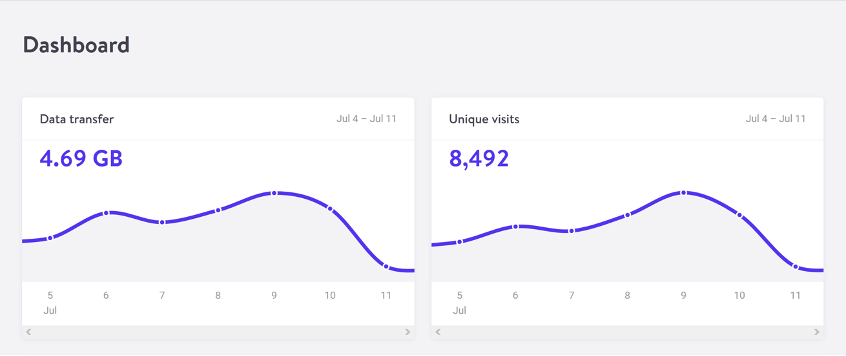
    For web pages, data transfer for a single visit can be most easily estimated by measuring the page weight, meaning the transfer size of the page in kilobytes the first time someone visits the page. It’s fairly easy to measure using the developer tools in any modern web browser. Often your web hosting account will include statistics for the total data transfer of any web application (Fig 2.1).

    The nice thing about page weight as a metric is that it allows us to compare the efficiency of web pages on a level playing field without confusing the issue with constantly changing traffic volumes. 

    Reducing page weight requires a large scope. By early 2020, the median page weight was 1.97 MB for setups the HTTP Archive classifies as “desktop” and 1.77 MB for “mobile,” with desktop increasing 36 percent since January 2016 and mobile page weights nearly doubling in the same period (Fig 2.2). Roughly half of this data transfer is image files, making images the single biggest source of carbon emissions on the average website. 

    History clearly shows us that our web pages can be smaller, if only we set our minds to it. While most technologies become ever more energy efficient, including the underlying technology of the web such as data centers and transmission networks, websites themselves are a technology that becomes less efficient as time goes on.

    You might be familiar with the concept of performance budgeting as a way of focusing a project team on creating faster user experiences. For example, we might specify that the website must load in a maximum of one second on a broadband connection and three seconds on a 3G connection. Much like speed limits while driving, performance budgets are upper limits rather than vague suggestions, so the goal should always be to come in under budget.

    Designing for fast performance does often lead to reduced data transfer and emissions, but it isn’t always the case. Web performance is often more about the subjective perception of load times than it is about the true efficiency of the underlying system, whereas page weight and transfer size are more objective measures and more reliable benchmarks for sustainable web design. 

    We can set a page weight budget in reference to a benchmark of industry averages, using data from sources like HTTP Archive. We can also benchmark page weight against competitors or the old version of the website we’re replacing. For example, we might set a maximum page weight budget as equal to our most efficient competitor, or we could set the benchmark lower to guarantee we are best in class. 

    If we want to take it to the next level, then we could also start looking at the transfer size of our web pages for repeat visitors. Although page weight for the first time someone visits is the easiest thing to measure, and easy to compare on a like-for-like basis, we can learn even more if we start looking at transfer size in other scenarios too. For example, visitors who load the same page multiple times will likely have a high percentage of the files cached in their browser, meaning they don’t need to transfer all of the files on subsequent visits. Likewise, a visitor who navigates to new pages on the same website will likely not need to load the full page each time, as some global assets from areas like the header and footer may already be cached in their browser. Measuring transfer size at this next level of detail can help us learn even more about how we can optimize efficiency for users who regularly visit our pages, and enable us to set page weight budgets for additional scenarios beyond the first visit.

    Page weight budgets are easy to track throughout a design and development process. Although they don’t actually tell us carbon emission and energy consumption analytics directly, they give us a clear indication of efficiency relative to other websites. And as transfer size is an effective analog for energy consumption, we can actually use it to estimate energy consumption too.

    In summary, reduced data transfer translates to energy efficiency, a key factor to reducing carbon emissions of web products. The more efficient our products, the less electricity they use, and the less fossil fuels need to be burned to produce the electricity to power them. But as we’ll see next, since all web products demand some power, it’s important to consider the source of that electricity, too.

    Carbon intensity of electricity

    Regardless of energy efficiency, the level of pollution caused by digital products depends on the carbon intensity of the energy being used to power them. Carbon intensity is a term used to define the grams of CO2 produced for every kilowatt-hour of electricity (gCO2/kWh). This varies widely, with renewable energy sources and nuclear having an extremely low carbon intensity of less than 10 gCO2/kWh (even when factoring in their construction); whereas fossil fuels have very high carbon intensity of approximately 200–400 gCO2/kWh. 

    Most electricity comes from national or state grids, where energy from a variety of different sources is mixed together with varying levels of carbon intensity. The distributed nature of the internet means that a single user of a website or app might be using energy from multiple different grids simultaneously; a website user in Paris uses electricity from the French national grid to power their home internet and devices, but the website’s data center could be in Dallas, USA, pulling electricity from the Texas grid, while the telecoms networks use energy from everywhere between Dallas and Paris.

    We don’t have control over the full energy supply of web services, but we do have some control over where we host our projects. With a data center using a significant proportion of the energy of any website, locating the data center in an area with low carbon energy will tangibly reduce its carbon emissions. Danish startup Tomorrow reports and maps this user-contributed data, and a glance at their map shows how, for example, choosing a data center in France will have significantly lower carbon emissions than a data center in the Netherlands (Fig 2.3).

    That said, we don’t want to locate our servers too far away from our users; it takes energy to transmit data through the telecom’s networks, and the further the data travels, the more energy is consumed. Just like food miles, we can think of the distance from the data center to the website’s core user base as “megabyte miles”—and we want it to be as small as possible.

    Using the distance itself as a benchmark, we can use website analytics to identify the country, state, or even city where our core user group is located and measure the distance from that location to the data center used by our hosting company. This will be a somewhat fuzzy metric as we don’t know the precise center of mass of our users or the exact location of a data center, but we can at least get a rough idea. 

    For example, if a website is hosted in London but the primary user base is on the West Coast of the USA, then we could look up the distance from London to San Francisco, which is 5,300 miles. That’s a long way! We can see that hosting it somewhere in North America, ideally on the West Coast, would significantly reduce the distance and thus the energy used to transmit the data. In addition, locating our servers closer to our visitors helps reduce latency and delivers better user experience, so it’s a win-win.

    Converting it back to carbon emissions

    If we combine carbon intensity with a calculation for energy consumption, we can calculate the carbon emissions of our websites and apps. A tool my team created does this by measuring the data transfer over the wire when loading a web page, calculating the amount of electricity associated, and then converting that into a figure for CO2 (Fig 2.4). It also factors in whether or not the web hosting is powered by renewable energy.

    If you want to take it to the next level and tailor the data more accurately to the unique aspects of your project, the Energy and Emissions Worksheet accompanying this book shows you how.

    With the ability to calculate carbon emissions for our projects, we could actually take a page weight budget one step further and set carbon budgets as well. CO2 is not a metric commonly used in web projects; we’re more familiar with kilobytes and megabytes, and can fairly easily look at design options and files to assess how big they are. Translating that into carbon adds a layer of abstraction that isn’t as intuitive—but carbon budgets do focus our minds on the primary thing we’re trying to reduce, and support the core objective of sustainable web design: reducing carbon emissions.

    Browser Energy

    Data transfer might be the simplest and most complete analog for energy consumption in our digital projects, but by giving us one number to represent the energy used in the data center, the telecoms networks, and the end user’s devices, it can’t offer us insights into the efficiency in any specific part of the system.

    One part of the system we can look at in more detail is the energy used by end users’ devices. As front-end web technologies become more advanced, the computational load is increasingly moving from the data center to users’ devices, whether they be phones, tablets, laptops, desktops, or even smart TVs. Modern web browsers allow us to implement more complex styling and animation on the fly using CSS and JavaScript. Furthermore, JavaScript libraries such as Angular and React allow us to create applications where the “thinking” work is done partly or entirely in the browser. 

    All of these advances are exciting and open up new possibilities for what the web can do to serve society and create positive experiences. However, more computation in the user’s web browser means more energy used by their devices. This has implications not just environmentally, but also for user experience and inclusivity. Applications that put a heavy processing load on the user’s device can inadvertently exclude users with older, slower devices and cause batteries on phones and laptops to drain faster. Furthermore, if we build web applications that require the user to have up-to-date, powerful devices, people throw away old devices much more frequently. This isn’t just bad for the environment, but it puts a disproportionate financial burden on the poorest in society.

    In part because the tools are limited, and partly because there are so many different models of devices, it’s difficult to measure website energy consumption on end users’ devices. One tool we do currently have is the Energy Impact monitor inside the developer console of the Safari browser (Fig 2.5).

    You know when you load a website and your computer’s cooling fans start spinning so frantically you think it might actually take off? That’s essentially what this tool is measuring. 

    It shows us the percentage of CPU used and the duration of CPU usage when loading the web page, and uses these figures to generate an energy impact rating. It doesn’t give us precise data for the amount of electricity used in kilowatts, but the information it does provide can be used to benchmark how efficiently your websites use energy and set targets for improvement.

  • Design for Safety, An Excerpt

    Design for Safety, An Excerpt

    Antiracist economist Kim Crayton says that “intention without strategy is chaos.” We’ve discussed how our biases, assumptions, and inattention toward marginalized and vulnerable groups lead to dangerous and unethical tech—but what, specifically, do we need to do to fix it? The intention to make our tech safer is not enough; we need a strategy.

    This chapter will equip you with that plan of action. It covers how to integrate safety principles into your design work in order to create tech that’s safe, how to convince your stakeholders that this work is necessary, and how to respond to the critique that what we actually need is more diversity. (Spoiler: we do, but diversity alone is not the antidote to fixing unethical, unsafe tech.)

    The process for inclusive safety

    When you are designing for safety, your goals are to:

    • identify ways your product can be used for abuse,
    • design ways to prevent the abuse, and
    • provide support for vulnerable users to reclaim power and control.

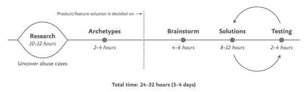
    The Process for Inclusive Safety is a tool to help you reach those goals (Fig 5.1). It’s a methodology I created in 2018 to capture the various techniques I was using when designing products with safety in mind. Whether you are creating an entirely new product or adding to an existing feature, the Process can help you make your product safe and inclusive. The Process includes five general areas of action:

    • Conducting research
    • Creating archetypes
    • Brainstorming problems
    • Designing solutions
    • Testing for safety

    The Process is meant to be flexible—it won’t make sense for teams to implement every step in some situations. Use the parts that are relevant to your unique work and context; this is meant to be something you can insert into your existing design practice.

    And once you use it, if you have an idea for making it better or simply want to provide context of how it helped your team, please get in touch with me. It’s a living document that I hope will continue to be a useful and realistic tool that technologists can use in their day-to-day work.

    If you’re working on a product specifically for a vulnerable group or survivors of some form of trauma, such as an app for survivors of domestic violence, sexual assault, or drug addiction, be sure to read Chapter 7, which covers that situation explicitly and should be handled a bit differently. The guidelines here are for prioritizing safety when designing a more general product that will have a wide user base (which, we already know from statistics, will include certain groups that should be protected from harm). Chapter 7 is focused on products that are specifically for vulnerable groups and people who have experienced trauma.

    Step 1: Conduct research

    Design research should include a broad analysis of how your tech might be weaponized for abuse as well as specific insights into the experiences of survivors and perpetrators of that type of abuse. At this stage, you and your team will investigate issues of interpersonal harm and abuse, and explore any other safety, security, or inclusivity issues that might be a concern for your product or service, like data security, racist algorithms, and harassment.

    Broad research

    Your project should begin with broad, general research into similar products and issues around safety and ethical concerns that have already been reported. For example, a team building a smart home device would do well to understand the multitude of ways that existing smart home devices have been used as tools of abuse. If your product will involve AI, seek to understand the potentials for racism and other issues that have been reported in existing AI products. Nearly all types of technology have some kind of potential or actual harm that’s been reported on in the news or written about by academics. Google Scholar is a useful tool for finding these studies.

    Specific research: Survivors

    When possible and appropriate, include direct research (surveys and interviews) with people who are experts in the forms of harm you have uncovered. Ideally, you’ll want to interview advocates working in the space of your research first so that you have a more solid understanding of the topic and are better equipped to not retraumatize survivors. If you’ve uncovered possible domestic violence issues, for example, the experts you’ll want to speak with are survivors themselves, as well as workers at domestic violence hotlines, shelters, other related nonprofits, and lawyers.

    Especially when interviewing survivors of any kind of trauma, it is important to pay people for their knowledge and lived experiences. Don’t ask survivors to share their trauma for free, as this is exploitative. While some survivors may not want to be paid, you should always make the offer in the initial ask. An alternative to payment is to donate to an organization working against the type of violence that the interviewee experienced. We’ll talk more about how to appropriately interview survivors in Chapter 6.

    Specific research: Abusers

    It’s unlikely that teams aiming to design for safety will be able to interview self-proclaimed abusers or people who have broken laws around things like hacking. Don’t make this a goal; rather, try to get at this angle in your general research. Aim to understand how abusers or bad actors weaponize technology to use against others, how they cover their tracks, and how they explain or rationalize the abuse.

    Step 2: Create archetypes

    Once you’ve finished conducting your research, use your insights to create abuser and survivor archetypes. Archetypes are not personas, as they’re not based on real people that you interviewed and surveyed. Instead, they’re based on your research into likely safety issues, much like when we design for accessibility: we don’t need to have found a group of blind or low-vision users in our interview pool to create a design that’s inclusive of them. Instead, we base those designs on existing research into what this group needs. Personas typically represent real users and include many details, while archetypes are broader and can be more generalized.

    The abuser archetype is someone who will look at the product as a tool to perform harm (Fig 5.2). They may be trying to harm someone they don’t know through surveillance or anonymous harassment, or they may be trying to control, monitor, abuse, or torment someone they know personally.

    The survivor archetype is someone who is being abused with the product. There are various situations to consider in terms of the archetype’s understanding of the abuse and how to put an end to it: Do they need proof of abuse they already suspect is happening, or are they unaware they’ve been targeted in the first place and need to be alerted (Fig 5.3)?

    You may want to make multiple survivor archetypes to capture a range of different experiences. They may know that the abuse is happening but not be able to stop it, like when an abuser locks them out of IoT devices; or they know it’s happening but don’t know how, such as when a stalker keeps figuring out their location (Fig 5.4). Include as many of these scenarios as you need to in your survivor archetype. You’ll use these later on when you design solutions to help your survivor archetypes achieve their goals of preventing and ending abuse.

    It may be useful for you to create persona-like artifacts for your archetypes, such as the three examples shown. Instead of focusing on the demographic information we often see in personas, focus on their goals. The goals of the abuser will be to carry out the specific abuse you’ve identified, while the goals of the survivor will be to prevent abuse, understand that abuse is happening, make ongoing abuse stop, or regain control over the technology that’s being used for abuse. Later, you’ll brainstorm how to prevent the abuser’s goals and assist the survivor’s goals.

    And while the “abuser/survivor” model fits most cases, it doesn’t fit all, so modify it as you need to. For example, if you uncovered an issue with security, such as the ability for someone to hack into a home camera system and talk to children, the malicious hacker would get the abuser archetype and the child’s parents would get survivor archetype.

    Step 3: Brainstorm problems

    After creating archetypes, brainstorm novel abuse cases and safety issues. “Novel” means things not found in your research; you’re trying to identify completely new safety issues that are unique to your product or service. The goal with this step is to exhaust every effort of identifying harms your product could cause. You aren’t worrying about how to prevent the harm yet—that comes in the next step.

    How could your product be used for any kind of abuse, outside of what you’ve already identified in your research? I recommend setting aside at least a few hours with your team for this process.

    If you’re looking for somewhere to start, try doing a Black Mirror brainstorm. This exercise is based on the show Black Mirror, which features stories about the dark possibilities of technology. Try to figure out how your product would be used in an episode of the show—the most wild, awful, out-of-control ways it could be used for harm. When I’ve led Black Mirror brainstorms, participants usually end up having a good deal of fun (which I think is great—it’s okay to have fun when designing for safety!). I recommend time-boxing a Black Mirror brainstorm to half an hour, and then dialing it back and using the rest of the time thinking of more realistic forms of harm.

    After you’ve identified as many opportunities for abuse as possible, you may still not feel confident that you’ve uncovered every potential form of harm. A healthy amount of anxiety is normal when you’re doing this kind of work. It’s common for teams designing for safety to worry, “Have we really identified every possible harm? What if we’ve missed something?” If you’ve spent at least four hours coming up with ways your product could be used for harm and have run out of ideas, go to the next step.

    It’s impossible to guarantee you’ve thought of everything; instead of aiming for 100 percent assurance, recognize that you’ve taken this time and have done the best you can, and commit to continuing to prioritize safety in the future. Once your product is released, your users may identify new issues that you missed; aim to receive that feedback graciously and course-correct quickly.

    Step 4: Design solutions

    At this point, you should have a list of ways your product can be used for harm as well as survivor and abuser archetypes describing opposing user goals. The next step is to identify ways to design against the identified abuser’s goals and to support the survivor’s goals. This step is a good one to insert alongside existing parts of your design process where you’re proposing solutions for the various problems your research uncovered.

    Some questions to ask yourself to help prevent harm and support your archetypes include:

    • Can you design your product in such a way that the identified harm cannot happen in the first place? If not, what roadblocks can you put up to prevent the harm from happening?
    • How can you make the victim aware that abuse is happening through your product?
    • How can you help the victim understand what they need to do to make the problem stop?
    • Can you identify any types of user activity that would indicate some form of harm or abuse? Could your product help the user access support?

    In some products, it’s possible to proactively recognize that harm is happening. For example, a pregnancy app might be modified to allow the user to report that they were the victim of an assault, which could trigger an offer to receive resources for local and national organizations. This sort of proactiveness is not always possible, but it’s worth taking a half hour to discuss if any type of user activity would indicate some form of harm or abuse, and how your product could assist the user in receiving help in a safe manner.

    That said, use caution: you don’t want to do anything that could put a user in harm’s way if their devices are being monitored. If you do offer some kind of proactive help, always make it voluntary, and think through other safety issues, such as the need to keep the user in-app in case an abuser is checking their search history. We’ll walk through a good example of this in the next chapter.

    Step 5: Test for safety

    The final step is to test your prototypes from the point of view of your archetypes: the person who wants to weaponize the product for harm and the victim of the harm who needs to regain control over the technology. Just like any other kind of product testing, at this point you’ll aim to rigorously test out your safety solutions so that you can identify gaps and correct them, validate that your designs will help keep your users safe, and feel more confident releasing your product into the world.

    Ideally, safety testing happens along with usability testing. If you’re at a company that doesn’t do usability testing, you might be able to use safety testing to cleverly perform both; a user who goes through your design attempting to weaponize the product against someone else can also be encouraged to point out interactions or other elements of the design that don’t make sense to them.

    You’ll want to conduct safety testing on either your final prototype or the actual product if it’s already been released. There’s nothing wrong with testing an existing product that wasn’t designed with safety goals in mind from the onset—“retrofitting” it for safety is a good thing to do.

    Remember that testing for safety involves testing from the perspective of both an abuser and a survivor, though it may not make sense for you to do both. Alternatively, if you made multiple survivor archetypes to capture multiple scenarios, you’ll want to test from the perspective of each one.

    As with other sorts of usability testing, you as the designer are most likely too close to the product and its design by this point to be a valuable tester; you know the product too well. Instead of doing it yourself, set up testing as you would with other usability testing: find someone who is not familiar with the product and its design, set the scene, give them a task, encourage them to think out loud, and observe how they attempt to complete it.

    Abuser testing

    The goal of this testing is to understand how easy it is for someone to weaponize your product for harm. Unlike with usability testing, you want to make it impossible, or at least difficult, for them to achieve their goal. Reference the goals in the abuser archetype you created earlier, and use your product in an attempt to achieve them.

    For example, for a fitness app with GPS-enabled location features, we can imagine that the abuser archetype would have the goal of figuring out where his ex-girlfriend now lives. With this goal in mind, you’d try everything possible to figure out the location of another user who has their privacy settings enabled. You might try to see her running routes, view any available information on her profile, view anything available about her location (which she has set to private), and investigate the profiles of any other users somehow connected with her account, such as her followers.

    If by the end of this you’ve managed to uncover some of her location data, despite her having set her profile to private, you know now that your product enables stalking. Your next step is to go back to step 4 and figure out how to prevent this from happening. You may need to repeat the process of designing solutions and testing them more than once.

    Survivor testing

    Survivor testing involves identifying how to give information and power to the survivor. It might not always make sense based on the product or context. Thwarting the attempt of an abuser archetype to stalk someone also satisfies the goal of the survivor archetype to not be stalked, so separate testing wouldn’t be needed from the survivor’s perspective.

    However, there are cases where it makes sense. For example, for a smart thermostat, a survivor archetype’s goals would be to understand who or what is making the temperature change when they aren’t doing it themselves. You could test this by looking for the thermostat’s history log and checking for usernames, actions, and times; if you couldn’t find that information, you would have more work to do in step 4.

    Another goal might be regaining control of the thermostat once the survivor realizes the abuser is remotely changing its settings. Your test would involve attempting to figure out how to do this: are there instructions that explain how to remove another user and change the password, and are they easy to find? This might again reveal that more work is needed to make it clear to the user how they can regain control of the device or account.

    Stress testing

    To make your product more inclusive and compassionate, consider adding stress testing. This concept comes from Design for Real Life by Eric Meyer and Sara Wachter-Boettcher. The authors pointed out that personas typically center people who are having a good day—but real users are often anxious, stressed out, having a bad day, or even experiencing tragedy. These are called “stress cases,” and testing your products for users in stress-case situations can help you identify places where your design lacks compassion. Design for Real Life has more details about what it looks like to incorporate stress cases into your design as well as many other great tactics for compassionate design.

  • A Content Model Is Not a Design System

    A Content Model Is Not a Design System

    Do you remember when having a great website was enough? Now, people are getting answers from Siri, Google search snippets, and mobile apps, not just our websites. Forward-thinking organizations have adopted an omnichannel content strategy, whose mission is to reach audiences across multiple digital channels and platforms.

    But how do you set up a content management system (CMS) to reach your audience now and in the future? I learned the hard way that creating a content model—a definition of content types, attributes, and relationships that let people and systems understand content—with my more familiar design-system thinking would capsize my customer’s omnichannel content strategy. You can avoid that outcome by creating content models that are semantic and that also connect related content. 

    I recently had the opportunity to lead the CMS implementation for a Fortune 500 company. The client was excited by the benefits of an omnichannel content strategy, including content reuse, multichannel marketing, and robot delivery—designing content to be intelligible to bots, Google knowledge panels, snippets, and voice user interfaces. 

    A content model is a critical foundation for an omnichannel content strategy, and for our content to be understood by multiple systems, the model needed semantic types—types named according to their meaning instead of their presentation. Our goal was to let authors create content and reuse it wherever it was relevant. But as the project proceeded, I realized that supporting content reuse at the scale that my customer needed required the whole team to recognize a new pattern.

    Despite our best intentions, we kept drawing from what we were more familiar with: design systems. Unlike web-focused content strategies, an omnichannel content strategy can’t rely on WYSIWYG tools for design and layout. Our tendency to approach the content model with our familiar design-system thinking constantly led us to veer away from one of the primary purposes of a content model: delivering content to audiences on multiple marketing channels.

    Two essential principles for an effective content model

    We needed to help our designers, developers, and stakeholders understand that we were doing something very different from their prior web projects, where it was natural for everyone to think about content as visual building blocks fitting into layouts. The previous approach was not only more familiar but also more intuitive—at least at first—because it made the designs feel more tangible. We discovered two principles that helped the team understand how a content model differs from the design systems that we were used to:

    1. Content models must define semantics instead of layout.
    2. And content models should connect content that belongs together.

    Semantic content models

    A semantic content model uses type and attribute names that reflect the meaning of the content, not how it will be displayed. For example, in a nonsemantic model, teams might create types like teasers, media blocks, and cards. Although these types might make it easy to lay out content, they don’t help delivery channels understand the content’s meaning, which in turn would have opened the door to the content being presented in each marketing channel. In contrast, a semantic content model uses type names like product, service, and testimonial so that each delivery channel can understand the content and use it as it sees fit. 

    When you’re creating a semantic content model, a great place to start is to look over the types and properties defined by Schema.org, a community-driven resource for type definitions that are intelligible to platforms like Google search.

    A semantic content model has several benefits:

    • Even if your team doesn’t care about omnichannel content, a semantic content model decouples content from its presentation so that teams can evolve the website’s design without needing to refactor its content. In this way, content can withstand disruptive website redesigns. 
    • A semantic content model also provides a competitive edge. By adding structured data based on Schema.org’s types and properties, a website can provide hints to help Google understand the content, display it in search snippets or knowledge panels, and use it to answer voice-interface user questions. Potential visitors could discover your content without ever setting foot in your website.
    • Beyond those practical benefits, you’ll also need a semantic content model if you want to deliver omnichannel content. To use the same content in multiple marketing channels, delivery channels need to be able to understand it. For example, if your content model were to provide a list of questions and answers, it could easily be rendered on a frequently asked questions (FAQ) page, but it could also be used in a voice interface or by a bot that answers common questions.

    For example, using a semantic content model for articles, events, people, and locations lets A List Apart provide cleanly structured data for search engines so that users can read the content on the website, in Google knowledge panels, and even with hypothetical voice interfaces in the future.

    Content models that connect

    After struggling to describe what makes a good content model, I’ve come to realize that the best models are those that are semantic and that also connect related content components (such as a FAQ item’s question and answer pair), instead of slicing up related content across disparate content components. A good content model connects content that should remain together so that multiple delivery channels can use it without needing to first put those pieces back together.

    Think about writing an article or essay. An article’s meaning and usefulness depends upon its parts being kept together. Would one of the headings or paragraphs be meaningful on their own without the context of the full article? On our project, our familiar design-system thinking often led us to want to create content models that would slice content into disparate chunks to fit the web-centric layout. This had a similar impact to an article that were to have been separated from its headline. Because we were slicing content into standalone pieces based on layout, content that belonged together became difficult to manage and nearly impossible for multiple delivery channels to understand.

    To illustrate, let’s look at how connecting related content applies in a real-world scenario. The design team for our customer presented a complex layout for a software product page that included multiple tabs and sections. Our instincts were to follow suit with the content model. Shouldn’t we make it as easy and as flexible as possible to add any number of tabs in the future?

    Because our design-system instincts were so familiar, it felt like we had needed a content type called “tab section” so that multiple tab sections could be added to a page. Each tab section would display various types of content. One tab might provide the software’s overview or its specifications. Another tab might provide a list of resources. 

    Our inclination to break down the content model into “tab section” pieces would have led to an unnecessarily complex model and a cumbersome editing experience, and it would have also created content that couldn’t have been understood by additional delivery channels. For example, how would another system have been able to tell which “tab section” referred to a product’s specifications or its resource list—would that other system have to have resorted to counting tab sections and content blocks? This would have prevented the tabs from ever being reordered, and it would have required adding logic in every other delivery channel to interpret the design system’s layout. Furthermore, if the customer were to have no longer wanted to display this content in a tab layout, it would have been tedious to migrate to a new content model to reflect the new page redesign.

    We had a breakthrough when we discovered that our customer had a specific purpose in mind for each tab: it would reveal specific information such as the software product’s overview, specifications, related resources, and pricing. Once implementation began, our inclination to focus on what’s visual and familiar had obscured the intent of the designs. With a little digging, it didn’t take long to realize that the concept of tabs wasn’t relevant to the content model. The meaning of the content that they were planning to display in the tabs was what mattered.

    In fact, the customer could have decided to display this content in a different way—without tabs—somewhere else. This realization prompted us to define content types for the software product based on the meaningful attributes that the customer had wanted to render on the web. There were obvious semantic attributes like name and description as well as rich attributes like screenshots, software requirements, and feature lists. The software’s product information stayed together because it wasn’t sliced across separate components like “tab sections” that were derived from the content’s presentation. Any delivery channel—including future ones—could understand and present this content.

    Conclusion

    In this omnichannel marketing project, we discovered that the best way to keep our content model on track was to ensure that it was semantic (with type and attribute names that reflected the meaning of the content) and that it kept content together that belonged together (instead of fragmenting it). These two concepts curtailed our temptation to shape the content model based on the design. So if you’re working on a content model to support an omnichannel content strategy—or even if you just want to make sure that Google and other interfaces understand your content—remember:

    • A design system isn’t a content model. Team members may be tempted to conflate them and to make your content model mirror your design system, so you should protect the semantic value and contextual structure of the content strategy during the entire implementation process. This will let every delivery channel consume the content without needing a magic decoder ring.
    • If your team is struggling to make this transition, you can still reap some of the benefits by using Schema.org–based structured data in your website. Even if additional delivery channels aren’t on the immediate horizon, the benefit to search engine optimization is a compelling reason on its own.
    • Additionally, remind the team that decoupling the content model from the design will let them update the designs more easily because they won’t be held back by the cost of content migrations. They’ll be able to create new designs without the obstacle of compatibility between the design and the content, and ​they’ll be ready for the next big thing. 

    By rigorously advocating for these principles, you’ll help your team treat content the way that it deserves—as the most critical asset in your user experience and the best way to connect with your audience.

  • How to Sell UX Research with Two Simple Questions

    How to Sell UX Research with Two Simple Questions

    Do you find yourself designing screens with only a vague idea of how the things on the screen relate to the things elsewhere in the system? Do you leave stakeholder meetings with unclear directives that often seem to contradict previous conversations? You know a better understanding of user needs would help the team get clear on what you are actually trying to accomplish, but time and budget for research is tight. When it comes to asking for more direct contact with your users, you might feel like poor Oliver Twist, timidly asking, “Please, sir, I want some more.” 

    Here’s the trick. You need to get stakeholders themselves to identify high-risk assumptions and hidden complexity, so that they become just as motivated as you to get answers from users. Basically, you need to make them think it’s their idea. 

    In this article, I’ll show you how to collaboratively expose misalignment and gaps in the team’s shared understanding by bringing the team together around two simple questions:

    1. What are the objects?
    2. What are the relationships between those objects?

    A gauntlet between research and screen design

    These two questions align to the first two steps of the ORCA process, which might become your new best friend when it comes to reducing guesswork. Wait, what’s ORCA?! Glad you asked.

    ORCA stands for Objects, Relationships, CTAs, and Attributes, and it outlines a process for creating solid object-oriented user experiences. Object-oriented UX is my design philosophy. ORCA is an iterative methodology for synthesizing user research into an elegant structural foundation to support screen and interaction design. OOUX and ORCA have made my work as a UX designer more collaborative, effective, efficient, fun, strategic, and meaningful.

    The ORCA process has four iterative rounds and a whopping fifteen steps. In each round we get more clarity on our Os, Rs, Cs, and As.

    I sometimes say that ORCA is a “garbage in, garbage out” process. To ensure that the testable prototype produced in the final round actually tests well, the process needs to be fed by good research. But if you don’t have a ton of research, the beginning of the ORCA process serves another purpose: it helps you sell the need for research.

    In other words, the ORCA process serves as a gauntlet between research and design. With good research, you can gracefully ride the killer whale from research into design. But without good research, the process effectively spits you back into research and with a cache of specific open questions.

    Getting in the same curiosity-boat

    What gets us into trouble is not what we don’t know. It’s what we know for sure that just ain’t so.

    Mark Twain

    The first two steps of the ORCA process—Object Discovery and Relationship Discovery—shine a spotlight on the dark, dusty corners of your team’s misalignments and any inherent complexity that’s been swept under the rug. It begins to expose what this classic comic so beautifully illustrates:

    This is one reason why so many UX designers are frustrated in their job and why many projects fail. And this is also why we often can’t sell research: every decision-maker is confident in their own mental picture. 

    Once we expose hidden fuzzy patches in each picture and the differences between them all, the case for user research makes itself.

    But how we do this is important. However much we might want to, we can’t just tell everyone, “YOU ARE WRONG!” Instead, we need to facilitate and guide our team members to self-identify holes in their picture. When stakeholders take ownership of assumptions and gaps in understanding, BAM! Suddenly, UX research is not such a hard sell, and everyone is aboard the same curiosity-boat.

    Say your users are doctors. And you have no idea how doctors use the system you are tasked with redesigning.

    You might try to sell research by honestly saying: “We need to understand doctors better! What are their pain points? How do they use the current app?” But here’s the problem with that. Those questions are vague, and the answers to them don’t feel acutely actionable.

    Instead, you want your stakeholders themselves to ask super-specific questions. This is more like the kind of conversation you need to facilitate. Let’s listen in:

    “Wait a sec, how often do doctors share patients? Does a patient in this system have primary and secondary doctors?”

    “Can a patient even have more than one primary doctor?”

    “Is it a ‘primary doctor’ or just a ‘primary caregiver’… Can’t that role be a nurse practitioner?”

    “No, caregivers are something else… That’s the patient’s family contacts, right?”

    “So are caregivers in scope for this redesign?”

    “Yeah, because if a caregiver is present at an appointment, the doctor needs to note that. Like, tag the caregiver on the note… Or on the appointment?”

    Now we are getting somewhere. Do you see how powerful it can be getting stakeholders to debate these questions themselves? The diabolical goal here is to shake their confidence—gently and diplomatically.

    When these kinds of questions bubble up collaboratively and come directly from the mouths of your stakeholders and decision-makers, suddenly, designing screens without knowing the answers to these questions seems incredibly risky, even silly.

    If we create software without understanding the real-world information environment of our users, we will likely create software that does not align to the real-world information environment of our users. And this will, hands down, result in a more confusing, more complex, and less intuitive software product.

    The two questions

    But how do we get to these kinds of meaty questions diplomatically, efficiently, collaboratively, and reliably

    We can do this by starting with those two big questions that align to the first two steps of the ORCA process:

    1. What are the objects?
    2. What are the relationships between those objects?

    In practice, getting to these answers is easier said than done. I’m going to show you how these two simple questions can provide the outline for an Object Definition Workshop. During this workshop, these “seed” questions will blossom into dozens of specific questions and shine a spotlight on the need for more user research.

    Prep work: Noun foraging

    In the next section, I’ll show you how to run an Object Definition Workshop with your stakeholders (and entire cross-functional team, hopefully). But first, you need to do some prep work.

    Basically, look for nouns that are particular to the business or industry of your project, and do it across at least a few sources. I call this noun foraging.

    Here are just a few great noun foraging sources:

    • the product’s marketing site
    • the product’s competitors’ marketing sites (competitive analysis, anyone?)
    • the existing product (look at labels!)
    • user interview transcripts
    • notes from stakeholder interviews or vision docs from stakeholders

    Put your detective hat on, my dear Watson. Get resourceful and leverage what you have. If all you have is a marketing website, some screenshots of the existing legacy system, and access to customer service chat logs, then use those.

    As you peruse these sources, watch for the nouns that are used over and over again, and start listing them (preferably on blue sticky notes if you’ll be creating an object map later!).

    You’ll want to focus on nouns that might represent objects in your system. If you are having trouble determining if a noun might be object-worthy, remember the acronym SIP and test for:

    1. Structure
    2. Instances
    3. Purpose

    Think of a library app, for example. Is “book” an object?

    Structure: can you think of a few attributes for this potential object? Title, author, publish date… Yep, it has structure. Check!

    Instance: what are some examples of this potential “book” object? Can you name a few? The Alchemist, Ready Player One, Everybody Poops… OK, check!

    Purpose: why is this object important to the users and business? Well, “book” is what our library client is providing to people and books are why people come to the library… Check, check, check!

    As you are noun foraging, focus on capturing the nouns that have SIP. Avoid capturing components like dropdowns, checkboxes, and calendar pickers—your UX system is not your design system! Components are just the packaging for objects—they are a means to an end. No one is coming to your digital place to play with your dropdown! They are coming for the VALUABLE THINGS and what they can do with them. Those things, or objects, are what we are trying to identify.

    Let’s say we work for a startup disrupting the email experience. This is how I’d start my noun foraging.

    First I’d look at my own email client, which happens to be Gmail. I’d then look at Outlook and the new HEY email. I’d look at Yahoo, Hotmail…I’d even look at Slack and Basecamp and other so-called “email replacers.” I’d read some articles, reviews, and forum threads where people are complaining about email. While doing all this, I would look for and write down the nouns.

    (Before moving on, feel free to go noun foraging for this hypothetical product, too, and then scroll down to see how much our lists match up. Just don’t get lost in your own emails! Come back to me!)

    Drumroll, please…

    Here are a few nouns I came up with during my noun foraging:

    • email message
    • thread
    • contact
    • client
    • rule/automation
    • email address that is not a contact?
    • contact groups
    • attachment
    • Google doc file / other integrated file
    • newsletter? (HEY treats this differently)
    • saved responses and templates

    Scan your list of nouns and pick out words that you are completely clueless about. In our email example, it might be client or automation. Do as much homework as you can before your session with stakeholders: google what’s googleable. But other terms might be so specific to the product or domain that you need to have a conversation about them.

    Aside: here are some real nouns foraged during my own past project work that I needed my stakeholders to help me understand:

    • Record Locator
    • Incentive Home
    • Augmented Line Item
    • Curriculum-Based Measurement Probe

    This is really all you need to prepare for the workshop session: a list of nouns that represent potential objects and a short list of nouns that need to be defined further.

    Facilitate an Object Definition Workshop

    You could actually start your workshop with noun foraging—this activity can be done collaboratively. If you have five people in the room, pick five sources, assign one to every person, and give everyone ten minutes to find the objects within their source. When the time’s up, come together and find the overlap. Affinity mapping is your friend here!

    If your team is short on time and might be reluctant to do this kind of grunt work (which is usually the case) do your own noun foraging beforehand, but be prepared to show your work. I love presenting screenshots of documents and screens with all the nouns already highlighted. Bring the artifacts of your process, and start the workshop with a five-minute overview of your noun foraging journey.

    HOT TIP: before jumping into the workshop, frame the conversation as a requirements-gathering session to help you better understand the scope and details of the system. You don’t need to let them know that you’re looking for gaps in the team’s understanding so that you can prove the need for more user research—that will be our little secret. Instead, go into the session optimistically, as if your knowledgeable stakeholders and PMs and biz folks already have all the answers. 

    Then, let the question whack-a-mole commence.

    1. What is this thing?

    Want to have some real fun? At the beginning of your session, ask stakeholders to privately write definitions for the handful of obscure nouns you might be uncertain about. Then, have everyone show their cards at the same time and see if you get different definitions (you will). This is gold for exposing misalignment and starting great conversations.

    As your discussion unfolds, capture any agreed-upon definitions. And when uncertainty emerges, quietly (but visibly) start an “open questions” parking lot. 😉

    After definitions solidify, here’s a great follow-up:

    2. Do our users know what these things are? What do users call this thing?

    Stakeholder 1: They probably call email clients “apps.” But I’m not sure.

    Stakeholder 2: Automations are often called “workflows,” I think. Or, maybe users think workflows are something different.

    If a more user-friendly term emerges, ask the group if they can agree to use only that term moving forward. This way, the team can better align to the users’ language and mindset.

    OK, moving on. 

    If you have two or more objects that seem to overlap in purpose, ask one of these questions:

    3. Are these the same thing? Or are these different? If they are not the same, how are they different?

    You: Is a saved response the same as a template?

    Stakeholder 1: Yes! Definitely.

    Stakeholder 2: I don’t think so… A saved response is text with links and variables, but a template is more about the look and feel, like default fonts, colors, and placeholder images. 

    Continue to build out your growing glossary of objects. And continue to capture areas of uncertainty in your “open questions” parking lot.

    If you successfully determine that two similar things are, in fact, different, here’s your next follow-up question:

    4. What’s the relationship between these objects?

    You: Are saved responses and templates related in any way?

    Stakeholder 3:  Yeah, a template can be applied to a saved response.

    You, always with the follow-ups: When is the template applied to a saved response? Does that happen when the user is constructing the saved response? Or when they apply the saved response to an email? How does that actually work?

    Listen. Capture uncertainty. Once the list of “open questions” grows to a critical mass, pause to start assigning questions to groups or individuals. Some questions might be for the dev team (hopefully at least one developer is in the room with you). One question might be specifically for someone who couldn’t make it to the workshop. And many questions will need to be labeled “user.” 

    Do you see how we are building up to our UXR sales pitch?

    5. Is this object in scope?

    Your next question narrows the team’s focus toward what’s most important to your users. You can simply ask, “Are saved responses in scope for our first release?,” but I’ve got a better, more devious strategy.

    By now, you should have a list of clearly defined objects. Ask participants to sort these objects from most to least important, either in small breakout groups or individually. Then, like you did with the definitions, have everyone reveal their sort order at once. Surprisingly—or not so surprisingly—it’s not unusual for the VP to rank something like “saved responses” as #2 while everyone else puts it at the bottom of the list. Try not to look too smug as you inevitably expose more misalignment.

    I did this for a startup a few years ago. We posted the three groups’ wildly different sort orders on the whiteboard.

    The CEO stood back, looked at it, and said, “This is why we haven’t been able to move forward in two years.”

    Admittedly, it’s tragic to hear that, but as a professional, it feels pretty awesome to be the one who facilitated a watershed realization.

    Once you have a good idea of in-scope, clearly defined things, this is when you move on to doing more relationship mapping.

    6. Create a visual representation of the objects’ relationships

    We’ve already done a bit of this while trying to determine if two things are different, but this time, ask the team about every potential relationship. For each object, ask how it relates to all the other objects. In what ways are the objects connected? To visualize all the connections, pull out your trusty boxes-and-arrows technique. Here, we are connecting our objects with verbs. I like to keep my verbs to simple “has a” and “has many” statements.

    This system modeling activity brings up all sorts of new questions:

    • Can a saved response have attachments?
    • Can a saved response use a template? If so, if an email uses a saved response with a template, can the user override that template?
    • Do users want to see all the emails they sent that included a particular attachment? For example, “show me all the emails I sent with ProfessionalImage.jpg attached. I’ve changed my professional photo and I want to alert everyone to update it.” 

    Solid answers might emerge directly from the workshop participants. Great! Capture that new shared understanding. But when uncertainty surfaces, continue to add questions to your growing parking lot.

    Light the fuse

    You’ve positioned the explosives all along the floodgates. Now you simply have to light the fuse and BOOM. Watch the buy-in for user research flooooow.

    Before your workshop wraps up, have the group reflect on the list of open questions. Make plans for getting answers internally, then focus on the questions that need to be brought before users.

    Here’s your final step. Take those questions you’ve compiled for user research and discuss the level of risk associated with NOT answering them. Ask, “if we design without an answer to this question, if we make up our own answer and we are wrong, how bad might that turn out?” 

    With this methodology, we are cornering our decision-makers into advocating for user research as they themselves label questions as high-risk. Sorry, not sorry. 

    Now is your moment of truth. With everyone in the room, ask for a reasonable budget of time and money to conduct 6–8 user interviews focused specifically on these questions. 

    HOT TIP: if you are new to UX research, please note that you’ll likely need to rephrase the questions that came up during the workshop before you present them to users. Make sure your questions are open-ended and don’t lead the user into any default answers.

    Final words: Hold the screen design!

    Seriously, if at all possible, do not ever design screens again without first answering these fundamental questions: what are the objects and how do they relate?

    I promise you this: if you can secure a shared understanding between the business, design, and development teams before you start designing screens, you will have less heartache and save more time and money, and (it almost feels like a bonus at this point!) users will be more receptive to what you put out into the world. 

    I sincerely hope this helps you win time and budget to go talk to your users and gain clarity on what you are designing before you start building screens. If you find success using noun foraging and the Object Definition Workshop, there’s more where that came from in the rest of the ORCA process, which will help prevent even more late-in-the-game scope tugs-of-war and strategy pivots. 

    All the best of luck! Now go sell research!